• Home
  • Tools dropdown img
    • Spreadsheet Charts

      • ChartExpo for Google Sheets
      • ChartExpo for Microsoft Excel
    • Power BI Charts

      • Power BI Custom Visuals by ChartExpo
    • Word Cloud

  • Charts dropdown img
    • Chart Category

      • Bar Charts
      • Circle Graphs
      • Column Charts
      • Combo Charts
      • Comparison Charts
      • Line Graphs
      • PPC Charts
      • Sentiment Analysis Charts
      • Survey Charts
    • Chart Type

      • Box and Whisker Plot
      • Clustered Bar Chart
      • Clustered Column Chart
      • Comparison Bar Chart
      • Control Chart
      • CSAT Survey Bar Chart
      • CSAT Survey Chart
      • Dot Plot Chart
      • Double Bar Graph
      • Funnel Chart
      • Gauge Chart
      • Likert Scale Chart
      • Matrix Chart
      • Multi Axis Line Chart
      • Overlapping Bar Chart
      • Pareto Chart
      • Radar Chart
      • Radial Bar Chart
      • Sankey Diagram
      • Scatter Plot Chart
      • Slope Chart
      • Sunburst Chart
      • Tornado Chart
      • Waterfall Chart
      • Word Cloud
    • Google Sheets
      Microsoft Excel
  • Services
  • Pricing
  • Contact us
  • Blog
  • Support dropdown img
      • Gallery
      • Videos
      • Contact us
      • FAQs
      • Resources
    • Please feel free to contact us

      atsupport@chartexpo.com

Categories
All Data Visualizations Data Analytics Surveys
Add-ons/
  • Google Sheets
  • Microsoft Excel
  • Power BI
All Data Visualizations Data Analytics Surveys
Add-ons
  • Google Sheets
  • Microsoft Excel
  • Power BI

We use cookies

This website uses cookies to provide better user experience and user's session management.
By continuing visiting this website you consent the use of these cookies.

Ok

ChartExpo Survey


Home > Blog > Data Analytics

Benchmarking Dashboard: Tips for Better Insights

Benchmarking dashboard is an indispensable tool for all business (and data) analysts. In this guide, you’ll discover what it is, the purpose of a benchmark report, and see some benchmark reporting examples.

Benchmarking Dashboards

This guide also serves as a data visualization guide for analysts who are into business intelligence analytics. The steps in this guide enable data-driven decision-making and showcase some Power BI advanced features for analysts who will be using Power BI in Office 365, Power BI Cloud, and other BI reporting tools.

You’ll discover types of benchmarking dashboards, key elements of a benchmarking dashboard, and how benchmarking and dashboards work well together.

Table of Contents:

  1. What are Benchmarking Dashboards?
  2. What is the purpose of a benchmark report?
  3. How many Types of Benchmarking Dashboards?
  4. What are the Key Elements of a Benchmarking Dashboard?
  5. How to Create a Benchmarking Dashboard in Power BI?
  6. How do Benchmarking and Dashboards Work Well Together?
  7.  Benefits of using a Benchmark Dashboard
  8. Best Practices for Benchmarking Dashboards
  9. FAQs
  10. Wrap Up

What are Benchmarking Dashboards?

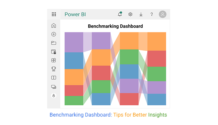
Definition: The Benchmarking Dashboard is a visual tool that compares key performance metrics against competitors, industry standards, or internal benchmarks. Organizations use it to identify gaps, track progress, and make data-driven decisions to improve efficiency, quality, and overall performance.

What is the purpose of a benchmark report?

  • Performance Comparison: Organizations can assess their performance in key areas like quality, productivity, efficiency, and customer satisfaction. This way, it becomes easy to compare the performance with competitors or industry benchmarks.
  • Setting Performance Standards: It helps establish clear performance expectations and ensures alignment with internal business objectives and best practices.
  • Tracking Progress Over Time: Organizations use benchmarking reports to track their progress, ensure continuous growth, and measure the impact of improvement initiatives.
  • Informed Decision-Making: A benchmark report offers objective data that enables leaders to make strategic decisions, allocate resources, and set realistic goals.

How many Types of Benchmarking Dashboards?

  • Competitive Benchmarking Dashboards: It compares the organization’s performance against direct competitors. It also analyzes market share, customer satisfaction, operational efficiency, and pricing.
  • Industry Benchmarking Dashboards: It measures performance against industry standards and also helps in setting realistic performance targets based on industry trends.
  • Internal Benchmarking Dashboards: Helps in comparing different departments, locations, or teams within the same organization. Aside from that, it plays a major role in encouraging continuous improvement and consistency across all business units.
  • Strategic Benchmarking Dashboards: Aligns benchmarking with long-term business objectives and goals. This will support decision-making for sustainable growth.
  • Process Benchmarking Dashboards: Helps in identifying inefficiencies and areas for process optimization, and also improves cost management and operational effectiveness.

What are the Key Elements of a Benchmarking Dashboard?

  • Key Performance Indicators (KPIs): These metrics measure performance against benchmarks (like revenue growth, operational efficiency, or customer satisfaction). The KPIs should be measurable, relevant, and aligned with business objectives.
  • Visual Representations: These include graphs, charts, and progress circles for easy data interpretation.
  • Customizable Views: These are user-friendly filters for personalized analysis. It helps different stakeholders focus on relevant insights.
  • Comparison Metrics: It displays performance gaps by comparing actual results with benchmarks. It always includes percentage differences and trend analysis.

How to Create a Benchmarking Dashboard in Power BI?

In this section, you’ll discover various Power BI Sales dashboards, Power BI KPI dashboards, and some Power BI reports.

Here are the various stages to help you create a benchmarking dashboard in Power BI.

  • Stage 1: Log into Power BI, enter your email, and click the “Submit” button.
Benchmarking Dashboards
  • Enter your password, and click “Sign in.”
Benchmarking Dashboards
  • You can opt to stay signed in.
Benchmarking Dashboards
  • Stage 2: Create a Data Set and Select the Data Set to Use in the Comparison Bar Chart
  • Navigate to the left-side menu, and click on the “Create” option. After that, select “Paste or manually enter data.”
Benchmarking Dashboards
  • The following data will be used for this illustration.
Benchmarking Dashboards
  • Paste the Power BI datasets above into the “Power Query” window. At this point, select the “Create a blank report” option.
Benchmarking Dashboards
  • Navigate to the left-side menu, and click on the “Data Hub” option. Power BI will populate the data set list. If no data set has been created, you’ll get an error message.
Benchmarking Dashboards
  • Choose a data set for your Comparison Bar Chart. PBI will populate the screen.
Benchmarking Dashboards
  • Click on the “Create a report” dropdown. After that, select “Start from scratch.”
Benchmarking Dashboards
  • A report canvas screen will appear.
Benchmarking Dashboards
  • Stage 3: Adding the Power BI Comparison Bar Chart Extension by ChartExpo
  • To create the Comparison Bar Chart, you’ll have to use an add-in or Power BI visual from AppSource. Navigate to the right side of the Power BI dashboard and open the Power BI Visualizations panel.
  • Click the ellipsis symbol (…) to import the Power BI Comparison Bar Chart extension by ChartExpo.
Benchmarking Dashboards
  • In the following menu that opens, select the “Get more visuals” option.
Benchmarking Dashboards
  • Enter “Comparison Bar Chart for Power BI by ChartExpo” in the highlighted search box. You’ll see the “Comparison Bar Chart for Power BI by ChartExpo.” After that, click the highlighted “Add” button.
Benchmarking Dashboards
  • Power BI will add the “Comparison Bar Chart for Power BI by ChartExpo” icon in the visualization panel.
Benchmarking Dashboards
  • Stage 4: Draw a Comparison Bar Chart with ChartExpo’s Power BI extension
  • To do that, select the “Comparison Bar Chart for Power BI by ChartExpo” icon in the visualization panel. A window, similar to the one below, will open in the report section of your dashboard.
Benchmarking Dashboards
  • There’s an option to resize the visual. Navigate to the right side of the Power BI dashboard. You’ll see “Fields” next to “Visualizations.” Select the fields to use in the Comparison Bar Chart. When selecting the fields, follow the sequence below:
    • Department
    • Factors
    • Benchmark Score.
  • You’ll have to provide your email address or a ChartExpo license key.
Benchmarking Dashboards
  • Stage 5: Activate your ChartExpo Trial or Apply a Subscription Key
  • Select the ChartExpo visual. After that, you’ll see three icons below “Build Visual” in the Visualizations panel. Select the middle icon, “Format visual.” The visual properties will be populated.
Benchmarking Dashboards
  • To start using ChartExpo as a new user, you have to enter your email address in the textbox under the “Trial Mode” section. Toggle “Enable Trial” to activate the 7-day trial.
Benchmarking Dashboards
  • The Comparison Bar Chart created under the 7-day trial comes with the ChartExpo watermark.
  • If you have a license key, enter it in the “ChartExpo License Key” textbox in the “License Settings” section. Slide the toggle switch next to “Enable License” to “On.”
Benchmarking Dashboards
  • Here’s the Comparison Bar Chart without a watermark.
Benchmarking Dashboards
  • You can add the header text on top of the chart.
Benchmarking Dashboards
  • Here’s how to disable the top number of bars.
Benchmarking Dashboards
  • You can disable the percentage sign of Bar Inner values.
Benchmarking Dashboards
  • Here’s the final Comparison Bar Chart.
Benchmarking Dashboards

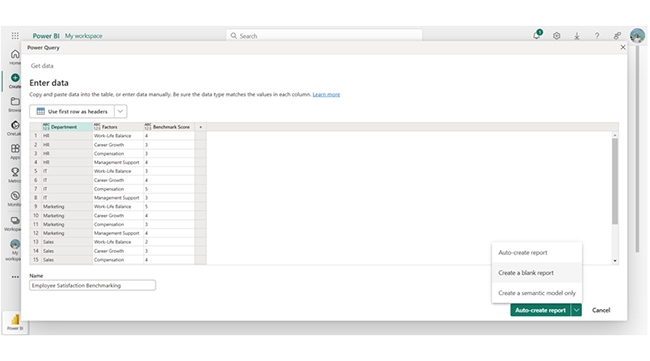
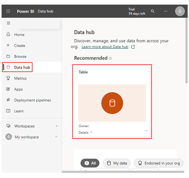
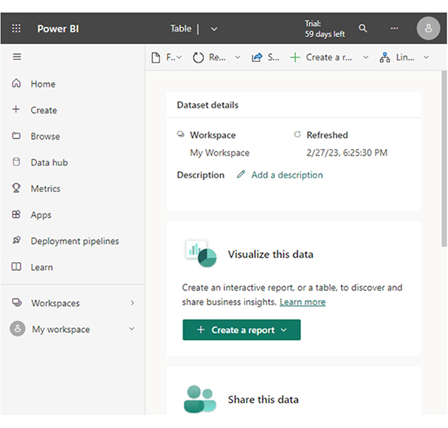
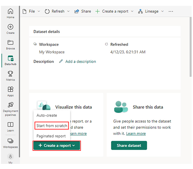
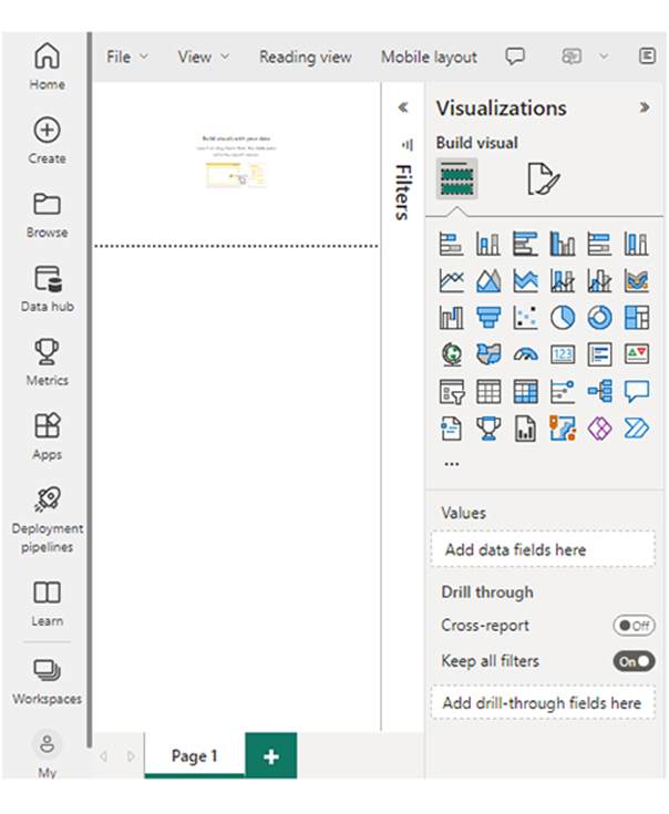
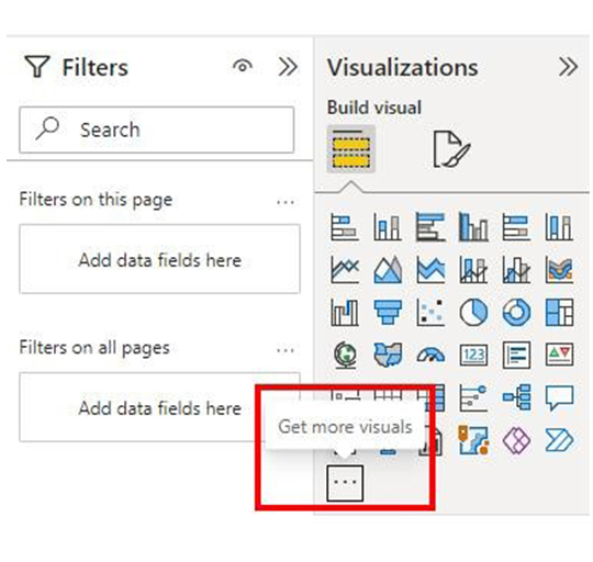
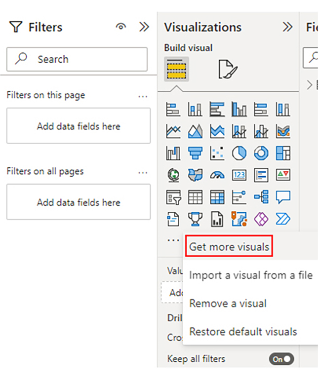
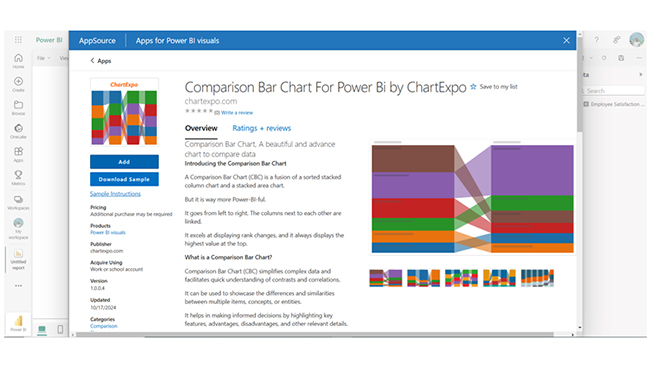
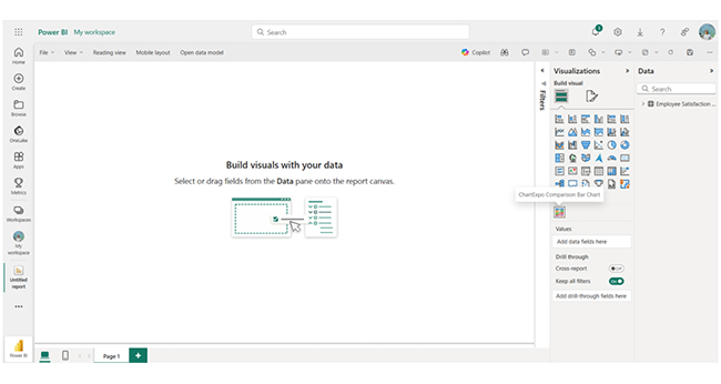
All these stages come in handy when analyzing any kind of data in Power BI. There are instances where you’ll have to use advanced features like the Power BI Connectors.

Insights

  • The marketing department has the highest work-life balance.
  • The department with the highest career growth benchmark is Finance.
  • The IT department has the highest compensation benchmark.

How do Benchmarking and Dashboards Work Well Together?

  • Visual Data Representation: Dashboards present benchmarking data in an easy-to-understand format using graphs, charts, and progress indicators.
  • Actionable Insights for Continuous Improvement: Benchmarking dashboards highlight gaps and also provide recommendations for improvement. This way, businesses will be able to take corrective actions and drive continuous growth.
  • Real-Time Performance Tracking: Dashboards provide real-time updates on key performance indicators (KPIs). This allows businesses to monitor how they’re performing against benchmarks.
  • Trends Analysis and Forecasting: Historical benchmarking data stored in dashboards help organizations predict future performance, track trends over time, and set realistic goals based on past performance.

 Benefits of using a Benchmark Dashboard

  • Performance Comparison: It helps organizations compare their performance against competitors, industry standards, or internal benchmarks.
  • Identifies Strengths and Weaknesses: It highlights areas of improvement, opportunities, and excellence.
  • Enhances Competitiveness: It keeps businesses aligned with industry best practices. This helps in maintaining a competitive edge.
  • Improves Efficiency: It tracks key performance indicators (KPIs) to boost operational effectiveness and productivity.

Best Practices for Benchmarking Dashboards

  • Define Clear Objectives: You have to identify the purpose of benchmarking, like competitive analysis, process improvement, or performance tracking.
  • Use Reliable Data Sources: Choose key performance indicators (KPIs) that align with industry standards and business goals.
  • Simply Visualization: Use easy-to-read charts, color-coded indicators, and graphs to highlight performance trends.
  • Allow Customization: You have to enable users to filter and analyze data based on locations, timeframes, or departments.

FAQs

How to show benchmarks in Power BI?

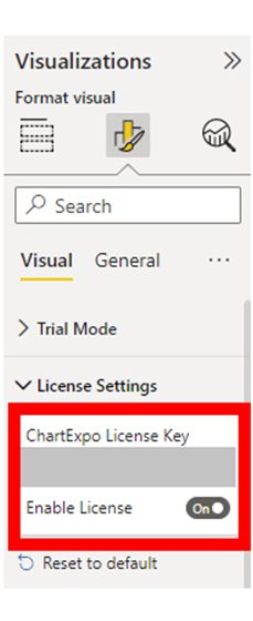
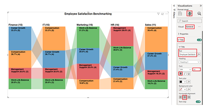
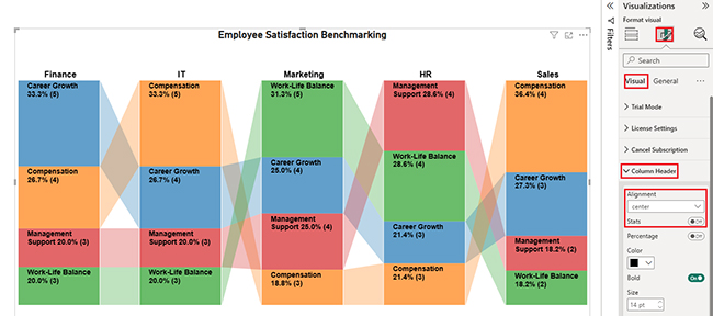
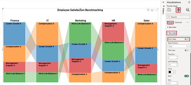
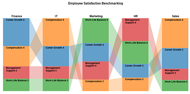
You can show benchmarks in Power BI by using constant lines in line charts, custom measures in bar charts, or target values in KPI visuals.

What is benchmarking in BI?

Benchmarking in Business Intelligence (BI) involves comparing the organization’s key performance metrics against industry standards, competitors, or internal goals. You can use BI tools to track progress, identify gaps, and drive data-driven improvements.

Wrap Up

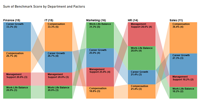
Benchmarking Dashboards visually compare performance metrics against competitors or industry standards. This helps businesses track progress. The benchmark report supports data-driven decisions, identifies gaps, and drives continuous improvement for competitiveness and enhanced efficiency.

To get the most out of a benchmarking dashboard, you’ll have to allow customization and focus on actionable insights. You should enable users to analyze and filter data based on locations, timeframes, or departments.

You must also provide recommendations and outline the next steps for addressing issues such as performance gaps.

Finally, you have to regularly review and update benchmarks. Always adjust benchmarks as the business needs and industry standards evolve.

Now you know what benchmarking dashboards are, what steps will you take to ascertain that your key performance metrics are appropriately compared with internal benchmarks, competitors, or industry standards?

How much did you enjoy this article?

ExcelAd1
Start Free Trial!
151326

Related articles

next previous
Data Analytics9 min read

Inventory Management KPIs for Better Visual Insights

Key Performance Indicators for inventory track stock accuracy and efficiency. This blog covers the essential KPIs, analysis tips, and Excel tracking methods.

Data Analytics11 min read

How to Increase Efficiency in a Business?

How to increase efficiency in the business is key to boosting performance. Click here to learn the strategies to use to increase your business efficiency.

Data Analytics9 min read

Moving Annual Total for Insightful Reports

The Moving Annual Total (MAT) tracks 12 months of data for clearer trends. Discover its importance, formula, and Excel analysis for better sales forecasting.

Data Analytics9 min read

Marketing Spend Template for Smarter Insights

Learn everything about the marketing spend template. You'll also learn how to create a marketing budget plan and tips for using one, and many more.

Data Analytics12 min read

Business Intelligence in Healthcare Industry: A Visual Approach

Business Intelligence in the healthcare industry improves patient care and streamlines operations. Learn how BI works and benefits healthcare providers.

ChartExpo logo

Turn Data into Visual
Stories

CHARTEXPO

  • Home
  • Gallery
  • Videos
  • Services
  • Pricing
  • Contact us
  • FAQs
  • Privacy policy
  • Terms of Service
  • Sitemap

TOOLS

  • ChartExpo for Google Sheets
  • ChartExpo for Microsoft Excel
  • Power BI Custom Visuals by ChartExpo
  • Word Cloud

CATEGORIES

  • Bar Charts
  • Circle Graphs
  • Column Charts
  • Combo Charts
  • Comparison Charts
  • Line Graphs
  • PPC Charts
  • Sentiment Analysis Charts
  • Survey Charts

TOP CHARTS

  • Sankey Diagram
  • Likert Scale Chart
  • Comparison Bar Chart
  • Pareto Chart
  • Funnel Chart
  • Gauge Chart
  • Radar Chart
  • Radial Bar Chart
  • Sunburst Chart
  • see more
  • Scatter Plot Chart
  • CSAT Survey Bar Chart
  • CSAT Survey Chart
  • Dot Plot Chart
  • Double Bar Graph
  • Matrix Chart
  • Multi Axis Line Chart
  • Overlapping Bar Chart
  • Control Chart
  • Slope Chart
  • Clustered Bar Chart
  • Clustered Column Chart
  • Box and Whisker Plot
  • Tornado Chart
  • Waterfall Chart
  • Word Cloud
  • see less

RESOURCES

  • Blog
  • Resources
  • YouTube
SIGN UP FOR UPDATES

We wouldn't dream of spamming you or selling your info.

© 2025 ChartExpo, all rights reserved.