Categories
Power BI Embedded is more than a reporting tool. Do you know how it connects to the daily choice between making something in-house or buying it externally?


I will help you understand. To begin with, every business faces this decision at some point. Research shows that 57% of companies outsource at least one business process. In manufacturing, smart make-or-buy strategies can cut costs by nearly 15%. These decisions go beyond money. They influence efficiency, innovation, and long-term growth.
Think of software, spare parts, or even support services. Do you build them with internal teams, or do you source them from outside? Making the wrong decision can be extremely expensive. Studies reveal that poor sourcing choices cost U.S. companies billions each year. That is why visualization tools matter. With Power BI report builder, data becomes easier to understand. Complex cost models turn into visuals that leaders can act on with confidence.
Excel still plays a strong role in quick calculations. Yet many businesses now combine spreadsheets with smarter analytics. Power BI datasets can merge multiple data sources into a single view, making comparisons faster and more reliable. Numbers no longer sit in isolation. They form patterns that guide decisions.
Clarity drives strategy. A Power BI KPI dashboard can highlight whether producing in-house improves margins or if outsourcing frees valuable resources. When combined with Power BI Embedded, decision-makers gain real-time insights across teams. That is how a simple make-or-buy question transforms into a powerful advantage.
Let me take you through this concept…
Definition: Power BI Embedded is a Microsoft service that allows developers to integrate interactive reports and dashboards into their applications. It provides users with insights without leaving the app they are working in.
Businesses use Power BI Embedded to share data-driven stories with clients or teams. With Power BI Pro, organizations can collaborate and securely manage shared content. Developers can also connect multiple data sources and create a Power BI data model that supports real-time decision-making. Companies value the flexibility and scalability it offers.
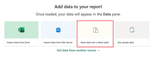
Have you noticed how users expect insights to be simple, fast, and right where they work? A Power BI embedded report makes this possible by bringing analytics directly into your app or portal. Instead of moving between tools, teams see the data they need in the same space where they make decisions. Let us look at why using Power BI embedded reports can be a smart choice:
Have you ever struggled to share insights with clients or teams without forcing them to leave your application? That is where Power BI Embedded shines. It integrates analytics directly into your software, making data an integral part of everyday workflows. With Power BI cloud, scaling and managing reports is effortless.
Here are four scenarios where using Power BI Embedded makes sense:
Thinking about adding embedded analytics to your app? Buying Power BI Embedded is simpler than it sounds. You get dedicated capacity that keeps reports and dashboards running smoothly. This approach gives control, flexibility, and cost-efficiency, especially if you know your expected user load.
Here’s how to get started:
Power BI Embedded helps developers add Power BI reports and analytics directly into their applications. It lets you give users a branded, personalized experience without leaving your product. This can make your software more engaging and valuable.
The cost of using Power BI Embedded depends on the type and number of nodes you choose. Each node comes with different amounts of virtual cores and RAM, where pricing varies based on these combinations. This allows you to scale resources according to your needs and budget:
| Node Type | Virtual Cores | Memory | Price |
| A1 | 1 | 3 GB RAM | $1.0081/hour |
| A2 | 2 | 5 GB RAM | $2.0081/hour |
| A3 | 4 | 10 GB RAM | $4.0242/hour |
| A4 | 8 | 25 GB RAM | $8.0565/hour |
| A5 | 16 | 50 GB RAM | $16.121/hour |
| A6 | 32 | 100 GB RAM | $32.2506/hour |
| A7 | 64 | 200 GB RAM | N/A |
| A8 | 128 | 400 GB RAM | N/A |
Ever wondered how businesses bring data to life inside their apps? Power BI Embedded examples demonstrate how analytics can be seamlessly integrated to provide users with real-time insights. These embedded solutions transform raw numbers into interactive visuals, enabling faster and smarter decision-making. Here are examples where Power BI Embedded shines:
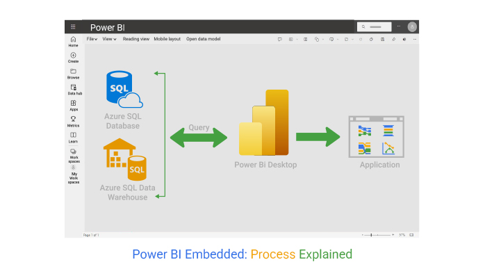
Creating Power BI Embedded analytics is a step-by-step process that brings your reports and visuals directly into your applications. It involves designing the reports, setting up dedicated capacities, and integrating the visuals through Azure and Power BI services.
Here’s how to do it:
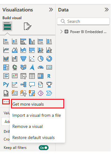
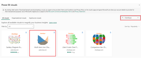
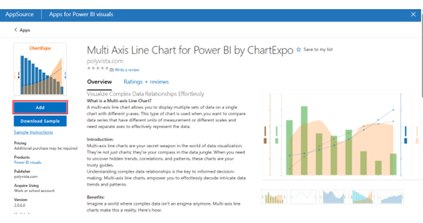
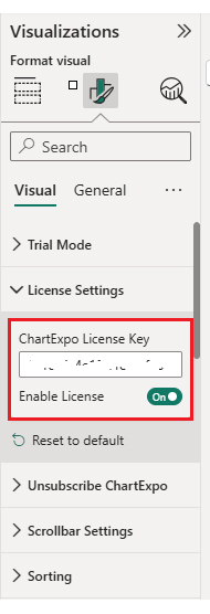
While Power BI provides strong analytics embedding, combining it with ChartExpo can enhance your visuals further. ChartExpo is a no-code visualization tool that offers advanced chart types and creative designs not available natively in Power BI. It is ideal for embedded analytics where impactful, clear visuals make a difference. This combination ensures your users get insightful and visually compelling reports within your app.
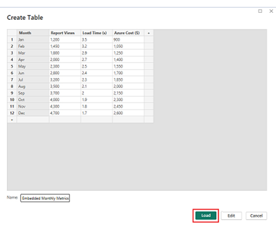
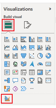
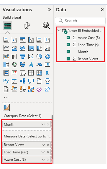
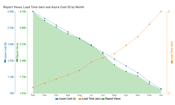
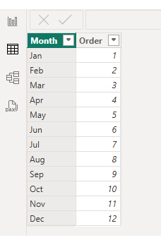
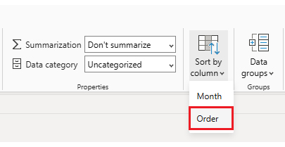
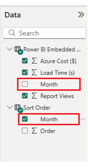
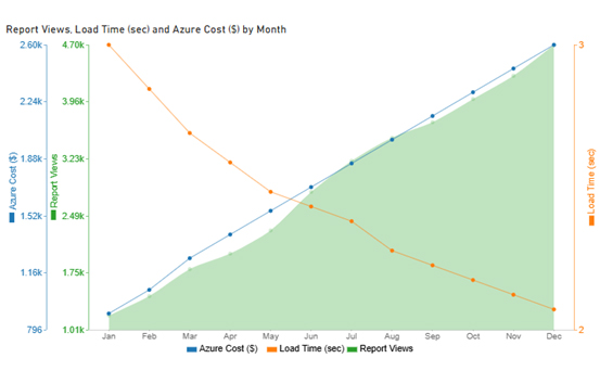
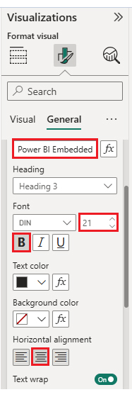
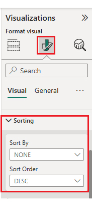
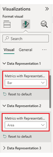
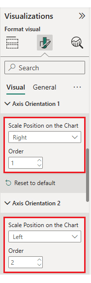
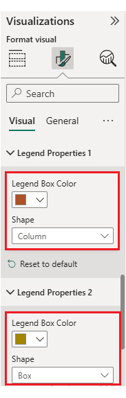
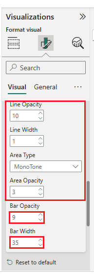
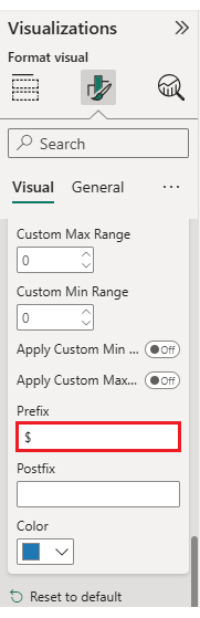
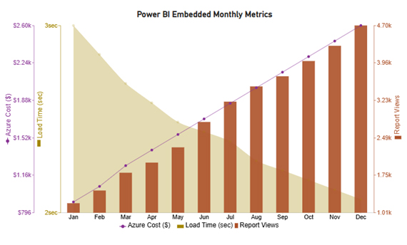
Consider we have the following data for a Multi Axis Line Chart. We want to visualize it and glean valuable insights from the visualization. Follow the steps below to make your data sing insights:
|
Month |
Report Views | Load Time (s) |
Azure Cost ($) |
| Jan | 1,200 | 3.5 | 900 |
| Feb | 1,450 | 3.2 | 1,050 |
| Mar | 1,800 | 2.9 | 1,250 |
| Apr | 2,000 | 2.7 | 1,400 |
| May | 2,300 | 2.5 | 1,550 |
| Jun | 2,800 | 2.4 | 1,700 |
| Jul | 3,200 | 2.3 | 1,850 |
| Aug | 3,500 | 2.1 | 2,000 |
| Sep | 3,700 | 2 | 2,150 |
| Oct | 4,000 | 1.9 | 2,300 |
| Nov | 4,300 | 1.8 | 2,450 |
| Dec | 4,700 | 1.7 | 2,600 |
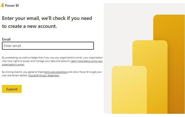
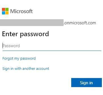
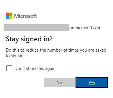
Power BI Login:
Delivering insights only matters if they reach the right person at the right moment. And that is the promise of Power BI Embedded analytics. It allows businesses to integrate reports directly into apps and control how users interact with data. With smart filtering and monitoring, every report becomes more meaningful.
Here are four ways to make the most of it:
To keep everything smooth, always follow Power BI best practices. Limit visuals per page, use DAX efficiently, and compress models where possible. With these steps, you get faster reports and happier users.
Power BI Embedded provides businesses with a way to integrate reports directly into their apps. It saves time, reduces friction, and makes insights part of daily workflows. But like any technology, it comes with both advantages and limitations.
Here’s what I’m talking about:
Pros
Cons
Power BI Embedded is used to bring interactive reports and dashboards directly into applications. It allows users to access insights without leaving the app. Businesses use it for real-time analytics, personalized dashboards, and data-driven decision-making within their software.
Yes, Power BI Embedded is still available. Microsoft continues to support and update it. Businesses can embed interactive reports and dashboards into their applications. It remains a popular choice for delivering analytics and real-time insights within software platforms.
Power BI Embedded empowers businesses to deliver advanced analytics and interactive data visualizations directly within their applications and digital platforms.
By embedding insights where users already work, organizations can improve data accessibility, enhance user experience, and drive faster, more informed decision-making.
Its scalable architecture, secure access controls, and real-time data capabilities make it an ideal solution for companies looking to turn complex data into meaningful insights without adding friction for end users.
With Power BI Embedded, developers and businesses can fully customize the analytics experience to match their brand and user interface, ensuring seamless integration and consistent user engagement. It supports a wide range of data sources, making it easy to combine, visualize, and analyze data from multiple systems in one centralized view.
Additionally, Power BI Embedded reduces operational overhead by eliminating the need for individual Power BI licenses for each user. Companies can deliver powerful, interactive analytics at scale, providing actionable insights to employees, customers, or partners while maintaining full control over data security and governance. This makes it a cost-effective and efficient solution for any organization aiming to become truly data-driven.
How much did you enjoy this article?


Discover diverse and high-quality Power BI report examples for inspiration and insights. Elevate your reporting with strategic visualization techniques.

A Customer Relationship Management Dashboard centralizes data, tracks key metrics, and drives smarter business decisions. Discover now!

Explore Healthcare Dashboard Examples and learn how to turn complex healthcare data into clear, actionable insights for better decision-making.


