• Home
  • Tools dropdown img
    • Spreadsheet Charts

      • ChartExpo for Google Sheets
      • ChartExpo for Microsoft Excel
    • Power BI Charts

      • Power BI Custom Visuals by ChartExpo
    • Word Cloud

  • Charts dropdown img
    • Chart Category

      • Bar Charts
      • Circle Graphs
      • Column Charts
      • Combo Charts
      • Comparison Charts
      • Line Graphs
      • PPC Charts
      • Sentiment Analysis Charts
      • Survey Charts
    • Chart Type

      • Box and Whisker Plot
      • Clustered Bar Chart
      • Clustered Column Chart
      • Comparison Bar Chart
      • Control Chart
      • CSAT Survey Bar Chart
      • CSAT Survey Chart
      • Dot Plot Chart
      • Double Bar Graph
      • Funnel Chart
      • Gauge Chart
      • Likert Scale Chart
      • Matrix Chart
      • Multi Axis Line Chart
      • Overlapping Bar Chart
      • Pareto Chart
      • Radar Chart
      • Radial Bar Chart
      • Sankey Diagram
      • Scatter Plot Chart
      • Slope Chart
      • Sunburst Chart
      • Tornado Chart
      • Waterfall Chart
      • Word Cloud
    • Google Sheets
      Microsoft Excel
  • Services
  • Pricing
  • Contact us
  • Blog
  • Support dropdown img
      • Gallery
      • Videos
      • Contact us
      • FAQs
      • Resources
    • Please feel free to contact us

      atsupport@chartexpo.com

Categories
All Data Visualizations Data Analytics Surveys
Add-ons/
  • Google Sheets
  • Microsoft Excel
  • Power BI
All Data Visualizations Data Analytics Surveys
Add-ons
  • Google Sheets
  • Microsoft Excel
  • Power BI

We use cookies

This website uses cookies to provide better user experience and user's session management.
By continuing visiting this website you consent the use of these cookies.

Ok

ChartExpo Survey


Home > Blog > Microsoft Excel

Excel Chart Templates for Insightful Presentations

What’s the fuss about chart templates in Excel? Now, let me ask you: why waste time rebuilding visuals from scratch when Excel already offers effective, reusable options?

Excel Chart Templates

Charts show patterns, not just numbers. In busy meetings, rapid data clarity is crucial. Manually fixing formatting each time is tiring and a risk for errors.

Globally, Excel serves over 750 million users, yet many overlook its most significant time-saver: chart templates. These let you present monthly KPIs or client reviews quickly and consistently by halving your workflow. And the best part is that they’re easy to set up and can transform your process.

About getting started? Don’t worry. You’ve come to the right place. You’ll learn to enhance your captivating, insightful visuals, such as the dual-axis charts and KPI graphs. These aren’t buzzwords—they’re what data-driven teams use to move fast and stay sharp.

This guide is for anyone who wants to create consistent, effective data visuals using chart templates. Whether you’re reporting sales, tracking marketing trends, or analyzing team progress, the right template makes a difference.

Are you ready to work smarter with Excel templates?

Let’s dive in…

Table of Contents:

  1. What are Excel Chart Templates?
  2. Why Do We Use Graph Templates for Excel?
  3. Examples of Chart Templates in Excel
  4. How to Create Excel Chart Templates (Step-by-Step)?
  5. How to Reuse Chart Format in Excel?
  6. How to Analyze a Chart Template Using ChartExpo in Excel?
  7. Benefits of Chart Templates in Excel
  8. Best Practices for Creating Graph Templates in Excel
  9. FAQs
  10. Wrap Up

What are Excel Chart Templates?

Definition: Chart templates are saved versions of your customized Excel charts. They hold your formatting, layout, and chart type so you don’t have to recreate them each time. Whether you’re working with burndown charts, butterfly charts, or strip charts, templates help keep things fast and consistent.

Instead of adjusting settings repeatedly, you load your template and start with a polished chart. It’s a time-saver, especially if you regularly handle reports or track progress across multiple projects.

Why Do We Use Graph Templates for Excel?

Are you tired of creating the same chart repeatedly? Graph templates handle formatting so you can concentrate on your data’s story. Here’s why they matter:

  • Saves time: Templates eliminate the need to start from zero every time. Whether you’re creating pivot charts or circular charts, a saved template lets you jump straight to analysis.
  • Ensures consistency: Using the same template ensures that all your charts appear uniform, which is crucial for reports and presentations. Assume you’re sending out weekly velocity charts. Consistency will build trust and credibility with your audience.
  • Improves accuracy: Manual formatting can lead to mistakes, such as missing labels, incorrect axis settings, and inconsistent colors. Templates lock in those settings so you’re less likely to misrepresent your data.
  • Enhances storytelling: Great charts guide your viewer’s eye and highlight the key message. Whether showing trend chart examples or yearly comparisons, good visuals make your story clear.
  • Highly customizable: Templates let you control colors, fonts, data labels, and chart types. Even niche visuals like butterfly charts can match your brand’s style and tone.
  • Streamlines workflows: Once a chart format is approved, it can be reused by your whole team. That means fewer formatting questions and faster delivery across departments.

Examples of Chart Templates in Excel

Are you frustrated by Excel’s standard charts not fitting your needs? You’re not alone. Most people want charts that fit their data, not the generic kind. That’s why chart templates are so useful. You can create one for nearly every chart type you rely on. Here are some real examples that go beyond the basics:

  • Burndown Chart: Agile teams use this to track work over time. Save your setup as a template to reuse across sprints and projects quickly.
  • Velocity Chart: Displays how much work a team completes in each iteration. Using a template makes it faster to build and allows you to spot trends or set future expectations easily.
  • Dual-Axis Chart: Ideal for comparing two different metrics with separate scales (like revenue and growth rate). Chart templates save your axis settings so you don’t have to reformat every time.
  • Strip Charts: Minimal visuals that show distribution. Save your styling once, and reuse it across datasets.
  • Butterfly Chart: Compare two groups side by side, such as survey results. Templates help recreate the symmetrical layout easily.
  • Trend Charts: Templates save your colors and line styles, so you can present trends instantly.
  • KPI Graphs: Used for quick snapshots of business health, like conversion rates or sales performance. Save one as a template to make dashboards quicker to update.

How to Create Excel Chart Templates (Step-by-Step)?

Have you been building the same chart over and over? You format the bars, change the colors, adjust the font, and then repeat the process next week. There’s a better way. With chart templates, Excel allows you to save your design once and reuse it repeatedly.

Here’s how to create your own in three simple steps. We’ll use a Clustered Bar Chart in this guide.

Step 1: Select your data range. Ensure that you highlight both columns: labels and values.

Excel Chart Templates

Step 2: Insert a Clustered Bar Chart from the menu.

Excel Chart Templates

Want it to pop? You can change the bar colors, adjust the font style, and size. Just do whatever it takes to make the chart your own.

Excel Chart Templates

Step 3: Right-click anywhere on the chart and choose “Save as Template.”

Excel Chart Templates

Name it something easy to remember, click Save, and you’re done. Your new template is now ready to use whenever you build future charts.

Excel Chart Templates

How to Reuse Chart Format in Excel?

You’ve created the perfect chart template. So, there is no need to rebuild formatting or redo colors. Here’s how to use your Excel Chart Template:

  • Go to Insert, then click Recommended Charts.
Excel Chart Templates
  • In the window, choose All Charts, then click Templates on the left. You’ll see a list of all your saved chart formats on the right, ready and waiting.
Excel Chart Templates
  • Select your template and click OK. Your chart appears with your new data, fully styled.
Excel Chart Templates

Top 10 Visuals Using ChartExpo to Use a Chart Template in Excel

Looking to spice up your reports and dashboards? Basic bars and lines can get the job done, but more advanced visuals tell deeper stories. ChartExpo offers unique ways to bring your data to life. Here are the top 10 visuals that can transform how you see and share information:

  • Multi-axis line chart: Ideal for comparing related metrics, such as revenue and profit margin. Each data series gets its vertical axis, making trends easier to spot without confusing scales.
Excel Chart Templates
  • Comparison Bar Chart: Great for side-by-side comparisons over time or across categories. Use it to track shifts or show before-and-after results clearly.
Excel Chart Templates
  • Sankey Chart: Turns complex flow data into easy-to-understand visuals. A Sankey Chart is ideal for tracing sales paths, customer journeys, or resource movements.
Excel Chart Templates
  • Likert Scale Chart: Display survey feedback on satisfaction levels in a visually appealing style. Quickly spot sentiment trends across different questions.
Excel Chart Templates
  • Progress Circle Chart: Offers a glance at KPIs like leads generated or campaign progress. Teams appreciate how it highlights goal achievement.
Excel Chart Templates
  • Multi Axis Spider Chart: A web-style chart to compare multiple variables. The Multi Axis Spider Chart is handy for spotting strengths and weaknesses across teams or products.
Excel Chart Templates
  • Clustered Stacked Bar Chart: Combines grouping and stacking to break down data by categories. Use it to compare department revenues or sales segments.
Excel Chart Templates
  • Gauge Chart: Uses a dial to display KPI percentages. A Gauge Chart is ideal for dashboards that require real-time progress checks.
Excel Chart Templates
  • Mosaic Chart: Shows category size and composition together. This chart helps dissect markets, brand shares, or customer segments easily.
Excel Chart Templates
  • Heatmap: Heatmaps color-code data for instant pattern spotting. They are great for large datasets, such as team performance or engagement statistics.
Excel Chart Templates

How to Analyze a Chart Template Using ChartExpo in Excel?

Excel is excellent at crunching numbers, but not so great at presenting them. Data deserves more than a basic bar chart and washed-out colors. Why? In data analysis, visualization is what turns spreadsheets into stories. It’s how patterns are spotted, decisions are made, and bosses are impressed.

Since Excel’s built-in visuals often fall flat, we have created ChartExpo. It fills the visual gap Excel leaves behind, ensuring you can bring pro-level visuals to your everyday reporting. All this without a single pivot table-induced meltdown.

How to Install ChartExpo in Excel?

  1. Open your Excel application.
  2. Open the worksheet and click the “Insert” menu.
  3. You’ll see the “My Apps” option.
  4. In the Office Add-ins window, click “Store” and search for ChartExpo on my Apps Store.
  5. Click the “Add” button to install ChartExpo in your Excel.

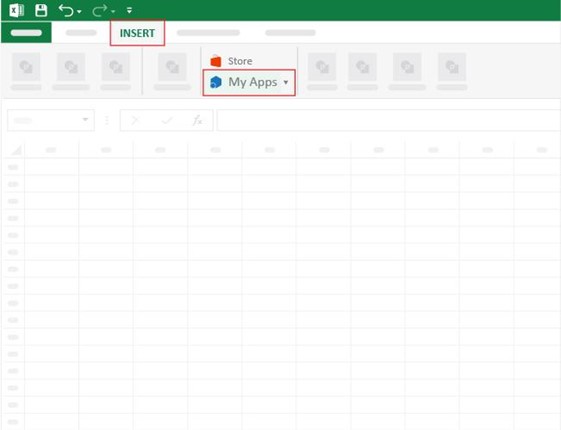
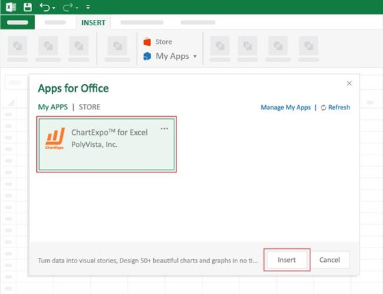
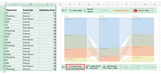
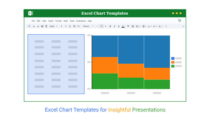
ChartExpo charts are available both in Google Sheets and Microsoft Excel. Please use the following CTAs to install the tool of your choice and create beautiful visualizations with a few clicks in your favorite tool.
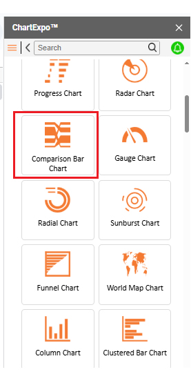
Example

Let’s analyze this sample data in Excel using ChartExpo.

Department Survey Type Satisfaction Score
IT Internal 81
Marketing External 75
Sales Peer Review 74
HR Internal 78
IT External 50
HR Peer Review 85
Marketing Internal 80
Sales External 68
HR Internal 79
IT Peer Review 83
Sales Internal 76
Marketing Peer Review 77
IT Internal 70
HR External 84
Sales Peer Review 69
Marketing External 82
IT Internal 70
HR External 84
Sales Peer Review 69
Marketing External 82
  • To get started with ChartExpo, install ChartExpo in Excel.
  • Now, click on My Apps from the INSERT menu.
Excel Chart Templates
  • Choose ChartExpo from My Apps, then click Insert.
Excel Chart Templates
  • Once it loads, scroll through the list of charts to locate and choose the “Comparison Bar Chart.”
Excel Chart Templates
  • Click the “Create Chart From Selection” button after selecting the data from the sheet, as shown.
Excel Chart Templates
  • ChartExpo will generate the visualization below for you.
  • If you want to add anything to the chart, click the Edit Chart button:
Excel Chart Templates
  • Click the pencil icon next to the Chart Header to change the title.
  • It will open the properties dialog. Under the Text section, you can add a heading in Line 1 and enable Show.
  • Give the appropriate title of your chart and click the Apply button.
Excel Chart Templates
  • You can show the percentage sign from Column Header Properties as follows:
Excel Chart Templates
  • Change bar color and width as follows:
Excel Chart Templates
  • You can change the Font size for better readability as follows:
Excel Chart Templates
  • After making all changes, click on the “Save Changes” button:
Excel Chart Templates
  • Your final chart will look like the one below.
Excel Chart Templates

Insights

IT Department:

  • The primary feedback source is internal surveys.
  • Accounts for 62% of total feedback.

Marketing Department:

  • Relies heavily on external feedback.
  • Makes up 60% of total responses.

Sales Department:

  • The primary source is a peer review.
  • Represents 60% of the feedback.

HR Department:

  • Feedback breakdown: External (41%), Internal (38%), Peer review (21%).
  • Received the highest number of responses (410), indicating strong participation.

Benefits of Chart Templates in Excel

Have you ever spent more time formatting your chart than analyzing your data? We’ve all been there. You fix the labels, adjust the colors, and align the legend. Then you do it all over again next week.

Don’t worry: chart templates are a lifesaver for your workflow. Here’s why they’re worth using:

  • Speed things up: Build it once, use it forever. No more redoing the same formatting every single time.
  • Keep it consistent: Whether you’re reporting weekly KPI graphs or monthly burndown charts, templates make sure everything looks polished and uniform.
  • Reduce errors: Manually tweaking settings leaves room for mistakes. Templates keep your visuals clean and accurate.
  • Stay on brand: Match your colors, fonts, and layout consistently. This is ideal for teams sharing reports or presenting to clients.
  • Upgrade visuals easily: Swap in advanced charts, such as dual-axis charts or strip charts, with saved formatting. This makes your data pop with zero stress.

Best Practices for Creating Graph Templates in Excel

Have you ever opened an old Excel file and wondered, “Who designed this chaos?” Creating clean, reusable graph templates helps avoid that moment for you and your team. Think of it as future-proofing your data work. It’s not hard, but a few smart moves go a long way.

Here are the best practices to keep your templates sharp and shareable:

  • Start with clean data: Messy data = messy chart. Make sure your rows and columns are properly labeled and structured.
  • Pick the right chart type: Don’t force a Line Chart when a Butterfly Chart or Circular Chart tells the story better. Choose visuals that match your message.
  • Use neutral colors first: Begin with simplicity. Bright, branded themes can be added later, but neutral styles work for everyone.
  • Label everything clearly: Avoid confusion. Make sure axes, titles, and legends are crystal clear, especially in templates that others will use.
  • Test it with different data sets: A good template should still look good with different inputs. Try plugging in sales, surveys, or even trend chart examples.

FAQs

Does Microsoft have a graph template?

Yes, Microsoft Excel includes basic graph templates. Above this, you can save custom charts as templates. These appear under the “Templates” tab in the chart options. It’s a quick way to reuse your favorite chart style.

Can you create a graph template in Excel?

Yes, you can easily create one. Build your chart, format it, then right-click and select “Save as Template.” Excel saves it as a .crtx file, and you can apply it to future charts anytime.

Wrap Up

Excel chart templates save time and ensure consistency. Build a template once and reuse it, so you never start from scratch again. Templates give your work a professional look. And it doesn’t matter whether you’re showing sales trends or goal chart templates. A preset format reduces the risk of error.

There are many types of charts and graphs in Excel, from simple to advanced. Match the chart to your data, then save it as a template. Your future self will thank you.

Worried about clarity? Templates help avoid misleading charts. When everyone uses the same format, the message stays clear. No stretched axes. No strange color shifts. What people see is what you meant to show.

If Excel’s built-in visuals feel limited, try a chart maker like ChartExpo. Chart makers offer a wider variety of chart types and interactive elements that make your data clearer. You can create beautiful, interactive, and insightful visuals while still utilizing templates to save time.

Excel chart templates transform raw data into clearer, more concise stories. Utilize them to enhance accuracy, expedite decision-making, and streamline your workflow. Templates are a simple upgrade with a significant impact for both solo and team projects.

And don’t hesitate. Install ChartExpo for more advanced chart options and easier customization.

How much did you enjoy this article?

ExcelAd2
Start Free Trial!
157516

Related articles

next previous
Microsoft Excel13 min read

Excel Automation: Turning Data into Insights Faster

Excel automations help you save time, reduce errors, and streamline your tasks. Learn simple methods to automate reports and work smarter in Excel.

Microsoft Excel13 min read

Excel Template for Job Tracking: A Complete Guide

An Excel template for job tracking helps organize tasks and progress. This guide shows how to use it and boost results with smart tips and tools.

Microsoft Excel12 min read

Audit Dashboard in Excel: A Complete Walkthrough

An audit dashboard in Excel tracks audits and risks using clear visuals. Learn how to build, use, and improve dashboards with charts and practical tips.

Microsoft Excel11 min read

How to Create a Matrix in Excel: Core Insights

Learn how to create a matrix in Excel to organize and analyze data. This guide shares simple steps, smart tips, and how to use visual tools like ChartExpo.

Microsoft Excel13 min read

How to Make a Template in Excel: A Simple Guide

Discover how to make a template in Excel for faster, cleaner work. Here, you’ll learn steps, examples, and how ChartExpo enhances your data and more.

ChartExpo logo

Turn Data into Visual
Stories

CHARTEXPO

  • Home
  • Gallery
  • Videos
  • Services
  • Pricing
  • Contact us
  • FAQs
  • Privacy policy
  • Terms of Service
  • Sitemap

TOOLS

  • ChartExpo for Google Sheets
  • ChartExpo for Microsoft Excel
  • Power BI Custom Visuals by ChartExpo
  • Word Cloud

CATEGORIES

  • Bar Charts
  • Circle Graphs
  • Column Charts
  • Combo Charts
  • Comparison Charts
  • Line Graphs
  • PPC Charts
  • Sentiment Analysis Charts
  • Survey Charts

TOP CHARTS

  • Sankey Diagram
  • Likert Scale Chart
  • Comparison Bar Chart
  • Pareto Chart
  • Funnel Chart
  • Gauge Chart
  • Radar Chart
  • Radial Bar Chart
  • Sunburst Chart
  • see more
  • Scatter Plot Chart
  • CSAT Survey Bar Chart
  • CSAT Survey Chart
  • Dot Plot Chart
  • Double Bar Graph
  • Matrix Chart
  • Multi Axis Line Chart
  • Overlapping Bar Chart
  • Control Chart
  • Slope Chart
  • Clustered Bar Chart
  • Clustered Column Chart
  • Box and Whisker Plot
  • Tornado Chart
  • Waterfall Chart
  • Word Cloud
  • see less

RESOURCES

  • Blog
  • Resources
  • YouTube
SIGN UP FOR UPDATES

We wouldn't dream of spamming you or selling your info.

© 2025 ChartExpo, all rights reserved.