Categories
By ChartExpo Content Team
Dual-axis charts offer a unique way to compare two different data sets on a single graph. Instead of struggling to visualize separate pieces of information, you get to see both together, making complex data easier to digest. If you’ve ever needed to see how sales numbers compare to marketing spend or how customer satisfaction stacks up against support calls, dual-axis charts are your solution.
What makes dual-axis charts stand out is their ability to show trends and relationships that might be missed when using a single-axis chart. By placing two different variables on their own axes, you can compare them side by side without confusion. This approach helps you see patterns and correlations more clearly, which can lead to faster, smarter decisions.
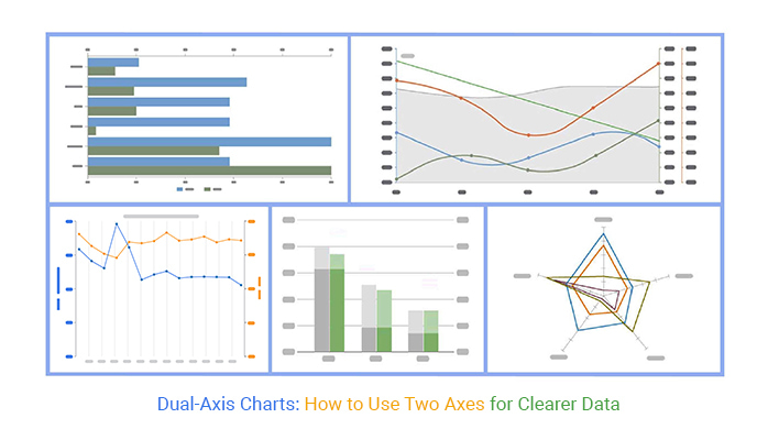


Using dual-axis charts doesn’t just make your data look better – it makes it more useful. Whether you’re tracking performance metrics, financial data, or customer behavior, these charts provide the clarity you need to act on insights quickly. So, if you’re looking to bring more precision and speed to your analysis, dual-axis charts are the tool you need.
First…
Dual-axis charts are vital in modern data analysis because they allow us to view and compare two different data types simultaneously.
Imagine trying to understand a financial report without being able to see both revenue and expenses side by side – that’s where dual-axis charts step in. They make it simple to grasp complex information by combining different scales in a single visual framework.
Dual-axis charts provide a clear solution to the problem of overlapping data. When you’re dealing with variables that have different units or scales, plotting them on a single axis can be confusing.
By using a dual-axis chart, each variable gets its own axis, making the chart cleaner and easier to understand. This setup is perfect for comparing trends over the same period, as it highlights relationships and discrepancies clearly.
Some folks argue that dual-axis charts are tricky to interpret, but this isn’t always the case. The key lies in their design.
Proper labeling and color coding can guide the viewer effortlessly through the data. It’s all about how you present it: ensure that each axis is distinct and that the information overload is avoided. With these in place, dual-axis charts can transform into a powerful tool for storytelling in data.
Dual-axis charts do more than just display data – they allow for deeper analysis and insights.
For instance, a marketer might use a dual-axis chart to compare the impact of two different campaigns by showing customer engagement on one axis and sales figures on the other. This clear visual comparison, a hallmark of visual analytics, helps leaders make informed decisions, seeing exactly which strategies perform best and why.
Dual-axis charts are a fantastic tool in data visualization, allowing you to compare two different variables on a single graph.
Imagine trying to understand both temperature and rainfall over a year on one chart – dual-axis charts make this possible. The left vertical axis might represent temperature, while the right handles rainfall, each using their own scale but shared horizontally by time across the bottom.
Opt for dual-axis charts when you need to display two related yet distinct data sets on the same plot.
These charts shine in scenarios where comparing the trends rather than the actual values is more insightful.
For instance, if you’re looking to see how sales volume correlates with advertising spend over time, a dual-axis chart efficiently illustrates these two layers of information in a digestible format.
The beauty of dual-axis charts lies in their ability to tell a more complete story. They are perfect for datasets that complement each other yet operate on different scales.
For example, a business might track the impact of customer satisfaction (measured in percentage) and the number of support calls (counted in calls). By plotting these on a dual-axis chart, the relationship between satisfaction and call volume becomes clear, providing valuable insights at a glance.
When creating dual-axis charts, it’s vital to match data types carefully to maintain clarity and avoid misinterpretation. Ensure that the data types are compatible; typically, one continuous and one categorical, or both continuous.
Also, synchronize the scale sensibly to prevent one data set from overshadowing the other, thus keeping the visual balance and data integrity of the chart. This thoughtful approach prevents confusion and supports accurate data presentation.
When you tackle dual-axis chart design, scaling and alignment are your top priorities. Missteps here can skew your data presentation, leading to misinterpretation. Here’s why getting these elements right from the start is essential.
Proper scaling on dual-axis charts is vital. Why? Because it ensures that each data set is represented accurately relative to the other.
If one axis is scaled too high or too low compared to the other, it might exaggerate or minimize important trends. Always check that your scales reflect true values, so your audience gets the real story.
Misaligned axes throw a wrench in your data’s story. Imagine presenting revenue and profit on the same chart but with misaligned scales. Suddenly, a small dip in profit might look catastrophic! To prevent this, align your axes so that related values line up, making your chart a reliable resource.
This step is about keeping your data honest and your interpretations on point.
When your dual-axis scales are aligned correctly, not only does your chart tell the true story, but it also becomes visually striking. Proper alignment draws your viewer’s eye across the chart, making comparisons easy and insights clear. Spend time fine-tuning this alignment.
Your goal? A chart that’s as easy on the eyes as it is on the brain.
When you’re staring at a dual-axis chart that looks more like a toddler’s scribble than a business tool, it’s clear we need to tackle the issue of overlapping data. Overlapping occurs when data from both axes are too dense or similarly scaled, causing a visual mess.
First off, transparency is your new best friend. Adjusting the opacity of one data set allows the other to shine through, making both sets visible without any mix-ups. Imagine looking through a lightly frosted glass pane; you see what’s behind it but also appreciate the texture of the glass itself.
Data separation involves spacing the axes or data points. This method spreads out data points on the chart, making each one distinct and reducing visual clutter. It’s like organizing a busy desk: everything’s still there, but now there’s a place for each item, and you can actually see the surface.
Mixing it up with lines and bars can be a game-changer. Assign bars to one axis and lines to the other. This contrast in styles prevents data from blending together. Think of it as attending a costume party; bars are the pirates, and lines are the astronauts – distinct, recognizable, and definitely not overlapping!
Never underestimate the power of color coding. Assign specific, contrasting colors to different data sets. This strategy works like a charm in distinguishing data at a glance. It’s akin to wearing a red hat in a sea of blue hats at a sports game – immediately noticeable and clearly separate.
Each of these strategies not only tackles the issue of overlapping data but also transforms your dual-axis charts into clear, effective communication tools. By implementing these techniques, you ensure that your data speaks clearly and effectively, allowing you to make data-driven decisions based on precise, unambiguous information.
Ever felt overwhelmed by data visualization tools? Say goodbye to frustration because ChartExpo has got your back! This tool simplifies the process of creating dual-axis charts. You don’t need to be a tech whiz – ChartExpo handles the heavy lifting. Load your data, pick your chart type, and voila, you’re set.
This ease of use ensures that your energy stays on analysis, not on figuring out software.
Your brand is unique, and your charts should be too.
ChartExpo understands this. It offers extensive customization options, from color schemes that match your company’s branding to font choices that keep your visuals consistent. Adjusting axis labels and tooltips for clarity or tweaking the layout to fit different platforms is straightforward.
With ChartExpo, your charts look like they were made just for you, reinforcing your brand’s identity in every visual.
The following video will help you create a Multi Axis Line Chart in Microsoft Excel.


The following video will help you to create a Multi Axis Line Chart in Google Sheets.
Dual-axis charts are a fantastic tool for those who need to display two different types of data on the same graph. Imagine trying to show both the temperature and the amount of ice cream sold at your shop on the same graph.
One axis could represent the temperature, and the other could show sales numbers. This way, it’s easy to see how changes in the weather affect ice cream sales.
Multi-layered data doesn’t have to overwhelm your audience.
Let’s say you’re presenting data on a new fitness app. You want to show both the number of daily users and the average workout time. A dual-axis chart allows you to layer this information effectively. Your viewers can grasp the trends without getting lost in a sea of numbers.
The key to dual-axis charts is balance. You wouldn’t wear polka dots and stripes at the same time, right?
Similarly, when using two axes, make sure that your data types complement rather than compete with each other. Pick colors that stand out against each other. If one data set is much larger in scale, adjust the axes so both sets of data are easy to read.
Annotations and data labels are like the tour guides of your chart. They point out the important bits so no one misses them.
Suppose you’re showing a spike in app downloads after a major update. Use an annotation to highlight this increase and add a label explaining what caused it. This directs your audience’s attention right where you want it, making your data story clear and engaging.
Dual-axis charts can be tricky. If not done right, they can give a skewed view of the data. Here’s how to stay on track:
Manipulating the axis can mislead viewers. Here’s what to look for:
It’s a general rule to start axes from zero, but not always:
Honesty is key in data presentation. Here’s how to keep your dual-axis charts truthful:
Dual-axis charts are fantastic tools for comparing different data sets effectively. They let you plot two separate scales on a single graph. Imagine you’re trying to compare sales data with customer satisfaction ratings over the same period.
A dual-axis chart allows you to see both trends without jumbling up the data.
Start by selecting your variables wisely. For instance, if you’re looking at sales and temperature data, align sales on the left axis and temperature on the right.
This setup helps viewers spot trends and correlations quickly. Use distinct colors for each data type to avoid confusion. Let’s say blue for sales and red for temperature, making it clear and visually striking.
The key is to keep your charts clean. Only show essential elements. Too many lines or bars can confuse. Use clear legends and avoid overly detailed grid lines. If comparing more than two data sets, consider using a clustered or stacked layout to maintain clarity.
Highlight significant data points or trends with markers or annotations to draw attention where it’s needed most.
Less is often more. If your chart is getting crowded, step back. Focus on the most telling data sets.
Too many variables can obscure the story you’re trying to tell. If you find yourself explaining the graph more than discussing the data, you might need to simplify your approach. Stick to two variables if possible. This strategy keeps your chart clean and your message clear.
Engaging your audience with dual-axis charts means more than just throwing data on the screen. It’s about making that data sing!
Think of a dual-axis chart as a tool that lets you tell a compelling story with your numbers. To really grab your audience, customize your charts to highlight key insights without overwhelming viewers with too much information at once.
Ever tried explaining something technical to a friend and watched their eyes glaze over?
That’s a no-go when it comes to dual-axis charts. You’ve got to adjust the complexity of your charts based on who’s looking at them.
For beginners, keep it simple: basic terms, fewer data points.
For the pros, you can get a bit more technical.
The goal? Everyone walks away with insight, not confusion.
Colors and fonts aren’t just about making things pretty; they guide your viewer’s eyes through the data.
Choose colors that stand out against each other for clarity and highlight important data points. And fonts? Keep them clean and easy to read. No one should have to squint! It’s like dressing up your data for a night out – it should look sharp and smart.
A beautiful chart that no one understands is like a joke that no one gets – it misses the mark. Yes, make your dual-axis charts look good, but keep them clear and functional.
Every element on your chart should have a purpose and contribute to the overall understanding of the data. It’s a balancing act between beauty and brains, and getting it right means your chart not only catches the eye but also clearly communicates the message.
Time series data tracks changes over time. It’s crucial in spotting trends in various sectors. Dual-axis charts help display this data clearly. They plot two different data types on two scales, one on the left and one on the right. This setup allows for easy comparison and better trend visualization.
To identify patterns using dual axes, focus on the scale. Ensure one axis doesn’t overshadow the other. Start by selecting indicators that relate closely but vary in magnitude.
For instance, plot revenue on one axis and customer count on the other. Watch how the lines intersect or diverge. This method highlights correlations or discrepancies.
Visualizing a time series chart in Excel with dual scales can be tricky. Scale mismatches make it hard to interpret data correctly.
To overcome this, always calibrate your axes. Make sure the scales align logically with the data types. Adjusting the start and end points of your scales can prevent one data type from dwarfing the other, ensuring a clear view of both data trends.
Moving averages smooth out data series to identify trends. In dual-axis charts, they help compare short-term changes with long-term patterns. Use moving averages when you have a lot of data points. This approach reduces noise and clarifies trends.
Summaries, like totals or averages, provide a snapshot. They’re useful on a secondary axis when you need to highlight overall performance against more granular trends on the primary axis.
When you’re presenting data, you want to make sure it pops! That’s where interactive dual-axis charts come into play.
Imagine a presentation where your data not only informs but also engages. By using two different scales within a single chart, dual-axis charts allow you to compare two types of data side by side, such as revenue and profit margin, or visitors and conversions.
This setup helps highlight correlations and discrepancies vividly, making your data speak louder and clearer.
Ever hovered over a chart and wished for a bit more info? Adding hover effects, tooltips, and zoom to your dual-axis charts can turn a static display into an interactive experience.
Hover effects can guide your audience through the data points, tooltips provide detailed data insights when users hover over or click on a particular element, and zoom features allow users to dive deeper into specific areas of the chart.
These interactive elements not only make your charts more informative but also more engaging, keeping your audience focused and curious.
Let’s empower the audience! By integrating filtering options into your dual-axis charts, you allow viewers to customize what data they see.
This feature is like giving a remote control to your audience, enabling them to hide or highlight specific data series based on their interests or needs. Just like a Control chart in Excel helps monitor process stability, these filters allow users to focus on the specific data points that matter most.
Whether it’s filtering by date range, geographic area, or any other category, these controls can make large datasets less overwhelming and more accessible, fostering a more interactive and tailored viewing experience.
Implementing real-time updates in your dual-axis charts ensures that the displayed information is always relevant and up-to-date.
This is particularly crucial during live presentations or when monitoring critical metrics that change frequently, like stock prices or website traffic. Real-time updates keep your audience informed with the latest data, providing them with a snapshot of events as they unfold, which can be incredibly engaging and sometimes even a bit suspenseful.
When we talk about data integrity in dual-axis charts, we’re really focusing on how accurate and complete our data appears. Think of it as making sure every piece you need is there, so when you look at the chart, what you see truly represents what’s happening.
But hey, sometimes data goes missing – maybe it’s a glitch or an oversight. No biggie, right? Well, let’s dig into how you handle those annoying gaps without messing up the whole chart.
First off, don’t panic when you spot some data missing from your dual-axis charts. It’s like when you’re cooking and realize you’re out of an ingredient. You can substitute!
In charts, this means using different strategies like deleting records with missing values, or even better, using average values from similar data points. Think of it as making your data not just presentable but also meaningful, ensuring everything lines up nicely on both axes.
Handling data gaps can be tricky, but it’s not impossible. It’s like playing connect the dots. If a dot is missing, you don’t just stop; you find a way to keep the picture clear. You might decide to leave the gap as is, which could be fine sometimes.
Or here’s a nifty trick: use linear trends from existing data points to estimate what should go in the gap. Keeps everything looking smooth and accurate!
Imputation and interpolation sound fancy, but think of them as your data’s backup singers – they fill in when the lead singer misses a cue.
Imputation is like guessing the lyrics based on what’s been sung before, using methods like mean, median, or mode substitution.
Interpolation, on the other hand, is more about drawing a straight line through your known data points and filling in the blanks directly in line.
Both ways help ensure your chart hits all the right notes, even if some of the original data isn’t there to sing.
Got a dual-axis chart that feels like it’s slogging through mud every time you load it up with data?
Let’s kick those performance issues to the curb! Start with the basics: streamline your data sources. Ensure that your chart only pulls the absolutely necessary data it needs to display. No more, no less. Next up, cache the results. If your data doesn’t update every nanosecond, caching can be a lifesaver, reducing load times significantly.
Consider the scale of your axes too. Sometimes, auto-scaling can cause performance dips, so setting static scale limits might just do the trick. And don’t forget about rendering only what’s visible. If users don’t need to see every data point at once, why make them wait for it all to load?
Dealing with chunky data sets can slow your dual-axis charts to a crawl, but fear not!
First, think about reducing the resolution of your data. Do you really need to plot every single data point? Often, sampling the data smartly can preserve trends without sacrificing performance.
Indexing your data can also work wonders. With proper indexes, your chart tools can quickly access the required data without sifting through unnecessary info. And let’s not overlook the power of asynchronous loading; fetch data in the background before it’s needed, so users aren’t twiddling their thumbs waiting.
When your dual-axis charts are dragging, aggregating your data might just give you that speed boost you need. By summarizing data into larger groups, you reduce the load and speed up rendering times. Implement rolling averages or median aggregations to smooth out spikes and simplify the data.
Batch processing can also be a game-changer. Process large sets of data in chunks to avoid overwhelming your system. And if you’re feeling fancy, why not try data cubing? This technique allows you to pre-calculate and store complex aggregations, making retrieval a breeze during rendering.
When you’re ready to export dual-axis charts, it’s vital to keep quality top of mind.
Start by ensuring that your chart design software supports high-resolution exports. Opt for settings that do not compress your data too much. This maintains the clarity of your visuals.
Picking the right format for your dual-axis charts depends on how you plan to use them.
PDFs are perfect for printouts and professional reports due to their scalable nature.
SVG files work wonders for web applications since they remain crisp and clear at any zoom level.
PNGs are ideal for digital presentations and documents, supporting transparency without losing quality.
Lastly, JPGs serve well for quick previews or emails where smaller file size is more important than perfect clarity.
Let’s dive right in! Have you ever wondered how big companies analyze complex data sets without breaking a sweat? They often use dual-axis charts. These charts and graphs let them view two different variables on a single graph.
Imagine watching two TV shows on one screen – efficient, right?
In the tech world, growth is everything. Companies track user numbers and cash flow side by side to see if new users bring in revenue or just add to the crowd, often analyzed alongside an exponential growth chart for clearer scaling insights. A dual-axis chart makes this clear as day.
On one side, you have user growth; on the other, revenue trends. It’s like watching a race where both runners are on the same team!
Marketing teams in SaaS companies love dual-axis charts. Why? Because they can measure lead generation against actual sales. It’s a game of expectation vs. reality!
By plotting both metrics together, they can spot which marketing efforts turned browsers into buyers and adjust their strategies on the fly.
In finance, time is money, and accuracy is the key to earning that money.
Investors compare multiple stocks to see which ones are the high flyers and which ones are just taking up space. Dual-axis charts show price changes and trading volumes over time, giving a clear picture of market trends. It’s like having a financial crystal ball!
Misaligned axes in dual-axis charts can confuse. To adjust, first ensure that both axes represent comparable scales.
For instance, if one axis shows revenue in thousands and the other shows units sold, adjust the units so proportions match. This avoids misleading visuals where one data set appears more significant due to scale differences.
Use software tools to sync axes automatically, or manually set maximum and minimum values to ensure both axes align correctly.
Dual-axis charts can get cluttered. To simplify, start by reducing the number of data points. Focus on key information.
For example, instead of showing daily data, use weekly averages. Choose clear, distinct colors for each data set to help viewers differentiate at a glance.
Also, consider using legends and labels to guide the reader through the data without confusion. Simplification means viewers can grasp your main points without getting lost in too much data.
Dual-axis charts allow you to plot two different sets of data on the same graph, each with its own vertical axis. This makes it easier to compare variables that have different units or scales. By using two axes, you can spot relationships between these data sets without having to rely on separate charts. It’s a simple yet effective way to combine multiple metrics into one visual, making analysis faster and clearer.
You should use dual-axis charts when you need to compare two related yet distinct data sets on the same timeline or category. For example, if you want to track both revenue and expenses over a quarter, dual-axis charts let you view both trends simultaneously. This method is helpful when the data has different units, such as percentages and numbers, because it allows each set to be accurately represented without distorting the scale.
Dual-axis charts simplify data analysis by allowing you to see how two different variables relate to each other. Instead of flipping between multiple charts, you can visualize everything in one place. This makes it easier to identify trends, correlations, and outliers in the data. With a dual-axis chart, decision-makers can compare key metrics quickly, making it a valuable tool for reporting and presentations.
One common mistake with dual-axis charts is using mismatched scales, which can lead to confusion or misinterpretation of the data. It’s important to ensure that both axes are scaled properly to provide a balanced comparison. Another issue is overcrowding the chart with too much data, which can make it hard to read. Always keep your data sets focused and ensure clear labeling to avoid these problems.
Yes, dual-axis charts are highly customizable. You can adjust colors, scales, and data labels to match your specific needs. Many tools allow you to modify the design so that each axis stands out clearly. Customization ensures that your chart not only looks professional but also highlights the key insights you want to convey. Whether you’re designing a report or giving a presentation, this flexibility allows you to tailor the chart for your audience.
Dual-axis charts are useful for comparing different data types because they let you plot two variables that may have different units or scales on the same graph. This is especially helpful in scenarios where one data set represents a count and the other a percentage. By giving each data set its own axis, dual-axis charts make it easy to compare these variables side by side without distorting the information.
To avoid confusion when using dual-axis charts, make sure both axes are clearly labeled and use distinct colors for each data set. Proper scaling is also critical – if one axis is much larger than the other, it can skew the visual impact of the data. Additionally, use legends or annotations to guide viewers through the chart, helping them quickly understand the comparison being made. Keeping the design simple and focused on key data points also helps maintain clarity.
Dual-axis charts offer a clear, powerful way to compare different data sets on one visual. By placing two variables on the same chart with separate axes, you can see relationships that might be missed otherwise. They’re especially useful when comparing trends or analyzing data with different units, giving you the flexibility to make faster, more informed decisions.
Whether you’re analyzing sales versus expenses, marketing spend versus conversions, or any other combination, dual-axis charts make complex data easier to grasp. The key is in the simplicity – two axes, one chart, and a world of insights. Just remember to scale your axes properly, label everything clearly, and focus on what’s truly important in the data.
In the end, dual-axis charts are about clarity. They take the guesswork out of data analysis and let your insights speak for themselves. The more you use them, the more they’ll help you make decisions that matter.
How much did you enjoy this article?


Calculate accounts receivable turnover ratio to measure credit collection speed, improve cash flow, and strengthen your financial strategy. Read on!

Change Management KPIs are the key to tracking adoption, performance, and ROI during transitions. Find out which metrics matter. Read on!

Data collection methods and techniques determine the quality of every insight you act on. Explore key approaches for gathering reliable data. Read on!


