• Home
  • Tools dropdown img
    • Spreadsheet Charts

      • ChartExpo for Google Sheets
      • ChartExpo for Microsoft Excel
    • Power BI Charts

      • Power BI Custom Visuals by ChartExpo
    • Word Cloud

  • Charts dropdown img
    • Chart Category

      • Bar Charts
      • Circle Graphs
      • Column Charts
      • Combo Charts
      • Comparison Charts
      • Line Graphs
      • PPC Charts
      • Sentiment Analysis Charts
      • Survey Charts
    • Chart Type

      • Box and Whisker Plot
      • Clustered Bar Chart
      • Clustered Column Chart
      • Comparison Bar Chart
      • Control Chart
      • CSAT Survey Bar Chart
      • CSAT Survey Chart
      • Dot Plot Chart
      • Double Bar Graph
      • Funnel Chart
      • Gauge Chart
      • Likert Scale Chart
      • Matrix Chart
      • Multi Axis Line Chart
      • Overlapping Bar Chart
      • Pareto Chart
      • Radar Chart
      • Radial Bar Chart
      • Sankey Diagram
      • Scatter Plot Chart
      • Slope Chart
      • Sunburst Chart
      • Tornado Chart
      • Waterfall Chart
      • Word Cloud
    • Google Sheets
      Microsoft Excel
  • Services
  • Pricing
  • Contact us
  • Blog
  • Support dropdown img
      • Gallery
      • Videos
      • Contact us
      • FAQs
      • Resources
    • Please feel free to contact us

      atsupport@chartexpo.com

Categories
All Data Visualizations Data Analytics Surveys
Add-ons/
  • Google Sheets
  • Microsoft Excel
  • Power BI
All Data Visualizations Data Analytics Surveys
Add-ons
  • Google Sheets
  • Microsoft Excel
  • Power BI

We use cookies

This website uses cookies to provide better user experience and user's session management.
By continuing visiting this website you consent the use of these cookies.

Ok

ChartExpo Survey


Home > Blog > Data Analytics

Lead Generation KPIs: A Guide for Better Results

What are lead generation KPIs, and why should they matter to your team? Every lead costs money, and every conversion impacts revenue. Without clear lead generation KPIs, teams waste time chasing numbers that don’t move the business forward.

Lead Generation KPIs

Think about it. If you’re tracking clicks but not conversions, are you measuring growth? If your funnel is whole but sales are flat, what’s the real issue? Lead generation KPIs bring focus. They show where prospects drop off, where quality weakens, and where opportunity lies. They separate interest from intent.

Smart companies understand this. Companies that excel at lead nurturing generate 50% more sales-ready leads at 33% less cost. But how do they get there? They use actionable Metrics and KPIs, not hunches.

Still, not all of these metrics are worth your time. The trick is to know which performance metrics tell the real story. Traffic is great, but leads are better. Impressions are nice, but engagement is what pays the bills. So, data without context is noise. Smart tracking connects marketing to revenue, helps sales and marketing align, and turns guesswork into strategy.

Are you leading a marketing team or managing campaigns solo? Understanding the right lead generation KPIs could differentiate growth and stagnation.

Let me help you understand these metrics.

First…

Table of Contents:

  1. What are Lead Generation Key Performance Indicators?
  2. Why Do You Need to Measure Lead Generation Metrics?
  3. Explaining the Top 10 Lead Generation KPIs
  4. How to Choose the Right Lead Generation Metrics?
  5. How to Analyze Lead Generation KPIs in Excel?
  6. Limitations of Lead Gen Metrics
  7. FAQs
  8. Wrap Up

What are Lead Generation Key Performance Indicators?

Definition: Lead generation KPIs are quantifiable metrics that demonstrate how a company connects with potential customers. Teams use these metrics to monitor progression down the sales funnel, making it easy to follow trends and changes in strategies quickly. These numbers help businesses optimize campaigns in real-time.

Having clear goals and SMART KPIs helps keep objectives in check. It doesn’t matter whether you’re interested in cost per lead, conversion rate, or another conversion or revenue-impacting metric. KPI graphs lead to smarter marketing decisions and generally better business metrics.

Why Do You Need to Measure Lead Generation Metrics?

If you’re not measuring, you’re guessing. And in lead generation, guessing burns time and budget fast. Tracking the right metrics and KPIs turns activity into insight. It shows what to keep, what to change, and what to cut.

Here’s why these numbers matter.

  • Evaluate campaign performance: Monitoring performance makes it easy to see which campaigns pay off. These insights show what is working and what might need to be adjusted.
  • Improve lead quality: Not all leads are created equal—some waste your time. When you measure your results, you can concentrate on potential clients with a higher chance of converting.
  • Optimize marketing spend: Spending starts with measurement. Tracking costs and returns lets you maximize your budget.
  • Enhance sales forecasting: Lucid data helps you forecast revenue, and using operational KPIs can help temper sales expectations.
  • Support strategic decisions: Decisions are only as good as the data behind them. Practice will help you make decisions more quickly and with confidence.

Explaining the Top 10 Lead Generation KPIs

How are your lead generation efforts working? Don’t guess—measure. Tracking the correct numbers makes all the difference. While vanity metrics can distract, these top 10 lead generation KPIs offer clear direction. They show what’s working, what’s wasting budget, and where the real value lies:

  1. Number of Leads Generated: This KPI tracks how many new leads enter your funnel in a given period. It shows the reach and volume of your lead generation efforts.
  2. Lead Conversion Rate: This measures the percentage of leads that become paying customers. It’s a vital performance metric that highlights the effectiveness of your sales and marketing strategy.
  3. Cost per Lead (CPL): CPL is calculated by dividing total campaign costs by the number of leads generated. It’s a key financial metric for understanding how efficiently your budget is used.
  4. Marketing Qualified Leads (MQLs): MQLs are leads that meet specific marketing criteria based on interest or behavior. Tracking MQLs helps prioritize prospects who are most likely to convert.
  5. Sales Qualified Leads (SQLs): SQLs are vetted leads ready for direct sales contact. Monitoring them supports sales forecasting and answers the question, “What are sales KPIs?”
  6. Lead Source Performance: This KPI tracks which marketing channels produce the most leads. It helps teams allocate resources to high-performing platforms.
  7. Time to Conversion: Time to conversion measures how long a lead takes to become a customer. Shorter timelines often indicate effective messaging and nurturing.
  8. Lead Engagement Rate: This shows how actively leads interact with your brand through its content or demos. Higher engagement usually signals better lead quality.
  9. Bounce Rate: Bounce rate shows how many visitors leave your page without taking action. It’s a critical business metric for improving landing page performance.
  10. Return on Investment (ROI): ROI compares the revenue earned to the money spent on campaigns. It’s one of the most essential lead generation KPIs to measure true success.

How to Choose the Right Lead Generation Metrics?

Choosing the right metrics isn’t about tracking everything—it’s about tracking what matters. You don’t need more data. You need smarter data—the kind that ties directly to revenue, action, and impact. Picking the wrong numbers will waste time and blur strategy.

Follow these steps to pick the right metrics:

  1. Define your objectives: Start with clear goals. Metrics mean nothing if they don’t connect to your purpose.
  2. Understand your sales funnel: Each stage tells a different story. Choose metrics that reflect where your leads are and what they need next.
  3. Measure lead quality, not just quantity: A hundred weak leads won’t help. Strong metrics focus on real potential, not inflated numbers.
  4. Track channel performance: Some channels bring traffic, and others get results. Choose metrics that show which efforts are driving high-value leads.
  5. Be consistent and review regularly: Data only works if you use it. Review your key performance indicators for operations often to stay sharp and make timely changes.

How to Analyze Lead Generation KPIs in Excel?

Is your lead-gen strategy solid? Prove it with data. Lead generation key performance indicators (KPIs) are your cheat sheet for what’s working and what’s not. But staring at rows of numbers in Excel isn’t exactly inspiring. Sure, Excel gets the job done for basics. But when it comes to data visualization, it hits a wall fast. Complex charts? Interactive dashboards? Not happening.

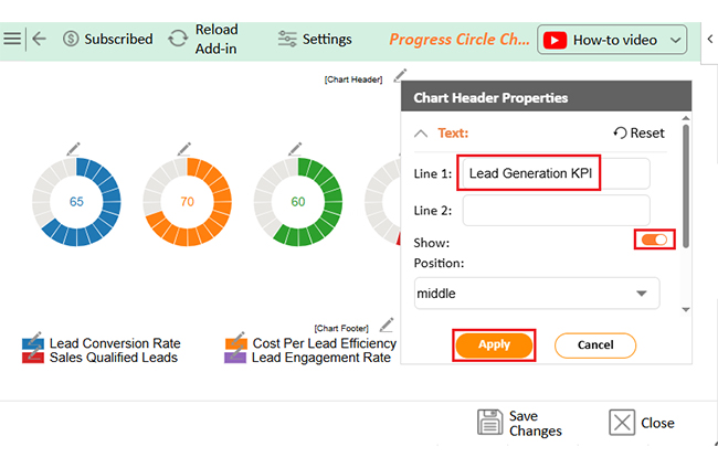
That’s where ChartExpo steps in. It quickly turns dry data into stunning, insightful visuals. With better visuals, your key performance indicators for operations tell a clearer, more convincing story.

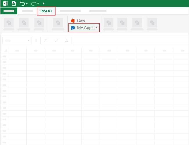
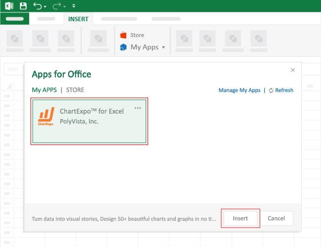
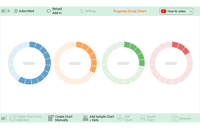
How to Install ChartExpo in Excel?

  1. Open your Excel application.
  2. Open the worksheet and click the “Insert” menu.
  3. You’ll see the “My Apps” option.
  4. In the Office Add-ins window, click “Store” and search for ChartExpo on my Apps Store.
  5. Click the “Add” button to install ChartExpo in your Excel.

ChartExpo charts are available both in Google Sheets and Microsoft Excel. Please use the following CTAs to install the tool of your choice and create beautiful visualizations with a few clicks in your favorite tool.

Example

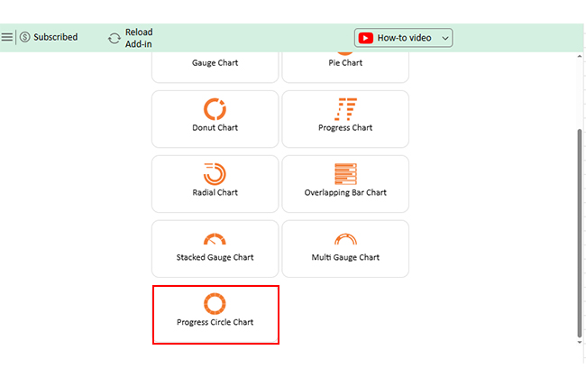
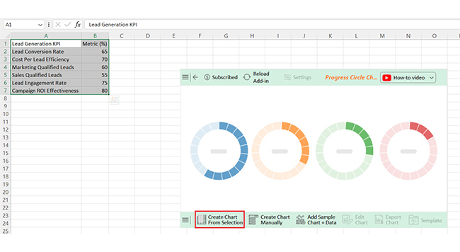
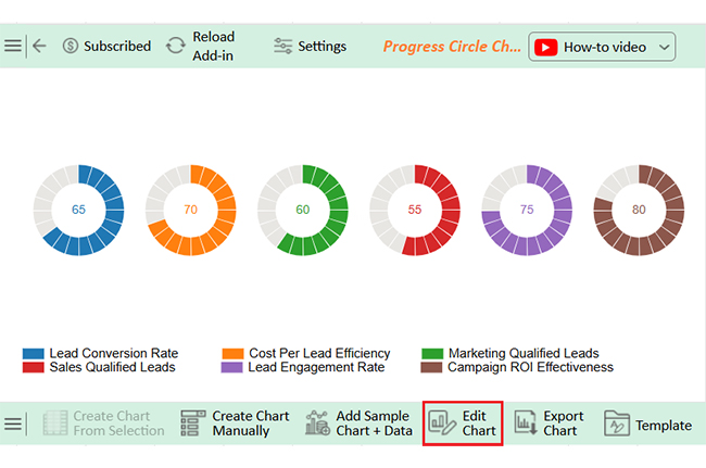
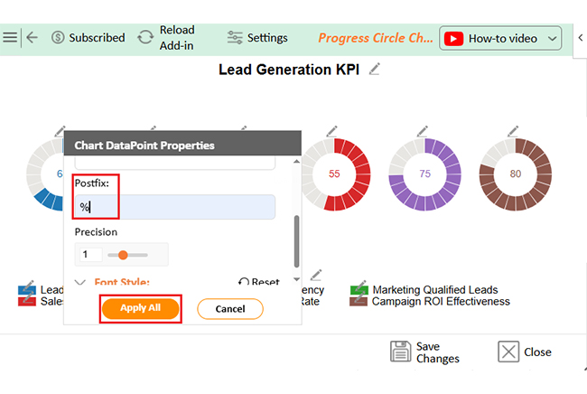
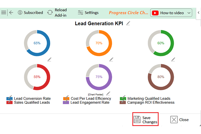
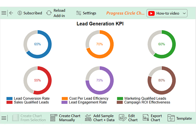
Let’s visualize and analyze this sample data in Excel using ChartExpo.

Lead Generation KPI Metric (%)
Lead Conversion Rate 65
Cost Per Lead Efficiency 70
Marketing Qualified Leads 60
Sales Qualified Leads 55
Lead Engagement Rate 75
Campaign ROI Effectiveness 80
  • To get started with ChartExpo, install ChartExpo in Excel.
  • Now, click on My Apps from the INSERT menu.
Lead Generation KPIs
  • Choose ChartExpo from My Apps, then click Insert.
Lead Generation KPIs
  • Once it loads, scroll through the charts list to locate and choose the “Progress Circle Chart”.
Lead Generation KPIs
  • The Progress Circle Chart will appear as below.
Lead Generation KPIs
  • Click the “Create Chart From Selection” button after selecting the data from the sheet, as shown.
Lead Generation KPIs
  • ChartExpo will generate the visualization below for you.
Lead Generation KPIs
  • If you want to add anything to the chart, click the Edit Chart button:
  • Click the pencil icon next to the Chart Header to change the title.
  • It will open the properties dialog. Under the Text section, you can add a heading in Line 1 and enable Show.
  • Give the appropriate title of your chart and click the Apply button.
Lead Generation KPIs
  • You can add the (%) with all values:
Lead Generation KPIs
  • You can change the data type by clicking on the settings button as follows:
Lead Generation KPIs
  • Click the “Save Changes” button to persist the changes made to the chart.
Lead Generation KPIs
  • Your final Progress Circle Chart will look like the one below.
Lead Generation KPIs

Insights

  • Campaign ROI: 80% – Strong return, showing practical lead generation efforts.
  • Engagement rate: 75% – High interaction level, indicating successful outreach.
  • Sales qualified leads: 55% – A lower rate signals a need to improve lead nurturing and qualification processes.

Limitations of Lead Gen Metrics

Lead generation metrics are robust, but they’re not perfect. Numbers can tell you a lot, but they don’t tell the whole story. When misused, they create a false sense of success. Here are some key limitations every team should consider:

  • Too much focus on quantity over quality: More leads don’t always mean better results. If the leads aren’t converting, the metric loses its meaning.
  • Lack of context: A spike in a number can seem dramatic, but what caused it? Key performance indicators without context can be misleading.
  • Attribution challenges: Was it that email, that ad, or that webinar that led to the lead? It’s challenging to pinpoint where it’s coming from and can muddy decision-making.
  • Delayed impact: Impact is not always immediate. Leads campaigns can take several days to appear in your metrics, and the early data can be deceivingly generated.
  • Over-reliance on tools: Tools are helpful, but they aren’t flawless. Metrics pulled from different platforms may vary; without human insight, you risk acting on incomplete data.

FAQs

How do you measure lead generation?

  • Track the number of new leads.
  • Measure conversion rates.
  • Monitor the cost per lead.
  • Use key performance indicators for operations.
  • Analyze channel performance.
  • Check engagement levels.
  • Review lead source data.
  • Use visual dashboards.

What parameters do you check to generate qualified leads?

Check lead source, engagement level, and buyer intent. Review demographics and behavior, and use scoring models to rank leads. Monitor interactions like email opens, clicks, and demo requests, and prioritize those matching your ideal customer profile.

Wrap Up

Lead generation key performance indicators help you track success. They show what’s working and what’s wasting time. Without them, it’s all guesswork.

Every lead counts. But not every lead is equal. These KPIs help you focus on quality, not just numbers. In the retail industry, speed and engagement matter. Retail industry KPIs can reveal which promotions and channels attract high-value customers. These insights drive better sales and service.

Support teams also rely on metrics. KPIs for call center teams track how well leads are handled once they reach your reps. Faster response times often mean better conversion rates. You also need structure. SMART KPIs examples keep your goals clear, measurable, and realistic. They help your team stay aligned and on target.

Conclusively, good data leads to wise decisions. The right KPIs guide strategy, boost ROI, and improve results. Track them consistently, and your lead generation will become more predictable and profitable.

And don’t forget to install ChartExpo. Why? Chart Expo will help you visualize and analyze these KPIs effectively.

How much did you enjoy this article?

GSAd1
Start Free Trial!
155873

Related articles

next previous
Data Analytics9 min read

Sales Pipeline Template: Visualizing Sales Flow

Sales pipeline templates organize your sales process and boost deal tracking. Click here to learn how to build and improve them in Google Sheets.

Data Analytics8 min read

Accounts Dashboard: Insights Made Easy

Discover all there is to know about the account dashboard. This guide also shows you some accounting dashboard examples, and how to create one.

Data Analytics8 min read

Inventory Dashboard for Fast and Accurate Insights

This guide shows you what an inventory dashboard is, and how to build one in Power BI. You'll also discover the benefits of using an inventory dashboard.

Data Analytics9 min read

Website Performance Metrics: From Data to Smart Visual

Website performance metrics track speed, engagement, and user actions. Click to learn top metrics, tools, and tips to boost site performance and conversions.

Data Analytics7 min read

Leveraging Big Data Analytics to Reduce Healthcare Costs

This guide dives deep into how to leverage big data analytics to reduce healthcare costs. It shows you why you should use big data in the healthcare industry.

ChartExpo logo

Turn Data into Visual
Stories

CHARTEXPO

  • Home
  • Gallery
  • Videos
  • Services
  • Pricing
  • Contact us
  • FAQs
  • Privacy policy
  • Terms of Service
  • Sitemap

TOOLS

  • ChartExpo for Google Sheets
  • ChartExpo for Microsoft Excel
  • Power BI Custom Visuals by ChartExpo
  • Word Cloud

CATEGORIES

  • Bar Charts
  • Circle Graphs
  • Column Charts
  • Combo Charts
  • Comparison Charts
  • Line Graphs
  • PPC Charts
  • Sentiment Analysis Charts
  • Survey Charts

TOP CHARTS

  • Sankey Diagram
  • Likert Scale Chart
  • Comparison Bar Chart
  • Pareto Chart
  • Funnel Chart
  • Gauge Chart
  • Radar Chart
  • Radial Bar Chart
  • Sunburst Chart
  • see more
  • Scatter Plot Chart
  • CSAT Survey Bar Chart
  • CSAT Survey Chart
  • Dot Plot Chart
  • Double Bar Graph
  • Matrix Chart
  • Multi Axis Line Chart
  • Overlapping Bar Chart
  • Control Chart
  • Slope Chart
  • Clustered Bar Chart
  • Clustered Column Chart
  • Box and Whisker Plot
  • Tornado Chart
  • Waterfall Chart
  • Word Cloud
  • see less

RESOURCES

  • Blog
  • Resources
  • YouTube
SIGN UP FOR UPDATES

We wouldn't dream of spamming you or selling your info.

© 2025 ChartExpo, all rights reserved.