• Home
  • Tools dropdown img
    • Spreadsheet Charts

      • ChartExpo for Google Sheets
      • ChartExpo for Microsoft Excel
    • Power BI Charts

      • Power BI Custom Visuals by ChartExpo
    • Word Cloud

  • Charts dropdown img
    • Chart Category

      • Bar Charts
      • Circle Graphs
      • Column Charts
      • Combo Charts
      • Comparison Charts
      • Line Graphs
      • PPC Charts
      • Sentiment Analysis Charts
      • Survey Charts
    • Chart Type

      • Box and Whisker Plot
      • Clustered Bar Chart
      • Clustered Column Chart
      • Comparison Bar Chart
      • Control Chart
      • CSAT Survey Bar Chart
      • CSAT Survey Chart
      • Dot Plot Chart
      • Double Bar Graph
      • Funnel Chart
      • Gauge Chart
      • Likert Scale Chart
      • Matrix Chart
      • Multi Axis Line Chart
      • Overlapping Bar Chart
      • Pareto Chart
      • Radar Chart
      • Radial Bar Chart
      • Sankey Diagram
      • Scatter Plot Chart
      • Slope Chart
      • Sunburst Chart
      • Tornado Chart
      • Waterfall Chart
      • Word Cloud
    • Google Sheets
      Microsoft Excel
  • Services
  • Pricing
  • Contact us
  • Blog
  • Support dropdown img
      • Gallery
      • Videos
      • Contact us
      • FAQs
      • Resources
    • Please feel free to contact us

      atsupport@chartexpo.com

Categories
All Data Visualizations Data Analytics Surveys
Add-ons/
  • Google Sheets
  • Microsoft Excel
  • Power BI
All Data Visualizations Data Analytics Surveys
Add-ons
  • Google Sheets
  • Microsoft Excel
  • Power BI

We use cookies

This website uses cookies to provide better user experience and user's session management.
By continuing visiting this website you consent the use of these cookies.

Ok

ChartExpo Survey


Home > Blog > Data Analytics

SMART KPIs Examples: How to Measure Success?

Do you feel lost in the labyrinth of metrics and information overload? SMART KPIs examples are a beacon in this era focused on data analysis.

Imagine this scenario: You are working as a marketer. You have initiated a new campaign and are fully immersed in data, trying to understand it. Enter SMART KPIs. They go beyond being just measurements; they serve as the guide that directs you toward success.

SMART KPIs Examples

Let’s talk numbers: 60% of companies struggle to align KPIs with their strategic goals. It’s a common challenge, but SMART KPIs examples offer a solution. They are not any Key Performance Indicators; they are the ones that matter most – those that drive real results.

What makes a KPI “smart”? It’s all about significance and influence. Examples of effective KPIs are precise, quantifiable, attainable, relevant, and time-sensitive. They inform us about the current situation, guide us toward the future, and provide directions.

In this article, we will examine practical examples of SMART KPIs that have led to the growth of various companies. We will explore the key performance indicators that impact, from customer acquisition cost to customer lifetime value.

Ready to harness the power of SMART KPIs examples?

Table of Contents:

  1. Understanding Smart KPIs
  2. Top 10 SMART KPIs Examples
  3. Why are SMART KPIs Important?
  4. What is the Key Difference between SMART Goals and KPIs?
  5. How to Create Smart KPIs for Business?
  6. How to Examine SMART KPIs?
  7. Wrap Up

First…

Understanding Smart KPIs

SMART KPIs are specific, measurable, achievable, relevant, and time-bound key performance indicators. They provide clear goals, ensuring each target is precisely defined. This specificity reduces ambiguity and aligns team efforts.

Measurable KPIs allow for tracking progress. They utilize quantifiable metrics, making it easy to monitor and assess performance. Achievable KPIs set realistic goals, ensuring they are attainable with available resources and capabilities.

Relevant KPIs align with business objectives. They ensure that every effort contributes to the overarching long-term financial goals. Time-bound KPIs have deadlines, creating a sense of urgency and promoting timely achievement.

In summary, SMART KPIs enhance focus, clarity, and efficiency. They help organizations set clear targets, measure progress accurately, and achieve meaningful results within a defined timeframe.

Top 10 SMART KPIs Examples

Setting the right KPIs can make or break your business strategy. SMART KPIs help you zero in on what truly matters, giving you clear targets and measurable outcomes. Here are the top 10 SMART KPIs that can elevate your business performance:

  1. Sales Growth Rate: Measures the percentage increase in sales over a period. This helps track how well your sales strategies are working.
  2. Customer Acquisition Cost (CAC): Calculates the cost of customer acquisition. This helps in budgeting and improving marketing strategies.
  3. Customer Holding Rate: Tracks the percentage of customers who stay with you over time. High retention indicates customer satisfaction and loyalty.
  4. Website Conversion Rate: Measures the percentage of website visitors who complete a desired action, such as making a purchase. This KPI helps optimize your online presence.
  5. Employee Turnover Rate: Monitors the rate at which employees leave your company. High turnover can indicate dissatisfaction and lead to higher recruitment costs.
  6. Inventory Turnover Ratio: Calculates how often inventory is sold and replaced over a period. This KPI helps manage stock levels and reduce holding costs.
  7. Customer Satisfaction Score (CSAT): Uses surveys to measure customer satisfaction. High scores reflect positive customer experiences and loyalty.
  8. Average Order Value (AOV): Tracks the average amount spent each time a customer places an order. Increasing AOV boosts revenue without needing more customers.
  9. Lead-to-Customer Conversion Rate: Measures the percentage of leads that become paying customers. This KPI helps refine your sales funnel and marketing strategies.
  10. Operational Efficiency Ratio: Evaluate your operations’ efficiency by comparing output to input. This KPI helps identify areas for improvement and cost reduction.

Why are SMART KPIs Important?

Setting goals is essential for any business, but knowing how to measure and achieve them is where the magic happens. That’s where SMART KPIs come into play. These metrics and KPIs are the guiding stars that keep your business on the right path.

Here are reasons why SMART KPIs are so important:

  • Focus: Smart KPIs help you concentrate on what truly matters. They filter out the noise and direct your attention to key areas that drive success. This focus ensures your team’s efforts are aligned with strategic goals.
  • Measurement: Having specific, measurable KPIs means you can track progress effectively. It turns abstract goals into concrete numbers, making it easier to see where you stand and what needs improvement. For a more structured visual representation, you can use tools like a Pyramid chart to outline different levels of performance and goals clearly.
  • Accountability: Responsibility occurs naturally when goals are clearly defined and quantifiable. Team members know their responsibilities and can be held accountable for their work. This responsibility promotes a culture where individuals take ownership and are responsible.
  • Alignment: Smart Key Performance Indicators guarantee that all areas of your business are aligned with the same goals. Aligning individual, team, and departmental objectives with the larger business strategy fosters a unified approach to achieving success.
  • Continuous improvement: Continuous improvement involves consistently assessing key performance indicators to promote ongoing evaluation and enhancement of processes. By addressing information overload and focusing on continuous improvement, your business ensures it remains agile and can adapt to changing conditions.
  • Communication: KPIs provide a common language for discussing performance. They make it easier to communicate goals, progress, and outcomes across all levels of the organization. Clear communication fosters collaboration and collective effort.

What is the Key Difference between SMART Goals and KPIs?

Among the most commonly discussed terms in business are SMART goals and KPIs. While they might seem similar at first glance, they serve different purposes and play unique roles in driving success. Let’s break it down to understand the key difference between these two important concepts.

Aspect SMART Goals KPIs
Definition Specific, Measurable, Achievable, Relevant, Time-bound objectives that outline what you want to achieve. Quantifiable metrics that track performance and progress towards specific goals.
Purpose To provide clear and actionable objectives. To measure and evaluate the effectiveness of actions and strategies.
Focus End goals and desired outcomes. Performance indicators and progress tracking.
Scope Typically broader and strategic. Often more specific and operational.
Timeframe Usually set for a longer term, such as annually or quarterly. Can be tracked frequently, such as weekly or monthly.
Usage Helps in setting the direction and defining success. Helps in monitoring and managing performance towards goals.

How to Create Smart KPIs for Business?

Creating effective KPIs is essential for steering your business towards success. But how do you ensure these KPIs truly serve their purpose? Applying the KPI SMART criteria helps you set clear, actionable, and measurable targets that align with your strategic goals. Here’s a step-by-step guide to help you craft KPIs that drive real results:

  1. Generate KPIs that fit the SMART criteria: Start by ensuring your KPIs are Specific, Measurable, Achievable, Relevant, and Time-bound. This clarity helps set precise and realistic targets.
  2. Identify the performance drivers of these KPIs: Determine the key factors that influence your KPIs. Understanding these drivers lets you focus on areas directly impacting your business performance.
  3. Create targets for every driver: Set specific targets for each performance driver. These targets should be realistic yet challenging, pushing your team to achieve excellence.
  4. Identify activities that lead to attaining targets: Pinpoint the actions and processes contributing to reaching your targets. This helps streamline efforts and resources towards impactful activities.
  5. Design activities to achieve targets: Develop detailed plans for each activity. Ensure these plans are aligned with your overall strategy and are feasible within your resources and capabilities.
  6. Monitor and review results: Regularly track your progress against the set KPIs. Use data and analytics to evaluate performance, identify areas for improvement, and celebrate successes.
  7. Devise a process that leads to improved performance: Continuously refine your processes based on insights gained from monitoring. This iterative approach ensures sustained growth and adaptation to changing business environments.

How to Examine SMART KPIs?

Are you drowning in a sea of data with Excel as your only lifeboat? We’ve all been there. Numbers, charts, and formulas – the struggle is real.

But fear not, for in this data complex lies a treasure map: data visualization. It’s the compass that guides you through the maze of numbers and unlocks the untold stories hidden within.

While Excel has its perks, it fumbles when turning raw data into captivating visual narratives. Enter ChartExpo – your ticket to effortlessly transform data chaos into compelling visual stories.

The era of dull spreadsheets is over; it’s time to let your data dance with ChartExpo!

Let’s learn how to install ChartExpo in Excel.

  1. Open your Excel application.
  2. Open the worksheet and click the “Insert” menu.
  3. You’ll see the “My Apps” option.
  4. In the Office Add-ins window, click “Store” and search for ChartExpo on my Apps Store.
  5. Click the “Add” button to install ChartExpo in your Excel.

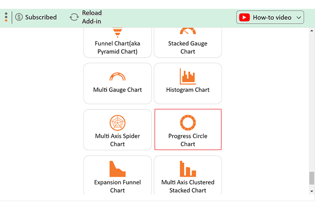
ChartExpo charts are available both in Google Sheets and Microsoft Excel. Please use the following CTAs to install the tool of your choice and create beautiful visualizations with a few clicks in your favorite tool.

Example

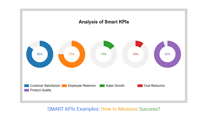
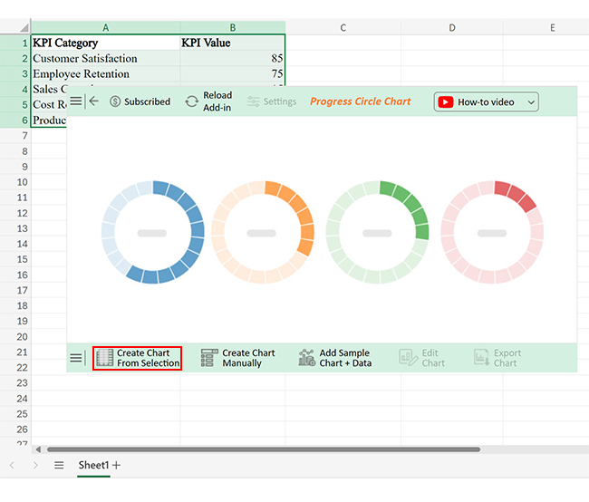
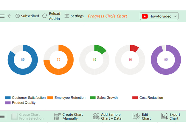
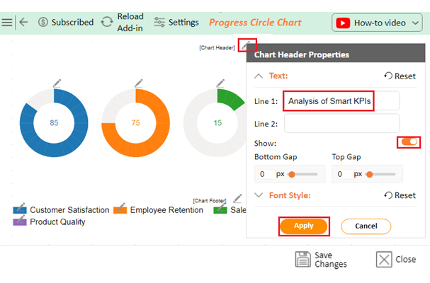
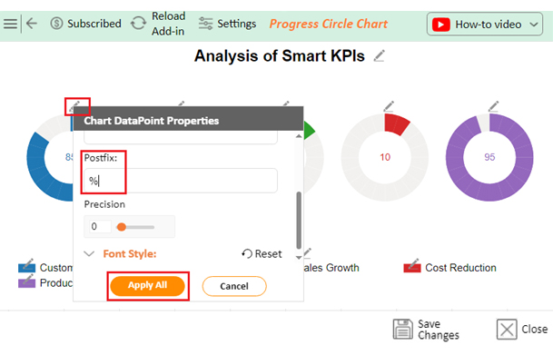
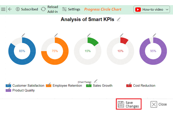
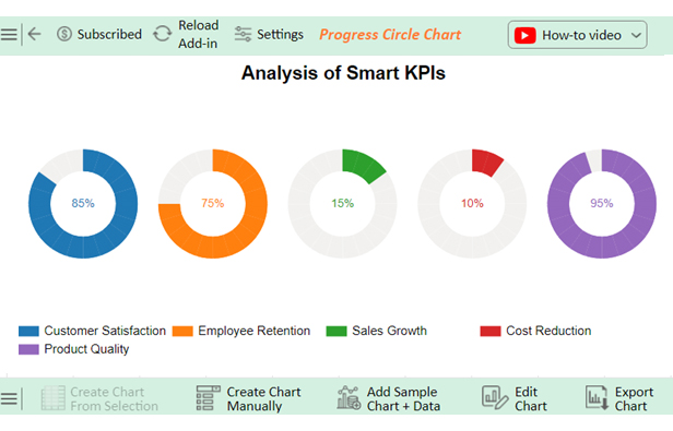
Let’s analyze the SMART KPIs example data below using ChartExpo.

KPI Category KPI Value
Customer Satisfaction 85
Employee Retention 75
Sales Growth 15
Cost Reduction 10
Product Quality 95
  • To get started with ChartExpo, install ChartExpo in Excel.
  • Now Click on My Apps from the INSERT menu.
insert chartexpo in excel
  • Choose ChartExpo from My Apps, then click Insert.
open chartexpo in excel
  • Once it loads, scroll through the charts list to locate and choose the “Progress Circle Chart”.
search Progress Circle Chart in Excel
  • Click the “Create Chart From Selection” button after selecting the data from the sheet, as shown.
Click Create Chart From Selection for SMART KPIs Examples
  • ChartExpo will generate the visualization below for you.
Click Edit Chart for SMART KPIs Examples
  • If you want to add anything to the chart, click the Edit Chart button:
  • Click the pencil icon next to the Chart Header to change the title.
  • It will open the properties dialog. Under the Text section, you can add a heading in Line 1 and enable Show.
  • Give the appropriate title of your chart and click the Apply button.
Add Chart Header for SMART KPIs Examples
  • Add the percentage sign with all values:
Add Postfix for SMART KPIs Examples
  • Click the “Save Changes” button to persist the changes made to the chart.
Click Save Changes for SMART KPIs Examples
  • Your final Progress Circle Chart will look like the one below.
Final SMART KPIs Examples

Insights

  • The data indicates strong performance in customer satisfaction and product quality, with high levels of satisfaction shown. Nonetheless, the employee retention rate has decreased, indicating possible difficulties in retaining staff.
  • Sales are increasing steadily, but the impact of cost-cutting measures has been minimal. This underscores the importance of enhancing efficiency tactics.

FAQs

What does SMART KPI stand for?

SMART KPI stands for Specific, Measurable, Achievable, Relevant, and Time-bound Key Performance Indicators. These criteria ensure KPIs are clear, quantifiable, attainable, aligned with goals, and time-framed for effective performance tracking and management.

How do you write good KPIs?

To write good KPIs:

  1. Ensure they are Specific, Measurable, Achievable, Relevant, and Time-bound.
  2. Align them with strategic goals.
  3. Use clear, concise language.
  4. Involve stakeholders in the process.
  5. Regularly review and adjust KPIs to maintain their effectiveness.

What is the SMART KPI format?

The SMART KPI format includes:

  • Specific: Clear and detailed
  • Measurable: Quantifiable metrics
  • Achievable: Realistic goals
  • Relevant: Aligned with objectives
  • Time-bound: Defined timeframe

This format ensures clarity and effectiveness in tracking performance.

Wrap Up

SMART KPIs are essential tools for any business. They provide clear and measurable targets. This helps track progress and achieve goals efficiently.

SMART KPIs ensure every effort is aligned with strategic objectives. They filter out distractions and focus on what truly matters. This alignment boosts overall productivity and effectiveness.

The right KPIs turn abstract goals into concrete actions. They remove ambiguity by being specific, measurable, achievable, relevant, and time-bound. This clarity fosters accountability and drives performance.

Regularly reviewing SMART KPIs keeps the business agile. It helps identify areas for improvement and make necessary adjustments. This continuous monitoring ensures sustained growth and adaptability.

Implementing SMART KPIs also enhances communication within the organization. It creates a common language for discussing performance and progress. This fosters collaboration and collective effort towards shared goals.

Ultimately, SMART KPIs are more than just KPIs. They are strategic tools that guide decision-making and drive success. Focusing on key performance areas, they help businesses achieve their full potential.

Do not hesitate.

Get started with SMART KPIs with ChartExpo today to take your business to the next level.

How much did you enjoy this article?

ExcelAd1
Start Free Trial!
136702

Related articles

next previous
Data Analytics31 min read

Data Analysis Without Nonsense: Fix the Right Problem, Fast

Data analysis can mislead when metrics look right but outcomes fail. Learn how to spot red flags, fix failures, and make better decisions. Read on!

Data Analytics29 min read

Variance Analysis Isn’t a Math Problem, It’s a Trust Problem

Variance analysis helps identify what went wrong, who owns it, and what to do next. Use it to drive decisions, not just reports. Learn more!

Data Analytics10 min read

Supplier Comparison Template: Download It Now

A supplier comparison template streamlines vendor evaluation by comparing cost and quality. Click here to learn its benefits and how to analyze them.

Data Analytics32 min read

Ecommerce Analytics: How to Fix What It Often Gets Wrong

Ecommerce analytics often lead to mixed signals and costly misreads. Fix attribution gaps, align teams, and act on the right data. Get started now!

Data Analytics30 min read

When Sales Funnel Breaks: Failures, Fixes, & Funnel Debt

Is your sales funnel hiding costly gaps? Learn how pipeline stalls, false metrics, and handoff chaos could be draining revenue. Get started now!

ChartExpo logo

Turn Data into Visual
Stories

CHARTEXPO

  • Home
  • Gallery
  • Videos
  • Services
  • Pricing
  • Contact us
  • FAQs
  • Privacy policy
  • Terms of Service
  • Sitemap

TOOLS

  • ChartExpo for Google Sheets
  • ChartExpo for Microsoft Excel
  • Power BI Custom Visuals by ChartExpo
  • Word Cloud

CATEGORIES

  • Bar Charts
  • Circle Graphs
  • Column Charts
  • Combo Charts
  • Comparison Charts
  • Line Graphs
  • PPC Charts
  • Sentiment Analysis Charts
  • Survey Charts

TOP CHARTS

  • Sankey Diagram
  • Likert Scale Chart
  • Comparison Bar Chart
  • Pareto Chart
  • Funnel Chart
  • Gauge Chart
  • Radar Chart
  • Radial Bar Chart
  • Sunburst Chart
  • see more
  • Scatter Plot Chart
  • CSAT Survey Bar Chart
  • CSAT Survey Chart
  • Dot Plot Chart
  • Double Bar Graph
  • Matrix Chart
  • Multi Axis Line Chart
  • Overlapping Bar Chart
  • Control Chart
  • Slope Chart
  • Clustered Bar Chart
  • Clustered Column Chart
  • Box and Whisker Plot
  • Tornado Chart
  • Waterfall Chart
  • Word Cloud
  • see less

RESOURCES

  • Blog
  • Resources
  • YouTube
SIGN UP FOR UPDATES

We wouldn't dream of spamming you or selling your info.

© 2025 ChartExpo, all rights reserved.