• Home
  • Tools dropdown img
    • Spreadsheet Charts

      • ChartExpo for Google Sheets
      • ChartExpo for Microsoft Excel
    • Power BI Charts

      • Power BI Custom Visuals by ChartExpo
    • Word Cloud

  • Charts dropdown img
    • Chart Category

      • Bar Charts
      • Circle Graphs
      • Column Charts
      • Combo Charts
      • Comparison Charts
      • Line Graphs
      • PPC Charts
      • Sentiment Analysis Charts
      • Survey Charts
    • Chart Type

      • Box and Whisker Plot
      • Clustered Bar Chart
      • Clustered Column Chart
      • Comparison Bar Chart
      • Control Chart
      • CSAT Survey Bar Chart
      • CSAT Survey Chart
      • Dot Plot Chart
      • Double Bar Graph
      • Funnel Chart
      • Gauge Chart
      • Likert Scale Chart
      • Matrix Chart
      • Multi Axis Line Chart
      • Overlapping Bar Chart
      • Pareto Chart
      • Radar Chart
      • Radial Bar Chart
      • Sankey Diagram
      • Scatter Plot Chart
      • Slope Chart
      • Sunburst Chart
      • Tornado Chart
      • Waterfall Chart
      • Word Cloud
    • Google Sheets
      Microsoft Excel
  • Services
  • Pricing
  • Contact us
  • Blog
  • Support dropdown img
      • Gallery
      • Videos
      • Contact us
      • FAQs
      • Resources
    • Please feel free to contact us

      atsupport@chartexpo.com

Categories
All Data Visualizations Data Analytics Surveys
Add-ons/
  • Google Sheets
  • Microsoft Excel
  • Power BI
All Data Visualizations Data Analytics Surveys
Add-ons
  • Google Sheets
  • Microsoft Excel
  • Power BI

We use cookies

This website uses cookies to provide better user experience and user's session management.
By continuing visiting this website you consent the use of these cookies.

Ok

ChartExpo Survey


Home > Blog > Data Analytics

Leading vs Lagging Indicators: A Walkthrough with Visual

Leading vs. lagging indicators—which one truly helps you stay ahead?

Leading vs Lagging Indicators

Every business tracks performance, but most only look in the rearview mirror. That’s the danger of relying solely on lagging data. You see the damage after it’s done. By then, it’s too late to steer.

Leading indicators point forward. They warn, guide, and forecast. Think of customer inquiries before a sales dip. Or an increase in failed login attempts before a cyberattack. These are signals. And businesses that watch for them move faster, adjust quicker, and lose less.

Why does this matter? Because performance isn’t random. It’s driven by early signals that reveal what’s coming. That’s why the conversation about leading indicators vs. lagging indicators isn’t academic—it’s practical. Every missed shipment, every bad hire, and every data breach was once a brewing issue. Leading indicators could’ve flagged them early.

Industries are catching on. Manufacturing leaders monitor machine vibrations to reduce downtime, and HR teams analyze application drop-off rates to improve hiring. These are leading vs. lagging indicators in action – real data shaping better outcomes.

This shift goes beyond trend-spotting. It’s about smarter decisions, fewer surprises, and more control. For instance, when refining cybersecurity key performance indicators, the proper signals change the game before it starts.

So, what should you track? How early is early enough? And how do you separate noise from value? That’s what this blog post looks into.

Table of Contents:

  1. What are Leading Indicators?
  2. What are Lagging Indicators?
  3. Difference Between a Lagging Indicator and a Leading Indicator
  4. How Lagging and Leading Indicators Work Together?
  5. How to Analyze Leading and Lagging Indicators in Excel?
  6. Benefits of Lagging and Leading Metrics
  7. Use Cases for Lagging and Leading Indicators
  8. FAQs
  9. Wrap Up

What are Leading Indicators?

Definition: Leading indicators are early signals. These metrics help predict future outcomes, and businesses use them to act before problems grow.

Unlike lagging indicators, they measure progress in real time. For example, website traffic can signal upcoming sales. Or absenteeism may point to declining morale.

Leading indicators are essential in KPI graphs and critical for building strong key performance indicators for operations. They help teams shift from reaction to preparation by showing what’s likely to happen, not what already has.

What are Lagging Indicators?

Definition: Lagging indicators show past performance. They confirm what has already happened. Think of last quarter’s revenue or final production output. These metrics help evaluate outcomes, but don’t help prevent issues. Sadly, businesses often rely too heavily on them.

Let me show you some real examples. In KPIs for accounting, profit margins and expenses are standard lagging metrics. Retail industry KPIs also include sales per square foot or monthly returns. These indicators are clear but late. Why? They tell the story only after the ending is written.

Top Charts of Lagging Indicator vs. Leading Indicator:

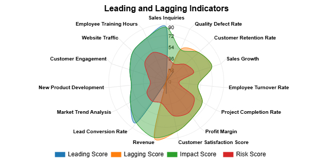
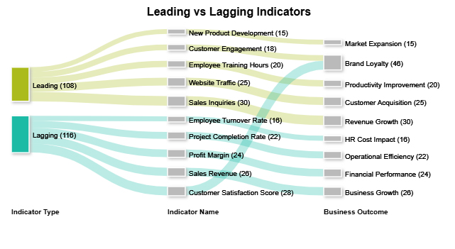
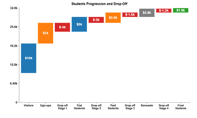
Here are the top 5 charts created in Excel using ChartExpo.
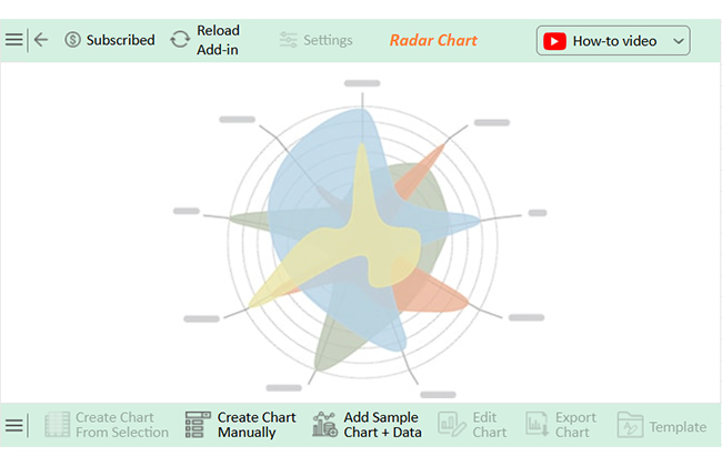
Radar Chart:

Leading vs Lagging Indicators

Sankey Chart:

Leading vs Lagging Indicators

Waterfall Chart:

Leading vs Lagging Indicators

Double Axis Line and Bar Chart:

Leading vs Lagging Indicators

Multi Axis Line Chart:

Leading vs Lagging Indicators

Difference Between a Lagging Indicator and a Leading Indicator

What’s the real difference between looking ahead and looking back? In business, it could mean the gap between solving a problem and explaining why it happened.

That’s the heart of the leading vs. lagging indicators debate. You need both, but for different reasons.

Let’s break it down:

Category Leading Indicators Lagging Indicators
Definition Predict future performance Reflect on past performance
Time Orientation Forward-looking Backward-looking
Usage Helps forecast and take action early Measures results after the action is taken
Examples ●       Job applications received (for Recruitment Key Performance Indicators)

●       Machine maintenance schedules (for Key Performance Indicators for the Manufacturing Industry)

●       Hires made

●       Units produced

●       Revenue closed

Limitations It can be hard to measure and validate; it is not always accurate It is too late to change outcomes; it only tells what happened

How Lagging and Leading Indicators Work Together?

Using leading vs. lagging Indicators together isn’t a strategy. It’s a necessity. One tells you where you’re heading, while the other tells you where you’ve been.

Relying on only one is like steering a car with either the windshield or the rearview mirror—not both.

Here’s why you need both to drive safely:

  • Complementary roles: Leading indicators offer early warnings, while lagging indicators confirm results. Together, they help businesses see the causes and effects of performance trends.
  • Improved planning and decision-making: Leading indicators support real-time adjustments before issues grow. Leading indicators verify whether those adjustments achieved the desired outcomes.
  • Balanced performance monitoring: Using both ensures you’re not stuck reacting to the past and guessing the future. This balance creates a complete view of progress and performance.

How to Analyze Leading and Lagging Indicators in Excel?

Have you ever felt like Excel was stuck in 1997 when analyzing data? You’re not wrong. It’s great for crunching numbers, but trips over its cells when it comes to data visualization. Charts are clunky. Insight gets buried in rows. And that’s a problem, especially when working with leading indicators.

These signals need to be seen clearly and acted on quickly. That’s where ChartExpo steps in. It turns raw metrics and KPIs into visuals that speak. There’s no coding or confusion. Just clean, sharp insights at a glance.

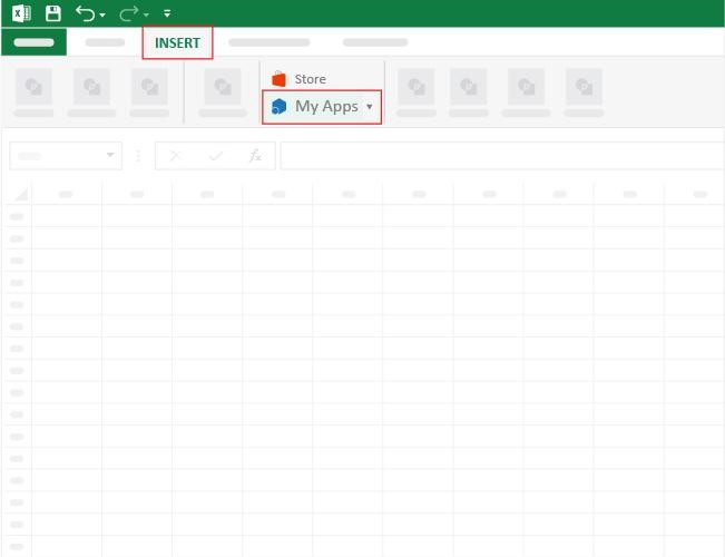
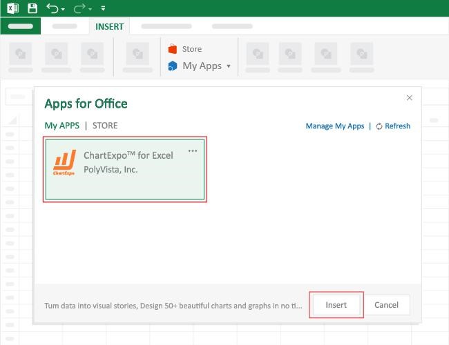
How to Install ChartExpo in Excel?

  1. Open your Excel application.
  2. Open the worksheet and click the “Insert” menu.
  3. You’ll see the “My Apps” option.
  4. In the Office Add-ins window, click “Store” and search for ChartExpo on my Apps Store.
  5. Click the “Add” button to install ChartExpo in your Excel.

ChartExpo charts are available both in Google Sheets and Microsoft Excel. Please use the following CTAs to install the tool of your choice and create beautiful visualizations with a few clicks in your favorite tool.

Example

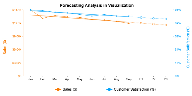
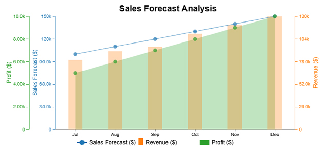
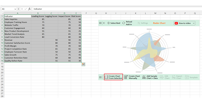
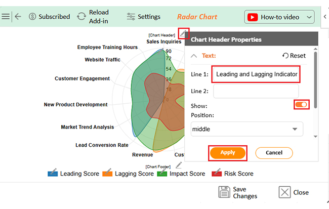
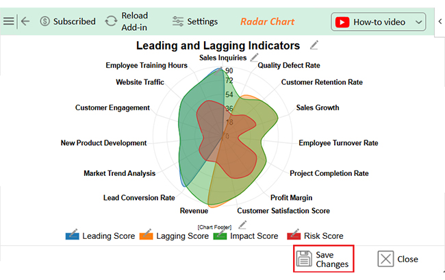
Let’s analyze this sample data in Excel using ChartExpo.

Indicator Leading Score Lagging Score Impact Score Risk Score
Sales Inquiries 85 85 40
Employee Training Hours 75 75 50
Website Traffic 70 70 45
Customer Engagement 60 60 30
New Product Development 55 55 25
Market Trend Analysis 65 65 35
Lead Conversion Rate 80 80 38
Revenue 90 90 35
Customer Satisfaction Score 80 80 55
Profit Margin 70 70 60
Project Completion Rate 65 65 50
Employee Turnover Rate 50 50 20
Sales Growth 75 75 45
Customer Retention Rate 68 68 40
Quality Defect Rate 55 55 30
  • To get started with ChartExpo, install ChartExpo in Excel.
  • Now, click on My Apps from the INSERT menu.
Leading vs Lagging Indicators
  • Choose ChartExpo from My Apps, then click Insert.
Leading vs Lagging Indicators
  • Once it loads, choose the “Radar Chart” from the charts list.
Leading vs Lagging Indicators
  • After clicking on the chart, you will see the Radar Chart on the screen.
Leading vs Lagging Indicators
  • Click the “Create Chart From Selection” button after selecting the data from the sheet, as shown.
Leading vs Lagging Indicators
  • ChartExpo will generate the visualization below for you:
Leading vs Lagging Indicators
  • If you want to have the chart’s title, click Edit Chart, as shown in the above image.
  • Click the pencil icon next to the Chart Header to change the title.
  • It will open the properties dialog. Under the Text section, you can add a heading in Line 1 and enable Show.
  • Give the appropriate title of your chart and click the Apply button.
Leading vs Lagging Indicators
  • Click the “Save Changes” button to persist the changes.
Leading vs Lagging Indicators
  • Your final chart will appear as follows.
Leading vs Lagging Indicators

Insights

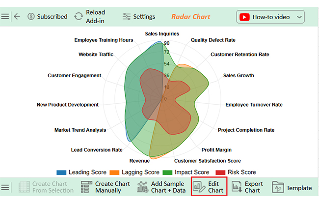
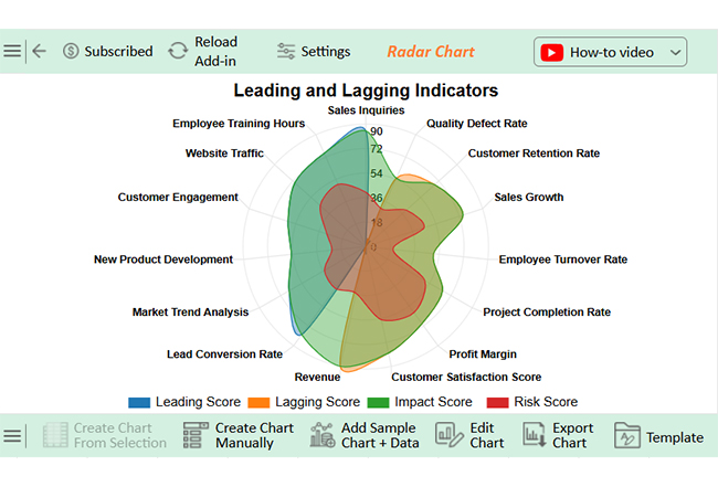
This data reveals that:

  • Leading indicators such as Sales Inquiries and Lead Conversion Rate have a high impact with moderate risk.
  • Lagging indicators like Revenue and Customer Satisfaction also reflect a high impact.
  • Lower scores in Employee Turnover and Quality Defect Rate point to areas requiring improvement.

Benefits of Lagging and Leading Metrics

You can’t fix what you can’t see. And you can’t grow if you only look backwards. That’s why leading vs. lagging indicators are more than buzzwords—they’re your strategy’s foundation. Used well, they help teams perform, plan, and pivot purposefully.

Lagging Metrics

  • Accurate measurement: They show concrete, verified results. You get complex numbers, not guesses.
  • Performance evaluation: You can assess goals and KPIs based on outcomes. This helps track success or failure over time.
  • Accountability: Teams can be held responsible for specific results. These metrics make ownership clear.
  • Reporting: Lagging indicators are perfect for financial and operational reports. Stakeholders rely on them to understand the impact.
  • Learning: They teach you what worked—and what didn’t. Past outcomes shape future strategy.

Leading Metrics

  • Early warning: They alert you to potential problems before they hit. You can act while there’s still time.
  • Proactive management: You don’t wait for results—you shape them. This keeps your strategy on offense, not defense.
  • Trend identification: Patterns emerge sooner with leading data. You catch shifts before they become crises.
  • Continuous improvement: These indicators support testing and adjustment. You’re always moving forward, not standing still.
  • Agility: Teams respond faster to change. That speed keeps your business competitive.

Using Both Lagging and Leading Metrics

  • A balanced perspective: You see where you are and where you’re going. That full view helps prevent blind spots.
  • Improved decision-making: With both data sets, choices are clearer and brighter. Relying on full context reduces risk.
  • Enhanced forecasting: Past results support trend analysis while leading signals guide projections, making predictions more reliable.
  • Sustained growth: You don’t just hit targets—you build on them. Each insight fuels progress.
  • Better resource allocation: Efforts and budgets go where they’ll matter most. You stop wasting time and start scaling impact.

Use Cases for Lagging and Leading Indicators

Every decision leaves a trail. And every smart move starts with a signal. Leading vs. lagging indicators aren’t just theory—they power real business outcomes.

Knowing where to apply them turns raw data into results. What are sales KPIs, and how do they fit in? Below are practical ways businesses use both to gain control and drive change.

Use Cases for Lagging Indicators

  • Financial reporting: Revenue, expenses, and net profit help track past performance. These are essential KPIs for accounting and investor updates.
  • Employee performance evaluation: Reviewing completed tasks and achieved goals highlights past efficiency. HR uses these to reward or retrain team members.
  • Customer satisfaction measurement: Post-service surveys and churn rates show how customers feel. This information is useful for improving future experiences and also reflects what has happened.
  • Project management: Final delivery times and budget usage are reviewed after the project closes. These show whether execution met original expectations.

Use Cases for Leading Indicators

  • Sales forecasting: Website visits, lead conversions, and demo requests point to future revenue. These metrics answer the question of what sales KPIs are before deals close.
  • Operational efficiency: Machine downtimes and supply delays warn of process bottlenecks. These are critical KPIs for the manufacturing industry.
  • Employee development: Training hours completed and internal mobility interest help predict engagement and retention. They indicate whether your talent pipeline is strong.
  • Risk management: Unusual logins and rising complaint volumes may flag future threats. These leading signals are vital in shaping cybersecurity key performance indicators.

FAQs

What are examples of leading and lagging indicators?

Sales pipeline and training hours are leading indicators. Revenue and customer complaints are lagging indicators, leading to a lack of information on what might happen. Lagging shows what you did.

Should KPIs be leading or lagging?

KPIs should include both. Leading KPIs guide action, while lagging KPIs measure results. A mix helps balance strategy, performance, and accountability.

What are leading vs. lagging key risk indicators?

Leading risk indicators signal potential threats early, while lagging risk indicators confirm past issues. Leading helps prevent, while lagging helps analyze and learn.

Wrap Up

Leading indicators are signals of what’s coming. They help you act before problems grow. They give direction, not just reflection.

Tracking average response time or agent availability is a strong KPI in a call center. These leading metrics help reduce wait times and improve customer satisfaction.

Sales teams use lead response time, proposal volume, and key sales KPIs. These show sales activity before deals close, helping managers spot trends early.

Recruiters monitor time-to-screen and candidate engagement. These are useful recruitment key performance indicators that reveal hiring momentum before a position is filled.

In retail, foot traffic and online cart additions are leading signs. These retail industry KPIs help forecast sales, stock needs, and promotions. It’s about staying one step ahead of demand.

SMART KPIs examples often rely on leading indicators. They’re specific, measurable, achievable, relevant, and time-bound. Leading metrics fit well because they guide behavior and predict outcomes.

So, what are the leading indicators? They’re the metrics that help you move faster, plan smarter, and stay prepared. Use them well, and your KPIs will stop reacting and start leading.

How much did you enjoy this article?

PBIAd1
Start Free Trial!
154000

Related articles

next previous
Data Analytics9 min read

Event Budget Template for Clear Insights

An event budget template tracks and controls event costs with ease. Learn how to build, use, and improve it in Google Sheets for better planning.

Data Analytics13 min read

How to Create Monthly Sales Reports Templates in Excel?

Discover the 4 best monthly sales report templates in Excel. Track sales, compare targets, and spot trends easily with ready-to-use reporting tools

Data Analytics8 min read

Business Dashboard Examples for Improved Decision Making

What is a business dashboard, and how can you create one? These answers are provided in this guide. You'll also see some business dashboard examples.

Data Analytics8 min read

Energy Demand Analysis for Better Insights

This guide dives deep into what energy demand is. You'll also discover how to calculate energy demands and ways to reduce electric energy demand.

Data Analytics13 min read

Store Performance Dashboards: Optimizing Retail Success

Discover how a store performance dashboard centralizes sales, inventory, and employee data into one view to improve retail performance and strategy.

ChartExpo logo

Turn Data into Visual
Stories

CHARTEXPO

  • Home
  • Gallery
  • Videos
  • Services
  • Pricing
  • Contact us
  • FAQs
  • Privacy policy
  • Terms of Service
  • Sitemap

TOOLS

  • ChartExpo for Google Sheets
  • ChartExpo for Microsoft Excel
  • Power BI Custom Visuals by ChartExpo
  • Word Cloud

CATEGORIES

  • Bar Charts
  • Circle Graphs
  • Column Charts
  • Combo Charts
  • Comparison Charts
  • Line Graphs
  • PPC Charts
  • Sentiment Analysis Charts
  • Survey Charts

TOP CHARTS

  • Sankey Diagram
  • Likert Scale Chart
  • Comparison Bar Chart
  • Pareto Chart
  • Funnel Chart
  • Gauge Chart
  • Radar Chart
  • Radial Bar Chart
  • Sunburst Chart
  • see more
  • Scatter Plot Chart
  • CSAT Survey Bar Chart
  • CSAT Survey Chart
  • Dot Plot Chart
  • Double Bar Graph
  • Matrix Chart
  • Multi Axis Line Chart
  • Overlapping Bar Chart
  • Control Chart
  • Slope Chart
  • Clustered Bar Chart
  • Clustered Column Chart
  • Box and Whisker Plot
  • Tornado Chart
  • Waterfall Chart
  • Word Cloud
  • see less

RESOURCES

  • Blog
  • Resources
  • YouTube
SIGN UP FOR UPDATES

We wouldn't dream of spamming you or selling your info.

© 2025 ChartExpo, all rights reserved.