• Home
  • Tools dropdown img
    • Spreadsheet Charts

      • ChartExpo for Google Sheets
      • ChartExpo for Microsoft Excel
    • Power BI Charts

      • Power BI Custom Visuals by ChartExpo
    • Word Cloud

  • Charts dropdown img
    • Chart Category

      • Bar Charts
      • Circle Graphs
      • Column Charts
      • Combo Charts
      • Comparison Charts
      • Line Graphs
      • PPC Charts
      • Sentiment Analysis Charts
      • Survey Charts
    • Chart Type

      • Box and Whisker Plot
      • Clustered Bar Chart
      • Clustered Column Chart
      • Comparison Bar Chart
      • Control Chart
      • CSAT Survey Bar Chart
      • CSAT Survey Chart
      • Dot Plot Chart
      • Double Bar Graph
      • Funnel Chart
      • Gauge Chart
      • Likert Scale Chart
      • Matrix Chart
      • Multi Axis Line Chart
      • Overlapping Bar Chart
      • Pareto Chart
      • Radar Chart
      • Radial Bar Chart
      • Sankey Diagram
      • Scatter Plot Chart
      • Slope Chart
      • Sunburst Chart
      • Tornado Chart
      • Waterfall Chart
      • Word Cloud
    • Google Sheets
      Microsoft Excel
  • Services
  • Pricing
  • Contact us
  • Blog
  • Support dropdown img
      • Gallery
      • Videos
      • Contact us
      • FAQs
      • Resources
    • Please feel free to contact us

      atsupport@chartexpo.com

Categories
All Data Visualizations Data Analytics Surveys
Add-ons/
  • Google Sheets
  • Microsoft Excel
  • Power BI
All Data Visualizations Data Analytics Surveys
Add-ons
  • Google Sheets
  • Microsoft Excel
  • Power BI

We use cookies

This website uses cookies to provide better user experience and user's session management.
By continuing visiting this website you consent the use of these cookies.

Ok

ChartExpo Survey


Home > Blog > Data Analytics

Public Relations KPIs: Insights Made Easy for PR

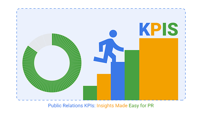
What are public relations KPIs, and why do they matter? In a time when a brand’s reputation can shift in minutes, PR efforts need clear measures of success. Without them, wasting time, money, and influence is easy.

Public Relations KPIs

That’s where public relations KPIs come in. These numbers show whether the message is landing. Whether the campaign is moving the needle. Or whether people care enough to talk, share, or trust.

PR teams used to count press releases and hope for the best. Now, success is tied to clear goals and real impact. Think share of voice, sentiment scores, media reach, and brand mentions. These aren’t vanity metrics. They show progress and risk.

Brands rely on metrics and KPIs that reflect attention, trust, and tone to keep PR accountable.

Smart tracking turns guesswork into strategy. It helps PR teams act, not react. That’s the power of public relations KPIs. They make success visible and connect effort with outcome.

The bigger picture? As PR joins forces with marketing, customer service, and sales, the correct numbers help leaders align. Customer success KPIs can now inform brand storytelling. KPI graphs visualize how perception changes over time.

PR needs measurement. And measurement starts with the right KPIs.

Let’s get started…

Table of Contents:

  1. What are Public Relations KPIs?
  2. Why Do We Need PR KPIs?
  3. What are the Key Differences Between PR Metrics vs. PR KPIs?
  4. How Do You Track Key Performance Indicators for Public Relations?
  5. How to Analyze Public Relations Metrics?
  6. FAQs
  7. Wrap Up

What are Public Relations KPIs?

Definition: Public relations KPIs are measurable values used to track PR performance. They demonstrate how to achieve communication goals effectively, helping teams stay focused and accountable. Common examples include media coverage, sentiment, and engagement rates.

Good SMART KPI for PR are mentions in top-tier outlets or positive sentiment scores. Companies use KPI graphs to see trends over time. With precise numbers, PR becomes easier to manage and improve. These KPIs turn strategy into measurable action.

Why Do We Need PR KPIs?

How do you prove your PR efforts are working? That’s where public relations KPIs step in. They turn opinions into numbers, helping you show what matters—and why.

Here’s how:

  • Demonstrate value and ROI: Public relations KPIs prove that PR efforts bring real business results. They link media exposure to outcomes like sales, engagement, or improved customer satisfaction KPI scores.
  • Track progress toward goal: KPIs help measure progress against clear communication goals. You can see if campaigns increase awareness, improve sentiment, or expand reach.
  • Optimize strategies: By tracking performance, you learn what’s working and what’s not. This helps refine messaging and timing, like KPIs for call center teams, to improve customer responses.
  • Enhance accountability: Clear KPIs, assign responsibility, and focus. Everyone knows what success looks like and can work toward it together.
  • Benchmark performance: You can compare current PR performance with past efforts or with competitors. This supports long-term improvement and aligns with broader key performance indicators for operations.
  • Support data-driven decision-making: PR decisions become more precise with numbers guiding the way. Teams can allocate resources better, like companies that use the retail industry KPIs to plan campaigns and promotions.

What are the Key Differences Between PR Metrics vs. PR KPIs?

Have you ever mixed up PR metrics and PR KPIs? You’re not alone. They sound similar but serve different roles. One gives you the numbers, while the other shows the story behind them. In simple terms, metrics are what you track, while KPIs are what you aim for.

Here’s a simple breakdown:

Aspect PR Metrics PR KPIs
Definition Basic data points collected during campaigns. Strategic indicators are tied to specific business or communication goals.
Purpose Measure activity and outputs. Measure progress toward success.
Examples
  • Number of press mentions.
  • Website visits.
  • Impressions.
  • Email opens.
  • Increase positive media sentiment by 20%.
  • Grow share of voice by 15%.
  • Improve customer success KPIs.
Use Case Used to monitor performance day-to-day. Used to evaluate impact, ROI, and long-term outcomes.

How Do You Track Key Performance Indicators for Public Relations?

Tracking key performance indicators for public relations isn’t complicated, but it has to be intentional. You can’t measure success if you don’t define it first. Too often, teams aim for attention without knowing the goal. Let’s break that cycle.

Here’s how to track what truly counts:

  1. Define clear PR objectives: Start with purpose. Are you trying to improve brand perception, drive engagement, or increase customer satisfaction KPI scores? Your objectives should guide what you measure.
  2. Select relevant KPIs: Pick KPIs that link directly to your goals. Track brand mentions, sentiment, and media quality using SMART KPIs showing progress.
  3. Use data collection tools: Platforms like Muck Rack, Talkwalker, or Google Analytics can help you gather the correct data. They simplify how you monitor reach, tone, impressions, and media resonance.
  4. Set benchmarks and targets: Use industry standards or past performance to set specific targets. Key performance indicators for the manufacturing industry can inspire process-focused thinking when setting PR goals.
  5. Review and report regularly: Make time to check in. Use visual reports, like KPIs for call center dashboards, to show impact and inform leaders.

How to Analyze Public Relations Metrics?

Have you ever tried making sense of PR results using Excel? It’s like trying to paint a mural with a toothbrush. You’ve got the data, but good luck making it look meaningful.

That’s where public relations KPIs come in. They turn messy numbers into clear insights, but raw data alone isn’t enough. You need visuals that tell the story.

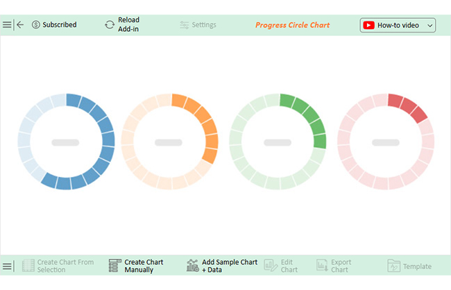
Data visualization plays a massive role in analysis, connecting the dots quickly. Unfortunately, Excel’s charts often miss the mark. Enter ChartExpo. It makes visualizing KPIs simple, innovative, and stunning.

Say goodbye to confusion and hello to clarity – install ChartExpo today!

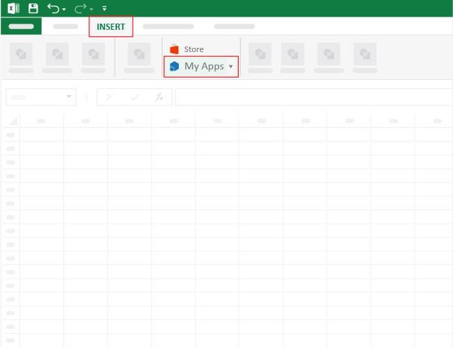
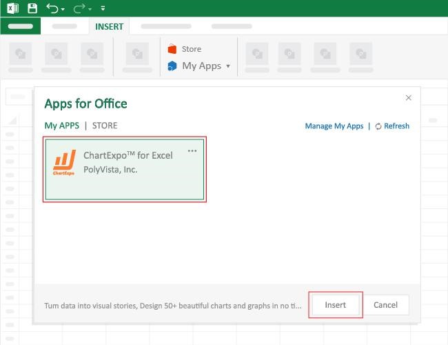
How to Install ChartExpo in Excel?

  1. Open your Excel application.
  2. Open the worksheet and click the “Insert” menu.
  3. You’ll see the “My Apps” option.
  4. In the Office Add-ins window, click “Store” and search for ChartExpo on my Apps Store.
  5. Click the “Add” button to install ChartExpo in your Excel.

ChartExpo charts are available both in Google Sheets and Microsoft Excel. Please use the following CTAs to install the tool of your choice and create beautiful visualizations with a few clicks in your favorite tool.

Example

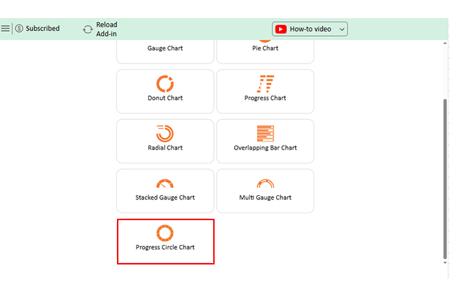
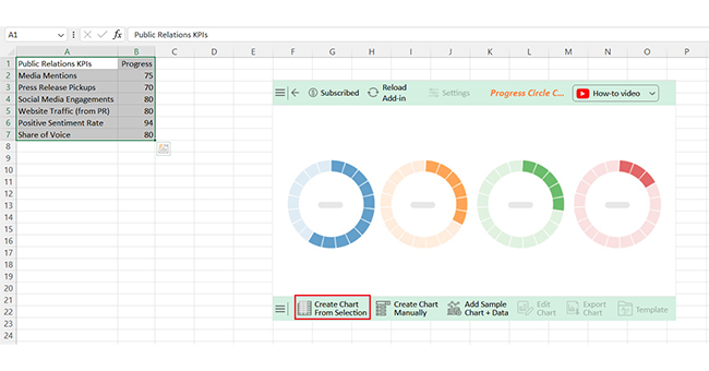
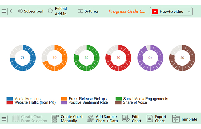
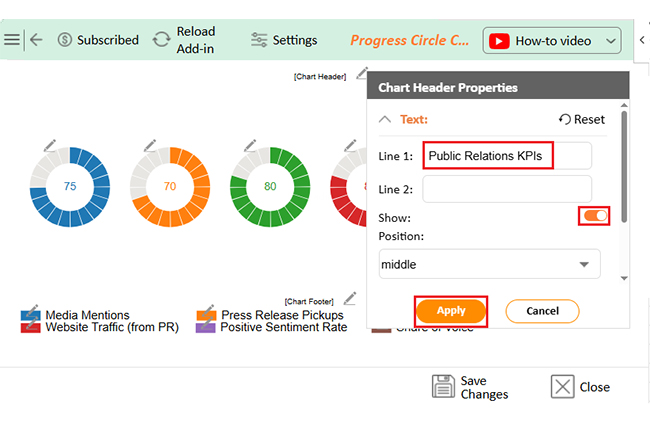
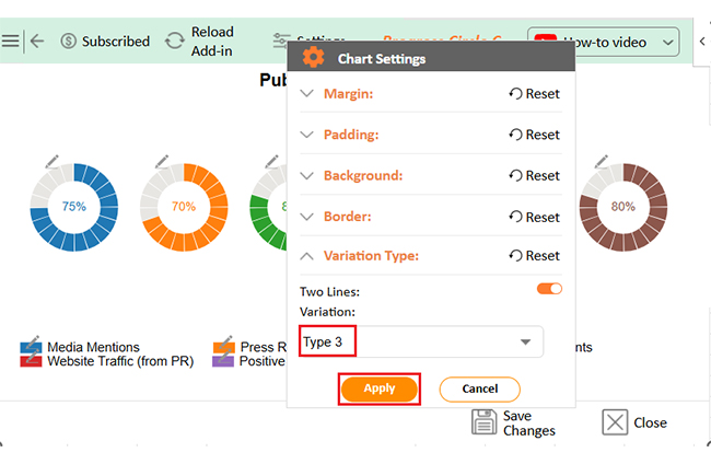
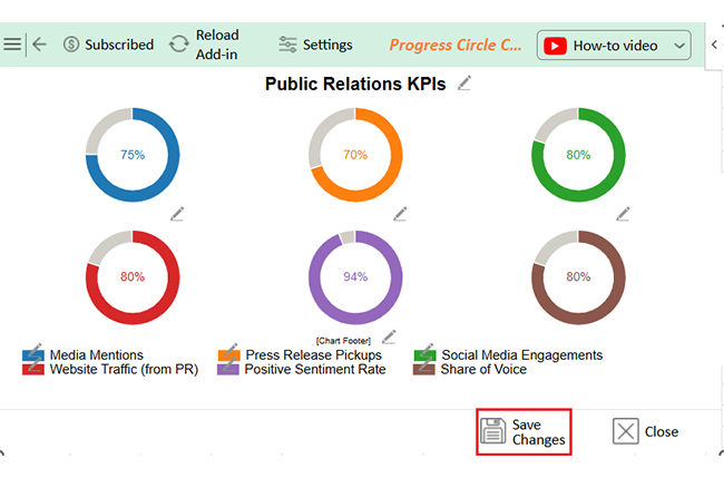
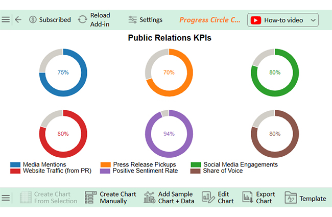
Let’s learn how to create a dashboard in Excel using ChartExpo and analyze it:
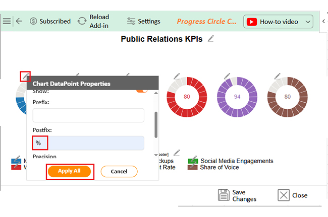
Public Relations KPIs  Progress
Media Mentions 75
Press Release Pickups 70
Social Media Engagements 80
Website Traffic (from PR) 80
Positive Sentiment Rate 94
Share of Voice 80
  • To get started with ChartExpo, install ChartExpo in Excel.
  • Now, click on My Apps from the INSERT menu.
Public Relations KPIs
  • Choose ChartExpo from My Apps, then click Insert.
Public Relations KPIs
  • Once it loads, scroll through the charts list to locate and choose the “Progress Circle Chart”.
Public Relations KPIs
  • The Progress Circle Chart will appear as follows.
Public Relations KPIs
  • Click the “Create Chart From Selection” button after selecting the data from the sheet, as shown below:
Public Relations KPIs
  • ChartExpo will generate the visualization below for you.
Public Relations KPIs
  • If you want to add anything to the chart, click the Edit Chart button:
  • Click the pencil icon next to the Chart Header to change the title.
  • It will open the properties dialog. Under the Text section, you can add a heading in Line 1 and enable Show.
  • Give the appropriate title of your chart and click the Apply button.
Public Relations KPIs
  • You can add the (%) with all values:
Public Relations KPIs
  • You can change the Data Representation as follows:
Public Relations KPIs
  • Click the “Save Changes” button to persist the changes made to the chart.
Public Relations KPIs
  • Your final Progress Circle Chart will look like the one below.
Public Relations KPIs

Insights

  • The positive sentiment rate is strong at 94%, indicating a favorable public perception.
  • Media mentions and press release pickups are slightly lower, highlighting a need for improved outreach.
  • Social media performance, website traffic, and share of voice are all performing well and showing a substantial overall PR impact.

FAQs

What is a PR metric?

A PR metric is a data point used to track communication activity. It measures things like mentions, reach, or clicks. These numbers help evaluate PR performance, support decisions, and show campaign progress over time.

How do you measure PR success?

You measure PR success by using clear goals and tracking public relations KPIs:

  • Look at sentiment, media quality, and engagement.
  • Compare outcomes to targets.
  • Use tools to gather data and report impact.

Does PR use metrics?

Yes, PR relies on metrics to measure performance. These include impressions, coverage, and social shares. Metrics show what’s working and are the foundation for building strong metrics and KPI strategies.

Wrap Up

Public relations KPIs help track the performance of your PR efforts. They give meaning to your campaigns—without them, success is just a guess.

KPIs show where you stand. They help you measure awareness, sentiment, and engagement. This clarity drives smarter PR decisions.

Good KPIs align with business goals. They’re not random numbers; they connect communication to the results leaders care about.

Other industries rely on KPIs, too. Key performance indicators for operations help teams stay efficient. The retail industry KPIs track store traffic and sales, while KPIs for call center teams measure response times and service quality. PR can learn from them.

Public relations KPIs make your efforts measurable. They turn work into value, help teams improve, adjust, and grow. Whether you monitor media coverage or brand sentiment, KPIs keep your PR sharp. Choose wisely. Track often. Report clearly.

Excel has limits, but the right tools make tracking easier. Tools like ChartExpo offer cleaner, faster, and better visual reporting.

So, do not hesitate. Install ChartExpo to unlock better data visualization.

How much did you enjoy this article?

GSAd1
Start Free Trial!
152442

Related articles

next previous
Data Analytics7 min read

Customer Experience Dashboard for Quick Insights

This guide explores the importance and features of a customer experience (CX) dashboard.

Data Analytics7 min read

Manufacturing Dashboard: Insights Made Easy

This guide shows you what a manufacturing dashboard is, and how to choose the right production dashboard. It also shows you how the dashboard works.

Data Analytics7 min read

Operations Dashboard for Executive Level Insights

This guide explains everything you need to know about operation dashboards, including what they include and how to create one.

Data Analytics12 min read

How to Analyze Financial Statements in Excel?

Learn how to analyze financial statements step-by-step. Master balance sheets, income statements, and cash flow for smarter business decisions.

Data Analytics14 min read

Direct vs. Indirect Cash Flow: Examples & Insights

Enhance your financial acumen with our guide of direct vs. indirect cash flow. Uncover definitions, examples, & key insights for effective financial management.

ChartExpo logo

Turn Data into Visual
Stories

CHARTEXPO

  • Home
  • Gallery
  • Videos
  • Services
  • Pricing
  • Contact us
  • FAQs
  • Privacy policy
  • Terms of Service
  • Sitemap

TOOLS

  • ChartExpo for Google Sheets
  • ChartExpo for Microsoft Excel
  • Power BI Custom Visuals by ChartExpo
  • Word Cloud

CATEGORIES

  • Bar Charts
  • Circle Graphs
  • Column Charts
  • Combo Charts
  • Comparison Charts
  • Line Graphs
  • PPC Charts
  • Sentiment Analysis Charts
  • Survey Charts

TOP CHARTS

  • Sankey Diagram
  • Likert Scale Chart
  • Comparison Bar Chart
  • Pareto Chart
  • Funnel Chart
  • Gauge Chart
  • Radar Chart
  • Radial Bar Chart
  • Sunburst Chart
  • see more
  • Scatter Plot Chart
  • CSAT Survey Bar Chart
  • CSAT Survey Chart
  • Dot Plot Chart
  • Double Bar Graph
  • Matrix Chart
  • Multi Axis Line Chart
  • Overlapping Bar Chart
  • Control Chart
  • Slope Chart
  • Clustered Bar Chart
  • Clustered Column Chart
  • Box and Whisker Plot
  • Tornado Chart
  • Waterfall Chart
  • Word Cloud
  • see less

RESOURCES

  • Blog
  • Resources
  • YouTube
SIGN UP FOR UPDATES

We wouldn't dream of spamming you or selling your info.

© 2025 ChartExpo, all rights reserved.