Categories
By ChartExpo Content Team
Control charts are not just graphs; they are a roadmap to process stability. Whether you run a factory, a hospital, or a service-based business, control charts show you when a process is stable and when it’s heading toward failure.


They don’t just react to problems—they help prevent them before they start.
Control charts track data over time, revealing hidden trends and shifts in performance. A sudden spike? A gradual drift? These charts flag changes early, giving teams a chance to act fast.
No more scrambling to fix errors after they impact quality—control charts bring clarity and control.
Businesses rely on control charts to reduce waste, improve efficiency, and maintain quality. They work in manufacturing, healthcare, logistics, and beyond. If consistency matters to you, control charts belong in your process.
Control charts, also known as Shewhart charts, are tools used in quality control to track process performance over time. These tools help teams spot trends, variability, and deviations in processes that might need correction.
Why does this matter to you? If you’re looking to maintain consistent quality in your products or services, embracing control charts is crucial. They offer a clear visual of process stability and highlight when corrective actions are necessary.
In essence, they are your eyes on the manufacturing floor or any process you wish to keep within specified limits.
The journey from simple plotting to sophisticated process monitoring is fascinating. Initially developed by Walter A. Shewhart in the 1920s, these charts transformed how we view quality control. Shewhart’s work laid the groundwork for statistical process control (SPC), turning basic inspections into a scientific process of quality management.
Over the decades, these charts have evolved, incorporating new statistical graphs, techniques, and technology, making them more precise and easier to use. This evolution has made them indispensable in industries where quality is critical.
SPC control charts play a pivotal role in quality control by monitoring process variance. By identifying when a process is deviating from its intended path, these charts help prevent the creation of off-spec products before they happen.
This proactive approach not only reduces variability but also boosts overall efficiency. In environments where precision is paramount, such as pharmaceuticals or automotive manufacturing, SPC control charts are vital tools that support consistent output and compliance with industry standards.
Control charts excel in identifying process instability, and outshining other quality tools due to their real-time data analysis capability. Unlike simple inspections or batch testing, control charts provide ongoing surveillance of a process, detecting shifts immediately.
This immediate feedback allows for quicker responses, helping to maintain process control and quality. Whether it’s a minor adjustment or a major overhaul, the insights provided by control charts enable more informed data-driven decision-making, keeping processes on track and under control.
Creating a control chart starts by mapping data points over a period. This graph displays how a process changes. It’s not just a bunch of numbers; think of it as the story of your process, told through data. Each point on this plot represents a snapshot, a moment in the life of your process.
To kick off, you’ll gather data from your process at regular intervals. Consistency here is key; random data won’t tell the true story. As you plot these points, patterns start to emerge. These aren’t just any patterns—they’re the rhythms of your process, whispering its secrets.
Now, why bother plotting? Because trends matter. They show if a process is stable or if trouble is brewing. Is there a sudden spike in data points? Or perhaps a gradual drift? These are the clues you need to act, making plotting not just useful but vital for quality control.
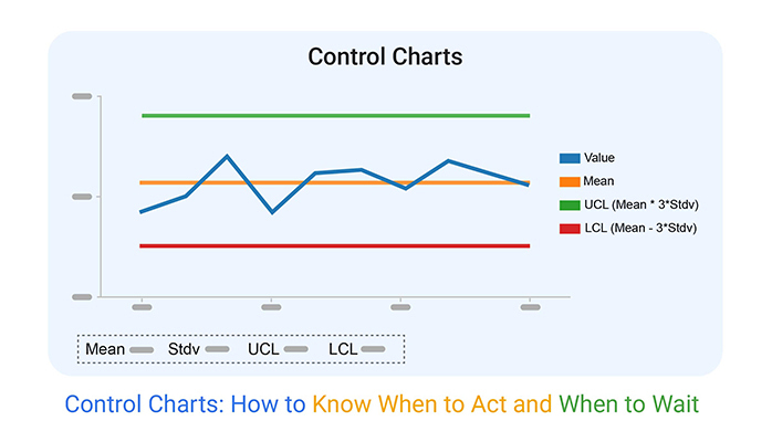
The heart of a control chart lies in its limits: the Upper Control Limit (UCL), Lower Control Limit (LCL), and the Center Line. These aren’t random lines; they are the boundaries that define normal variations in your process. The Center Line typically represents the average or median of your data, acting as the baseline.
UCL and LCL are the watchtowers standing guard over your process. Calculated from historical data, they mark the boundaries of expected variations. If a data point crosses these lines, it’s a signal, a shout from your process that something unusual might be happening.
Understanding these limits helps you distinguish between normal jitters and signs of real issues. It’s like knowing the difference between a windy day and a hurricane. With these limits set, a control chart not only monitors but also safeguards your process.
When it comes to process instability, two main culprits lurk: common and special cause variations. Common cause variation is the usual, expected fluctuation in a process. It’s the background noise, the everyday ups and downs you can predict and prepare for. This type of variation is inherent and not generally a cause for alarm.
Special cause variation, on the other hand, is the disruptor. It’s unexpected, and not part of the routine. Think of it as a signal flaring up, indicating something has changed. Detecting this type of variation early is crucial. It’s your cue to delve deeper, to find and fix issues before they escalate.
Control charts excel in spotting these variations. By monitoring how data points interact with control limits, you can detect these signals. A single point outside the limits, or a run of points on one side of the Center Line, might suggest a special cause. Recognizing these patterns helps maintain control over your process, ensuring stability and quality.
Distinguishing between variable data and attribute data is key in process control. Variable data is quantitative; it’s measured on a continuous scale. Think of dimensions like length, speed, or temperature.
This data type allows for more precise and detailed analysis, making it possible to detect even small shifts in process performance.
Attribute data, however, is qualitative. It categorizes items based on presence or absence, like defective vs. non-defective items. This data type is less detailed but crucial for processes where measurement is impractical or impossible.
Knowing which type of data you’re dealing with helps in selecting the right tools for process improvement.
Let’s break down the go-to SPC charts.
X-bar charts are perfect for tracking the average of measurements grouped over time. They show trends and shifts in the process mean.
R (range) and S (standard deviation) charts go hand-in-hand with X-bar charts, providing insights into the variability of the process.
For individual measurements, the I/MR chart (Individuals and Moving Range) is your tool. It’s ideal for data that comes in one at a time.
P-charts (proportion charts) are invaluable for attribute data, helping you monitor the proportion of defective items in a sample.
Each chart has a specific use case, ensuring that you can monitor various aspects of process performance effectively. Matching the chart to your data type and the aspect of the process you want to monitor is key.
Creating a quick lookup table can simplify the decision-making process when selecting an SPC chart. Here’s a simplified guide:
This table acts as a handy reference, helping you quickly decide which SPC chart aligns with your data type and process monitoring needs. By referring to this table, you can ensure that you are always using the most effective tool for your specific situation.
Gathering data is your first step in building a control chart. It’s vital to ensure accuracy right from the start. Focus on collecting quality data that reflects your true process performance. Avoid any factors that could skew your results.
This means taking regular samples under consistent conditions. Check tools and methods for consistency. If your data gathering is flawed, your control chart won’t reflect reality.
Here’s a tip: use random sampling to avoid bias. Ensure the data collection period is long enough to capture variations. This way, your control chart will be a reliable tool for detecting process changes.
Now, let’s calculate control limits. These are key in setting the boundaries for process variation. You’ll use basic statistical methods here. First, find the mean (average) of your collected data. This represents your process center.
Next, calculate the standard deviation, which shows the data spread. Multiply the standard deviation by three and add or subtract this from the mean to find the upper and lower control limits. Remember, data within these limits are likely just normal process variations, not cause for alarm.
These calculations can be done manually or with software. They are crucial as they set the stage for effective monitoring.
Time to plot your control chart! You can do this using quality management software or even a simple spreadsheet. Start by marking your mean on the chart. Then, draw lines for your upper and lower control limits.
Make sure your chart is clear and easy to read. Use different colors or markers for different types of information. For instance, use one color for your data points and another for your control limits.
Consider using templates from software like ChartExpo. They often come with ready-to-use control chart formats. This saves time and helps you maintain accuracy in your plotting.
The following video will help you to create a Control Chart in Microsoft Excel.


The following video will help you to create a Control Chart in Google Sheets.
Healthy data on a control chart looks calm and consistent. Data points are randomly distributed around the centerline, mostly within control limits. You shouldn’t see any patterns forming; it’s like the data points are having a casual party, not following any specific dance moves.
If the points consistently stay within limits without any predictable pattern, give yourself a pat on the back—your process is normal and under control!
Keep your eyes peeled for red flags in SPC charts. One major alert is a point outside the control limits—this screams “Check me out!”
Also, watch for a series of points creeping towards one control limit. This trend might hint at process shifts.
Seven points in a row on one side of the centerline? That’s another warning. These signs help you catch issues before they blow up, saving you time and stress.
Diving deeper, advanced pattern recognition in SPC charts involves spotting cycles, shifts, or trends that might not be obvious at first glance. Think of it as becoming a pattern detective. You might notice cycles that indicate seasonal effects or other recurring factors.
Understanding these subtleties allows you to predict and adjust more effectively, keeping your processes sharp and efficient.
Process errors can disrupt production and impact quality. Identifying and addressing these common issues quickly is crucial:
Addressing these errors involves setting up checkpoints and preventive measures. Continuous training and equipment maintenance plays a big role in minimizing these common issues.
Deciding when to adjust a process is as crucial as knowing how to adjust. Frequent, unnecessary changes can lead to overcorrection, causing more variability. The key is understanding the difference between common cause variations and special cause variations.
Common cause variations are inherent in the process and often require a process redesign rather than frequent adjustments.
If the SPC chart shows a stable process within control limits, wait before making any changes. These variations are normal. However, if you spot a run, trend, or points outside the control limits, investigate potential special causes. Only adjust the process after confirming a special cause that needs correction.
Patience is vital. Make changes based on data, not assumptions, to maintain process control and quality.
Root cause analysis with SPC control charts involves more than spotting an outlier. It requires understanding why the variation occurred. Begin by confirming the process stability using the control chart. If the process shows instability, gather a team to brainstorm potential causes.
Use tools like the Five Whys or fishbone diagrams to dig deeper into each potential cause, linking back to the data shown in the SPC charts. Testing each theory by changing one factor at a time helps isolate the root cause. Once identified, you can implement corrective actions to prevent recurrence.
This methodical approach ensures solutions address the actual problem rather than just the symptoms. By using SPC charts effectively, teams can maintain tighter control over processes, leading to higher quality and lower costs.
In manufacturing, efficient production is key. Here, SPC charts play a crucial role. They help track production processes and identify variations before they become larger issues.
For example, an SPC chart can signal when a machine starts to drift from its standard settings. This early detection allows for quick adjustments, reducing scrap materials and increasing overall efficiency.
SPC charts also help in maintaining consistent product quality. By monitoring process behavior, manufacturers can ensure that each item meets quality standards. This reduces the chance of defective products reaching the customer, which in turn, boosts customer satisfaction and loyalty.
Furthermore, SPC charts assist in predicting machine maintenance needs. Regular monitoring of equipment performance helps predict potential failures. This proactive approach to maintenance helps avoid unexpected downtime, keeping production lines running smoothly and more predictably.
In healthcare, patient safety and healthcare quality are paramount. SPC charts are instrumental in monitoring various healthcare processes, from patient wait times to surgical outcomes. By analyzing these charts, healthcare providers can identify trends and variations in care delivery, leading to better patient outcomes.
For instance, SPC charts can track the rate of post-operative infections across different wards. Identifying a rise in infection rates can prompt immediate investigation and corrective measures, thus ensuring patient safety and care quality.
Moreover, SPC charts are used in monitoring drug administration processes. They help ensure that medications are administered on time and in the correct dosages, reducing medication errors and improving patient health outcomes.
Service industries, including retail and hospitality, rely heavily on customer satisfaction. SPC charts are vital tools for standardizing service delivery. They help measure key performance indicators such as service speed and complaint resolution times. By analyzing these metrics, businesses can identify areas needing improvement.
In a retail setting, an SPC chart might track checkout line lengths throughout the day. Insights from the chart could lead to better staff allocation during peak hours, enhancing customer satisfaction through reduced waiting times.
Similarly, in the hospitality industry, SPC charts monitor room readiness for new guests. Tracking and improving turnover times ensures that rooms meet cleanliness standards, thereby enhancing guest experiences and boosting ratings.
By using SPC charts to monitor and refine processes, service industries can deliver more consistent and error-free customer experiences. This not only boosts customer loyalty but also enhances operational efficiency.
Introducing new systems in any business can be tricky, especially when it involves control charts. The first step is getting buy-in from all stakeholders. Start by presenting the tangible benefits of control charts, such as improved product quality and reduced waste. Make sure to communicate in terms everyone understands.
Next, appoint a champion within your team who believes in the benefits of Statistical Process Control (SPC). This person can help facilitate acceptance among other team members. Their enthusiasm and understanding can help dispel doubts and foster a positive attitude toward the change.
Finally, implement the charts in phases. Begin with a pilot area to show real-world benefits before a full-scale rollout. This phased approach helps mitigate resistance by proving the system’s effectiveness on a small scale first.
Training is crucial for the successful adoption of control charts in your business. Start with basic training sessions that explain what control charts are and how they work. Use real data from your business during these sessions to make the examples relevant and easier to grasp.
Interactive workshops can be very effective. In these sessions, allow team members to create and interpret their control charts with guidance. This hands-on approach helps solidify understanding and encourages practical engagement with the concepts.
Keep resources like cheat sheets and quick-reference guides readily available. These tools can help team members recall training when they begin using control charts in their daily work.
One major pitfall in using control charts is incorrect data collection. Ensure that the data used is accurate and collected consistently. Training your team on how to collect and record data reliably is a step that cannot be skipped.
Another common mistake is reacting too hastily to every fluctuation in the data. Teach your team to distinguish between common cause variations and special cause variations. This understanding will prevent unnecessary adjustments to processes that are performing as expected.
Lastly, avoid the set-it-and-forget-it mindset. Regular reviews and recalibrations of control charts are necessary to maintain their accuracy and effectiveness. Make these reviews a standard part of your process control procedures.
Creating a culture that embraces continuous improvement is key to the long-term success of control charts in your business. Celebrate successes achieved through the use of control charts. Highlighting these wins boosts morale and reinforces the value of the charts.
Encourage ongoing feedback from your team regarding the control chart process. This input can provide insights into challenges and opportunities for further training or adjustments in the implementation process.
Lastly, integrate the use of control charts into your regular business rhythm. Include discussions of control chart results in team meetings and decision-making processes. This integration helps cement the role of control charts in your ongoing business operations, supporting sustained use.
A Shewhart chart, often known as a control chart, excels in detecting process variations. Unlike a run chart, which merely plots data over time, a Shewhart chart determines if these changes are consistent with a stable process. It does this by comparing data against control limits, calculated from the data. This feature allows for early detection of shifts in process behavior, facilitating timely corrective actions.
Histograms and control charts both visualize data, but their uses differ sharply. A histogram, showing the frequency of data points, outlines the distribution and central tendency of data. However, it lacks the temporal insights provided by control charts, which plot data over time.
This timeline view in control charts is crucial for spotting trends and patterns that histograms might miss, making control charts superior for ongoing process analysis.
Integrating SPC charts with Pareto and cause-and-effect diagrams creates a robust toolset for quality control. Pareto charts help identify the most significant problems, while cause-and-effect diagrams map out potential causes.
Adding SPC charts to this mix not only pinpoints where issues occur but also when they happen, enhancing the problem-solving process. This integration allows for a comprehensive approach to quality improvement initiatives, ensuring no aspect of the process is overlooked.
Embracing AI and machine learning can revolutionize how we monitor manufacturing processes. These technologies excel in identifying complex patterns from vast datasets—something humans might find challenging.
For instance, machine learning models can predict potential defects and process deviations by learning from historical process data. This proactive approach shifts the focus from detection to prevention.
Additionally, AI algorithms adjust in real time, improving their accuracy as more data becomes available. This dynamic adjustment is crucial in environments where product specifications or external conditions frequently change. It ensures that monitoring systems remain relevant and accurate over time.
Lastly, these smart systems can automate the generation and adjustment of SPC charts, reducing the manual workload. This automation frees up quality control professionals to focus on more strategic tasks, such as process improvement and root cause analysis.
Predictive control transforms reactive processes into proactive ones. By integrating predictive analytics with SPC charts, we anticipate problems before they manifest. This technique uses historical data to build models that forecast future outcomes based on current process trends.
One practical application is the use of regression analysis to predict future process behaviors. If a process starts to drift, predictive models can forecast when it might hit specification limits. Armed with this information, process adjustments can be made in advance, avoiding non-conformance.
Another method involves anomaly detection techniques to identify data points that deviate from normal behavior patterns. Early detection of anomalies allows for immediate corrective actions, thus maintaining process integrity and product quality.
Effective data visualization is key to actionable quality control charts. Simplifying complex data through strategic visual elements makes charts easier to understand and act upon.
For instance, using color coding for different phases of the process can highlight areas needing attention. This method helps quickly draw the eye to potential issues without sifting through numbers.
Interactive dashboards are another powerful tool. They allow users to drill down into specific data points and time frames. This capability makes it easy to trace the root causes of anomalies within the process.
Lastly, integrating real-time data feeds into visualization tools ensures that the displayed information is current. This immediacy allows for quicker decision-making, keeping your processes tightly controlled and within desired specifications.
Each of these strategies not only supports better quality control but also empowers teams to maintain high standards efficiently and effectively.


Control charts give you the power to spot process changes before they turn into problems. They show when a process is stable and when it needs attention. Instead of reacting to defects after they happen, you can take action early and keep your quality in check.
These charts work across industries. Manufacturers use them to cut waste. Healthcare providers track patient outcomes. Service businesses improve customer experience. The ability to monitor trends and act on signals makes them a must-have tool.
Applying control charts is simple but takes commitment. You need accurate data, regular monitoring, and a team that understands how to respond. When used right, they reduce errors, improve efficiency, and protect your bottom line.
Ignoring process signals leads to costly mistakes. Using control charts helps you take control, make informed decisions, and keep things running smoothly.
Act now—small changes today prevent big problems tomorrow.
How much did you enjoy this article?


Waterfall chart breaks down complex data into clear steps that show change, impact, and outcomes. Want clarity in decisions and strategy? Read on!

Business management KPIs track key performance areas to drive success. Click here to learn how to analyze, use, and measure them effectively and more.

A business development plan template helps to structure your growth strategy. This blog will guide you on how to write, visualize, and download your template.