Categories
By ChartExpo Content Team
A run chart helps you focus on what matters most—performance over time. It doesn’t require advanced technical skills or fancy tools. You plot your data, connect the dots, and watch as the story unfolds.
It’s one of the simplest yet most effective tools to turn raw numbers into meaningful insights. By plotting data over time, run charts let you spot trends, changes, or patterns that might otherwise get lost in a spreadsheet.


Whether you’re tracking sales, monitoring website traffic, or improving a process, the run chart reveals patterns in a way that’s easy to understand and act on.
Why is a run chart so valuable? Because it lets you identify shifts or trends without unnecessary complexity. You can quickly see if you’re heading in the right direction or if something’s gone off track.
It’s a no-nonsense way to keep your finger on the pulse and make smarter decisions faster.
First…
Run charts, often the first step in trend analysis for many, set the stage for more advanced chart types. They plot data in a time sequence, offering a visual display of patterns. Think of them as a storybook of data over time, where you can spot trends, shifts, or cycles from the information presented.
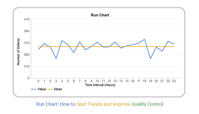
A run chart is a powerful tool used to display data points plotted over time. It helps in identifying trends or patterns in the process performance. As one of the most straightforward statistical graphs, the simplicity of a run chart makes it a favorite among professionals who need quick insights without complex statistical analysis.
The backbone of a run chart includes the median line, representing the middle value of the data points when they’re arranged in numeric order. Around this median, individual data points are plotted across chosen time intervals. Each point represents a snapshot of performance at a specific time, and the median offers a benchmark for comparison.
Both run charts and control charts track data over time, the control chart goes a step further by incorporating statistical limits—upper and lower control limits.
These limits are calculated using the data’s variability and are used to detect signals or potential causes of variation.
Run charts, on the other hand, are simpler, focusing on the median and trends without statistical tests. Use a run chart for quick, informal checks; opt for a Control chart in Excel when precision is necessary.Run charts, on the other hand, are simpler, focusing on the median and trends without statistical tests. Use a run chart to find out median for quick, informal checks; opt for a control chart when precision is necessary.
One of the key strengths of run charts is their ability to make process trends clear and understandable. As data is plotted over time, variations and shifts become visible, providing immediate insights into how a process is performing.
This makes it easier to identify periods of unusual performance or to see the effects of changes implemented within the process.
Run charts are incredibly useful for tracking key performance metrics over time. Whether it’s measuring the speed of service delivery, quality control levels, or any other relevant metric, run charts provide a chronological snapshot of performance.
This ongoing record is vital for assessing how well a process or system is functioning against set benchmarks or goals.
The clarity and straightforward nature of run charts make them particularly appealing to those who aren’t experts in statistics. By providing a clear visual representation of data, run charts offer effective visual analytics, allowing team members, managers, and stakeholders to make informed decisions without needing to interpret complex statistical data.
This democratization of data is key in fast-paced environments where timely decision-making is critical.
When you think you’ve got run charts down, it’s time to kick it up a notch! Advanced techniques in run chart creation can transform your basic line graph into a powerhouse tool for spotting trends and driving data-driven decision-making.
One advanced technique is stratification. This involves dividing data into smaller groups to pinpoint specific patterns or issues that might be masked in an aggregated view.
Imagine you’re looking at customer satisfaction scores across the whole country. By stratifying this data by region, you could uncover unique trends that apply only to specific areas.
Run charts are not just lines on a graph; they tell a story. Identifying patterns like trends, shifts, and cycles can turn raw data into actionable insights. A trend indicates a long-term increase or decrease in data points.
It’s like watching a balloon slowly rise or sink; the direction is clear after several points. Shifts are sudden changes in data level.
Think of it as a step ladder, where you suddenly step up to a higher or lower level.
Cycles occur when data points show periodic fluctuations. It’s like the seasons changing; you can predict ups and downs at certain times.
To really harness the power of run charts, you need to know when changes in data are just noise or if they signify something bigger. This is where statistical rules come in handy. One popular rule is the “shift rule,” where seven consecutive data points all going up or down indicate a potential meaningful change.
It’s like watching ducks line up in a row – if you see it happening, something’s up!
Data can be noisy, and too much detail can obscure the bigger picture.
Smoothing helps clarify trends without sacrificing the integrity of the data. Aggregation is one way to smooth data, where you average data points within a specific time interval.
Think of it as reducing the clutter in your room so you can better see the floor layout. This technique helps in highlighting important trends while maintaining the essence of the original data.


Run charts are a fantastic tool for tracking data over time. However, users often face challenges that can skew the data interpretation and affect the accuracy of the results.
One common issue is distinguishing between normal fluctuations and actual trends. It’s crucial to recognize that not every change signifies a meaningful pattern.
A second challenge is missing data, which can disrupt the flow of information and lead to incorrect conclusions.
Identifying the right metric to track is another hurdle. Choosing a metric that doesn’t align with your goals can render the chart useless for decision-making.
Understanding random variations in data is vital. Noise can often look like a trend or a shift, leading to misleading charts and misinterpretations. To tackle this, apply statistical tools that help differentiate noise from actual change.
Using control limits can aid in identifying when data points are within expected ranges of variation or when they have ventured out, indicating a potential issue or change worth exploring further. This clarity ensures that decisions are based on genuine trends rather than random fluctuations.
Missing data can throw off the accuracy of a run chart. It’s important to address gaps effectively. One approach is interpolation, where you estimate missing values based on existing data.
Another strategy is using carry-forward methods, where the last known data point is used as a placeholder until new data comes in. Both techniques help maintain the data integrity and the integrity of the data sequence, ensuring that the run chart reflects a more accurate trend analysis.
Selecting an appropriate metric is pivotal for the relevance of your data analysis. The key is to align the metric closely with your strategic goals.
For example, if improving customer satisfaction is the aim, measuring call response times might be more relevant than measuring the number of calls. This alignment ensures that the insights gained are actionable and directly tied to business objectives, making your run chart a valuable tool for decision-making.
When you’re working with run charts, it’s tempting to throw in every bit of data you’ve got. Hold up, though!
Cluttering your chart with too much information can backfire. Stick to the essential data points that directly relate to your analysis goals. A clear and focused run chart enhances readability and helps highlight the trends and shifts that matter. Remember, when it comes to run charts, less is often more.
Don’t skip the rules! Run charts come with a set of statistical guidelines that are easy to overlook but crucial for proper analysis. These rules help you identify non-random patterns and trends in your data. Ignoring these can lead to misinterpretations and faulty conclusions.
Always check for shifts, trends, and too many or too few runs. Following these guidelines keeps your analysis accurate and your decisions sound.
Here’s a tip: don’t jump at every wiggle in your data. Run charts are great for spotting trends over time, so focus on sustained patterns rather than short-term blips. Reacting hastily to minor fluctuations can lead to unnecessary changes and confusion.
Instead, look for consistent or recurring patterns that indicate a real shift in your process or system. This approach helps you make informed decisions based on long-term trends, not just temporary spikes or drops.
In healthcare analytics, run charts are a vital tool. They track patient outcomes over time, revealing trends that might go unnoticed in day-to-day operations.
Imagine a hospital uses a run chart to monitor the recovery rates of post-surgical patients. By plotting the number of successful recoveries against time, healthcare professionals can spot changes in trends, perhaps due to new medication regimes or updated surgical techniques, and react swiftly to ensure high standards of patient care.
In the bustling world of manufacturing, maintaining product quality and consistency is paramount. Run charts come into their own here, providing a clear visual of production metrics over a period.
For instance, a car manufacturer might use a run chart to monitor the number of units produced that meet quality standards per day. This ongoing record helps pinpoint the exact moment when discrepancies arise, like a sudden drop in quality due to a machine fault, allowing for quick corrective action.
In finance, where the market’s pulse needs constant monitoring, run charts serve as critical tools. Financial analysts might use them to track revenue trends or key economic indicators over time.
This could involve a run chart displaying quarterly revenue growth, helping analysts to spot trends, prepare better forecasts, and provide strategic advice on potential financial maneuvers.
The immediate visual representation of data helps demystify complex financial concepts, making strategic discussions more grounded in reality.
Run charts are simple; they don’t provide statistical tests. When you need more detailed analysis, consider tools like Histograms, which offer insights through statistical rigor, helping in identifying variations that run charts might miss.
Run charts require sequential data. It’s vital to gather data consistently and accurately. Irregular data collection compromises the chart’s reliability, making it hard to identify true trends from the visualized data.
Run charts don’t handle multiple variables well. When dealing with complex data interactions, use more sophisticated tools like Scatter Plots or Multi Axis Line Charts. These can display relationships between different data sets clearly, providing deeper insights into how variables interact with each other.
Run charts are a favorite among analysts for their straightforward ability to show data trends over time.
Imagine watching a line graph that tells you, at a glance, how your sales have trended this month or how website traffic has grown. That’s the power of a run chart.
It simplifies the identification of upward or downward trends, shifts, and patterns. You don’t need complex software or statistical knowledge to get meaningful insights. It’s like having a crystal ball, but better, because it’s based on real data!
Whether you’re just starting out in data analysis or you’ve been at it for years, run charts are wonderfully accessible. They don’t demand high-level expertise or specialized tools; a simple spreadsheet program does the trick.
This accessibility makes run charts an excellent starting point for newbies while still being a staple in the expert’s toolkit for quick checks and updates.
Run charts are versatile. Think about any type of data—customer satisfaction scores, machine output, daily sales, or even temperature readings—and a run chart can handle it.
This versatility makes them exceptionally useful across different industries and data types, providing clear data visualizations that are easy to interpret and act upon.
Whether you’re in healthcare monitoring patient recovery times or in retail tracking daily transactions, run charts serve up the visual data you need to make informed decisions quickly and effectively.
To get better results from your run charts, focus on the variations and patterns over time. Look at shifts or trends that could indicate a significant change in your data. It’s helpful to mark these changes directly on the chart to keep a visual reminder of when and how your data shifted.
When you’re working with run charts, it’s vital to note any external factors that might affect your data.
This could be anything from a change in the market conditions to a new company policy. By annotating these factors next to your data points, you help future you and others understand what was happening at that time that might have influenced the results.
Consider pairing your run charts with other analytical tools to deepen your insight.
For instance, a Pareto chart can help you identify the most significant factors in your data set, while a scatter plot might show you the relationship between two variables. Using multiple tools together can give you a fuller picture of what your data is telling you.
Run charts are vital in continuous improvement, tracking data over time to show trends, cycles, and variations.
Organizations use run charts to spot deviations and ensure processes remain within desired limits. They are essential in environments committed to ongoing success, as they provide a clear, visual format to monitor continuous data, making it easier to see unwanted variations and improvements.
Run charts are seamlessly woven into Lean and Six Sigma initiatives, which focus on reducing waste and enhancing quality, respectively.
In Lean, run charts reveal process efficiency over time, helping teams see the impact of waste reduction efforts.
In Six Sigma projects, they monitor variations and help maintain the gains from improved processes. By plotting the time on the X-axis and the process metric on the Y-axis, teams can visually align their observations with specific goals like speeding up operations or reducing error rates, thereby aligning with Lean and Six Sigma’s objectives of creating more value with less work.
Root cause analysis with run charts involves examining variations in data points to pinpoint underlying issues.
If a process shows too much variability, it may indicate inefficiencies that need addressing.
Teams can compare data before and after implementing changes to see if the changes lead to improvement. This method allows for real-time monitoring and immediate feedback on the process adjustments.
By identifying these trends and patterns, organizations can proactively manage and fix inefficiencies, leading to more stable and predictable processes.
Run charts excel in ‘before and after’ scenarios, where their clear visual comparison before and after interventions show how changes impact processes. This can be particularly effective in presentations or reports to stakeholders who need to see evidence of improvement or impact.
For instance, a run chart could display the decrease in call handling times in a customer service department before and after training sessions. This visual evidence supports the case for the effectiveness of the training provided, offering a straightforward demonstration of success in improving key process indicators.
In today’s world, being data-driven isn’t just a buzzword but a key strategy for competing in a fast-paced market. Run charts, simple yet powerful, serve as an ideal starting point.
Imagine every team member pulling in the same direction. That’s the power of using run charts as a shared resource. By involving everyone in the data analysis process, teams can identify problem areas and celebrate improvements together.
This collaboration fosters a sense of ownership and accountability, making the data work for everyone.
When it comes to run charts, simplicity is key. They don’t just track changes over time; they tell a story everyone can understand.
For stakeholders without a tech background, explain run charts using real-world examples. Compare them to tracking daily steps or monitoring monthly expenses. This relatable approach helps demystify data and brings everyone on board.
To truly embed run charts in the fabric of organizational processes, make them part of the daily routine. Whether it’s a quick morning review or a deep analysis at team meetings, regular usage of run charts can transform data culture. It turns passive data consumption into active data exploration, encouraging a proactive approach to decision-making.
A run chart is a simple yet powerful tool used to track data points over time. It helps you spot trends, patterns, or irregularities in processes by plotting data on a graph and connecting the points with lines. This makes it easier to see how things change and whether variations occur randomly or because of specific factors. Often used in quality improvement, run charts are great for monitoring performance and making data-driven decisions.
A run chart is perfect when you want to visualize changes in data over time without getting bogged down by complex statistical analysis. It’s especially useful in the early stages of process improvement or when exploring trends in performance. For example, you can use a run chart to track monthly sales, daily production output, or response times in customer service.
A run chart typically includes a time axis (horizontal) and a data axis (vertical). The data points represent individual measurements over time and are connected by lines to show the flow. It also often features a median line, which acts as a reference point to help identify shifts or trends in the data. These elements make the chart easy to read and analyze, even for those with minimal statistical knowledge.
To interpret a run chart, start by looking for patterns in the data. Check for trends, clusters, or shifts in the data points relative to the median line. If you see a steady upward or downward slope, that’s a trend. Clusters or long runs above or below the median may indicate that something is influencing the process. The key is to use these observations to investigate and improve processes.
Run charts are easy to create, simple to interpret, and incredibly effective at identifying trends or changes in processes. They help teams spot opportunities for improvement and communicate data insights clearly. By visualizing data over time, run charts encourage proactive decision-making and support continuous improvement without requiring advanced statistical expertise.
One common mistake is misinterpreting random variations as significant patterns. It’s important to remember that not all fluctuations indicate a meaningful trend. Another error is failing to use a sufficient amount of data, which can lead to misleading conclusions. Always ensure your data is collected consistently and represents the process accurately for reliable insights.
Yes, many tools and software options make it easy to automate run chart creation. Platforms like ChartExpo, for instance, simplify the process by allowing you to input your data and generate professional-looking charts in seconds. Automation ensures accuracy, saves time, and helps maintain consistency in chart formatting.
Run charts are simple but effective tools for tracking data over time. They help you spot trends, shifts, or patterns without overwhelming complexity. Whether you’re monitoring sales, quality metrics, or process efficiency, run charts give a clear view of what’s happening.
The key to using run charts effectively is consistency. Regularly update your chart and review it with a critical eye. Look for patterns and ask what they mean for your goals. Combine run charts with other analysis methods to deepen your understanding of what’s working and what needs improvement.
Run charts aren’t about fancy visuals—they’re about clarity and action. Use them to make smarter decisions based on what your data shows, not what you hope it means.
Remember: A run chart doesn’t tell the whole story, but it gives you the starting point to ask the right questions.
How much did you enjoy this article?


Calculate accounts receivable turnover ratio to measure credit collection speed, improve cash flow, and strengthen your financial strategy. Read on!

Change Management KPIs are the key to tracking adoption, performance, and ROI during transitions. Find out which metrics matter. Read on!

Data collection methods and techniques determine the quality of every insight you act on. Explore key approaches for gathering reliable data. Read on!


