Categories
By ChartExpo Content Team
Data hides problems in plain sight. Without the right tools, businesses miss fraud, system failures, and security threats. Anomaly detection finds patterns that don’t belong, exposing risks before they cause damage.
A sudden drop in sales, a server processing unusual traffic, or an employee logging in at odd hours—these small changes signal bigger issues.
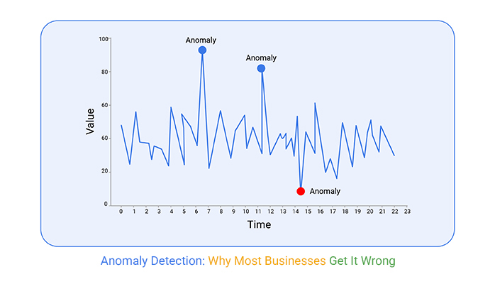


Anomaly detection tracks these shifts, separating random noise from real problems. Businesses that ignore these warnings lose money, time, and trust.
Companies use different methods to catch these irregularities. Some rely on statistics. Others use machine learning. The best systems combine multiple techniques, reducing false alarms and improving accuracy.
Whether handling financial transactions, customer behavior, or network traffic, anomaly detection stops threats before they grow.
First…
Anomaly detection is a technique used to identify rare events or observations which can be indicators of significant issues such as fraud or system failures. It involves algorithms and data analysis techniques to detect outliers that deviate from the norm significantly.
This capability makes it invaluable across domains like finance, healthcare, and cybersecurity.
When it comes to time series data, anomaly detection focuses on uncovering patterns that deviate from historical trends.
Whether it’s a sudden spike in website traffic or unexpected drops in temperature readings, recognizing these anomalies helps businesses and researchers react swiftly to potentially critical changes.
In data analysis, not all unusual points are mere errors. Sometimes, these anomalies can signal pivotal insights or early warnings of bigger issues.
By effectively identifying and analyzing these data points, organizations can preemptively address problems before they escalate or harness unexpected opportunities.
Anomaly detection operates through various methods. One common approach is statistical methods where data points are tested against a defined normal distribution.
Clustering-based techniques group similar data and identify points that do not belong to any group as anomalies.
Machine learning models, especially in complex environments, are trained to recognize patterns and predict deviations.
A Scatter plot diagram is a simple way to visualize anomalies. It plots data points on a graph, making outliers easy to spot. Most points cluster together, while anomalies stand apart.
This chart helps compare relationships between two variables. For example, a scatter plot of bank transactions might show most purchases near a central trend. A few points—unusually high amounts—stand out. These could be fraud attempts.
The advantage of scatter plots is their clarity. They provide a quick snapshot of how data behaves. Analysts use them as a first step before deeper analysis. The goal is to find outliers fast and investigate further.
AI-driven anomaly detection systems are revolutionizing how businesses tackle fraud and security threats. These systems sift through massive datasets, spotting irregularities that could indicate fraud or security breaches.
For instance, if an account suddenly makes several high-value transactions in a short period, an AI system can flag this as suspicious, prompting immediate review.
Network anomaly detection is like having a vigilant guard monitoring a fortress. It continuously analyzes network traffic, looking for odd patterns that might suggest a cyberattack. Early detection is key, allowing IT teams to thwart potential threats before they cause significant harm or data loss.
Time series anomaly detection is particularly useful in sectors like finance, healthcare, and manufacturing where time-stamped data streams are critical.
By analyzing these data points over time, anomalies such as sudden spikes in financial transactions, unusual patient vitals, or production errors can be detected swiftly, ensuring timely intervention.
A Tornado Chart is an effective tool for visualizing the financial risks in anomalous transactions. This chart type lays out the variability of outcomes from different inputs, providing a clear view of potential financial impacts.
By aligning with the need to measure and understand risks associated with anomalies, the Tornado Chart becomes an integral part of financial analysis and decision-making.
Each bar in the Tornado Chart represents a variable that affects the outcome, and its length shows the potential impact on the financial result.
This visual clarity helps stakeholders quickly grasp which factors are most likely to influence financial risks, enhancing strategic planning and response measures. The chart’s structured layout makes it an invaluable tool for any financial analyst dealing with anomalies.
When it comes to anomaly detection, deciding between statistics and machine learning is like choosing between a manual or an automatic camera. Both can take great pictures, but they operate differently.
Statistics are great for understanding data. They help identify what’s normal and what’s not by calculating averages and variances.
If something falls too far from the average, it’s considered an anomaly. This method is straightforward but might miss more subtle anomalies.
Machine learning, on the other hand, can learn from data. It adapts and improves over time, making it great for complex environments.
This approach can detect subtle and complex anomalies that statistical methods might miss. It’s like having a camera that learns to take better photos in different lighting conditions.
Choosing between isolation forest and autoencoders for anomaly detection is like picking between two specialized tools. Each has its strengths depending on the job.
Isolation forests work by isolating anomalies instead of profiling normal data points. It’s effective and fast, especially with large datasets. Think of it as quickly finding the piece that doesn’t fit in a puzzle.
Autoencoders are a type of neural network that learns to copy its input to its output. They are good at learning what normal data looks like. When something different shows up, it stands out. It’s like someone who knows a song so well that they immediately notice a wrong note.
Unsupervised anomaly detection is like trying to find a hidden treasure without a map. It involves algorithms that look at data with no previous labels or indications of what’s normal or abnormal. These algorithms must learn and decide on their own what seems out of place.
This method is useful when you don’t have enough labeled data or when anomalies are rare or not well defined. It’s a challenging but very flexible approach. The algorithms get smarter over time, improving their ability to spot anomalies even in changing conditions.
A multi-axis line chart is an excellent tool for comparing different methods of anomaly detection. It shows how each approach performs across various metrics like accuracy, speed, and scalability. This visual comparison helps highlight the strengths and weaknesses of each method, making it easier to decide which is best for a specific situation.
Multi-axis line charts enhance understanding by providing a clear, visual representation of data. It helps stakeholders quickly grasp key differences without getting lost in technical details. It’s like giving someone a clear, simple map instead of detailed directions.
This makes decision-making faster and more informed.
The following video will help you to create a Scatter Plot in Microsoft Excel.


The following video will help you to create a Scatter Plot in Google Sheets.
In the world of anomaly detection, not all alerts are created equal. False positives occur when normal events are mistakenly flagged as anomalies.
Conversely, false negatives happen when actual anomalies go undetected. Both can disrupt your operations. Reducing false positives and negatives begins with tweaking detection algorithms.
Regularly updating these parameters can help maintain the balance between sensitivity and specificity, ensuring more reliable detection.
Time series data is crucial for forecasting in many industries. Detecting anomalies in this data involves understanding patterns over time.
Seasonal trends, for instance, can often look like anomalies. A spike in retail sales during the holidays is a typical example. Effective anomaly detection in time series data requires models that adapt to these predictable changes.
This adjustment prevents the model from mistaking a seasonal spike for an anomaly, thus improving accuracy.
Preparing your data for anomaly detection is like setting the stage for a performance. Clean data leads to better detection and insights. Start by removing duplicates and correcting errors.
Next, handle missing values appropriately—decide whether to impute or remove these data points.
Finally, normalize the data to ensure that the scale of measurements does not distort the analysis. These steps significantly enhance the reliability of your anomaly detection efforts.
Dirty data ruins anomaly detection. It leads to two common problems: false positives and false negatives. False positives flag normal values as anomalies. False negatives miss real anomalies, leaving threats unnoticed. Both mistakes waste time and money.
A mosaic plot helps compare these errors visually. It shows proportions of true positives, true negatives, false positives, and false negatives. Each section of the chart scales based on frequency, making patterns clear. If false positives dominate, the system is too sensitive. If false negatives are high, it’s too lenient.
Mosaic plot helps improve detection models. It reveals imbalance, guiding adjustments to algorithms. Businesses use it to fine-tune alerts and reduce wasted effort. The goal is simple: catch real anomalies while ignoring harmless fluctuations.
Outliers skew data analysis, leading to misleading results. The Z-score method identifies how many standard deviations a data point is from the mean. Most data points lie within three standard deviations in a normal distribution. Points outside this range are potential outliers.
The Interquartile Range (IQR) method focuses on the middle 50% of data. It finds values below Q1 – 1.5 IQR or above Q3 + 1.5 IQR as outliers. This method is robust against non-normal data distributions, making it highly versatile.
Grubbs’ Test statistically tests the most extreme values. It assumes a normal distribution and is used when suspecting one outlier. This test helps confirm if a single outlier is skewing the dataset significantly.
Autoencoders are neural networks that learn efficient data codings in an unsupervised manner. They are excellent at anomaly detection. They learn to reconstruct normal data. When they fail to reconstruct a new data point, it’s likely an anomaly.
One-Class SVM is designed for anomaly detection in a dataset where all training data has only one class. It learns a decision boundary around this data. Any new data point falling outside this boundary is considered an anomaly. This model is effective in high-dimensional spaces.
Hybrid models leverage both statistical techniques and AI to improve anomaly detection. They use statistical methods to handle structured data and AI models to capture complex patterns in high-dimensional data. This combination leads to improved accuracy and robustness in anomaly detection systems.
Not all anomaly detection methods work the same. Some find small, rare outliers. Others catch hidden patterns across large datasets. Each approach has strengths and trade-offs. Choosing the right one depends on the problem, data, and risks involved.
A Pareto Chart is a visual tool based on the 80-20 rule. The chart ranks detection methods by impact. It combines a bar graph and a line graph. The bars show how often each method catches anomalies. The line shows cumulative importance. The goal is to see which techniques find most anomalies with the least effort.
This chart helps businesses pick detection methods wisely. It reveals which models give the best return on time and resources. Instead of guessing, teams can focus on what works. Anomaly detection improves when companies rely on data, not assumptions.
Supervised anomaly detection thrives when you have labeled datasets. These labels clearly mark normal and abnormal instances, guiding the model during training. This method excels in environments where historical data is rich and well-documented, allowing the model to learn and identify deviations with high accuracy.
Industries like finance and healthcare, where precision is paramount, often rely on supervised models to pinpoint irregularities that could indicate fraud or disease.
In contrast, unsupervised anomaly detection does not require labeled data. It analyzes data without prior input, identifying outliers based solely on the inherent properties of the dataset. This approach is ideal for large-scale data environments where labeling could be impractical or impossible.
It’s widely used in cybersecurity and manufacturing sectors, where it quickly adapts to new and evolving types of data, recognizing anomalies that haven’t been seen before.
Semi-supervised anomaly detection merges the strengths of both supervised and unsupervised methods. It utilizes a small amount of labeled data alongside a larger set of unlabeled data.
This hybrid approach enhances the model’s ability to learn from limited labeled data while leveraging large volumes of unlabeled data for broader insights. It’s particularly effective in situations where acquiring comprehensive labels is costly or labor-intensive.
The Sankey diagram is a powerful visualization tool that illustrates how different anomaly detection approaches interact and lead to various outcomes. By mapping the flow from input data through different processing stages to the final detection output, the Sankey diagram highlights the volume and transformation of data at each stage.
This visual representation is crucial for understanding the distribution of normal versus abnormal findings across different techniques.
The value of the Sankey diagram in this context lies in its ability to show the proportionate impact of supervised, unsupervised, and semi-supervised approaches within a single view. It aids decision-makers in seeing which methods are most effective for specific types of data or scenarios, thereby informing strategic adjustments in anomaly detection processes.
Overall, the integration of different anomaly detection methods, depicted clearly in the Sankey diagram, allows organizations to tailor their detection systems more effectively, leading to improved accuracy and efficiency in identifying anomalies. This strategic visualization supports more informed decision-making, ultimately enhancing operational resilience against anomalies.
Autoencoders are a fascinating type of neural network designed to reconstruct input data. They are perfect for spotting deviations from normal patterns.
By compressing data into a lower-dimensional space and then reconstructing it, autoencoders learn to identify anomalies by measuring reconstruction errors.
Significant errors suggest anomalies. Industries like finance and healthcare now rely on this technology to spot fraudulent activities or diagnose diseases early, making it a crucial tool in AI-driven anomaly detection.
Deep learning models have transformed how we approach anomaly detection. Traditional methods often fall short due to their inability to handle large, complex datasets. In contrast, neural networks excel at digesting vast amounts of data and identifying subtle patterns humans might miss.
Their ability to learn from data without explicit programming allows them to adapt and improve continuously. This makes them invaluable for tasks where precision and reliability are critical, such as monitoring industrial machinery or cybersecurity threats.
Reinforcement learning stands out by enabling models to learn from their experiences. This AI technique involves agents making decisions in an environment to maximize a reward signal.
Applied to anomaly detection, these agents learn to identify anomalies by interacting with data and receiving feedback on their accuracy.
Over time, they become adept at spotting outliers, enhancing their ability to preemptively warn against potential issues in systems ranging from finance to manufacturing.
A radar chart compares AI models across multiple factors. It plots accuracy, processing speed, false positive rate, adaptability, and data requirements on a web-like graph. Each model gets a unique shape, showing strengths and weaknesses.
This chart helps businesses choose the right approach. Autoencoders may score high in accuracy but require large datasets. Neural networks handle complexity well but demand high processing power. Reinforcement learning adapts over time but needs constant feedback.
By visualizing trade-offs, decision-makers avoid guesswork. They see which method fits their needs best. Anomaly detection works better when teams match the right model to the right challenge.
Detecting anomalies in time series data is like finding a needle in a haystack. By observing patterns, you can spot inconsistencies that don’t fit the norm.
These outliers can signal critical incidents before they escalate. It’s all about catching the subtle hints that suggest a deviation from expected patterns.
Rolling averages smooth out noise and reveal underlying trends in time series data.
This method calculates the average of data points within a specific window that rolls across the data set.
By moving this window, you can spot shifts in data trends early, helping you react swiftly to changes.
Data drift occurs when the model’s performance degrades over time due to changes in underlying data patterns.
To combat this, it’s essential to continuously monitor and recalibrate your models.
This ensures they remain accurate and relevant, providing reliable insights regardless of how data evolves.
A stacked area chart shows multiple data categories over time. It highlights changes in trends, making anomalies easy to spot. Each layer represents a data segment, with sudden shifts indicating possible issues.
This chart helps in detecting long-term trends. It reveals unusual spikes or drops across different data groups. If one segment suddenly expands or shrinks, it may signal fraud, equipment failure, or system errors.
Businesses use stacked area charts to monitor key metrics. They track customer activity, financial trends, and machine performance. By comparing patterns across different categories, they spot irregularities before problems escalate.
Scaling up an anomaly detection system means preparing for the demands of a business environment. Key elements include integrating diverse data sources and ensuring the system can handle large data volumes efficiently. The system must also adapt quickly to changes in data patterns, maintaining accuracy and reliability.
Businesses should consider infrastructure scalability, which involves both hardware and software. Real-time processing capabilities may be necessary depending on the application. Effective scaling ensures that the anomaly detection system remains robust and responsive as business needs evolve.
Deciding when to automate involves assessing the complexity and frequency of data anomalies. For infrequent or simple anomalies, manual monitoring might suffice. However, as data volume and complexity grow, automation becomes essential.
Machine learning models can process large datasets more efficiently than humans.
Automation also allows for continuous monitoring without the fatigue or errors that can affect manual checks. The transition to automation should be gradual, starting with the most clear-cut cases to build confidence in the system’s accuracy before fully integrating machine learning for anomaly detection.
Selecting the right software requires considering several factors. First, assess the software’s ability to integrate with existing systems. Compatibility reduces potential disruptions. Next, evaluate the user interface and support services; these aspects are crucial for smooth operation and troubleshooting.
Another key factor is the software’s scalability and its ability to handle data growth. Finally, consider the types of anomalies the software is best equipped to detect. Some systems excel in spotting certain types of irregularities, making them better suited for specific business needs.
Choosing between real-time and batch processing depends on the business requirements for speed and accuracy. Real-time processing offers immediate insights, essential for industries where immediate data analysis is critical. However, it requires more robust computing resources.
Batch processing, on the other hand, handles large volumes of data at scheduled times. It is more manageable and cost-effective for businesses that do not require instant results. Businesses must weigh their need for speed against their operational capacities and budget constraints.
The gauge chart presents a clear, visual representation of performance metrics at a glance. It is particularly useful for displaying the extent to which a system meets its target performance thresholds. By setting benchmarks for detection accuracy and speed, the gauge chart visually depicts how well the anomaly detection system is performing.
This visual tool adds value by simplifying complex data into understandable segments. It aids in data-driven decision-making and helps in pinpointing areas needing improvement. Integrating a gauge chart ensures that performance assessments are both straightforward and impactful, enhancing overall system management.
Banks save millions by spotting unusual transactions quickly. Real-time monitoring systems scan endless streams of data, alerting security teams to potential fraud. This proactive approach stops criminals before they drain accounts, safeguarding customer trust and bank assets.
Cybersecurity teams rely on anomaly detection to identify potential threats. By analyzing network traffic patterns, these systems flag unusual activity, often indicative of a breach attempt. Early detection enables swift action, preventing data theft and maintaining system integrity.
In manufacturing, anomaly detection tools predict equipment failures before they occur. This foresight allows for timely maintenance, avoiding costly downtime and production losses. Supply chains benefit too, as these systems ensure smooth operations, minimizing disruptions.
A tree map presents anomaly detection applications across different industries. Each section represents a sector, with larger areas showing where anomaly detection has the biggest impact.
Banking and finance take a big share due to fraud prevention needs. Cybersecurity follows, detecting threats in real time. Manufacturing and logistics use anomaly detection to prevent breakdowns and delays.
This visual helps businesses see where anomaly detection is most effective. It highlights industries that rely on data monitoring to prevent losses. The goal is clear—stop problems before they grow.
When your system sends out too many alerts, it’s overwhelming. This “alert fatigue” can make users ignore warnings, including the real ones. To manage this, refine your detection algorithms. Focus on reducing noise by enhancing the precision of what qualifies as an anomaly.
Regularly update the thresholds based on recent data and trends. This active management keeps the system relevant and trusted.
An effective anomaly detection system must catch rare, critical events. If it fails, the consequences can be severe. To prevent this oversight, regularly test your system with new scenarios. Adjust sensitivity settings to ensure it remains alert to subtle, yet significant, deviations.
Incorporate diverse data sources to enrich the detection capabilities, making the system robust against varied anomalies.
Anomalies aren’t just numbers; they reflect real-world events or changes. Ignoring the business context can lead to misguided interpretations. Always pair anomaly detection with insights from domain experts. This integration ensures anomalies are not just detected but also correctly interpreted, aligning the technical data with business reality.
A double bar graph clearly compares two types of data—here, false alarms and actual anomalies. Its visual clarity helps in quickly distinguishing between these two critical metrics. By placing them side by side, stakeholders can assess the performance of the anomaly detection system at a glance.
A double bar graph enriches our understanding by visually quantifying the efficiency of the detection system. It highlights whether most alerts are true positives or false positives, guiding necessary adjustments in the detection parameters.
This visual tool supports better decision-making about refining the system to balance sensitivity and specificity.
Firstly, your system should include automated alerts. These alerts help you react swiftly to potential issues as they arise.
Machine learning capabilities are also vital, enabling the system to adapt and improve from incoming data. Lastly, ensure the tool has a user-friendly interface.
This makes the system accessible to team members regardless of their tech expertise.
Open-source tools often allow greater customization and cost savings, ideal for tech-savvy teams with tight budgets. On the other hand, enterprise software offers extensive support and more robust security features, suitable for larger organizations needing reliability and compliance with regulations. Assessing your team’s skill level and security needs will help you decide.
A good anomaly detection tool must easily integrate with existing tech infrastructure. This integration allows for smoother operations and less downtime. Scalability is another critical factor; the tool should grow with your business without requiring frequent replacements or expensive upgrades.
A clustered column chart effectively displays the strengths and weaknesses of various software at a glance. This visual tool groups features like processing speed, algorithm variety, and user interface quality, allowing for quick comparisons. By aligning this with your specific needs, the chart aids in making an informed decision.
Clustered column charts not only simplifies data comparison but also highlights which software excels in particular areas, such as real-time processing or ease of use. Understanding these nuances can significantly impact your choice, ensuring you select software that aligns well with your business objectives and current tech stack.
Embracing anomaly detection starts with understanding your data. Identify what normal performance looks like for your systems to spot deviations. Start small by selecting a critical segment of your business operations. Use this as your test area. Gather data and apply basic anomaly detection algorithms.
There are several tools available that can help you start without needing expert knowledge. Practical steps include setting up alerts for detected anomalies and deciding on response protocols. This initial phase is about learning and refining your approach.
Integrating anomaly detection into daily decisions requires a shift towards data-driven thinking. Train your team on the importance of data and its insights. Encourage them to ask questions about data and its implications.
Create policies that foster data review in regular meetings. This way, anomalies aren’t just detected; they’re expected and planned for. Over time, this creates a culture where data is not just available but actively used to drive strategic decisions.
A Waterfall chart effectively displays the initial costs versus the return on investment (ROI) over time from implementing anomaly detection. The chart starts with the initial cost and sequentially adds the financial benefits realized from the adoption of anomaly detection. This visual representation helps stakeholders see the financial journey from expenditure to profit.
A Waterfall Chart clarifies the financial impact of anomaly detection. It helps business leaders understand the timeline for ROI, and supports strategic decision-making. By visualizing costs against benefits, it reassures stakeholders of the financial viability and benefits of investing in anomaly detection technologies.
This aids in securing budget approval and fosters a supportive environment for data-driven initiatives.
Data holds hidden risks. Systems fail, fraud happens, and mistakes cost money. Without a way to detect unusual activity, businesses lose revenue and trust.
Different methods catch different types of problems. Some use fixed rules, others rely on learning patterns. The right approach depends on the data, the risks, and the speed needed to respond.
No system works without fine-tuning. False alerts waste time. Missed threats lead to disaster. Testing, adjusting, and improving detection methods keeps businesses ahead of problems.
Ignoring outliers is expensive. Fixing small issues now prevents bigger failures later.
How much did you enjoy this article?


Calculate accounts receivable turnover ratio to measure credit collection speed, improve cash flow, and strengthen your financial strategy. Read on!

Change Management KPIs are the key to tracking adoption, performance, and ROI during transitions. Find out which metrics matter. Read on!

Data collection methods and techniques determine the quality of every insight you act on. Explore key approaches for gathering reliable data. Read on!


