• Home
  • Tools dropdown img
    • Spreadsheet Charts

      • ChartExpo for Google Sheets
      • ChartExpo for Microsoft Excel
    • Power BI Charts

      • Power BI Custom Visuals by ChartExpo
    • Word Cloud

  • Charts dropdown img
    • Chart Category

      • Bar Charts
      • Circle Graphs
      • Column Charts
      • Combo Charts
      • Comparison Charts
      • Line Graphs
      • PPC Charts
      • Sentiment Analysis Charts
      • Survey Charts
    • Chart Type

      • Box and Whisker Plot
      • Clustered Bar Chart
      • Clustered Column Chart
      • Comparison Bar Chart
      • Control Chart
      • CSAT Survey Bar Chart
      • CSAT Survey Chart
      • Dot Plot Chart
      • Double Bar Graph
      • Funnel Chart
      • Gauge Chart
      • Likert Scale Chart
      • Matrix Chart
      • Multi Axis Line Chart
      • Overlapping Bar Chart
      • Pareto Chart
      • Radar Chart
      • Radial Bar Chart
      • Sankey Diagram
      • Scatter Plot Chart
      • Slope Chart
      • Sunburst Chart
      • Tornado Chart
      • Waterfall Chart
      • Word Cloud
    • Google Sheets
      Microsoft Excel
  • Services
  • Pricing
  • Contact us
  • Blog
  • Support dropdown img
      • Gallery
      • Videos
      • Contact us
      • FAQs
      • Resources
    • Please feel free to contact us

      atsupport@chartexpo.com

Categories
All Data Visualizations Data Analytics Surveys
Add-ons/
  • Google Sheets
  • Microsoft Excel
  • Power BI
All Data Visualizations Data Analytics Surveys
Add-ons
  • Google Sheets
  • Microsoft Excel
  • Power BI

We use cookies

This website uses cookies to provide better user experience and user's session management.
By continuing visiting this website you consent the use of these cookies.

Ok

ChartExpo Survey


Home > Blog > Power BI

Power BI Automatic Refresh: A Comprehensive Guide

This guide shows you what the Power BI automatic refresh is, why you should use it, and when to use the auto-refresh in the Power BI dashboard.

Power BI Automatic Refresh

In the next section, you’ll discover what the Power BI automatic refresh is, and why you should use it.

Table of Contents:

  1. What is Power BI Automatic Refresh?
  2. Why Use the Auto-Refresh Power BI Report?
  3. When to Use Auto-Refresh in the Power BI Dashboard?
  4. How to Refresh Power BI Data Automatically in Power BI?
  5. How to Setup an Automatic Refresh Schedule in Power BI?
  6. Integrating Tools with Power BI’s Auto Refresh Feature
  7. How to Visualize Your Data Using Power BI?
  8. What are the Best Practices for Power BI Auto Refresh?
  9. Wrap Up

First…

What is Power BI Automatic Refresh?

Power BI Automatic Refresh is a feature that allows the data in Power BI reports and dashboards to update automatically at specified intervals. This way, there will be no need for manual intervention, and the information displayed is current.

Here’s an overview of how it works:

  • Data Source: You can configure automatic refresh for data imported from multiple sources like online services, databases, or files.
  • Schedule: You can set up a refresh schedule in the Power BI service. You must also specify the frequency (e.g., weekly, daily) and time for updates.
  • Configuration: This is done through the Power BI service by accessing the dataset settings and configuring the refresh options.

Automatic refresh helps keep the dashboards and reports up-to-date with the latest data. This comes in handy during real-time monitoring and decision-making.

Why Use the Auto-Refresh Power BI Report?

  • Real-Time Data: It keeps the dashboards and reports up-to-date with the latest data. This enables timely and data-driven decision-making.
  • Efficiency: It reduces the need for manual updates. This will, in turn, save the user’s time and effort.
  • Consistency: All users have to view the most current information to avoid outdated data and discrepancies.
  • Alerting: Facilitate timely notifications based on the latest data. This will help users to identify and address issues easily.
  • Data-Driven Insights: It enhances the accuracy of insights and visual analytics by reflecting recent trends and changes.

When to Use Auto-Refresh in the Power BI Dashboard?

Auto-refresh in the Power BI dashboard helps users monitor live or frequently updated data. The feature is particularly important for stakeholders who want to gain real-time insights. These could be gaining insights from the financial markets, social media metrics, or tracking system performance.

Auto-refresh also plays a vital role in environments where data changes regularly. It reduces the manual effort needed to update dashboards and ensures consistency across reports.

How to Refresh Power BI Data Automatically in Power BI?

To set up automatic data refresh in Power BI, you’ll have to:

  • Navigate to the workspace and select a semantic model from the workspace content list.
  • On the semantic model details page, select “Refresh” > “Schedule refresh.”
Select Refresh to Schedule Refresh for Learning Power BI Automatic Refresh
  • If you’re using the on-premises data gateway to refresh data, you won’t need to supply credentials. After all, the on-premises data gateway is defined for the data source by the gateway administrator.
Use On-Premises Data Gateway to Refresh Data for Learning Power BI Automatic Refresh
  • The “Refresh” section is where you define the frequency and time slots to refresh the semantic model. Some data sources don’t require a gateway to be configurable for refresh, while others data sources require a gateway.
  • In a DirectQuery scenario, a semantic model qualifies for performance optimization. In these cases, “Refresh” will be moved to the “Optimize performance” section.
  • Set the “Configure a refresh schedule” slider to “On” to configure the settings.
Set Configure Refresh Schedule Slider to On for Learning Power BI Automatic Refresh

How to Set Up an Automatic Refresh Schedule in Power BI?

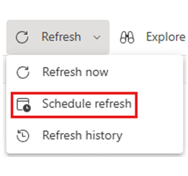
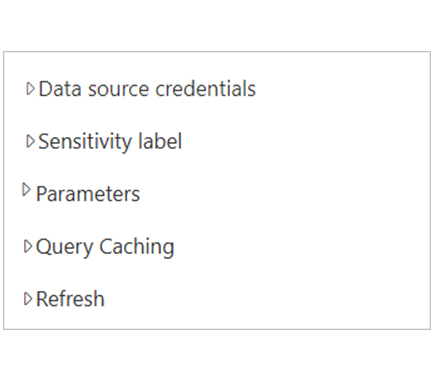
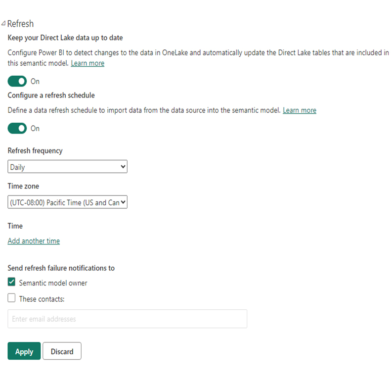
Here are the steps to set an automatic refresh schedule in Power BI:

  • Export data into Power BI Service and launch your dashboard or report.
  • Navigate to the Settings of the dataset and click Publish.
  • Sign in, and make sure that the “Privacy Level” is set correctly.
  • Choose a workplace to publish the dashboard or report.
  • Review the published report/dashboard.
  • Navigate to the Settings section and select the workspace where you publish the report.
  • Find the report under the Datasets and click on the vertical ellipsis to select Scheduled Refresh.
  • If you notice that the data source can’t be refreshed, click on Edit credentials and do an authentication.
  • Enter and enlarge Scheduled Refresh, select “On,” and configure the frequency and time you want to refresh your data source.
  • Click Apply and control refresh history to see all the updates.

Integrating Tools with Power BI’s Auto Refresh Feature

Power BI supports a range of third-party tools that improve the process of Power BI auto-refresh data. These integrating tools offer additional capabilities like conversion, downloading, and data extraction. This helps with the advanced Power BI desktop scheduled refresh.

Popular tools are Microsoft Flow, Zapier, or custom-built solutions using API or Azure Logic Apps. The Power scripts can be used to configure refresh activities programmatically. However, if you’re looking to manage complex refresh schedules, you should opt for Azure functions.

The Microsoft cloud-based data management is an integral part of the platform, and it seamlessly integrates with the Power BI auto refresh. These solutions help you combine Power BI with multiple data sources and technologies. This will, in turn, increase flexibility and control over the data refresh process, especially when tracking time-sensitive metrics like No. of Days Between two Dates for performance or compliance monitoring.

There are tools that do not support Power BI scheduled refresh features. In these cases, you’ll have to perform a manual refresh.
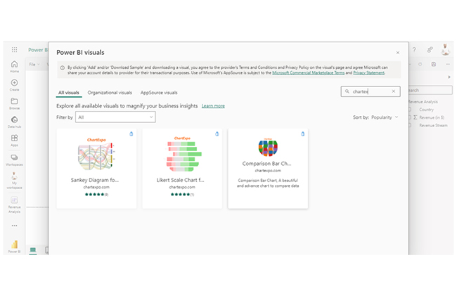
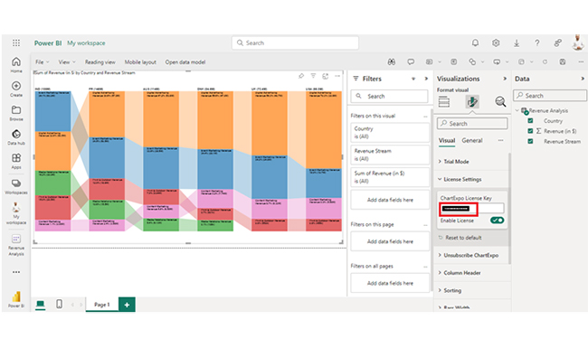
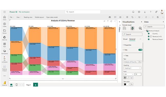
How to Visualize Your Data Using Power BI?

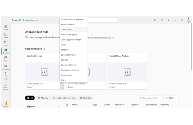
Stage 1: Logging in to Power BI

  • Log in to Power BI.
  • Enter your email address and click the “Submit” button.
Enter email to login to Power BI
  • You are redirected to your Microsoft account.
  • Enter your password and click “Sign in“.
Enter Password to login to Power BI
  • You can choose whether to stay signed in.
Click on stay signed in
  • Once done, the Power BI home screen will open.

Stage 2: Creating a Data Set and Selecting the Data Set to Use in Your Chart

  • Go to the left-side menu and click the “Create” button.
  • Select “Paste or manually enter data“.
select Paste or manually enter data in Power BI ce487
  • We’ll use the sample data below for this example.
Country Revenue Stream Revenue (in $)
USA Digital Advertising Revenue 39,620,000
USA Event Marketing Revenue 10,670,000
USA Content Marketing Revenue 5,580,000
USA Print & Outdoor Revenue 455,270
UK Digital Advertising Revenue 40,710,000
UK Event Marketing Revenue 24,770,000
UK Content Marketing Revenue 6,330,000
UK Print & Outdoor Revenue 552,190
DNK Digital Advertising Revenue 47,040,000
DNK Event Marketing Revenue 29,070,000
DNK Content Marketing Revenue 7,740,000
DNK Print & Outdoor Revenue 600,690
DNK Media Relations Revenue 106,430
AUS Digital Advertising Revenue 53,790,000
AUS Event Marketing Revenue 38,530,000
AUS Content Marketing Revenue 6,590,000
AUS Print & Outdoor Revenue 9,040,000
AUS Media Relations Revenue 6,130,000
FR Digital Advertising Revenue 57,860,000
FR Event Marketing Revenue 50,450,000
FR Content Marketing Revenue 3,560,000
FR Print & Outdoor Revenue 18,790,000
FR Media Relations Revenue 15,460,000
IND Digital Advertising Revenue 60,470,000
IND Event Marketing Revenue 63,200,000
IND Content Marketing Revenue 2,080,000
IND Print & Outdoor Revenue 29,500,000
IND Media Relations Revenue 30,020,000
  • Paste the data table above into the “Power Query” window. Next, select the “Create a dataset only” option.
Select Craete a Dataset Only After Learning Power BI Automatic Refresh
  • Navigate to the left-side menu, and click on the “Data Hub” option. Power BI will populate the data set list. If no data set has been created, you’ll get an error message. Next, click on “Create report.”
Click Create Report After Learning Power BI Automatic Refresh
  • Click on “Expand” to see the chart metrics. At this point, you can check the dimensions and metrics.
Click on Expand After Learning Power BI Automatic Refresh
  • Click on “Get more visuals.” Search ChartExpo and select the Comparison Bar Chart.
Click Get More Visuals After Learning Power BI Automatic Refresh
  • Click on “Add.”
Click Add Button After Learning Power BI Automatic Refresh
  • After that, you’ll see the Comparison Bar Chart in the visuals list.
See Comparison Bar Chart After Learning Power BI Automatic Refresh
  • Click on License Settings and add the key. Next, the comparison bar chart will be displayed on your screen.
Add License Key After Learning Power BI Automatic Refresh
  • Here’s the final look at the Comparison Bar Chart in Power BI.
Final Power BI Automatic Refresh

Insights

  • India has the highest total revenue, and they’re closely followed by France, Australia, and Denmark.
  • “Digital Advertising” tends to be a significant revenue contributor in most countries. However, “Event Marketing” is the leading revenue contributor in India.
  • The “Media Relations” revenue stream is absent in countries like the US and the UK.

Refine Chart Insights Through Power BI Automatic Refresh Capabilities:

  1. Open your Power BI Desktop or Web.
  2. From the Power BI Visualizations pane, expand three dots at the bottom and select “Get more visuals”.
  3. Search for “Comparison Bar Chart by ChartExpo” on the AppSource.
  4. Add the custom visual.
  5. Select your data and configure the chart settings to create the chart.
  6. Customize your chart properties to add header, axis, legends, and other required information.
  7. Share the chart with your audience.

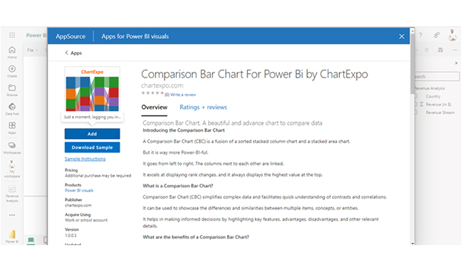
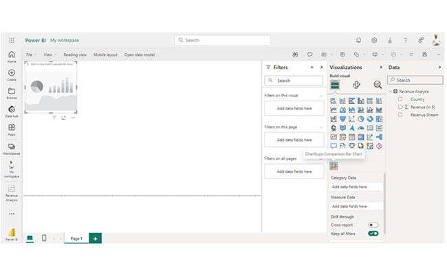
The following video will help you create a Comparison Bar Chart in Microsoft Power BI.

What are the Best Practices for Power BI Auto Refresh?

  • Use gradual refresh when handling large datasets and control the refresh history regularly to ensure that the reports and dashboards use current data.
  • Always program refreshes for less busy times, and that’s important for users whose datasets are on Power BI Premium. Also, control the refresh time so it doesn’t exceed the maximum refresh duration (use the Power BI Premium if the refresh duration is more than 2 hours).
  • Optimize the datasets, including the columns and tables needed for the dashboard or report. Make sure that the Power BI shares notifications of failure by email.
  • You need to enhance the query in order to reduce the time needed for the data source to refresh. It also helps you avoid overpriced DAX calculations.
  • Work with cached results to quantify frequently used queries. This will help you refine the refresh data presentation and save the time needed to recoup data from the source.

FAQs

What are the types of refreshes available in Power BI?

Power BI offers three types of refreshes: Manual Refresh, Scheduled Refresh, and Dataflow Refresh.

Can I refresh a Power BI dataset manually?

Yes, the Power BI dataset can be refreshed manually by selecting the dataset in the Power BI Service and clicking “Refresh now.”

What happens if a scheduled refresh fails?

If a scheduled refresh fails in Power BI, the dataset won’t update as planned. You will receive an email notification (if configured), and manually refresh the dataset. If that doesn’t work, address the issue directly.

Wrap Up

Power BI Automatic Refresh updates data at set intervals. It’s efficient and can be used to gain real-time insights. It’s the best fit for live monitoring, time-sensitive decision-making, and frequent data updates.

To get the most from the Power BI automatic refresh, you have to use it when handling large datasets. The refresh history should be regularly controlled to ascertain that the dashboards and reports use current data.

You also need to work with cached results to quantify frequently used queries. This will help refine the refresh presentation, and save the time needed to recoup data from the source.

Now you know the benefits of the Power BI automatic refresh, what kind of data will you use the refresh feature to monitor?

How much did you enjoy this article?

PBIAd2
Start Free Trial!
141962

Related articles

next previous
Power BI12 min read

Power BI Group By Guide for Effective Data Insights

Learn how Power BI Group By helps you aggregate data, clarify trends, and create reports by grouping values to make large datasets manageable & insightful.

Power BI12 min read

How to Create Sankey Diagram in Microsoft Power BI?

Learn How to Create Sankey Diagram in Microsoft Power BI using Desktop & Web Service. What they are and how to use them effectively.

Power BI8 min read

Power BI Artificial Intelligence: Insights Using Visuals

Discover all there is to know about the Power BI artificial intelligence. You'll also discover how AI is used in Power BI, and how to use it for analysis and more.

Power BI9 min read

Budgeting in Healthcare: Use Visuals to Spot Budget Gaps

This guide helps you discover what budgeting in healthcare is. You'll also discover the factors that affect hospital budgets and types of budgeting in healthcare.

Power BI9 min read

Predictive Analytics in Power BI for Making Insightful Visuals

This guide shows you everything you need to know about Predictive Analytics in Power BI. It also shows you how it works, and how to interpret the results.

ChartExpo logo

Turn Data into Visual
Stories

CHARTEXPO

  • Home
  • Gallery
  • Videos
  • Services
  • Pricing
  • Contact us
  • FAQs
  • Privacy policy
  • Terms of Service
  • Sitemap

TOOLS

  • ChartExpo for Google Sheets
  • ChartExpo for Microsoft Excel
  • Power BI Custom Visuals by ChartExpo
  • Word Cloud

CATEGORIES

  • Bar Charts
  • Circle Graphs
  • Column Charts
  • Combo Charts
  • Comparison Charts
  • Line Graphs
  • PPC Charts
  • Sentiment Analysis Charts
  • Survey Charts

TOP CHARTS

  • Sankey Diagram
  • Likert Scale Chart
  • Comparison Bar Chart
  • Pareto Chart
  • Funnel Chart
  • Gauge Chart
  • Radar Chart
  • Radial Bar Chart
  • Sunburst Chart
  • see more
  • Scatter Plot Chart
  • CSAT Survey Bar Chart
  • CSAT Survey Chart
  • Dot Plot Chart
  • Double Bar Graph
  • Matrix Chart
  • Multi Axis Line Chart
  • Overlapping Bar Chart
  • Control Chart
  • Slope Chart
  • Clustered Bar Chart
  • Clustered Column Chart
  • Box and Whisker Plot
  • Tornado Chart
  • Waterfall Chart
  • Word Cloud
  • see less

RESOURCES

  • Blog
  • Resources
  • YouTube
SIGN UP FOR UPDATES

We wouldn't dream of spamming you or selling your info.

© 2025 ChartExpo, all rights reserved.