• Home
  • Tools dropdown img
    • Spreadsheet Charts

      • ChartExpo for Google Sheets
      • ChartExpo for Microsoft Excel
    • Power BI Charts

      • Power BI Custom Visuals by ChartExpo
    • Word Cloud

  • Charts dropdown img
    • Chart Category

      • Bar Charts
      • Circle Graphs
      • Column Charts
      • Combo Charts
      • Comparison Charts
      • Line Graphs
      • PPC Charts
      • Sentiment Analysis Charts
      • Survey Charts
    • Chart Type

      • Box and Whisker Plot
      • Clustered Bar Chart
      • Clustered Column Chart
      • Comparison Bar Chart
      • Control Chart
      • CSAT Survey Bar Chart
      • CSAT Survey Chart
      • Dot Plot Chart
      • Double Bar Graph
      • Funnel Chart
      • Gauge Chart
      • Likert Scale Chart
      • Matrix Chart
      • Multi Axis Line Chart
      • Overlapping Bar Chart
      • Pareto Chart
      • Radar Chart
      • Radial Bar Chart
      • Sankey Diagram
      • Scatter Plot Chart
      • Slope Chart
      • Sunburst Chart
      • Tornado Chart
      • Waterfall Chart
      • Word Cloud
    • Google Sheets
      Microsoft Excel
  • Services
  • Pricing
  • Contact us
  • Blog
  • Support dropdown img
      • Gallery
      • Videos
      • Contact us
      • FAQs
      • Resources
    • Please feel free to contact us

      atsupport@chartexpo.com

Categories
All Data Visualizations Data Analytics Surveys
Add-ons/
  • Google Sheets
  • Microsoft Excel
  • Power BI
All Data Visualizations Data Analytics Surveys
Add-ons
  • Google Sheets
  • Microsoft Excel
  • Power BI

We use cookies

This website uses cookies to provide better user experience and user's session management.
By continuing visiting this website you consent the use of these cookies.

Ok

ChartExpo Survey


Home > Blog > Data Visualization

Alternative of Pie Chart: Examples & When to Use Each

Alternative of Pie Chart becomes an important topic when simple circular visualizations are no longer enough to explain complex data clearly.

In many reporting scenarios, proportional views can make it harder to compare values accurately, especially when multiple categories or close differences are involved.

Alternative of Pie Chart

In real-world data analysis, decision-makers often need clearer comparison methods that go beyond basic proportional visuals.

This is where other chart types become more effective for highlighting trends, differences, and patterns in data.

In this guide, we will explore the most effective Alternative of Pie Chart, when to use them, and how they improve clarity in data visualization and reporting.

Top 5 Alternatives of Pie Chart with Use Cases

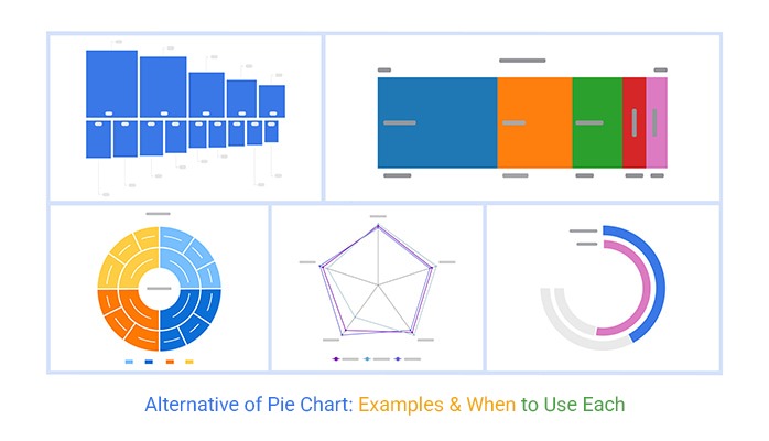
Below are the most effective alternative charts created using ChartExpo in Excel. Each visualization is designed for a specific type of data, helping improve clarity, comparison, and decision-making.

  • Spectrum Chart

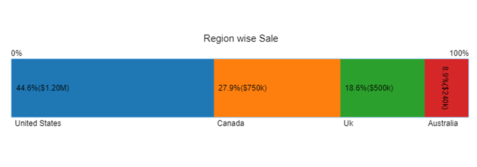
This Spectrum Chart represents region-wise sales distribution across the United States, Canada, the UK, and Australia.

It provides a clear view of how total sales are distributed across regions in a continuous horizontal format, making it easier to compare proportional contributions without the distortion often seen in circular visualizations.

Key Insight

The United States contributes the highest share (44.6%), while Australia has the smallest share (8.9%), making performance gaps visually clearer than a proportional circle-based chart.

Spectrum Chart as Alternative of Pie Chart
  • Sequence Chart

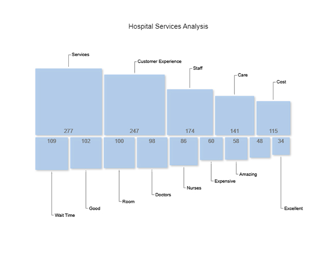
This Sequence Chart visualizes hospital service performance across multiple factors such as service quality, customer experience, staff efficiency, and cost perception.

Unlike circular formats, this sequential structure helps in understanding how each service component flows and performs across different evaluation levels.

Key Insight

Customer Experience and Services show higher values, while Cost-related metrics appear lower, helping stakeholders quickly identify operational strengths and gaps.

Sequemce Chart as Alternative of Pie Chart
  • Radial Chart

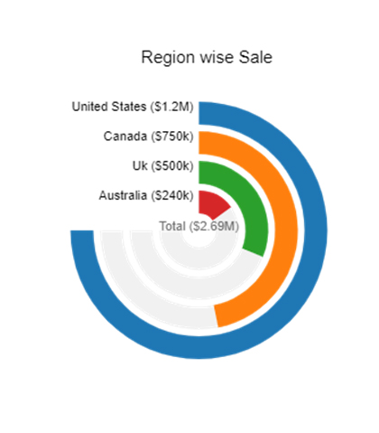
The Radial Chart displays regional sales performance in a circular but structured format, offering a balanced view of proportion and hierarchy.

It highlights total sales distribution while maintaining better readability compared to traditional pie-style visuals.

Key Insight

Even though the United States dominates sales, the radial structure makes it easier to compare mid-tier contributors like Canada and the UK without visual distortion.

Radial Chart as Alternative of Pie Chart
  • Multi-Axis Spider Chart

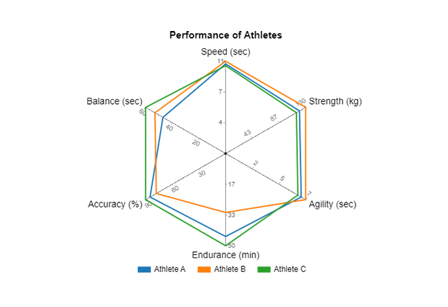
This Multi-Axis Spider Chart visualizes athlete performance across multiple metrics such as speed, strength, endurance, and agility.

It allows you to compare multiple variables at once from a central point, making it ideal for evaluating overall performance across different dimensions.

Unlike proportional visuals, this chart highlights strengths and weaknesses clearly without relying on size-based interpretation.

Key Insight

Athletes with balanced performance across all metrics form a more uniform shape, while variations in the chart immediately reveal specific strengths and areas that need improvement.

Multi Axis Spider Chart as Alternative of Pie Chart
  • Sunburst Chart

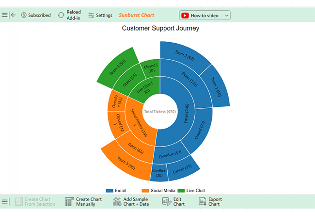
The Sunburst Chart represents the customer support journey across different stages and categories, using layered circular segments to show hierarchy and relationships.

It breaks down complex processes into multiple levels, helping users understand how different stages contribute to the overall flow.

This makes it far more effective for hierarchical data compared to basic proportional visuals.

Key Insight

Users can quickly identify which stages of the support journey handle the highest volume and where drop-offs or bottlenecks may occur within the process.

Sunburst Chart as Alternative of Pie Chart

When Should You Use an Alternative to a Pie Chart?

An Alternative of Pie Chart should be used when your data requires clearer comparison, better structure, or deeper analysis. In many real-world scenarios, other chart types provide more accurate and readable insights.

Use an Alternative of Pie Chart in the following situations:

  • Too Many Categories: When your data includes multiple categories, circular visuals become cluttered and hard to interpret. Bar charts or Treemaps provide better structure and readability.
  • Similar-Sized Values: When values are close in size, it becomes difficult to distinguish differences visually. Bar or column charts make comparisons more precise.
  • Need for Exact Comparisons: If your analysis requires accurate value comparison, alternatives using length or position (such as Bar charts) are more effective than proportional visuals.
  • Time-Based Data: For trends and changes over time, Line or Area charts provide clear progression, which circular formats cannot represent.
  • Presence of Negative Values: Circular visualizations cannot display negative values. Use bar or line charts to represent datasets with both positive and negative numbers.
  • Ranking or Multiple Data Series: When comparing rankings or multiple variables, grouped or stacked charts provide a clearer and more structured view.

When Should You Not Use an Alternative to a Pie Chart?

While Alternatives of Pie Chart offer better precision in many cases, there are situations where a simple circular visualization remains effective.

  • Simple Part-to-Whole Relationships: When working with 2–4 categories that sum to 100%, a circular format provides a quick and intuitive overview.
  • Familiarity for General Audiences: For non-technical users, circular visuals are often easier to understand and interpret quickly.
  • Highlighting a Dominant Category: When one segment clearly dominates (e.g., 70% or more), it stands out more effectively in a proportional layout.
  • Minimal Data with Visual Focus: For presentations or infographics with limited data, a simple circular design can be more engaging.
  • Quick Insights Over Precision: When the goal is to provide a general overview rather than exact comparisons, this format works well.

How To Create a Better Alternative of Pie Chart in Excel

Step 1: Prepare Your Data

Organize your dataset in a structured format with hierarchical levels.

For example:

  • Level 1 → Main category (e.g., Department or Region)
  • Level 2 → Sub-category (e.g., Product or Service type)
  • Level 3 → Values (e.g., Sales or Count)

Make sure your data is clean, consistent, and free from empty cells.

Step 2: Open Excel and Load Your Data

  • Launch Excel and open your worksheet
  • Select the dataset you want to visualize
  • Ensure all columns are properly labeled

Step 3: Insert Chart 

  • Go to the Insert tab
  • Click on My Apps and open Chartexpo
  • Search for Sunburst Chart
  • Select it and click Create Chart

Step 4: Map Your Data

  • Assign your main category to the first level
  • Map sub-categories to the next level
  • Assign values to the measure field

This step ensures the chart correctly reflects hierarchical relationships.

Step 5: Customize the Chart

  • Adjust colors for better distinction between levels
  • Add data labels for clarity
  • Modify layout settings to improve readability

Keep the design clean so insights remain easy to interpret.

Step 6: Analyze the Output

Once your chart is ready, focus on identifying patterns:

  • Which categories contribute the most?
  • How do sub-categories compare within each group?
  • Are there any noticeable imbalances or trends?

Step 7: Use Insights for Decision-Making

This chart not only shows proportions but also reveals structure within your data. Use it to:

  • Understand hierarchical relationships
  • Identify key contributors
  • Support data-driven decisions
Final Alternative of Pie Chart

Benefits of Using Alternatives

Here are the key benefits:

Improved Clarity

  • Alternatives present data in a more structured format, making it easier to understand even when multiple categories are involved.

Better Comparisons

  • Charts like bar and column charts allow direct side-by-side comparison, helping users quickly identify differences between values.

Higher Precision

  • Unlike proportional visuals, alternative charts can display exact values clearly, making them more suitable for detailed analysis.

Handles Complex Data Effectively

  • For datasets with multiple variables or layers, charts such as stacked or grouped visuals provide a more comprehensive view without losing readability.

Supports Trend Analysis

  • Line and area charts make it easy to visualize changes over time, offering insights that static proportional visuals cannot provide.

Works with Diverse Data Types

  • Alternatives can represent negative values, multiple data series, and complex relationships, making them more versatile for real-world scenarios.

FAQs

What can be used in place of a pie chart?

Bar charts, radial charts, sunburst charts, spectrum charts, sequence charts, and multi-axis spider charts can all be used instead of pie charts for clearer and more detailed data comparisons.

What chart is better than a pie chart?

Bar charts are often better than pie charts. They provide clear comparisons and exact values. Stacked bar charts show parts of a whole effectively. Line charts are ideal for trends over time. Donut charts offer a modern alternative to pie charts.

Wrap Up

Choosing the right visualization directly impacts how effectively your data is understood. While simple proportional visuals can work for limited scenarios, an Alternative of Pie Chart provides better clarity, comparison, and flexibility for most real-world datasets.

By selecting the appropriate chart based on your data type—whether for comparison, trends, or hierarchical analysis—you can present insights more accurately and make better decisions.

Instead of relying on a single format, focus on using the visualization that best fits your data structure and purpose. Tools like ChartExpo make it easier to create advanced charts in Excel, helping you turn complex data into clear and actionable insights.

How much did you enjoy this article?

PBIAd1
Start Free Trial!
139961

Related articles

next previous
Data Analytics9 min read

How to Calculate Accounts Receivable Turnover Ratio?

Calculate accounts receivable turnover ratio to measure credit collection speed, improve cash flow, and strengthen your financial strategy. Read on!

Data Analytics10 min read

Change Management KPIs: You Should Track for Success

Change Management KPIs are the key to tracking adoption, performance, and ROI during transitions. Find out which metrics matter. Read on!

Data Analytics11 min read

Data Collection Methods and Techniques: A Complete Guide

Data collection methods and techniques determine the quality of every insight you act on. Explore key approaches for gathering reliable data. Read on!

Data Visualization11 min read

Segmented Bar Graph: Make Layered Data Understandable

Unlock the power of data with this guide to Segmented Bar Graphs. Learn its types, pros and cons, and when to use it for clear data visualization in Excel.

Data Visualization10 min read

How to Visualize Data Using Exponential Growth Chart?

Explore exponential growth, its real-world applications, and how to visualize it in Excel. Includes examples, chart types, and key limitations for better data insights.

ChartExpo logo

Turn Data into Visual
Stories

CHARTEXPO

  • Home
  • Gallery
  • Videos
  • Services
  • Pricing
  • Contact us
  • FAQs
  • Privacy policy
  • Terms of Service
  • Sitemap

TOOLS

  • ChartExpo for Google Sheets
  • ChartExpo for Microsoft Excel
  • Power BI Custom Visuals by ChartExpo
  • Word Cloud

CATEGORIES

  • Bar Charts
  • Circle Graphs
  • Column Charts
  • Combo Charts
  • Comparison Charts
  • Line Graphs
  • PPC Charts
  • Sentiment Analysis Charts
  • Survey Charts

TOP CHARTS

  • Sankey Diagram
  • Likert Scale Chart
  • Comparison Bar Chart
  • Pareto Chart
  • Funnel Chart
  • Gauge Chart
  • Radar Chart
  • Radial Bar Chart
  • Sunburst Chart
  • see more
  • Scatter Plot Chart
  • CSAT Survey Bar Chart
  • CSAT Survey Chart
  • Dot Plot Chart
  • Double Bar Graph
  • Matrix Chart
  • Multi Axis Line Chart
  • Overlapping Bar Chart
  • Control Chart
  • Slope Chart
  • Clustered Bar Chart
  • Clustered Column Chart
  • Box and Whisker Plot
  • Tornado Chart
  • Waterfall Chart
  • Word Cloud
  • see less

RESOURCES

  • Blog
  • Resources
  • YouTube
SIGN UP FOR UPDATES

We wouldn't dream of spamming you or selling your info.

© 2026 ChartExpo, all rights reserved.