Categories
A categorical variable (also known as a nominal variable) has two or more categories.

Here’s the twist.
There is no explicit ordering in the categories.
A binary data point such as a yes/no question is a categorical value with two variables: no and yes.
Hair color is a practical example of categorical data. This is because it has several categories, such as brunette, red, blonde, brown, gray, etc.).
There’s no agreed way to order the hair color from highest to lowest.
So, how do you analyze categorical data?
Well, one of the most straightforward analyses you can undertake is data visualization.
Some of the best graphs for categorical data include:
Well, Microsoft Excel has a sizable library of charts and graphs.
However, it lacks ready-made and insightful charts for visualizing categorical data.
So, how can you overcome this challenge?
Download and install a particular third-party application (add-in) if your goal is to get ready-to-use and easy-to-interpret graphs for visualizing categorical data.
Keep reading to discover more about this add-in.
In this blog, you’ll learn:
Definition: The best graphs for categorical data visualization include bar charts, pie charts, column charts, stacked bar charts, dot plots, and frequency tables. They effectively display and compare the frequency or proportions of different categories.
Definition: Categorical data can easily be divided into groups. Some examples of categorical variables include age group, educational level, race, sex, etc.
Categorical data analysis involves extracting insights into categorical data sets. There are multiple ways of analyzing this data type e.g. funnel chart.
However, we recommend data storytelling through data visualization because it’s straightforward, especially if you have suitable charts.
Check out the example below.
Imagine you’ve conducted a survey that involved about 20 respondents. Let’s assume the details you asked for are hair and eye color.
The table below represents categorical data.
| Eye Color | ||||
| Hair Color | Blue | Green | Brown | Black |
| Blonde | 2 | 1 | 2 | 1 |
| Red | 1 | 1 | 2 | 0 |
| Brown | 1 | 0 | 4 | 2 |
| Black | 1 | 0 | 2 | 0 |
In the scenario above, the aggregate number of respondents with blue eyes, irrespective of hair color, is 5.
We can easily extract insights for now because the table is smaller. Imagine the table consisting of thousands of rows and columns of data.
How long would it take you to visualize this massive table?
Therefore, we recommend you use data visualization to save time and resources.
So, what are the best graphs for categorical data?
Stick around because this is the question we’ll address in the coming sections.
You don’t want to miss this.
Besides categorical data (also known as nominal), there’s also ordinal data type.
Ordinal data has a set order or scale to it.
Example of ordinal data.
Let us assume 100 respondents earning between $1000 to $10,000 monthly participated in a survey that measures the level of happiness.
A fresh graduate earning a salary of $3,000 per month may be on an 8/10 scale. Conversely, a father of 4 earning $7,000 may rate his happiness as 3/10.
Check out our easy-to-follow examples of categorical data.
Some of the categorical data points include the following:
A categorical data with 2 possible values is called binary.
For example, “Do you have children?” (Yes/No).
In the coming section, we’ll unveil the best graph to use when showing categorical data.
Some of the best graphs for showing categorical data include:

Treemaps are one of the best graphs for categorical data visualization.
The space within the chart is split up into rectangles sized and organized based on key data points.
The levels in the Treemap Graph are depicted as boxes containing other smaller boxes, with each box representing a categorical data point. Mekko charts, which also visually break down data into segments, can be used alongside Treemaps to provide an additional layer of insight.
To understand how to make a graph from a table, it’s helpful to visualize the data using these tools to gain a clearer perspective on the relationships between data points.
To generate ready-made Treemaps and Mekko charts, we suggest you use a game-changing tool (which we’ll talk about).

Sunburst Chart is one of the best graphs for categorical data analysis.
It shows insights using a series of concentric rings, with each ring representing a specific data point, such as an IELTS band score. Each ring illustrates the part-to-whole relationship of a categorical data point relative to the parent ring.
Both Sunburst and Treemap charts are effective for visualizing categorical data; however, Sunburst visualization excels at demonstrating how a categorical data point is divided into its constituent variables.
More so, the easy-to-interpret chart uses a circular chart template to create an immersive experience, especially among your target audiences (and readers).

A Sankey plot is one of the best graphs for categorical data visualization.
It uses node-to-node flows to show insights into measurable resources, such as money, energy flow diagrams, etc.
Besides, it uses colors to draw the attention of your readers (or audience) to the largest flows.
The wider the flow the larger the categorical data point. You can leverage this visualization to display insights into:

The Stacked Bar Chart is one of the best graphs for categorical data analysis.
You can use this visualization design to track the trends of categorical data points over time. Each bar is divided into several sub-bars arranged end to end.
It outdoes other charts in displaying part-to-whole relationships in variables.
It gets better.
The visualization is straightforward to read and interpret, and it can handle bulky data without clutter. Use a simple or clustered stacked bar chart to display how the composition of variables in your data changes over time.

A Crosstab Chart is a form of hierarchical visualization.
It’s created by stacking bars on each other.
The chart is ideal for presenting hierarchical data. Each level is represented by a long bar.
While a Bar Chart can only represent a single dimension of your data, a Crosstab Graph in Excel can represent multiple dimensions at once.
Each box is subdivided into smaller bars organized hierarchically. You can easily point out the contribution of the smaller bars relative to the parent bars.
So, how can you access the best graphs for categorical data visualization- Treemap, Crosstab, Scatter plot graph, Stacked Bar, and Sankey Chart?
Excel is one of the most popular tools of visualization among business owners. However, it lacks ready-made charts for visualizing categorical data.
We’re not advising you to do away with Excel.
There’s an amazingly affordable tool that comes as an add-in you can easily install in Excel to access ready-to-go and easy-to-customize Excel graphs and charts, like a Pyramid chart for visualizing categorical data.
The application is called ChartExpo.
What is ChartExpo?
ChartExpo is an add-in you can easily install in your Excel to access ready-made and visually appealing Charts.
Features and Benefits
In the coming section, we’ll show you how to visualize categorical data using ChartExpo.
You don’t want to miss it.
This section will use a Crosstab Chart to visualize the data table below.
Example Data:
| Cities | Items | Orders |
| Los Angeles | Clothing | 5118 |
| Los Angeles | Jewelry | 5884 |
| Los Angeles | Watches | 5028 |
| Los Angeles | Ceramics | 3732 |
| Chicago | Clothing | 3899 |
| Chicago | Jewelry | 6478 |
| Chicago | Watches | 6176 |
| Chicago | Ceramics | 3983 |
| Phoenix | Clothing | 6271 |
| Phoenix | Jewelry | 6158 |
| Phoenix | Watches | 4034 |
| Phoenix | Ceramics | 5147 |
| Miami | Clothing | 3770 |
| Miami | Jewelry | 3356 |
| Miami | Watches | 4108 |
| Miami | Ceramics | 4659 |
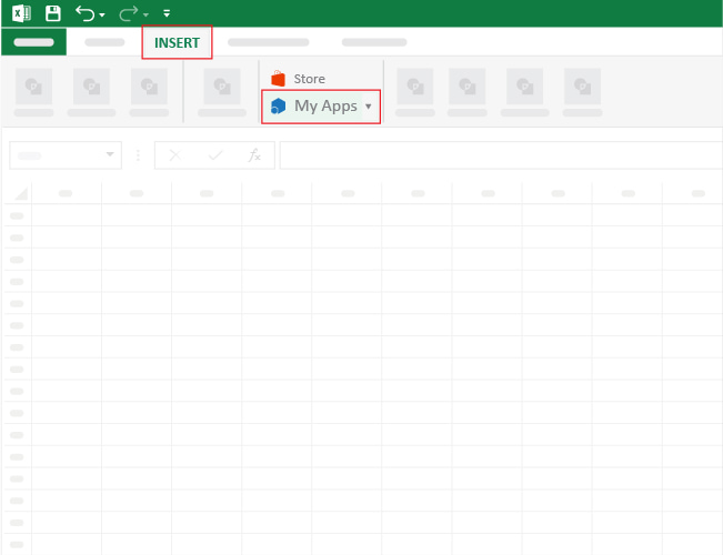
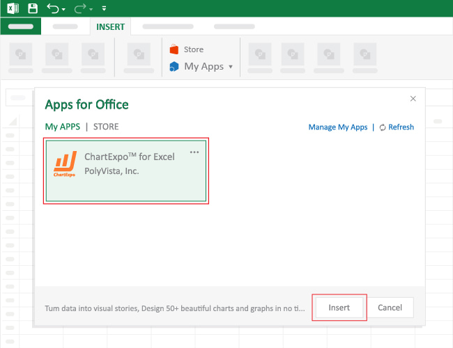
To get started with ChartExpo in Excel, follow the steps below:


You can use categorical data for survey storytelling.
Some examples of categorical variables include age group, educational level, race, sex, etc.
Categorical data analysis involves extracting insights into categorical data sets. There are multiple ways of analyzing this data type.
There’s no single best chart for visualizing categorical data variables. However, some of the best graphs for categorical data visualization include Treemap, Crosstab, Stacked Bar, and Sankey Chart.
These charts are amazingly easy to read and interpret. Besides, if you have gaming-changing tools, such as ChartExpo, you can access ready-made categorical-oriented charts.
Bar charts and pie charts are typically used to display categorical data. Bar charts compare the frequency or count of categories using bars, while pie charts show the proportions of categories as segments of a circle.
A categorical variable (also known as a nominal variable) has two or more categories. But there is no explicit ordering in the categories.
A binary data point such as a yes/no question is a categorical value with two variables: no and yes.
Hair color is a practical example of categorical data. This is because it has several categories, such as brunette, red, blonde, brown, gray, etc.
There’s no agreed way to order the hair color from highest to lowest.
One of the most straightforward analyses you can undertake is data visualization.
Some of the tested and proven charts for visualizing categorical data include: