Categories
Layered data hides insights. Numbers stacked in rows blur the bigger picture. A Treemap in Excel solves this by packing hierarchical information into nested boxes where size speaks louder than digits. Each rectangle’s area maps to a value.
Bigger boxes dominate. Smaller ones fade to the edges. Color adds another dimension, splitting categories at a glance without decoding legends. Finance teams track spending breakdowns. Product managers compare category performance. Anyone wrestling with parent-child data structures benefits.
This guide walks through creation methods, explains when these visuals work best, and shows how advanced platforms push past Excel’s basic capabilities to unlock richer analysis.
Definition: A Treemap in Excel organizes hierarchical datasets into space-filling rectangles. Each box represents a data point. Its proportional size reflects the underlying metric, like sales volume or budget allocation. Larger areas signal higher values. Tiny slivers denote minimal contributions.
This Excel Treemap chart enables simultaneous comparison across multiple tiers within constrained screen real estate. Structure and magnitude both become visible instantly. Color gradients and size differentials together eliminate the need for separate charts or pivot tables when exploring nested relationships.
This visualization format transforms sprawling, multi-layered records into digestible visual summaries. Several reasons drive adoption:
Parent-child links surface clearly, revealing how subcategories nest beneath broader groups.
Anomalies, dominant segments, and underperformers jump out without scanning rows.
Dense information occupies minimal vertical or horizontal room, avoiding scrolling fatigue.
Individual elements’ contributions to totals appear proportionally at first glance.
Multiple category tiers, values, and attributes stack into one cohesive display.
Reduces interpretation effort by converting intricate structures into intuitive shapes.
An Excel Treemap chart shines when handling structured information containing nested categorization layers. Proportional magnitude matters more than exact figures. Deploy it when you want to:
Any dataset split into parent buckets with meaningful subdivisions makes a solid candidate for a Treemap chart in Excel.
Treemap charts in Excel appear across industries for comparative insight extraction and visual storytelling.
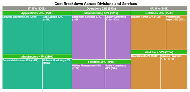
Example # 1:
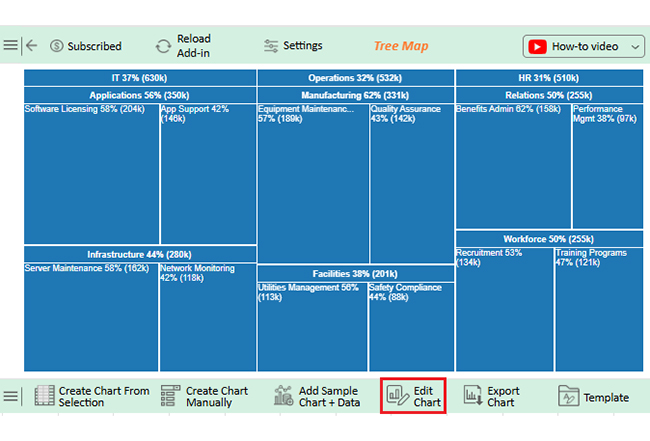
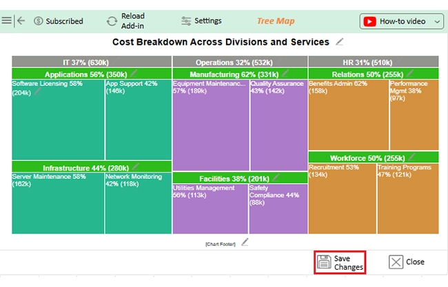
This Treemap breaks down organizational spending across IT, Operations, and HR divisions. Service areas and their proportional weight appear through percentage-driven comparisons.
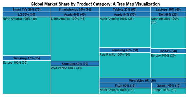
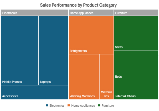
Example # 2:
Product-wise sales distribution across device types shows brand contributions and regional concentration via proportional percentages.
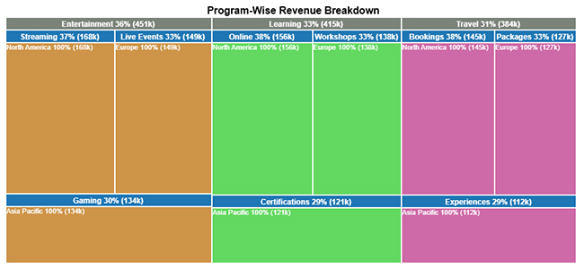
Example # 3:
Revenue streams from Travel, Entertainment, and Learning programs appear by channel and region, highlighting relative magnitudes instantly.
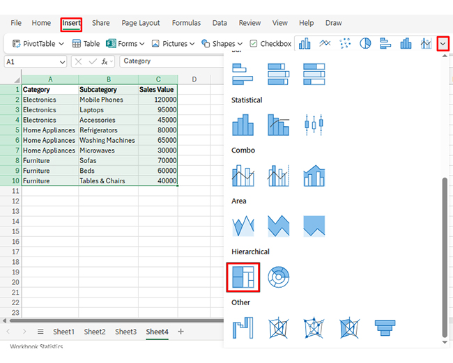
Building a Treemap in Excel gets straightforward once the data sits in proper hierarchical columns. A step-wise method ensures accurate representation of nested values and category relationships.
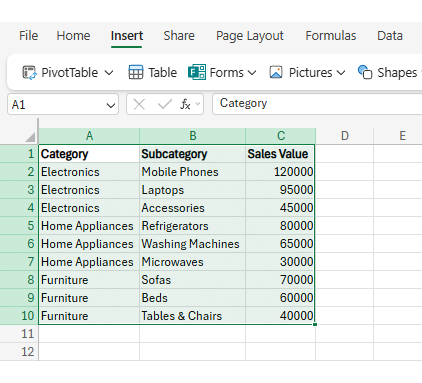
Pick data containing parent groups, child categories, and numerical metrics, similar to how to create a matrix in Excel.
Head to the Insert tab, find Hierarchy Chart, then pick Treemap from the dropdown.
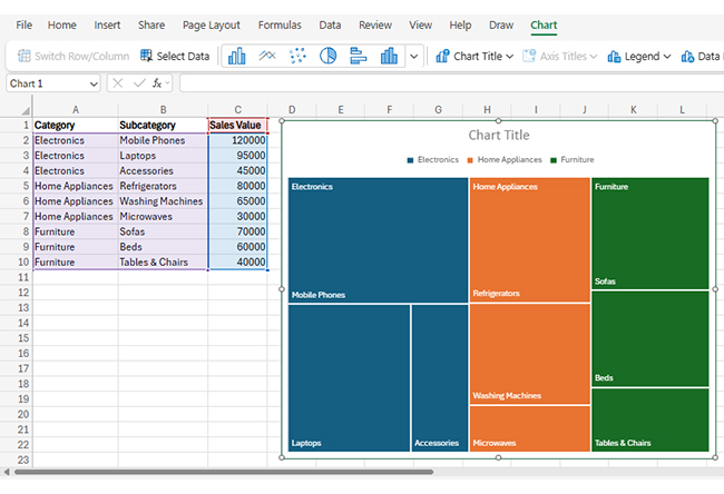
The software builds the chart automatically using your selected hierarchical structure.
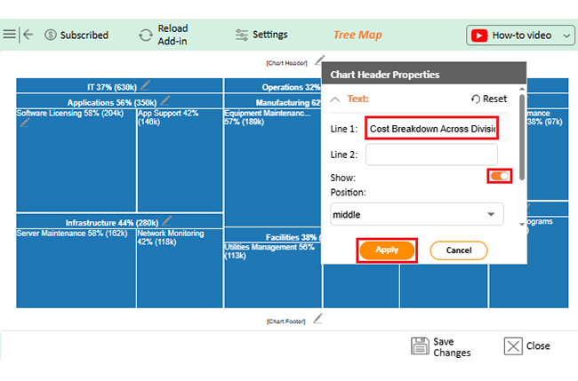
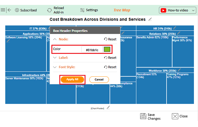
Tweak colors, text, and legends through chart formatting in Excel for improved readability.
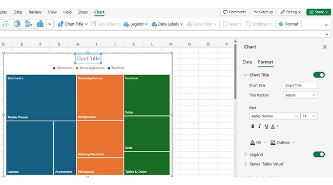
Reorder columns to refine category and subcategory display logic.
Tune fonts, spacing, and legend positioning so the Treemap communicates clearly and remains easy to scan.
Building a Treemap chart in Excel with ChartExpo brings precision, flexibility, and design smarts that native tools don’t offer. Integration happens seamlessly with spreadsheets while upgrading how hierarchical visuals emerge.
Unlike simple tools, ChartExpo turns Treemaps into interactive, dynamic graphs, sharpening insights and boosting engagement.
Why use ChartExpo?
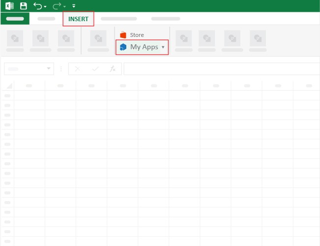
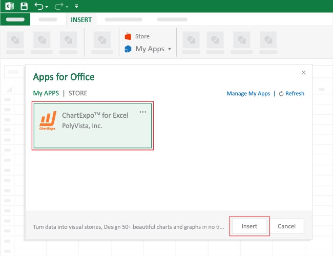
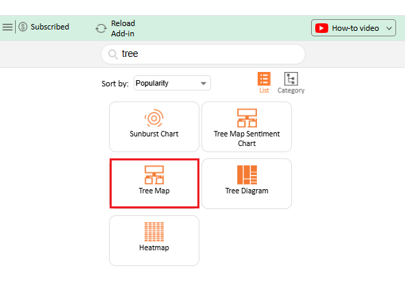
How to install ChartExpo in Excel?
ChartExpo can be used with both Google Sheets and Microsoft Excel. Follow the CTAs to install your favorite tool and create a beautiful visualization with just a few clicks directly on your favorite platform.
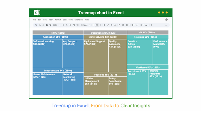
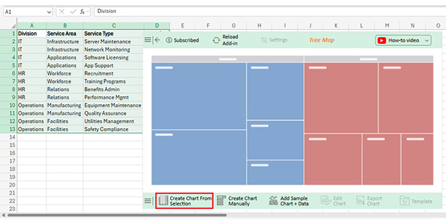
Consider we have the following data for Treemap.
| Division | Service Area | Service Type | Cost ($) |
| IT | Infrastructure | Server Maintenance | 162000 |
| IT | Infrastructure | Network Monitoring | 118000 |
| IT | Applications | Software Licensing | 204000 |
| IT | Applications | App Support | 146000 |
| HR | Workforce | Recruitment | 134000 |
| HR | Workforce | Training Programs | 121000 |
| HR | Relations | Benefits Admin | 158000 |
| HR | Relations | Performance Mgmt | 97000 |
| Operations | Manufacturing | Equipment Support | 189000 |
| Operations | Manufacturing | Quality Assurance | 142000 |
| Operations | Facilities | Utilities Management | 113000 |
| Operations | Facilities | Safety Compliance | 88000 |

This format renders sprawling, multi-tier records into digestible visual snapshots. Quick comparison, pattern spotting, and efficient analysis make it valuable for both reports and presentations.
Parent-child structures emerge plainly, showing subcategory nesting under broader classifications.
Large datasets pack into tight visual footprints without scrolling marathons.
Element contributions to aggregate totals stand out proportionally at first glance.
Trends and anomalies surface instantly without row-by-row inspection.
Extensive record sets don’t create visual clutter or comprehension barriers.
Element dimensions adjust automatically for maximum readability across screen sizes.
With smart data formatting in Excel, Treemaps stay among the strongest visualization options available.
Maximizing the effectiveness of an Excel Treemap chart demands adherence to proven practices.
Proper application of chart elements in Excel guarantees your Treemap delivers insights cleanly.
Standard Excel Treemap charts serve basic needs, but ChartExpo delivers upgraded command and adaptability.
| Feature | Native Excel Treemap | ChartExpo Treemap |
| Treemap features | Basic | Advanced |
| Customization options | Limited | Extensive |
| Color palettes | Fixed | Dynamic |
| Interactivity | Static | Interactive |
| Label adjustments/automation | Manual | Automated |
Even those unfamiliar with how to add a chart in Excel can assemble professional outputs faster using ChartExpo.
ChartExpo refines the Treemap in Excel experience by stripping away design roadblocks and adding analytical depth. Smarter color schemes, interactive exploration features, and automation slash manual tweaking time.
Generic chart maker platforms or basic toolsets can’t compete. ChartExpo targets business analysis specifically. It converts raw figures into meaningful visuals without demanding advanced design chops. Working with Excel chart templates becomes faster, yielding sharper insights wrapped in professional polish.
Enable data labels through chart settings to surface values right on rectangle surfaces.
Recent versions support native Treemap creation, particularly when working with hierarchical records.
Apply conditional color rules or tap advanced platforms like ChartExpo for automated emphasis logic.
Treemaps in Excel turn hierarchical data into a compact, easy-to-scan view where rectangle size reflects value and color highlights categories at a glance.
With a clean parent–child layout and one numeric metric, you can insert a Treemap from the Hierarchy Charts menu, then refine titles, labels, and number formats to improve readability and comparisons.
If you need deeper control—such as advanced color scaling, automated labeling, and interactive exploration—an add-in like ChartExpo can extend what native Excel offers for dashboards and presentations.
Whichever route you choose, keep hierarchies simple, avoid overcrowding, and let the chart surface the biggest contributors, outliers, and patterns that matter for decisions.
How much did you enjoy this article?


Learn how to use sparklines in Excel to quickly visualize trends inside cells. Discover types, creation steps, customization, use cases, benefits, and best practices.

Learn what a confidence interval graph is, how to create it in Excel, and how to interpret results to make more reliable, data-driven decisions.

A correlation matrix in Excel helps identify relationships between variables. Learn how to create, read, and use it for effective data analysis.


