Categories
By ChartExpo Content Team
A user flow diagram is great for mapping how visitors move through your website or app, but what if you could make it even better?
Imagine quickly spotting where users drop off, which paths are most traveled, and where they end up. Traditional user flow diagrams can show the basic steps, but they often miss the bigger picture. They give you the layout but lack the detail that drives real insight.


Here’s where an upgrade comes in. By transforming your user flow diagram, you gain a whole new view. A user flow diagram lets you visualize not just paths but the traffic volume of each one. Thicker lines show high-traffic routes, making it clear where users are headed most and where engagement drops. This lets you understand which paths work and where you can improve.
Upgrading your user flow visualization gives you more than a map; it shows a clear story of your users’ journeys. You’ll see, at a glance, which steps need adjusting and where you can guide users better.
With this approach, your user flow diagram becomes an essential tool for improving the entire user experience.
First…
Traditional user flow mapping often oversimplifies complex user journeys, losing essential nuances. These maps typically display a start-to-finish pathway, assuming users follow a single sequence of actions.
However, real-life interactions are rarely this straightforward. Users might take unexpected turns, revisit previous steps, or skip parts of the process entirely. This non-linear approach can lead to misunderstandings of user behavior and ineffective solutions.
Sankey Diagrams visually display nonlinear paths, offering a clearer view of multi-step user journey flow and interactions. Unlike traditional flowcharts, this visualization highlights the volume of movement between steps, showing where users commonly travel within an application or service.
This type of data visualization helps identify popular pathways and bottlenecks, providing insights that are crucial for optimizing user experience. By mapping multiple potential user actions at each stage, it captures the complexity of user behavior more effectively than linear maps.
When tracking a customer’s journey from their first click on your website to the point of conversion, it’s easy to get lost in the data.
Traditional flow chart diagrams often miss the mark by not highlighting the most vital actions, such as sign-up or purchase moments. This can leave significant gaps in understanding exactly where users convert and where they drop off.
Consider how standard user flow charts are set up. They provide a basic outline of user movements within a website or application but tend to gloss over the sections where critical decisions are made.
This oversight means businesses might not notice trends or patterns in user behavior that are key to optimizing the conversion process. Highlighting these moments can dramatically change how a business understands and enhances user interactions.
This is a unique visual tool that changes the game in conversion visualization. What sets it apart is its use of varying line thickness to depict the volume of user interactions.
This method makes it much easier to identify where users take significant actions. For example, a thick line leading to a sign-up form indicates high user engagement at that point, while a thinner line exiting a shopping cart might show where potential conversions are lost.
Discovering where users stop engaging is key in optimizing any business process. Often, these crucial points go unnoticed because they’re not obvious or are overlooked during data analysis.
User flow chart diagrams are fantastic tools that map out the journey of a user through an application or website.
However, they sometimes fail to highlight the exact spots where users disengage and leave the process. This oversight can lead to misunderstandings about customer behavior and needs. To combat this, it’s essential to analyze the diagrams critically and look beyond the obvious paths, scrutinizing each stage for signs of user drop-off that might not be clearly marked.
This visualization is characterized by thick lines that taper off as the volume of flow decreases. This visual approach is particularly effective in pinpointing where drop-offs occur in a process.
As users discontinue their journey, the corresponding lines become thinner, visually indicating the reduction in user engagement. This method allows businesses to quickly identify and address these critical drop-off points, making it easier to take corrective action and improve user retention.
When you’re mapping out how users interact with your service, it’s tempting to cover every possible action and decision. The more steps you add to your user flow journey diagram, the more you end up with a confusing mess.
Picture this: a map so jam-packed with routes and conditions, it looks like a city’s subway system during a power outage. Not fun, right?
Each added step piles on more complexity, turning what should be a clear visual guide into a tangled web of decisions and actions. It’s like trying to follow a recipe where every ingredient is mixed up in one bowl; how do you even start to untangle that?
Now, let’s switch gears. If the traditional user flow diagram is a tangled mess, this approach is like your calm, organized friend who has a place for everything and everything in its place. It works exceptionally well for showing multi-step processes without clutter.
Why? Because it uses branches that clearly map out each decision point and subsequent action. Imagine a flowchart that’s not only easy on the eyes but also makes sense at a glance. You get a clean, organized layout that lets you see the user’s journey from start to finish without the hassle of lines crisscrossing everywhere.
It’s like having a GPS that takes you on a scenic, traffic-free route compared to a confusing road map filled with dead ends and detours.
When businesses attempt to understand how users interact with their services, it’s crucial to have tools that can clearly map out these interactions. Traditional diagrams often fall short because they don’t provide a detailed visual of how different user groups behave across various channels.
Most traditional diagrams provide a basic overview but miss out on showing detailed patterns of behavior that differ among user segments. This lack of detail can lead to oversights in understanding user needs and improving user experiences.
What sets this visualization apart is its ability to layer flows, making it easier to spot differences in behavior among user segments. Through this approach, businesses can see not just the volume of interactions but also how these interactions vary across specific groups.
This deeper insight enables more targeted improvements in user interface and service delivery, ultimately enhancing the overall user experience.
Understanding where users start and stop their interaction in a business process is key. However, typical diagrams sometimes miss these critical spots, making it tough to see the full picture.
Often, standard diagrams don’t show the specific points where users come in or go out clearly. This can lead to confusion when trying to optimize or analyze a process.
Imagine trying to follow a recipe but not knowing when to add certain ingredients or when the cooking is done. That’s the challenge faced without clear entry and exit points in process mapping.
Here’s where this visualization really shines. It uses distinct flow lines that clearly show where users enter and exit the process. This makes it easier for anyone reviewing the process to understand how transitions occur throughout the user journey.
Think of it as a roadmap that highlights all the on-ramps and off-ramps, ensuring you don’t miss a turn or an exit.
When folks switch between devices, it throws a wrench in the works for mapping user flow diagrams. Imagine trying to follow a trail but the footprints keep changing shoes! It’s tricky to keep track of which device someone used at different stages of their journey.
This can lead to gaps in the data collected, making it hard to get a full picture of the user experience.
Picture a visualization that doesn’t just go straight down but spreads out like branches on a tree. Each branch represents a different path a user might take, from web to mobile or even tablet. The width of each branch changes based on how many users take that path, making it easy to see the most popular routes and where users tend to switch devices.
This approach makes it simple to spot trends and patterns in user behavior across different platforms.
When mapping out business processes, displaying the journey for different segments visually can be a bit tricky. Most basic user flow maps don’t do a great job at showing varied routes for distinct segments. This lack of clarity can lead to confusion, making it hard for teams to follow or optimize these paths.
A common hurdle in process mapping is the difficulty of illustrating separate paths for different user segments in a basic diagram. Typically, these maps merge several paths, muddying the visual representation.
This can obscure important nuances of how distinct user groups interact with the process, potentially leading to oversights in user experience enhancements.
What makes diagrams particularly useful in business process mapping is their capability to apply color overlays for each segment. This feature allows distinct paths to be visually differentiated, providing a clear and unified view that makes it easier to identify and analyze specific interactions within the process.
This visual differentiation aids in pinpointing inefficiencies or opportunities for optimization tailored to each segment’s unique journey through the process.
Often, when we peek at standard funnel diagrams, they seem too simple, almost elementary. They show us the start and end, but what about everything in between? That’s where the magic happens, and sadly, it’s usually missing. Let’s jazz it up a bit, shall we?
It’s easy to find funnel diagrams that look like they were drawn with a ruler: straight, predictable, and, frankly, a bit dull. They line everything up neatly, from top to bottom, but skip over the juicy details. Where’s the drama of the drop-offs? The thrill of the transitions? We need more than just a ladder of steps; we need the full story.
Imagine a visualization that swells and narrows, just like a river, guiding you through the twists and turns of user behavior. Each stage of the funnel changes in width, clearly showing where users stick around and where they take the exit ramp. Tracking the user journey has never looked this lively!
Are you finding it hard to see how different traffic sources affect user behavior on your site? You’re not alone. Many traditional diagrams just don’t make the connection clear. But let’s peel back the layers and see why this is more than just a minor hiccup.
Traditional tools often drop the ball. They show user movements and actions, alright, but when it’s time to tie these back to where the users came from, things get murky. Imagine trying to follow a trail but losing sight of the starting point; it’s frustrating, isn’t it?
It seems like a simple task: connect traffic sources to user actions. Yet, traditional diagrams often leave us scratching our heads. They’re great at mapping out the paths users take once they’re on the site.
However, linking these actions directly back to the traffic sources? That’s where they falter. It’s like having a map without a legend. Sure, you see the roads, but you’re missing the key to unlock their significance.
Think of this visualization as your GPS for mapping traffic sources. Each flow is represented as a stream, similar to an energy flow diagram, with the width corresponding to its volume. It starts with nodes (your traffic sources) and vividly captures the journey toward various user actions and behaviors on your site.
When dealing with various decision-making paths in business process mapping, the challenge is often how to do this without creating a confusing mess. Let’s be real, nobody likes a cluttered diagram! It’s like trying to read a map with too many roads marked on it — overwhelming, right?
Ever tried to make sense of a process map splattered with options like spaghetti thrown at a wall?
It’s tough! Each choice a user can make might add a new branch, and before you know it, you’re staring at a beast of a diagram that’s more puzzling than helpful. Keeping it clean without losing information is the real trick.
Imagine looking at a flow chart that not only shows you who went where but also how many went each way. Sounds handy, doesn’t it? User flow diagrams do just that, displaying the flow from one decision point to the next with varying thickness in lines representing the volume of choices.
This way, you see the main trends at a glance, without the headache of a thousand lines crisscrossing everywhere.
When we talk about standard diagrams in business process mapping, they often miss the mark on capturing the nitty-gritty of user engagement. It’s easy to get lost in the broad strokes and miss those critical details that tell us more about how users truly interact with a system or process.
This gap in high-level engagement can leave businesses without a clear understanding of where they need to focus their improvement efforts.
The typical diagrams used in mapping business processes tend to skim the surface. They show us the paths users might take but don’t delve into the emotional or psychological impact of those journeys.
They lack the finer details that give insights into user frustrations, confusions, or moments of satisfaction. Recognizing these gaps is the first step towards creating more engaging and user-friendly systems.
What sets the user flow diagram apart is its ability to visualize the flow of users’ engagement through varying thicknesses. Areas where the lines thicken indicate higher user engagement or time spent.
This visual cue helps businesses easily identify ‘engagement hotspots’—key areas where users are most active or perhaps face bottlenecks.
When you peek into the world of user flow charts, one might spot an issue: the high-traffic paths don’t jump out at you.
Imagine you’re trying to find the busiest route in a city without a map highlighting the main roads. That’s what happens here. Essential pathways that most users tread aren’t given the spotlight they deserve, making it hard for analysts to identify where the majority of traffic flows.
This lack of emphasis can lead to missed opportunities in optimizing the most frequented routes.
High-traffic paths don’t stand out in basic user flow chart diagrams.
This is a hiccup in the design that can lead to inefficiencies in understanding user behavior. If you’re overseeing a complex system, recognizing which routes are most traveled is key to enhancing user experience. However, without these pathways being made prominent, it’s like trying to find your way in a busy mall without any directory boards.
In a user flow diagram, the width of the paths changes based on the volume of traffic they receive. This approach naturally draws the eye to the busier routes, making them stand out. It’s akin to having highlighted paths in a forest, guiding you to follow where most have walked before.
By spotlighting user trends through varying widths, user flow diagrams offer a clear and immediate understanding of where the action is.
In business process mapping, clarity is king, especially when you’re tackling those tricky conditional flows.
You know the ones I’m talking about: if this happens, then that happens; but if something else happens, then it’s a whole different ballgame.
It’s like trying to follow a recipe that changes based on what’s in your fridge!
Let’s face it, conditional paths can be a real head-scratcher.
You’ve got a process that splits into two or more paths depending on certain conditions. It’s like choosing between chocolate and vanilla, but with way more at stake than just your taste buds.
If mapped unclearly, these conditions can make your process map look like a tangled mess of spaghetti that even a fork can’t handle.
A user flow diagram is like a GPS that guides you through the maze of decisions and actions with ease. With its wide branches that narrow down as choices are made, it’s perfect for showing who does what and where things split off.
It’s like watching traffic flow smoothly from a bird’s eye view; each decision point is clearly marked, showing you exactly how resources move from one action to the next.
When you’re knee-deep in business process mapping, understanding and comparing alternative journey paths can feel like trying to solve a puzzle without all the pieces. Let’s break it down!
Ever tried to compare two routes using a static user flow diagram? It can be as clear as mud. These diagrams often fail to capture the nuances between different user journeys, making it tough to pinpoint where the variations lie. It’s like trying to spot a cat in a marathon; they just don’t stand out!
A user flow diagram gives you X-ray vision: it lets you see through the clutter of overlapping paths and highlights distinct user behaviors with ease. A well-designed user flow diagram lays out all journey options side by side, making it easy to spot differences and similarities.
It’s like lining up several flavors of ice cream side by side — you can instantly see which one is chocolate and which one is vanilla!
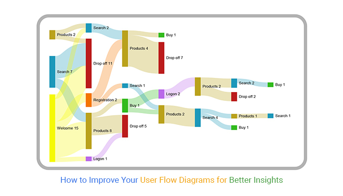
User flow diagrams are more than a map; they’re a strategic tool to understand how users navigate your site and where they might hit bumps along the way. Using a detailed user flow diagram doesn’t just organize data – it makes it meaningful. By highlighting key paths and drop-off points, these diagrams bring clarity and action to user flow analysis, letting you focus on improvements where they’ll make the biggest difference.
This approach empowers teams to communicate insights, adjust strategies, and optimize paths with precision. Whether it’s spotting drop-off points, tracking device-based behaviors, or comparing different user segments, a user flow diagram offers a straightforward, visual way to make sense of complex journeys. It’s not about adding more; it’s about making every step count.
In the end, it’s simple: a clearer user flow leads to a better user experience.
How much did you enjoy this article?


Calculate accounts receivable turnover ratio to measure credit collection speed, improve cash flow, and strengthen your financial strategy. Read on!

Change Management KPIs are the key to tracking adoption, performance, and ROI during transitions. Find out which metrics matter. Read on!

Data collection methods and techniques determine the quality of every insight you act on. Explore key approaches for gathering reliable data. Read on!


