Categories
By ChartExpo Content Team
Every business story has a pattern, and few are as revealing as the S-Curve. It’s not just a graph—it’s a mirror showing how growth unfolds over time. Whether you’re planning a product launch, tracking market adoption, or forecasting project milestones, the S-Curve gives you a clear picture of where things stand and where they’re headed.
The S-Curve highlights three distinct phases: a slow start, a rapid climb, and a leveling-off point. Each phase holds valuable insights. Why is growth sluggish at first? What drives the sharp uptick? When does momentum start to fade? These questions aren’t just academic; they’re the keys to timing your next move, whether it’s reallocating resources or introducing new strategies.


But the S-Curve doesn’t only apply to product cycles or projects. It’s your go-to tool for understanding how markets evolve, how adoption takes off, and when saturation sets in.
If you’re not using the S-Curve to map your growth, you’re missing a vital tool for decision-making. Let’s break it down, step by step, so you can put it to work.
First…
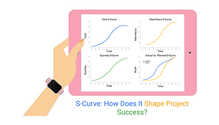
S-Curve graphs are tools that show growth over time. They start slow, speed up, and then slow down again. This shape is crucial because it helps predict how projects or markets grow. Think of it as a snapshot of expected progress or sales over a period.
It’s not just a pretty graph; it helps businesses plan resources and anticipate challenges. If you’re managing a new product launch, an S-Curve can show when you might need extra support or resources.
S-Curve graphs aren’t just theoretical; they apply to real-world scenarios. For instance, they show how technology catches on in society. At first, only a few tech enthusiasts might use a new gadget. Then, as more people see its value, usage shoots up quickly. Eventually, the market becomes saturated, and growth slows. This pattern, often analyzed using a marketing analytics platform, helps companies decide when to invest in marketing or develop new products. It’s like watching a play unfold; each act brings a different pace and set of challenges.
In the initial phase of an S-Curve, growth appears sluggish. Why does this happen, you might wonder? Well, during this slow start, businesses or technologies are still finding their footing. They’re ironing out kinks and figuring out the best strategies to grab the market.
It’s a bit like a new runner on the block, pacing cautiously, saving stamina for the long run. They’re testing waters, understanding what works and what doesn’t—quite a tricky phase, but hey, every big player starts somewhere!
Now, here’s where the magic happens! Once past the teething problems, we hit a phase of exponential growth. Think of it as a snowball rolling down a snowy hill, gathering more snow and momentum as it rolls. This stage, often visualized with an exponential growth chart, is when businesses or technologies start to see rapid acceptance and success.
It’s vital here to keep the momentum going. Think on your feet, act fast, and make the most of this growth spurt. It’s the perfect time to expand, invest, and maybe even take some bold risks, guided by risk analysis to ensure informed decision-making.
After the rush of the growth phase, things start to level off. It’s called the plateau. Imagine a runner who has sprinted and now slows down to catch a breath. It’s not necessarily a bad thing. This phase is about stability.
The key here is to sustain what you’ve built. It’s time to innovate within, improve the existing processes, and maybe find new avenues to keep the engine running. It’s about smart thinking and strategic planning to maintain your position and prepare for the next big leap.
In the context of product lifecycles, S-Curve graphs illustrate the introduction, growth, and maturity stages. Initially, growth is slow as the product gains awareness. The curve then steepens as adoption increases rapidly, before flattening again as the market saturates.
S-Curve graphs provide valuable insights into market adoption rates. By analyzing the curve, businesses can identify how quickly their product is being adopted and compare this pace to previous products or competitors’ products.
When an S-Curve graph begins to plateau, it indicates that the market is becoming saturated. This is a critical signal for businesses to start innovating or diversifying their offerings to maintain growth momentum.
Advanced S-Curve Analysis is a tool that helps businesses predict and manage growth. It shows the growth of revenue or productivity against time, providing a visual analytics representation of growth stages: introduction, growth, maturity, and decline. Decision-makers use this graph to plan strategies at each phase, ensuring they maximize gains and minimize risks.
Inflection points on an S-Curve graph indicate where the rate of growth changes. These points are significant for businesses as they signal the need for changes in strategy. Spotting these points early can give a business a competitive edge, allowing timely adjustments before market shifts become too challenging.
Using S-Curve projections to assess growth potential involves analyzing and interpreting data from the maturity stage of a product or service. If the curve shows a slow growth rate, it might suggest that the market is saturated. On the other hand, a steep growth curve can indicate untapped potential and the possibility for aggressive expansion strategies.
Comparing S-Curve graphs of competitors provides insights into their growth strategies and market position. By conducting competitive analysis through these curves, a company can identify which competitors are gaining market share and at what growth stage they are. This comparison helps businesses adjust their strategies to address competitive threats or to capitalize on competitors’ weaknesses.
First off, simplicity is your friend. Cluttered graphs confuse more than they clarify. Stick to minimal colors—maybe one for actual progress and another for planned. Consistency in your color scheme across data presentations keeps your audience tuned in without getting lost.
Grid lines? Keep them light; they’re guides, not the main event.
Labels need to be clear and positioned where they don’t overlap with your data points. Ever tried reading a graph with labels jumbled all over? It’s a headache no one needs. And speaking of labels, make sure they’re big enough to read but not so big they take over.
Scaling can make or break your S-Curve graph. If the scale is too broad, important nuances in the data might get lost. Too narrow, and the graph could exaggerate minor fluctuations, causing unnecessary alarm or optimism. Aim for a balanced scale that reflects true progress while highlighting critical milestones.
Labels are signposts; they guide your viewers through the data. Dates and percentages are typical on S-Curves, but keep them sparse. Overlabeling is like over-talking; it drowns out the main message. Highlight only the key points like project start and end dates, major milestones, and critical shifts in progress. This approach is especially useful when working with project status reports, ensuring clarity and focus on the most important details.
Not all stakeholders digest data the same way. Some might prefer detailed breakdowns, while others want broad strokes. Customizing your S-Curves to fit your audience can change a standard presentation into a powerful communication tool.
For the tech-savvy crowd, incorporate more detailed data markers or advanced statistical overlays. But for high-level viewers, streamline. Focus on big milestones and overall trends. What’s the big picture? That’s what they care about.
And remember, the goal isn’t just to show data; it’s to tell a story. Make sure that story is clear, engaging, and tailored to the needs of your audience. That way, your S-Curve graph becomes more than just numbers—it becomes a narrative of progress.
The following video will help you create a Multi-Axis Line Chart in Microsoft Excel.


The following video will help you to create a Multi-Axis Line Chart in Google Sheets.
Using S-Curve graphs to assess customer acquisition strategies allows businesses to see how effectively they’re attracting new customers.
If the curve shows a rapid ascent, it suggests that strategies are working and customer interest is high.
Conversely, a flat curve might indicate it’s time to rethink the approach. This visual tool helps refine tactics to boost customer engagement and conversion rates.
S-Curve graphs split campaign performance into distinct phases: introduction, growth, and maturity.
Analyzing these can highlight when a campaign is gaining traction or has peaked. Marketers can pinpoint successful elements of a campaign during the growth phase and identify areas for improvement in future campaigns. This phase-focused analysis aids in optimizing marketing efforts for better results.
With insights from S-Curve graphs, planning future marketing efforts becomes more data-driven. Understanding the lifecycle stage of a product or service helps in forecasting future trends and preparing appropriate marketing strategies.
If a product is at the growth phase, marketers might plan aggressive promotional activities. For mature products, they might explore rejuvenation strategies or developing new markets.
S-Curve graphs are a staple in project management. They map the progress of a project against time, providing a visual representation of growth, struggles, and plateaus.
Imagine your project as a journey where your progress speeds up, slows down, and sometimes levels off. That’s what an S-Curve helps you see at a glance.
By using S-Curve graphs, project managers can pinpoint exactly where they are in relation to planned milestones.
If your project is a train ride, think of S-Curves as the stations along the way. You can check if you’re arriving on time or if you’re behind schedule, allowing for quick adjustments. It’s like having a roadmap that tells you when to speed up or slow down.
The shape and trajectory of an S-Curve can reveal potential delays and risks before they become bigger problems.
If the curve flattens out when it should be climbing, it’s a sign that the project might be stalling. It’s similar to a weather forecast for your project, helping you prepare and adjust before the storm hits.
Resource allocation is crucial for keeping a project on track. S-Curves provide insights into which phases of the project will require more resources. It’s like knowing in advance which parts of a marathon will be the toughest, so you can plan where to have water stations ready for your runners.
This foresight helps in maximizing efficiency and ensuring that resources are used effectively, without waste.
S-Curve graphs are fascinating tools in the technology sector, particularly when examining how new tech gains traction.
Picture a new gadget hitting the market. Initially, only a few tech enthusiasts might snatch it up. This slow start is the first phase of the S-Curve, known as the introduction phase.
As buzz grows and the gadget proves its worth, more folks jump on board – we’re now hitting the steep middle part of the S, the growth phase.
Eventually, the market saturates, growth levels off, and we reach the plateau at the top, the maturity phase. Through this graph, businesses can predict when to push marketing, plan for demand, or introduce upgrades.
In finance, S-Curve graphs have a knack for making sense of return forecasts.
Consider an investment in a budding industry. At first, returns might crawl as the sector finds its footing—our slow start on the S-Curve.
As the industry finds its groove and demand surges, so do the returns, climbing that steep curve.
But every boom has its peak. Once the industry matures, growth in returns slows, and the curve levels off. Investors use this model to decide when to dive in when to hold on, and when it might be time to cash out.
Healthcare professionals often turn to S-Curve graphs to predict how diseases progress over time. Let’s break down a scenario.
A new disease emerges. Initially, cases might trickle in slowly, the flat start of our S-Curve.
As the disease spreads and transmission increases, we see a sharp rise in cases—the steep ascent of the curve.
Eventually, as measures control the spread or a population achieves immunity, new cases plateau.
This model helps public health officials anticipate resource needs, like hospital beds or vaccines, and implement timely interventions.
Scaling and labeling your S-Curve accurately is vital. Often, people scale their graphs without considering the range of their data, leading to compressed or stretched curves that misrepresent the growth trends.
Start by ensuring your axes correctly represent the data range you’re working with. Labels are just as important; they must be clear and precise. Each axis should be labeled with the right terms and units, making the graph easy to understand at a glance.
The plateau phase, where the curve starts to level off, is often misunderstood. Many assume that once the curve flattens, growth has stopped.
However, this phase can indicate that the market is saturated or that most of the potential growth has been achieved, not that it’s completely halted. Recognizing this can help you make more data-driven decisions about whether to invest further or to start exploring new opportunities.
Data noise is random variability in data that isn’t part of the actual signal. It can make it tough to interpret S-Curve graphs accurately. To handle this, use smoothing techniques that help clarify the true signal of your data.
This approach can reveal the actual trends hidden beneath the noise, allowing for a more accurate interpretation of the S-Curve.
When we look at how things grow or change over time, the models we use can shape our understanding. Two common types are the S-Curve and Linear growth models. The S-Curve, shaped like the letter “S,” shows a slow start, rapid growth in the middle, and then a leveling off. On the other hand, Linear growth is straight and consistent, with equal growth over time.
In the real world, not much grows at a constant rate, which is why S-Curve graphs often give us a better picture. They mimic the actual process of growth in many natural and human-made systems.
For example, when a new product hits the market, it usually starts slow, speeds up once it gains popularity, and finally slows down as the market saturates. This pattern is a classic S-Curve, not just a straight line.
It’s like watching a plant grow; it doesn’t shoot up overnight but gradually picks up speed as it matures.
Choosing between a Linear and an S-Curve model depends on what you’re studying. Use a Linear model when growth is expected to be consistent. It’s great for things that don’t have many ups and downs. Think of adding a fixed number of new customers every month.
However, switch to an S-Curve model when the growth rate isn’t uniform, like in the launch of a new tech gadget or the spread of a viral video. It helps you plan better by showing how things speed up and slow down, giving you insights on when to push harder and when to expect a plateau.
Resource allocation gets smarter with S-Curve insights. In the early phase, investing heavily might not yield immediate results. However, as the curve slopes upward, it’s time to push resources to maximize growth. Once the curve flattens, the focus should shift to maintaining and optimizing gains rather than high spending.
Each phase of the S-Curve holds unique opportunities. Initially, the focus should be on research and development. Midway, as growth accelerates, it’s crucial to focus on scaling operations efficiently. In the maturity phase, it’s all about refining processes and finding new markets to sustain the business.
Revenue peaks can be predicted with S-Curve graphs. By analyzing past cycles, businesses can forecast future peaks. This allows for strategic planning in marketing, production, and finance to capitalize on high-growth phases and prepare for slower growth periods.
When dealing with S-Curve graphs, smoothing and refining are key steps to boost their accuracy. To start, smoothing involves using statistical methods to reduce noise from data points. This method ensures that the S-Curve represents underlying trends more faithfully rather than noisy fluctuations. Common techniques include moving averages or exponential smoothing, where recent data points carry more weight.
Refining, on the other hand, involves tweaking the S-Curve model to better fit specific data sets. This might include adjusting the parameters of the curve, such as the growth rate or saturation point, based on new data or expert feedback. The goal here is to tailor the curve so that it not only fits past data well but also reliably predicts future trends. This process of refinement is crucial in trend analysis, helping businesses make more accurate predictions and strategic decisions based on evolving data patterns.
Cleaning noisy data is crucial for a clear and effective S-Curve visualization. The first step usually involves identifying and removing outliers that can skew the overall data analysis. Tools such as Z-scores or Box Plot IQR (Interquartile Range) can be helpful here.
Once outliers are handled, applying filters to smooth out short-term fluctuations can be useful. For instance, a rolling average filter helps by averaging data points within a specific window, which moves across the data series step by step. This process helps in highlighting the true underlying trends necessary for accurate S-Curve visualization.
Adjusting S-Curve projections based on historical trends is about learning from the past to predict the future more accurately. This involves analyzing how similar projects or phenomena have unfolded over time and applying these insights to current S-Curve models.
A practical approach is to use regression analysis to understand how key variables influenced outcomes in past S-Curve scenarios. This analysis can help in adjusting current projections to better reflect the impact of these variables. It’s about making informed guesses on future trends by looking back at how things have previously progressed.
Aligning S-Curve models with multivariate data inputs involves incorporating multiple variables into the S-Curve analysis to enhance its accuracy and relevance. This can include variables like market conditions, demographic shifts, or technological advancements that might affect the growth curve.
The process typically requires building a multivariate model where each variable’s impact is quantified and integrated into the S-Curve. Techniques such as multiple regression analysis or machine learning models can be used to determine how these variables interact with each other and how they collectively influence the S-Curve.
This alignment ensures that the S-Curve not only reflects a single trend or variable but provides a holistic view of the environment in which the curve develops.
Imagine a SaaS company struggling with customer churn. They turned to S-Curve analysis to pinpoint when customers typically lose interest. Data showed a trend: engagement drops significantly after three months. Armed with this insight, they introduced targeted engagement strategies right before the critical three-month mark.
Result? A significant uptick in retention rates, demonstrating the power of timely data analysis.
Consider a company launching several marketing campaigns simultaneously. Using S-Curve graphs, they tracked the ROI over time for each campaign. This visual representation helped identify which campaigns were performing and which were not.
The slow-starting campaigns showed a delayed but strong growth in ROI, characteristic of an S-Curve, guiding the decision to continue investment in seemingly underperforming campaigns with potential for high long-term gain.
Tech startups often experience rapid phases of growth and stagnation. By studying various startups, it was observed that successful companies anticipate and plan for each phase of the S-Curve.
For instance, a startup initially focused on user acquisition to climb the curve but shifted its focus to user retention as growth matured. This strategic shift is crucial for maintaining momentum and moving towards sustainable growth.
An S-Curve is a visual representation of growth patterns over time. It’s called an S-Curve because the graph resembles the letter “S,” starting with a slow rise, moving into a sharp climb, and leveling off eventually. This curve is essential for tracking progress, planning resources, and identifying trends in everything from product launches to market adoption. It simplifies complex growth dynamics into a clear, actionable picture.
The S-Curve is a decision-making powerhouse. It shows you where your project, product, or business stands in its lifecycle. For instance, during the steep growth phase, you know it’s time to ramp up resources or marketing. On the other hand, a plateau might signal market saturation, prompting innovation or diversification. It’s not just a graph—it’s your guide to timing and strategy.
S-Curve graphs are like GPS for project managers. They help track progress, identify delays, and allocate resources effectively. By comparing actual progress with planned milestones, managers can spot potential risks early and adjust strategies. This insight ensures smoother execution and minimizes surprises, making projects more predictable and manageable.
Absolutely. By analyzing historical data and current growth patterns, S-Curve graphs can forecast future trends. For example, a steep curve suggests untapped potential, signaling opportunities for aggressive expansion. Conversely, a plateau hints at market saturation, guiding businesses to innovate or diversify. It’s about turning past performance into future strategy.
One common mistake is misinterpreting the plateau as the end of growth rather than a shift in phase. Another is using poorly scaled graphs, which can distort data and lead to incorrect conclusions. Clear labeling, consistent scaling, and understanding the full lifecycle are key to avoiding these pitfalls. Accurate S-Curve analysis requires attention to detail and context.
Linear growth models show steady, constant growth, while S-Curve graphs reflect real-world dynamics of slow starts, rapid climbs, and eventual plateaus. For instance, a new product might have a slow uptake (flat line), gain popularity (steep curve), and then reach market saturation (level off). The S-Curve captures these nuances, making it more insightful for strategic planning.
Yes! S-Curve graphs can be tailored to suit diverse stakeholders. For technical teams, include detailed metrics and performance indicators. For executives, focus on high-level insights and trends. The key is to present the data in a way that aligns with the audience’s interests and decision-making needs, ensuring clarity and relevance for everyone.
The S-Curve isn’t just a graph—it’s a practical tool for spotting growth patterns, managing resources, and planning for the future. It lays out growth in clear phases, helping you see where you are and what’s next. From slow starts to rapid gains and steady plateaus, the S-Curve guides decisions that keep projects and strategies on track.
For businesses, it simplifies complex growth trends, ensuring decisions are tied to actual data, not guesswork. In marketing, it highlights when to push campaigns or shift focus. In project management, it’s a visual checkpoint for staying aligned with goals.
What makes the S-Curve invaluable is its ability to show not just progress but potential. It reveals when to shift gears, whether that’s scaling up, maintaining stability, or exploring new opportunities.
If you’re looking to stay ahead, make the S-Curve part of your toolkit. It’s not about trends—it’s about timing, growth, and making your next move count.
How much did you enjoy this article?


Calculate accounts receivable turnover ratio to measure credit collection speed, improve cash flow, and strengthen your financial strategy. Read on!

Change Management KPIs are the key to tracking adoption, performance, and ROI during transitions. Find out which metrics matter. Read on!

Data collection methods and techniques determine the quality of every insight you act on. Explore key approaches for gathering reliable data. Read on!


