• Home
  • Tools dropdown img
    • Spreadsheet Charts

      • ChartExpo for Google Sheets
      • ChartExpo for Microsoft Excel
    • Power BI Charts

      • Power BI Custom Visuals by ChartExpo
    • Word Cloud

  • Charts dropdown img
    • Chart Category

      • Bar Charts
      • Circle Graphs
      • Column Charts
      • Combo Charts
      • Comparison Charts
      • Line Graphs
      • PPC Charts
      • Sentiment Analysis Charts
      • Survey Charts
    • Chart Type

      • Box and Whisker Plot
      • Clustered Bar Chart
      • Clustered Column Chart
      • Comparison Bar Chart
      • Control Chart
      • CSAT Survey Bar Chart
      • CSAT Survey Chart
      • Dot Plot Chart
      • Double Bar Graph
      • Funnel Chart
      • Gauge Chart
      • Likert Scale Chart
      • Matrix Chart
      • Multi Axis Line Chart
      • Overlapping Bar Chart
      • Pareto Chart
      • Radar Chart
      • Radial Bar Chart
      • Sankey Diagram
      • Scatter Plot Chart
      • Slope Chart
      • Sunburst Chart
      • Tornado Chart
      • Waterfall Chart
      • Word Cloud
    • Google Sheets
      Microsoft Excel
  • Services
  • Pricing
  • Contact us
  • Blog
  • Support dropdown img
      • Gallery
      • Videos
      • Contact us
      • FAQs
      • Resources
    • Please feel free to contact us

      atsupport@chartexpo.com

Categories
All Data Visualizations Data Analytics Surveys
Add-ons/
  • Google Sheets
  • Microsoft Excel
  • Power BI
All Data Visualizations Data Analytics Surveys
Add-ons
  • Google Sheets
  • Microsoft Excel
  • Power BI

We use cookies

This website uses cookies to provide better user experience and user's session management.
By continuing visiting this website you consent the use of these cookies.

Ok

ChartExpo Survey


Home > Blog > Power BI

Power BI SUMIF for Advanced Reporting

The Data Analysis Expressions (DAX) is a software library that holds functions and operators that are important in streamlining the use of Power BI. With the rich DAX functions, you can create expressions that will perform complex Power BI tasks.

Power BI SUMIF

For instance, DAX functions can be used in creating an expression (formula) that reads an input statement and returns one of the specified values. Simply put, DAX can use the available data to generate new information.

In this guide, you’ll discover what the SUMIF function in Power BI is, why it is important, and the key features of DAX SUMIF functions.

Table of Contents:

  1. What is the SUMIF function in Power BI?
  2. Why is Power BI SUMIF Important?
  3. What is the Role of SUMIF in DAX?
  4. What are the Key Features of DAX SUMIF Functions?
  5. How to Use SUMIF in Power BI to Evaluate Data?
  6. Power BI SUMIF Equivalent Function: CALCULATE
  7. Power BI SUMIF Equivalent Function: FILTER
  8. How to Create a Dashboard in Power BI?
  9. What are the Benefits of the Power BI SUMIF Function?
  10. Wrap Up

First…

What is the SUMIF function in Power BI?

Power BI SUMIF function allows the user to sum values in a column based on a specified condition (or criteria). Here’s how to use the SUMIF function in Power BI:

SUMIF = SUMX(FILTER(TableName,[CriteriaColumn] = “Condition”),[SumColumn])

  • TableName: This is the name of the table that contains the data you want to evaluate.
  • [CriteriaColumn]: This is the column that contains the criteria (or conditions) you want to apply.
  • “Condition”: This is the specific value (or condition) you want to filter on.
  • [SumColumn]: This is the column that contains the values you want to sum based on the condition.

Why is Power BI SUMIF Important?

SUMIF function in Power BI helps to streamline data analysis and reporting processes. It also provides users with a powerful tool to extract valuable insights from complex datasets. Since it allows users to aggregate data based on specific conditions (or criteria), that helps to boost the accuracy, efficiency, and relevance of analytical tasks.

Furthermore, SUMIF facilitates conditional aggregation — and that comes in handy when analyzing and interpreting data in context. SUMIF enables the user to tailor their analyses to meet specific business requirements.

What is the Role of SUMIF in DAX?

SUMIF function in DAX helps to aggregate data based on specified conditions (or criteria). The SUMIF function in DAX, just like its counterpart in Excel, allows users to sum values from a column that meets certain criteria and also filters the data as needed.

What are the Key Features of DAX SUMIF Functions?

  • Measures: Measures are dynamic expressions for calculation stored in the DAX Function library. The Measure result transforms based on the input data’s context. You can create Measures from the DAX formula bar present on the model designer. You can also move measures between tables without causing any loss of functionality.
  • Calculated Columns: Calculated columns store the computational results obtained by performing operations on two or more columns during a data refresh. Calculated columns are created to perform row-level calculations and build an output column in the table. The feature consumes RAM (Random Access Memory), and it should not be implemented during the production stage.
  • Row-level Security: DAX Functions maintain the row-level security of the Power BI tables. That is, all DAX evaluations provide only a boolean result (True or False). This allows the row set to be created at once and no other users are allowed to access it. Moving on, DAX depends upon filters to keep the currently active relationship safe.
  • High Performance: DAX functions provide fast data processing and intelligent dashboards. It upgrades the calculations in Power BI and ensures efficient querying of data. You can connect Power BI with external sources and directly implement DAX functions on source data.

How to Use SUMIF in Power BI to Evaluate Data?

In this section, you’ll sum up subjects with higher than 15 midterm marks. You can obtain the results using the following Power BI SUMIF functions:

  • Power BI SUMIF Equivalent Function: CALCULATE
  • Power BI SUMIF Equivalent Function: FILTER.

Power BI SUMIF Equivalent Function: CALCULATE

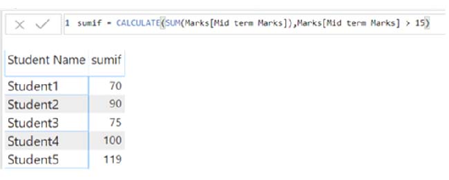
The CALCULATE Function in Power BI DAX helps in achieving accurate results from complex calculations. For instance, CALCULATE can be used as a Power BI SUMIF equivalent function:

sumif = CALCULATE(SUM(Marks[Mid term Marks]),Marks[Mid term Marks] > 15)

The above syntax of SUMIF in Power BI uses at least two parameters:

  • Expression: From the formula above, the first parameter is an expression showing the addition process as “SUM(Marks[Mid term Marks]).” The expression aggregates the midterm marks for all students.
  • Filter: The filter plays a crucial role when applying the conditional aspect of the SUMIF Function. You’ll have to calculate the total midterm marks for subjects that come under the condition “Marks[Mid term Marks] > 15.

The image below shows the output of the Power BI SUMIF equivalent CALCULATE Function.

Image Below Shows Output of Power BI SUMIF

Power BI SUMIF Equivalent Function: FILTER

The FILTER Function is another equivalent of the SUMIF Power BI. It’s a table-based function that returns a table as output.

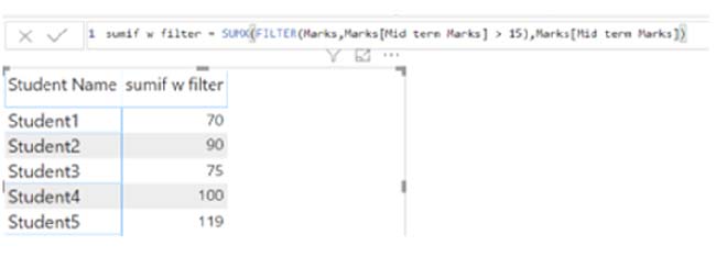
sumif = SUMX(FILTER(Marks,Marks[Mid term Marks] > 15),Marks[Mid term Marks])

The Power BI SUMIF equivalent FILTER Function above uses two parameters:

  • Table: The first parameter is a table that the user can input in the form of a complete Table (or as a single-column Table) with the help of the “All()” function in DAX. The SUMX Function in the expression above requires a Table as the first parameter.
  • Filter: The “FILTER(Marks, Marks[Mid term Marks] > 15)” parameter uses the FILTER Function to aggregate midterm marks only for subjects having marks higher than 15.

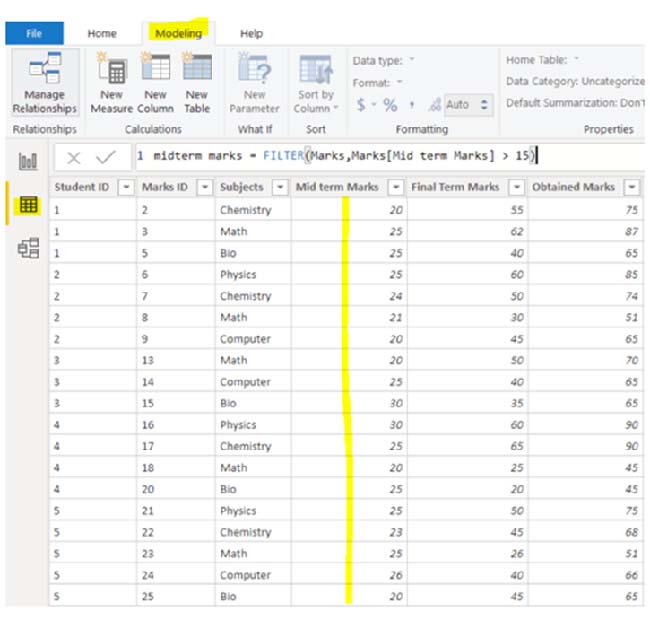
The first step involves clicking the modeling tab at the top to generate an input Table. After that, select the “New Table” option. Using the FILTER Function, you will generate a table similar to the one below:

Use Filter Function for Doing Power BI SUMIF

Using the table as input to the SUMX Function, you’ll have to drag the measure “sumif w filter” onto the report. Use the SUMX Function to a result similar to the one below:
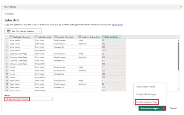
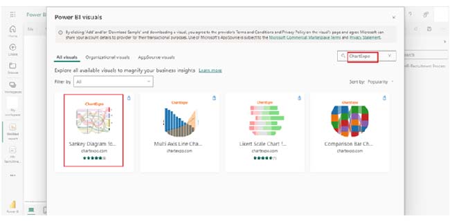
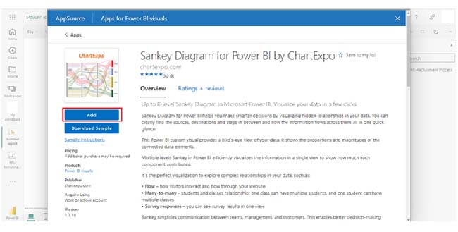
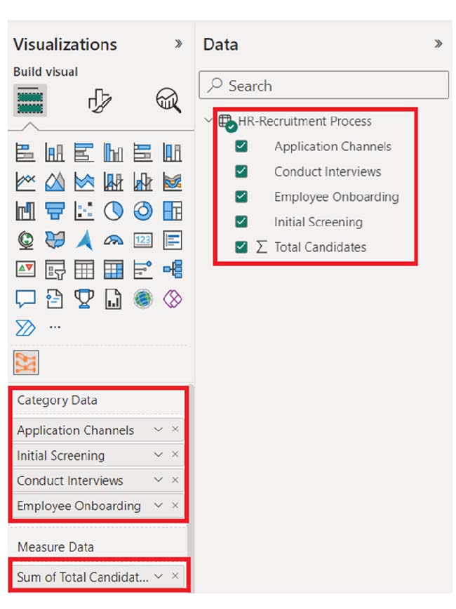
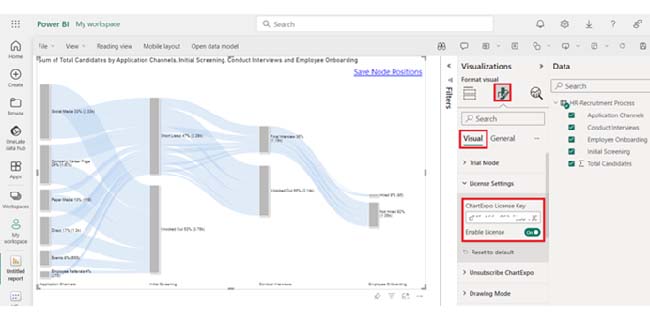
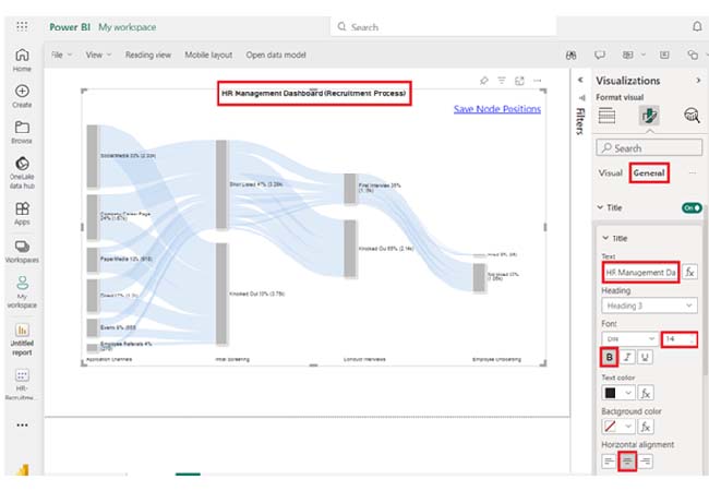
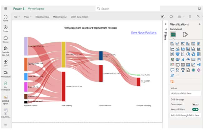
Use SUMX Function to Result Similar for Doing Power BI SUMIF

How to Create a Dashboard in Power BI?

Stage 1: Log into Power BI, enter your email, and click “Submit.”

  • Log in to Power BI.
  • Enter your email address and click the “Submit” button.
Enter email to login to Power BI
  • You are redirected to your Microsoft account.
  • Enter your password and click “Sign in“.
Enter Password to login to Power BI
  • You can choose whether to stay signed in.
Click on stay signed in
  • Once done, the Power BI home screen will open.

Stage 2: Create a Data Set and Select the Data Set to Use in the Sankey Chart

  • Go to the left-side menu and click the “Create” button.
  • Select “Paste or manually enter data“.
select Paste or manually enter data in Power BI ce487
  • We’ll use the sample data below for this example.
Application Channels Initial Screening Conduct Interviews Employee Onboarding
Total Candidates
Social Media Short Listed Final Interview Hired 32
Social Media Short Listed Final Interview Not Hired 400
Social Media Short Listed Knocked Out 800
Social Media Knocked Out 1100
Company Career Page Short Listed Final Interview Hired 20
Company Career Page Short Listed Final Interview Not Hired 250
Company Career Page Short Listed Knocked Out 500
Company Career Page Knocked Out 900
Events Short Listed Final Interview Hired 5
Events Short Listed Final Interview Not Hired 100
Events Short Listed Knocked Out 200
Events Knocked Out 350
Paper Media Short Listed Final Interview Hired 3
Paper Media Short Listed Final Interview Not Hired 80
Paper Media Short Listed Knocked Out 135
Paper Media Knocked Out 700
Employee Referrals Short Listed Final Interview Hired 10
Employee Referrals Short Listed Final Interview Not Hired 70
Employee Referrals Short Listed Knocked Out 80
Employee Referrals Knocked Out 110
Direct Short Listed Final Interview Hired 25
Direct Short Listed Final Interview Not Hired 150
Direct Short Listed Knocked Out 425
Direct Knocked Out 600
  • To add data to the report, you’ll have to paste the data table above into the “Power Query” window. Next, select the “Create a dataset only” option.
Select Create a Dataset Only After Doing Power BI SUMIF
  • Navigate to the left-side menu, and click on the “Data Hub” option. Power BI will populate the data set list. If no data set has been created, you’ll get an error message.
Click on Data Hub Option After Doing Power BI SUMIF
  • Click on the “Create report” dropdown.
Click on Create Report After Doing Power BI SUMIF
  • To add the Power BI Sankey Diagram Extension by ChartExpo, you’ll have to create the Sankey Diagram using an add-in or Power BI visual from AppSource. Navigate to the right side of the Power BI dashboard, and open the Power BI Visualizations panel. Click the ellipsis symbol (…) to import the Power BI Sankey Diagram extension by ChartExpo. In the following menu that opens, select the “Get more visuals” option.
Select Get More Visuals After Doing Power BI SUMIF
  • Enter “ChartExpo” in the highlighted search box. You’ll see the “Sankey Diagram for Power BI by ChartExpo” as shown below.
Enter ChartExpo in Highlighted Search Box After Doing Power BI SUMIF
  • After that, click on the Sankey Diagram and also click the highlighted “Add” button.
Click Add Button After Doing Power BI SUMIF
  • Power BI will add the “Sankey Diagram for Power BI by ChartExpo” icon in the visualization panel.
Add Sankey Diagram Icon in VIsualization Panel After Doing Power BI SUMIF
  • To draw a Sankey Diagram with ChartExpo’s Power BI extension, you’ll have to select the “Sankey Diagram for Power BI by ChartExpo” icon in the visualization panel. A window similar to the one below will open in the report section of your dashboard.
Open in Report Section of Your Dashboard After Doing Power BI SUMIF
  • Follow the sequence below when selecting the fields to use in the Sankey chart.
Sekect Fields to Use in Sankey Chart After Doing Power BI SUMIF
  • You’ll have to provide your email address or the ChartExpo license key. Add the key under the Visual section. After that, the Sankey Chart will be displayed on your screen.
Provide License Key After Doing Power BI SUMIF
  • Navigate to the General section to add the top header text in the chart.
Navigate to General Section After Doing Power BI SUMIF
  • Here’s the final look at the HR Dashboard in Power BI using ChartExpo.
Final Power BI SUMIF

Insights:

  • Social Media has the highest number of candidates across all stages. That indicates strong outreach and high competition. Most candidates are knocked out in the initial screening stage.
  • Across all channels, the ratio of candidates hired to the total candidates is relatively low, and that indicates a competitive selection process. It also shows high hiring standards.
  • Direct channels and Employee Referrals have a lower proportion of candidates knocked out initially, and that indicates higher quality referrals (or direct applicants).

Improving Business Insights with Power BI SUMIF and Charts:

  1. Open your Power BI Desktop or Web.
  2. From the Power BI Visualizations pane, expand three dots at the bottom and select “Get more visuals”.
  3. Search for “Sankey Chart by ChartExpo” on the AppSource.
  4. Add the custom visual.
  5. Select your data and configure the chart settings to create the chart.
  6. Customize your chart properties to add header, axis, legends, and other required information.
  7. Share the chart with your audience.

The following video will help you create a Sankey Chart in Microsoft Power BI.

What are the Benefits of the Power BI SUMIF Function?

Here are some benefits of the Power BI SUMIF function:

  • DAX library opens the users up to advanced Power BI features. For instance, the users can perform dynamic data manipulations through select, filter, join, and other commands.
  • DAX helps to make Power BI Dashboards smart. This is done by implementing calculated columns, and Power BI Measures put constraints on the data fetched by the dashboard.
  • DAX uses a collection of nested filter contexts to carry out performance optimization. Therefore, DAX functions help you build an optimal thinking pattern for creating tables and filtering data.

FAQs

Is there a SUMIF function in Power BI?

Power BI doesn’t come with a built-in SUMIF function like Excel. However, you can achieve similar functionality using DAX expressions like FILTER and SUMX.

How do you sum a column based on a condition in Power BI?

To sum a column based on a condition in Power BI, use DAX expressions like FILTER and SUMX. Specify the condition within the FILTER function to dynamically aggregate the data.

How do I sum all values in a column in Power BI?

The SUM function is used to sum all values in a column in Power BI. It is followed by the column name enclosed in square brackets ([]), like SUM([ColumnName]).

Wrap Up

The Power BI SUMIF function is achieved through DAX expressions like FILTER and SUMX. It gives room for conditional aggregation, enhanced data analysis, and dynamic filtering. Users use it to extract insights from data.

But why should you use the Power BI SUMIF function? Well, it opens you up to the world of advanced Power BI features. With the Power BI SUMIF function, you can perform dynamic manipulations like join, select, filter, and other commands.

It also makes the Power BI dashboards smart. A correct DAX expression can optimize your latency and fulfill data processing tasks.

Finally, your DAX experience sharpens your thinking and enables you to find better solutions when it comes to operations like filter, merge, and data manipulation.

Now you know what the Power BI SUMIF function is, how will you incorporate it into your data analytic process?

How much did you enjoy this article?

PBIAd1
Start Free Trial!
146711

Related articles

next previous
Power BI12 min read

Power BI Group By Guide for Effective Data Insights

Learn how Power BI Group By helps you aggregate data, clarify trends, and create reports by grouping values to make large datasets manageable & insightful.

Power BI12 min read

How to Create Sankey Diagram in Microsoft Power BI?

Learn How to Create Sankey Diagram in Microsoft Power BI using Desktop & Web Service. What they are and how to use them effectively.

Power BI8 min read

Power BI Artificial Intelligence: Insights Using Visuals

Discover all there is to know about the Power BI artificial intelligence. You'll also discover how AI is used in Power BI, and how to use it for analysis and more.

Power BI9 min read

Budgeting in Healthcare: Use Visuals to Spot Budget Gaps

This guide helps you discover what budgeting in healthcare is. You'll also discover the factors that affect hospital budgets and types of budgeting in healthcare.

Power BI9 min read

Predictive Analytics in Power BI for Making Insightful Visuals

This guide shows you everything you need to know about Predictive Analytics in Power BI. It also shows you how it works, and how to interpret the results.

ChartExpo logo

Turn Data into Visual
Stories

CHARTEXPO

  • Home
  • Gallery
  • Videos
  • Services
  • Pricing
  • Contact us
  • FAQs
  • Privacy policy
  • Terms of Service
  • Sitemap

TOOLS

  • ChartExpo for Google Sheets
  • ChartExpo for Microsoft Excel
  • Power BI Custom Visuals by ChartExpo
  • Word Cloud

CATEGORIES

  • Bar Charts
  • Circle Graphs
  • Column Charts
  • Combo Charts
  • Comparison Charts
  • Line Graphs
  • PPC Charts
  • Sentiment Analysis Charts
  • Survey Charts

TOP CHARTS

  • Sankey Diagram
  • Likert Scale Chart
  • Comparison Bar Chart
  • Pareto Chart
  • Funnel Chart
  • Gauge Chart
  • Radar Chart
  • Radial Bar Chart
  • Sunburst Chart
  • see more
  • Scatter Plot Chart
  • CSAT Survey Bar Chart
  • CSAT Survey Chart
  • Dot Plot Chart
  • Double Bar Graph
  • Matrix Chart
  • Multi Axis Line Chart
  • Overlapping Bar Chart
  • Control Chart
  • Slope Chart
  • Clustered Bar Chart
  • Clustered Column Chart
  • Box and Whisker Plot
  • Tornado Chart
  • Waterfall Chart
  • Word Cloud
  • see less

RESOURCES

  • Blog
  • Resources
  • YouTube
SIGN UP FOR UPDATES

We wouldn't dream of spamming you or selling your info.

© 2025 ChartExpo, all rights reserved.