Categories
Interpreting data in Power BI is such a daunting task. To get the most out of this tedious process, you should have a good grasp of Power BI edit interactions. The Power BI edit interactions help you to edit your interactions for a more impactful and cohesive visual representation.


This guide shows you how to effectively edit interactions in Power BI. You’ll also discover types of Power BI visual interaction, and common mistakes to avoid.
First…
Definition: Reports always come with visual elements and these visual elements can be manipulated and connected using interactions in Power BI. Data manipulation could be in the form of highlighting, filtering, and interacting with elements in the data. Interactions in Power BI help in analyzing data and gaining useful insights. It enhances the user experience and offers dynamic ways of exploring the data.
Interactions in Power BI help users to analyze and explore their data. With interactions, users can easily establish relationships between multiple visual elements like tables and charts. This will, in turn, lead to a more robust understanding of the data.
Furthermore, interactions improve the overall user experience. To get the most out of your Power BI edit interactions, you’ll have to:
Having access to edit a report is a prerequisite to enabling visual interaction control. Enabling the visual interaction control helps you customize how the highlight and filter features work on your report. Here are easy steps to help you get started.
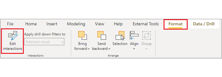
When it comes to Power BI visual interactions, there are options for the designer to either turn the visual interactions on or off. The designer can also manipulate the visual using visual interactions like cross-highlighting, cross-filtering, or drilling behavior.
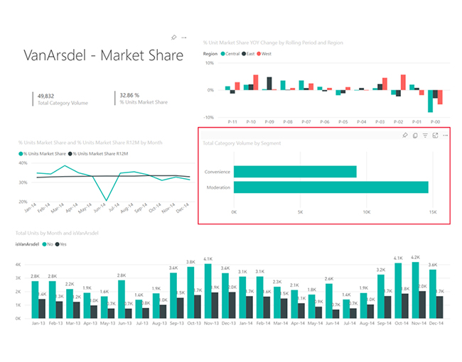
Cross-filtering and cross-highlighting show you how a value in one data contributes to the other. The report pages below show a pictorial representation of cross-filtering and cross-highlighting. The values found in the Total Category Volume by Segment are Convenience and Moderation.
Moderation is selected in the image below.
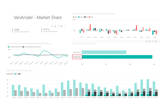
Since Moderation is the selected value on a bar chart, you’ll notice:
Here are steps to help you during the Power BI edit interactions.
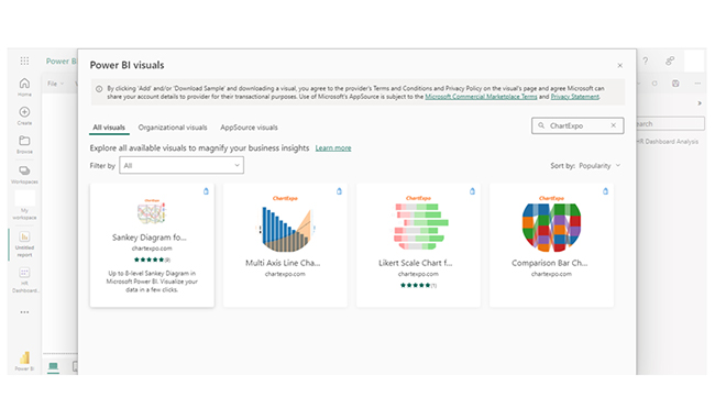
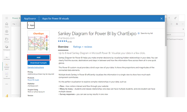
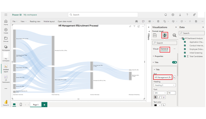
Explore the demo of the Sankey plot for the Power BI app here:
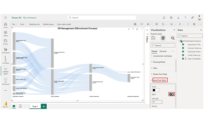
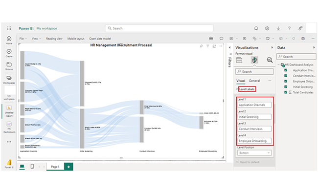
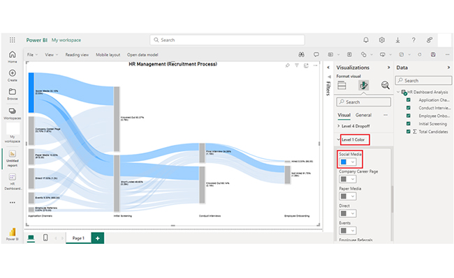
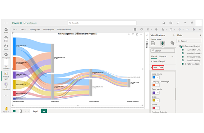
Analyzing visual interactions becomes easier with the Sankey chart in Power BI, as it clearly shows relationships between data points.
Stage 1: Logging in to Power BI


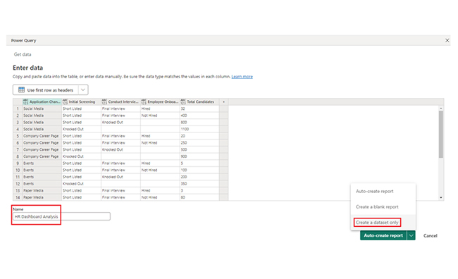
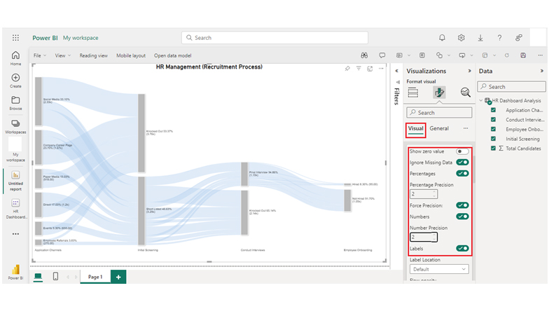
| Application Channels | Initial Screening | Conduct Interviews | Employee Onboarding | Total Candidates |
| Social Media | Short Listed | Final Interview | Hired | 32 |
| Social Media | Short Listed | Final Interview | Not Hired | 400 |
| Social Media | Short Listed | Knocked Out | 800 | |
| Social Media | Knocked Out | 1100 | ||
| Company Career Page | Short Listed | Final Interview | Hired | 20 |
| Company Career Page | Short Listed | Final Interview | Not Hired | 250 |
| Company Career Page | Short Listed | Knocked Out | 500 | |
| Company Career Page | Knocked Out | 900 | ||
| Events | Short Listed | Final Interview | Hired | 5 |
| Events | Short Listed | Final Interview | Not Hired | 100 |
| Events | Short Listed | Knocked Out | 200 | |
| Events | Knocked Out | 350 | ||
| Paper Media | Short Listed | Final Interview | Hired | 3 |
| Paper Media | Short Listed | Final Interview | Not Hired | 80 |
| Paper Media | Short Listed | Knocked Out | 135 | |
| Paper Media | Knocked Out | 700 | ||
| Employee Referrals | Short Listed | Final Interview | Hired | 10 |
| Employee Referrals | Short Listed | Final Interview | Not Hired | 70 |
| Employee Referrals | Short Listed | Knocked Out | 80 | |
| Employee Referrals | Knocked Out | 110 | ||
| Direct | Short Listed | Final Interview | Hired | 25 |
| Direct | Short Listed | Final Interview | Not Hired | 150 |
| Direct | Short Listed | Knocked Out | 425 | |
| Direct | Knocked Out | 600 |
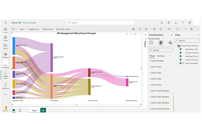
Here are some insights you’ll get from the Power BI with ChartExpo.
Unlock the full potential of your Power BI dashboards with the Edit Interactions feature in this hands-on tutorial. This powerful tool allows you to control how charts and graphs respond to user selections, creating tailored, interactive visualizations that enhance data exploration. Whether you’re filtering data across multiple visuals, focusing on specific metrics, or customizing report behavior, mastering Edit Interactions ensures your dashboards tell a cohesive and meaningful story. With precise control over visual interactions, you can drive better insights, improve usability, and deliver impactful presentations that resonate with your audience.
Here are some tips to help you through your Power BI edit interactions.
Here are mistakes to avoid during Power BI edit interactions.
Deleting interactions in Power BI is quite simple. Right-click on your visual, and choose “Edit interactions.” Next, select the icon that’s next to the visual the interaction will be removed from. After that, select “None.”
Power BI edit interactions help users determine how visuals interact with one another in the report. It specifies the visual that highlights, filters, or has no interaction with the other visual.
Edit interactions in Power BI enable users to determine how visuals within a report interact with one another. It determines if a visual highlights, filters, or records no interaction with the other visual in the report.
Power BI edit interactions show how users’ actions affect how visuals within a report interact with each other. It’s a significant piece of data exploration and it enables users to highlight (or filter) multiple visuals within a report. This will, in turn, help users draw better insights and make deeper data analysis.
To create a compelling dashboard in Power BI, you should consider using visualizations like the Sankey chart.
When it comes to Power BI interactions, less is more, and avoid complicating interactions. Your interactions should be simple, and easy for the users to interpret. Start with the basic interactions before adding some complexity to the mix.
Furthermore, test interactions across multiple scenarios to ascertain that they’re working as intended.
Now you know how Power BI edit interaction works, what things will you look out for when creating visualization in Power BI with ChartExpo?
How much did you enjoy this article?


Discover diverse and high-quality Power BI report examples for inspiration and insights. Elevate your reporting with strategic visualization techniques.

A Customer Relationship Management Dashboard centralizes data, tracks key metrics, and drives smarter business decisions. Discover now!

Explore Healthcare Dashboard Examples and learn how to turn complex healthcare data into clear, actionable insights for better decision-making.


