Categories
Power BI Data mart is a new feature that helps in efficient data visualization. Microsoft introduced it, and it’s still in the preview stage. The Power BI Data mart is a self-service analytic solution that helps users store and explore data loaded in a fully managed database. It eliminates the need for database administration.


In this blog, you’ll discover what the Power BI Data mart is, why it is important, how to create a Data mart in Power BI, and how to use it.
First…
Power BI Data Mart enables users to build, load, transform, and upload data to data warehouses and create datasets. It also allows users to create secure and governed databases from various data sources with no coding experience.
Users can create compelling data visualizations, build relationships, store, query, retrieve, and refresh data from multiple data sources.
Benefits of using Power BI Data marts:
Data mart features:
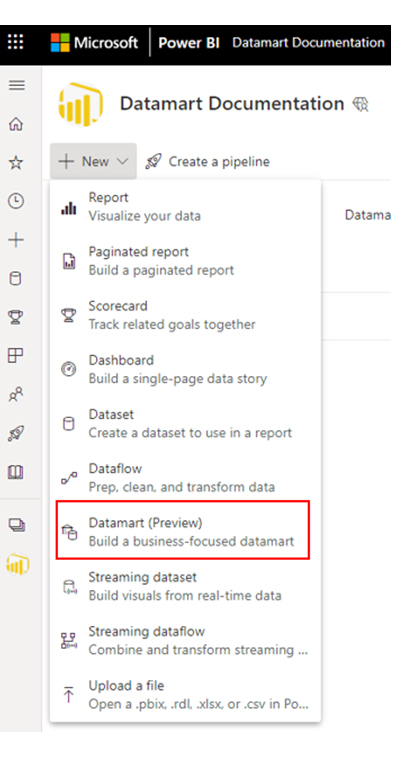
You’ll have to navigate to your existing Power BI Premium or Premium Per User (PPU) workspace. However, you’ll need to have a Power BI Premium subscription. Once in the Premium workspace, select + New. After that, select “Data mart (Preview)” to create a Data mart.
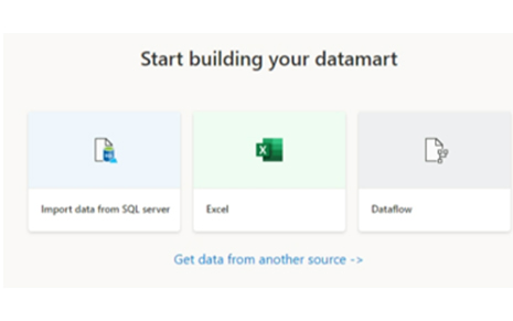
To load data into the Data mart, open your Data mart (or create a new Data mart). After that, select “Get Data.”
If you opt to get data from a different source, you can do that by selecting your preferred data source from the multitude of data sources in the data source selection window that appears on your screen.
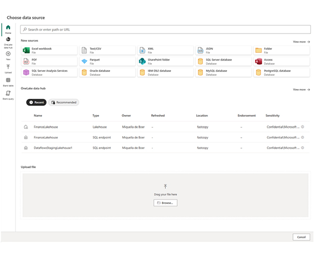
There’s the option of dragging and dropping files from your computer to load data into your data mart. These files could be Excel files. There are cases where data sources require parameters (or connection strings) to properly connect.
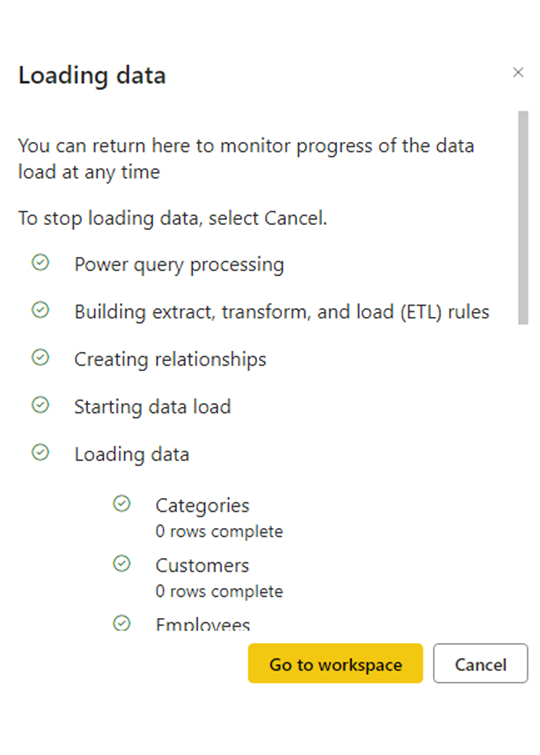
After the connection, select the tables you want to load into the data mart. You can apply transformations to your chosen data and load the data into the data mart. After loading the data, the tables are imported into your data mart. At this point, you’ll have to monitor the progress in the status bar.
For each selected table, a corresponding view is created in the data mart, and it appears in the “Object Explorer” in “Data View.”
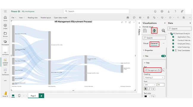
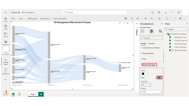
To model your data, navigate to “Model view.” That can be done by selecting the “Model View” icon found at the bottom of the window, as shown in the image below.
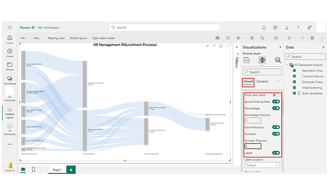
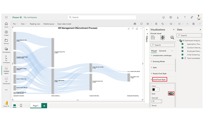
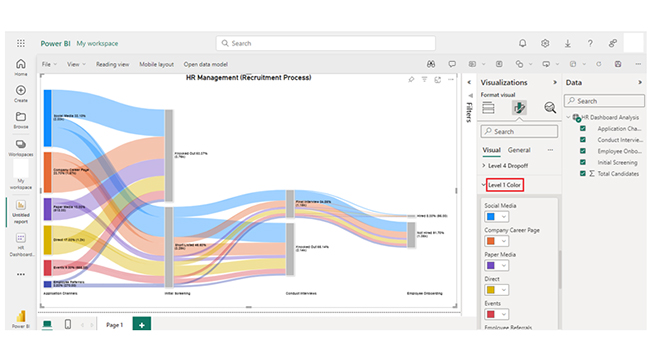
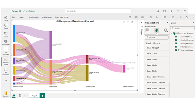
Use Power BI charts to connect, summarize, and visualize data marts in one view, making patterns, relationships, and insights easy to explore and share.


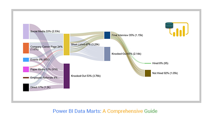
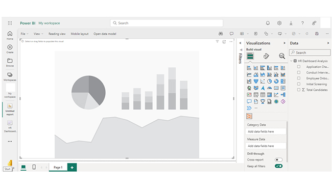
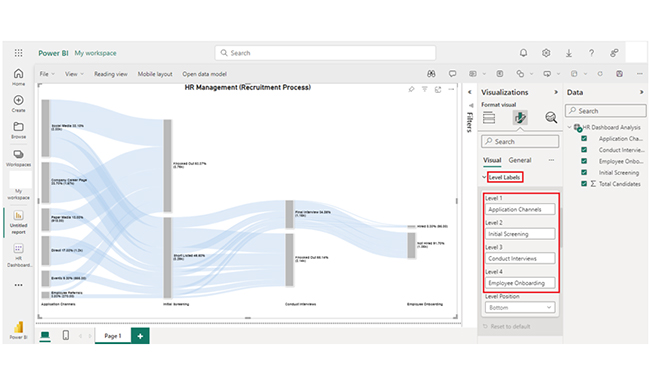
| Application Channels | Initial Screening | Conduct Interviews | Employee Onboarding |
Total Candidates
|
| Social Media | Short Listed | Final Interview | Hired | 32 |
| Social Media | Short Listed | Final Interview | Not Hired | 400 |
| Social Media | Short Listed | Knocked Out | 800 | |
| Social Media | Knocked Out | 1100 | ||
| Company Career Page | Short Listed | Final Interview | Hired | 20 |
| Company Career Page | Short Listed | Final Interview | Not Hired | 250 |
| Company Career Page | Short Listed | Knocked Out | 500 | |
| Company Career Page | Knocked Out | 900 | ||
| Events | Short Listed | Final Interview | Hired | 5 |
| Events | Short Listed | Final Interview | Not Hired | 100 |
| Events | Short Listed | Knocked Out | 200 | |
| Events | Knocked Out | 350 | ||
| Paper Media | Short Listed | Final Interview | Hired | 3 |
| Paper Media | Short Listed | Final Interview | Not Hired | 80 |
| Paper Media | Short Listed | Knocked Out | 135 | |
| Paper Media | Knocked Out | 700 | ||
| Employee Referrals | Short Listed | Final Interview | Hired | 10 |
| Employee Referrals | Short Listed | Final Interview | Not Hired | 70 |
| Employee Referrals | Short Listed | Knocked Out | 80 | |
| Employee Referrals | Knocked Out | 110 | ||
| Direct | Short Listed | Final Interview | Hired | 25 |
| Direct | Short Listed | Final Interview | Not Hired | 150 |
| Direct | Short Listed | Knocked Out | 425 | |
| Direct | Knocked Out | 600 |
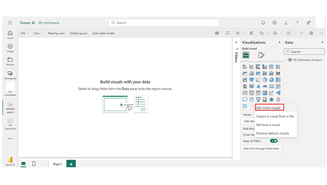
Read here about conditional formatting in Power BI:
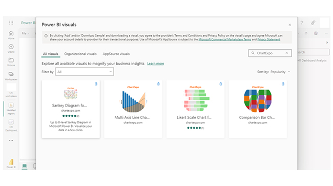
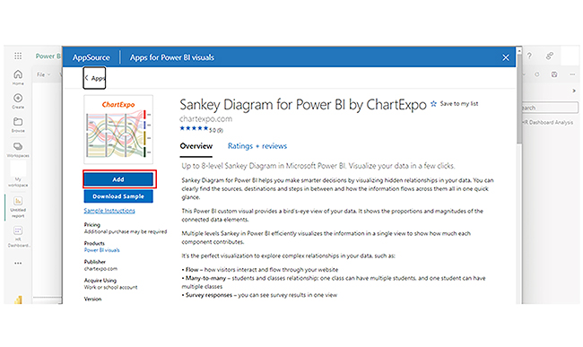
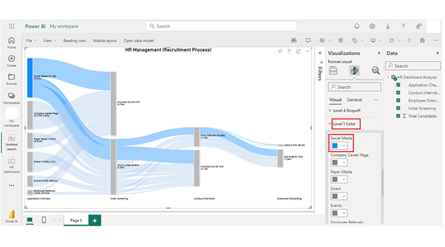
Unlock the power of Power BI Data Marts with this hands-on tutorial, where you’ll learn how to create and visualize centralized data repositories for efficient reporting and analysis. Data Marts in Power BI allow you to streamline your data sources into focused, easily accessible segments, enhancing the clarity of your visuals. With dynamic charts and graphs, including the Sankey Diagram in Power BI, you can quickly spot trends, compare data points, and gain deeper insights into business operations. By organizing your data into specific categories, Power BI Data Marts help you present a more structured and visually impactful view of your organization’s key metrics.
Power BI Data Marts are a powerful tool designed to simplify and enhance data analysis within organizations. Here are the key benefits of using them:
With the Power BI Data mart, non-technical users like business analysts can create, manage, and explore data without deep database or coding expertise.
Data mart enables users to integrate multiple data sources (like on-premises, cloud, databases, and Excel) into one structured relational format. Data is stored in a centralized location, and that provides a unified source of truth for analysis and reporting.
Data mart is built to handle and scale with medium to Power BI datasets, and that allows for efficient storage and querying of complex data models.
With Data mart, users can write SQL queries to explore and retrieve data. This provides flexibility for those familiar with SQL.
Power BI Data Marts enable efficient data storage, transformation, and analysis. To maximize their effectiveness, follow these best practices:
Your Data mart should be structured using a star schema. The fact tables (transactional data) should be connected to dimension tables (reference data). This simplifies query performance and improves report creation.
Power Query can be used to clean and transform your data. That involves removing duplicates, handling missing data, and formatting columns before loading them into the data mart. You should also filter out irrelevant records or columns, and load only necessary data.
Power Query is used to efficiently shape data. Always apply transformations in a logical order. It could involve filtering rows early in the query to reduce the dataset size before applying more complex operations.
SQL performance tuning techniques should be used within the Data mart to optimize query execution. Also, review SQL query plans to identify slow-performing queries. You can improve query performance and load times by partitioning large tables in the data mart.
Power BI comes with limitations like complexity in data transformations, data size constraints, limited direct integration with some data sources, lack of advanced modeling features, and potential performance issues with large datasets.
To connect Power BI to a Data mart, use Power BI Desktop (or Service). Next, select “Get Data,” choose “Power BI Data mart,” and connect using the Data mart URL and credentials.
Power BI Data mart supports data analysis by centralizing and structuring data. It gives room for self-service data exploration, enables SQL querying, integrates with Power BI for visualizations, and provides performance optimization.
Power BI Data mart is a specialized data repository for analyzing and storing structured data. It centralizes data, enables efficient queries, and supports self-service analytics.
Data mart supports SQL and other popular client tools. It can integrate with Power BI, Microsoft Office, and other Microsoft analytics offerings.
The Power BI Data mart is optimized for large datasets. It’s built to handle and scale with medium to large datasets, and that allows for efficient storage and querying of complex data models.
With Power Query, users are enabled to perform Extract, Transform, and Load (ETL) processes, which helps clean and shape data as it’s loaded into the data mart.
Finally, the Power BI Data mart is a feature that helps in the overall creation of compelling visualizations.
How much did you enjoy this article?


Discover diverse and high-quality Power BI report examples for inspiration and insights. Elevate your reporting with strategic visualization techniques.

A Customer Relationship Management Dashboard centralizes data, tracks key metrics, and drives smarter business decisions. Discover now!

Explore Healthcare Dashboard Examples and learn how to turn complex healthcare data into clear, actionable insights for better decision-making.


