• Home
  • Tools dropdown img
    • Spreadsheet Charts

      • ChartExpo for Google Sheets
      • ChartExpo for Microsoft Excel
    • Power BI Charts

      • Power BI Custom Visuals by ChartExpo
    • Word Cloud

  • Charts dropdown img
    • Chart Category

      • Bar Charts
      • Circle Graphs
      • Column Charts
      • Combo Charts
      • Comparison Charts
      • Line Graphs
      • PPC Charts
      • Sentiment Analysis Charts
      • Survey Charts
    • Chart Type

      • Box and Whisker Plot
      • Clustered Bar Chart
      • Clustered Column Chart
      • Comparison Bar Chart
      • Control Chart
      • CSAT Survey Bar Chart
      • CSAT Survey Chart
      • Dot Plot Chart
      • Double Bar Graph
      • Funnel Chart
      • Gauge Chart
      • Likert Scale Chart
      • Matrix Chart
      • Multi Axis Line Chart
      • Overlapping Bar Chart
      • Pareto Chart
      • Radar Chart
      • Radial Bar Chart
      • Sankey Diagram
      • Scatter Plot Chart
      • Slope Chart
      • Sunburst Chart
      • Tornado Chart
      • Waterfall Chart
      • Word Cloud
    • Google Sheets
      Microsoft Excel
  • Services
  • Pricing
  • Contact us
  • Blog
  • Support dropdown img
      • Gallery
      • Videos
      • Contact us
      • FAQs
      • Resources
    • Please feel free to contact us

      atsupport@chartexpo.com

Categories
All Data Visualizations Data Analytics Surveys
Add-ons/
  • Google Sheets
  • Microsoft Excel
  • Power BI
All Data Visualizations Data Analytics Surveys
Add-ons
  • Google Sheets
  • Microsoft Excel
  • Power BI

We use cookies

This website uses cookies to provide better user experience and user's session management.
By continuing visiting this website you consent the use of these cookies.

Ok

ChartExpo Survey


Home > Blog > Power BI

Power BI Cumulative Sum Steps to Build Insights

If you’re a business (or data) analyst, you’ve probably come across the cumulative sum. The cumulative sum is the cumulative total of a series of values like revenue (or sales) over a period of time.

Power BI Cumulative Sum

Cumulative sums play a vital role in a variety of contexts like financial reporting and trend analysis. Using cumulative sum, you can easily track progress and identify patterns in your data.

This guide will help fully understand what the Power BI cumulative sum is, why you should use the cumulative sum in Power BI, and the importance of using Power BI running total.

Table of Contents:

  1. What is a Power BI Cumulative Sum?
  2. Why Use Cumulative Sum in Power BI?
  3. How Do You Calculate the Running Total in Power BI?
  4. How to Evaluate and Visualize Cumulative Sum in Power BI?
  5. How to Create Custom Visualizations in Power BI?
  6. What are the Tips and Tricks for Using Power BI Cumulative Sum?
  7. Wrap Up

First…

What is a Power BI Cumulative Sum?

Power BI cumulative sum is the running total of a measure across a specified order, and it’s based on the date or a specific column. It reflects the sum of values accumulated over time (or within a defined grouping).

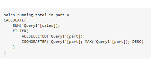
DAX is used to create a cumulative sum in Power BI. You’ll have to take advantage of functions like CALCULATE, SUM, and FILTER. For instance:

CumulativeSales = CALCULATE(SUM(’Sales’[Amount]),FILTER(ALL(’Calendar’),’Calendar’[Date] ← MAX(’Calendar’[Date]))).

Here:

  • SUM(‘Sales'[Amount]) calculates the sum of the sales amount.
  • FILTER(ALL(’Calendar’), ‘Calendar’[Date] ← MAX(’Calendar’[Date])) filters the dates up to the current date.
  • CALCULATE applies the filter context, and the result is the cumulative sum.

Why Use Cumulative Sum in Power BI?

Using a cumulative sum (also known as a running total) in Power BI provides a powerful way to analyze and visualize data over time or across categories. Here are some key reasons to use it:

  • Trend Analysis: Cumulative sums help visualize the overall trend of a measure over time. It plays a vital role in identifying patterns, growth, or decline in the data.
  • Progress Tracking: Cumulative sums are often used to track progress towards a target or goal. It’s common in scenarios where you want to monitor how a particular measure accumulates over time.
  • Comparative Analysis: The Power BI cumulative sum by date helps users to compare the total accumulated values across multiple periods. This will, in turn, help the user identify trends (or anomalies) in a report such as the cost of living comparison by city.
  • Seasonal Patterns: When working with data with seasonal variations, the cumulative sum highlights how values accumulate during specific seasons and also reveals annual trends or cycles.
  • Customer Lifetime Value (CLV): In cases related to customer lifetime value (CLV) analysis, cumulative sums are used to calculate and analyze the cumulative spending (or engagement) of customers over their lifetime, providing insights into customer behavior and long-term value.

How Do You Calculate the Running Total in Power BI?

To calculate the running total (or cumulative sum) in Power BI, you typically use DAX (Data Analysis Expressions) in either a calculated column or a measure. Here’s a step-by-step guide:

  1. Launch the Power BI Desktop, and open the Power BI file (or connect to the data source).
  2. Load your data into the Power BI.
  3. Navigate to the Fields pane on the right. Right-click on the table you want to create the running total.
  4. Choose “New Measure” from the context menu.
  5. In the formula bar, use the SUM function (and appropriate filtering conditions) to enter the DAX formula. Here’s the basic example for a running total of the “Amount” column in the “Sales” table:

CumulativeSales= CALCULATE(SUM(’Sales’[Amount]),FILTER(ALL(’Calendar’),’Calendar’[Date] ← MAX(’Calendar’[Date])))

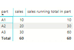
The formula calculates the running total of the “Amount” column. It sums the values where the date is less than (or equal) to the maximum date in the current context.

  1. After entering the formula, press “Enter” to apply the formula to the new measure.
  2. The new measure (like “CumulativeSales”) will appear in the Fields pane. Drag and drop it into the report (or visualization) to see the running total in action.

How to Evaluate and Visualize Cumulative Sum in Power BI?

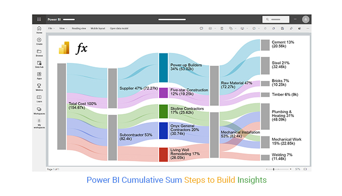
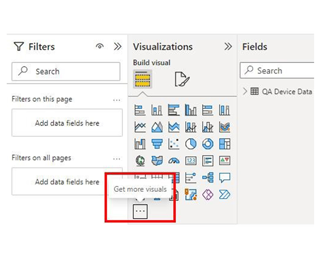
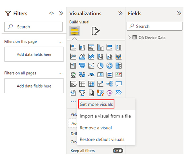
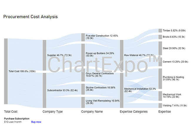
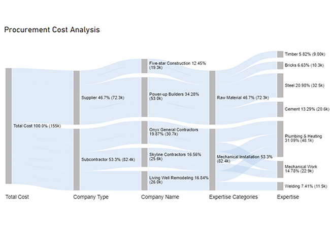
Evaluating a cumulative sum in Power BI involves creating a DAX measure using the CALCULATE and FILTER functions. Use data visualizations like line charts (or stacked column charts) to display the cumulative growth or total over time. This helps in enhancing data analysis and decision-making.

Example:

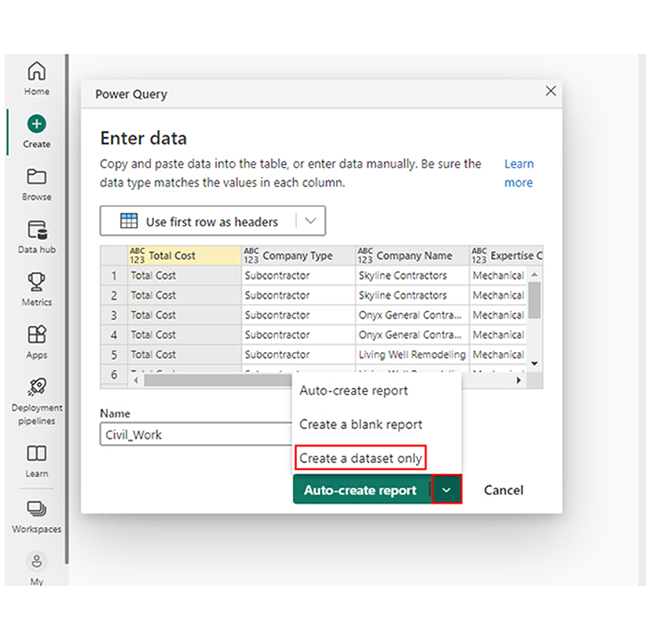
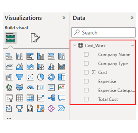
If you want the CUM Sales for the data below:

CUM Sales for Data for Learning Power BI Cumulative Sum

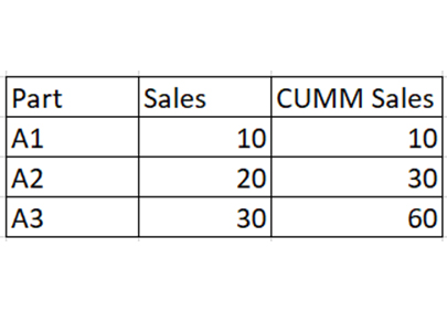
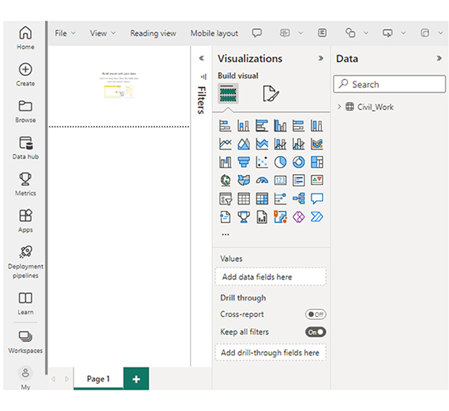
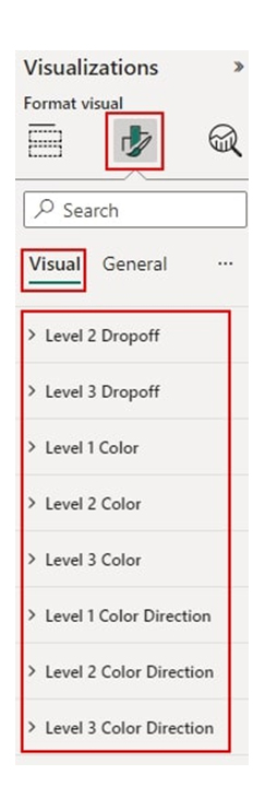
You’ll have to select New Quick Measure. After that, navigate to Totals —> Running total to create this:

Runninf Total to Create This for Learning Power BI Cumulative Sum

Returns:

Return for Learning Power BI Cumulative Sum

How to Create Custom Visualizations in Power BI?

Stage 1: Log into Power BI, enter your email, and click “Submit.”

  • Log in to Power BI.
  • Enter your email address and click the “Submit” button.
Enter email to login to Power BI
  • You are redirected to your Microsoft account.
  • Enter your password and click “Sign in“.
Enter Password to login to Power BI
  • You can choose whether to stay signed in.
Click on stay signed in
  • Once done, the Power BI home screen will open.

Stage 2: Create a Data Set and Select the Data Set to Use in the Sankey Chart

  • Go to the left-side menu and click the “Create” button.
  • Select “Paste or manually enter data“.
select Paste or manually enter data in Power BI ce487
  • We’ll use the sample data below for this example.
Total Cost Company Type Company Name Expertise Categories Expertise Cost
Total Cost Subcontractor Skyline Contractors Mechanical Installation Plumbing & Heating 15456
Total Cost Subcontractor Skyline Contractors Mechanical Installation Mechanical Work 10159
Total Cost Subcontractor Onyx General Contractors Mechanical Installation Plumbing & Heating 18045
Total Cost Subcontractor Onyx General Contractors Mechanical Installation Mechanical Work 12695
Total Cost Subcontractor Living Well Remodeling Mechanical Installation Plumbing & Heating 14589
Total Cost Subcontractor Living Well Remodeling Mechanical Installation Welding 11456
Total Cost Supplier Power-up Builders Raw Material Cement 20561
Total Cost Supplier Power-up Builders Raw Material Steel 32456
Total Cost Supplier Five-star Construction Raw Material Bricks 10253
Total Cost Supplier Five-star Construction Raw Material Timber 9000
  • Paste the data table above into the “Power Query” window. After that, select the “Create a dataset only” option.
Select Create a Dataset Only After Learning Power BI Cumulative Sum
  • Navigate to the left-side menu, and click on the “Data Hub” option. Power BI will populate the data set list. If no data set has been created, you’ll get an error message.
Click on Data Hub After Learning Power BI Cumulative Sum
  • Choose the data set you want to use in the Sankey diagram. After that, you’ll see Power BI populate the screen as shown below.
Choose Data Set You Want to Use After Learning Power BI Cumulative Sum
  • Click on the “Create a report” dropdown. Next, select “Start from scratch.”
Click on Create a Report After Learning Power BI Cumulative Sum
  • A Report Canvas, similar to the one below will appear on your screen.
Report Canvas will Appear After Learning Power BI Cumulative Sum

Stage 3: Add the Power BI Sankey Diagram Extension by ChartExpo

  • To create the Sankey Diagram, you’ll have to use an add-in or the Power BI visual from AppSource. Navigate to the right side of the Power BI dashboard, and open the Power BI Visualizations panel. Next, click the ellipsis symbol (…) to import the Power BI Sankey Diagram extension by ChartExpo.
Click Ellipsis Symbol After Learning Power BI Cumulative Sum
  • When the menu opens, select the “Get more visuals” option.
Select Get more VIsuals After Learning Power BI Cumulative Sum
  • In the following window that opens, enter “Sankey Diagram for Power BI by ChartExpo” in the highlighted search box. You’ll see the “Sankey Diagram for Power BI by ChartExpo.”
See Sankey Diagram After Learning Power BI Cumulative Sum
  • Click the highlighted “Add” button.
Click Add Button After Learning Power BI Cumulative Sum
  • Power BI will add the “Sankey Diagram for Power BI by ChartExpo” icon in the visualization panel.
Sankey Diagram Icon in Visualization Panel After Learning Power BI Cumulative Sum

Stage 4: Draw a Sankey Diagram with ChartExpo’s Power BI extension

  • To do that, select the “Sankey Diagram for Power BI by ChartExpo” icon in the visualization panel. After that, a window similar to the one below will open in the report section of your dashboard.
Select Sankey Diagram Icon in Visualization Panel After Learning Power BI Cumulative Sum
  • You have the option to resize the visual. Moving on, navigate to the right side of the Power BI dashboard, and look out for “Fields” next to “Visualizations.”
Look Out for Fields Next to Visualizations After Learning Power BI Cumulative Sum
  • Follow the sequence below when selecting the fields to use in the Sankey chart.
    • Total Cost
    • Company Type
    • Company Name
    • Expertise Categories
    • Expertise
    • Cost
Select Fields to Use in Sankey Chart After Learning Power BI Cumulative Sum
  • You’ll have to provide your email address or ChartExpo license key.
Provide Email Address After Learning Power BI Cumulative Sum

Stage 5: Activate the ChartExpo Trial or Apply a Subscription Key

  • Select the ChartExpo visual. You’ll see three icons below “Build Visual” in the Visualizations panel.
See Three Icons Below Build Visual After Learning Power BI Cumulative Sum
  • Select the middle icon, “Format visual.” After that, the visual properties will be populated.
Select Middle Icon Format Visual After Learning Power BI Cumulative Sum
  • As a new user, you’ll have to enter your email address in the textbox under the “Trial Mode” section. The license key will be sent to the email upon subscription. Toggle “Enable Trial’ to activate the 7-day trial.
Enable Trial to Activate 7-Day Trial After Learning Power BI Cumulative Sum
  • The Sankey Diagram you create under the 7-day trial comes with the ChartExpo watermark.
See Sankey Diagram with ChartExpo Watermark After Learning Power BI Cumulative Sum
  • Enter the license key in the “ChartExpo License Key” textbox in the “License Settings” section. After that, slide the toggle switch next to “Enable License” to “On.”
Enter License Key After Learning Power BI Cumulative Sum
  • The Sankey diagram should be ready. It does not come with a watermark.
See Sankey Diagram without Watermark After Learning Power BI Cumulative Sum
  • To add a Prefix (like the $ sign) with the numeric values in the chart, you’ll have to expand the “Stats” properties. After that, include the Prefix value.
Add Prefix with Numeric Values After Learning Power BI Cumulative Sum
  • To add colors to each node, expand the “Level Colors” properties and select the colors.
Add Colors to Each Node After Learning Power BI Cumulative Sum
  • The changes will be saved automatically.
Final Power BI Cumulative Sum

Insights

  • At Level 1 (Total Cost), the procurement cost is $155K.
  • At Level 2 (Company Type), out of the $155K cost, $82.4K (53.3%) was spent on subcontractors, while $72.3K (46.7%) was allocated to the supplier.
  • At Level 3 (Company Name), the supplier cost of $72.3K was divided between two companies: Five-star Construction and Power-up Builder, with charges of $19.3K and $53.0K, respectively.
  • The subcontractor cost of $82.4K was distributed among three companies: Onyx General Contractors, Skyline Contractors, and Living Well Remodeling. They charged $30.7K, $25.6K, and $26.0K, respectively, for their services.

Revolutionize Data Flow in Power BI Cumulative Sum Using Graphs:

  1. Open your Power BI Desktop or Web.
  2. From the Power BI Visualizations pane, expand three dots at the bottom and select “Get more visuals”.
  3. Search for “Sankey Chart by ChartExpo” on the AppSource.
  4. Add the custom visual.
  5. Select your data and configure the chart settings to create the chart.
  6. Customize your chart properties to add header, axis, legends, and other required information.
  7. Share the chart with your audience.

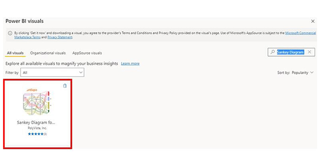
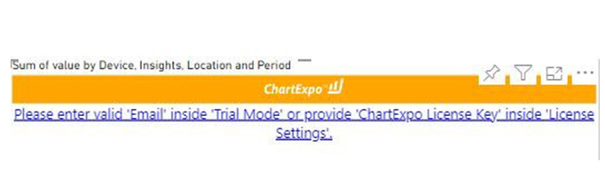
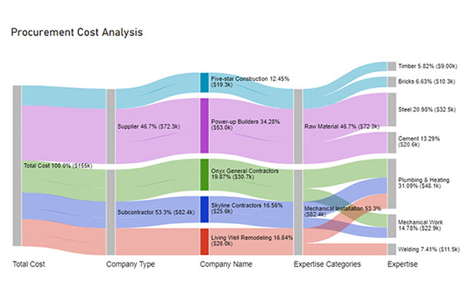
The following video will help you create a Sankey Chart in Microsoft Power BI.

What are the Tips and Tricks for Using Power BI Cumulative Sum?

Using Power BI cumulative sums effectively requires leveraging DAX, proper visualization practices, and smart data modeling. Here are some tips and tricks to help you make the most out of cumulative sums in Power BI:

  • Understand the Data Model: Familiarize yourself with the Power BI data model. A good grasp of the data model will help you create meaningful and accurate cumulative sums, ensuring that your calculations reflect the true relationships and structure of your data.
  • Use Time Intelligence Functions: Take advantage of the built-in time business intelligence functions like TOTALMTD, TOTALYTD, or TOTALQTD for cumulative sums over different periods. These functions simplify calculations for year-to-date, quarter-to-date, or month-to-date totals.
  • Consider Sorting and Filtering: Your data should be properly sorted and filtered using filters in Power BI for the cumulative sum calculation. This becomes particularly important when you’re dealing with time-based data, as it ensures accurate and meaningful results.
  • Optimize Performance: You need to optimize the performance of the cumulative sum calculations by using DAX variables. Avoid unnecessary iterations and ensure that the DAX formulas are efficient, improving the overall calculation speed and accuracy.

FAQs

How do you find the cumulative sum in Power BI?

To find the cumulative sum in Power BI, you’ll have to create a new measure using DAX. For instance, CumulativeSales = CALCULATE(SUM(’Sales’[Amount]), FILTER(ALL(’Sales’), ‘Sales’[Date] ← MAX(’Sales’[Date]))).

How do you add a cumulative line in Power BI?

To add a cumulative line in Power BI, create a line chart with a date field on the axis. Use a cumulative sum measure, like CumulativeSales = TOTALYTD(SUM(’Sales’[Amount]), ‘Sales’[Date]).

Wrap Up

Power BI cumulative sums are used to track running totals over time. That helps to reveal trends, progress towards goals, and overall patterns.

To get the most out of Power BI cumulative sums, you’ll have to follow DAX patterns and best practices. This will enable you to write efficient and maintainable cumulative sum formulas. You should also consider using variables, and avoid unnecessary recalculations. Always organize your code for clarity.

Furthermore, you have to verify the accuracy of your cumulative sum calculations. That can be done by performing manual checks or comparing results with known values. This way, your calculations will align with your expectations.

Data (and business) analysts who combine cumulative sums with other relevant metrics will most likely have a comprehensive view of their data. This will, in turn, enhance the insights gained from the analysis.

Now you know how to create a cumulative sum using DAX in Power BI, what kind of visualization will you be using to represent your data?

How much did you enjoy this article?

PBIAd2
Start Free Trial!
145089

Related articles

next previous
Power BI12 min read

How to Create Sankey Diagram in Microsoft Power BI?

Learn How to Create Sankey Diagram in Microsoft Power BI using Desktop & Web Service. What they are and how to use them effectively.

Power BI8 min read

Power BI Artificial Intelligence: Insights Using Visuals

Discover all there is to know about the Power BI artificial intelligence. You'll also discover how AI is used in Power BI, and how to use it for analysis and more.

Power BI9 min read

Budgeting in Healthcare: Use Visuals to Spot Budget Gaps

This guide helps you discover what budgeting in healthcare is. You'll also discover the factors that affect hospital budgets and types of budgeting in healthcare.

Power BI9 min read

Predictive Analytics in Power BI for Making Insightful Visuals

This guide shows you everything you need to know about Predictive Analytics in Power BI. It also shows you how it works, and how to interpret the results.

Power BI8 min read

Quarterly Business Review Template for Optimum Reports

Discover what the quarterly business review template is. This guide also shows you the best practices to consider when using the QBR template.

ChartExpo logo

Turn Data into Visual
Stories

CHARTEXPO

  • Home
  • Gallery
  • Videos
  • Services
  • Pricing
  • Contact us
  • FAQs
  • Privacy policy
  • Terms of Service
  • Sitemap

TOOLS

  • ChartExpo for Google Sheets
  • ChartExpo for Microsoft Excel
  • Power BI Custom Visuals by ChartExpo
  • Word Cloud

CATEGORIES

  • Bar Charts
  • Circle Graphs
  • Column Charts
  • Combo Charts
  • Comparison Charts
  • Line Graphs
  • PPC Charts
  • Sentiment Analysis Charts
  • Survey Charts

TOP CHARTS

  • Sankey Diagram
  • Likert Scale Chart
  • Comparison Bar Chart
  • Pareto Chart
  • Funnel Chart
  • Gauge Chart
  • Radar Chart
  • Radial Bar Chart
  • Sunburst Chart
  • see more
  • Scatter Plot Chart
  • CSAT Survey Bar Chart
  • CSAT Survey Chart
  • Dot Plot Chart
  • Double Bar Graph
  • Matrix Chart
  • Multi Axis Line Chart
  • Overlapping Bar Chart
  • Control Chart
  • Slope Chart
  • Clustered Bar Chart
  • Clustered Column Chart
  • Box and Whisker Plot
  • Tornado Chart
  • Waterfall Chart
  • Word Cloud
  • see less

RESOURCES

  • Blog
  • Resources
  • YouTube
SIGN UP FOR UPDATES

We wouldn't dream of spamming you or selling your info.

© 2025 ChartExpo, all rights reserved.