Categories
Imagine a world where one simple question could unlock the secrets to your business’s success. That’s exactly what the Net Promoter Score (NPS) offers.
Picture this: ask your customers, “How likely are you to recommend our product/service to a friend or colleague?” Their responses, ranging from 0 to 10, are key to understanding customer loyalty.
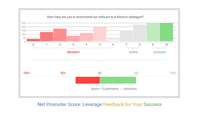


Net Promoter Score isn’t just a metric; it’s a mirror reflecting your customers’ true feelings. With promoters (9-10) cheering you on, passives (7-8) on the fence, and detractors (0-6) waving red flags, you get a clear snapshot of where you stand. But why stop at just knowing your score?
So, why should you care about Net Promoter Score? It’s simple. A high Net Promoter Score correlates with loyal customers, increased referrals, and robust growth. It’s not just about collecting data; it’s about listening to your customers and acting on what they say.
Let’s explore how Net Promoter Score can transform your business, one customer interaction at a time.
Net Promoter Score (NPS) is a metric that gauges customer loyalty by asking one simple question: “How likely are you to recommend our product/service to a friend or colleague?” Customers respond on a scale from 0 to 10. The score is calculated by subtracting the percentage of Detractors from the percentage of Promoters.
Fred Reichheld, a consultant at Bain & Company, introduced NPS in 2003. The goal was to create a straightforward way to measure customer satisfaction and predict business growth. Since then, it has been widely adopted by companies of all sizes, from Fortune 500 giants to small startups.
Net Promoter Score, or NPS, measures customer loyalty. It asks a simple question: “How likely are you to recommend our product/service to a friend or colleague?” Responses are on a scale from 0 to 10.
NPS offers several benefits:
To measure NPS, you need to ask one simple question: “On a scale of 0 to 10, how likely are you to recommend our product/service to a friend or colleague?” This question helps gauge customer loyalty and satisfaction.
NPS = %Promoters ˆ’ %Detractors
For example, if you have 50% promoters, and 20% detractors, your NPS would be 30.
By following these guidelines, you can effectively measure, understand, and act on your Net Promoter Score to drive customer satisfaction and business growth.
When talking about Net Promoter Scores, it’s crucial to understand that a “good” score can vary significantly based on the industry. However, there are some general benchmarks you can use to gauge how well you’re doing.
NPS can also vary by geography. For example, customers in different countries might have varying expectations and standards for what constitutes excellent service. This nuance means that comparing NPS across regions should be done carefully, accounting for these differences.
Employee Net Promoter Score (eNPS) gauges employee loyalty. It asks a simple question: “How likely are you to recommend our company as a place to work?” Employees respond on a scale from 0-10. Scores of 9-10 are Promoters, 7-8 are Passives, and 0-6 are Detractors.
A high eNPS indicates a loyal and engaged workforce, essential for productivity and retention. When employees are promoters, they are more likely to deliver great customer service, boosting overall customer satisfaction.
Net Promoter Score (NPS) measures customer loyalty and predicts business growth. It’s calculated by asking customers how likely they are to recommend your company on a scale of 0-10. Promoters (9-10) are loyal enthusiasts, Passives (7-8) are satisfied but unenthusiastic, and Detractors (0-6) are unhappy customers.
High NPS correlates with revenue growth. Promoters are more likely to repurchase, refer others, and forgive mistakes. Detractors can damage your brand through negative word-of-mouth. Monitoring NPS helps you understand customer loyalty and make data-driven decisions to boost growth.
In healthcare, NPS measures patient satisfaction and loyalty. High NPS indicates trust in healthcare providers and services. It’s crucial for attracting new patients and retaining existing ones. Healthcare organizations use NPS feedback to improve patient care and enhance their reputation.
NPS is a powerful predictor of customer behavior, including churn. Detractors are more likely to leave for competitors. By tracking NPS over time, companies can identify at-risk customers and take proactive measures to retain them.
To predict churn:
Understanding these dynamics helps businesses tailor their strategies to different customer segments, enhancing overall satisfaction and loyalty.
Net Promoter Score (NPS) is a great way to gauge customer loyalty. But what if you could take those scores and dig even deeper? Enter machine learning (ML) and artificial intelligence (AI). These technologies can transform raw NPS data into actionable insights.
ML models can analyze patterns in your NPS responses, identifying trends that might not be immediately obvious. For instance, AI can help determine if certain phrases in customer feedback correlate with high or low scores. This way, businesses can understand the underlying reasons behind customer sentiments.
Consider a retail company struggling with declining NPS. By integrating AI tools, they could analyze thousands of customer comments, revealing that delivery delays were a major issue. This insight prompted them to optimize their logistics, leading to a significant boost in their NPS.
Another example is a tech firm that used ML to track NPS trends over time. By analyzing their IELTS band score chart alongside customer feedback, they discovered that product updates correlated with a drop in scores. This insight helped them refine their update process, reducing customer frustration and improving their NPS.
Visualizing NPS data helps make sense of the numbers. Use clear and impactful visuals to communicate insights effectively. Here are some charts:


ChartExpo is an excellent tool for creating NPS visualizations. It offers various chart types that make it easy to display NPS data. For instance, its Sankey diagrams can illustrate the flow of customer sentiments from detractors to promoters, while radar charts can compare NPS across different geographies.
The following video will help you to create an NPS Score Survey Chart in Microsoft Excel.


The following video will help you to create an NPS Score Survey Chart in Google Sheets.
NPS can vary widely across cultures. For example, customers in one country might generally be more critical, leading to lower scores, while customers in another culture might be more lenient. Understanding these cultural nuances is crucial for accurate NPS interpretation.
Industry benchmarks can also help. For instance, an NPS of 30 might be excellent in the utility sector but mediocre in the tech industry. Comparing your scores against industry averages can provide valuable context.
Implementing NPS globally requires a tailored approach. Here are some strategies:
By understanding and adapting to cultural differences, businesses can effectively use NPS to enhance customer satisfaction worldwide.
By implementing these strategies, you can effectively leverage NPS to not only measure but also enhance customer and employee satisfaction.
Net Promoter Score provides a simple metric, but it often lacks the depth needed for actionable insights. A score alone doesn’t reveal the reasons behind customer satisfaction or dissatisfaction. Without context, companies might struggle to understand why customers gave specific scores. This can lead to misinterpretations and misguided strategies.
Another issue is the challenge of grasping the ”˜why’ behind the scores. NPS surveys typically ask how likely a customer is to recommend a product or service. But they don’t always dig deeper into the reasons behind their rating. Follow-up questions can help, but they rely on customers’ willingness and ability to articulate their experiences accurately.
Relying solely on NPS can be risky. It’s a valuable tool, but it should be part of a broader set of metrics. Combining NPS with other measurements like customer satisfaction (CSAT) and customer effort score (CES) provides a more comprehensive view. This holistic approach helps in understanding various aspects of customer experience and loyalty.
There are several alternatives and supplementary metrics to consider. Metrics like customer satisfaction (CSAT) and customer effort score (CES) can offer insights into specific interactions and overall effort required by customers. These can complement NPS and provide a fuller picture of customer satisfaction and loyalty.
Accurate sampling is critical. Without it, the data might not represent the entire customer base. High response rates are also essential to ensure the data’s reliability. To achieve this, surveys should be short, accessible, and distributed through the right channels.
Interpreting NPS data correctly is another common challenge. Companies must avoid overreacting to minor changes in scores, which might be due to seasonal variations, small sample sizes, or sampling bias.
It’s important to analyze trends over time and understand the broader context behind the scores. Acting on the feedback effectively requires a structured approach, with clear steps for addressing issues raised by detractors and passives.
Startups and SaaS companies leverage NPS to inform their KPIs. For example, a SaaS company might track NPS alongside customer churn rates. If NPS is high but churn is increasing, it might indicate external factors affecting customer retention.
Conversely, a low NPS with high churn signals issues with the product or service quality. By integrating NPS into their performance metrics and KPIs, companies can make data-driven decisions to enhance customer satisfaction and reduce churn.
Companies use NPS leaderboards to benchmark against competitors. For instance, a telecom company might track its NPS against industry leaders like Verizon or AT&T. By doing so, it can identify gaps in customer experience and areas where competitors excel. This competitive analysis drives strategic initiatives aimed at improving their own NPS, such as enhancing customer service or rolling out new features.
Continuous benchmarking with NPS helps companies stay ahead. For instance, a retail brand might compare its NPS quarterly with competitors. If their score drops, they can quickly investigate and address the root causes. This proactive approach ensures they maintain a high level of customer satisfaction and loyalty, which is critical in the competitive retail sector.
Identifying and engaging with NPS detractors is crucial. A bank, for example, might use NPS data to pinpoint customers who rated them low. They can then reach out directly to understand their concerns and resolve issues. Personalized follow-ups not only improve the customer’s experience but also can turn detractors into promoters.
Turning negative experiences into positive ones involves addressing the feedback from detractors. For instance, a software company might receive low scores due to a bug in their application. By promptly fixing the issue and informing the affected users, they show responsiveness and commitment to customer satisfaction. This can lead to improved customer perceptions and higher NPS over time.
NPS is instrumental in guiding marketing strategies. A fashion retailer might analyze NPS data to identify trusted brands and popular products. This insight allows them to highlight these brands in their marketing campaigns, boosting customer trust and sales. Additionally, NPS feedback can reveal which products need improvement, guiding development teams in refining their offerings.
Customer feedback collected through NPS surveys can direct product development. For example, an electronics manufacturer might discover through NPS feedback that customers want longer battery life. Prioritizing this in their product roadmap aligns their development efforts with customer desires, leading to higher satisfaction and loyalty.
A higher Net Promoter Score means more satisfied customers. Happy customers are more likely to explore additional products or services. Companies with strong NPS numbers often see better results in upselling and cross-selling. When customers trust and enjoy their experience, they’re more open to investing further in your offerings.
Promoters (those who score 9-10) are enthusiastic about your brand. They’re not just staying with you; they’re exploring more. They see value and are willing to invest further. This enthusiasm can translate to more revenue per customer, as they opt for premium services or products. On the flip side, Detractors (score 0-6) can harm potential upsell opportunities. They’re less likely to stick around, let alone buy more.
NPS isn’t just about today’s sales. It’s a predictor of future behavior. Customers who are promoters tend to stay longer. They’re loyal, and loyal customers bring consistent revenue.
High NPS scores often correlate with higher Customer Lifetime Value (CLV). Promoters are more likely to make repeat purchases, reducing churn rates. Retention is cheaper than acquisition, so focusing on keeping promoters happy is a smart strategy. They spread positive word-of-mouth, bringing in new customers at no cost.
Top companies with high, NPS like Apple, Amazon, and Tesla, show how focusing on customer experience pays off. Apple’s approach to customer service, product design, and overall experience sets a benchmark. They listen to their customers, innovate based on feedback, and ensure each touchpoint is seamless.
Amazon excels in convenience and customer-centric policies. Their easy return processes, vast selection, and fast delivery make them a favorite. Tesla, with its direct-to-consumer model and emphasis on customer feedback, also ranks high. They continuously update their products based on what customers say.
Consider Apple. Their NPS is consistently high. Why? They innovate and prioritize user experience. This results in a loyal customer base willing to pay premium prices, boosting their revenue significantly.
Amazon, with its high NPS, dominates e-commerce. Their focus on customer satisfaction leads to repeat purchases and high retention rates. These companies show that a high NPS isn’t just a number; it’s a direct link to growth.
Net Promoter Score Benchmarks: Relationship Between Net Promoter Score and Monthly Revenue Growth
Companies with high NPS often see faster revenue growth. When customers are happy, they buy more and tell others. This organic growth is cost-effective and sustainable.
A study by Bain & Co. found that companies with leading NPS scores outgrow their competitors by over two times. This is because promoters help in expanding the customer base without additional marketing costs.
Look at the data. Companies with high NPS outperform those with low scores in revenue growth. Promoters are not just customers; they’re advocates. They bring in new business through referrals, reducing marketing expenses and increasing the bottom line.
In contrast, companies with low NPS struggle. Detractors spread negative feedback, discouraging potential customers. This can lead to a vicious cycle of declining sales and increasing customer acquisition costs.
Detractors, those who rate your service between 0 and 6, can provide the most valuable insights for improvement. Address their concerns promptly. Listen to their feedback and act on it. This shows you value their opinion and are committed to making things right.
Regularly follow up with detractors. Ask what changes would improve their experience. Use this information to adjust your strategies and services. When detractors see changes based on their feedback, they’re more likely to become loyal customers.
Promoters, who score 9 or 10, are your biggest advocates. They love your service and are likely to recommend it to others. Engage with them by acknowledging their positive feedback and offering incentives for referrals. Use their testimonials in your marketing campaigns.
Encourage promoters to share their positive experiences on social media. This brings in new customers and boosts your brand’s credibility. Remember, word-of-mouth from a satisfied customer is powerful marketing.
When collecting feedback, don’t stop at the NPS question. Use driver questions to understand the reasons behind the scores. Ask what specific aspects of your service influenced their rating. This helps identify key areas for improvement.
For example, if a customer rates your service low, ask why. Is it the product quality, customer service, or delivery time? Such questions provide actionable insights, making it easier to address specific issues.
Customer feedback should be a cornerstone of your business strategy. Regularly review feedback to identify trends and common issues. Use this data to inform your business decisions and strategic planning.
Integrate feedback into your product development process. This ensures new features or products meet customer expectations. Share feedback insights with all departments to align efforts towards improving customer satisfaction.
Implementing NPS can face challenges like low response rates or biased feedback. Ensure your surveys are short and easy to complete. Timing is crucial; send surveys soon after a customer interaction to get fresh feedback.
Offer incentives for completing surveys. This can increase response rates. Ensure questions are clear and concise to avoid confusion. Regularly test and refine your survey process to identify and address any issues.
To get a true picture of customer sentiment, your data must be accurate and representative. Use a mix of transactional and relational surveys. Transactional surveys provide feedback after specific interactions, while relational surveys gauge overall satisfaction over time.
Segment your audience for more detailed insights. Analyze feedback by customer demographics, purchase history, or interaction type. This helps identify specific areas for improvement and ensures your strategies are well-targeted.
While some companies measure NPS annually or semi-annually, this isn’t always enough. To get a real-time pulse on customer satisfaction, consider measuring NPS more frequently, such as monthly. This allows you to track changes over time and respond quickly to any issues.
NPS is versatile but might not suit every business. It’s most effective for businesses where repeat purchases or word-of-mouth play a significant role. For some industries, other customer satisfaction metrics might be more appropriate.
Avoid using NPS as the sole measure of customer satisfaction. It’s crucial to complement it with other metrics and qualitative feedback. Also, don’t ignore Passives; they are a valuable group that can swing toward Promoters or Detractors with the right engagement.
Net Promoter Score is a customer loyalty metric that businesses use to gauge the likelihood of customers recommending their products or services to others. It’s a simple yet powerful tool for understanding customer satisfaction and predicting business growth.
Net Promoter Score (NPS) is more than just a metric; it’s a compass guiding you towards better customer relationships. By regularly measuring NPS, you tap into the pulse of your customer base. It tells you where you stand and points out where you can improve. Remember, every piece of feedback is a chance to grow, and every score an opportunity to listen and act.
NPS gives you a straightforward look at customer loyalty and satisfaction. Promoters are your cheerleaders, spreading the good word and bringing in new fans. Passives, while content, are on the fence ”“ a little nudge could turn them into promoters. Detractors? They’re your toughest critics, but also your greatest teachers. Their feedback can show you exactly where to make changes that matter.
To make the most out of NPS, integrate it into your daily operations. Share the insights with your team, celebrate the wins, and tackle the challenges head-on. Use the data to drive decisions, improve customer experiences, and ultimately, boost your bottom line.
So, what’s your next move? Keep the feedback loop tight, stay committed to enhancing the customer journey, and watch your NPS ”“ and your business ”“ soar. In the end, happy customers are the best business strategy of all.
Engage. Improve. Repeat. That’s the Net Promoter Score way.
How much did you enjoy this article?


Income survey questions capture financial data while protecting privacy. Master bracket design, response analysis, and visualization tactics. Learn more!

Discover how a 7-point Likert scale works in surveys and learn step-by-step methods to capture detailed opinions and analyze responses effectively.
Master 5-point Likert scale analysis and interpretation. Turn survey responses into clear insights, visualize data, and improve decision-making fast.