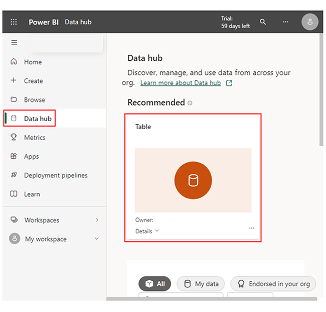
Categories
A manufacturing dashboard visually tracks key production metrics, helping business owners monitor quality, efficiency, and performance. It enhances productivity, enables real-time decision-making, and optimizes resource utilization for streamlined manufacturing operations.


This guide delves into what a manufacturing dashboard is, how a digital manufacturing analytics dashboard works, and provides examples of manufacturing dashboards.
You’ll discover the major key performance indicators for the manufacturing industry, and how to navigate store performance dashboards and digital dashboards. There are also some dashboard examples, data dashboard examples, and executive dashboard examples.
Definition: A manufacturing dashboard is a visual reporting tool that displays real-time data from production lines, equipment, and quality systems.
It consolidates key performance indicators (KPIs) such as output, efficiency, and downtime into interactive charts and graphs, helping manufacturers monitor performance, identify bottlenecks, and make data-driven decisions to improve productivity.
A manufacturing KPI dashboard provides a real-time overview of production performance through key performance indicators (KPIs). It highlights essential metrics that help manufacturers track efficiency, output, and quality across operations.
Here’s what a typical manufacturing KPI dashboard displays:
Different roles across the production process use a real-time manufacturing dashboard:
Here’s how the digital manufacturing analytics dashboard works:
Digital manufacturing dashboards integrate data from multiple sources:
Collected data is processed using AI-driven algorithms and analytics. The dashboard categorizes, filters, and structures data into meaningful insights. It detects inefficiencies, identifies trends, and predicts potential disruptions.
The dashboard presents vital metrics in a user-friendly format. These metrics could be:
Automated alerts notify managers of potential issues like supply shortages, machinery malfunctions, or production delays. This gives room for proactive decision-making.
By continuously analyzing data, the dashboard helps manufacturers optimize operations, improve production timelines, and reduce waste. Reports can be generated for forecasting, compliance, and strategic planning.
Provides real-time visibility into production activities, equipment performance, and workforce efficiency to ensure smooth day-to-day operations.
Used by executives to analyze high-level KPIs such as overall productivity, profitability, and long-term performance trends for decision-making.
Focuses on short-term goals and mid-level management tasks like resource allocation, scheduling, and quality control improvements.
Tracks defect rates, rework data, and inspection results to maintain quality standards and support continuous improvement initiatives.
Tracks key metrics like output rate, cycle time, and downtime to help managers evaluate daily operational efficiency.
Monitors defect rates, yield percentage, and inspection results to maintain consistent product standards and reduce waste.
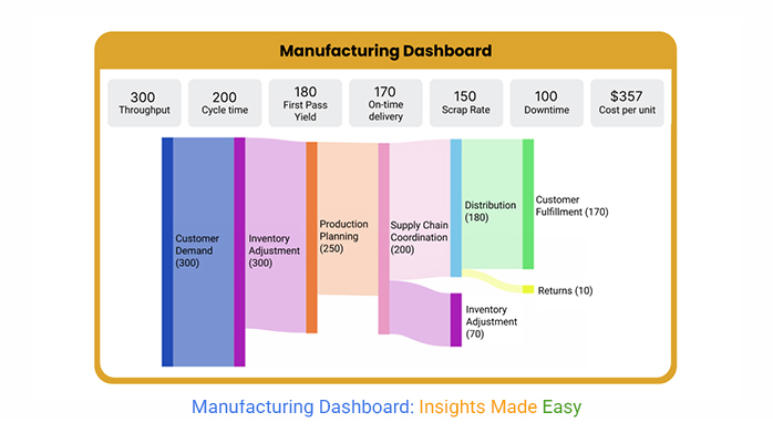
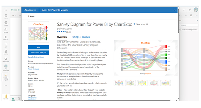
Displays equipment uptime, mean time to repair (MTTR), and predictive maintenance alerts using Power BI Sankey Chart to minimize breakdowns and improve reliability.
Helps track raw materials, work-in-progress, and finished goods in real time to prevent stockouts and overproduction.
Visualizes supplier performance, lead times, and delivery accuracy to ensure smooth operations and on-time fulfillment.
Power BI is the best manufacturing dashboard software for production industries, especially when paired with advanced visual tools like an online Sankey diagram for tracking resource flow and efficiency.
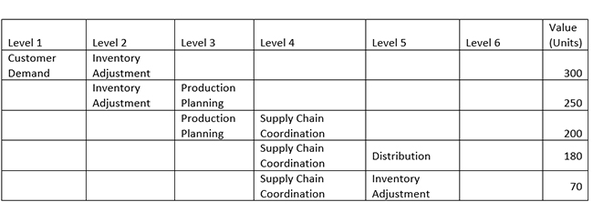
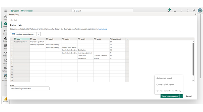
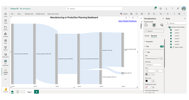
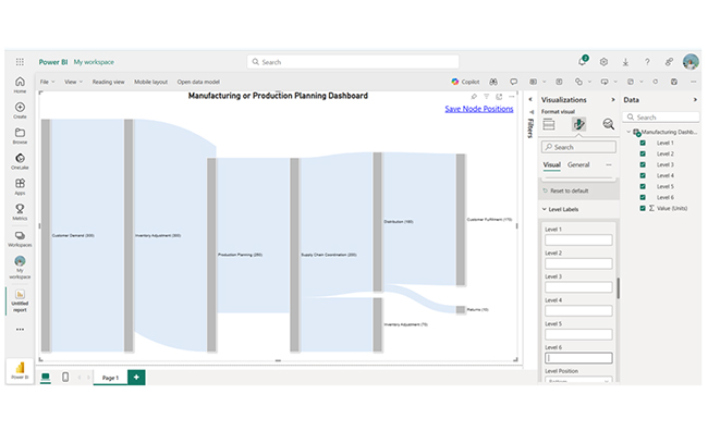
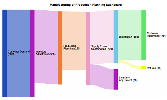
The data shows a hierarchical supply chain flow from customer demand to fulfillment. Inventory adjustments impact production planning (250 units), and that coordinates with supply chain processes (200 units).
Distribution plays a vital role (180 units). Customer fulfillment (170 units) dominates, while returns remain minimal (10 units). That highlights efficiency in demand fulfillment.
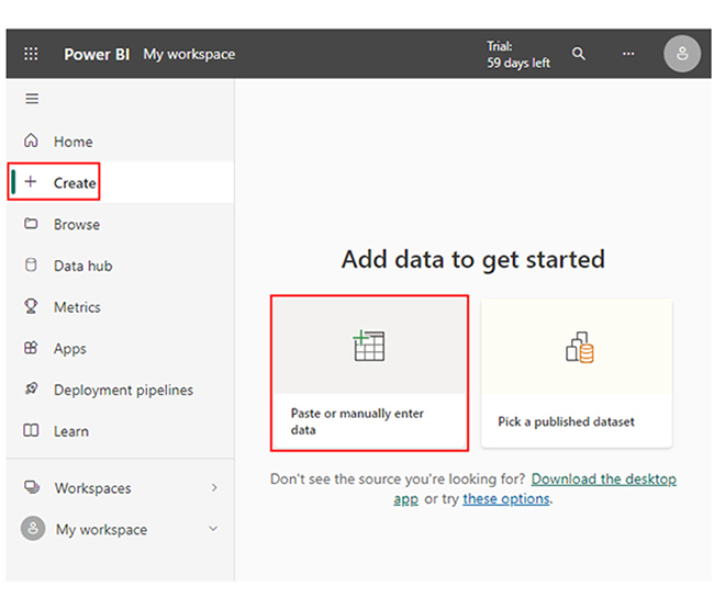
Here are easy steps to help you use the Power BI manufacturing dashboard to optimize production:
Power BI can pull data from various sources, like:
You can set up dashboards to monitor:
Power BI’s AI capabilities help predict equipment failures, forecast production trends, and recommend efficiency improvements. This way, manufacturers will be able to take proactive measures.
Set up alerts for critical parameters like low inventory levels, machine breakdowns, or production delays. This will, in turn, enable quick corrective actions.
Analyse shift performance, worker productivity, and labor efficiency to enhance output and streamline operations.
Power BI gives room for automated reporting and data sharing. This will help management make informed decisions based on real-time and historical data.
A KPI dashboard offers live tracking of production metrics like machine utilization, output, and defect rates. This allows managers to identify and resolve issues immediately.
Tracking rework percentages, defect rates, and quality inspections ensures that manufacturers can maintain high product quality and also reduce material waste.
Keeping a close eye on shift efficiency and worker performance helps businesses identify training needs, improve labor utilization, and balance workloads.
Manufacturing quality dashboards consolidate complex data into easy-to-read visualizations. This helps managers to make faster and more informed decisions.
Identify what you want to track — such as production efficiency, downtime, or quality performance — before designing your dashboard.
Include only the most relevant KPIs like OEE, output rate, and defect percentage to keep the dashboard simple and actionable.
Connect live data sources to ensure your dashboard reflects the latest production insights and supports quick decision-making.
Use clean visuals, consistent colors, and intuitive layouts so users can understand performance at a glance.
Here are things to consider when choosing a production monitoring dashboard.
You have to ascertain that the dashboard integrates seamlessly with existing MES, ERP, IoT sensors, and quality control systems for real-time analysis and data collection.
You should figure out the key performance indicators (KPIs) relevant to your operations. These could be machine utilization, downtime, defect rates, and production output. Choose a manufacturing quality dashboard that aligns with these metrics.
Go for a dashboard that offers real-time alerts, AI-driven recommendations, and predictive maintenance insights to improve efficiency and reduce downtime.
Cloud-based dashboards offer remote access, scalability, and automatic updates. On-premise solutions, on the other hand, provide greater data security and control. Your choice should be based on your company’s infrastructure.
A mobile-friendly manufacturing quality dashboard enables managers to monitor production remotely and make informed decisions.
A good dashboard gives room for customization. This helps in displaying relevant data in an easy-to-understand format. Look for filter options, interactive charts, and drag-and-drop widgets.
A production dashboard is a visual tool that tracks key manufacturing metrics like downtime, efficiency, output, and quality in real-time. This will help businesses reduce costs, optimize operations, and improve decision-making.
A manufacturing dashboard features KPI tracking, real-time monitoring, machine utilization insights, predictive analytics, quality control metrics, downtime alerts, and inventory management. It also features workforce productivity analysis and customizable reports for data-driven decision-making and operational optimization.
A manufacturing dashboard visualizes key metrics like downtime, efficiency, and quality. It enhances predictive maintenance, real-time monitoring, workforce productivity, and cost reduction.
It also enhances decision-making and improves manufacturing performance and profitability.
But why should you use a manufacturing KPI dashboard? Well, it increases operational efficiency, reduces cost, tracks compliance, and monitors safety.
By analyzing production trends and bottlenecks, manufacturers can streamline workflows, optimize machine usage, and reduce waste. This will, in turn, lower costs and lead to higher efficiency.
Identifying inefficiencies in production and resource efficiency helps businesses to figure out training needs, improve labor utilization, and balance workloads.
Now you know what a manufacturing quality dashboard is and how it works, what key performance indicator (KPI) will you look for in your dashboard?
How much did you enjoy this article?


Calculate accounts receivable turnover ratio to measure credit collection speed, improve cash flow, and strengthen your financial strategy. Read on!

Change Management KPIs are the key to tracking adoption, performance, and ROI during transitions. Find out which metrics matter. Read on!

Data collection methods and techniques determine the quality of every insight you act on. Explore key approaches for gathering reliable data. Read on!


