Categories
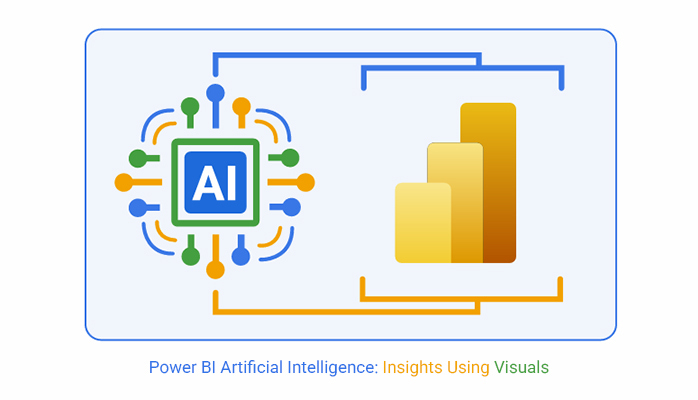
The Power BI’s artificial intelligence helps users with advanced analytics. This will, in turn, breed data-driven insights, predictive capabilities, and an efficient decision-making process. It also plays a major role in swot analysis.


This guide focuses on what the AI-powered Power BI is. It will help you get a good grasp of AI in Power BI, AI-powered features in Power BI, and how AI is used in Power BI.
A section of this guide shows how to integrate AI with Power BI and how to do Power BI AI analysis.
AI-powered Power BI is the integration of artificial intelligence capabilities within Microsoft’s Power BI platform. It helps users to extract deeper insights, automate data analysis tasks, and predict trends.
These features include machine learning models, predictive analytics, cognitive services, and natural language processing (NLP). With tools like Q&A for conversational querying, automated insights, and AI visuals, AI-powered Power BI transforms complex data into actionable intelligence. It also makes advanced analytics accessible to data professionals and business users.
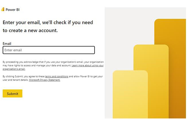
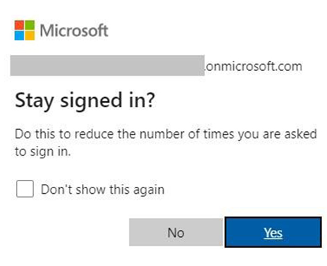
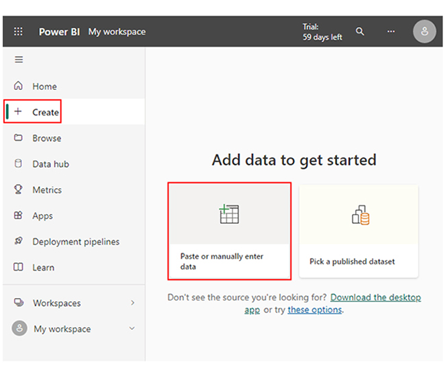
To get started:
Whether you’re using Power BI in Office 365 or the regular Power BI for web browsers, you’ll have to create visualizations. This section showcases some Power BI dashboard designs and Power BI report designs to help you get started.
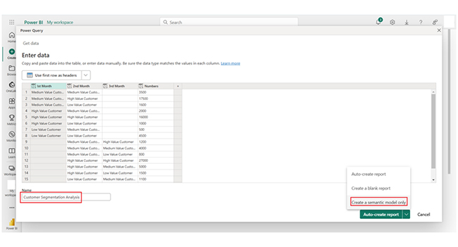
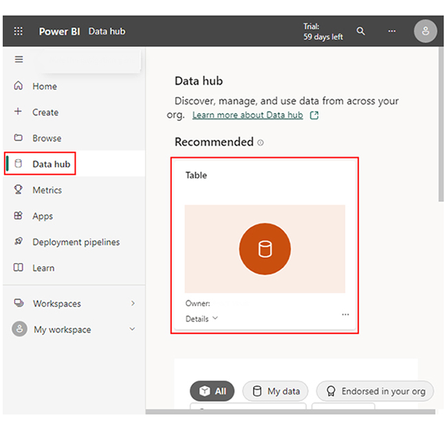
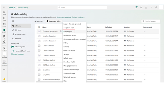
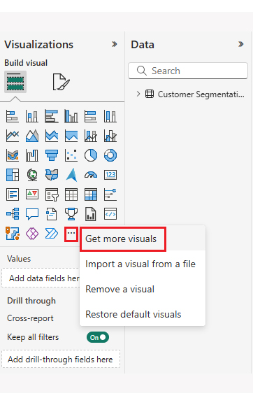
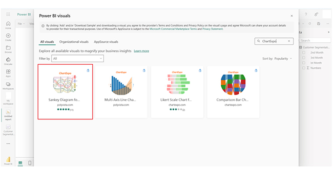
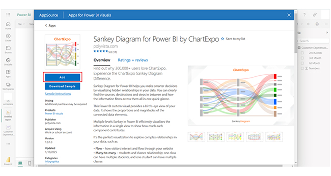
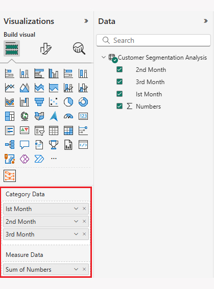
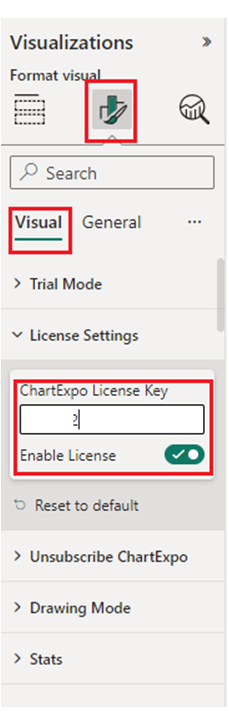
Here are the steps to help you create a visualization using a Sankey diagram generator.

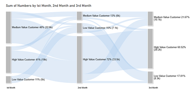
The Power BI report example above shows how the Power BI data model can be used to perform market analysis. You can create recruitment dashboards, or perform cash flow analysis by following the steps above.
Professionals who are into CRM analytics or offer data and analytics services should incorporate data storytelling into their overall visualization process. This will, in turn, help them draw meaningful insights from their analysis.
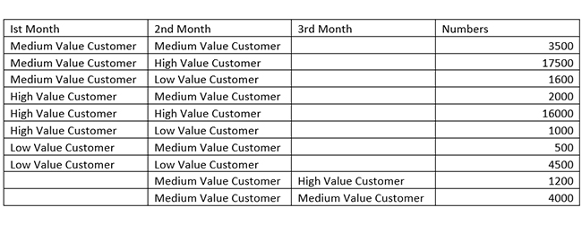
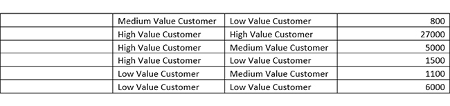
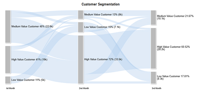
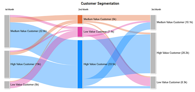
The data tracks customer transitions across value categories over three months. High-value customers dominate revenue, and they come with consistent retention and some downgrades.
Medium-value customers frequently shift between higher and lower tiers, and that reflects volatility. Low-value customers remain in their category but upgrade occasionally. That implies potential growth opportunities in targeted engagement.
Yes, Power BI integrates AI through features like the ChartExpo add-in or the Power BI visual from AppSource. It also offers more use for key influencers, AutoML, decomposition tree, and Azure Cognitive Services.
No, Power BI is enhanced by AI. AI integrates with Power BI to improve analytics, automate insights, and make advanced data processing accessible.
AI can assist in creating dashboards in Power BI. It generates insights, visual recommendations, and automates data preparation. Human expertise is needed for design and the business context.
Power BI artificial intelligence integrates AI features like machine learning and predictive analytics for enhanced insights.
With the AI visuals in Power BI, users can generate deeper insights. These insights are generated using AI visuals like Decomposition Tree and Key Influencers. AI visuals help to quickly identify patterns, anomalies, and key drivers. This will, in turn, help the users eliminate manual analysis and save time.
AI visuals are a good fit for large datasets. It enables organizations to analyze complex data hierarchies and multiple variables efficiently.
By following the steps outlined in this guide, you’ll be able to use Power BI to create a compelling Sankey chart.
Now you know what the Power BI artificial intelligence is, how will you use it to elevate your data analysis process?
How much did you enjoy this article?


Discover diverse and high-quality Power BI report examples for inspiration and insights. Elevate your reporting with strategic visualization techniques.

A Customer Relationship Management Dashboard centralizes data, tracks key metrics, and drives smarter business decisions. Discover now!

Explore Healthcare Dashboard Examples and learn how to turn complex healthcare data into clear, actionable insights for better decision-making.


