• Home
  • Tools dropdown img
    • Spreadsheet Charts

      • ChartExpo for Google Sheets
      • ChartExpo for Microsoft Excel
    • Power BI Charts

      • Power BI Custom Visuals by ChartExpo
    • Word Cloud

  • Charts dropdown img
    • Chart Category

      • Bar Charts
      • Circle Graphs
      • Column Charts
      • Combo Charts
      • Comparison Charts
      • Line Graphs
      • PPC Charts
      • Sentiment Analysis Charts
      • Survey Charts
    • Chart Type

      • Box and Whisker Plot
      • Clustered Bar Chart
      • Clustered Column Chart
      • Comparison Bar Chart
      • Control Chart
      • CSAT Survey Bar Chart
      • CSAT Survey Chart
      • Dot Plot Chart
      • Double Bar Graph
      • Funnel Chart
      • Gauge Chart
      • Likert Scale Chart
      • Matrix Chart
      • Multi Axis Line Chart
      • Overlapping Bar Chart
      • Pareto Chart
      • Radar Chart
      • Radial Bar Chart
      • Sankey Diagram
      • Scatter Plot Chart
      • Slope Chart
      • Sunburst Chart
      • Tornado Chart
      • Waterfall Chart
      • Word Cloud
    • Google Sheets
      Microsoft Excel
  • Services
  • Pricing
  • Contact us
  • Blog
  • Support dropdown img
      • Gallery
      • Videos
      • Contact us
      • FAQs
      • Resources
    • Please feel free to contact us

      atsupport@chartexpo.com

Categories
All Data Visualizations Data Analytics Surveys
Add-ons/
  • Google Sheets
  • Microsoft Excel
  • Power BI
All Data Visualizations Data Analytics Surveys
Add-ons
  • Google Sheets
  • Microsoft Excel
  • Power BI

We use cookies

This website uses cookies to provide better user experience and user's session management.
By continuing visiting this website you consent the use of these cookies.

Ok

ChartExpo Survey


Home > Blog > Power BI

Predictive Analytics in Power BI for Making Insightful Visuals

Predictive analytics in Power BI uses AI models and historical data to forecast future trends and empowers data-driven decision-making and planning.

Predictive analytics in Power BI

In this guide, you’ll discover what predictive analytics in Power BI is, how it works, and also see a Power BI predictive analytics example. There’s a section dedicated to showing you how to do predictive analytics in Power BI.

Table of Contents:

  1. What is Predictive Analytics in Power BI?
  2. How Does Power BI Predictive Analytics Work?
  3. How to do Predictive Analytics in Power BI?
  4. How to Interpret Predictive Analysis Results in Power BI?
  5. Benefits of Predictive Analysis in Power BI
  6. Best Practices for Predictive Analytics in Power BI
  7. FAQs
  8. Wrap Up

What is Predictive Analytics in Power BI?

Definition: Predictive analytics in Power BI involves using statistical algorithms and historical data to forecast future trends and outcomes. It leverages built-in AI tools and machine learning models. Power BI helps users to predict patterns like customer behavior, financial performance, or sales growth.

Users who are looking to use Power BI for Salesforce analysis can elevate the analytic process and draw more insights by using predictive analytics.

Step by Step Guide to Applying Predictive Analytics in Microsoft Excel Using Multi Axis Line Chart for Better Insights

Step by Step Guide to Applying Predictive Analytics in Google Sheets Using Multi Axis Line Chart for Better Insights

How Does Power BI Predictive Analytics Work?

  • Data Preparation

You have to clean and organize the historical data in Power BI using Power Query. The structure and quality of data play a role in accurate predictions.

  • Time Series Forecasting

Power BI allows the user to forecast time-based data. It automatically identifies patterns like trends, seasonality, and cycles within the data.

  • AutoML (Automated Machine Learning)

Power BI integrates AutoML, which automatically selects, trains, and applies machine learning models to the data. It helps the user with little (or no) data science experience build predictive models.

  • AI Visuals for Predictive Insights

    • Decomposition Tree: It breaks down data hierarchies to uncover trends, and that can be used to predict future data points.
    • Key Influencers: It analyzes factors that drive specific outcomes. It identifies predictors and projects future behavior based on these influencers.

How to do Predictive Analytics in Power BI?

Step 1: Define Goal

You have to define what you want to predict. It could be customer churn, future sales, or inventory needs. Figuring out what the problem is helps in determining the right data and model.

Step 2: Prepare the Data

The data have to be clean, structured, and ready for analysis. It involves importing data, handling missing values, and transforming variables.

  • Import Data: Load the data into Power BI from sources like databases, Excel, or APIs.
  • Clean Data: Remove missing values, duplicates, and outliers.
  • Feature Engineering: Add any relevant features like creating time-based columns (e.g., year, quarter, month) for time-series forecasting.

Step 3: Implement the Predictive Model

To implement the predictive model, you have to use a pre-built model or create one using R or Python.

Using Azure Machine Learning (integrated in Power BI)

  1. Connect to Azure Machine Learning
    • From the Power BI Desktop, navigate to the “Home” ribbon, click on “Get Data,” and select “Azure Machine Learning.”
  2. Choose a Model
    • Deploy a custom model or select a pre-built model from Azure ML.
  3. Apply Model to Data
    • Use Power BI to pass the data to Azure and retrieve predictions.

Using R or Python Scripts

  1. Enable R/Python:
    • To do that, install R or Python on the machine, and enable them in Power BI.
  2. Add Predictive Script
    • Navigate to the “Transform Data” tab, and select “Run R Script” or “Run Python Script.”
    • Insert the script to create a predictive model. You can do that using linear regression, or ARIMA.

Step 4: Visualize the Model

To visualize the model, you can try various types of visualizations like line charts and bar charts for time-series predictions and classification results respectively.

  1. Create Predictive Visuals
    • To show future predictions, add a line chart.
    • Add error bars (or confidence intervals) when necessary.
  2. Use Forecasting in Power BI
    • Use Power BI’s built-in forecasting features. To do that, add a line chart and turn on the “forecast” option.

Step 5: Deploy and Monitor

To deploy and monitor, you have to:

  1. Publish to Power BI Service
    • From the Power BI Desktop, click “Publish” to deploy your report to the Power BI Service.
  2. Schedule Data Refresh
    • You have to configure the data refresh schedule to ensure that the new data is used for predictions.
  3. Monitor Model performance
    • Regularly monitor the predictions and adjust the model. You should also set up alerts to notify you if the model’s predictions significantly change.

How to Interpret Predictive Analysis Results in Power BI?

  • Review Predicted Values: Examine visualizations like line charts to figure out the forecasted trends.
  • Assess Confidence Intervals: Look at the confidence intervals that show the range the actual values are likely to fall. Smaller intervals suggest higher confidence in predictions.
  • Check Model Accuracy: Evaluate metrics like Mean Absolute Error (MAE), R-squared, or Mean Squared Error (MSE) to understand how well the model fits the data. Lower error values show more accurate predictions.
  • Identify Trends and Seasonality: Analyze time-series predictions for recurring trends (or patterns) like seasonal sales spikes. This will help guide strategic decisions.
  • Monitor and Update: Keep a close eye on the model performance and refresh it with new data to maintain accuracy.

How to Create Visualization in Power BI?

In this section, you’ll learn how to use Power BI to create data visualizations. You’ll also come across some Power BI design ideas and other features of the Power BI service.
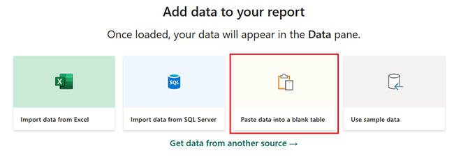
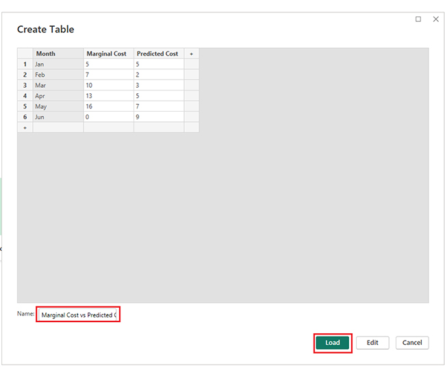
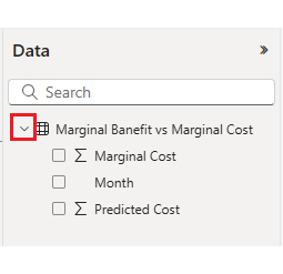
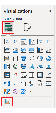
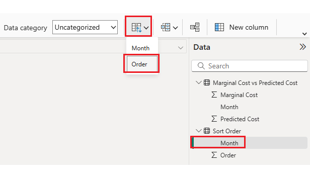
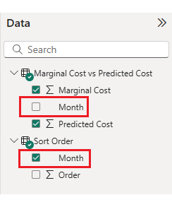
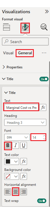
Here are the steps to help you create visualization in Power BI.

  • Stage 1: Log into Power BI, enter your email, and click the “Submit” button.
Predictive analytics in Power BI
  • Enter your password, and click “Sign in.”
Predictive analytics in Power BI
  • You can opt to stay signed in.
Predictive analytics in Power BI
  • Stage 2: The data table below will be used for this illustration.
Predictive analytics in Power BI
  • First, you need to add data to your report, click on the “Paste data into a blank report”.
Predictive analytics in Power BI
  • Paste the data table above into a blank table, name it and click on the “Load” button.
Predictive analytics in Power BI
  • Click on “Expand All” to see the chart metrics. Check the dimensions and metrics.
Predictive analytics in Power BI
  • Click on “Get more visuals.”
Predictive analytics in Power BI
  • Search ChartExpo and select the Multi Axis Line Chart.
Predictive analytics in Power BI
  • Click on the “Add” button.
Predictive analytics in Power BI
  • After that, you’ll see the Multi-Axis Line Chart in the visuals list.
Predictive analytics in Power BI
  • To add this visual in the report, click on this chart icon, and choose the dimension and measures as shown in the image below.
Predictive analytics in Power BI
  • Rename metrics names, right click and click on “Rename for this visual”. Once you rename the metrics, should look like as follow.
Predictive analytics in Power BI
  • In Visualization’s properties, click on License Settings and add the key.
Predictive analytics in Power BI
  • After adding the key, you’ll see the Multi-Axis Line Chart.
Predictive analytics in Power BI
  • If you notice in the chart, months in x-axis are not in specific order as we have in our data. To make data in sorting order from Jan to Jun, follow the steps below.
  • Create a new table.
Predictive analytics in Power BI
  • Manually enter data, name it and click on the “Load” button.
Predictive analytics in Power BI
  • A new data table will be created with name “Sort Order”, and a relationship will be created between two tables, as shown below.
Predictive analytics in Power BI
  • Open “Table View”, select the “Sort Order” table, select the “Month Column”, and set the sorting order column.
Predictive analytics in Power BI
  • Now all is done for custom sorting, we will use “Month” column from “Sort Order” table, instead of “Marginal Cost vs Predicted Cost” table’s “Month Column. You can see below.
Predictive analytics in Power BI
  • Chart should be created with custom sorting order in x-axis.
Predictive analytics in Power BI
  • At this point, add the Header text on top of the chart.
Predictive analytics in Power BI
  • The chart should look like as the following.
Predictive analytics in Power BI
  • Now we will prepend ‘$’ sign with y-axis values as prefix. Same property you need to set for “Y Axis Properties 2”.
Predictive analytics in Power BI
  • You can see ‘$’ sign in the chart with y-axes.
Predictive analytics in Power BI
  • Now, we will change data representation in the chart. “Marginal Cost” as “Data Represenation 1” will show with bars and “Predicted Cost” as “Data Represenation 2” will show with area.
Predictive analytics in Power BI
  • The chart should look like as the following.
Predictive analytics in Power BI
  • Now, we will change the color of bars and area, and in the same step we will also change the shape in legend as well. For bars we will change to ‘Column’ and for area it will remain same ‘Box’.
Predictive analytics in Power BI
  • Here’s the final look at the Multi-Axis Line Chart in Power BI.
Predictive analytics in Power BI

The stages in this section should be used when performing data analytics, business analytics, visual analytics, or self-service analytics using the Sankey Diagram in Power BI. If done the right way, it helps in data-driven decision-making.

You should also pay attention to the Power BI alerts. The Power BI alert helps notify the user when data in the dashboards changes beyond the limit they set. Users who are looking to quickly analyze and summarize large amounts of data should consider using the Pivot table in Power BI.

Insights

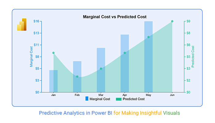
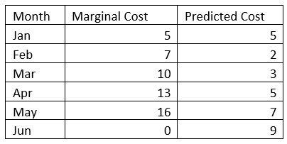
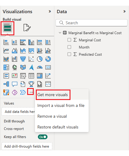
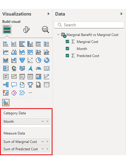
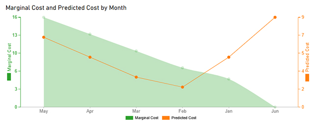
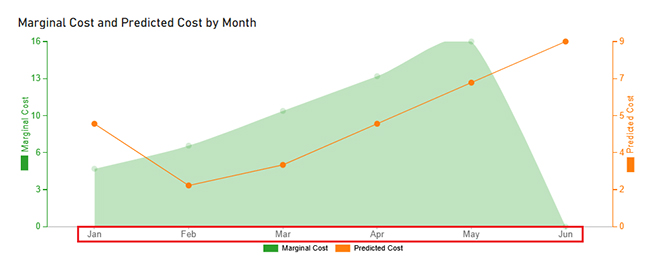
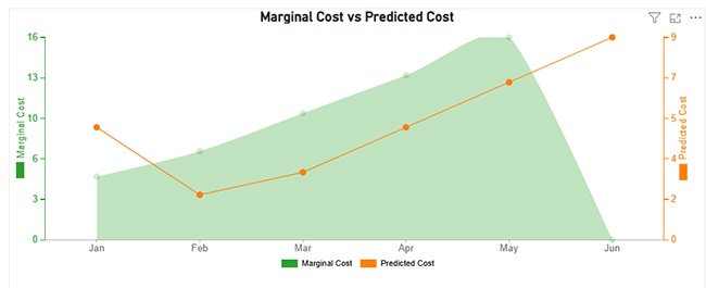
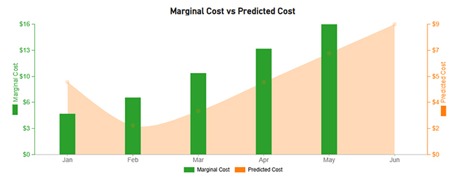
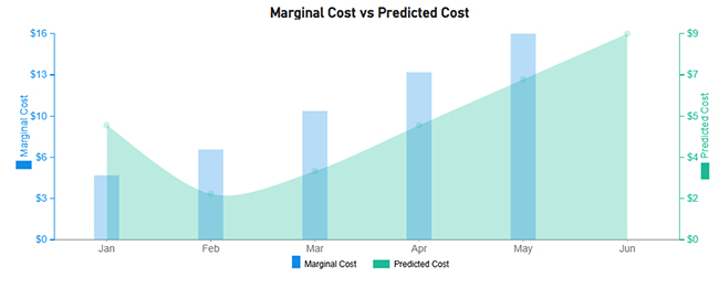
This chart compares Marginal Cost (bar chart) with Predicted Cost (area chart) over six months (Jan–Jun).

Increasing Trend: Both Marginal and Predicted Costs increase over time.

Gap Between Costs: Predicted Cost starts lower but grows steadily, eventually approaching the Marginal Cost.

Fluctuations in Marginal Cost: There are fluctuations in the Marginal Cost, but the general trend is upward.

Alignment: The Predicted Cost closely follows the Marginal Cost, suggesting a reliable prediction model.

Benefits of Predictive Analysis in Power BI

  • Informed Decision Making: Users can use historical data to forecast future outcomes. This way, business owners will be able to make data-driven decisions.
  • Improved Accuracy: It provides statistical models that predict patterns, behaviors, and trends.
  • Time Efficiency: It automates forecasting processes. And that helps save time spent on manual predictions and analysis.
  • Cost Savings: It identifies trends that can lead to cost-saving opportunities. That is done by optimizing resources.

Best Practices for Predictive Analytics in Power BI

  • Clean and Prepare Data: Your data has to be accurate, complete, and well-structured before applying predictive models.
  • Choose the Right Model: Select an appropriate model (like ARIMA, or regression) based on the data type and problem.
  • Use Historical Data: Take advantage of a sufficient amount of historical data to build reliable predictions.
  • Integrate with Other Tools: If you desire advanced modeling, you’ll have to combine Power BI with R/Python or Azure Machine Learning.

FAQs

Can Power BI do predictive analysis?

Yes, the Power BI performs predictive analysis through built-in forecasting features, integration with Azure Machine Learning, and using R or Python scripts to build and apply predictive models.

What are predictive analytics in Power BI?

Predictive analytics in Power BI uses machine learning, statistical algorithms, and historical data to forecast future trends, outcomes, or behaviors. This way, business owners are able to make data-driven decisions and optimize strategies for growth.

Wrap Up

Predictive analytics in Power BI uses forecasting techniques and data models to predict future trends. With predictive analytics, users will be able to make informed decisions. It also provides statistical models that predict patterns, behaviors, and trends.

Power BI’s interactive visualizations combined with predictive insights provide clear and actionable insights. To get the most out of predictive analytics in Power BI, you have to ensure the data is accurate, complete, and well-structured.

You also have to select an appropriate model (like ARIMA, or regression) based on the data type and the problem. Keep a close eye on your metrics and adjust models to maintain relevance.

Now you know what Predictive analytics in Power BI is, how will you use it to elevate your data analysis process?

How much did you enjoy this article?

PBIAd1
Start Free Trial!
149083

Related articles

next previous
Power BI12 min read

Power BI Group By Guide for Effective Data Insights

Learn how Power BI Group By helps you aggregate data, clarify trends, and create reports by grouping values to make large datasets manageable & insightful.

Power BI12 min read

How to Create Sankey Diagram in Microsoft Power BI?

Learn How to Create Sankey Diagram in Microsoft Power BI using Desktop & Web Service. What they are and how to use them effectively.

Power BI8 min read

Power BI Artificial Intelligence: Insights Using Visuals

Discover all there is to know about the Power BI artificial intelligence. You'll also discover how AI is used in Power BI, and how to use it for analysis and more.

Power BI9 min read

Budgeting in Healthcare: Use Visuals to Spot Budget Gaps

This guide helps you discover what budgeting in healthcare is. You'll also discover the factors that affect hospital budgets and types of budgeting in healthcare.

Power BI8 min read

Quarterly Business Review Template for Optimum Reports

Discover what the quarterly business review template is. This guide also shows you the best practices to consider when using the QBR template.

ChartExpo logo

Turn Data into Visual
Stories

CHARTEXPO

  • Home
  • Gallery
  • Videos
  • Services
  • Pricing
  • Contact us
  • FAQs
  • Privacy policy
  • Terms of Service
  • Sitemap

TOOLS

  • ChartExpo for Google Sheets
  • ChartExpo for Microsoft Excel
  • Power BI Custom Visuals by ChartExpo
  • Word Cloud

CATEGORIES

  • Bar Charts
  • Circle Graphs
  • Column Charts
  • Combo Charts
  • Comparison Charts
  • Line Graphs
  • PPC Charts
  • Sentiment Analysis Charts
  • Survey Charts

TOP CHARTS

  • Sankey Diagram
  • Likert Scale Chart
  • Comparison Bar Chart
  • Pareto Chart
  • Funnel Chart
  • Gauge Chart
  • Radar Chart
  • Radial Bar Chart
  • Sunburst Chart
  • see more
  • Scatter Plot Chart
  • CSAT Survey Bar Chart
  • CSAT Survey Chart
  • Dot Plot Chart
  • Double Bar Graph
  • Matrix Chart
  • Multi Axis Line Chart
  • Overlapping Bar Chart
  • Control Chart
  • Slope Chart
  • Clustered Bar Chart
  • Clustered Column Chart
  • Box and Whisker Plot
  • Tornado Chart
  • Waterfall Chart
  • Word Cloud
  • see less

RESOURCES

  • Blog
  • Resources
  • YouTube
SIGN UP FOR UPDATES

We wouldn't dream of spamming you or selling your info.

© 2025 ChartExpo, all rights reserved.