• Home
  • Tools dropdown img
    • Spreadsheet Charts

      • ChartExpo for Google Sheets
      • ChartExpo for Microsoft Excel
    • Power BI Charts

      • Power BI Custom Visuals by ChartExpo
    • Word Cloud

  • Charts dropdown img
    • Chart Category

      • Bar Charts
      • Circle Graphs
      • Column Charts
      • Combo Charts
      • Comparison Charts
      • Line Graphs
      • PPC Charts
      • Sentiment Analysis Charts
      • Survey Charts
    • Chart Type

      • Box and Whisker Plot
      • Clustered Bar Chart
      • Clustered Column Chart
      • Comparison Bar Chart
      • Control Chart
      • CSAT Survey Bar Chart
      • CSAT Survey Chart
      • Dot Plot Chart
      • Double Bar Graph
      • Funnel Chart
      • Gauge Chart
      • Likert Scale Chart
      • Matrix Chart
      • Multi Axis Line Chart
      • Overlapping Bar Chart
      • Pareto Chart
      • Radar Chart
      • Radial Bar Chart
      • Sankey Diagram
      • Scatter Plot Chart
      • Slope Chart
      • Sunburst Chart
      • Tornado Chart
      • Waterfall Chart
      • Word Cloud
    • Google Sheets
      Microsoft Excel
  • Services
  • Pricing
  • Contact us
  • Blog
  • Support dropdown img
      • Gallery
      • Videos
      • Contact us
      • FAQs
      • Resources
    • Please feel free to contact us

      atsupport@chartexpo.com

Categories
All Data Visualizations Data Analytics Surveys
Add-ons/
  • Google Sheets
  • Microsoft Excel
  • Power BI
All Data Visualizations Data Analytics Surveys
Add-ons
  • Google Sheets
  • Microsoft Excel
  • Power BI

We use cookies

This website uses cookies to provide better user experience and user's session management.
By continuing visiting this website you consent the use of these cookies.

Ok

ChartExpo Survey


Home > Blog > Power BI

Power BI for Salesforce: Visualize CRM Data Effectively

Data integration plays a major role in business analytics. In this guide, you’ll discover a seamless way of integrating Microsoft Power BI and Salesforce.

Power BI for Salesforce

You’ll also be introduced to Salesforce, the relationship between Power BI and Salesforce, how to connect Power BI with Salesforce, and how to access data with Power BI for Salesforce.

Table of Contents:

  1. An Introduction to Power BI
  2. An Introduction to Salesforce
  3. What is the Relationship between Power BI and Salesforce?
  4. How to Connect Power BI with Salesforce (Stepwise)?
  5. How to Access Data with Power BI for Salesforce?
  6. How to Create Power BI Salesforce Reports?
  7. What are the Benefits of Power BI in Salesforce?
  8. What are the Tips for Power BI integration with Salesforce?
  9. What are the Limitations of Power BI Salesforce Integration?
  10. Wrap Up

First…

An Introduction to Power BI

Power BI is a business analytics tool that offers comprehensive solutions ranging from software services to connectors, and applications. All these are designed to empower organizations with insightful data analysis.

An Introduction to Salesforce

Salesforce is a cloud-based customer relationship management (CRM) platform that enhances business interactions. It offers a comprehensive suite of features for sales and marketing. It’s scalable, flexible, and has a user-friendly design.

What is the Relationship between Power BI and Salesforce?

The relationship between Power BI and Salesforce lies in the integration of data analytics with customer relationship management (CRM). Salesforce is a leading CRM platform, while Power BI is a powerful data visualization and business intelligence tool. Integrating the two enhances the ability to derive insights and make data-driven decisions based on customer and sales data.
  • Data Integration: Power BI can connect directly to Salesforce as a data source, and that allows users to import data like customer information, performance metrics, and sales figures. The seamless integration makes it possible to analyze Salesforce data along with other data sources like SQL databases, cloud services, and Excel.
  • Real-Time Analytics: Power BI can pull data from Salesforce in real-time or near real-time. All these enable organizations to monitor their sales pipeline, customer interactions, and overall performance.
  • Collaboration and Accessibility: Both platforms support collaboration, and that enables users to share Power BI reports with stakeholders. Furthermore, Power BI’s web-based interface allows users to access their Salesforce insights from anywhere.
  • Enhanced Reporting and Visualization: Power BI comes with advanced data visualization capabilities that allow users to create interactive and customizable reports.

How to Connect Power BI with Salesforce (Stepwise)?

In this section, you’ll discover how to connect Salesforce to Power BI using the Salesforce report.

Step 1: Click “Get Data.” From the drop-down menu, select “More,” to open the data dialogue box.

Click Get Data From Drop Down Menu Select More for Doing Power BI for Salesforce

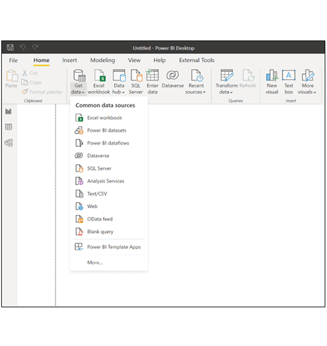
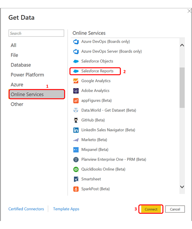
Step 2: On the “Get Data” dialogue box, select online services. Navigate to the left pane and click on “Salesforce Reports.” Next, click on the connect button. A Salesforce Reports dialogue box will appear.

Click Salesforce Reports for Doing Power BI for Salesforce

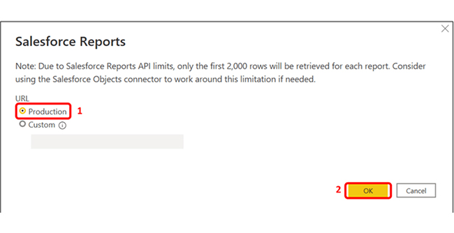
Step 3: Select “Production” under URL or choose “Custom” if there’s a need to connect to a custom domain or sandbox. Next, click “OK.”

Select Production and Click OK for Doing Power BI for Salesforce

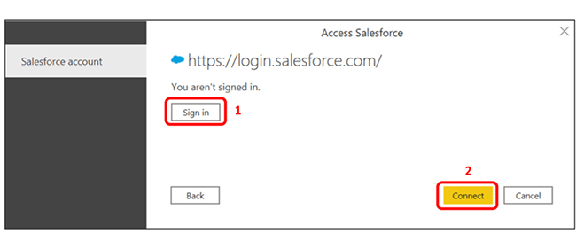
Step 4: On the Access Salesforce dialogue box, click the “Sign in” box to sign into the Salesforce account, and click Connect.

Click Sign in to Sign Into Salesforce Account and Click Connect for Doing Power BI for Salesforce

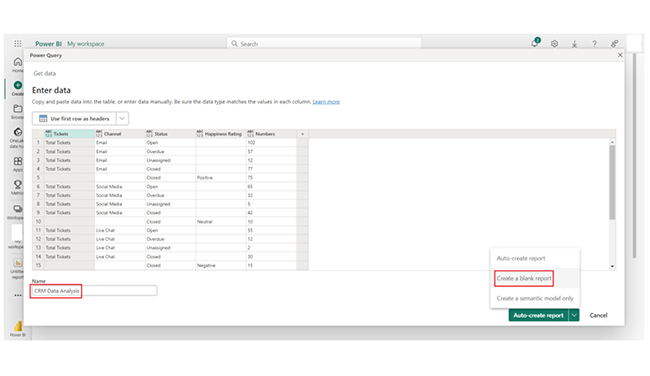
Step 5: Once connected, a Navigator window will appear. Look out for the options under “Display Options” and choose one or multiple reports to load. Click “Load” to load the data or click “Transform Data” to apply data transformation before loading.

How to Access Data with Power BI for Salesforce?

To access Salesforce data with Power BI, follow these steps:

Step 1: Open Power BI Desktop

Launch Power BI Desktop on your computer. You should have the latest version installed on your device.

Step 2: Connect to Salesforce

Click the Home tab in the Power BI Desktop, select Get Data, and choose More. In the “Get Data” window, search for Salesforce. You’ll see options like Salesforce Objects or Salesforce Reports. Choose your desired option and click “Connect.”

Step 3: Sign In

To sign into the Salesforce account, enter your credentials and grant the necessary permissions to Power BI.

Step 4: Select Data

You’ll see a navigator window showing available Salesforce objects or reports. Select the data tables you want to import and click “Load.”

Step 5: Transform Data (Optional)

The Power Query can be used to clean and transform your data before loading it into the Power BI model.

Step 6: Create Visualizations

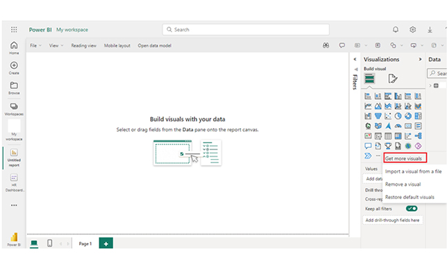
After loading the data, create interactive reports and dashboards by dragging fields onto the report canvas and using various visualization options.

How to Create Power BI Salesforce Reports?

Stage 1: Logging in to Power BI
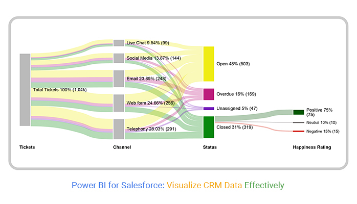
  • Log in to Power BI.
  • Enter your email address and click the “Submit” button.
Enter email to login to Power BI
  • You are redirected to your Microsoft account.
  • Enter your password and click “Sign in“.
Enter Password to login to Power BI
  • You can choose whether to stay signed in.
Click on stay signed in
  • Once done, the Power BI home screen will open.

Stage 2: Creating a Data Set and Selecting the Data Set to Use in Your Chart

  • Go to the left-side menu and click the “Create” button.
  • Select “Paste or manually enter data“.
select Paste or manually enter data in Power BI ce487
  • We’ll use the sample data below for this example.
Tickets Channel Status Happiness Rating Numbers
Total Tickets Email Open 102
Total Tickets Email Overdue 57
Total Tickets Email Unassigned 12
Total Tickets Email Closed Positive 77
Closed Positive 75
Total Tickets Social Media Open 65
Total Tickets Social Media Overdue 32
Total Tickets Social Media Unassigned 5
Total Tickets Social Media Closed Neutral 42
Neutral 10
Total Tickets Live Chat Open 55
Total Tickets Live Chat Overdue 12
Total Tickets Live Chat Unassigned 2
Total Tickets Live Chat Closed Negative 30
Closed Negative 15
Total Tickets Telephony Open 145
Total Tickets Telephony Overdue 32
Total Tickets Telephony Unassigned 19
Total Tickets Telephony Closed 95
Total Tickets Web Form Open 136
Total Tickets Web Form Overdue 25
Total Tickets Web Form Unassigned 9
Total Tickets Web Form Closed 75
  • Paste the data table above into the “Power Query” window. Next, select the “Create a blank report” option.
Select Create a Blank Report After Fetching Data in Power BI for Salesforce
  • Navigate to the left-side menu, and click on the “Data Hub” option. Power BI will populate the data set list. You’ll get an error message if no data set has been created.
Click on Data Hub Option After Fetching Data in Power BI for Salesforce
  • Click on the “Create Report” dropdown.
  • To add the Power BI Sankey Diagram Extension by ChartExpo, you’ll need to use an add-in or Power BI visual from AppSource. Navigate to the right side of the Power BI dashboard, and open the Power BI Visualizations panel.
  • Next, click the ellipsis symbol (…) to import the Power BI Sankey Diagram extension by ChartExpo. In the menu that opens, select the “Get more visuals” option.
Click on Create Report After Fetching Data in Power BI for Salesforce
  • In the window that opens, enter “ChartExpo” in the highlighted search box. You’ll see the “Sankey Diagram for Power BI by ChartExpo” as shown below.
Enter ChartExpo in Highlighted Search Box After Fetching Data in Power BI for Salesforce
  • Click on the Sankey Diagram. Also, click on the highlighted “Add” button.
Click on Sankey Diagram and Click on Add Button After Fetching Data in Power BI for Salesforce
  • Power BI will add the “Sankey Diagram for Power BI by ChartExpo” icon in the visualization panel.
Sankey Diagram Icon Added in Visualization Panel After Fetching Data in Power BI for Salesforce
  • To draw a Sankey Diagram with ChartExpo’s Power BI extension, you’ll have to select the “Sankey Diagram for Power BI by ChartExpo” icon in the visualization panel. A window will open in the report section of the dashboard.
A Window will Open in Report Section of Dashboard After Fetching Data in Power BI for Salesforce
  • You’ll have to select the fields to use in the Sankey chart. The sequence below should be followed when selecting the fields.
    • Tickets
    • Channel
    • Status
    • Happiness Rating
    • Numbers
  • You’ll have to provide your email address or the ChartExpo license key. The key should be added under the Visual section.
Select Fields in Sequence After Fetching Data in Power BI for Salesforce
  • After adding the key, you’ll see the Sankey Chart to your data.
Add Key in Sankey Chart After Fetching Data in Power BI for Salesforce
  • You can add the top header text in the chart under the General section.
Add Top Header Text in Chart Under General Section After Fetching Data in Power BI for Salesforce
  • There’s the option of changing the Node’s color of status.
Change Nodes Color of Status After Fetching Data in Power BI for Salesforce
  • Here’s how to change the Nodes color of the Happiness Rating.
Change the Nodes Color of Happiness Rating After Fetching Data in Power BI for Salesforce
  • Here’s what the Sankey Chart looks like.
Final Power BI for Salesforce

Insights

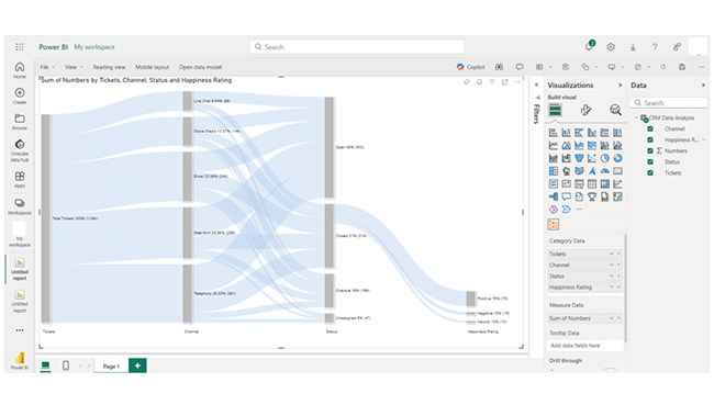
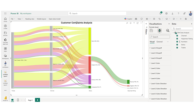
From the data, you’ll notice that the most open tickets are in Telephony and Web Form. Social media and Email have significant overdue rates. Unassigned tickets are minimal but notable in Telephony. Closed tickets with positive ratings dominate, but Live Chat has the highest negative feedback, and that signals a need for improvement.

Enhance Salesforce Reporting with Power BI Visualizations:

Enhance your Salesforce data analysis with Power BI for Salesforce in this detailed tutorial. By integrating these two powerful platforms, you can visualize key sales metrics, track performance, and create interactive dashboards that provide valuable insights. Whether you’re analyzing customer trends, forecasting sales, or evaluating team performance, Power BI’s dynamic charts and graphs turn complex Salesforce data into actionable intelligence. Mastering this integration enables you to make data-driven decisions, improve sales strategies, and drive business growth. With intuitive visuals and customized reporting, Power BI for Salesforce helps you optimize processes and deliver impactful results across your organization.

What are the Benefits of Power BI in Salesforce?

Power BI offers several benefits when integrated with Salesforce, enhancing the data analysis and visualization capabilities for Salesforce users. Here are the key benefits:

  • Enhanced Data Visualization: Power BI offers advanced visualization tools. Users can create interactive dashboards that present Salesforce data.
  • Comprehensive Analysis: Power BI for Salesforce offers a holistic view of business performance, and that facilitates deeper insights and informed decision-making.
  • Real-Time Data Access: Power BI pulls data from Salesforce in real-time. This will help users have up-to-date information for monitoring customer engagement and sales performance.
  • User-Friendly Interface: Power BI’s intuitive interface simplifies data exploration, and makes it accessible to users with varying levels of technical expertise.

What are the Tips for Power BI integration with Salesforce?

Here are some key tips for a smooth and efficient Power BI integration with Salesforce:

  • Define Objectives: You should outline the insights you want to gain from the integration. This will guide you during your data selection and visualization.
  • Use the Right Connection: Your choice of connection should be based on your analysis needs.
  • Optimize Data Model: If you’re looking to enhance performance and simplify relationships, you should opt for the star schema for your data model in Power BI.
  • Schedule Data Refresh: Set up scheduled data refreshes in Power BI to ensure you’re always working with the latest Salesforce data.

What are the Limitations of Power BI Salesforce Integration?

Here are some common limitations of Power BI’s integration with Salesforce:

  • Data Size Constraints: Power BI datasets have size limits. It’s 1 GB for Pro users, and 400 GB for premium users). All these restrict the volume of Salesforce data that can be analyzed.
  • Complex Data Models: Power BI supports complex models. However, intricate relationships between Salesforce objects can lead to performance issues or confusion in reporting.
  • Refresh Limitations: The frequency of data refreshes in Power BI is limited, and that impacts the availability of real-time data for analysis.
  • Learning Curve: Users may have issues when it comes to mastering DAX for advanced calculations and building complex visualizations.

FAQs

Is Salesforce compatible with Power BI?

Yes, Salesforce is compatible with Power BI. Power BI’s Salesforce connector can be used to import and visualize Salesforce data. This will help in comprehensive reporting and analysis within Power BI.

Can Power BI connect directly to Salesforce?

Yes, Power BI can connect directly to Salesforce using its built-in Salesforce connector.

Is Power BI similar to Salesforce?

Power BI and Salesforce serve different purposes. Power BI focuses on business intelligence and data visualization, while Salesforce is a CRM platform for managing customer relationships and sales processes.

Wrap Up

Power BI is a business analytics tool for data visualization, while Salesforce is a CRM platform for customer relationship management. Integrating Power BI with Salesforce enhances data analysis and reporting.

If you’re looking to integrate Power BI with Salesforce, consider involving stakeholders in the reporting process. This will help you ascertain that the dashboards meet their expectations and needs.

Furthermore, you should use DAX formulas to create calculated fields. DAX formulas help in enhancing analysis, and they also provide deeper insights.

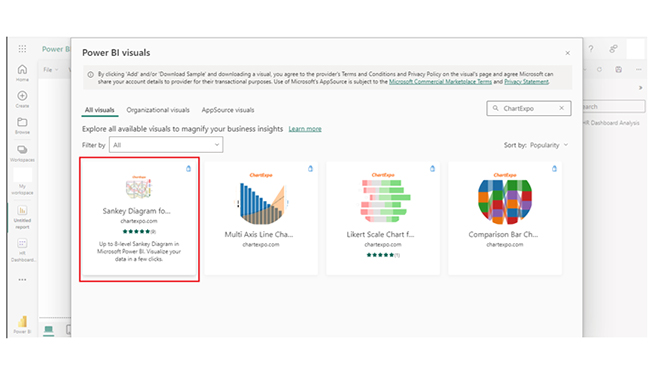
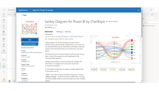
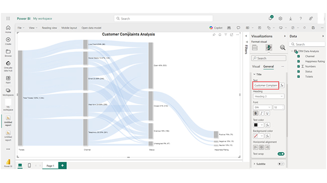
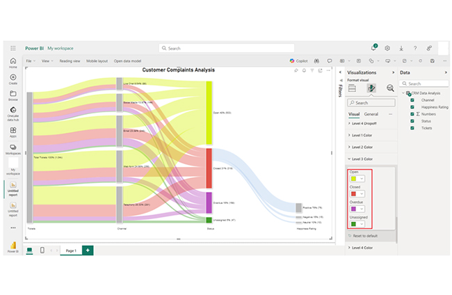
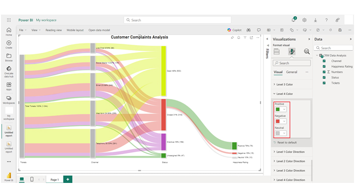
You can create a dashboard for CRM in Power BI. After that, you should consider using visualizations like the Sankey chart to represent the evolving total over time. All of these aid in effective data visualization.

How much did you enjoy this article?

PBIAd1
Start Free Trial!
141411

Related articles

next previous
Power BI12 min read

Power BI Group By Guide for Effective Data Insights

Learn how Power BI Group By helps you aggregate data, clarify trends, and create reports by grouping values to make large datasets manageable & insightful.

Power BI12 min read

How to Create Sankey Diagram in Microsoft Power BI?

Learn How to Create Sankey Diagram in Microsoft Power BI using Desktop & Web Service. What they are and how to use them effectively.

Power BI8 min read

Power BI Artificial Intelligence: Insights Using Visuals

Discover all there is to know about the Power BI artificial intelligence. You'll also discover how AI is used in Power BI, and how to use it for analysis and more.

Power BI9 min read

Budgeting in Healthcare: Use Visuals to Spot Budget Gaps

This guide helps you discover what budgeting in healthcare is. You'll also discover the factors that affect hospital budgets and types of budgeting in healthcare.

Power BI9 min read

Predictive Analytics in Power BI for Making Insightful Visuals

This guide shows you everything you need to know about Predictive Analytics in Power BI. It also shows you how it works, and how to interpret the results.

ChartExpo logo

Turn Data into Visual
Stories

CHARTEXPO

  • Home
  • Gallery
  • Videos
  • Services
  • Pricing
  • Contact us
  • FAQs
  • Privacy policy
  • Terms of Service
  • Sitemap

TOOLS

  • ChartExpo for Google Sheets
  • ChartExpo for Microsoft Excel
  • Power BI Custom Visuals by ChartExpo
  • Word Cloud

CATEGORIES

  • Bar Charts
  • Circle Graphs
  • Column Charts
  • Combo Charts
  • Comparison Charts
  • Line Graphs
  • PPC Charts
  • Sentiment Analysis Charts
  • Survey Charts

TOP CHARTS

  • Sankey Diagram
  • Likert Scale Chart
  • Comparison Bar Chart
  • Pareto Chart
  • Funnel Chart
  • Gauge Chart
  • Radar Chart
  • Radial Bar Chart
  • Sunburst Chart
  • see more
  • Scatter Plot Chart
  • CSAT Survey Bar Chart
  • CSAT Survey Chart
  • Dot Plot Chart
  • Double Bar Graph
  • Matrix Chart
  • Multi Axis Line Chart
  • Overlapping Bar Chart
  • Control Chart
  • Slope Chart
  • Clustered Bar Chart
  • Clustered Column Chart
  • Box and Whisker Plot
  • Tornado Chart
  • Waterfall Chart
  • Word Cloud
  • see less

RESOURCES

  • Blog
  • Resources
  • YouTube
SIGN UP FOR UPDATES

We wouldn't dream of spamming you or selling your info.

© 2025 ChartExpo, all rights reserved.