Categories
By ChartExpo Content Team
Scatter plots don’t lie — they reveal connections hiding in plain sight.
A Scatter Plot is more than a chart filled with dots. It’s a direct look at how two variables relate. Every dot marks a single data point — a pair of values that belong together.
Sales and advertising spend. Temperature and ice cream sales. Study hours and test scores. A Scatter Plot places each pair where they belong and leaves nothing to guesswork.
The power of a Scatter Plot is its simplicity. There’s no filtering, averaging, or smoothing that might blur the truth. It’s all there — trends, outliers, even randomness — laid bare. Dots clustering into a line suggest a connection. Dots scattering with no clear order suggest independence. Either way, you see what’s happening.
Spreadsheets miss these connections. They show rows and columns, but they don’t show relationships. A Scatter Plot breaks those walls. It helps you see which numbers move together and which go their own way.
Whether you’re tracking performance, sales, or risk, this visual tool turns columns into clarity.
A scatter plot is a graph made of dots. Each dot shows one data point. It has two numbers—one for each variable. One number places the dot sideways. The other places it up and down.
The graph has two axes. The horizontal axis shows the first variable. The vertical axis shows the second. You could plot sales on one axis and ad spending on the other. Or age and cholesterol. Or temperature and ice cream sales. Each dot shows where one pair of numbers fits.
This chart shows relationships between variables. It helps spot trends, patterns, and outliers. It’s not about guessing. It’s about seeing. If dots drift up together, it might show a link. If they scatter like confetti, the variables might not care about each other.
Scatter plots help anyone who needs to see if one thing connects to another. They’re simple. They’re clear. And they work.
Spreadsheets are great, but they don’t show the full picture. They can even be misleading. Why? Because they keep data in silos, limiting your view. A scatter plot, however, lays it all out in the open. It exposes relationships between variables that you might not have suspected.
For instance, could there be a link between the time your staff spends on training and their performance scores? Scatter plots can show you, at a glance, whether more training time might lead to better performance or not.
The beauty of scatter diagrams lies in their simplicity and their power to reveal relationships without needing complex models or assumptions. By plotting two variables against each other, they let the data speak for itself.
This direct approach cuts through potential biases and preconceived notions, allowing for objective analysis. Whether you’re looking at sales data, customer behavior, or production costs, scatter diagrams help you identify correlations quickly and accurately.
Let’s say you run a cafe. By using a scatter chart to plot the time of day against sales data, you might notice higher sales in the mid-morning. Perhaps that’s when a local office has its break time. With this insight, you could adjust staffing or run special promotions during those peak times to boost profits even further.
Conversely, the same chart could show you when it’s least busy, helping you cut unnecessary costs. A simple scatter chart, then, can be a powerful tool in enhancing your business’s efficiency and profitability.
A scatter diagram maker takes numerical data from columns and turns them into dots on a graph. First, you choose which variables you want to compare, assigning one to the X-axis and another to the Y-axis.
The software then plots each row of data as a point on the graph based on these variables. This transformation allows you to visualize the relationship between the two variables at a glance.
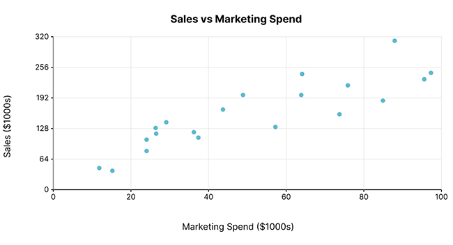
In every scatter plot, the X and Y axes are crucial. They represent the variables you’re comparing. The X-axis typically shows the independent variable, while the Y-axis represents the dependent variable.
This setup helps you see if changes in one variable might affect the other. For example, in a plot comparing advertising spend (X) and sales (Y), you can visually analyze how changes in spending might influence sales figures.
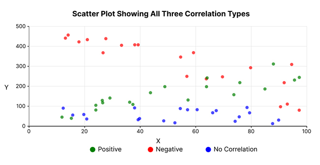
Imagine this: as one variable climbs, so does its buddy. In a positive correlation scatter plot, you’ll see data points that resemble a line sloping upwards. This plot tells us that the two metrics are in sync; as one increases, so does the other. Think of it like a friendship where both friends grow and improve together.
What does this look like in real life? Consider the relationship between hours studied and test scores. Generally, the more you study, the better your scores. By plotting these variables, we can visually confirm this expected pattern. Each data point represents a different instance of studying and scoring, and a clear upward trend emerges.
This type of scatter plot is crucial for predicting outcomes. If you know one variable, you can anticipate the other. Businesses use this to forecast sales based on advertising spend, or sports coaches might predict performances based on practice hours. It’s all about spotting the trend and planning your next move accordingly.
Now, let’s flip the script. In a negative correlation scatter plot, as one metric goes up, the other dives. Picture it like a seesaw. When one side goes up, the other must come down. This scatter plot shows an inverse relationship between the two variables, and it’s just as telling as its positive counterpart.
A classic example? Temperature and heater usage. As the temperature drops, heater usage typically increases. Plot these metrics, and you’ll see a downward trend. Each point on the plot represents a different temperature point and corresponding heater use, clearly showing the inverse relationship.
Understanding these patterns can help in resource management and planning. For instance, energy companies might use such plots to predict when the highest demand for heating will occur, allowing them to manage supply more effectively.
Sometimes, you plot two metrics expecting some action, but what you get is a plot where there’s no discernible pattern, no rhyme or reason to the positioning of data points. It’s like throwing darts blindfolded.
This is the no-correlation scatter plot. Here, no matter how one variable changes, the other remains unaffected, doing its own thing.
Consider plotting the number of ice creams sold against the number of dogs seen at the park. Chances are, you’ll see data points all over the place with no clear trend. This tells you that these two variables don’t really affect each other.
Knowing this is crucial because it saves effort and resources. It tells researchers, marketers, or decision-makers where not to focus, confirming that some factors just don’t influence each other.
Each of these scatter plot stories offers unique insights. Recognizing which plot your data creates can guide you in understanding relationships and informed decision-making. Whether it’s moving together, moving opposite, or not moving in sync at all, each pattern has a story to tell.
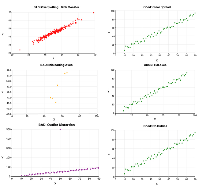
Overplotting occurs when too many data points fall in one area. It creates a blob on your scattergram, making it hard to discern individual points. This issue often misleads by suggesting a high concentration where clarity is needed. Here’s how to fix it:
Misaligned axes can distort a scatter plot, misleading viewers about the data’s behavior. For instance, non-uniform axis scales can exaggerate or underplay trends. Here are fixes you can apply:
Outliers can skew your scatter plot, drawing misleading conclusions. Here’s how to handle them:
Each of these fixes enhances your scatter plot, making it a more reliable tool in data analysis. By addressing these common issues, you ensure your data visualization communicates accurate insights.
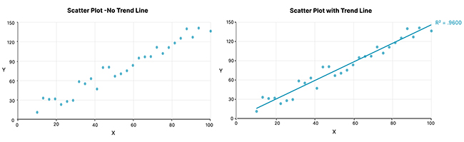
A line of best fit in a scatter graph represents the trend of the data points. It shows where most data points fall concerning a general line. But remember, it’s a simplification. Not all points will lie on the line, and it doesn’t cover all variations in your data.
It’s crucial to recognize when this line is useful or just an oversimplification. If your scatter plot shows a clear trend, the line of best fit is helpful and gives a good summary of that trend. However, if the data is too scattered or the points form a more complex pattern (like a curve or cluster), the line of best fit might not be very telling.
Watch out for overfitting—fitting the line too closely to the specifics of your data sample, which might not represent the larger population or different data sets. The line should help in making predictions or understanding trends, not just threading through points without reflecting broader patterns.
Adding a trend line to your scattergram isn’t magic—it’s a practical step to enhance your data’s readability. Here’s how you can do it in most chart tools:
This process turns a chaotic scatter plot into a navigable chart, where trends become clear and actionable. By doing this, you not only make your data easier to understand but also more compelling to present.
Trust in a trend line depends on the data’s nature and how it’s used. A trend line is a powerful tool for identifying the general direction of your data points. It’s helpful when you want to highlight or predict trends over time, like sales over months or temperature changes over years.
However, a trend line might mislead in some cases. If the data is highly variable or if outliers significantly affect the line’s slope, it might not give a truthful picture of the underlying trend. Also, it’s less useful for non-linear relationships, where the data points show more complex patterns than a straight line can summarize.
Always check if your data meets the criteria for using a trend line effectively. It’s a tool, not a one-size-fits-all solution. When used correctly, it can reveal much about your data. But when applied without consideration, it might lead to misinterpretations.
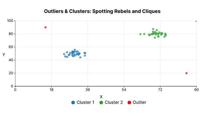
Outliers can skew your data analysis. They are the dots far from others. Why hide them? They can show valuable insights or errors. Your scattergram tool might not flag these, but you should always check.
Outliers can affect averages and trends. Recognizing them helps in making more informed decisions. They might represent rare events or errors in data collection. Understanding their origin is key to using them correctly.
Always question outliers’ presence. Are they errors or rare truths? This questioning can lead to better data understanding and more reliable results.
Clusters in scatter plots show how data points group naturally. These formations are not random but have underlying factors. Recognizing these groups can reveal patterns or common traits.
Clusters help in segmenting data. This segmentation can be used in targeted marketing, risk assessment, or resource allocation. They show where concentrations of data points occur, guiding strategic decisions.
Understanding what drives these clusters helps in predictive modeling and decision-making. It makes your scatter plot a powerful tool for revealing natural groupings in your data.
Deciding whether to keep outliers in your data can be tricky. Are they revealing a hidden truth or misleading your analysis? This decision impacts your data’s integrity and your analysis’ outcome.
Trust outliers when they have a logical explanation, such as a new trend or demographic. If there are errors, like data entry mistakes, it’s better to remove them. This keeps your data clean and your analysis accurate.
Evaluate each outlier’s impact on your overall data. This evaluation helps decide whether to keep it or drop it. Making the right choice here is crucial for maintaining the reliability of your data insights.
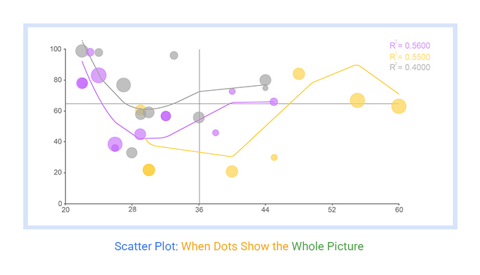
Using color in scatter plots can effectively highlight data patterns. Assign a color spectrum based on a variable’s range—this visually segments data, making trends easier to spot. For instance, use a warm-to-cool color transition to reflect high-to-low values.
Size is another clever trick to add depth to your scatter plots. Adjust the size of data points to reflect the magnitude of a third variable. Larger sizes can indicate higher values, making the visual impact immediate and obvious.
Balance is key when using color and size. Overdoing these elements can lead to a confusing mess. Test different scales to find the most effective visual representation, ensuring it remains easy to decode for your audience.
Sometimes one scatter plot isn’t enough to tell the full story. Here’s where multi-panel scatter diagrams come into play. They allow you to compare several variables or data sets side by side. This method offers a broader view and better context.
Arrange similar scatter plots in a grid layout. This setup helps viewers make quick comparisons without switching between different charts. Consistency in scale and axes across panels is critical. It maintains continuity and prevents confusion during analysis.
Use multi-panel diagrams to highlight differences or similarities between groups. This visual arrangement supports better hypothesis testing and deeper insights into your data.
More data can mean more insights, but only if handled correctly. Adding too much data to a scatter plot can lead to noise rather than clarity. How do you decide what’s beneficial? Start by defining your analysis goals. Include data points that directly support these objectives.
Data relevancy is your guiding principle. Irrelevant data points can obscure trends and weaken your analysis. Prioritize data that contributes to understanding relationships among variables. This selective approach helps maintain focus and effectiveness in your visual representation.
Procter & Gamble (P&G), one of the largest consumer goods companies, has been significantly increasing its digital ad spend, targeting a wide audience across social platforms and online media. However, their return on investment (ROI) wasn’t growing in line with the increased spending.
P&G’s data team plotted digital ad spend vs. customer engagement metrics (click-through rates, site visits, and purchases) across multiple campaigns. When visualized in a scatter plot, a clear trend emerged:
This visual evidence showed that P&G was overspending on digital platforms, essentially throwing money into ads that didn’t improve engagement or sales.
P&G cut over $200 million in “wasted” digital ad spend, particularly on platforms where they were oversaturating their target audience. They reallocated the budget to more effective channels and focused on targeting quality impressions rather than sheer volume.
The scatter plot turned raw marketing data into a clear, actionable insight, proving that more spending doesn’t always equal more value — and helping P&G unlock smarter budgeting and improved ROI.
Target uses scatter plots to group customers into clusters based on age, purchase history, and product preferences. By visualizing these data points, Target’s product strategists spot patterns that reveal what different segments want — from eco-friendly cleaning products to trendy apparel.
For example, a scatter plot analysis showed that millennial shoppers clustered around sustainable home goods and organic food, while younger Gen Z segments gravitated toward budget-friendly fashion and tech accessories.
These visual clusters helped Target’s product teams tailor product lines, marketing campaigns, and in-store displays to match each segment’s tastes — reducing guesswork and improving the chances of successful product launches.
The scatter plot didn’t just track purchases — it made customer desires visible, helping Target predict future demand and adapt product strategy in real time.
By using scatter plots to find natural clusters in customer behavior, Target transformed raw sales data into clear, actionable product strategies, boosting sales and customer satisfaction.
Scatter plots are great visual tools for spotting relationships in data. But sometimes, they tell a convincing lie.
Let’s say you plot data from different cities, showing higher temperatures correlate with more aggressive driving. One might think, “Heat causes aggression!” But maybe both are influenced by other variables like population density or stress levels.
This scenario is a classic case of correlation appearing as causation. It’s crucial to investigate all possible factors influencing the data. Otherwise, one might make costly errors in judgment based solely on what appears to be an obvious relationship in a scatter plot.
Explaining correlation vs. causation doesn’t have to be boring or complex. Here’s a quick way: imagine you’re at a party and notice that the more people dance, the better they seem to feel. Does dancing make them happy? Or are happier people more likely to dance? That’s correlation vs. causation.
In just 30 seconds, you can clarify that just because two things occur together (like dancing and happiness), it doesn’t mean one causes the other. This simple party example can help anyone understand that while correlation is a mutual relationship, causation directly influences one another.
In the early 1990s, Pepsi launched Crystal Pepsi, a clear cola meant to tap into the rising popularity of clear beverages like bottled water and clear fruit sodas. Pepsi saw a correlation between clear drinks and strong sales, assuming that clarity itself was driving demand.
This was a classic correlation vs. causation mistake. Consumers weren’t buying clear drinks because they were clear — they associated them with healthier, more natural options. Crystal Pepsi, despite its transparency, was still a sugary cola with no added health benefits. The disconnect confused consumers, and sales quickly fizzled.
Pepsi’s mistake — trusting correlation instead of understanding the true cause behind consumer preferences — cost the company millions.
The lesson? A correlation might highlight a trend, but without understanding why it exists, blindly acting on it can lead to disaster. Always dig deeper before betting big.
Free tools are tempting, aren’t they? They promise data plotting without the pinch to your wallet. But what do you really get with a free scatter plot calculator? Let’s dig in.
Free tools often come with simplicity. They are perfect for straightforward tasks and can be quite handy for quick looks at data or educational purposes. However, they might lack advanced features like customization or extensive data handling, which can be a dealbreaker for professional needs.
Paid tools, while requiring an investment, bring robust features to the table. They handle large datasets with ease, offer extensive customization, and often come with superb support. If your team regularly dives into complex data analysis, the cost of a paid tool could be well worth it.
What makes a scatter chart creator stand out when tackling business data? Here are the must-have features that can make or break your data visualization experience.
First up, is scalability. Your chosen tool should handle large datasets without a hiccup. Next, consider integration capabilities. Can the tool easily mesh with other software your business uses? This can be critical for streamlining workflows.
Lastly, don’t forget about customization. Business data often requires specific visualization tweaks to make the data speak clearly. A tool that offers extensive customization options allows your data to be as informative as possible, tailored exactly to your needs.
As Starbucks expanded, it relied heavily on scatter plots and spatial data analysis to understand the relationship between store location density, foot traffic, and revenue. By plotting these data points, they could see clear patterns showing that in high-density urban areas, clustering stores within a short distance of each other actually increased total revenue.
At first, this countered conventional wisdom, which assumed store cannibalization (where stores steal customers from each other) would reduce profits. However, Starbucks’ scatter plots showed that placing stores closer together increased convenience for customers, reduced wait times, and increased overall visits and spending per area.
These insights directly shaped Starbucks’ aggressive urban clustering strategy in cities like New York, Tokyo, and London — turning those data dots into real dollars.
This case highlights how companies can use scatter diagrams not just to observe patterns but to make strategic, data-backed decisions that align with growth and financial goals.
A scatter graph calculator is a handy tool for tracking efficiency across processes. For example, in manufacturing, you can plot the time taken against the number of units produced. If improvements are made in the process, this should be reflected in the scatter plot as a trend toward higher productivity and lower time costs.
Regular updates to this graph can serve as a scorecard, showing real-time improvements and helping to maintain focus on key performance metrics. It’s a practical, visual method to keep teams motivated and processes sharp.
In its earlier years, Dropbox’s customer support team noticed a pattern when plotting the number of support tickets against customer satisfaction (CSAT) scores. Locations on the scattergram revealed that certain product features—like file sharing permissions and sync conflicts—generated significantly more support tickets than others.
The correlation was clear: users encountering these issues were less satisfied and more likely to churn.
Armed with these scattergram insights, Dropbox’s product team prioritized simplifying file-sharing workflows and improving sync conflict resolution. Once these changes were rolled out, follow-up scattergrams showed a clear shift: fewer support tickets related to these issues and higher customer satisfaction scores.
The outcome? Lower support costs and higher customer retention, driving long-term revenue growth. This case perfectly illustrates how smart companies transform scattergram patterns into actionable improvements that directly impact both costs and revenue.
Switching from a scatter plot to a more effective chart type doesn’t mean losing your data’s narrative. It’s about enhancing how your audience understands the information. For instance, if a scatter plot is too cluttered, a bar chart can focus on specific data points, emphasizing differences and similarities among categories.
Transitioning to a line chart can help if your data involves measurements over time. This switch maintains the chronological narrative but in a cleaner, more linear format that’s often easier to follow. Remember, the goal is to maintain the integrity of your data story while improving its presentation.
A heatmap might be your best bet for complex interrelationships among data points. It maintains the depth of your data while providing a bird’s-eye view of the landscape. This can be particularly useful in fields like genomics or complex system monitoring, where relationships within the data are more significant than individual data points.
Using the wrong type of chart, like an inappropriate scatter plot, can lead to confusion. Scatter plots are great for showing correlations between variables, but they can be misleading if used incorrectly. If the data doesn’t suggest a clear relationship, or if there are too many outliers, the scatter plot might suggest a false narrative.
A poorly chosen scatter plot can obscure important trends and lead to misguided conclusions. This not only confuses the team but can lead to poor decision-making based on incorrect data interpretation. It’s vital to match the chart type to the data’s story and the details you need to emphasize.
If your team struggles with scatter plots that don’t clearly convey the intended message, consider switching to a more suitable chart type. This switch can clarify objectives, sharpen focus, and drive better-informed team decisions. Remember, the right chart not only presents data but also tells its true story.
| Criteria | Scatter Plot | Heatmap | Line Chart | Bar Chart |
| Primary Purpose | Visualizing relationships between two numeric variables | Showing data density, intensity, or correlation across two dimensions | Tracking changes over time for one or more variables | Comparing categories against a numeric value |
| Best For | Exploring correlation between two variables; Detecting outliers; Identifying clusters or segments | Revealing data concentration patterns; Showing intensity heat zones | Tracking trends over time; Observing growth, dips, or cycles | Comparing sales, revenue, or counts across categories |
| Data Types | Two numeric variables (X and Y axis) | Two categorical or continuous variables (matrix structure) | Time-based (X) and numeric (Y) | Categorical (X) and numeric (Y) |
| Typical Use Cases | Revenue vs. Ad Spend; Temperature vs. Product Defects; Age vs. Purchase Frequency | Sales volume across product categories and regions; Sensor heat maps; Error rates by region | Monthly revenue trends; Quarterly sales performance; Customer churn over time | Product sales by category; Customer satisfaction by service type |
| Advantages | Best at showing variable relationships; Great for outlier detection; Reveals clusters and gaps | Excellent for visualizing dense datasets; Easy to spot hotspots; Works for spatial data too | Clear for tracking trends and patterns over time; Easy to interpret for all audiences | Simple and intuitive; Works well for comparative data; Familiar format |
| Limitations | Hard to read with too much overplotting; Doesn’t handle more than 3 variables easily | Doesn’t show individual data points; Needs careful color scale selection | Limited to time-based data; Poor at showing relationships between variables | Doesn’t show data relationships; Less effective for continuous data |
| Business Questions It Answers | Is there a relationship between ad spend and revenue? Are there distinct customer segments? | Where are errors or sales concentrated? Which regions or product types perform best? | Are sales improving over time? When do we see seasonal trends? | Which product category is performing best? How do different departments compare? |
| Visual Example Concept | 2-axis plot with dots forming a loose upward trend | Grid with color gradient indicating density or intensity | Simple line chart tracking monthly revenue | Vertical bars comparing product sales |
Why should every business analyst pack a scatter chart in their data toolkit? Simple: it’s a multipurpose chart for data insights! Take a scenario where a business tracks ad spend against web traffic. A scatter chart crisply shows how these variables interact, highlighting ROI on marketing efforts.
Suddenly, what seemed like insignificant dots become beacons, illuminating the path to optimized spending and smarter marketing moves. It’s clear: in the world of business, small dots on a scatter chart offer big clues!
Facing a jumble of data can feel like being lost in a forest. But, a scattergram chart acts as your compass. By plotting variables, it helps you see relationships you might have missed. For example, does higher education link to job satisfaction?
A scattergram lays it all out, prompting deeper questions and smarter analysis. It’s not just about seeing the data; it’s about understanding the stories behind the numbers. Let your scattergram chart light up the path from confusion to confidence!
A great scatter diagram doesn’t just sit there; it challenges you to think differently. Consider a scatter diagram showing age against tech product usage. Instead of just plotting these points, ask why certain age groups prefer specific technologies.
This questioning can lead to targeted marketing strategies and product improvements. A scatter diagram is more than a tool for display; it’s a catalyst for innovation and inquiry. So, don’t just plot—question, and let your scatter diagrams push you to uncover new insights and opportunities.
Scatter plots don’t lie. They lay out each dot exactly where your data says it belongs. No filters. No shortcuts.
You see trends without guessing. You catch patterns you didn’t expect. You spot outliers that could cost you money if ignored. A scatter plot doesn’t add anything or take anything away. It shows you the data as it is.
Every dot matters. One dot could show a trend forming. Another could be the warning sign you need to act fast. These dots don’t work alone. Together, they tell a clear story — if you’re willing to read it.
Scatter plots work in any industry. Sales, marketing, manufacturing, healthcare — anywhere two numbers might connect. Whether you want to track ad spending against revenue or customer complaints against wait times, the scatter plot hands you the truth.
Charts and tables are useful, but scatter plots show relationships. That’s where the real value lives. Numbers alone can’t tell you how one change affects another. Scatter plots can.
Don’t guess what your data says. Let every dot speak.
How much did you enjoy this article?


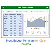
An event budget template tracks and controls event costs with ease. Learn how to build, use, and improve it in Google Sheets for better planning.
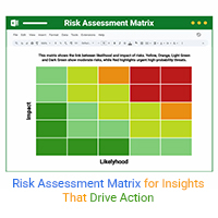
A risk assessment matrix ranks risks by impact and likelihood. Click here to learn how to use it effectively with examples, tools, and Excel tips.
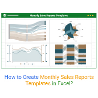
Discover the 4 best monthly sales report templates in Excel. Track sales, compare targets, and spot trends easily with ready-to-use reporting tools