• Home
  • Tools dropdown img
    • Spreadsheet Charts

      • ChartExpo for Google Sheets
      • ChartExpo for Microsoft Excel
    • Power BI Charts

      • Power BI Custom Visuals by ChartExpo
    • Word Cloud

  • Charts dropdown img
    • Chart Category

      • Bar Charts
      • Circle Graphs
      • Column Charts
      • Combo Charts
      • Comparison Charts
      • Line Graphs
      • PPC Charts
      • Sentiment Analysis Charts
      • Survey Charts
    • Chart Type

      • Box and Whisker Plot
      • Clustered Bar Chart
      • Clustered Column Chart
      • Comparison Bar Chart
      • Control Chart
      • CSAT Survey Bar Chart
      • CSAT Survey Chart
      • Dot Plot Chart
      • Double Bar Graph
      • Funnel Chart
      • Gauge Chart
      • Likert Scale Chart
      • Matrix Chart
      • Multi Axis Line Chart
      • Overlapping Bar Chart
      • Pareto Chart
      • Radar Chart
      • Radial Bar Chart
      • Sankey Diagram
      • Scatter Plot Chart
      • Slope Chart
      • Sunburst Chart
      • Tornado Chart
      • Waterfall Chart
      • Word Cloud
    • Google Sheets
      Microsoft Excel
  • Services
  • Pricing
  • Contact us
  • Blog
  • Support dropdown img
      • Gallery
      • Videos
      • Contact us
      • FAQs
      • Resources
    • Please feel free to contact us

      atsupport@chartexpo.com

Categories
All Data Visualizations Data Analytics Surveys
Add-ons/
  • Google Sheets
  • Microsoft Excel
  • Power BI
All Data Visualizations Data Analytics Surveys
Add-ons
  • Google Sheets
  • Microsoft Excel
  • Power BI

We use cookies

This website uses cookies to provide better user experience and user's session management.
By continuing visiting this website you consent the use of these cookies.

Ok

ChartExpo Survey


Home > Blog > Surveys

How are Surveys Conducted? Simple Steps

Surveys. We’ve all seen them. They pop up in our inboxes, fill our social media feeds, and interrupt our dinner with phone calls.

Have you ever wondered how these surveys are conducted?

Buckle up; let’s take a closer look at the behind-the-scenes of survey administration.

How are surveys conducted

First, surveys are not just randomly thrown together like a mismatched outfit. Oh no, they are carefully crafted to gather specific information. Questions are meticulously designed, ensuring they are clear, concise, and not loaded with bias.

Upon setting the questions, it’s time to gather the troops. Participants are selected through methods like random sampling or targeted recruitment.

With the participants in place, it’s showtime! You can administer the survey in different ways – online, over the phone, or even face-to-face. Each has pros and cons influencing participation and response accuracy.

After collecting the data, it’s time to roll up our sleeves and dive into analysis. We crunch the numbers, looking for patterns, trends, and insights. It’s like solving a puzzle but with statistics.

Let’s get started.

Table of Contents:

  1. What is a Survey?
  2. How to Conduct a Survey?
  3. What are the Challenges in Conducting a Survey?
  4. How to Analyze Survey Results in Excel?
  5. Wrap Up

What is a Survey?

A survey constitutes a structured approach to collecting survey data from a group of individuals. It involves asking questions about specific subjects, viewpoints, or encounters. You can conduct surveys through various mediums, such as online forms, phone interviews, or in-person interactions.

For example, using a survey template in Excel can streamline the data collection process. Subsequently, the data undergoes analysis to draw conclusions and insights about the target population’s views or behaviors.

How to Conduct a Survey?

Follow the steps below to survey with style, finesse, and a touch of wit.

  • Determine Your Research Goals

What information are you seeking to gather?

Before you start, clearly define the purpose of your survey. Research goals can include understanding customer preferences, evaluating employee satisfaction, or exploring public opinions. Knowing your research goals upfront will guide the entire survey process.

  • Create a List of Questions

Craft a well-structured questionnaire that aligns with your research goals. Start with demographic questions (age, gender, location) to contextualize responses. Then, formulate questions addressing the topics or issues you’re investigating. Use a mix of question types – multiple-choice, yes/no, ranking, and open-ended questions – to capture diverse perspectives.

  • Invite the Participants

Determine your target audience and select a suitable sampling method. If using an online survey platform, create the survey and generate a link to share. If conducting phone or in-person interviews, prepare a script for the interviewer. Ensure your survey invitation provides the following:

  • Clear instructions.
  • The purpose of the survey.
  • The estimated time to complete it.
  • Gather Your Responses

Collect and organize answers as participants respond to your longitudinal survey. If using online surveys, the data will be automatically organized. For phone or in-person interviews, record responses accurately. Of importance is to ensure data security and privacy compliance, especially when collecting personal information.
  • Analyze the Results

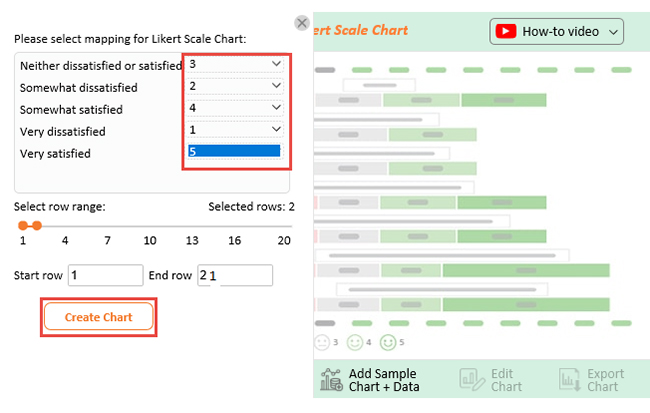
Once data collection is complete, it’s time to analyze the responses:

  • Quantitative data: Use statistical software to calculate percentages, averages, and correlations for closed-ended questions.
  • Qualitative data: For open-ended questions, categorize and analyze responses to identify recurring themes.
  • Cross-analysis: Compare responses based on demographic factors to uncover patterns and trends.
  • Interpret the Findings

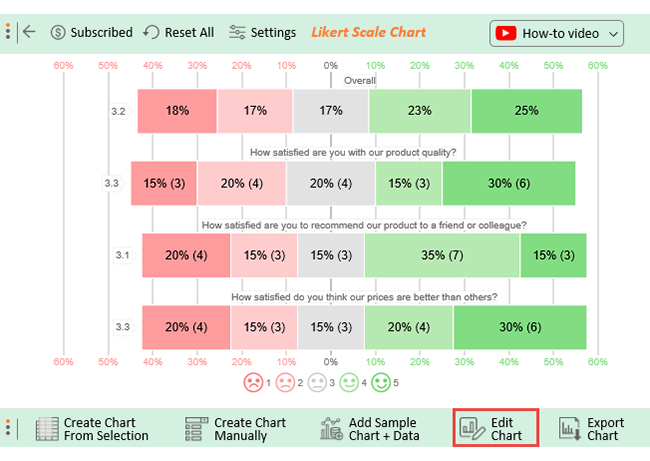
Interpret the results of your analysis in the context of your research goals. What do the responses reveal about your target audience’s opinions, attitudes, or behaviors?

Address any patterns or outliers.

  • Draw Conclusions and Make Recommendations

What insights can be inferred from the data? How do these findings relate to your initial research goals?

Draw meaningful conclusions based on the interpreted results. Additionally, it offers recommendations or actions that can be taken based on the conclusions.

What are the Challenges in Conducting a Survey?

Conducting surveys comes with challenges that can impact the research’s validity, reliability, and overall success.

  1. Non-response bias: This happens when a significant portion of the invited participants do not respond. The data may not accurately represent the entire population in such a case. As a result, this can introduce bias and compromise the generalizability of the findings.
  2. Sampling bias: The results may be skewed if the sampling method does not represent the target population. Sampling bias can occur due to limitations in sampling techniques, accessibility issues, or non-random participant selection.
  3. Question wording: Poorly worded or ambiguous questions can lead to misunderstanding, confusion, and inconsistent responses. Therefore, formulating clear, unbiased, and easily comprehending questions across diverse backgrounds is crucial.
  4. Survey fatigue: Respondents may become fatigued or disinterested when faced with long or repetitive surveys. This can result in rushed or incomplete responses, affecting the data quality.
  5. Cultural and language barriers: Cultural differences and language barriers can hinder participants’ understanding of questions, leading to inaccurate responses. Ensuring translation accuracy and cultural sensitivity is essential in multicultural surveys.
  6. Data quality: Inaccurate or incomplete responses can compromise data quality. Therefore, implementing validation checks and data-cleaning procedures to minimize errors is crucial.
  7. Technology issues: Online surveys can be affected by technical glitches, compatibility problems, or internet connectivity issues. This can lead to incomplete submissions or data loss.
  8. Ethical concerns: Obtaining informed consent, ensuring participant privacy, and safeguarding sensitive information are ethical imperatives in survey research. Violations can damage participant trust and the research’s integrity.
  9. Researcher bias: Researchers’ biases and preconceived notions can inadvertently influence question framing, participant selection, and data interpretation, potentially distorting results.
  10. Data analysis complexity: Survey data analysis can be complex, especially when dealing with large datasets or intricate survey designs. Moreover, inadequate analysis skills can lead to misinterpretation of findings.
  11. Changing trends: Societal, technological, or cultural changes can impact the relevance of survey questions and how respondents understand them. Surveys need to adapt to evolving trends to remain accurate and meaningful.

How to Analyze Survey Results in Excel?

Navigating the vast sea of data can feel like surfing a tidal wave in a canoe. Excel, while a brave companion, has limitations when taming extensive data for analysis and creating data visualizations that pop.

Fear not – ChartExpo rides to the rescue. This dynamic tool turns your Excel data into captivating charts with all the flair of a rockstar guitarist.

Benefits of Using ChartExpo

  • ChartExpo visualizations cover a broad spectrum, giving you the power to handpick the perfect one for your data. This turbocharges your data analysis and presentation, making it as effective as a superhero with a cape.
  • ChartExpo’s user interface is so intuitive it creates visualizations with a flick of a wand. No coding skills are required.
  • ChartExpo is the Picasso of visualizations, allowing you to unleash your creativity. Its customization options allow you to turn your visuals into masterpieces by adding your personal touch.
  • ChartExpo is a steal! It offers a 7-day free trial, giving you a taste of its greatness. And for just $10 a month, it’s like having a pocket-sized data wizard at your beck and call.

How to Install ChartExpo in Excel?

  1. Open your Excel application.
  2. Open the worksheet and click the “Insert” menu.
  3. You’ll see the “My Apps” option.
  4. In the office Add-ins window, click “Store” and search for ChartExpo on my Apps Store.
  5. Click the “Add” button to install ChartExpo in your Excel.

ChartExpo charts are available both in Google Sheets and Microsoft Excel. Please use the following CTA’s to install the tool of your choice and create beautiful visualizations in a few clicks in your favorite tool.

Example

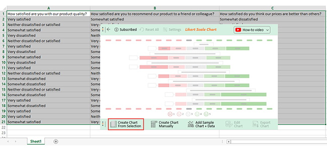
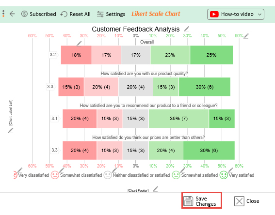
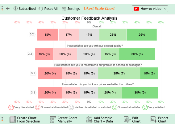
Assume you run a store and have created a survey with the following questions to collect customer feedback.

  • How satisfied are you with our product quality?
  • How satisfied are you to recommend our product to a friend or a colleague?
  • How satisfied do you think our prices are better than others?

Your respondents provide an answer to each question using the response scale below.

  1. Very dissatisfied
  2. Somewhat dissatisfied
  3. Neither dissatisfied nor satisfied
  4. Somewhat satisfied
  5. Very satisfied

Let’s say your survey yields the data table below.

How satisfied are you with our product quality? How satisfied are you to recommend our product to a friend or a colleague?


How satisfied do you think our prices are better than others?


Very satisfied Somewhat satisfied Somewhat dissatisfied
Neither dissatisfied nor satisfied Very dissatisfied Very satisfied
Somewhat satisfied Somewhat dissatisfied Neither dissatisfied nor satisfied
Very dissatisfied Neither dissatisfied nor satisfied Very dissatisfied
Neither dissatisfied nor satisfied Very dissatisfied Somewhat satisfied
Very satisfied Very satisfied Somewhat satisfied
Very dissatisfied Somewhat satisfied Very satisfied
Somewhat satisfied Somewhat satisfied Somewhat dissatisfied
Very dissatisfied Somewhat dissatisfied Very satisfied
Very satisfied Somewhat satisfied Very dissatisfied
Neither dissatisfied nor satisfied Neither dissatisfied nor satisfied Very satisfied
Somewhat dissatisfied Very satisfied Neither dissatisfied nor satisfied
Somewhat dissatisfied Somewhat satisfied Somewhat dissatisfied
Neither dissatisfied nor satisfied Very dissatisfied Somewhat satisfied
Somewhat dissatisfied Somewhat satisfied Very dissatisfied
Very satisfied Very dissatisfied Neither dissatisfied nor satisfied
Somewhat dissatisfied Somewhat dissatisfied Very satisfied
Very satisfied Somewhat satisfied Somewhat satisfied
Very satisfied Neither dissatisfied nor satisfied Very satisfied
Somewhat satisfied Very satisfied Very dissatisfied

This table contains example data. Expect many responses and questions in real life.

  • To get started with ChartExpo, install ChartExpo in Excel.
  • Now Click on My Apps from the INSERT menu.
insert chartexpo in excel
  • Choose ChartExpo from My Apps, then click Insert.
open chartexpo in excel
  • Once it loads, choose the “Likert Scale Chart” from the charts list.
search likert scale chart in excel
  • Click the “Create Chart From Selection” button after selecting the data from the sheet, as shown.
Create Chart From Selection ce428
  • When you click the “Create Chart From Selection” button, you have to map responses with numbers manually. The Likert scale has this arrangement:
    • Very dissatisfied=1
    • Somewhat dissatisfied=2
    • Neither dissatisfied nor satisfied=3
    • Somewhat satisfied=4
    • Very satisfied=5
  • Once all is set, click the “Create Chart” button.
Map Likert Responses to Numbers ce428
  • ChartExpo will generate the visualization below for you.
How are surveys conducted Design Template
  • If you want to have the chart’s title, click Edit Chart, as shown in the above image.
  • Click the pencil icon next to the Chart Header to change the title.
  • It will open the properties dialog. Under the Text section, you can add a heading in Line 1 and enable Show.
  • Give the appropriate title of your chart and click the Apply button.
Apply Title on Chart ce428
  • Let’s say you want to add text responses instead of numbers against every emoji.
  • Click the pencil icon next to the respective emoji. Expand the “Label” properties and write the required text. Then click the “Apply All” button.
Apply label on Chart ce428
  • Click the “Save Changes” button to persist the changes.
How are surveys conducted 1
  • Your final chart will appear below.
Final How are surveys conducted

Insights

  • 50% of customers are satisfied with the prices, 35% are dissatisfied and 15% remain neutral.
  • 50% are satisfied and would recommend the product to others. 35% are not satisfied and would not recommend it.
  • 45% are satisfied with the quality of the product, 35% are dissatisfied, and 20% are neutral.
  • Overall, 48% of customers responded positively, 35% expressed dissatisfaction, and 17% remained neutral.

FAQs

What is a survey?

A survey is a method to collect information from a group of individuals. It involves asking questions about specific topics, opinions, or experiences. Surveys help gather insights and trends, aiding decision-making and understanding public sentiment.

What are 4 ways a survey can be conducted?

  • Online surveys: Distributing questionnaires via web platforms, emails, or social media.
  • Telephone surveys: Interview respondents over the phone, asking questions, and recording responses.
  • In-person surveys: Administering surveys face-to-face, often conducted in public spaces or door-to-door.
  • Mailed surveys: Sending questionnaires through postal mail, with respondents mailing back their completed forms.

How do you prepare a survey?

  1. Clearly state the research goals and what you aim to learn.
  2. Craft well-worded questions with diverse formats.
  3. Select survey type – online, phone, in-person, or mail.
  4. Arrange questions logically for smooth flow.
  5. Pilot test the survey for clarity and effectiveness.

Wrap Up

Surveys, though silent, are potent data collection instruments that distill human perspectives with precision. From the inception of research objectives to the culmination of data analysis, every step is meticulously choreographed.

With the finesse of an artist, we form questions that transcend mere words to extract genuine insights. The choice of mediums accommodates diverse participants, considering digital convenience and face-to-face intimacy. Ethical considerations stand as sentinels, reminding us to protect confidentiality, obtain consent, and handle sensitive topics cautiously.

Yet, amid the pursuit of information, challenges loom. Non-response bias and question-framing intricacies cast shadows on the quest for unadulterated data. Technology glitches, ethical considerations, and the changing tides of culture and communication further texture the canvas.

Nevertheless, ChartExpo stepped into the limelight, bridging Excel’s analytical gaps with resonating visuals.

Don’t let data be a snooze-fest. Spice it up with ChartExpo’s visual wizardry!

How much did you enjoy this article?

PBIAd1
Start Free Trial!
129241

Related articles

next previous
Surveys13 min read

5 Point Likert Scale Analysis, Interpretation & Examples

Dive deep into the realm of 5-point Likert Scale Analysis and Interpretation to unravel the sentiments behind your responses. Gain actionable insights today.

Surveys11 min read

3-Point Likert Scale: Range Interpretation & Analysis

Learn the basics of the 3-point Likert scale, including examples, benefits, and when it's best applied in research and feedback forms.

Surveys16 min read

Survey Data Collection: Definition, Methods and Analysis

Find the best methods of Survey data collection. Elevate your research game with practical tips for gathering, analyzing, and leveraging valuable information.

Surveys11 min read

5-Point Performance Rating Scale With Examples: Quick Guide

Discover how the 5-Point Performance Rating Scale helps organizations evaluate employee performance with clarity, consistency, and fairness across teams.

Surveys11 min read

How to Interpret 4-Point Likert Scale Results?

Click to learn How to Create, Gather and Analyze Data Using the 4-Point Likert Scale? A complete guide with definition, examples, uses, and applications.

ChartExpo logo

Turn Data into Visual
Stories

CHARTEXPO

  • Home
  • Gallery
  • Videos
  • Services
  • Pricing
  • Contact us
  • FAQs
  • Privacy policy
  • Terms of Service
  • Sitemap

TOOLS

  • ChartExpo for Google Sheets
  • ChartExpo for Microsoft Excel
  • Power BI Custom Visuals by ChartExpo
  • Word Cloud

CATEGORIES

  • Bar Charts
  • Circle Graphs
  • Column Charts
  • Combo Charts
  • Comparison Charts
  • Line Graphs
  • PPC Charts
  • Sentiment Analysis Charts
  • Survey Charts

TOP CHARTS

  • Sankey Diagram
  • Likert Scale Chart
  • Comparison Bar Chart
  • Pareto Chart
  • Funnel Chart
  • Gauge Chart
  • Radar Chart
  • Radial Bar Chart
  • Sunburst Chart
  • see more
  • Scatter Plot Chart
  • CSAT Survey Bar Chart
  • CSAT Survey Chart
  • Dot Plot Chart
  • Double Bar Graph
  • Matrix Chart
  • Multi Axis Line Chart
  • Overlapping Bar Chart
  • Control Chart
  • Slope Chart
  • Clustered Bar Chart
  • Clustered Column Chart
  • Box and Whisker Plot
  • Tornado Chart
  • Waterfall Chart
  • Word Cloud
  • see less

RESOURCES

  • Blog
  • Resources
  • YouTube
SIGN UP FOR UPDATES

We wouldn't dream of spamming you or selling your info.

© 2025 ChartExpo, all rights reserved.