Categories
Growth metrics are the difference between scaling fast and staying stuck. However, as much as numbers tell stories, few businesses pay attention until it’s too late.


This is dangerous because businesses today thrive on numbers. From revenue streams to churn rates, the data is endless. But the real challenge is knowing which numbers matter. That’s where growth metrics step in. They cut through the noise and spotlight performance that drives progress.
Think about this. Over 70% of executives admit they don’t trust the accuracy of their own business metrics. Yet, those very numbers guide decisions worth millions. Imagine running campaigns, expanding markets, or hiring teams based on the wrong signals. The cost is huge.
The smartest companies rely on more than guesswork. They focus on performance metrics that connect strategy to results. This shift changes how leaders measure efficiency, profitability, and customer impact. A simple glance at a dashboard can reveal whether you’re thriving or slipping behind competitors.
Growth metrics are not spreadsheets full of random figures. They are the markers that show whether your efforts are paying off. Ignore them, and growth stalls. Embrace them, and business decisions become sharper, faster, and smarter. The question is no longer if you should track them. It’s whether you’re tracking the right ones.
Let me guide you…
Definition: Growth metrics are the numerical indicators that describe a business’s growth over time. They measure progress in terms of sales, revenue, and customer engagement. Without them, leaders have to resort to guessing. With them, choices are rational and data-based.
Think about financial measures that signal margins or cash flow. These show whether the growth is sustainable. Load in customer-centric insights, and a fuller picture emerges. Growth doesn’t just mean bigger numbers; it also means greater impact. It’s a problem of numbers.
Keeping track of growth metrics helps you maintain team alignment and focus. What they do is act on raw data, making growth quantifiable, visible, and possible.
Growth is exciting, but without the right measurements, it can mislead leaders. Companies that track growth metrics avoid blind spots and gain the clarity to grow with confidence. These measures turn scattered data into focused insights.
Why are they paramount?
Choosing the right growth KPIs can feel like a big task, but it doesn’t have to be. The secret is to focus on what truly drives progress, rather than chasing every number you see. Every metric tells a story, but not all stories are equally important. Businesses that choose wisely move faster, make sharper decisions, and stay ahead of the competition.
Here’s how to make the right choice:
There is more than one way to measure growth. It’s a hodgepodge of signals that indicate whether a business is performing well or poorly. These are no-nonsense figures, but simple measures and KPIs of linking input with output. By consistently monitoring them, teams can visualize progress, identify potential dangers, and adjust their course early.
Here are some key KPI examples that every business should be aware of.
Every growing business needs clarity on the numbers that drive progress. Tracking these business management KPIs helps leaders identify opportunities, mitigate risks, and maintain team alignment.
Here are ten essential growth metrics to consider:
Growth without measurement is guesswork, and guesswork rarely wins. Numbers may tell the truth, but understanding them is another story. That is where data visualization makes the difference. Clear visuals transform confusion into insight and highlight trends that are often hidden in plain sight.
Businesses rely on growth metrics, yet raw spreadsheets often obscure the broader picture. Excel is powerful for crunching numbers, but its charts lack depth and clarity for serious data storytelling.
ChartExpo steps in as the smarter choice, transforming dull tables into engaging visuals. It makes data easy to read, easy to act on, and impossible to ignore.
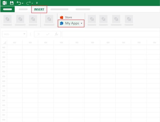
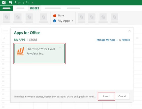
How to Install ChartExpo in Excel?
ChartExpo charts are available both in Google Sheets and Microsoft Excel. Please use the following CTAs to install the tool of your choice and create beautiful visualizations with a few clicks in your favorite tool.
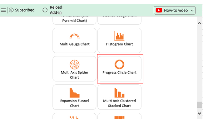
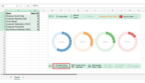
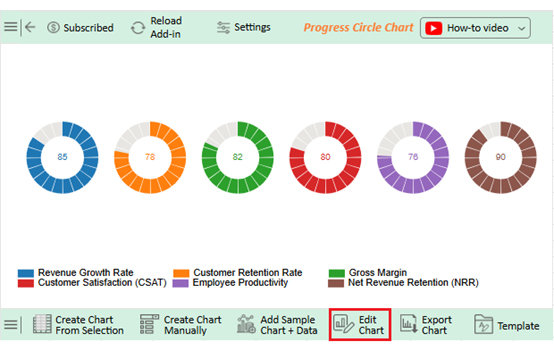
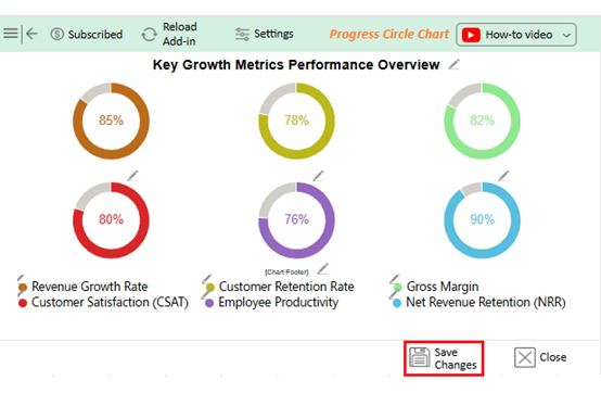
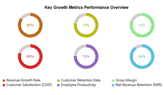
Let’s visualize and analyze this sample data in Excel using ChartExpo.
|
Metric |
Value (%) |
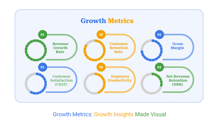
| Revenue Growth Rate | 85 |
| Customer Retention Rate | 78 |
| Gross Margin | 82 |
| Customer Satisfaction (CSAT) | 80 |
| Employee Productivity | 76 |
| Net Revenue Retention (NRR) | 90 |


Every business wants to grow, but growth without measurement is like running in the dark. Metrics and KPIs give direction by showing what is working and what needs fixing. They transform scattered data into actionable insights that inform more intelligent decisions.
Why?
Framing growth helps us only if we measure the process correctly. The best organizations adhere to practices that render data reliable, relevant, and actionable:
Growth itself is not a KPI. KPIs measure progress toward growth. Business management KPIs, such as revenue, churn, and retention, track growth outcomes. Simply, growth is the goal, while metrics and KPIs are the tools to measure it.
Growth does not happen by chance. It is built on precise measurement and informed decisions. Companies that track the correct numbers create focus and direction. Business management KPIs make this possible by connecting goals with tangible outcomes.
Growth metrics are more than financial reports. They show where strength lies and where attention is needed. They highlight the value of loyal customers and the cost of losing them. With the proper measures, success becomes visible.
Different industries need different views. For example, the retail industry keeps its focus on sales, inventory, and customer behavior. Service-based companies often prioritize customer retention and satisfaction. The proper focus ensures growth is relevant and sustainable.
Operations matter too. Tracking KPIs for operations reveals where processes slow progress. Teams can then adjust, save time, and reduce costs. This is how growth becomes efficient and consistent.
The way data is shown is as important as the data itself. A KPI dashboard in Excel is helpful, but it is often limited in its capabilities. A modern benchmarking dashboard gives leaders deeper insights and comparisons that drive more innovative strategies.
This is where ChartExpo changes the game. It turns raw numbers into engaging visuals that speak clearly. It makes growth easy to track, share, and act on. To achieve business success, install ChartExpo today and start using it to bring your growth metrics to life.
How much did you enjoy this article?


Calculate accounts receivable turnover ratio to measure credit collection speed, improve cash flow, and strengthen your financial strategy. Read on!

Change Management KPIs are the key to tracking adoption, performance, and ROI during transitions. Find out which metrics matter. Read on!

Data collection methods and techniques determine the quality of every insight you act on. Explore key approaches for gathering reliable data. Read on!


