Categories
Charles Miglietti once said, “Data Visualization is the Art of Depicting Data in a Fun and Creative Way. Beyond the Possibilities of Excel Tables. In a Way, it’s like Setting Figures to Music”.
As a team that has been working with data for more than 30 years, we agree with this quote fully.
Good and Bad Examples of Data Visualizations combines graphic designing, analytical, and storytelling skills to display insights more conveniently for everyone.
Analyzing your data using charts and graphs is not restricted to the business sphere. You can also leverage this methodology in the health industry, as well. Good data visualization designs should possess the following attributes:
Conversely, bad data visualizations come in many forms, such as:
To safeguard your business from Good and Bad Examples of Data visualization misinformation, you’ve got to arm yourself with third-party add-ins for your Excel.
Why?
Excel comes with very basic charts, which take time to customize. Besides, it lacks specialized charts, such as the ones for survey storytelling.
Before jumping into the blog’s heart, we’ll address the following question:
Good and bad examples of data visualizations are translating raw information into a visual context, such as a chart or graph. Understanding what a data analyst does can help in creating effective visualizations, as their role involves interpreting and presenting data in a way that highlights key insights.
Its goal is to make data more manageable for your audience to pull insights from. Also, it makes it easier for you to identify patterns, trends, and outliers in large data sets.
Visualization is often used interchangeably with other synonyms, such as information graphics or information visualization. Besides, it’s one of the most effortless analyses you’ll ever do.
Yes, you read that right.
This methodology is vital for almost every sector. Teachers can leverage it to display insights into the student test results. Investors can use visualization charts to establish the long-term profitability of a business.
Business owners can use maps, charts, and graphs to uncover hidden insights, such as missed opportunities in sales data.
Check out the benefits of good data insights:
Charts, graphs, and maps can help you extract actionable insights from your data. Visualizations show accurate results if you use the right type of chart to present data.
Tables and spreadsheets are not ideal for explaining emerging patterns and other significant insights.
Bulky data is worth more than you think.
Why?
It can provide you with unlimited opportunities to extract actionable insights. Yes, insights that could spell the difference between failure and success.
Charts and graphs can help you highlight relationships and patterns that matter the most.
Interactive data visualization tools and charts can help you quickly spot errors and outliers in your data. Working with error-free data validates the resulting answers.
The critical goal of visualizing data is to extract insights for creating data stories.
Going through numbers in spreadsheets manually is monotonous and time-consuming. We recommend you create a compelling narrative with the resulting insights, such as using a Circular Chart because people love stories.
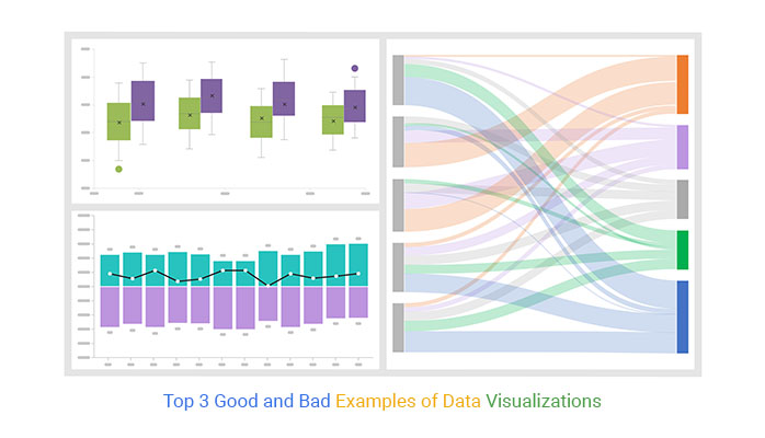
In the coming section, we’ll take you through the top 3 good visualization examples.
The Sankey Chart is the go-to visualization design if you want a high-level view of flows in your data and changes from one node to the next.

Tracking the flow movements can help you uncover critical insights, such as how water-tight your funnel is. Also, the chart can save you time, especially during the analysis phase.
The chart displays the path and quantity of your data through various phases and categories, all easily created with a Sankey diagram Excel.


A Sentiment Trend Chart can help you to display the trends and patterns of opinions of the target market.
Besides, it is insightful and easy to read, especially if your goal is to highlight the decline and growth of key metrics that matter to you.
The Sentiment Trend Chart line displays key variables’ trends and patterns over a specified period.
A Box and Whiskers Diagram is a chart to display the distribution and variation in your data.

The visualization design shares many similarities with histograms since it showcases data distribution. The only difference is that it offers a more condensed and immersive view of your data.
More so, it presents data distribution using a compact and straightforward design. This means you can:
Its simplicity and minimalist appearance make it the go-to chart when space is limited. Also, it’s an excellent choice for showcasing a visual summary of your data to your audience (and readers).
We’ve just taken you through the good and bad data visualization examples. In the coming section, we’ll address the data visualization best practices for better analysis.
Check out game-changing tips below.
Clean your data before converting it into a graphical format for in-depth insights.
Cleaning entails filtering out any anomalies or inaccuracies present in your raw data. Besides, the process increases the reliability of the resulting insights.
Always mind the interests of the target audience when selecting a suitable chart to analyze your data for insights. Complex charts are likely to confuse a less technical audience.
Choosing the wrong visualization design can distort the resulting insights.
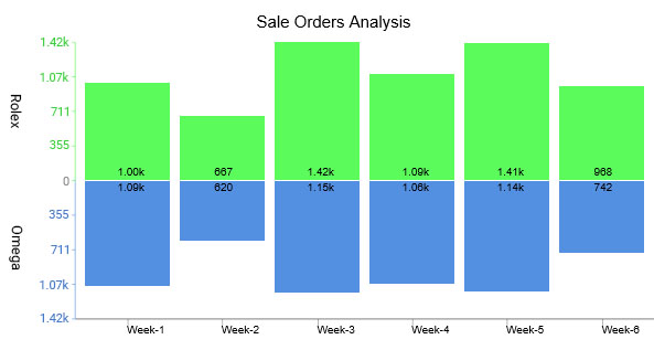
Use charts and graphs that align with the unique nature of your data. For instance, use the chart below to visualize ratings and sentiments toward your brand and its offering.

Labeling your charts can help you establish context quickly with people who are alien to your data.

For instance, the chart above is a financial chart with a title, signaling that the key theme is the comparison between revenue and profit margin. Besides, the x-axis, which depicts the financial year, is adequately labeled.
Note that labeling is a key variable, especially for good and bad data visualization examples.
Always use highly contrasting colors to emphasize key insights. For instance, use the Likert Scale Chart below with contrasting colors to graph survey results.

In the coming section, we’ll take you through how to create good data visualizations in Excel.


A visualization is a form of analysis you can use to extract answers from your data. One of the common tools for visualizing data is charts, graphs, and maps for example, Mosaic plots in the Excel spreadsheet.
However, the spreadsheet application lacks ready-made charts, which can protect you from visualization misinformation.
We’re not advising you to do away with Excel in favor of other expensive tools.
This is because there’s an amazingly affordable visualization tool that comes as an add-in you can easily install in Excel to access insightful and easy-to-customize good and bad data visualization examples. The tool is called ChartExpo.
So, what is ChartExpo?
ChartExpo is an add-in you can easily install in your Excel without needing tutorials.
With many ready-to-go and insightful charts, graphs, and maps, including Funnel Charts, ChartExpo transforms your complex, raw data into easy-to-interpret and visually appealing charts and graphs that tell data stories in real time.
More benefits
In the coming section, we’ll show you how to analyze your data using ChartExpo.
This section will use a Sentiment Trend Chart to display insights into the table below.
You don’t want to miss this.
| Month | Satisfied | Dissatisfied |
| Jan | 43 | 57 |
| Feb | 46 | 54 |
| Mar | 43 | 57 |
| Apr | 48 | 52 |
| May | 47 | 53 |
| Jun | 38 | 62 |


Bad data visualizations come in many forms, such as:
Some characteristics of poor data visualization include:


We’ve just covered the top 3 good and bad data visualization examples for you to get started.
Good and bad data visualization combines graphic designing, analytical, and storytelling skills to display insights more conveniently for everyone.
Analyzing your data using charts and graphs is not restricted to the business sphere. You can also leverage this methodology in the health industry, as well. Good data visualization designs should possess the following attributes:
Conversely, bad data visualizations come in many forms, such as:
How much did you enjoy this article?


Calculate accounts receivable turnover ratio to measure credit collection speed, improve cash flow, and strengthen your financial strategy. Read on!

Change Management KPIs are the key to tracking adoption, performance, and ROI during transitions. Find out which metrics matter. Read on!

Data collection methods and techniques determine the quality of every insight you act on. Explore key approaches for gathering reliable data. Read on!


