Categories
Forecasting in Power BI is where messy history turns into a workable plan. If the date column’s clean and the visual is set up right, the forecast line won’t just look smart, it’ll stay useful when the meeting gets tense.


Forecasting in Power BI pushes reporting past the rearview mirror and into decisions that can actually be acted on.
Definition: Forecasting in Power BI projects future values from past trends inside a report, so planning has a defensible baseline. It works best with time-series measures that appear at steady intervals.
Power BI extends a line chart forward using its forecast model, supporting predictive analytics in Power BI without custom code. Power BI forecasting turns yesterday’s pattern into a short, testable projection.
Forecasting in Power BI matters because leaders don’t get paid to be surprised. A solid forecast turns historical data into a forward view, so planning feels less reactive and more deliberate.
A forecast line puts likely outcomes on the table, so decisions aren’t based on vibes.
When demand is visible early, staffing and spend can be set before the crunch hits.
Goals land better when targets match what the trend is saying, not what someone’s hoping for.
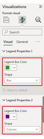
Forecasts sit right on the chart, and Power BI data visualization keeps the story interactive instead of static.
With the right joins in place, Power BI datasets from different systems can feed a single forecast view.
A forecast is only as good as the timeline and cleanup behind it. Wrong date, grain, or messy blanks will make the output noisy.
It’s best to clear out nulls and duplicates before charting.
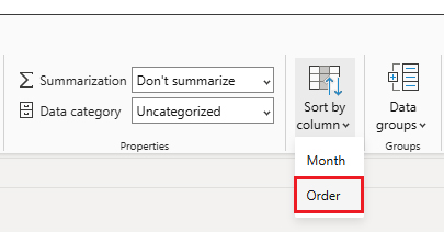
Keep dates ordered and at one grain, or trends break.
Use line or area visuals; others won’t forecast well.
Set a continuous date axis; categories won’t work.
Power BI uses exponential smoothing under the hood.
Choose a projection window that matches the business cycle.
Auto-detect seasonality, or set it manually.
Set the interval to reflect uncertainty, similar to how a confidence interval graph helps represent data reliability and range.
Handled well, these settings keep Forecasting in Power BI consistent enough for Power BI advanced analytical work.
Accuracy checks keep Forecasting in Power BI honest. A few straightforward metrics show whether the forecast is tracking reality or drifting off over time.
Shows the average error in the measure’s units.
Shows error as a percent of actuals.
Punishes large errors more than small ones.
Wider bounds mean more uncertainty.
Uses variance from the Power BI data model to check fit.
In practice, forecasting with Power BI goes beyond sales. With a clean timeline, Forecasting in Power BI can support planning across teams.
Projects near-term sales using trend and seasonality.
Maps revenue direction over quarters for targets.
Helps set reorder points so stock doesn’t run out or pile up.
Estimates customer growth and retention shifts over time.
Supports budgets, cash planning, and variance analysis, and helps visualize financial flows using tools like a Sankey diagram.
It also fits CRM-heavy teams, where Power BI for Salesforce data needs a quick projection for pipeline and renewals.
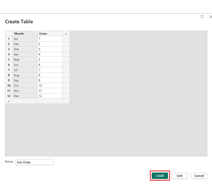
Setting up Forecasting in Power BI takes a few clicks, but the setup rules still matter.
Use a line chart and place date values on the X-axis.
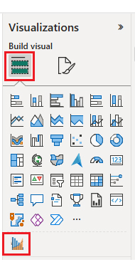
Open the Analytics pane and locate the forecasting controls.
Switch forecasting on for the selected visual.
Set the options that match the data:
Those steps are the practical baseline for how to use Power BI when a report needs forward-looking context.
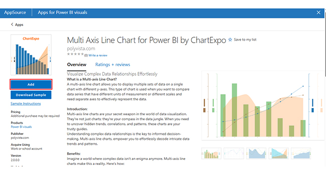
Forecasting in Power BI isn’t finished when the line appears. The forecast should follow history, and the confidence bands should match the cycle. Spikes usually mean the data is off. ChartExpo can combine historicals, forecasts, and KPIs in one view, supporting analysis with Power BI artificial intelligence.
Why Use ChartExpo?
Example:
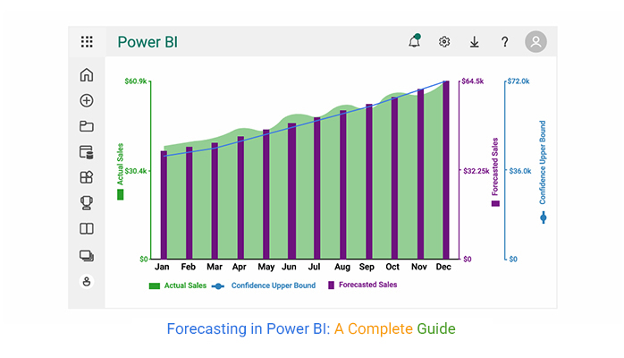
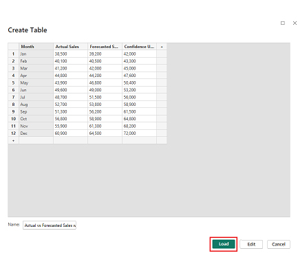
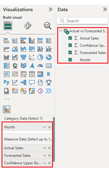
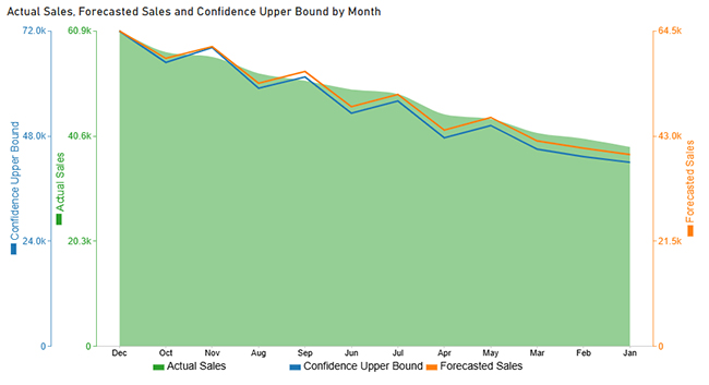
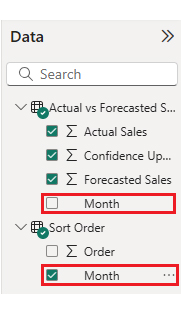
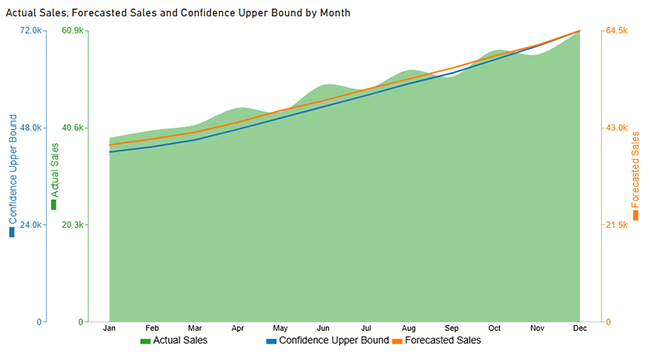
The table below shows monthly Sales alongside Forecast Sales, which is enough to demonstrate a multi-axis line chart.
|
Month |
Actual Sales | Forecasted Sales |
Confidence Upper Bound |
| Jan | 38,500 | 39,200 | 42,000 |
| Feb | 40,100 | 40,500 | 43,300 |
| Mar | 41,200 | 42,000 | 45,000 |
| Apr | 44,800 | 44,200 | 47,600 |
| May | 43,900 | 46,800 | 50,400 |
| Jun | 49,600 | 49,000 | 53,200 |
| Jul | 48,700 | 51,500 | 56,000 |
| Aug | 52,700 | 53,800 | 58,900 |
| Sep | 51,300 | 56,200 | 61,500 |
| Oct | 56,800 | 58,900 | 64,800 |
| Nov | 55,900 | 61,300 | 68,200 |
| Dec | 60,900 | 64,500 | 72,000 |
Forecasting in Power BI helps teams plan and avoid surprises. It supports budgeting, staffing, and course corrections.
Put together, these wins make forecasting with Power BI a dependable part of modern analytics.
Good forecasts don’t happen by accident. The list below keeps Forecasting in Power BI stable when the dataset changes or the business shifts.
Follow those habits, and Power BI forecasting stays grounded, predictable, and useful.
Line and area charts work best because they use a continuous date axis, which the forecast feature needs.
Select a supported visual, open the Analytics pane, then turn Forecast on and set the parameters.
Accuracy depends on data quality, seasonality, and how far the forecast reaches. It’s smart to compare forecasts to actuals and track error metrics over time.
Yes. Forecasting in Power BI is built in and covers many common time-series needs, as long as the timeline is consistent.
Forecasting in Power BI turns historical reporting into a forward-looking view that teams can act on. Clean data, sensible settings, and routine accuracy checks keep the forecast honest. It’s a simple upgrade that pays back fast.
How much did you enjoy this article?


Discover diverse and high-quality Power BI report examples for inspiration and insights. Elevate your reporting with strategic visualization techniques.

A Customer Relationship Management Dashboard centralizes data, tracks key metrics, and drives smarter business decisions. Discover now!

Explore Healthcare Dashboard Examples and learn how to turn complex healthcare data into clear, actionable insights for better decision-making.


