• Home
  • Tools dropdown img
    • Spreadsheet Charts

      • ChartExpo for Google Sheets
      • ChartExpo for Microsoft Excel
    • Power BI Charts

      • Power BI Custom Visuals by ChartExpo
    • Word Cloud

  • Charts dropdown img
    • Chart Category

      • Bar Charts
      • Circle Graphs
      • Column Charts
      • Combo Charts
      • Comparison Charts
      • Line Graphs
      • PPC Charts
      • Sentiment Analysis Charts
      • Survey Charts
    • Chart Type

      • Box and Whisker Plot
      • Clustered Bar Chart
      • Clustered Column Chart
      • Comparison Bar Chart
      • Control Chart
      • CSAT Survey Bar Chart
      • CSAT Survey Chart
      • Dot Plot Chart
      • Double Bar Graph
      • Funnel Chart
      • Gauge Chart
      • Likert Scale Chart
      • Matrix Chart
      • Multi Axis Line Chart
      • Overlapping Bar Chart
      • Pareto Chart
      • Radar Chart
      • Radial Bar Chart
      • Sankey Diagram
      • Scatter Plot Chart
      • Slope Chart
      • Sunburst Chart
      • Tornado Chart
      • Waterfall Chart
      • Word Cloud
    • Google Sheets
      Microsoft Excel
  • Services
  • Pricing
  • Contact us
  • Blog
  • Support dropdown img
      • Gallery
      • Videos
      • Contact us
      • FAQs
      • Resources
    • Please feel free to contact us

      atsupport@chartexpo.com

Categories
All Data Visualizations Data Analytics Surveys
Add-ons/
  • Google Sheets
  • Microsoft Excel
  • Power BI
All Data Visualizations Data Analytics Surveys
Add-ons
  • Google Sheets
  • Microsoft Excel
  • Power BI

We use cookies

This website uses cookies to provide better user experience and user's session management.
By continuing visiting this website you consent the use of these cookies.

Ok

ChartExpo Survey


Home > Blog > Power BI

Edit Queries in Power BI for Customized Data Views

Microsoft Power BI is a powerful business intelligence (BI) platform that empowers non-technical business users to efficiently aggregate, analyze, visualize, and collaborate on data. Its user-friendly interface makes it easily accessible to users.

Edit Queries in Power BI

Before data is loaded into a model, it has to be transformed and cleaned ”” and that’s where edit queries in Power BI come in. In this guide, you’ll discover what queries in Power BI are, figure out why edit queries in Power BI are used, and when to use Power BI edit queries.

Table of Contents:

  1. What are Queries in Power BI?
  2. Why Use Edit Queries in Power BI?
  3. When to Use Power BI Edit Queries?
  4. How to Edit a Query in Power BI?
  5. How to Visualize in Power BI?
  6. What are the Best Practices for Query Editing?
  7. Wrap Up

First…

What are Queries in Power BI?

Power Query in Power BI is a robust data connectivity and data preparation tool within the platform. The tool helps users effortlessly connect and import data from diverse sources like Microsoft Excel, Analysis Services, Power BI, and Dataverse.

Why Use Edit Queries in Power BI?

  • Custom Transformation: It provides the ability to transform and reshape data to meet specific analytical needs like merging tables or creating calculated columns.
  • Data Cleaning: It allows you to remove errors, inconsistencies, and duplicates. This ensures that high-quality data is used for analysis.
  • Improved Performance: It streamlines data by filtering and aggregating it before loading it into the model. This enhances report performance.
  • Enhanced Accuracy: It ensures data is accurate and aligns with business rules. This will, in turn, reduce the risk of incorrect insights.

When to Use Power BI Edit Queries?

  • Data Cleaning: You have to remove duplicates, handle missing values, or correct inconsistencies in the data.
  • Data Transformation: You have to reshape or transform data by splitting fields, pivoting columns, or merging tables.
  • Data Filtering: You have to filter out unnecessary columns or rows to focus on relevant information.
  • Enhancing Data Quality: You have to apply business rules, enrich data, or standardize formats to improve accuracy and relevance.

How to Edit a Query in Power BI?

With Power BI Desktop, users can connect to the world of data, create foundational and compelling reports, and share their efforts with others. This will, in turn, help them build on the work, and expand their business intelligence efforts.

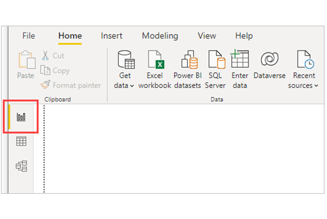
Power BI Desktop has three views:

  • Report view: Queries are used to build compelling data visualizations that are arranged just the way you want them. These visualizations can come with multiple pages, and the user can easily share them with other stakeholders.
  • Data view: The data in your report can be displayed in data model format. This way, you can add measures, create new columns, and manage relationships.
  • Model view: It helps you get a graphical representation of the relationships established in the data model. This way, the user can easily manage (or modify) them as needed.

To access these views, you’ll have to select one of the three icons along the left side of Power BI Desktop. From the image below, you’ll notice that the Report view has been selected, and it’s indicated by the red band beside the icon.

Notice Report View After Learning Edit Queries in Power BI

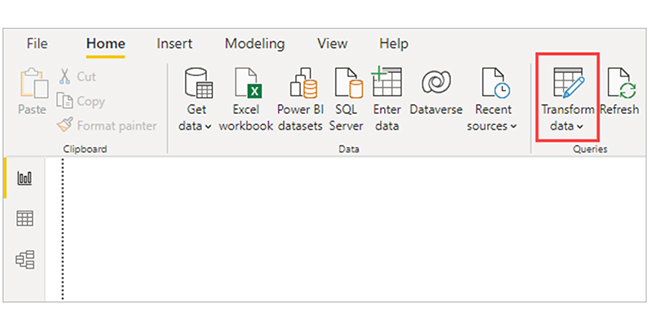
Power BI Desktop comes with the Power Query Editor. You can use the Power Query Editor to connect to one or multiple data sources, and shape and transform the data to meet your needs. After that, load the model into Power BI Desktop.

Power Query Editor

To get to Power Query Editor, select “Transform data” from the Home tab of Power BI Desktop.

Select Transform Data After Learning Edit Queries in Power BI

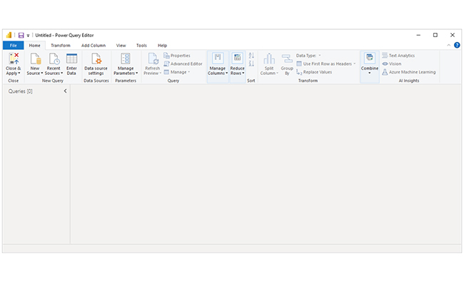
If there are no data connections, Power Query Editor appears as a blank pane.

Power Query Editor Appears as a Blank Pane After Learning Edit Queries in Power BI

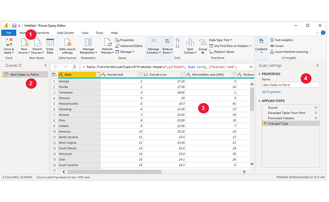
After the query is loaded, the Power Query Editor view becomes more fascinating. If the New Source button in the top left is used to connect to a Web data source, the Power Query Editor loads information about the data.

Here’s how the Power Query Editor appears after a data connection has been established.
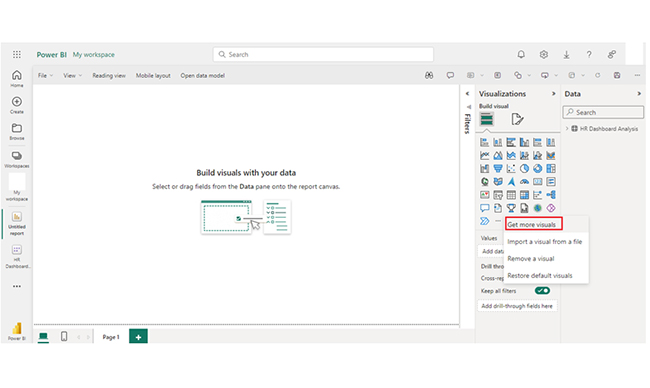
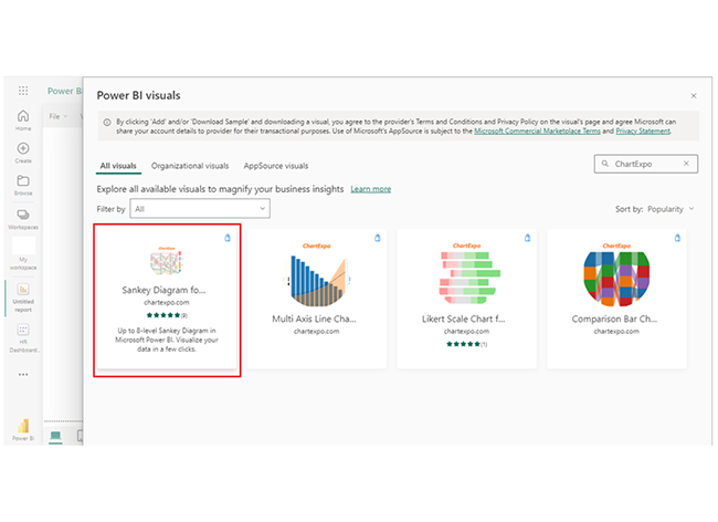
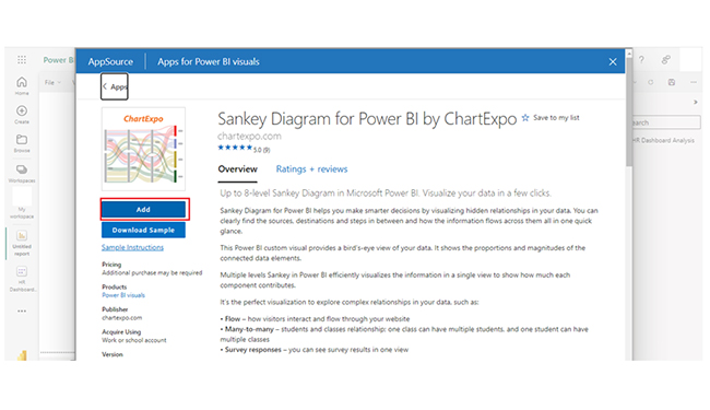
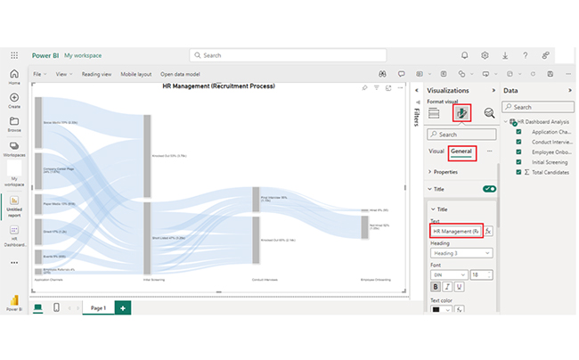
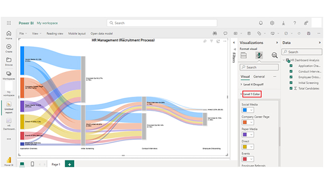
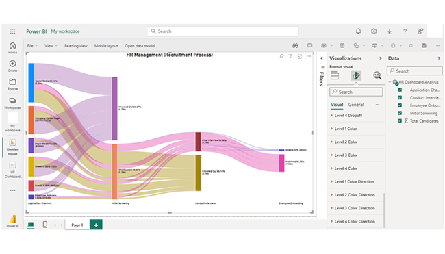
  • In the ribbon, many ribbons are active to interact with the data in the query.
  • In the left pane, queries are listed and available for selection, viewing, and shaping.
  • In the center pane, data from the selected query is displayed and available for shaping.
  • The Query Settings pane appears, and it lists the query’s properties and applied steps.
Power Query Editor Appears After Data Connection After Learning Edit Queries in Power BI

How to Visualize in Power BI?

Stage 1: Logging in to Power BI
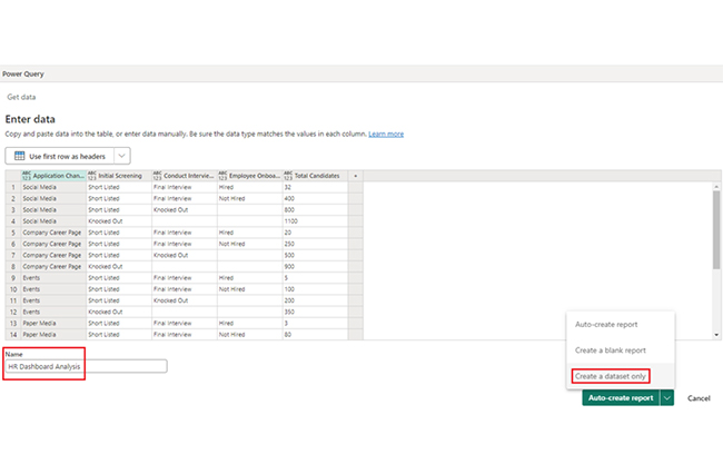
  • Log in to Power BI.
  • Enter your email address and click the “Submit” button.
Enter email to login to Power BI
  • You are redirected to your Microsoft account.
  • Enter your password and click “Sign in“.
Enter Password to login to Power BI
  • You can choose whether to stay signed in.
Click on stay signed in
  • Once done, the Power BI home screen will open.

Stage 2: Creating a Data Set and Selecting the Data Set to Use in Your Chart

  • Go to the left-side menu and click the “Create” button.
  • Select “Paste or manually enter data“.
select Paste or manually enter data in Power BI ce487
  • We’ll use the sample data below for this example.
Application Channels Initial Screening Conduct Interviews Employee Onboarding
Total Candidates
Social Media Short Listed Final Interview Hired 32
Social Media Short Listed Final Interview Not Hired 400
Social Media Short Listed Knocked Out 800
Social Media Knocked Out 1100
Company Career Page Short Listed Final Interview Hired 20
Company Career Page Short Listed Final Interview Not Hired 250
Company Career Page Short Listed Knocked Out 500
Company Career Page Knocked Out 900
Events Short Listed Final Interview Hired 5
Events Short Listed Final Interview Not Hired 100
Events Short Listed Knocked Out 200
Events Knocked Out 350
Paper Media Short Listed Final Interview Hired 3
Paper Media Short Listed Final Interview Not Hired 80
Paper Media Short Listed Knocked Out 135
Paper Media Knocked Out 700
Employee Referrals Short Listed Final Interview Hired 10
Employee Referrals Short Listed Final Interview Not Hired 70
Employee Referrals Short Listed Knocked Out 80
Employee Referrals Knocked Out 110
Direct Short Listed Final Interview Hired 25
Direct Short Listed Final Interview Not Hired 150
Direct Short Listed Knocked Out 425
Direct Knocked Out 600
  • Paste the data table above into the “Power Query” window. After that, select the “Create a dataset only” option.
Select Create a Dataset Only After Learning Edit Queries in Power BI
  • Navigate to the left-side menu, and click on the “Data Hub” option. Power BI will populate the data set list. If there are no datasets created, you’ll get an error message.
Click on Data Hub After Learning Edit Queries in Power BI
  • Click on the “Create Report” dropdown.
Click on Create Report After Learning Edit Queries in Power BI
  • To add the Power BI Sankey Diagram Extension by ChartExpo, you’ll have to create the Sankey Diagram using an add-in or the Power BI visual from AppSource. Navigate to the right side of the Power BI dashboard, and open the Power BI visualizations panel. Next, click the ellipsis symbol (…) to import the Power BI Sankey Diagram extension by CharExpo. On the following menu that opens, select the “Get more visuals” option.
Select Get More Visuals After Learning Edit Queries in Power BI
  • Enter “ChartExpo” in the highlighted search box. You’ll see the “Sankey Diagram for Power BI by ChartExpo’ as shown below.
Enter ChartExpo in Search After Learning Edit Queries in Power BI
  • Click on the Sankey Diagram. After that, click the highlighted “Add” button.
Click Add Button After Learning Edit Queries in Power BI
  • Power BI will add the “Sankey Diagram for Power BI by ChartExpo” icon in the visualization panel.
Sankey Diagram Icon in Visualization Panel After Learning Edit Queries in Power BI
  • To draw a Sankey Diagram with ChartExpo’s Power BI extension, you’ll have to select the “Sankey Diagram for Power BI by ChartExpo” icon in the visualization panel. After that, you’ll see a dashboard similar to the one below displayed on your screen.
Dashboard Similar Displayed After Learning Edit Queries in Power BI
  • Select the fields to use in the Sankey chart.
Slect Fields to Use in Sankey Chart After Learning Edit Queries in Power BI
  • When selecting the fields, follow the sequence below:
    • Application Channels
    • Initial Screening
    • Conduct Interviews
    • Employee Onboarding
    • Total Candidates
  • You’ll have to provide the email address or the ChartExpo license. Add the key under the visual section.
Add Email Address After Learning Edit Queries in Power BI
  • After that, you’ll see the Sankey Chart displayed with your data. The top header text in the chart can be added under the General section.
Add Top Header Under General Section After Learning Edit Queries in Power BI
  • You can click on Visual to set the number and also enable the options as shown below:
Click Visuals to Set the Number and Enable the Options After Learning Edit Queries in Power BI
  • You can change the “Node Font Style.”
Change Node Font Style After Learning Edit Queries in Power BI
  • There’s an option to change the “Level Font Style.”
Change Level Font Style After Learning Edit Queries in Power BI
  • Here are the Level Labels.
Here are Level Labels After Learning Edit Queries in Power BI
  • Here’s how to change the Nodes’ color.
Change Nodes Color After Learning Edit Queries in Power BI
  • Since you’ve discovered “how to change Level 1 color,” you should follow the same steps to change the node color of other levels.
Change Level 1 Color After Learning Edit Queries in Power BI
  • Here’s the final look of the HR Dashboard in Power BI using ChartExpo after changing the all-nodes color.
Final Edit Queries in Power BI

Insights:

  • Social Media is the primary application channel with the highest number of candidates (1100).
  • Company Career Page follows with 900 candidates.
  • Paper Media and Events have comparatively lower candidate counts of 700 and 350, respectively.
  • Direct applications have 600 candidates.

Master Edit Queries in Power BI to Transform Data for Powerful Visuals:

Dive into the world of Edit Queries in Power BI with this hands-on tutorial, where you’ll learn how to refine and transform your data before creating impactful charts and graphs. With Power BI’s powerful Query Editor, you’ll gain the skills to clean, shape, and combine data from multiple sources, ensuring that your visuals reflect accurate, high-quality information. Whether it’s filtering out unnecessary data, merging tables, or performing complex transformations, mastering Edit Queries will lay the foundation for effective data analysis. Once your data is transformed, you can move seamlessly into creating dynamic reports and dashboards that bring your insights to life. By optimizing your data through query editing, you ensure your Power BI visualizations are both meaningful and actionable, empowering better decision-making and driving business growth.

What are the Best Practices for Query Editing?

  • Plan Transformations: Outline your data transformation needs before editing to streamline the process.
  • Start with Raw Data: Work with raw data to ensure you capture all necessary details.
  • Use Steps Wisely: Apply transformations in a logical sequence to minimize complex steps and enhance readability.
  • Name Queries Clearly: Use descriptive names for queries and steps to improve clarity and manageability.
  • Remove Unnecessary Data: Filter out irrelevant data early to reduce complexity and improve performance.
  • Preview Results: Preview the results to ascertain that transformations produce the desired results.

FAQs

Can I edit queries directly in Power BI Desktop?

Yes, you can edit queries directly in Power BI Desktop using the Power Query Editor.

How can I rename a column in the Query Editor?

In Power Query Editor, right-click on the column header and select “Rename.” You can also double-click on the header and type the new name. Press Enter to apply the change.

How do I edit a query after it has been loaded to the model?

To edit a query after loading, navigate to the Power BI Desktop, click “Transform data” on the Home tab, and modify the query in the Power Query Editor. Apply changes to update the model.

Wrap Up

Queries in Power BI are used to transform and retrieve data. Cleaning and shaping data are the processes used to facilitate these processes in Power BI Query Editor.

With edit queries in Power BI, users can ascertain the accuracy, relevance, and performance of their data model. To get the best out of the query editing process, you have to document changes. That can be achieved by adding comments. Documentation helps explain complex transformations for future reference.

Furthermore, you should remove unnecessary data by filtering out irrelevant data. This will help reduce complexity and improve performance. You should also check the preview to ascertain that the transformations produce your desired results.

Now you know what edit queries in Power BI are, and why you should use it, you can follow the steps outlined in this guide to produce compelling data visuals.

How much did you enjoy this article?

PBIAd2
Start Free Trial!
141905

Related articles

next previous
Power BI12 min read

Power BI Group By Guide for Effective Data Insights

Learn how Power BI Group By helps you aggregate data, clarify trends, and create reports by grouping values to make large datasets manageable & insightful.

Power BI12 min read

How to Create Sankey Diagram in Microsoft Power BI?

Learn How to Create Sankey Diagram in Microsoft Power BI using Desktop & Web Service. What they are and how to use them effectively.

Power BI8 min read

Power BI Artificial Intelligence: Insights Using Visuals

Discover all there is to know about the Power BI artificial intelligence. You'll also discover how AI is used in Power BI, and how to use it for analysis and more.

Power BI9 min read

Budgeting in Healthcare: Use Visuals to Spot Budget Gaps

This guide helps you discover what budgeting in healthcare is. You'll also discover the factors that affect hospital budgets and types of budgeting in healthcare.

Power BI9 min read

Predictive Analytics in Power BI for Making Insightful Visuals

This guide shows you everything you need to know about Predictive Analytics in Power BI. It also shows you how it works, and how to interpret the results.

ChartExpo logo

Turn Data into Visual
Stories

CHARTEXPO

  • Home
  • Gallery
  • Videos
  • Services
  • Pricing
  • Contact us
  • FAQs
  • Privacy policy
  • Terms of Service
  • Sitemap

TOOLS

  • ChartExpo for Google Sheets
  • ChartExpo for Microsoft Excel
  • Power BI Custom Visuals by ChartExpo
  • Word Cloud

CATEGORIES

  • Bar Charts
  • Circle Graphs
  • Column Charts
  • Combo Charts
  • Comparison Charts
  • Line Graphs
  • PPC Charts
  • Sentiment Analysis Charts
  • Survey Charts

TOP CHARTS

  • Sankey Diagram
  • Likert Scale Chart
  • Comparison Bar Chart
  • Pareto Chart
  • Funnel Chart
  • Gauge Chart
  • Radar Chart
  • Radial Bar Chart
  • Sunburst Chart
  • see more
  • Scatter Plot Chart
  • CSAT Survey Bar Chart
  • CSAT Survey Chart
  • Dot Plot Chart
  • Double Bar Graph
  • Matrix Chart
  • Multi Axis Line Chart
  • Overlapping Bar Chart
  • Control Chart
  • Slope Chart
  • Clustered Bar Chart
  • Clustered Column Chart
  • Box and Whisker Plot
  • Tornado Chart
  • Waterfall Chart
  • Word Cloud
  • see less

RESOURCES

  • Blog
  • Resources
  • YouTube
SIGN UP FOR UPDATES

We wouldn't dream of spamming you or selling your info.

© 2025 ChartExpo, all rights reserved.