Categories
Surveys are an integral part of the successful running of your business. However, surveys can be challenging to create and administer.


Especially when your target audience is vast and you need concise responses.
This is where dichotomous questions come into play.
Dichotomous questions ask survey participants to choose between two mutually exclusive options. Thus, ideal for collecting valuable data on a range of topics from a large group of people. As such, they are widely used in research studies.
Assume you want to understand the impact of your new product on your target audience. To do this, you survey with dichotomous questions. You ask the respondents to answer simple yes or no questions about the product.
This poll will provide a clear image of your target audience’s sentiment. This will assist you in determining ways to enhance your products to serve your clients better.
It’s common practice for surveys to include dichotomous questions. However, surveyors experience difficulties analyzing the data in Excel.
This blog post will discuss the basics of dichotomous questions in surveys. Then show you how to glean meaningful insights from the results in Excel with ease.
Let’s get started.
Definition: A dichotomous question is a closed-ended question that prompts the respondent to choose between two distinct answers.
In simple terms, it is a yes or no type of question.
It is a simple way to gather data or information on a specific topic or issue. As a result, dichotomous questions are common in surveys since they allow easy data analysis and comparison.
With only two possible answer options, dichotomous questions are straightforward. Consequently, it is easy for respondents to understand and answer quickly. This simplicity and ease of use make them popular for survey data collection methods.
Dichotomous questions only require a “yes” or “no” answer. Thus, respondents can quickly provide their responses without spending time formulating complex answers. This is particularly useful in cases where surveys need quick responses. Or where respondents have limited time or attention spans, such as with online surveys.
Since dichotomous questions only require two possible answer options, you can easily administer them to a large group. This reduces the time and resources required to create and administer the survey. This is particularly useful for organizations or researchers with limited budgets or resources. It allows quick and efficient collection of data without incurring high costs.
You can minimize respondent bias by asking questions with just two possible answers. They give you a simple, dependable structure for completing the survey. As a result, the collected information is more likely to be trustworthy and objective. Thus, it’s helpful for factual decision-making.
Dichotomous survey questions are designed to have only two possible response options, typically “yes” or “no.” To use dichotomous questions effectively:
By offering only two possible answer options, dichotomous questions can provide straightforward and objective data. This is by eliminating any biases or subjective interpretations. It helps ensure the data collected is accurate and reliable and reflects the genuine opinions of the respondents.
Using dichotomous questions eliminates any potential ambiguity in survey questions. This may lessen respondents’ likelihood of misinterpreting the question or providing irrelevant responses. Hence resulting in more precise data.
With dichotomous questions, respondents can quickly and easily choose the answer that best reflects their opinion or experience. It eliminates the need to spend time considering multiple answer options. Furthermore, respondents are less likely to become frustrated or disengaged by a lengthy or confusing survey. Consequently, this leads to higher response rates and accurate data.
Respondents may have a more nuanced perspective that cannot be accurately captured by a “yes” or “no” response. This can make capturing complex topics’ nuances or attitudes difficult. Consequently, fail to capture the respondent’s attitudes and opinions accurately.
Dichotomous questions do not provide detailed information about the respondent’s opinion or experience. There may not be enough variation in the responses to draw meaningful conclusions. This can make it difficult to identify patterns or trends in the data.
Dichotomous questions may be less reliable than other question types because they can be overly simplistic. As a result, fails to capture the full complexity of the topic under study. Respondents may feel that the answer options do not accurately reflect their opinion or experience. Consequently, provide less accurate or untruthful responses.
HR exit survey questions typically contain dichotomous questions that require a “yes” or “no” answer. These questions help gather quantitative data about specific aspects of the employee’s experience.
Some examples of dichotomous questions you can include in an HR exit survey are:
In the context of market research, dichotomous questions collect quantitative data on customer preferences, opinions, and behaviors.
Examples of dichotomous questions in market research include:
In education research, dichotomous questions are frequently used to gather and analysis of quantitative data. They offer a quick and easy technique to gauge attitudes and beliefs.
Examples of dichotomous questions in education include:
Dichotomous questions are often used in event surveys or evaluations to test attendees’ satisfaction or experience.
Here are some examples of dichotomous questions in event management:
The next step after data collection is the analysis of the survey results. Excel is a great program to use while conducting a survey analysis. However, it poses some challenges in data analysis.
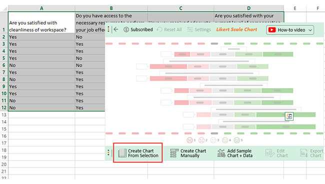
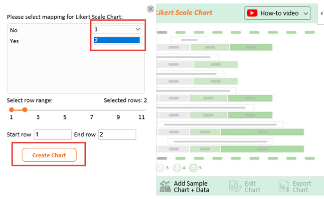
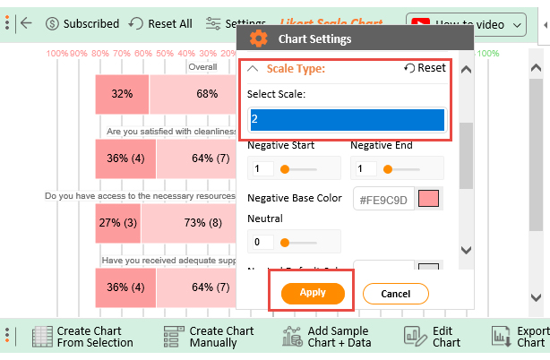
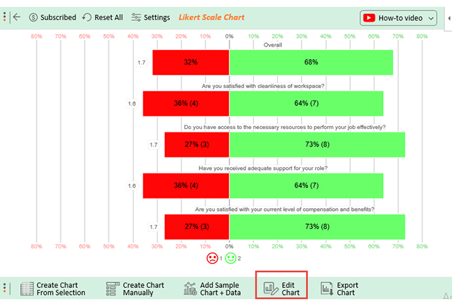
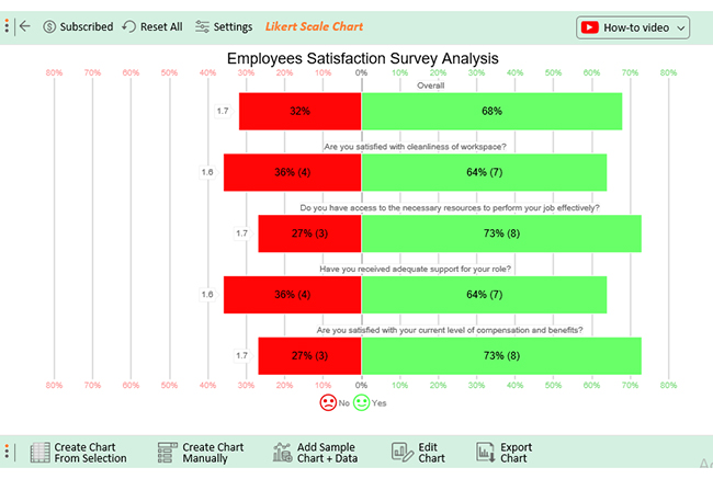
Analyzing dichotomous survey questions in Excel becomes easy with ChartExpo. ChartExpo is a powerful data visualization tool that helps you quickly create charts from survey data.
To analyze dichotomous survey questions efficiently, use the Likert Scale Chart. A Likert Scale Chart is a type of bar chart ideal for displaying survey results. It measures the intensity of a respondent’s opinion or attitude.
ChartExpo will help you create an insightful Likert Scale Chart from the dichotomous survey data. Then you can use the chart to analyze the responses and gain valuable insights.
Why ChartExpo?
Benefits of Using ChartExpo
How to Install ChartExpo in Excel?
ChartExpo charts and graphs are available both in Google Sheets and Microsoft Excel. Please use the following CTA’s to install the tool of your choice and create beautiful visualizations in a few clicks in your favorite tool.


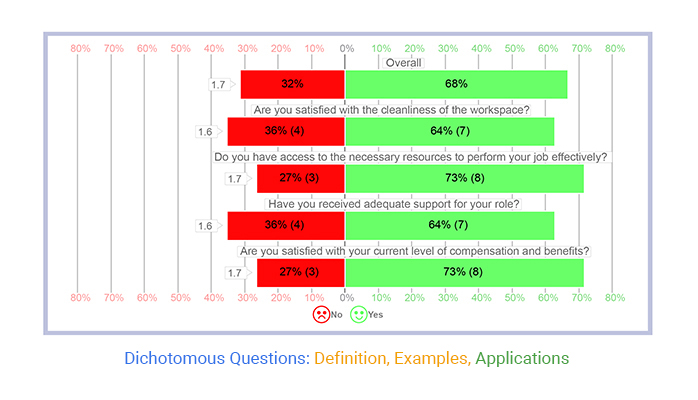
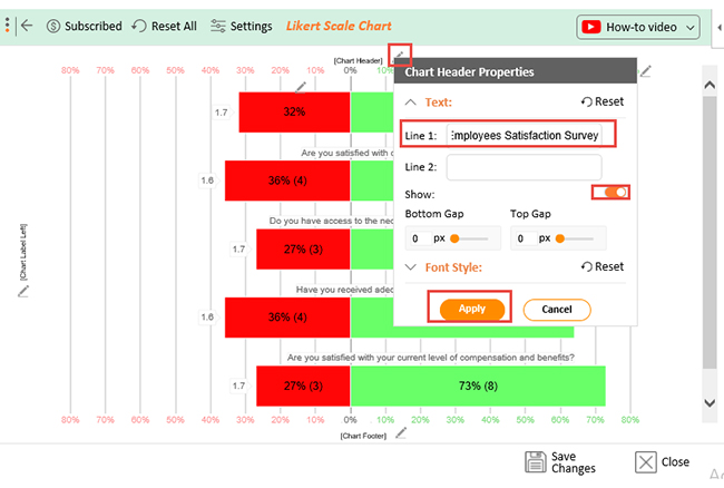
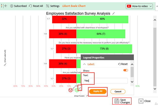
Let’s say you conducted an employee satisfaction survey that yielded the results below.
| Are you satisfied with the cleanliness of the workspace? | Do you have access to the necessary resources to perform your job effectively? |
Have you received adequate support for your role? |
Are you satisfied with your the current level of compensation and benefits? |
| Yes | No | Yes | Yes |
| Yes | Yes | Yes | Yes |
| Yes | Yes | No | No |
| Yes | No | No | Yes |
| No | No | Yes | Yes |
| Yes | Yes | Yes | No |
| No | Yes | Yes | Yes |
| Yes | Yes | No | Yes |
| Yes | Yes | Yes | No |
| No | Yes | No | Yes |
| No | Yes | Yes | Yes |
Follow through as I show you how a Likert Scale creator works. Then, glean valuable insights from this data.


A dichotomous scale is a rating scale that offers respondents two options.
Below are some of the common dichotomous scale examples;
The purpose of dichotomous questions is to collect concise data that is easy to analyze. They are also helpful for surveys or questionnaires that need to be administered quickly and efficiently.
The main advantage of using dichotomous questions is simplicity. This helps to increase the response rate and reduce the likelihood of missing data. This simplicity can also reduce respondent confusion or uncertainty. Consequently, improves the accuracy of the data collected.
Respondents do not have to spend time considering multiple options. Instead, they can quickly choose between the two options. This helps to save time and reduce cognitive load for respondents. Consequently, makes it easier for them to complete the survey or questionnaire.
With dichotomous questions, you present only two possible answers. Such as “yes” or “no”. This means your respondent can only choose one of the two options. You can also provide a few examples of each answer. This will help respondents decide with more confidence.
The best thing about dichotomous questions is that they only require one specific answer. Hence, reducing the likelihood of respondents providing irrelevant or misleading information.
These might, however, be less reliable than other question types. They cannot give specific information about the respondent’s perceptions and experiences.
After defining the survey questions, you need an efficient data visualization method that best suits your data analysis needs. The most common data visualization method for survey analysis is the Likert Scale Chart. However, you can create many other visual representations using ChartExpo.
Remember, data visualization is only one part of data analysis. You also have to make sense of it. ChartExpo provides you with the appropriate features to glean valuable insights effortlessly.
Why wait?
Get ChartExpo today to enjoy the benefits firsthand.
How much did you enjoy this article?


Google Forms to Google Sheets keeps your data organized and current with every submission. Learn the steps, methods, and tips now!

Product survey questions reveal what customers truly think. Learn how to ask the right ones and act on the survey results. Read on!

Learn how the 5-Point Performance Rating Scale improves employee evaluations with clear, consistent, and fair performance reviews across teams.


