Categories
By ChartExpo Content Team
Ever stared at a mountain of data, unsure how to make sense of it all? You’re not alone. Businesses today are swimming in data, but the real challenge is turning that data into actionable insights. That’s where a density plot can make a difference. A density plot helps you visualize the distribution of your data, making it easier to see patterns, trends, and outliers that might be buried in the numbers.


When you’re analyzing customer behavior, sales trends, or any other business metric, you need tools that simplify complex data. A density plot does exactly that. It gives you a clear picture of where your data points cluster, which can highlight opportunities or risks you might otherwise miss. It’s a practical solution that turns raw data into a visual story, helping you make decisions faster and with more confidence.
For businesses, using density plots means less guesswork and more precision. You can quickly identify key areas that need attention, whether it’s understanding customer preferences or spotting inefficiencies in your operations.
In short, density plots can be a game-changer in how you approach data-driven decision-making, saving you time and boosting your bottom line.
First…
Density plots are graphs that show how data spreads by creating a smooth curve. You can spot the most common values because they peak on the plot. It’s like seeing the popular hangout spots in data!
Density plots and histograms both tell us about data, but in different styles. Histograms use bars to show frequencies, giving us a chunky view. Density plots smooth things out with a curve, offering a cleaner, continuous picture. Imagine histograms are like pixelated photos; density plots are the high-resolution versions.
Density plots are great for showing probability distributions. They let us peek at where values are likely to fall on a graph. It’s similar to predicting where a tossed ball is most likely to land on the ground.
Using density curves makes life easier when analyzing complex data. They help in spotting trends and patterns quickly, without getting lost in noisy details. Think of them as your data’s best storytellers, turning numbers into visual storytelling.
Picking the right bandwidth for KDE is like finding the perfect temperature for your morning coffee – it has to be just right. Too broad, and you miss out on important details. Too narrow, and you’re overwhelmed with noise. The trick is to strike a balance where the curve is smooth but still captures the true nature of your data.
The bandwidth in KDE acts like the zoom on a camera. Set it too high, and your data looks blurred. Too low, and the picture is too sharp, making it hard to decipher. The right bandwidth sharpens your view, helping you see the distribution of your data clearly.
Think of KDE bandwidth as the brush size on a painting app. If the brush is too big, your painting lacks detail. Too small, and it’s all chaotic strokes. The bandwidth affects your density curves similarly, controlling how detailed or generalized they appear.
In KDE, overfitting is like listening too closely to gossip – every little rumor seems true. Oversmoothing, though, is like ignoring the details that matter. Avoid both to ensure your KDE doesn’t mislead you about what your data is really saying.
There are a few tried and true methods to pick the right bandwidth. You can start with rule-based methods, which use your data to suggest a starting point. Then, tweak it based on what your graphs tell you. It’s a bit like adjusting the focus until the picture is clear.
Silverman’s rule is a handy shortcut for initial bandwidth selection. It uses your sample size and standard deviation to suggest a good starting point. It’s not perfect, but it’s like using a basic recipe – you can adjust the ingredients as needed.
Cross-validation helps you avoid fooling yourself with your bandwidth choice. It’s like asking several friends for feedback on your outfit. If they all say it looks good, you’re on the right track. This method helps you fine-tune the bandwidth by testing how well it performs in representing your data.
Seeing is believing, right? By visualizing how different bandwidths affect your KDE, you can make better choices. It’s like trying on different outfits before a big event. Some will be clearly off, while others might surprise you with their fit.
These plots show data density over a continuous interval. Key features include smooth curves that peak where data clusters. They’re great for identifying data trends and patterns.
Peaks in a Kernel Density Plot show where data points pile up; valleys are less common data areas. The shape tells you if data is spread out or clumped together, which helps in making predictions or decisions.
An unimodal distribution has one peak, simple and common.
Bimodal distributions have two peaks; they might suggest two popular choices or preferences among data subjects.
Multimodal, with multiple peaks, points to diverse preferences or outcomes in the dataset.
Adding color shading or lines can highlight important data parts, making plots easier to understand at a glance. Visual aids point out key data features quickly.
Annotations explain what certain plot parts mean, and reference lines mark important values like means or medians. They guide the viewer’s eye to significant points.
Putting a histogram behind a Kernel Density Plot combines two views: the raw count from the histogram and the smoothed trend from the plot. This combo clarifies the data’s story.
Tooltips that appear when you hover over plot parts provide more details, like exact numbers or data explanations. They make plots not just pictures but interactive tools for deeper data analysis.
When you see data scattered across various peaks in a Scatter plot, you’re often looking at multimodal distributions. This usually signals the presence of different groups or patterns within your data. Kernel density estimates (KDE) help highlight where these peaks occur, making it easier to interpret clusters and data behavior.
Handling data with multiple peaks can be tricky. The main challenge? Making sure each peak is accurately represented without blending into one another, which can skew your analysis.
Spotting multiple peaks in your data set is key. Each peak represents a different “group” or “category” in your data. Understanding this helps you make data-driven decisions based on each group’s specific behaviors or characteristics.
Sometimes KDEs can trick you by showing peaks that aren’t really there – artificial modes. This happens when the method used to smooth the data does too much, making it look like there are distinct peaks where there shouldn’t be.
To get around these issues, advanced techniques are your best friend. These methods adjust how KDEs work to better handle data with multiple peaks, ensuring a more accurate representation of your data.
One effective technique is using Gaussian Mixture Models. Think of it as breaking down your data into several overlapping data sets, each represented by a Gaussian distribution. This helps in modeling each peak more accurately.
Adaptive KDE changes the game by altering the bandwidth or smoothness based on how dense or sparse the data is. It’s like adjusting your focus depending on the detail you need, ensuring that each peak is just right – not too blurry, not too sharp.
Lastly, don’t be afraid to try different kernels. Each kernel can handle data differently, and finding the right one can mean preserving the true nature of multimodal distributions without losing important details.
When you’re dealing with density plots, boundary effects can be a real headache. Let’s break it down.
Boundary effects pop up when you use kernel density estimation (KDE). Imagine you’re looking at how data spreads out, but you hit an edge, like zero. The standard KDE might smudge the truth here, stretching data into places it shouldn’t.
The main challenge? KDE assumes data can roam freely in any direction. Near boundaries, this assumption flops, potentially tilting your data analysis off track.
Here’s the rub: if boundary effects mess with your plot, your conclusions might follow the wrong lead. Think you see a trend or pattern? Double-check those edges!
One nifty trick is the reflection method. It mirrors your data across the boundary, padding out the edges and giving a fuller picture.
Beta kernels are another ace up your sleeve. They’re tailor-made for data that knows its limits, staying within bounds like a well-trained dog.
Got data squeezed between zero and one? Logit transformation maps it out on an infinite line, making it easier to handle with standard KDE tools. It’s like giving your data a new playground that’s just the right size.
High-dimensional data can be tricky. Imagine trying to read a map that has too many paths. Kernel density plots help by showing data density. They use math to smooth out how crowded data points are.
One major challenge is clutter. When too many dimensions are present, everything can look mashed together. It’s like trying to watch a fast-paced movie; you might miss important parts.
While helpful, 2D and 3D plots have limits. They can only show so much before everything starts overlapping. It’s similar to trying to understand a story where everyone talks at once.
To handle high-dimensional data, break it down. Use methods that simplify or summarize the data without losing key details. Think of it as turning a complex book into a short summary.
Pair plots are great for comparing two variables at a time. It’s like looking at a relationship through a magnifying glass, focusing on one interaction at a time.
Techniques like PCA and t-SNE reduce data dimensions while keeping important patterns. Think of it as packing for a trip – you bring only what you need.
2D density heatmaps show where data points are most common. It’s similar to seeing where most people stop in a park. Warmer colors mean more people.
ChartExpo makes creating density plots easier. It’s like having a smart assistant that knows exactly what tools you need to make your data clear.
ChartExpo can handle many types of charts and graphs. Whether it’s pie charts or complex multivariable graphs, it’s got you covered. It simplifies work so you don’t feel overwhelmed.
ChartExpo turns complex data into easy-to-read visuals. It’s like translating a foreign language into your native tongue. You get to understand and use the data without hassle.


Kernel density plots are a fantastic way to see where data points concentrate. They smooth out the frequency of data, showing peaks and valleys like a landscape. But when you compare several distributions at once, things get tricky.
The main challenge? Too much information all at once. It’s like trying to listen to three people talking at the same time. Each curve has its story, but when you stack them together, it’s tough to tell them apart.
Overlaying multiple kernel density plots can turn into a visual mess. Imagine a pile of tangled wires. Each wire is important, but figuring out which is which? That’s a headache.
To avoid confusion, use different colors or styles for each plot. Think of it as giving each one a different voice. This way, you can hear each plot’s story clearly.
Ridgeline plots are the solution to tangled plots. They layer the density plots, making it look like rolling hills. This setup lets you see each distribution without them fighting for space.
Difference plots are like highlighting differences in a photo comparison game. They show where one distribution differs from another, pointing out the key variances directly.
CDF plots simplify the whole picture. Instead of showing where data piles up, they show the total build-up of data as you move across values. It’s like tracking your progress on a hike, seeing how far you’ve come.
When you’re working with kernel density estimation (KDE), running into sparse data can throw a wrench in the works. Sparse data means fewer data points to work with, which can make your estimates less reliable.
The main headache with sparse data is high variance. With only a small sample size, each data point holds too much sway, risking an overfit model that doesn’t generalize well to new data.
Small sample sizes can be tricky. They often lead to high variance, which means your model might fit the limited data you have too closely. It doesn’t just learn the underlying pattern but also the noise, which isn’t great when you apply the model to other data.
Don’t sweat it! There are ways to manage sparse data effectively. Let’s explore a couple of practical solutions that can help smooth out the bumps.
Adaptive KDE is like having a smart assistant that adjusts the bandwidth depending on the density of the data. Where the data is thin, it widens the bandwidth to get a smoother, more general view. Where data points cluster, it narrows down, focusing more on the detail.
Bootstrap resampling is your go-to strategy for reinforcing your KDE under sparse conditions. By repeatedly sampling from your data, with replacement, it builds a stronger, more stable estimate that’s less likely to be thrown off by the quirks of a small dataset.
Ever seen those tiny ticks along the axis of a plot? Those are rug plots, and they’re pretty handy for adding context. They show exactly where the data points lie, helping you visualize the distribution and density, which is super useful when you’re dealing with sparse data.
Why bother making sure your kernel density plots can be recreated? Simple. It keeps your findings reliable. Imagine sharing your results, and no one can get the same numbers. That hurts your credibility. So, keeping things reproducible means everyone can trust your work.
The main headache? Every computer setup can vary. Differences in software versions, operating systems, and even hardware can mess with your results. Plus, if someone forgets how a plot was set up, trying to recreate it can turn into a wild goose chase!
Stick to a few smart moves, and you’ll keep your kernel density plots consistent. First, document everything: which data you used, what steps you followed, and any tweaks you made along the way. Think of it as leaving breadcrumbs for anyone following in your footsteps.
Version control isn’t just for software developers. Use it to track changes in your scripts or data. It’s like a time machine for your project. Set random seeds in your code too. This makes sure that the “random” numbers your computer generates are the same every time.
Ever tried baking a cake in someone else’s kitchen? Not so easy, right? It’s the same with data analysis. Set up an environment where anyone can run your code and get the same results. Tools like Docker or virtual machines can help.
Write down the settings and parameters you use. It’s like jotting down a recipe. Then, automate your workflows. This makes your analysis a press-the-button affair, reducing the chance of human errors messing things up.
Ever peeked at a plot and noticed those odd points that just don’t seem to fit? Those are outliers, and they can really shake things up when interpreting kernel density plots.
Imagine you’re trying to understand where most of your data points fall, but these outliers keep pulling your attention away. It’s like trying to listen to your favorite song with noise in the background.
Outliers are those pesky points that don’t quite match the rest of your data. They’re like the one person who claps offbeat at a concert hard to ignore and potentially misleading. When you’re dealing with kernel density estimation, these outliers can skew your results, making it tough to see what’s really going on.
Outliers can be a real headache. They tend to drag the estimated density away from where most data points lie. Think of it as trying to balance a see-saw when one side is much heavier than the other. Not so easy, right?
So, how do you deal with these outliers? Well, there are a few tricks you can use. You might try trimming (cutting off the extremes) or using a more resistant method to estimate your density, like the median for instance, which isn’t as easily swayed by those extreme values.
To keep things fair and balanced, you can use robust methods for kernel density estimation. This approach is like having a referee in a game, making sure no single player – or in this case, outlier – can dominate the play.
Winsorization might sound fancy, but it’s just a technique where you cap extreme values so they don’t mess up your analysis. Imagine putting bumpers in bowling: it keeps your data ball from rolling into the gutter.
Lastly, don’t rely on just one plot. Create multiple views of your data. It’s like getting a second or even third opinion on an important decision. This way, you can understand your data from different angles and make a well-rounded conclusion.
To share results from Kernel Density Estimates (KDE), it’s all about clarity. Imagine explaining it to a friend who’s curious but not a math whiz. Start with the basics: “KDE helps us see where data points gather on a graph.” Simple, right? You bet! By breaking it down, you keep everyone on the same page.
The main hurdle? Ensuring people get the right message. Without clear explanations, KDE plots can seem like just fancy squiggles. Stay focused on what those peaks and valleys in the plot really mean, and how they reflect trends or concentrations in your data.
Tech speak can confuse. Say “data spread” instead of “bandwidth”. Clear terms help prevent mix-ups. Remember, confusion can lead to errors in using your data, so keep it straightforward.
Top tip: Keep it simple. Use visuals and direct language to point out key parts of the KDE. Charts and graphs? Yes, please! They help tell the story at a glance.
When you spot a trend in your KDE plot, call it out plainly. “Here’s a major gathering of data points – this is where our main interest lies.” Direct and to the point, this approach keeps everyone nodding along without scratching their heads.
Who’s your audience? Tech experts or everyday folks? Adjust your language accordingly. If you’re talking to newbies, it’s okay to use simple metaphors and everyday examples. For the tech-savvy, you might touch on the specifics a bit more but keep away from unnecessary jargon.
Visuals are your best friends. They grab attention and make complex data digestible. Think of using colors in your plots not just for appeal but to highlight key info. A well-placed chart or graph can do the heavy lifting in explaining your points, making your presentation not just informative, but also engaging.
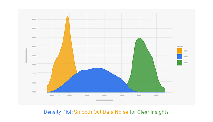
A density plot is a tool that helps you see how data is distributed over a range. It’s a smooth curve that shows where values are packed tightly and where they spread out. Think of it as a way to understand the “shape” of your data.
Probability density is about how likely an event is to happen within a range. Imagine spreading sand over a line. Some spots have more sand than others, meaning events are more likely to happen there. The higher the density in that spot, the more probable it is. But unlike simple counts, probability density doesn’t tell you exact counts. It shows how much the likelihood is packed into certain parts of the data.
A probability distribution function (PDF) shows the full picture of where things are likely to happen. It’s a map of all the possible outcomes and how likely they are. Picture it as a curve; under that curve are all the possible events, and the area under the curve equals 1. That’s because the total chance of something happening has to be 100%. The PDF tells you where to expect most of the events but also where the rare stuff might pop up.
Reading a density plot is simple. The higher the curve, the more values are packed in that area. If the curve is flat, there aren’t many data points in that range. It’s all about looking at peaks and valleys to see where your data clusters are.
No, density plots are for numerical data. If you have categories, you’ll want something like a bar chart. Density plots need numbers to show the spread and distribution of values.
Density plots are often used in statistics and data analysis. They’re great for comparing distributions, seeing patterns, or spotting outliers in your data. They can also help you visualize probabilities and trends over time.
Yes, density plots can sometimes hide data details, especially if the data is very spread out. Also, if you have small data sets, the plot might not be as accurate since smoothing the curve can be tricky with limited points.
Yes, you can overlay multiple density plots to compare different data sets. This is useful for seeing how two or more sets of data compare in terms of their distribution.
Bandwidth controls how smooth the curve is. If the bandwidth is too wide, the plot may look too smooth and miss details. If it’s too narrow, the plot might look jagged and hard to read. It’s about finding the sweet spot for your data.
A density plot can show probabilities by representing the likelihood of different outcomes in your data. The area under the curve adds up to 1, which ties it to probability distribution.
Density plots give you a clear, visual way to understand how data spreads. They help you spot trends, clusters, and outliers that would otherwise stay hidden in the numbers. By smoothing the noise, density plots make complex data easy to digest and act on. Whether you’re tracking customer behavior or analyzing market trends, they provide sharp insights quickly.
The key takeaway? Density plots simplify your data, cutting through the noise so you can focus on what matters. Use them wisely, and you’ll turn raw data into real opportunities. Keep your bandwidth choices tight, your visual aids helpful, and your analysis sharp.
And remember: data’s only useful when you know how to read it. Density plots are your tool to do just that – making the invisible visible.
How much did you enjoy this article?


Consulting Report Template: structure insights, drive decisions, and deliver standout results. Discover how to build better reports now!
Event budget template keeps event finances clear and controlled. Use one to track costs, compare spending, and stay on budget. Learn more!
MySQL ODBC connector bridges MySQL databases and BI tools for secure, reliable data access across platforms. Set up yours today. Read on!