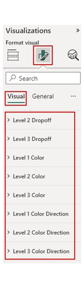
Categories
Data, in its raw state, is not usable, and it is somewhat impossible to draw insights from it. To make it usable and valuable to the reader, you will have to incorporate additional elements like labels, metadata, or tags into it and that’s where data annotation comes in. But what are data annotations?


Data annotation is an expensive and complex process that should be handled by experts. There are lots of pieces that go into it, and lots of companies fail to put these pieces together.
In this guide, you’ll discover what are data annotations, data annotation tools, why data annotation is helpful, and other useful details about data annotation.
First…
Definition: Data annotation is the labeling of data to make it valuable for machine learning. It involves adding labels, metadata, or tags to raw data. Raw data could be video, audio, images, or text.
If you’re wondering, “What are data annotations,” they are the key elements that help machine learning models learn and understand the data. This will, in turn, boost their performance and accuracy. For example, during image recognition, annotators help in labeling the objects within the images. The labeling could be “car,” “dog,” or “cat.”
Data annotators are used in natural language processing to mark named entities or parts of speech in the text.
Data annotations help in providing the labeled and structured data needed for training machine learning models. With data annotation, the models are taught to recognize trends and make accurate classifications or predictions that align with the patterns. For instance, trend analysis examples in data annotation include identifying seasonal patterns in sales data or detecting anomalies in financial transactions.
When considering the question, “What are data annotations,” it becomes evident that they are essential for ensuring the quality and accuracy of machine learning outputs. AI for data analytics relies on these annotations to enhance model performance. During image recognition, the labeled images help the model correctly categorize and identify objects. All these are necessary in applications like medical imaging, autonomous driving, and facial recognition.
Annotated text plays a role in natural language processing it enables models to understand language nuances, entities, and sentiments. This, in turn, helps improve tasks like sentiment analysis, chatbot interactions, and translation.
The common types of data annotation are:
When considering the question, “What are data annotations,” it is important to note that data annotation and data labeling are often used interchangeably but they’re different terms. Here are the differences between the two.
Here are things to consider when choosing the right tool.
The tool has to support the data type you want to annotate.
There have to be support documents and tutorials. Also, the tool has to be user-friendly.
Take a look at the pricing, and opt for a tool that fits your budget.
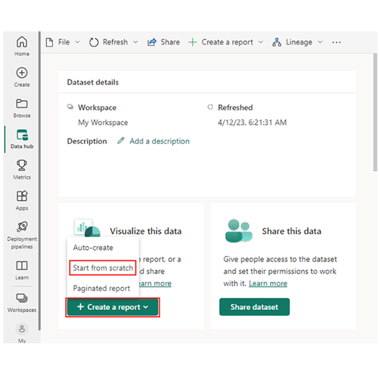
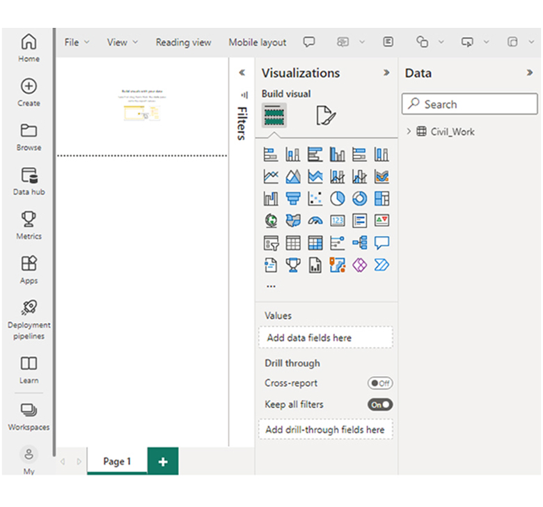
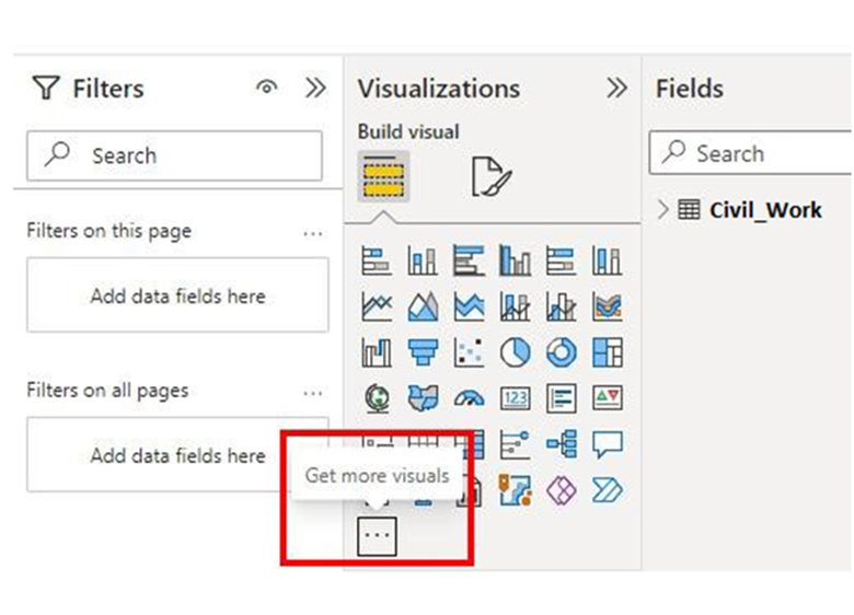
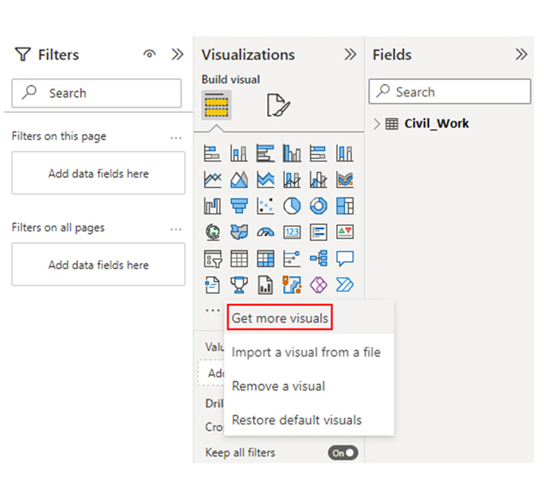
Here are easy ways to perform annotations in Power BI.
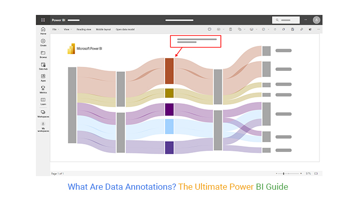
You can use tools like a Sankey plot in Power BI to visually analyze data annotations and understand how information flows between categories.


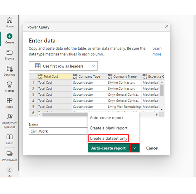
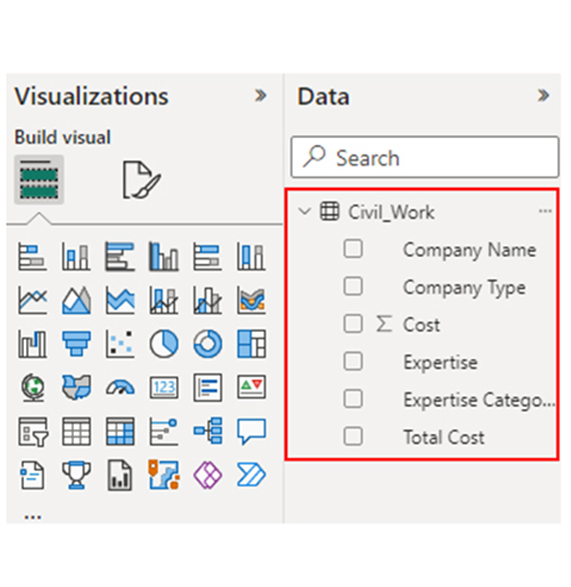
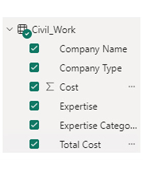
| Total Cost | Company Type | Company Name | Expertise Categories | Expertise | Cost |
| Total Cost | Subcontractor | Skyline Contractors | Mechanical Installation | Plumbing & Heating | 15456 |
| Total Cost | Subcontractor | Skyline Contractors | Mechanical Installation | Mechanical Work | 10159 |
| Total Cost | Subcontractor | Onyx General Contractors | Mechanical Installation | Plumbing & Heating | 18045 |
| Total Cost | Subcontractor | Onyx General Contractors | Mechanical Installation | Mechanical Work | 12695 |
| Total Cost | Subcontractor | Living Well Remodeling | Mechanical Installation | Plumbing & Heating | 14589 |
| Total Cost | Subcontractor | Living Well Remodeling | Mechanical Installation | Welding | 11456 |
| Total Cost | Supplier | Power-up Builders | Raw Material | Cement | 20561 |
| Total Cost | Supplier | Power-up Builders | Raw Material | Steel | 32456 |
| Total Cost | Supplier | Five-star Construction | Raw Material | Bricks | 10253 |
| Total Cost | Supplier | Five-star Construction | Raw Material | Timber | 9000 |
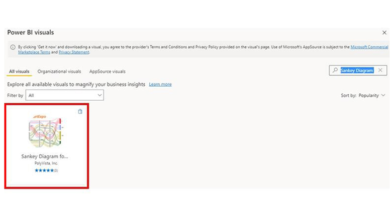
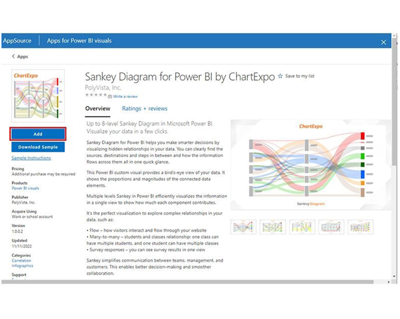
Stage 3: Add Power BI Sankey Diagram Extension by ChartExpo
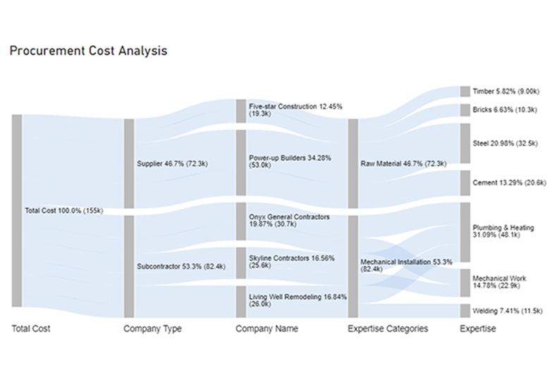
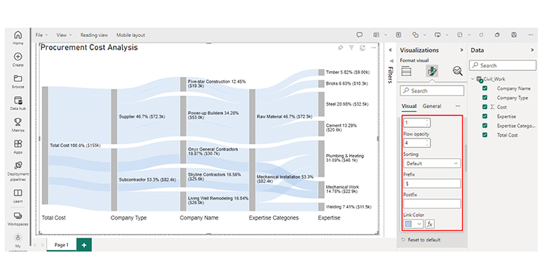
Stage 4: Draw a Sankey Diagram with ChartExpo’s Power BI extension
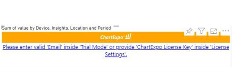
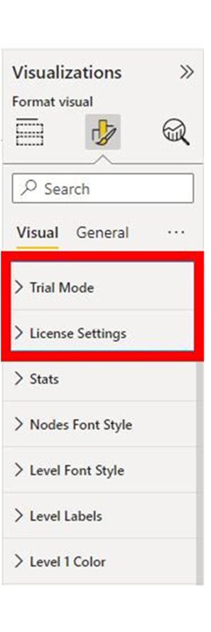
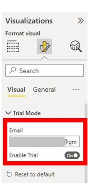
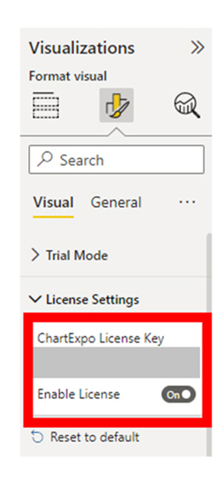
Stage 5: Apply a Subscription Key or Activate the ChartExpo
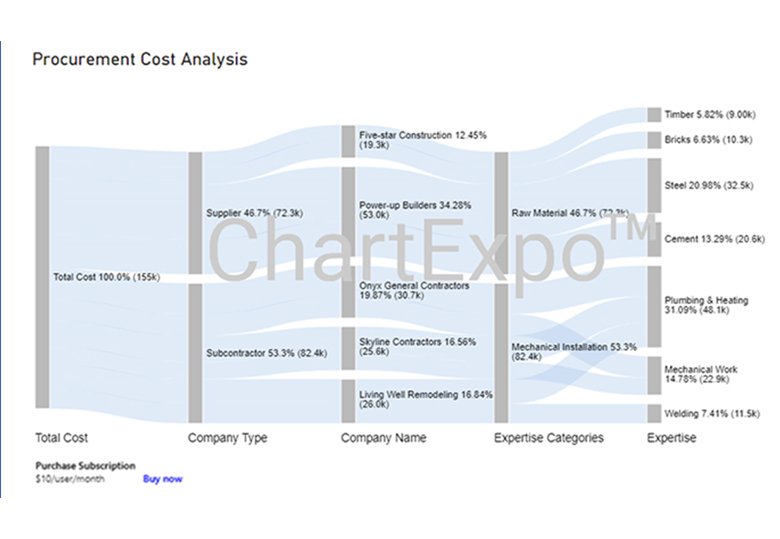
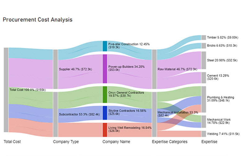
Here are some insights you can get from the chart.
The annotation feature in Power BI mobile enables users to highlight, add notes, and draw directly into the Power BI dashboards and reports. It also enables collaboration with multiple users.
You can add comments in Dax ‘#’ using multi-line comments or double-forward slashes // for single-line comments.
Data annotation highlights key points, clarifies insights, adds context, and improves the overall visualization experience.
Data annotation involves the addition of extra elements to a raw dataset to enhance its readability and usability. It improves the accuracy of machine learning models and ascertains better decision-making in visualizations.
Data annotation and data labeling are used interchangeably, but they’re quite different. When asking “What are data annotations,” it’s important to note that data annotation involves making raw data more meaningful for machine learning, while data labeling involves assigning predefined categories or labels to data points.
You can improve annotations by:
The common types of data annotation include image annotation, audio annotation, text annotation, 3D point cloud annotation, and video annotation.
Now you know what data annotation is, what elements will you be incorporating into your data?
How much did you enjoy this article?


Calculate accounts receivable turnover ratio to measure credit collection speed, improve cash flow, and strengthen your financial strategy. Read on!

Change Management KPIs are the key to tracking adoption, performance, and ROI during transitions. Find out which metrics matter. Read on!

Data collection methods and techniques determine the quality of every insight you act on. Explore key approaches for gathering reliable data. Read on!


