• Home
  • Tools dropdown img
    • Spreadsheet Charts

      • ChartExpo for Google Sheets
      • ChartExpo for Microsoft Excel
    • Power BI Charts

      • Power BI Custom Visuals by ChartExpo
    • Word Cloud

  • Charts dropdown img
    • Chart Category

      • Bar Charts
      • Circle Graphs
      • Column Charts
      • Combo Charts
      • Comparison Charts
      • Line Graphs
      • PPC Charts
      • Sentiment Analysis Charts
      • Survey Charts
    • Chart Type

      • Box and Whisker Plot
      • Clustered Bar Chart
      • Clustered Column Chart
      • Comparison Bar Chart
      • Control Chart
      • CSAT Survey Bar Chart
      • CSAT Survey Chart
      • Dot Plot Chart
      • Double Bar Graph
      • Funnel Chart
      • Gauge Chart
      • Likert Scale Chart
      • Matrix Chart
      • Multi Axis Line Chart
      • Overlapping Bar Chart
      • Pareto Chart
      • Radar Chart
      • Radial Bar Chart
      • Sankey Diagram
      • Scatter Plot Chart
      • Slope Chart
      • Sunburst Chart
      • Tornado Chart
      • Waterfall Chart
      • Word Cloud
    • Google Sheets
      Microsoft Excel
  • Services
  • Pricing
  • Contact us
  • Blog
  • Support dropdown img
      • Gallery
      • Videos
      • Contact us
      • FAQs
      • Resources
    • Please feel free to contact us

      atsupport@chartexpo.com

Categories
All Data Visualizations Data Analytics Surveys
Add-ons/
  • Google Sheets
  • Microsoft Excel
  • Power BI
All Data Visualizations Data Analytics Surveys
Add-ons
  • Google Sheets
  • Microsoft Excel
  • Power BI

We use cookies

This website uses cookies to provide better user experience and user's session management.
By continuing visiting this website you consent the use of these cookies.

Ok

ChartExpo Survey


Home > Blog > Data Analytics

Days Inventory Outstanding: Definition, Formulas, Example

Do you ever wonder how efficiently a business manages its stock? The days inventory outstanding indicator, or DIO, is a key financial indicator that provides insights into this question.

Days Inventory Outstanding

DIO indicates the number of days on average that a company holds its inventory before selling it. Therefore, this is the measuring glass for understanding the company’s inventory management effectiveness. It indicates the company’s operational performance and liquidity.

In the bustling corridors of the retail industry, where products move fast, days inventory outstanding takes center stage. A lower DIO signifies that a company is rapidly converting its inventory to sales. It suggests a streamlined process and healthy demand for products. Conversely, a high DIO might signal overstocking or sluggish sales, potentially tying up valuable capital in unsold goods.

Consider the automotive industry, where inventory management is a delicate balancing act. Vehicles are high-value items with significant carrying costs. This makes the DIO a crucial metric for companies like Toyota or Ford. They can fine-tune production schedules and sales strategies from DIO analysis, ensuring each model rolls off the lot efficiently.

Let’s unpack the days inventory outstanding, its implications, and how mastering it can be a game-changer for your business strategy.

Table of Contents:

  1. What is Days Inventory Outstanding (DIO)?
  2. What are Days Sales of Inventory (DSI)?
  3. What is the Days Inventory Outstanding Formula?
  4. How do you examine the Days Inventory Outstanding (DIO)?
  5. What are the Advantages of Days Inventory Outstanding?
  6. Wrap Up

First…

What is Days Inventory Outstanding (DIO)?

Definition: Days inventory outstanding is a metric that demonstrates how well a company manages its inventory. It indicates the average number of days the inventory is maintained before being sold.

In 2023, reports revealed that, on average, retail businesses maintain inventories for almost 45 days. This shows how critical inventory turnover is to a successful business model. However, this is not always the case in all industries. For example, DIO is significantly lower in fast-moving consumer goods (FMCG), reflecting a quick inventory conversion to revenue.

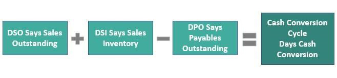
To calculate DIO, divide the average inventory by the cost of goods sold (COGS) per day. Understanding a day’s inventory outstanding is more than knowing a formula. It’s about comprehending the story behind the numbers. It’s a tale of how well a company responds to market demands and manages its resources. Essentially, DIO reflects the Days Between Two Dates from when inventory is purchased to when it’s sold, providing a clear picture of operational efficiency.

  • A low DIO suggests efficient inventory management, where inventory is quickly sold and converted into cash.
  • A high DIO may indicate potential issues such as overstocking, poor sales performance, or obsolete inventory. This can lock up funds and raise storage expenses.

What are Days Sales of Inventory (DSI)?

Definition: Days sales of inventory (DSI) measure the average number of days it takes to sell the entire inventory. Unlike days inventory outstanding (DIO), which focuses on inventory management efficiency, DSI focuses on inventory turnover.

To calculate DSI, divide the number of days in the period by the inventory turnover ratio. A lower DSI indicates faster inventory turnover, meaning the company sells its inventory quickly. This can signify efficient inventory management and strong sales. Conversely, a higher DSI suggests slower turnover, potentially indicating overstocking or weak sales.

DSI is crucial for assessing a company’s inventory management effectiveness and operational efficiency. It helps to optimize inventory levels, reduce carrying costs, and improve cash flow by ensuring inventory is sold promptly.

What is the Days Inventory Outstanding Formula?

Want to learn how to calculate days inventory outstanding (DIO)? Use the days inventory outstanding formula below.

Formula for Days Inventory Outstanding

Where:

  • Average Inventory represents the average value of inventory over a specific period. It is typically calculated by adding the beginning and ending inventory values and dividing by two.
  • Cost of Goods Sold (COGS) is the cost of goods sold during the same period.
  • Days in Period represents the number of days in the period.

Interpretation of days inventory outstanding:

Interpretation of Days Inventory Outstanding

How do you examine the Days Inventory Outstanding (DIO)?

In data analysis, numbers twist and turn like a Rubik’s Cube. Deciphering the secrets of days inventory outstanding (DIO) can feel like a quest for the Holy Grail.

Enter the knight in shining armor: data visualization. Data visualization makes the exploration of days inventory outstanding a vivid journey of discovery.

But alas, creating visual representations that genuinely communicate the subtleties of DIO can be a Herculean task in Excel. Excel, though robust, requires extensive expertise to manipulate data into visualizations like Slope charts that can speak volumes at a glance.

Don’t worry we have ChartExpo. ChartExpo’s sleek graphs and charts slice through data fog, revealing clarity, and numbers tell their story. It is the answer to Excel’s constraints.

Let’s learn how to install ChartExpo in Excel.

  1. Open your Excel application.
  2. Open the worksheet and click the “Insert” menu.
  3. You’ll see the “My Apps” option.
  4. In the Office Add-ins window, click “Store” and search for ChartExpo on my Apps Store.
  5. Click the “Add” button to install ChartExpo in your Excel.

ChartExpo charts are available both in Google Sheets and Microsoft Excel. Please use the following CTAs to install the tool of your choice and create beautiful visualizations with a few clicks in your favorite tool.

Days Inventory Outstanding Example

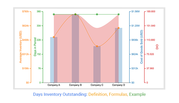
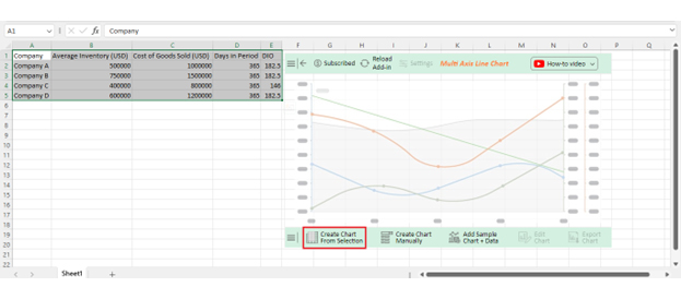
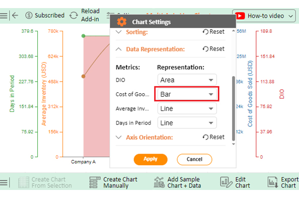
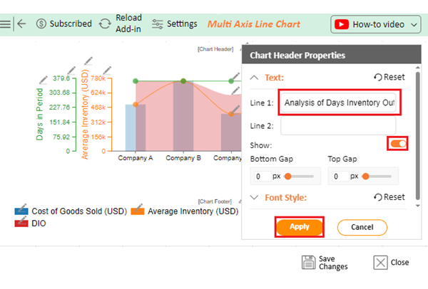
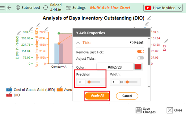
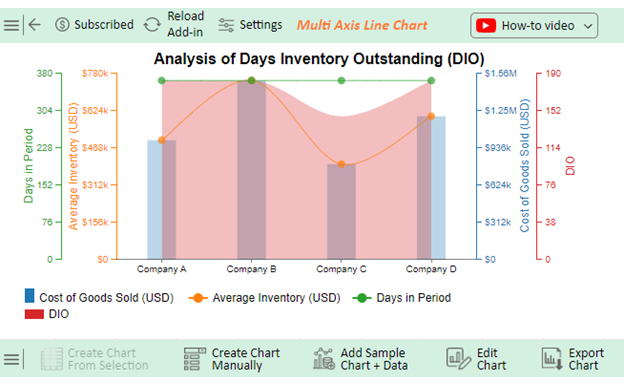
Let’s analyze the day’s inventory outstanding example data below using ChartExpo.

Company Average Inventory (USD) Cost of Goods Sold (USD) Days in Period DIO
Company A 500000 1000000 365 182.5
Company B 750000 1500000 365 182.5
Company C 400000 800000 365 146
Company D 600000 1200000 365 182.5
  • To get started with ChartExpo, install ChartExpo in Excel.
  • Now Click on My Apps from the INSERT menu.
insert chartexpo in excel
  • Choose ChartExpo from My Apps, then click Insert.
open chartexpo in excel
  • Once it loads, scroll through the charts list to locate and choose the “Multi-Axis Line Chart”.
search multi axis line chart in excel
  • Click the “Create Chart From Selection” button after selecting the data from the sheet, as shown.
Click Create Chart From Selection to Analyze Days Inventory Outstanding
  • ChartExpo will generate the visualization below for you.
Initial Visual of Days Inventory Outstanding
  • Click on Settings and change the “Data Representation” as follows.
Change Data Representation of Visual to Days Inventory Outstanding
  • If you want to add anything to the chart, click the Edit Chart button:
Edit Chart to Days Inventory Outstanding
  • Click the pencil icon next to the Chart Header to change the title.
  • It will open the properties dialog. Under the Text section, you can add a heading in Line 1 and enable Show.
  • Give the appropriate title of your chart and click the Apply button.
Create Chart Header of Visual to Days Inventory Outstanding
  • Change the precision value of DIO to zero:
Change Precision of DIO to Zero of Visual to Days Inventory Outstanding
  • Add the dollar sign with the Cost of Goods Sold:
Add Prefix to Cost of Good of Visual to Days Inventory Outstanding
  • Add the dollar sign with Average Inventory:
Add Prefix to Average Inventory of Visual to Days Inventory Outstanding
  • Change the precision value of Days in Period into zero:
Change Precision of Days in Period into Zero of Visual to Days Inventory Outstanding
  • Change the Legend shape of Cost of Goods Sold to Column and click the Apply button.
Change Legend Shape of Cost of Goods Sold of Visual to Days Inventory Outstanding
  • Change the Legend shape of Average Inventory into a Line and Circle and click the Apply button.
Change the Legend Shape Average Inventory of Visual to Days Inventory Outstanding
  • Change the Legend shape of Days in Period into a Line and Circle and click the Apply button.
Change Legend Shape of Days in Period of Visual to Days Inventory Outstanding
  • Click the Save Changes button to persist the changes made to the chart.
Save Changes of Visual to Days Inventory Outstanding
  • Your final Multi Axis Line Chart will look like the one below.
Final Days Inventory Outstanding

Insights

  • Company A, Company B, and Company D have an inventory outstanding (DIO) of 182 days, meaning they take about half a year to sell their inventory.
  • Company C’s DIO is 146 days, indicating a higher inventory turnover rate.

What are the Advantages of Days Inventory Outstanding?

Days Inventory Outstanding (DIO) is an essential financial metric used to evaluate the efficiency of inventory management. Let’s explore the advantages of using this metric.
  • Inventory management assessment: DIO offers a comprehensive assessment of how effectively a company manages its inventory. By analyzing DIO trends over time, you can identify areas for improvement in inventory turnover rates. Then, ensure optimal stock levels to meet customer demand without excess inventory carrying costs.
  • Operational efficiency: A lower DIO indicates faster inventory turnover, reflecting efficient operations and responsiveness to market demands. Companies with shorter DIO can adapt quickly to changing customer preferences and minimize the risk of obsolete inventory.
  • Cash flow management: Monitoring DIO helps optimize cash flow by aligning inventory levels with sales cycles. Reducing the time inventory sits idle frees up cash for investment in growth initiatives or debt reduction.
  • Working capital optimization: DIO plays a vital role in working capital management. By reducing DIO, you can free up working capital tied up in inventory. This allows for more strategic allocation of resources to areas such as expansion, innovation, or debt repayment.
  • Investor insight: Investors use DIO as a key indicator of a company’s operational efficiency and financial health. A declining DIO may signal improved efficiency and profitability potential. Conversely, a rising DIO could raise concerns about inventory management challenges or slowing sales.
  • Decision making: DIO provides actionable data for strategic decision-making. From analyzing DIO alongside other financial metrics and industry benchmarks, you can make informed decisions regarding the following:
    • Production planning
    • Inventory control
    • Pricing strategies
    • Supply chain management

FAQs

What is the average day’s inventory outstanding?

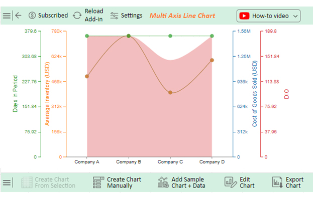
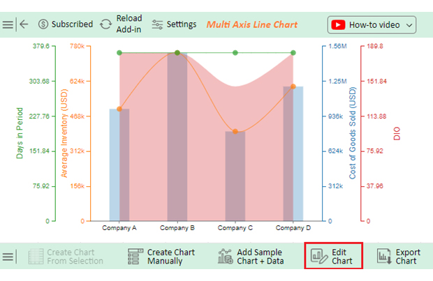
The average day’s inventory outstanding (DIO) varies by industry and company. A lower DIO is generally desirable, indicating faster inventory turnover. Industry benchmarks can provide context for assessing a company’s DIO performance.

What does higher days inventory outstanding mean?

A higher days inventory outstanding (DIO) suggests slower inventory turnover. It may indicate overstocking, sluggish sales, or ineffective inventory management practices. Companies with a high DIO may face increased carrying costs and liquidity challenges.

Is a higher or lower days inventory held better?

A lower-day inventory outstanding (DIO) is generally better. It indicates faster inventory turnover, efficient operations, and reduced carrying costs. Higher DIO suggests slower turnover, potentially leading to overstocking, increased expenses, and liquidity issues.

Wrap Up

From the company’s financial analysis and liquidity management viewpoint, days inventory outstanding is a critical metric. It provides relevant information for evaluating an enterprise’s inventory management performance and general financial balance. DIO explains how effective operations, cash flows, and working capital maximization results are achieved. Understanding DIO provides a conceptual basis for future production planning, inventory management, and resource allocation decision-making.

The DIO formula is relatively straightforward. It is the average inventory divided by the cost of goods sold per day. It gives a number that tells the average number of days it takes for a company to sell its inventory. Lower DIO values generally indicate faster turnover and higher efficiency in managing inventory levels.

A lower DIO is generally preferred. Why? It signifies efficient operations and responsiveness to market demands. Companies with shorter DIO can adapt quickly to changing customer preferences and optimize cash flow by reducing idle inventory. Conversely, a higher DIO suggests slower turnover, potentially leading to overstocking, increased carrying costs, and liquidity challenges.

Additionally, DIO serves as a valuable metric for investors and stakeholders, offering insights into a company’s operational efficiency and financial performance. A declining DIO may signal improved profitability potential and management effectiveness. Conversely, a rising DIO could raise concerns about inventory management challenges or slowing sales growth.

Conclusively, the days’ inventory outstanding encapsulates critical aspects of a company’s inventory management practices and overall business performance.

Do not hesitate.

Start monitoring and analyzing DIO today with ChartExpo. It will help optimize inventory turnover, enhance operational efficiency, and drive sustainable growth and profitability.

How much did you enjoy this article?

ExcelAd1
Start Free Trial!
135542

Related articles

next previous
Data Analytics29 min read

Data Analytics: Metrics, Mayhem, and Misunderstandings

Data analytics helps teams align strategy, spot failures, and act fast, but only if insights drive action. Ready to make it count? Get started now!

Data Analytics31 min read

Data Analysis Without Nonsense: Fix the Right Problem, Fast

Data analysis can mislead when metrics look right but outcomes fail. Learn how to spot red flags, fix failures, and make better decisions. Read on!

Data Analytics29 min read

Variance Analysis Isn’t a Math Problem, It’s a Trust Problem

Variance analysis helps identify what went wrong, who owns it, and what to do next. Use it to drive decisions, not just reports. Learn more!

Data Analytics10 min read

Supplier Comparison Template: Download It Now

A supplier comparison template streamlines vendor evaluation by comparing cost and quality. Click here to learn its benefits and how to analyze them.

Data Analytics32 min read

Ecommerce Analytics: How to Fix What It Often Gets Wrong

Ecommerce analytics often lead to mixed signals and costly misreads. Fix attribution gaps, align teams, and act on the right data. Get started now!

ChartExpo logo

Turn Data into Visual
Stories

CHARTEXPO

  • Home
  • Gallery
  • Videos
  • Services
  • Pricing
  • Contact us
  • FAQs
  • Privacy policy
  • Terms of Service
  • Sitemap

TOOLS

  • ChartExpo for Google Sheets
  • ChartExpo for Microsoft Excel
  • Power BI Custom Visuals by ChartExpo
  • Word Cloud

CATEGORIES

  • Bar Charts
  • Circle Graphs
  • Column Charts
  • Combo Charts
  • Comparison Charts
  • Line Graphs
  • PPC Charts
  • Sentiment Analysis Charts
  • Survey Charts

TOP CHARTS

  • Sankey Diagram
  • Likert Scale Chart
  • Comparison Bar Chart
  • Pareto Chart
  • Funnel Chart
  • Gauge Chart
  • Radar Chart
  • Radial Bar Chart
  • Sunburst Chart
  • see more
  • Scatter Plot Chart
  • CSAT Survey Bar Chart
  • CSAT Survey Chart
  • Dot Plot Chart
  • Double Bar Graph
  • Matrix Chart
  • Multi Axis Line Chart
  • Overlapping Bar Chart
  • Control Chart
  • Slope Chart
  • Clustered Bar Chart
  • Clustered Column Chart
  • Box and Whisker Plot
  • Tornado Chart
  • Waterfall Chart
  • Word Cloud
  • see less

RESOURCES

  • Blog
  • Resources
  • YouTube
SIGN UP FOR UPDATES

We wouldn't dream of spamming you or selling your info.

© 2025 ChartExpo, all rights reserved.