• Home
  • Tools dropdown img
    • Spreadsheet Charts

      • ChartExpo for Google Sheets
      • ChartExpo for Microsoft Excel
    • Power BI Charts

      • Power BI Custom Visuals by ChartExpo
    • Word Cloud

  • Charts dropdown img
    • Chart Category

      • Bar Charts
      • Circle Graphs
      • Column Charts
      • Combo Charts
      • Comparison Charts
      • Line Graphs
      • PPC Charts
      • Sentiment Analysis Charts
      • Survey Charts
    • Chart Type

      • Box and Whisker Plot
      • Clustered Bar Chart
      • Clustered Column Chart
      • Comparison Bar Chart
      • Control Chart
      • CSAT Survey Bar Chart
      • CSAT Survey Chart
      • Dot Plot Chart
      • Double Bar Graph
      • Funnel Chart
      • Gauge Chart
      • Likert Scale Chart
      • Matrix Chart
      • Multi Axis Line Chart
      • Overlapping Bar Chart
      • Pareto Chart
      • Radar Chart
      • Radial Bar Chart
      • Sankey Diagram
      • Scatter Plot Chart
      • Slope Chart
      • Sunburst Chart
      • Tornado Chart
      • Waterfall Chart
      • Word Cloud
    • Google Sheets
      Microsoft Excel
  • Services
  • Pricing
  • Contact us
  • Blog
  • Support dropdown img
      • Gallery
      • Videos
      • Contact us
      • FAQs
      • Resources
    • Please feel free to contact us

      atsupport@chartexpo.com

Categories
All Data Visualizations Data Analytics Surveys
Add-ons/
  • Google Sheets
  • Microsoft Excel
  • Power BI
All Data Visualizations Data Analytics Surveys
Add-ons
  • Google Sheets
  • Microsoft Excel
  • Power BI

We use cookies

This website uses cookies to provide better user experience and user's session management.
By continuing visiting this website you consent the use of these cookies.

Ok

ChartExpo Survey


Home > Blog > Microsoft Excel

How to Calculate Inventory Turnover Ratio?

So, you want to learn how to calculate inventory turnover ratio?

Buckle up because we’re about to dive into this numerical wonderland.

Picture this: You’re running a business and want to know how well those precious goods are flying off your shelves. That’s where the inventory turnover ratio comes into play.

How to Calculate Inventory Turnover Ratio

Learning how to calculate the inventory turnover ratio reveals how often your inventory replenishes itself over time. It’s like peeking into your stockroom’s crystal ball and seeing whether it’s on fire or dancing with unicorns.

But don’t get scared; how to calculate the inventory turnover ratio is as easy as pie. To calculate this bad boy, all you need are two key ingredients:

  • The cost of goods sold (COGS).
  • The average inventory value.

Simply divide the cost of goods sold by the average inventory value. Voila- a magical number that tells you whether you have an efficient operation. Or if your products are gathering dust.

A higher ratio suggests that your company swiftly moves its goods off the shelves. On the other hand, a lower ratio indicates some sluggishness in sales.

Intrigued yet?

Keep reading for more exciting details as we unravel the mysteries of inventory management.

Table of Content:

  1. What is Inventory Turnover?
  2. Why Do Inventory Turns Matter?
  3. What is the Inventory Turnover Ratio?
  4. Inventory Turnover Ratio Formula
  5. How Does Inventory Turnover Ratio Work?
  6. Factors That Affect Inventory Turnover Ratio
  7. Inventory Turnover Ratio Calculation Example
  8. How to Interpret Inventory Turnover Ratio By Industry?
  9. Can the Inventory Turnover Ratio be too High?
  10. Advantages of Inventory Turnover Ratio
  11. Limitations of Inventory Turnover Ratios
  12. Tips For Improve Your Inventory Turnover Ratio
  13. Inventory Turnover Ratio FAQs
  14. Wrap Up

First…

What is Inventory Turnover?

Definition: Inventory turnover is a financial metric representing the frequency with which a company sells and replaces its inventory. Monitoring inventory turnover aids in optimizing stock levels, streamlining operations, and maintaining healthy cash flow. It is a key performance indicator, guiding businesses in adapting to market demands and enhancing overall financial health.

In essence, inventory turnover reflects a company’s ability to convert inventory investments into sales. It offers valuable insights into its operational effectiveness and financial viability.

Why Do Inventory Turns Matter?

The inventory turns concept is a crucial conductor in supply chain management, orchestrating a symphony of operational efficiency. Let’s unravel the reasons why it matters, shaping the rhythm of successful business strategies.

  1. Efficient use of resources: Inventory turns signify the frequency with which products flow through the supply chain. A higher turnover ratio indicates optimized resource utilization, ensuring products are neither sitting idly nor going to waste. This, as a result, contributes to an efficient and lean operation.
  2. Cash flow management: A swift inventory turnover translates to faster sales cycles. This, in turn, means quicker conversion of inventory into revenue. It involves freeing up cash that would otherwise be tied up in stagnant stock. Efficient cash flow management becomes a reality, empowering your business to invest in growth initiatives.
  3. Reduced holding costs: Excessive inventory leads to higher holding costs – warehousing, insurance, and potential obsolescence. Inventory turns to act as a safeguard against bloated stock levels. It reduces holding costs and prevents financial leakage that might otherwise erode profit margins.
  4. Responsive to demand: Inventory turns are a litmus test for a business’s agility. A company with a high turnover adapts swiftly to market demands, aligning supply with actual needs. This responsiveness enhances customer satisfaction and shields your business from the risks of outdated or unsellable inventory.
  5. Financial health: The health of a business is often mirrored in its inventory turns. A healthy ratio reflects a finely tuned supply chain, demonstrating operational excellence and adaptability. Investors and stakeholders often scrutinize this metric as a key indicator of a company’s financial robustness.

What is the Inventory Turnover Ratio?

Definition: The inventory turnover ratio is a financial metric that measures how efficiently a company manages its inventory. It reflects the frequency at which a company sells and replenishes its stock. Businesses use the inventory turnover ratio to fine-tune inventory levels and optimize resource usage.

Moreover, you can use this metric to enhance financial performance by aligning inventory with market demand. Regular monitoring provides insights into your company’s inventory management health and its ability to adapt to market dynamics.

Are you wondering how to calculate the inventory turnover ratio?

Inventory Turnover Ratio Formula

Inventory Turnover Ratio =(Cost of Goods Sold (COGS))/(Average Inventory)

Where:

  • Cost of Goods Sold (COGS) represents the total cost of goods sold during the period.
  • Average Inventory is the average value of inventory held during the same period.

A higher ratio suggests efficient inventory management, indicating that products move swiftly through the supply chain. Conversely, a lower ratio may signify slow-moving stock or overstocking.

How Does Inventory Turnover Ratio Work?

The inventory turnover ratio isn’t just a numerical figure. It’s a strategic compass navigating businesses through the complexities of supply chain dynamics. Let’s unravel the workings of this vital metric, step by step.

  1. Calculation: It’s a simple equation, divide the cost of goods sold by the average inventory over a set period. This unveils the frequency with which your company turns over its inventory.
  2. Interpretation: A higher inventory turnover ratio implies that products move swiftly through the supply chain, reflecting efficient inventory management. Conversely, a lower ratio may indicate sluggish sales or overstocking, highlighting potential inefficiencies in stock handling.
  3. Efficiency benchmarking: This ratio serves as a benchmark for operational efficiency. It allows you to compare your business performance against industry standards or competitors. This provides insights into how well you optimize inventory levels and manage supply chains compared to peers.
  4. Financial health: The inventory turnover ratio mirrors your company’s financial health. A healthy ratio suggests effective resource utilization and adaptability to market demands. This portrays your company as operationally robust and financially sound. 
  5. Impact on cash flow: The swiftness with which inventory turns over directly impacts cash flow. A higher turnover ratio indicates faster inventory conversion into revenue, freeing resources for crucial business aspects. Efficient cash flow management becomes a tangible outcome of a well-maintained inventory turnover ratio.

Factors That Affect Inventory Turnover Ratio

1. Demand Variability

The level of customer demand directly affects how quickly inventory moves. Seasonal trends, consumer preferences, and unexpected market shifts can lead to fluctuations in sales. Businesses must forecast demand accurately to maintain optimal stock levels and avoid overstocking or stockouts.

2. Inventory Management Practices

Efficient inventory management, such as implementing Just-in-Time (JIT) inventory systems or using real-time tracking tools, can optimize stock levels. Poor inventory control can lead to excess storage costs and unsold goods, ultimately reducing turnover.

3. Pricing Strategy

Competitive pricing plays a crucial role in inventory turnover. If prices are too high, sales may slow down, leading to excess inventory. Conversely, strategic discounts, promotions, and value-based pricing can drive higher sales and increase turnover rates.

4. Supplier Lead Times

The speed at which suppliers deliver goods affects how quickly a business can restock and fulfill customer demand. Delayed shipments can disrupt sales and reduce turnover, while faster lead times help maintain a steady flow of inventory, ensuring products are available when needed.

5. Product Type & Shelf Life

Different products have different turnover rates. Perishable goods like food and pharmaceuticals move quickly due to expiration dates, while durable goods such as electronics or furniture may have slower turnover rates. Businesses need to align inventory strategies with product lifecycles to optimize turnover.

Inventory Turnover Ratio Calculation Example

The Inventory Turnover Ratio is calculated using the formula:

Inventory Turnover Ratio = Cost of Goods Sold (COGS) ​/Average Inventory

Where:

  • COGS = Total cost of goods sold during a period
  • Average Inventory = Beginning Inventory+Ending Inventory/2

Example Calculation

Scenario:
A retail store has the following financial data for the year:

  • Cost of Goods Sold (COGS): $500,000
  • Beginning Inventory: $100,000
  • Ending Inventory: $150,000

Step 1: Calculate Average Inventory

Average Inventory= 100,000+150,000/2 ​ =125,000

Step 2: Calculate Inventory Turnover Ratio

Inventory Turnover Ratio = 500,000/125,000 ​ =4

Interpretation:

The store’s inventory turned over four times during the year. A higher turnover ratio indicates efficient inventory management, while a lower ratio may suggest overstocking or weak sales.

How to Interpret Inventory Turnover Ratio By Industry?

Data analysis is like unraveling a mystery novel, challenging, at times perplexing, yet undeniably exciting. Data visualization emerges as the Sherlock Holmes, aiding our detective work in this world of numbers and patterns. But, alas, even the venerable Excel falls short in dynamic data visualization.

Fear not, for ChartExpo steps onto the scene, ready to rescue us from lackluster charts and static graphs.

Let’s learn how to Install ChartExpo in Excel.

  1. Open your Excel application.
  2. Open the worksheet and click the “Insert” menu.
  3. You’ll see the “My Apps” option.
  4. In the Office Add-ins window, click “Store” and search for ChartExpo on my Apps Store.
  5. Click the “Add” button to install ChartExpo in your Excel.

ChartExpo charts are available both in Google Sheets and Microsoft Excel. Please use the following CTA’s to install the tool of your choice and create beautiful visualizations in a few clicks in your favorite tool.

Example: How to Calculate Inventory Turnover Ratio

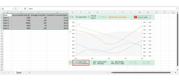
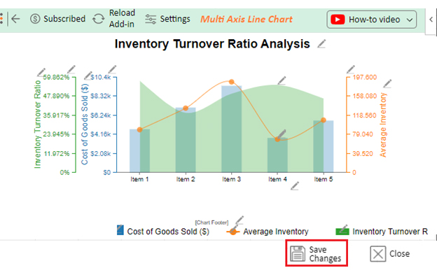
Let’s say you have the inventory data table below.

Item Cost of Goods Sold ($) Average Inventory Inventory Turnover Ratio
Item 1 5000 90 57.56
Item 2 7500 135 37.56
Item 3 10000 190 49.63
Item 4 4000 70 55.14
Item 5 6000 110 46.55

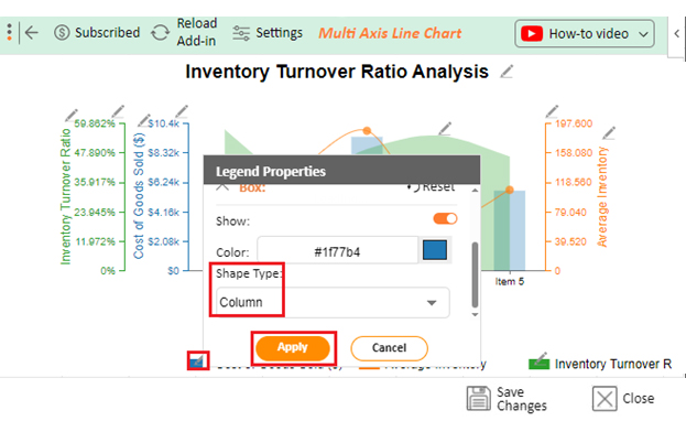
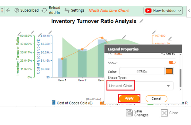
Let’s visualize this data in Excel using ChartExpo and glean valuable insights.

  • To get started with ChartExpo, install ChartExpo in Excel.
  • Now Click on My Apps from the INSERT menu.
insert chartexpo in excel
  • Choose ChartExpo from My Apps, then click Insert.
open chartexpo in excel
  • Once it loads, scroll through the charts list to locate and choose the “Multi-Axis Line Chart”.
search multi axis line chart in excel
  • Click the “Create Chart From Selection” button after selecting the data from the sheet, as shown.
Create Chart From Selection ce529
  • ChartExpo will generate the visualization below for you.
Inventory Turnover Ratio Design Template
  • Click on Settings and change the “Data Representation” as follows.
Data Representation ce529
  • If you want to add anything to the chart, click the Edit Chart button:
Edit Chart ce529
  • Click the pencil icon next to the Chart Header to change the title.
  • It will open the properties dialog. Under the Text section, you can add a heading in Line 1 and enable Show.
  • Give the appropriate title of your chart and click the Apply button.
Apply Tittle on Chart ce529
  • Add the dollar sign with “Cost of Goods Sold” as shown below:
Add dollar sign with Cost of Goods Sold ce529
  • Add the dollar sign with “Inventory Turnover Ratio” as shown below:
Add dollar sign with Inventory Turnover Ratio ce529
  • Change the Legend shape of “Cost of Goods Sold” to Column and click the “Apply” button.
Change Legend shape of Cost of Goods Sold ce529
  • Change the Legend shape of “Average Inventory” into a Line and Circle and click the “Apply” button.
Change Legend shape of Average Inventory ce529
  • Click the “Save Changes” button to persist the changes made to the chart.
Save Changes ce529
  • Your final Multi Axis Line Chart will look like the one below.
Final Calculate Inventory Turnover Ratio

Insights

  • The items exhibit inventory turnover ratios spanning from 37.56 to 57.56.
  • Item 1 leads the pack with the highest ratio (57.56), signaling adept inventory management and swift sales compared to its average inventory.
  • Conversely, Item 2 holds the lowest ratio (37.56), implying sluggish sales and a potential inventory surplus.
  • Items 3 and 5 reside in the middle ground, boasting turnover ratios of 49.63 and 46.55, respectively.
  • Item 4 mirrors efficiency with a ratio of 55.14.

Can the Inventory Turnover Ratio be too High?

Yes, an excessively high Inventory Turnover Ratio may indicate understocking, frequent stockouts, or lost sales opportunities due to insufficient inventory. It can also lead to increased costs from expedited shipping and poor customer satisfaction.

Advantages of Inventory Turnover Ratio

  1. Improves Cash Flow – Faster inventory turnover reduces tied-up capital, improving liquidity.
  2. Enhances Profitability – Efficient inventory management minimizes storage costs and waste.
  3. Indicates Strong Demand – A high turnover ratio suggests products are selling well.
  4. Reduces Obsolescence – Frequent stock movement prevents outdated or expired inventory.
  5. Optimizes Supply Chain – Helps businesses adjust purchasing and restocking strategies.

Limitations of Inventory Turnover Ratios

  1. Industry Variations – Different industries have different turnover benchmarks, making comparisons difficult.
  2. Does Not Consider Profitability – A high turnover does not always mean higher profits if margins are low.
  3. Ignores Seasonal Fluctuations – Seasonal demand changes can distort the ratio.
  4. May Indicate Stockouts – Extremely high turnover may suggest frequent shortages, leading to lost sales.
  5. Dependent on Accounting Methods – Variations in inventory valuation (FIFO, LIFO) can affect calculations.

Tips For Improve Your Inventory Turnover Ratio

1. Optimize Demand Forecasting

Accurate demand predictions help maintain the right inventory levels. Use historical sales data, market trends, and AI-based forecasting tools to avoid overstocking or stock shortages.

2. Implement Just-in-Time (JIT) Inventory

A JIT approach reduces excess inventory by ordering stock only when needed. This minimizes storage costs and increases turnover efficiency.

3. Adjust Pricing and Promotions

Competitive pricing and periodic discounts can help move slow-selling products. Implementing bundle deals or flash sales can also boost turnover.

4. Improve Supplier Management

Work with reliable suppliers to reduce lead times and ensure timely restocking. Establishing strong vendor relationships can help with better pricing and faster deliveries.

5. Eliminate Obsolete Stock

Regularly audit inventory to identify and clear out slow-moving or outdated products. Offering clearance sales or discounts can free up space for high-demand items.

Inventory Turnover Ratio FAQs

How do you calculate the stock turnover ratio on a balance sheet?

To calculate the stock turnover ratio, divide the cost of goods sold (COGS) by the average inventory. The formula is Stock Turnover Ratio = COGS / Average Inventory. This ratio assesses how efficiently a company manages its inventory.

What is a good inventory turnover ratio?

A good inventory turnover ratio varies by industry but generally falls between 4 and 6. A higher ratio suggests efficient inventory management, indicating products move quickly. A lower ratio may indicate overstocking or slow-moving inventory, potentially impacting cash flow and profitability.

What if inventory turnover is too high?

An excessively high inventory turnover may indicate stockouts or an overly conservative approach. While rapid turnover suggests efficiency, it might lead to potential sales losses and strained supplier relationships. Therefore, striking a balance between efficiency and meeting customer demand is crucial.

Wrap Up

Learning how to calculate the inventory turnover ratio unveils the strategic key to deciphering a company’s supply chain efficiency. The formula is a deceptively simple division of the cost of goods sold (COGS) by average inventory. It is a powerful lens through which we gauge how a company’s inventory dances through the supply chain.

With each calculated ratio, a unique narrative emerges. A high turnover ratio signals a symphony of efficiency, where products gracefully twirl through the inventory tango. This suggests adept management, swift sales, and a fine-tuned approach to meeting customer demand.

However, caution must accompany the dance of understanding how to calculate the inventory turnover ratio. An excessively high ratio, while seemingly virtuosic, could indicate potential pitfalls, stockouts, sales losses, or strained supplier relationships. Therefore, striking a harmonious balance becomes the choreography. Efficiency must coexist with meeting market demand, preventing potential disruptions in the graceful rhythm of inventory flow.

Yet, the magic lies not just in the calculation but in its application. Beyond a numerical figure, the inventory turnover ratio becomes a strategic compass for businesses navigating the seas of operational efficiency. By optimizing resources, managing cash flow, and aligning with industry benchmarks, they harness its power.

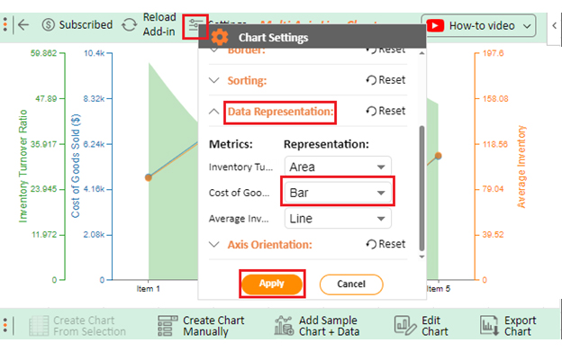
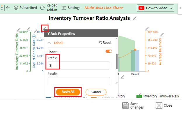
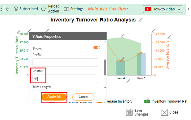
Gone are the days of static numbers on a spreadsheet. ChartExpo breathes life into your understanding of how to calculate the inventory turnover ratio by translating it into dynamic visualizations. Choose from various options to illustrate turnover trends with a comprehensive and engaging view of your inventory performance.

So, let the visual storytelling begin, and may your inventory turnover ratio reveal its secrets with ChartExpo.

How much did you enjoy this article?

ExcelAd2
Start Free Trial!
133835

Related articles

next previous
Microsoft Excel8 min read

Excel Task Tracker Template for Smarter Task Insights

Task tracker template in Excel organizes tasks, tracks deadlines, and boosts efficiency. Learn its benefits, and explore expert tips to simplify task management.

Microsoft Excel10 min read

Invoice Tracker Template in Excel for Better Insights

An invoice tracker Excel template helps track invoices, due dates, and payments. Learn how to use this template for better financial management.

Microsoft Excel12 min read

Key Performance Indicators in Healthcare for Better Insights

Key Performance Indicators in healthcare track patient care and efficiency. Learn about these KPIs, top examples, and how to use them to improve outcomes.

Microsoft Excel10 min read

BMI Calculation Formula in Excel for Better Fitness Insights

The BMI calculation formula in Excel helps track and analyze body mass index. Explore step-by-step instructions and tips to simplify BMI tracking in Excel.

Microsoft Excel29 min read

How to Create a Tornado Chart in Excel? A Complete Guide

Click to learn how to plot a Tornado Chart in Excel using easy-to-follow steps. Also, we’ll address the following question: what is a Tornado Diagram?

ChartExpo logo

Turn Data into Visual
Stories

CHARTEXPO

  • Home
  • Gallery
  • Videos
  • Services
  • Pricing
  • Contact us
  • FAQs
  • Privacy policy
  • Terms of Service
  • Sitemap

TOOLS

  • ChartExpo for Google Sheets
  • ChartExpo for Microsoft Excel
  • Power BI Custom Visuals by ChartExpo
  • Word Cloud

CATEGORIES

  • Bar Charts
  • Circle Graphs
  • Column Charts
  • Combo Charts
  • Comparison Charts
  • Line Graphs
  • PPC Charts
  • Sentiment Analysis Charts
  • Survey Charts

TOP CHARTS

  • Sankey Diagram
  • Likert Scale Chart
  • Comparison Bar Chart
  • Pareto Chart
  • Funnel Chart
  • Gauge Chart
  • Radar Chart
  • Radial Bar Chart
  • Sunburst Chart
  • see more
  • Scatter Plot Chart
  • CSAT Survey Bar Chart
  • CSAT Survey Chart
  • Dot Plot Chart
  • Double Bar Graph
  • Matrix Chart
  • Multi Axis Line Chart
  • Overlapping Bar Chart
  • Control Chart
  • Slope Chart
  • Clustered Bar Chart
  • Clustered Column Chart
  • Box and Whisker Plot
  • Tornado Chart
  • Waterfall Chart
  • Word Cloud
  • see less

RESOURCES

  • Blog
  • Resources
  • YouTube
SIGN UP FOR UPDATES

We wouldn't dream of spamming you or selling your info.

© 2025 ChartExpo, all rights reserved.