Categories
By ChartExpo Content Team
An area chart does more than show numbers—it tells a story. It reveals how data changes over time, making trends easy to see. Whether tracking sales, website traffic, or stock prices, this chart highlights growth and decline at a glance.


An area chart fills the space beneath the line, turning raw numbers into a clear picture. This simple adjustment makes patterns stand out, helping businesses and analysts spot shifts before they become problems. It’s a tool for making fast, informed decisions.
But not every area chart works well. A cluttered design or poor scaling can hide the real message. Choosing the right type—stacked, multi-series, or overlapping—makes all the difference. Understanding when and how to use an area chart ensures accuracy and clarity in every report.
An area chart is a visual tool that tracks changes over time. It looks like a line chart but has the space below the line filled with color. This shading helps show volume and trends in a way that’s easy to compare.
This type of chart works well for tracking data that adds up over time. It shows the rise and fall of values clearly. Businesses use it to track revenue, population growth, or website traffic. The color fill makes trends stand out, making it easier to see patterns at a glance.
Area charts handle multiple data sets, making them useful for comparisons. Stacked versions show how different parts contribute to a total. Overlapping versions highlight separate trends in the same time frame. Each type serves a different purpose, depending on the data.
An area chart shows totals and trends over time. The colored sections help compare different values easily. The higher the shaded area, the larger the value.
It’s great for showing growth, decline, and patterns. You can see how things change across months, years, or other timeframes. If there are multiple data sets, stacked charts make it clear how each part adds up.
However, it doesn’t work well for showing exact numbers. It focuses on overall movement, not specific values. It can also hide details if too many layers overlap. If you need exact comparisons, a bar chart or line chart might be better.
William Playfair, a Scottish engineer, changed the way people viewed data. In the 18th century, he introduced area charts along with bar and line charts. His goal was simple: make numbers easier to understand.
Before his work, data was mostly presented in tables. Playfair realized that pictures could tell stories faster than raw numbers. His charts helped people spot trends without reading long lists of figures.
His impact is still felt today. Businesses, scientists, and governments rely on area charts to track patterns. Playfair’s work laid the foundation for modern data visualization, turning complex numbers into clear, visual stories.
Area charts highlight patterns that might be hard to see in plain numbers. The color fill makes trends more visible than a simple line chart. It quickly shows how values increase or decrease over time.
They work well for tracking cumulative totals. Stacked versions help break down how different categories contribute to a whole. This is useful for financial reports, sales tracking, and population studies.
However, they aren’t ideal for precise comparisons. If exact values are important, bar or line charts might be better. But if you need to see how things grow or shrink over time, area charts are a strong choice.
The x-axis in an area chart details time or categories. It sets the stage, telling you ‘when’ or ‘what’. The y-axis gives the numbers, revealing ‘how much’. Together, they narrate a data story.
However, axes can be tricky! They don’t tell you about data quality or context. They just show the numbers. Also, the scale can mislead. A compressed scale might downplay big changes.
Always check the axis labels and scales. They impact how you interpret the data. Are they showing a short burst or a long trend? It matters!
The fill in an area chart isn’t just for show. It highlights volume and changes more dramatically than a plain line. This shading helps your eyes see rises and drops quickly.
A darker or more intense color often means higher values. Lighter shades? Lower values. This visual cue lets you spot trends at a glance.
But beware of too many shades or overlapping areas. It can turn into a visual mess, making it hard to see what’s going on. Stick to a clear color scheme.
Choosing the right colors for an area chart is key. Each color should make a point clearer, not just make the chart pretty. Too many bright colors can clash, leading to confusion.
Stick to a palette that makes sense for your data. Cool colors like blue or green can suggest calmer trends, while warm colors like red or yellow can indicate urgency or increase.
Remember, color adds meaning. Use it wisely to guide the viewer’s eyes to the most important parts of your data. Avoid a random mix that can mislead or distract.
A simple area chart serves as a fundamental tool for visualizing data trends over time. This chart type fills the space between a line graph and the horizontal axis, offering a vivid display of volume beneath the line. It is ideal for showing how a single data set changes at equal intervals.
For instance, you might use a simple area chart to illustrate monthly rainfall or annual sales data. Its visual weight makes it easy to spot rises and falls in data points, providing clear insights into trends.
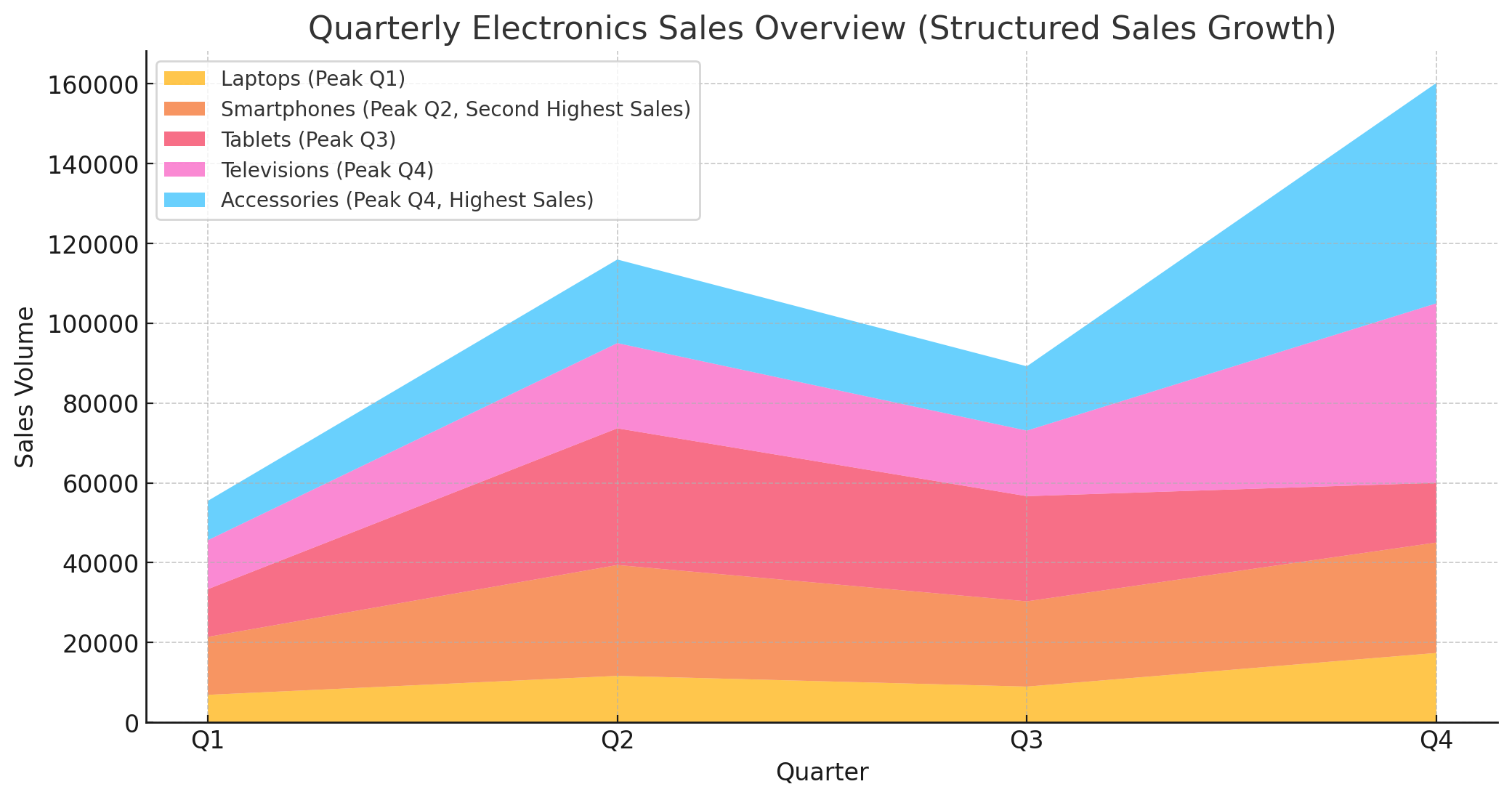
When dealing with multiple related data series, a stacked area chart is invaluable. It layers several area charts on top of one another, allowing you to view the cumulative total while still observing individual values.
This type of chart is particularly useful for comparing multiple components that contribute to a whole, such as sales figures for different products over time. By stacking the data, it becomes possible to assess both the overall trend and the relative contribution of each component.
| Quarter | Laptops | Smartphones | Tablets | Televisions | Accessories |
| Q1 | 6,899 | 14,521 | 11,958 | 12,260 | 9,864 |
| Q2 | 11,655 | 27,774 | 34,260 | 21,355 | 20,944 |
| Q3 | 8,966 | 21,365 | 26,354 | 16,427 | 16,111 |
| Q4 | 17,396 | 27,676 | 14,958 | 44,980 | 55,218 |


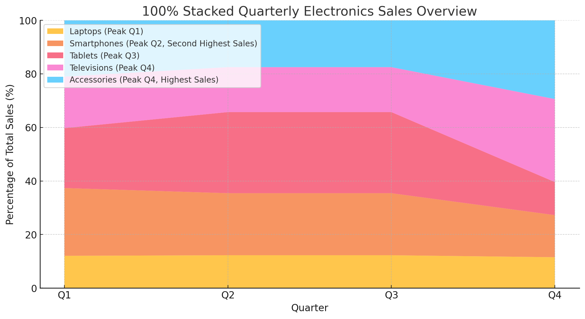
The 100% stacked area chart modifies the standard stacked chart by aligning the cumulative total to a consistent 100% across the chart. This adjustment places the focus on the percentage that each component contributes to the whole, rather than their absolute values.
This type of chart is perfect for understanding how the proportions of components change over time, like the market share of products within a total sales volume.
| Quarter | Laptops | Smartphones | Tablets | Televisions | Accessories |
| Q1 | 12.03957586 | 25.31589746 | 22.37071693 | 19.23762775 | 21.036182 |
| Q2 | 12.25489057 | 23.17334883 | 30.3009878 | 16.78171606 | 17.48905675 |
| Q3 | 12.25488715 | 23.17329869 | 30.30083291 | 16.78198427 | 17.48899699 |
| Q4 | 11.51492794 | 15.72235438 | 12.3487807 | 31.01410744 | 29.39982954 |
Overlapping area charts are designed to display several datasets that overlap each other with varying opacities. This chart helps in identifying the relationships and intersections between different data series.
It can be tricky to interpret if not designed carefully—choosing distinct colors and adjusting transparency levels is key to maintaining readability. Use this chart when you need to highlight how distinct data sets interact over the same period.
A multi-series area chart is a step up in complexity, allowing for the comparison of multiple data series within the same graph without stacking. Each series is represented by a different color, and the areas are usually opaque.
This setup helps in comparing the absolute values of multiple datasets side by side, such as the performance of several branches of a business across different regions.
Step area charts bring a unique visual style to the traditional area chart by using horizontal and vertical lines to connect data points. This creates a step-like progression that makes it easier to see the exact points of change between data points.
It is particularly effective in scenarios where data changes at irregular intervals or where the timing of changes is critical.
The streamgraph presents a flowing, organic look to the visualization of data, often used to display fluctuating metrics like website traffic or stock market changes over time. It centers the data horizontally, creating a symmetrical display that emphasizes the ebb and flow of the dataset.
This type of chart is both aesthetically pleasing and functional, offering a dynamic perspective on data that might seem static in more conventional charts.
Notice a rising area on the chart? This typically signals an increase in the variable being measured. It could indicate growth or a positive trend.
Conversely, a falling area suggests a decrease. But here’s a tip: context is king. A rise in expenses or a drop in revenue paints a whole different picture. Always align the trend with its real-world implications.
Stacked area charts are great for viewing parts of a whole over time. Each segment’s area can help you understand its proportionate change.
But beware! These charts can be tricky. Overlapping areas might lead to misinterpretation. Always look at the scale and separate the layers in your mind to trace the actual journey of each category.
Stacked area graphs can sometimes obscure more than they reveal. When layers pile up, it’s easy to lose track of individual trends.
A shrinking bottom layer might be completely hidden under a swelling top layer. To avoid being misled, try breaking down the data. Look at each layer individually and cross-verify with simple bar or line graphs if possible.
Area charts are ideal for displaying accumulated totals over time. Think of showing revenue growth from various products. They help in understanding trends at a glance. This makes them perfect for financial data or inventory levels.
They also excel in environmental studies. Imagine tracking temperature changes over decades. Area plots can effectively show gradual increases or decreases. Their visual impact helps in highlighting significant trends in large data sets.
Area charts fall short in scenarios requiring precise data comparisons. They’re not suited for datasets where categories compete against each other. In such cases, it’s hard to gauge exact figures for each group.
Avoid them when dealing with small or similar datasets. They can make minor differences look more dramatic than they are. This can lead to misinterpretation of data. It’s better to choose another chart type for clarity.
In many cases, bar charts outperform area charts for clarity. They’re better for comparing quantities across different categories. Each bar stands alone, making it easy to compare without confusion.
Line graphs are superior when clarity in trend data is necessary. They don’t fill space beneath the line, which avoids visual clutter. This makes them excellent for multi-series data where precision is crucial.
Streamgraphs are a variant of the area chart, offering better readability for multiple data streams. They’re wavy, centered, and less likely to mislead than stacked area charts. Use them when you want to show volume changes in a more stylized, readable format.
Selecting the perfect data set is your first step. Without relevant data, your area chart may fail to communicate effectively. Look for data that shows changes over time, as area charts excel in displaying this dynamism.
Ensure your data is complete and accurate. Small errors can lead to misleading charts. Remember, credibility in your data is crucial for a reliable area plot. Think of your data as the building blocks of a story you want to tell.
For clarity in your area chart, always set your baseline at zero. This setup prevents misinterpretation of the data’s volume and growth. If the baseline is not zero, the visual might exaggerate or downplay the actual trends, misleading the viewer.
This approach maintains integrity in the visual representation, making your chart honest and straightforward.
Color choice in an area chart is not just about aesthetics; it’s about usability and readability. Select colors that contrast well to ensure that each area stands out, making the chart easier to read. Avoid using shades that are too similar, as they can blend and confuse the viewer.
Instead, opt for a palette that differentiates clearly between sections, guiding the viewer’s eye naturally through the data. Remember, the goal is to enhance understanding, not overwhelm with colors.
When dealing with complex data sets, readability is key. Stacked area charts are often more readable for those looking to understand how parts add up to a whole. The layered design visually guides through the cumulative process of data segments, making it straightforward to grasp changes over time.
Conversely, overlapping area charts present a challenge in readability. While they highlight individual category trends effectively, the overlapping nature can create a visual puzzle. Colors and patterns can blend, leading to potential misinterpretation if not designed carefully.
In readability wars, stacked charts generally come out ahead due to their clearer data representation of how various sections contribute to total values.
While stacked area charts are great for showing total values, they can sometimes mislead. This is because the height of each segment is dependent on the segments below it. If earlier data is incorrect, it cascades, affecting all subsequent data layers.
This stacking can distort perception, making it difficult to judge individual category sizes accurately.
Moreover, when segments have similar values, they can appear more significant than they are due to their position on top of other layers. This visual illusion can mislead viewers about the true significance of data points.
Therefore, while stacked area charts are useful, scrutinize the data and consider using other forms for precise category comparison.
Choosing between stacked and overlapping area charts hinges on your data’s nature and what you need to communicate. Here’s a quick cheat sheet to help you decide:
Remember, the right choice varies based on your specific data and the story you need to tell.
Area charts shine in forecasting by displaying volume changes over time. Marketers and data analysts track rises and dips in product interest or market activity. This visual tool aids in predicting the ‘next big thing’ by highlighting growth areas.
For instance, a steady increase in a product’s area could signal rising market dominance. These insights allow businesses to allocate resources more effectively, ensuring they capitalize on upcoming trends before they become mainstream.
In the realm of sales and revenue, guesswork can lead to missed opportunities and misallocated budgets. Area charts provide a clear picture of sales trends and revenue accumulation over specific periods.
This clarity helps companies identify successful products and time frames. It aids in understanding seasonal impacts on sales, and guiding promotional and sales strategies.
With this data, companies can better forecast future revenue streams, leading to more accurate budgeting and investment planning.
Understanding customer behavior is crucial for maintaining and expanding a customer base. Area charts assist in visualizing how customer interests and behaviors evolve over time. They track changes in customer demographics or purchase patterns.
This data is vital for tailoring marketing strategies to meet shifting customer needs. Companies use these insights to adjust their product offerings and marketing tactics, ensuring they remain relevant and appealing to their target audience.
Ever noticed how some area charts seem to scream drama? That’s often poor scaling at play. When the y-axis isn’t set right, minor changes look huge, and big shifts seem trivial. The fix? Always start your y-axis at zero. This keeps things in perspective and your data’s integrity intact.
It’s like setting the stage for an honest story—no embellishments needed!
Picture this: several series piled atop each other, each screaming for attention. Result? A visual mess where data gets lost. When you’re juggling multiple series, opacity is your friend. Tone down the fill opacity to about 50-70%.
This little tweak lets each series shine through, making your chart a clear, insightful mosaic rather than a confusing overlap of colors.
Stacked area charts are like lasagna; each layer should add to the flavor without overpowering it. But pile on too many ingredients, and you’ve got a recipe for disaster. If your stacked graph has more than four or five layers, it’s time to simplify.
Consider splitting complex data into two charts. This approach serves up your insights in manageable, delicious slices, helping viewers digest the information bit by bit.
Layering data can reveal hidden patterns. Start with a step area chart. This chart is precise. It shows data changes at specific intervals. Now, blend it with a line graph. This combo allows comparisons of gradual trends against sudden shifts. Think of it as watching a slow-motion video alongside a time-lapse.
Next, add a Scatter plot. This plot introduces variability points. It’s perfect for spotting outliers. When these visuals merge, they tell a complete story. You see not just the ‘what’ but the ‘why’ and ‘how’ of data trends.
Layering isn’t just stacking; it’s about creating a dialogue between data sets. Each chart talks, highlighting different data facets. This method supports smarter data interpretations and decisions.
Clear visuals communicate better. Start with transparency settings. Adjusting this lets your area chart breathe. It avoids the clutter often seen in dense data plots. You’ll want your audience to see through the layers, not get lost in them.
Next, rethink your labels. Are they clear? Are they necessary? Every label should serve a purpose. If it doesn’t explain or clarify, it might distract. Aim for balance.
Annotations are your best friends. Use them to highlight key insights. But remember, it’s about quality, not quantity. Too many notes can overwhelm you. Pick critical data points and craft short, sharp annotations. They guide viewers through the data maze.
These tweaks don’t just add clarity; they refine your chart’s ability to communicate.
Interactive charts invite exploration. They turn viewers into active participants. Here’s how to get started. First, enable tooltip features. These small boxes of info appear when you hover over a chart segment. They can show data specifics without cluttering your visual.
Incorporate slider controls. These allow users to adjust what data they see. Maybe they want a year-by-year view or a month-by-month analysis. Sliders empower your audience. They control their view of the data.
Don’t forget clickable legends. These can toggle data sets on and off. This feature helps in comparing specific data sets without losing context.
Interactive elements transform static charts into dynamic data exploration tools. They make data not just seen, but experienced. This hands-on approach leads to deeper insights and smarter decisions.
Color plays a pivotal role in data interpretation through area charts. It creates a visual hierarchy, directing attention to critical data points. Bright, warm colors often draw attention faster than cool, muted ones. This can be used strategically to highlight significant trends or data points.
Color contrast also affects readability and viewer focus. High contrast between colors can help differentiate data sets clearly, making the chart easier to understand. On the other hand, similar colors might blend too much, causing viewers to miss subtle but important differences.
Additionally, color can evoke emotions and reactions. Red might indicate urgency or decline, while green often represents growth or safety. Selecting the right colors can not only make data more understandable but also align viewers’ emotional responses with the data’s implications.
In stacked area charts, the order of data series is critical. It can change the perception and meaning of the data. Placing a data series at the bottom of the stack gives it a baseline appearance, suggesting foundational qualities. Conversely, data at the top might seem less stable or more variable.
Stack order affects readability too. Overlapping or densely packed series can confuse viewers, making it difficult to trace individual data trends. Logical stacking, possibly by size or importance, can help avoid this, making each data series clear and its trends easy to follow.
The stacking method also influences how viewers interpret growth or decline. A cumulative stacking approach can show overall growth trends, while individual stacking might highlight the performance of specific data series within the broader context.
Creating engaging stacked area charts involves finding the right balance between detail and clarity. Too much information can overwhelm viewers, while too little can render the chart uninformative. The key is to prioritize data that offers the most insight and arrange it to maintain viewer interest.
Balancing color and texture can also make charts more engaging without being overpowering. Soft gradients can indicate depth and volume, while solid colors might be used to emphasize specific data points or trends.
Lastly, labeling plays a significant role in maintaining this balance. Clear, concise labels and legends help viewers understand the chart quickly. Interactive elements, like tooltips or clickable legends, can provide additional information on demand, keeping the initial view clean and straightforward.
When labels overlap, understanding an area chart can become a headache. To fix this, start by reducing the number of categories displayed. Focus on key data points that offer the most valuable insights. If multiple series are essential, try alternating label positions between series to avoid overlap.
Another effective strategy involves using interactive tooltips. These appear when a user hovers over a data point. This method keeps the chart clean while providing all necessary information on demand.
Stacked area charts should show part-to-whole relationships. However, poor stacking can obscure data. Always order categories by size with the largest at the bottom. This layout supports readers in seeing each category’s trends without interference. It’s also critical to limit the number of layers.
Too many stacked layers can confuse rather than clarify. Stick to three to five categories for optimal clarity. Color choice matters too. Use contrasting colors to differentiate layers clearly and guide the eye smoothly across the chart.
Overlapping area charts can quickly become puzzling if not designed thoughtfully. To enhance these charts, reduce opacity. This change allows viewers to see where series overlap, clarifying the relationships between data sets. Another tactic is to shift to a line chart for one or more series.
This variation can maintain visibility for all series without the overlaps hiding critical data. Lastly, consider using annotations. These can direct viewers’ attention to significant overlaps and explain their relevance, making the data stand out rather than confusing.
Here’s a fun way to explain area charts: think of a sandcastle. Each bucket of sand is a data point. As you pile on more buckets, the castle grows. Each layer of sand adds to the total, just like segments in an area chart. This builds up a complete story, showing not just individual bits but the entire, stacked result.
This analogy works because it’s visual and familiar. Everyone has either made or seen a sandcastle. By associating each bucket of sand with a part of the data, it becomes easier to see how individual contributions shape the overall trend.
So, next time you’re explaining area charts, say, “Imagine building a sandcastle with buckets labeled for different data points. Each bucket’s sand contributes to the whole structure, helping us see how everything stacks up over time.”
When presenting area charts, clarity is key. Start with a clear title that tells what the chart measures. Use direct labels and a legend that explains the colors or patterns. This is like labeling parts of a machine; it helps everyone understand what they’re looking at without technical jargon.
Focus on one or two main insights. For example, if the total area grows significantly, point out what this growth means in simple terms. If one segment shrinks, explain its impact. This approach keeps your explanation focused and prevents data overload.
End with a direct statement about what the viewer should take away from the chart. If the biggest takeaway is a drastic increase in one area, make that clear: “Notice how quickly this segment has grown, which suggests a strong shift in our focus.”
When questions about data accuracy arise, stay calm and informed. Begin by explaining how data was collected and processed. Assure your audience that sources are reliable, and mention any checks made to verify data. This builds trust and sets a foundation for your explanation.
If there are anomalies or outliers in the data, acknowledge them. Explain why they might exist and how they affect the overall trends. This shows you understand the data deeply and aren’t just glossing over inconsistencies.
Finally, encourage ongoing questions and offer to provide more detailed breakdowns if needed. This openness shows confidence in your data and willingness to engage further. It shifts the conversation from doubt to dialogue, fostering a more informed discussion.


Area charts are a clear, effective way to visualize data over time. They highlight trends, compare multiple datasets, and show cumulative changes at a glance. But like any tool, they work best when used correctly.
A good area chart doesn’t just display data—it tells a story. Make sure yours is one worth reading.
How much did you enjoy this article?


Calculate accounts receivable turnover ratio to measure credit collection speed, improve cash flow, and strengthen your financial strategy. Read on!

Change Management KPIs are the key to tracking adoption, performance, and ROI during transitions. Find out which metrics matter. Read on!

Data collection methods and techniques determine the quality of every insight you act on. Explore key approaches for gathering reliable data. Read on!


