Categories
Spreadsheets are full of data, but not always insight. When numbers stretch across rows, patterns become hard to spot and even harder to act on.
This is where sparklines in Excel make a difference.
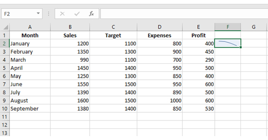
A sparkline is a small chart inside a single cell that shows trends at a glance.
Instead of scanning raw data, you can instantly see whether performance is rising, falling, or staying consistent.
It turns static tables into something you can read in seconds.
For example, a row of quarterly sales might not say much on its own. Add a sparkline, and the trend becomes obvious immediately.
This kind of quick visual feedback helps teams track performance, compare results, and react faster.
Sparklines are especially useful in dashboards where space is limited but clarity matters.
They keep reports compact while still showing meaningful patterns across multiple metrics.
If your goal is to move from raw numbers to quick, actionable insight, sparklines in Excel are one of the simplest ways to do it in Excel.
Let me help you get started…
Definition: A sparkline in Excel is a compact chart placed inside a single cell that displays data trends at a glance.
It is commonly used to track changes over time, such as sales performance, expenses, or key metrics.
Unlike traditional charts, sparklines are designed for quick scanning. They sit alongside your data, making it easier to spot increases, decreases, or patterns without leaving the worksheet.
They are simple to create, automatically update with your data, and help turn rows of numbers into clear, visual insights that support faster decisions.
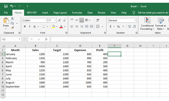
You don’t need advanced skills to create sparklines in excel. In just a few clicks, you can turn rows of data into a quick visual trend that’s easy to read and compare.
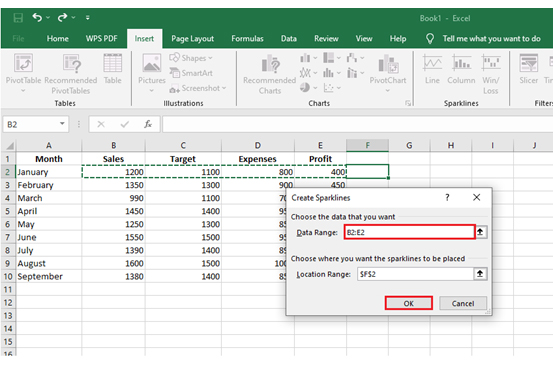
Follow these steps:
The first sparkline style you choose may not always communicate your data clearly.
For example, a column sparkline can highlight differences better, while a win/loss sparkline is more effective for showing positive and negative outcomes.
You don’t need to recreate it. Excel lets you change the sparkline type instantly:
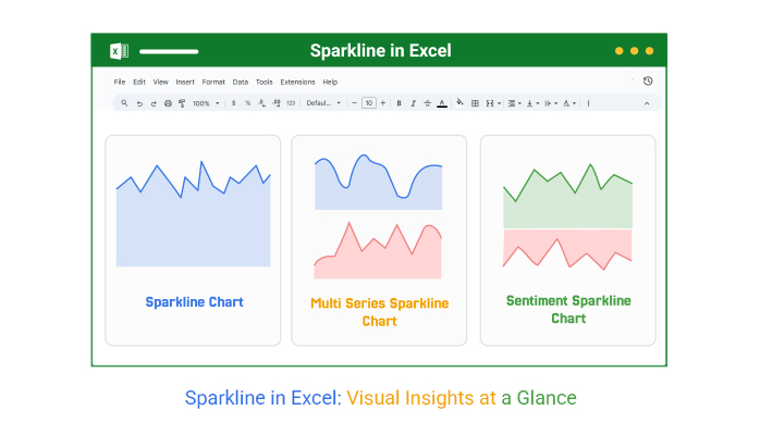
Data can get messy when it spans many rows and columns. Sparklines solve this by turning numbers into tiny visuals inside cells, making patterns easier to spot at a glance. Excel offers three main types:
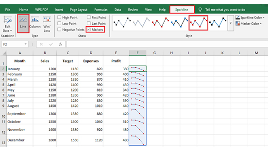
After creating a sparkline in Excel, the real value comes from customization. Adjusting the design helps you highlight insights more clearly and align visuals with your report or dashboard style.
Enable options like:
This helps emphasize performance changes in financial or KPI dashboards.
Sparkline lines are ideal for tracking monthly trends without building full Excel charts. In a compact dashboard, each row can show a different KPI such as revenue, users, or conversions.
Instead of scanning columns of numbers, you instantly see whether performance is trending upward, dipping, or staying flat.
Excel Use Case:
Add sparklines next to monthly KPI data (e.g., Jan–Dec revenue) to quickly compare growth patterns across departments.
Key Insight:
Sparklines reveal direction, not detail. They help you spot momentum shifts faster than traditional tables.

For short-term tracking, sparklines help visualize week-by-week performance directly inside your dataset.
This is especially useful for sales teams that need quick updates without opening full dashboards.
You can instantly identify spikes, drops, or inconsistent sales patterns across weeks.
Excel Use Case:
Insert sparklines beside weekly sales data to monitor performance across regions or products in real time.
Key Insight:
Sparklines make it easy to detect volatility. Sudden dips or peaks stand out immediately, helping teams react faster.
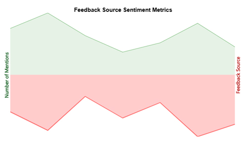
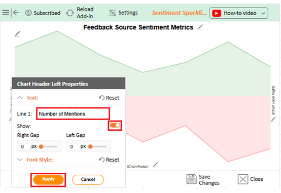
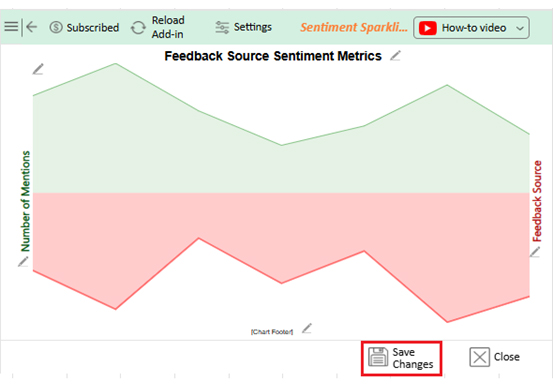
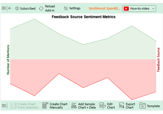
When dealing with feedback data, sparklines help compare sentiment trends across different sources like surveys, support tickets, or reviews.
Instead of analyzing raw counts, you can quickly see which sources are improving and which are declining over time.
Excel Use Case:
Use sparklines to track positive vs. negative mentions across feedback channels, helping teams prioritize problem areas.
Key Insight:
Sparklines highlight trend divergence. When one metric rises while another falls, it signals deeper issues worth investigating.
Sparklines are powerful, but only when used in the right context. They are designed for quick trend detection, not deep analysis.
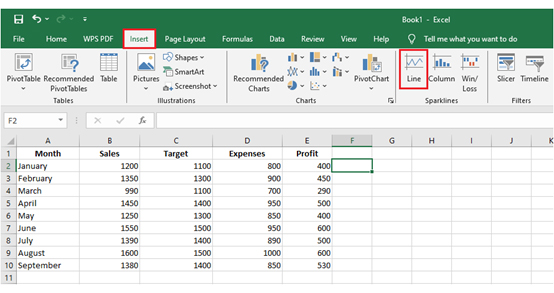
Follow these simple steps to create sparklines in Excel and visualize data trends inside cells:
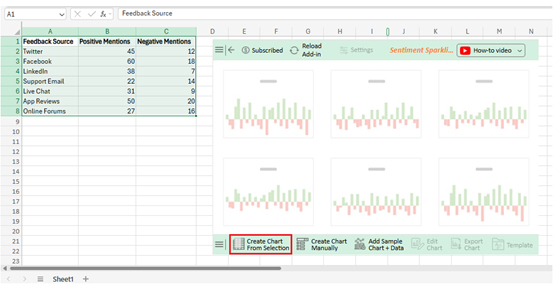
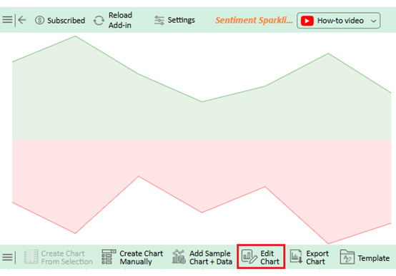
Use the Sparkline Tools Design tab to:
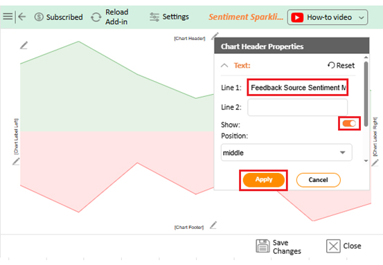

This helps improve readability in an Excel dashboard.
For more advanced visualization needs like sentiment or multi-dimensional analysis, tools like ChartExpo can extend Excel’s capabilities beyond native sparklines.
Tracking performance in large datasets becomes difficult when you rely only on numbers.
Sparklines solve this by turning data into compact visuals inside cells, making patterns easier to understand at a glance. Here are the key benefits:
Sparklines are simple, but small setup mistakes can easily distort insights or make dashboards harder to read. Here are the most common errors to avoid when using them in Excel:
Sparklines are most effective when they are treated as lightweight design elements inside a report, not just small charts.
The goal is to keep them visually consistent, easy to interpret, and aligned with the overall dashboard structure.
To insert sparklines in Excel Online:
Excel sparklines cannot be truly rotated horizontally or vertically. However, you can make them appear more horizontal by adjusting layout settings:
This layout is commonly used in dashboards to show time-based trends like monthly sales or performance tracking.
Sparklines in Excel are a simple but powerful way to turn raw numbers into visual patterns inside cells.
Instead of scanning large datasets, you can quickly understand trends, performance shifts, and comparisons in seconds.
Proper formatting plays an important role in making sparklines effective.
Adjusting colors, markers, and styles helps highlight key movements and makes reports easier to interpret, especially in dashboards and performance summaries.
When combined with other Excel tools like data bars or dynamic formulas such as GETPIVOTDATA, sparklines become part of a more flexible reporting system that updates automatically as data changes.
This improves accuracy and reduces manual reporting effort.
However, Excel’s native visualization options can feel limited when building more advanced or large-scale dashboards.
This is where tools like ChartExpo help simplify the process and create more structured, insight-driven visual reports.
Used correctly, sparklines improve how quickly data can be read and understood, making everyday analysis faster and more practical.
Related Article:
How much did you enjoy this article?


Learn what a confidence interval graph is, how to create it in Excel, and how to interpret results to make more reliable, data-driven decisions.

A correlation matrix in Excel helps identify relationships between variables. Learn how to create, read, and use it for effective data analysis.

Learn how to create a clustered column chart in Excel with real use cases, step-by-step guide, tips, and common mistakes.