• Home
  • Tools dropdown img
    • Spreadsheet Charts

      • ChartExpo for Google Sheets
      • ChartExpo for Microsoft Excel
    • Power BI Charts

      • Power BI Custom Visuals by ChartExpo
    • Word Cloud

  • Charts dropdown img
    • Chart Category

      • Bar Charts
      • Circle Graphs
      • Column Charts
      • Combo Charts
      • Comparison Charts
      • Line Graphs
      • PPC Charts
      • Sentiment Analysis Charts
      • Survey Charts
    • Chart Type

      • Box and Whisker Plot
      • Clustered Bar Chart
      • Clustered Column Chart
      • Comparison Bar Chart
      • Control Chart
      • CSAT Survey Bar Chart
      • CSAT Survey Chart
      • Dot Plot Chart
      • Double Bar Graph
      • Funnel Chart
      • Gauge Chart
      • Likert Scale Chart
      • Matrix Chart
      • Multi Axis Line Chart
      • Overlapping Bar Chart
      • Pareto Chart
      • Radar Chart
      • Radial Bar Chart
      • Sankey Diagram
      • Scatter Plot Chart
      • Slope Chart
      • Sunburst Chart
      • Tornado Chart
      • Waterfall Chart
      • Word Cloud
    • Google Sheets
      Microsoft Excel
  • Services
  • Pricing
  • Contact us
  • Blog
  • Support dropdown img
      • Gallery
      • Videos
      • Contact us
      • FAQs
      • Resources
    • Please feel free to contact us

      atsupport@chartexpo.com

Categories
All Data Visualizations Data Analytics Surveys
Add-ons/
  • Google Sheets
  • Microsoft Excel
  • Power BI
All Data Visualizations Data Analytics Surveys
Add-ons
  • Google Sheets
  • Microsoft Excel
  • Power BI

We use cookies

This website uses cookies to provide better user experience and user's session management.
By continuing visiting this website you consent the use of these cookies.

Ok

ChartExpo Survey


Home > Blog > Microsoft Excel

Moving Average in Excel Simple Steps for Clear Visuals

What is a moving average in Excel?

It’s a powerful tool for analyzing data trends. Businesses and analysts use it to smooth fluctuations and understand patterns over time. Tracking sales, stock prices, or website traffic provides valuable insights.

Moving Average in Excel

Excel makes calculating moving averages simple. The built-in tools and formulas allow you to analyze data efficiently. Moving averages help identify long-term trends by eliminating short-term noise, making them essential for decision-making.

Businesses rely on moving averages to predict future sales. Financial analysts use them to monitor stock market performance, while marketers analyze website traffic trends to optimize campaigns. The versatility of moving averages in Excel makes them widely applicable.

Understanding moving averages also helps improve forecasts. Focusing on averages gives a clearer view of consistent patterns, reducing errors caused by random fluctuations in data.

Excel has a wide range of users worldwide. Many use moving averages for data analysis. Mastering this function is valuable whether you’re a beginner or a seasoned analyst.

In this blog, we’ll explain moving averages in Excel, their uses, and how to calculate them step-by-step.

Table of Contents:

  1. What is a Moving Average in Excel?
  2. Reasons to Calculate a Moving Average in Excel
  3. How Many Types of Moving Averages in Excel?
  4. How to Calculate Moving Average in Excel?
  5. How to Visualize Moving Averages in Excel?
  6. Wrap Up

First…

What is a Moving Average in Excel?

Definition: A moving average in Excel is a tool for analyzing data trends over time. It smooths out fluctuations by calculating the average of a specific range, helping identify patterns and long-term changes. Commonly used in sales, finance, and marketing, moving averages simplifies forecasting and decision-making.

Excel’s built-in functions and tools make creating moving averages straightforward. They are essential for anyone looking to analyze data effectively and understand underlying trends in dynamic datasets.

Reasons to Calculate a Moving Average in Excel

Tracking trends in data can feel overwhelming without the right tools. That’s where a moving average in Excel becomes invaluable. It’s a straightforward and effective method for trend analysis in Excel, helping you make sense of ever-changing numbers with ease.

Here’s why you should calculate it:

  • To constantly update average prices: Markets change daily, and moving averages help monitor price shifts. They provide a clearer picture of long-term value by updating as new data becomes available.
  • To mitigate data errors associated with short-term fluctuations: Short-term changes can distort insights. Moving averages smooth out these fluctuations, making patterns easier to spot.
  • To detect changes in momentum for security: A moving average reveals when trends in security prices might be shifting, aiding data-driven decisions.

How Many Types of Moving Averages in Excel?

There are three main types of moving averages in Excel, each serving different analytical needs:

  • Simple Moving Average (SMA): This averages a set number of data points over a specified range. It gives equal weight to all values, making it useful for smoothing short-term fluctuations.
  • Weighted Moving Average (WMA): WMA assigns greater importance to recent data points. It helps emphasize recent trends, which is especially valuable in dynamic datasets.
  • Exponential Moving Average (EMA): EMA further prioritizes recent data while gradually reducing the impact of older points. It reacts faster to data changes, making it ideal for real-time analysis.

How to Calculate Moving Average in Excel?

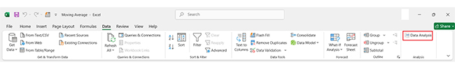
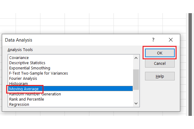
A moving average in Excel simplifies trend analysis. It smoothes fluctuations and highlights patterns. Let’s walk through the steps to calculate it effectively.

  1. Create a time series in Excel: Organize your data in a time-based format. This serves as the foundation for your analysis.
Organize Data in Time Based Format for Doing Moving Average in Excel
  1. Select “Data Analysis”: Enable the Data Analysis ToolPak from Excel’s settings. It provides a dedicated option for moving averages.
Enable Data Analysis ToolPak for Doing Moving Average in Excel
  1. Choose “Moving Average”: Click on the Data Analysis tab and select “Moving Average”. This will open a setup window for your calculation.
Select Moving Average for Doing Moving Average in Excel
  1. Set interval, input, and output ranges: Input your data range and specify the interval. For example, set it to 3 months for quarterly analysis. Then, select an output range to display results.
Select Output Range to Display Results for Doing Moving Average in Excel
  1. Create a graph using the values: Use Excel’s charting tools to visualize your moving average. A “Multi-Axis Line Chart” is a great choice for clear data presentation.
Use Exce; Charting Tools for Doing Moving Average in Excel
  1. Adjust for a different interval: Repeat the process, but set the interval to 2 months or another desired period.
Repeat the Process for Doing Moving Average in Excel
  1. Create a graph using the new values: Generate a separate chart to compare trends across intervals.
Generate a Seprate Chart for Doing Moving Average in Excel

How to Visualize Moving Averages in Excel?

Data visualization is the secret weapon of effective data analysis. It turns raw numbers into clear, actionable insights. However, Excel often falls short of advanced visuals. Its built-in tools can feel clunky and limited.

That’s where ChartExpo comes in. This powerful add-on transforms Excel into a data visualization powerhouse.

Want to make moving averages truly pop? ChartExpo makes it simple, stunning, and efficient. Let’s explore how to bring your moving averages to life in Excel.

Below are the top 5 charts and graphs created in Excel using ChartExpo:

Sankey Chart

Sankey Chart After Doing Moving Average in Excel

Progress Chart

Progress Chart After Doing Moving Average in Excel

Clustered Stacked Bar Chart

Clustered Stacked Bar Chart After Doing Moving Average in Excel

Likert Scale Chart

Likert Scale Chart After Doing Moving Average in Excel

Multi Axis Line Chart

Multi Axis Line Chart After Doing Moving Average in Excel

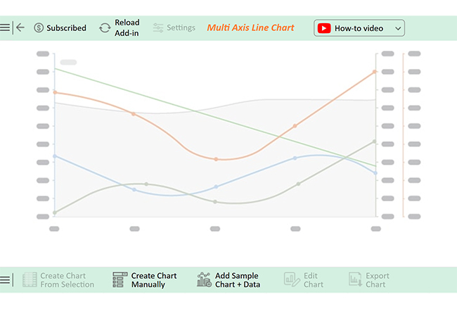
Let’s learn how to install ChartExpo in Excel.

  1. Open your Excel application.
  2. Open the worksheet and click the “Insert” menu.
  3. You’ll see the “My Apps” option.
  4. In the Office Add-ins window, click “Store” and search for ChartExpo on my Apps Store.
  5. Click the “Add” button to install ChartExpo in your Excel.

ChartExpo charts are available both in Google Sheets and Microsoft Excel. Please use the following CTAs to install the tool of your choice and create beautiful visualizations with a few clicks in your favorite tool.

Example

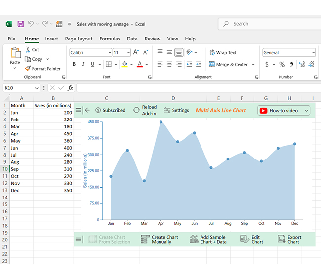
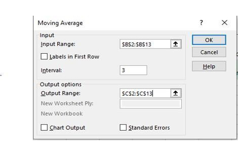
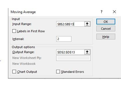
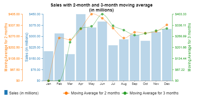
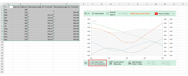
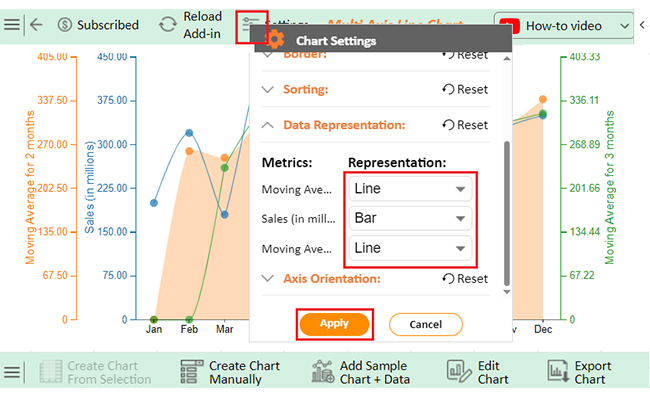
Let’s analyze this sample data in Excel using ChartExpo, a powerful tool for analyzing and interpreting data effectively.
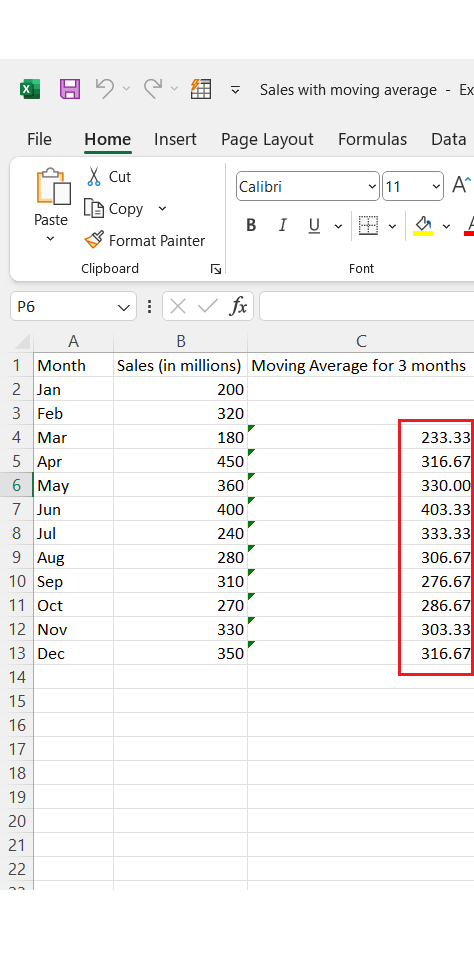
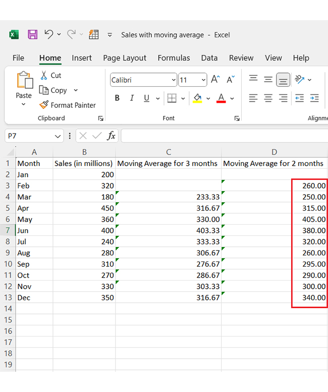
Month Sales (in millions) Moving Average for 3 months Moving Average for 2 months
Jan 200 0 0
Feb 320 0 260.00
Mar 180 233.33 250.00
Apr 450 316.67 315.00
May 360 330.00 405.00
Jun 400 403.33 380.00
Jul 240 333.33 320.00
Aug 280 306.67 260.00
Sep 310 276.67 295.00
Oct 270 286.67 290.00
Nov 330 303.33 300.00
Dec 350 316.67 340.00
  • To get started with ChartExpo, install ChartExpo in Excel.
  • Now Click on My Apps from the INSERT menu.
insert chartexpo in excel
  • Choose ChartExpo from My Apps, then click Insert.
open chartexpo in excel
  • Once it loads, scroll through the charts list to locate and choose the “Multi Axis Line Chart”.
search multi axis line chart in excel
  • You will see a Multi Axis Line Chart on the screen.
See Multi Axis Line Chart Page After Doing Moving Average in Excel
  • Click the “Create Chart From Selection” button after selecting the data from the sheet, as shown.
Click Create Chart From Selection After Doing Moving Average in Excel
  • ChartExpo will generate the visualization below for you.
Initial Visual After Doing Moving Average in Excel
  • Click on Settings and change the “Data Representation” as follows.
Change Data Representation After Doing Moving Average in Excel
  • If you want to add anything to the chart, click the Edit Chart button:
Click Edit Chart Button After Doing Moving Average in Excel
  • Click the pencil icon next to the Chart Header to change the title.
  • It will open the properties dialog. Under the Text section, you can add a heading in Line 1 and enable Show.
  • Give the appropriate title of your chart and click the Apply button.
Add Chart Header After Doing Moving Average in Excel
  • You can add the dollar sign with (Sales) value as follows:
Add Prefix with Sales Value After Doing Moving Average in Excel
  • Enable the Legend show button as follows:
Enable Legend Show Button After Doing Moving Average in Excel
  • Change the Legend shape of “Sales” to Column and click the “Apply” button.
Change Legend Shape of Sales After Doing Moving Average in Excel
  • Change the Legend shape of “Moving Average for 2 and 3 months” into a Line and Circle and click the “Apply” button.
Change Legend Shape of Moving Average After Doing Moving Average in Excel
  • Click the “Save Changes” button to persist the changes made to the chart.
Click Save Changes After Doing Moving Average in Excel
  • Your final Multi Axis Line Chart will look like the one below.
Final Moving Average in Excel

Insights

  • Monthly sales data shows fluctuating trends.
  • The 3-month moving average smooths variations, peaking at 450 million in June.
  • The 2-month moving average highlights more immediate fluctuations.
  • Overall, sales show seasonal patterns, ranging between 180 million and 450 million.

Enhance Data Insights by Visualizing Moving Average in Microsoft Excel Through Charts:

  1. Open your Excel Application.
  2. Install ChartExpo Add-in for Excel from Microsoft AppSource to create interactive visualizations.
  3. Select the Multi-Axis Line Chart from the list of charts.
  4. Select your data.
  5. Click on the “Create Chart from Selection” button.
  6. Customize your chart properties to add header, axis, legends, and other required information.

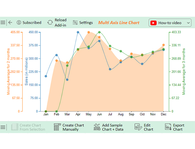
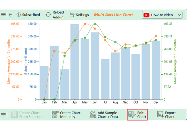
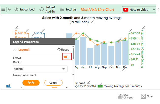
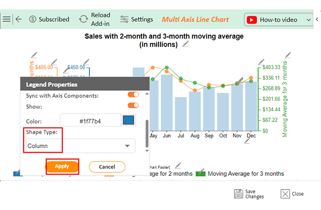
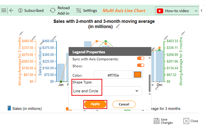
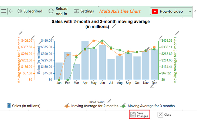
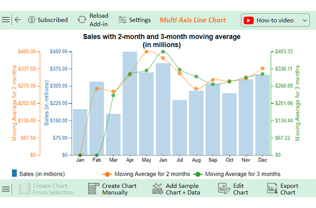
The following video will help you create a Multi-Axis Line Chart in Microsoft Excel.

FAQs

How do I add a rolling average to an Excel chart?

  • Calculate the rolling average in a separate column.
  • Use formulas like =AVERAGE(range) for the rolling window.
  • Add the rolling average column to the chart.
  • Format as a smooth line for clarity.

How do you make a moving average control chart in Excel?

  • Enter data in Excel.
  • Calculate the moving average in a new column.
  • Add columns for control limits (e.g., mean ± 3σ).
  • Insert a line chart with data, moving averages, and limits.
  • Format appropriately.

What is a moving average line in Excel?

A moving average line in Excel shows the average value over a specific period, smoothing fluctuations in data. It highlights trends. You can add it to charts using Excel’s “Trendline” feature, selecting “Moving Average” as the type.

Wrap Up

A moving average in Excel is a powerful tool for analyzing trends. It smooths fluctuations in data, making patterns easier to understand. It helps you focus on long-term changes.

Businesses rely on moving averages to track sales, monitor inventory, and analyze market trends. They’re also popular for financial forecasting and performance evaluation, making them versatile and valuable.

Excel simplifies moving average calculations with built-in functions. You can apply formulas and create graphs quickly. It saves time and improves data interpretation.

There are different types of moving averages. Simple, weighted, and exponential moving averages each serve specific purposes. Choosing the right one depends on your data and goals.

Using moving averages improves forecasting accuracy. By reducing short-term noise, it reveals meaningful insights. It supports better decision-making and strategic planning.

Mastering moving averages in Excel enhances data analysis skills. Whether for business or personal use, this tool helps you uncover trends and make informed decisions confidently.

Start using it today with ChartExpo and revolutionize your data analysis.

How much did you enjoy this article?

ExcelAd2
Start Free Trial!
145234

Related articles

next previous
Microsoft Excel8 min read

Excel Task Tracker Template for Smarter Task Insights

Task tracker template in Excel organizes tasks, tracks deadlines, and boosts efficiency. Learn its benefits, and explore expert tips to simplify task management.

Microsoft Excel10 min read

Invoice Tracker Template in Excel for Better Insights

An invoice tracker Excel template helps track invoices, due dates, and payments. Learn how to use this template for better financial management.

Microsoft Excel12 min read

Key Performance Indicators in Healthcare for Better Insights

Key Performance Indicators in healthcare track patient care and efficiency. Learn about these KPIs, top examples, and how to use them to improve outcomes.

Microsoft Excel10 min read

BMI Calculation Formula in Excel for Better Fitness Insights

The BMI calculation formula in Excel helps track and analyze body mass index. Explore step-by-step instructions and tips to simplify BMI tracking in Excel.

Microsoft Excel29 min read

How to Create a Tornado Chart in Excel? A Complete Guide

Click to learn how to plot a Tornado Chart in Excel using easy-to-follow steps. Also, we’ll address the following question: what is a Tornado Diagram?

ChartExpo logo

Turn Data into Visual
Stories

CHARTEXPO

  • Home
  • Gallery
  • Videos
  • Services
  • Pricing
  • Contact us
  • FAQs
  • Privacy policy
  • Terms of Service
  • Sitemap

TOOLS

  • ChartExpo for Google Sheets
  • ChartExpo for Microsoft Excel
  • Power BI Custom Visuals by ChartExpo
  • Word Cloud

CATEGORIES

  • Bar Charts
  • Circle Graphs
  • Column Charts
  • Combo Charts
  • Comparison Charts
  • Line Graphs
  • PPC Charts
  • Sentiment Analysis Charts
  • Survey Charts

TOP CHARTS

  • Sankey Diagram
  • Likert Scale Chart
  • Comparison Bar Chart
  • Pareto Chart
  • Funnel Chart
  • Gauge Chart
  • Radar Chart
  • Radial Bar Chart
  • Sunburst Chart
  • see more
  • Scatter Plot Chart
  • CSAT Survey Bar Chart
  • CSAT Survey Chart
  • Dot Plot Chart
  • Double Bar Graph
  • Matrix Chart
  • Multi Axis Line Chart
  • Overlapping Bar Chart
  • Control Chart
  • Slope Chart
  • Clustered Bar Chart
  • Clustered Column Chart
  • Box and Whisker Plot
  • Tornado Chart
  • Waterfall Chart
  • Word Cloud
  • see less

RESOURCES

  • Blog
  • Resources
  • YouTube
SIGN UP FOR UPDATES

We wouldn't dream of spamming you or selling your info.

© 2025 ChartExpo, all rights reserved.