Categories
How do I add data bars in Excel? This question often arises when looking for a simple way to make numbers stand out visually. Data bars are a dynamic feature that turns plain cells into visual value indicators. They help you compare data at a glance, saving time and boosting clarity.
Think about this: the average person processes visuals 60,000 times faster than text. In a world where 2.5 quintillion bytes of data are created daily, tools like data bars in Excel are essential. They transform overwhelming rows of numbers into easy-to-read visuals.


How to add data bars in Excel isn’t just about creating colorful cells. It’s about using Excel to communicate better. Imagine tracking sales, grades, or performance metrics—data bars quickly highlight patterns and trends. No more hunting through numbers to find insights.
You can stand out by adding tools like data bars to your toolkit. Professionals who use advanced Excel features are 12% more productive on average. That productivity often translates to better outcomes and recognition.
Whether managing small projects or large datasets, learning to add data bars in Excel can elevate your work. It’s a skill that’s practical, easy to master, and impactful. And the best part? You can start using it today to simplify your data story.
First…
Definition: Excel data bars are visual tools that turn numbers into bar charts within cells. They show the relative size of values, making data easier to compare. The longer the bar, the higher the value.
These bars are conditional formatting and excellent for creating quick comparisons, much like a side-by-side bar chart. They help highlight patterns, trends, or outliers in your data. You might need to use traditional charting tools for more complex visualizations, such as an Overlapping Bar Chart in Excel. However, data bars offer a simpler, in-cell alternative.
Data bars can be solid or gradient and adjust as values change. This feature saves time and enhances data visualization in spreadsheets.
Bringing data to life is crucial in today’s data-driven world. Excel’s data bars are a simple yet powerful way to visualize numbers and spot trends instantly. Whether working with sales reports, grades, or project metrics, these bars make your spreadsheets more dynamic and readable. Let’s explore how to add data bars in Excel—both with and without displaying values.


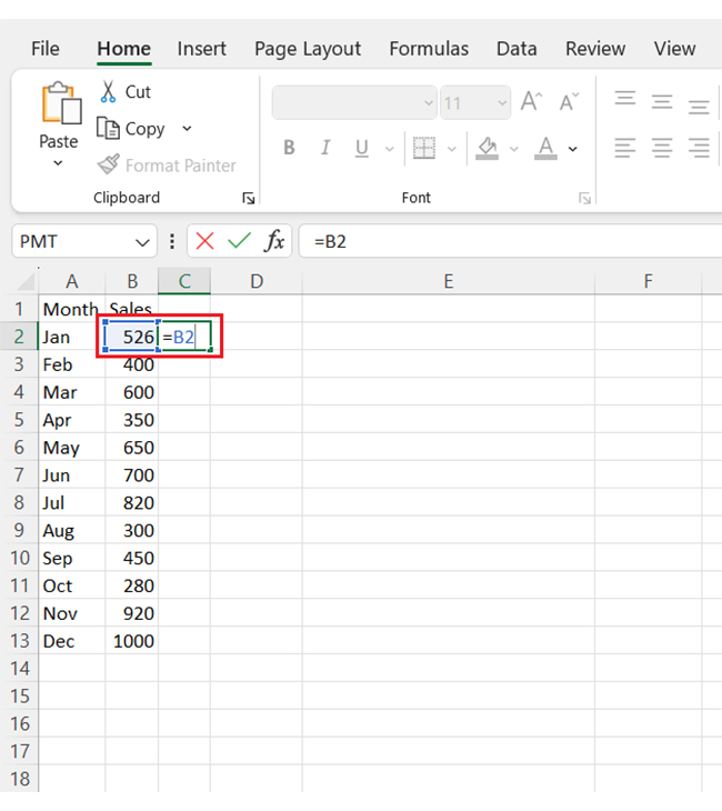
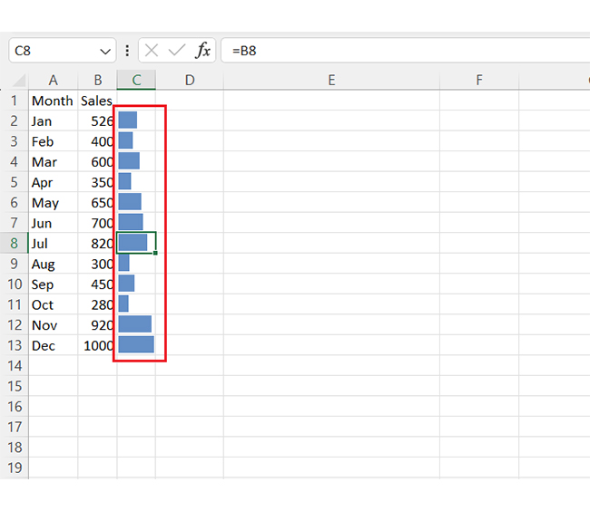
Do you want bars without numbers in the cells? Follow these steps:
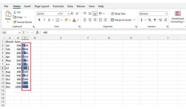
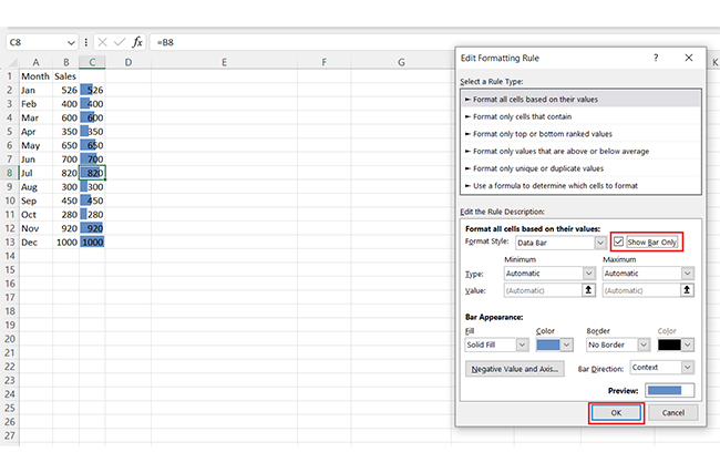
Excel offers two data bar fill types: Gradient Fill and Solid Fill. Choosing the right one depends on your data and presentation needs. Both have unique advantages, but knowing when to use each can make your spreadsheets more effective.
Want to make your data pop without overwhelming your spreadsheet? Data bars are the perfect way to add instant visual appeal. They’re quick, and easy, and help highlight trends at a glance.
Let’s break it down step by step:
Data speaks louder when it’s visual. That’s why data visualization is crucial in analysis—it turns boring numbers into insights you can see. Excel’s data bars are a great start, but let’s be honest—the chart elements in Excel are limited.
Do you want stunning visuals that go beyond basic charts? Enter ChartExpo, the ultimate tool for creating engaging, custom visuals. Install ChartExpo and say goodbye to Excel’s constraints and hello to next-level data storytelling.
Let’s learn how to install ChartExpo in Excel.
ChartExpo charts are available both in Google Sheets and Microsoft Excel. Please use the following CTAs to install the tool of your choice and create beautiful visualizations with a few clicks in your favorite tool.
Let’s analyze this sample data with a dynamic graph in Excel using ChartExpo.
| Channel | Gender | Views | Clicks | Sales |
| Male | 15000 | 1000 | 55 | |
| Female | 4000 | 150 | 10 | |
| Male | 9000 | 1200 | 60 | |
| Female | 3000 | 325 | 15 | |
| X (Twitter) | Male | 7000 | 900 | 33 |
| X (Twitter) | Female | 2000 | 125 | 20 |


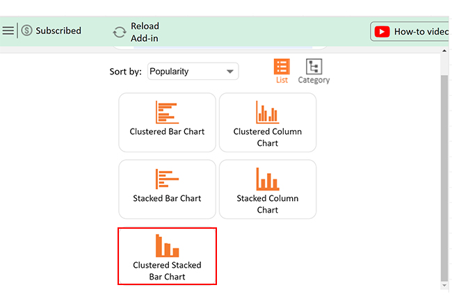
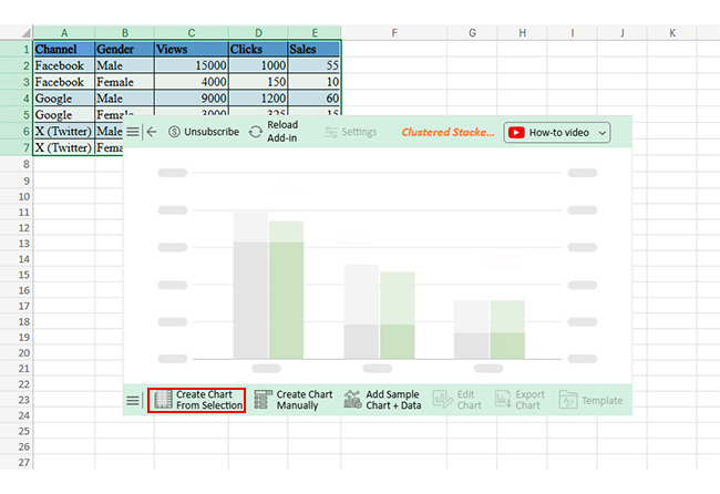
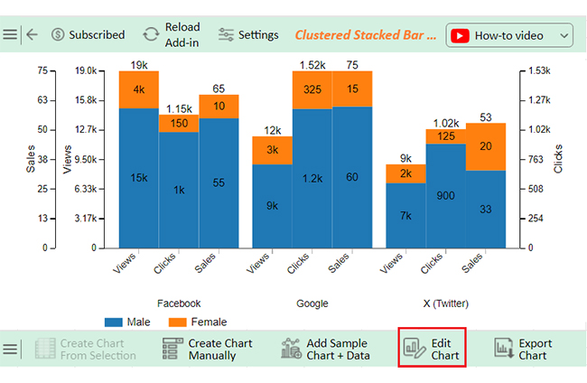
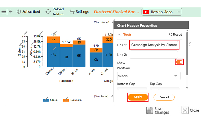
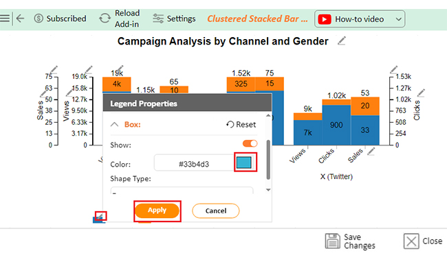
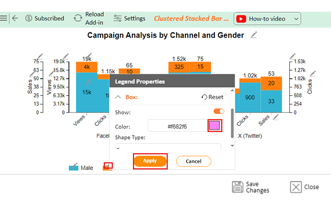
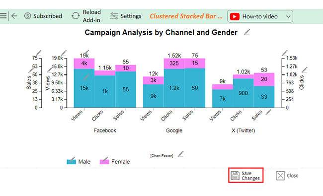
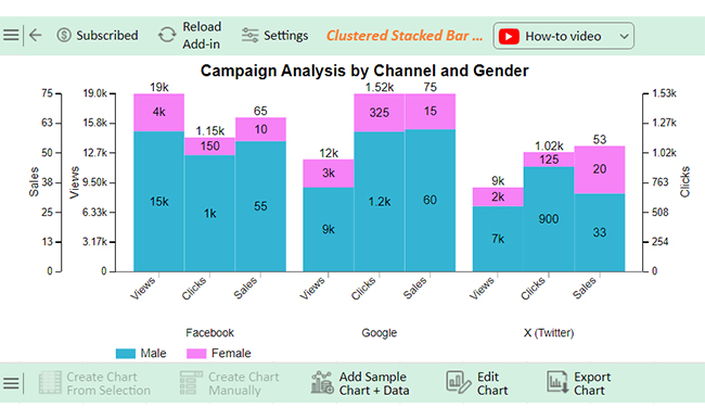


The following video will help you create a Clustered Stacked Bar Chart in Microsoft Excel.
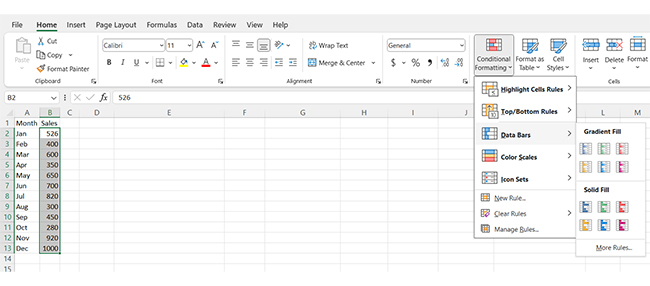
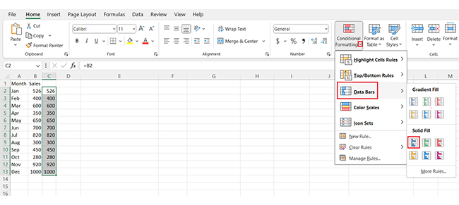
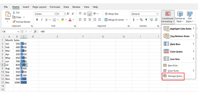
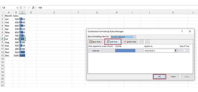
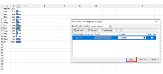
To access the data bars menu in Excel, follow these steps:
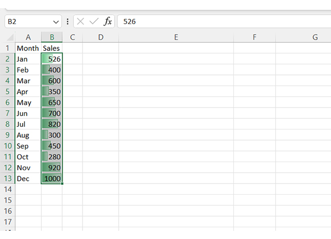
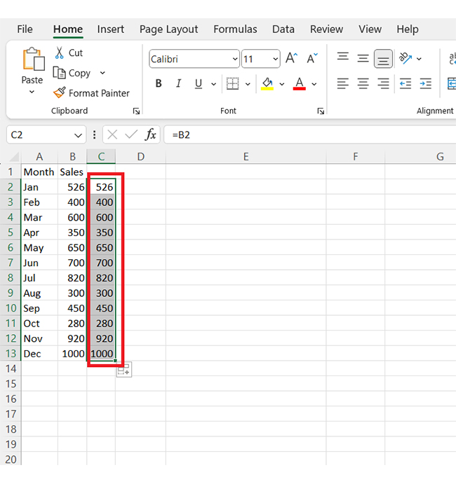
To add a data bar in an Excel cell:
To create data bars using conditional formatting in Excel:
Adding data bars in Excel is a powerful way to enhance data visualization. They simplify large datasets, like a Progress Bar Chart, offering instant insights into completion or performance. With just a few clicks, you can create a visual impact that improves clarity.
This feature is ideal for comparing values within a range. It highlights trends and outliers, bringing focus to critical data points. Whether for reports or presentations, it ensures your audience grasps the data quickly.
Customizing data bars is simple, too. You can adjust colors, directions, and rules to suit your needs. These options allow you to match the bars to your Data for Excel Chart, ensuring a cohesive and meaningful design.
When using data bars, avoid clutter. Stick to clean and meaningful visuals. Too many bars or colors can confuse your audience – aim for simplicity and focus.
Data bars work seamlessly with other Excel features. Combine them with conditional formatting, filters, or pivot tables. This integration makes them versatile and efficient. For Radial Bar Charts or advanced visuals, data bars offer foundational insights before exploring complex representations.
Now you know how to add data bars in Excel. Use them to transform raw numbers into engaging visuals. Try this feature today with ChartExpo and bring your spreadsheets to life.
How much did you enjoy this article?


Learn how to use sparklines in Excel to quickly visualize trends inside cells. Discover types, creation steps, customization, use cases, benefits, and best practices.

Learn what a confidence interval graph is, how to create it in Excel, and how to interpret results to make more reliable, data-driven decisions.

A correlation matrix in Excel helps identify relationships between variables. Learn how to create, read, and use it for effective data analysis.


