• Home
  • Tools dropdown img
    • Spreadsheet Charts

      • ChartExpo for Google Sheets
      • ChartExpo for Microsoft Excel
    • Power BI Charts

      • Power BI Custom Visuals by ChartExpo
    • Word Cloud

  • Charts dropdown img
    • Chart Category

      • Bar Charts
      • Circle Graphs
      • Column Charts
      • Combo Charts
      • Comparison Charts
      • Line Graphs
      • PPC Charts
      • Sentiment Analysis Charts
      • Survey Charts
    • Chart Type

      • Box and Whisker Plot
      • Clustered Bar Chart
      • Clustered Column Chart
      • Comparison Bar Chart
      • Control Chart
      • CSAT Survey Bar Chart
      • CSAT Survey Chart
      • Dot Plot Chart
      • Double Bar Graph
      • Funnel Chart
      • Gauge Chart
      • Likert Scale Chart
      • Matrix Chart
      • Multi Axis Line Chart
      • Overlapping Bar Chart
      • Pareto Chart
      • Radar Chart
      • Radial Bar Chart
      • Sankey Diagram
      • Scatter Plot Chart
      • Slope Chart
      • Sunburst Chart
      • Tornado Chart
      • Waterfall Chart
      • Word Cloud
    • Google Sheets
      Microsoft Excel
  • Services
  • Pricing
  • Contact us
  • Blog
  • Support dropdown img
      • Gallery
      • Videos
      • Contact us
      • FAQs
      • Resources
    • Please feel free to contact us

      atsupport@chartexpo.com

Categories
All Data Visualizations Data Analytics Surveys
Add-ons/
  • Google Sheets
  • Microsoft Excel
  • Power BI
All Data Visualizations Data Analytics Surveys
Add-ons
  • Google Sheets
  • Microsoft Excel
  • Power BI

We use cookies

This website uses cookies to provide better user experience and user's session management.
By continuing visiting this website you consent the use of these cookies.

Ok

ChartExpo Survey


Home > Blog > Microsoft Excel

Chart Elements in Excel for Effective Formatting

Excel is the largest data analysis tool 750 million people worldwide use it. One feature worth mentioning is its charting capabilities. Understanding chart elements in Excel is crucial for effective data visualization.

People can process visual information 60,000 times faster than written text. This highlights how crucial charts are in displaying data. The components in Excel charts are the fundamental units of these graphical tools. They turn unprocessed data into engaging narratives.

Chart Elements in Excel

Excel offers a wide array of chart types. Bar charts, pie charts, line graphs – each serves a unique purpose. But the magic lies in the details. Chart elements in Excel allow you to customize these visuals. They help highlight key information and trends.

In business, time is money. Forbes reports that managers who use visual data tools are 28% more likely to find relevant information. Knowing how to manipulate chart elements in Excel can save hours of work. It can also lead to better decision-making.

From axis labels to data series, each element plays a vital role. They work together to create a cohesive visual narrative. Understanding these components is essential for anyone working with data.

This blog post will demystify chart elements in Excel. We’ll explore their functions and how to use them effectively.

Get ready to elevate your data visualization skills!

Table of Contents:

  1. What are Chart Elements in Excel?
  2. What is the Importance of Chart Elements in Excel?
  3. How to Create a Visual with a Focus on Chart Elements in Excel?
  4. What is the Benefit of Adding a Chart Title in Excel?
  5. What are the Advantages & Disadvantages of Chart Elements in Excel?
  6. What are the Best Practices for Using Chart Element Features in Excel?
  7. Wrap Up

First…

What are Chart Elements in Excel?

Definition: Chart elements are the various components that make up a chart. Each element contributes to the chart’s readability, clarity, and overall data presentation:

  • Chart Title: The Chart Title is the main heading of the chart. It tells what the chart is about and is usually placed at the top.
  • Axis Titles: Axis Titles are labels for the X-axis and Y-axis. They describe the type of data shown on each axis, such as “Months” on the X-axis and “Sales” on the Y-axis.
  • Legend: The Legend explains the colors or symbols used in the chart. It helps to differentiate between different data series.
  • Data Labels: Data Labels show specific values at data points. They make it easier to see the exact data represented on the chart.
  • Gridlines: Gridlines are lines that run across the chart. They help to align and read data points more accurately.
  • Data Series: A Data Series is a group of related data points. Each series can be shown in different colors or styles.
  • Chart Area: The Chart Area is the entire space that includes all chart elements. It can be customized with colors and borders.
  • Plot Area: The Plot Area is where the data series are plotted. It is a part of the chart area but excludes the title, legend, and other labels.
  • Axis: The Axis refers to the lines that define the chart’s scale. The X-axis is horizontal, and the Y-axis is vertical. They show the categories and values.
  • Trendlines: Trendlines are lines that show the direction of the data. They help to identify patterns or trends over time. When you add trendlines, it becomes easier to see these trends and make data-driven decisions.

What is the Importance of Chart Elements in Excel?

When creating charts in Excel, it’s easy to focus on the data. However, the elements surrounding and supporting that data are just as crucial. Let’s explore why each of these elements is important.

  • Chart Title: Gives your chart a clear identity and context. It quickly tells viewers what the chart is about.
  • Axis Titles: Labels the axes. It helps viewers understand what each axis represents.
  • Legend: Explains the colors or patterns used. It identifies what each data series means. By using the best colors for graphs, you ensure that each series stands out, making it easier for viewers to differentiate and interpret the data effectively.
  • Data Series: Data Series are the heart of your chart. They represent the actual data being visualized.
  • Axis: Axes define the boundaries of your data. They provide a scale and reference points, helping viewers understand the magnitude and direction of the data.
  • Gridlines: They allow for precise alignment of data points with their corresponding values on the axes.
  • Data Labels: Display the exact values. They offer immediate, exact information without the need to trace back to the axes. By choosing to add data labels, you enhance the clarity of your data visualizations, ensuring that your audience can quickly grasp the specific figures associated with each data point.
  • Plot Area: The space where data is plotted. It frames your data series and ensures everything is presented within a defined space.
  • Chart Area: The entire area of the chart. A well-defined chart area ensures all elements are visible and well-organized, contributing to the chart’s readability.
  • Trendlines: The storytellers of your chart. They highlight trends and patterns that might not be immediately obvious, allowing for deeper insights through trend analysis. By identifying these narratives, you can make more informed decisions based on the underlying data trends.

How to Create a Visual with a Focus on Chart Elements in Excel?

Have you ever tried to create a chart in Excel? It’s like trying to paint a masterpiece with a toothbrush – possible but unnecessarily challenging. Excel sometimes feels stuck in the Stone Age of data visualization.

But don’t worry; we have ChartExpo, the time-traveling wizard of the spreadsheet world. With ChartExpo, you can whip up stunning, insightful visuals faster than you can say “components of charts in Excel.” It’s the secret sauce that turns your data analysis into a visual feast.

No more squinting at rows and columns – ChartExpo transforms your spreadsheets into eye-catching, insight-packed charts.

Let’s learn how to install ChartExpo in Excel.

  1. Open your Excel application.
  2. Open the worksheet and click the “Insert” menu.
  3. You’ll see the “My Apps” option.
  4. In the Office Add-ins window, click “Store” and search for ChartExpo on my Apps Store.
  5. Click the “Add” button to install ChartExpo in your Excel.

ChartExpo charts are available both in Google Sheets and Microsoft Excel. Please use the following CTAs to install the tool of your choice and create beautiful visualizations with a few clicks in your favorite tool.

How to Add Chart Elements in Excel Using ChartExpo?

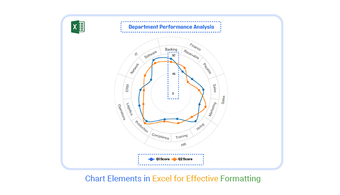
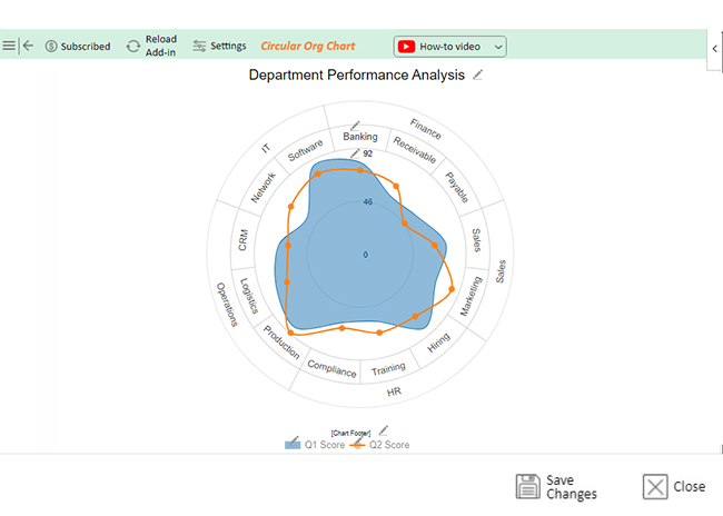
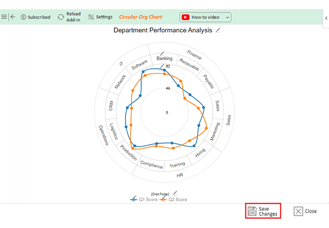
Let’s visualize this data and add chart elements to the chart using ChartExpo.

Departments Teams Q1 Score Q2 Score
Finance Banking 80 73
Finance Receivable 57 67
Finance Payable 59 47
Sales Sales 75 65
Sales Marketing 70 85
HR Hiring 85 72
HR Training 60 70
HR Compliance 61 66
Operations Production 85 91
Operations Logistics 78 68
Operations CRM 71 63
IT Network 56 73
IT Software 87 79
  • To get started with ChartExpo, install ChartExpo in Excel.
  • Now Click on My Apps from the INSERT menu.
insert chartexpo in excel
  • Choose ChartExpo from My Apps, then click Insert.
open chartexpo in excel
  • Once it loads, choose the “Circular Org Chart” from the charts list.
search Circular Org Chart in excel
  • Click the “Create Chart From Selection” button after selecting the data from the sheet, as shown.
Click Creaet Chart From Selection for Adding Chart Elements in Excel

How to Select Chart Elements in Excel?

  • ChartExpo will generate the visualization below for you.
Initial Visual for Adding Chart Elements in Excel

How to add chart elements in Excel?

  • If you want to have the chart’s title, click Edit Chart, as shown in the above image.
  • Click the pencil icon next to the Chart Header to change the title.
  • It will open the properties dialog. Under the Text section, you can add a heading in Line 1 and enable Show.
  • Give the appropriate title of your chart and click the Apply button.
Add Chart Header for Adding Chart Elements in Excel

How to show elements of a chart in Excel?

  • You can show the Stats as follows:
Show Stats for Adding Chart Elements in Excel
  • You can change the shape of the inner part into “Line and Circle” as follows:
Change Shape of Inner Part into Line and Circle for Adding Chart Elements in Excel
  • You can change the font size of text as follows:
Change Font Size of Text for Adding Chart Elements in Excel
  • You can enable the Stats button as follows:
Enable Stats Button for Adding Chart Elements in Excel

How to remove Chart Elements from Excel?

  • For example, you can change the shape and remove “Line and Circle” as follows:
Change Shape and Remove Line and Circle for Adding Chart Elements in Excel
  • After that, chart visualization will appear as follows:
Chart Visualization will Appear for Adding Chart Elements in Excel
  • But Now you can revert/reset the chart again and click on “Save Changes” as follows:
Save Changes for Adding Chart Elements in Excel
  • Your final chart will appear below.
Final Chart Elements in Excel

Insights

  • Operations: Performed best.
  • Production: Strong growth (85 to 91).
  • Finance: Struggled, especially Payable (59 to 47).
  • Marketing: Improved significantly.
  • HR: Steady with minor gains in Training and Compliance.

Enhance Organizational Clarity with Circular Org Charts in Microsoft Excel:

  1. Open your Excel Application.
  2. Install ChartExpo Add-in for Excel from Microsoft AppSource to create interactive visualizations.
  3. Select the Circular Org Chart from the list of charts.
  4. Select your data.
  5. Click on the “Create Chart from Selection” button.
  6. Customize your chart properties to add header, axis, legends, and other required information.

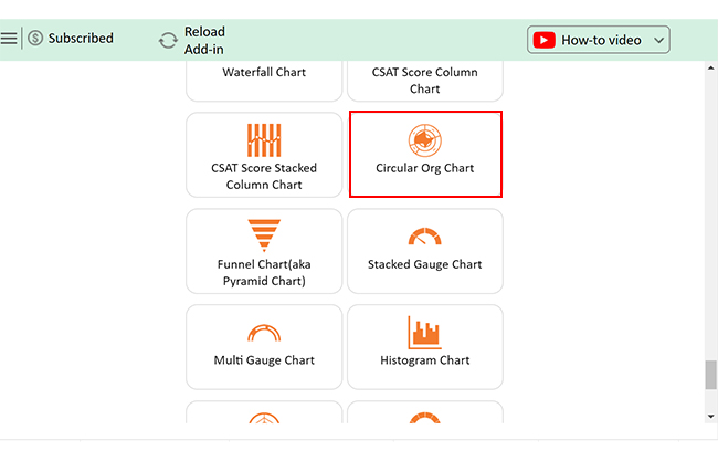
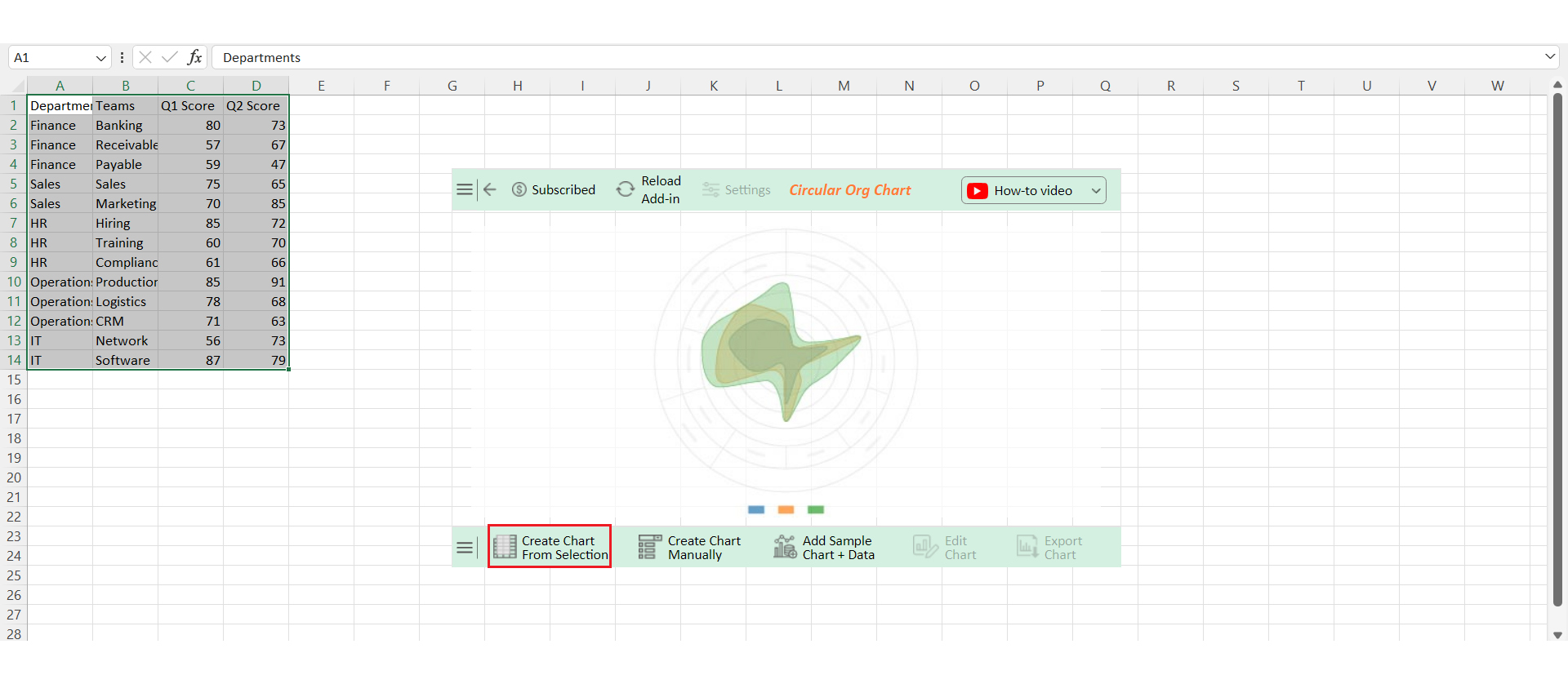
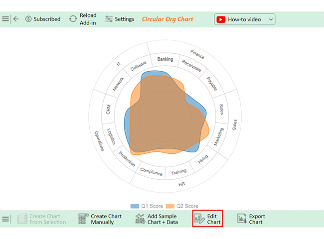
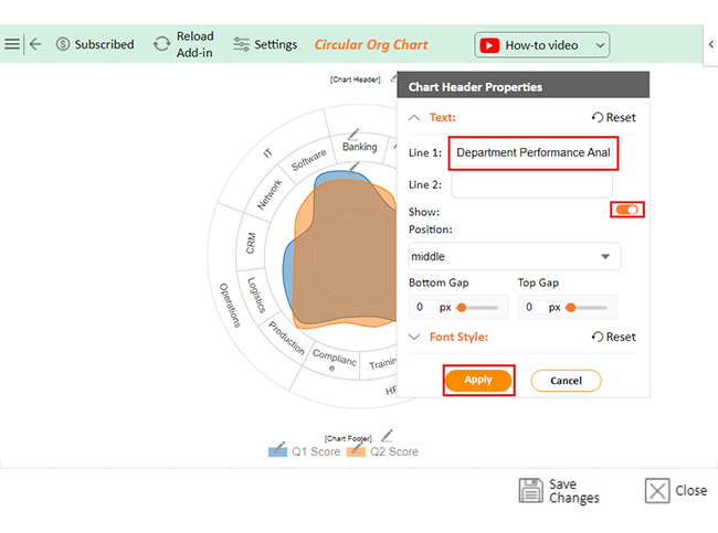
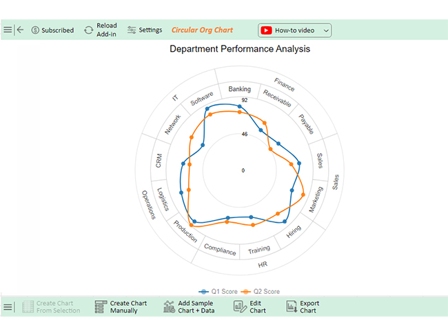
The following video will help you create an Circular Org Chart in Excel in Microsoft Excel.

What is the Benefit of Adding a Chart Title in Excel?

Adding a chart title in Excel may seem like a small detail, but it has significant benefits. Here’s why you should always include one:

  • Clarity and context: A chart title immediately informs viewers what the data represents, providing essential context at a glance.
  • Professional presentation: Including a title enhances the overall appearance of your chart, making your work look polished and well-organized.
  • Improved communication: A clear title helps convey your message more effectively, ensuring your audience understands the key takeaway from your data.

What are the Advantages & Disadvantages of Chart Elements in Excel?

Elements of charts in Excel offer many benefits. However, they can have some downsides if not used carefully. Let’s explore the advantages and disadvantages of key chart elements.

Advantages:

Chart Title:

  • Clarity: Shows what the chart is about.
  • Focus: Keeps viewers on the main topic.

Axis Titles:

  • Guidance: Explains what each axis represents.
  • Context: Makes data easier to understand.

Legend:

  • Identification: Helps distinguish between data series.
  • Quick reference: You can easily see what each color or symbol means.

Data Labels:

  • Precision: Shows exact values at data points.
  • Quick insights: You can view key data without looking at axes.

Gridlines:

  • Alignment: Helps align data with values.
  • Readability: Makes charts easier to read.

Disadvantages:

Chart Title:

  • Clutter: A long title can make the chart look crowded.
  • Distraction: A bold title might overshadow the data.

Axis Titles:

  • Redundancy: This can be unnecessary if the data is clear.
  • Space: Takes up room that could be used for data.

Legend:

  • Complexity: Too many items can confuse viewers.
  • Space: Uses up space, shrinking the data area.

Data Labels:

  • Overcrowding: Too many labels can clutter the chart.
  • Distraction: Can take attention away from overall trends.

Gridlines:

  • Visual noise: Too many gridlines can make the chart harder to read.
  • Overemphasis: Might highlight unimportant details.

What are the Best Practices for Using Chart Element Features in Excel?

Using chart elements in Excel can make or break how well your data is understood. Follow these best practices to ensure your charts are clear and effective:

  1. Use clear titles: Make sure your chart title is short and to the point. It should instantly tell viewers what the chart is about.
  2. Label axes: Always label your axes to show what each one represents. This helps people understand the data without guessing.
  3. Optimize legends:
    • Keep your legend simple and clear.
    • Place it where it doesn’t block the data.
    • If you have multiple data series, ensure the legend is easy to read and not overcrowded.
  1. Use data labels wisely: Add data labels only where they add value. Too many labels can clutter the chart. Use them to highlight key data points or to show exact values when necessary.
  2. Balance gridlines: Use gridlines to help guide the eye, but don’t overdo it. Too many gridlines can create visual noise. Keep them light and minimal to maintain clarity.
  3. Maintain simplicity: Less is more. Avoid adding too many elements that might overwhelm the chart. Focus on what’s essential for telling the story behind your data.

FAQs

Where are chart elements in Excel?

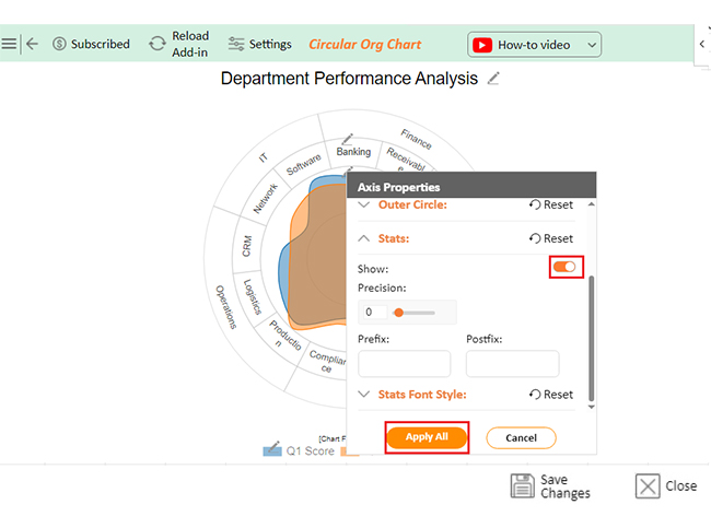
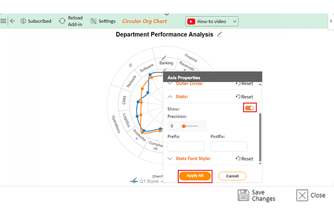
Chart elements in Excel are located under the “Chart Design” and “Format” tabs when a chart is selected. You can also add or modify them by clicking the plus sign (+) next to the chart.

What are the elements of chart display?

Chart display elements include:

  • Chart Title
  • Axis Titles
  • Legend
  • Data Series
  • Axes
  • Gridlines
  • Data Labels
  • Plot Area
  • Chart Area
  • Trendlines

These components help organize, label, and enhance the visual presentation of data.

Where is the chart elements quick button in Excel?

The Chart Elements quick button in Excel appears as a green plus sign (+) next to a selected chart. Click it to quickly add, remove, or modify chart elements like titles, legends, and data labels.

Wrap Up

Chart elements in Excel are crucial for creating effective charts. They help present data in a clear and organized way. Each element plays a specific role in enhancing the chart’s readability.

The Chart Title provides the main heading for the chart. It immediately tells the viewer what the chart is about. Without a title, the chart’s purpose might be unclear.

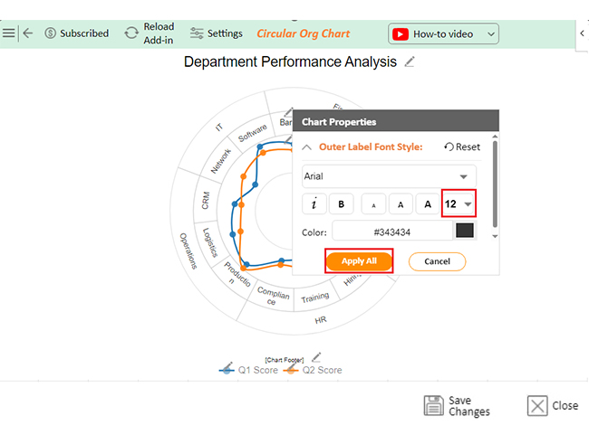
Axis Titles label the X and Y axes. They guide the viewer through the chart’s data, preventing confusion and ensuring the data is understood correctly.

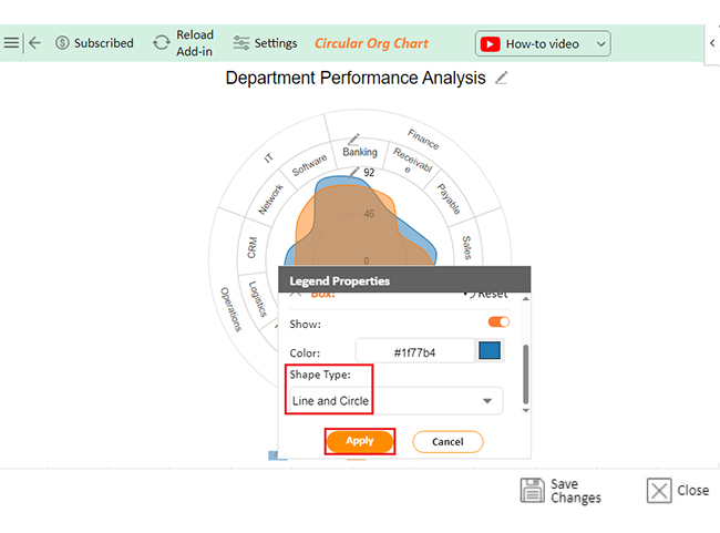
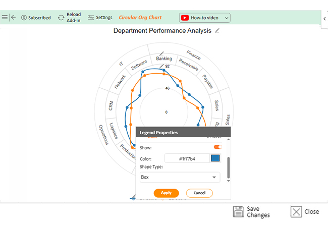
The Legend explains the symbols, colors, or patterns in the chart. It makes it easier to differentiate between different data series. Without a legend, interpreting complex charts becomes challenging.

Data Labels show exact values for specific data points, adding precision to the chart. However, too many labels can clutter the chart, so they should be used wisely.

Gridlines provide visual references that align data points with their values. They improve the chart’s readability. However, excessive gridlines can create visual noise.

In summary, chart elements in Excel are essential tools for effectively presenting data. When used correctly, they enhance clarity and understanding. Balancing these elements is key to creating powerful charts.

How much did you enjoy this article?

ExcelAd2
Start Free Trial!
140928

Related articles

next previous
Microsoft Excel13 min read

Excel for Teachers for Insightful Preparation

Excel for teachers simplifies grading, tracks attendance, and organizes data. Find its key features, expert tips, and how ChartExpo enhances data visualization.

Microsoft Excel14 min read

How to Make a Cash Flow Diagram in Excel?

Learn how to make a Cash Flow Diagram in Excel. It will help you learn to visualize and analyze inflows and outflows of your business cash flow.

Microsoft Excel11 min read

Succession Planning Template for Long-Term Success

Succession Planning Templates help businesses prepare for leadership changes. Learn to create, analyze, and use them for seamless transitions and growth.

Microsoft Excel10 min read

Grant Tracking Spreadsheet: Insights Made Easy

A Grant Tracker Spreadsheet helps track funding, deadlines, and expenses in Excel. Learn to use grant tracking templates, analyze data, and stay organized.

Microsoft Excel10 min read

What is Excel Software Used for: A Complete Guide

What is Excel software used for? It organizes, analyzes, and manages data. Explore its workplace applications, benefits, and top tips for efficiency and more.

ChartExpo logo

Turn Data into Visual
Stories

CHARTEXPO

  • Home
  • Gallery
  • Videos
  • Services
  • Pricing
  • Contact us
  • FAQs
  • Privacy policy
  • Terms of Service
  • Sitemap

TOOLS

  • ChartExpo for Google Sheets
  • ChartExpo for Microsoft Excel
  • Power BI Custom Visuals by ChartExpo
  • Word Cloud

CATEGORIES

  • Bar Charts
  • Circle Graphs
  • Column Charts
  • Combo Charts
  • Comparison Charts
  • Line Graphs
  • PPC Charts
  • Sentiment Analysis Charts
  • Survey Charts

TOP CHARTS

  • Sankey Diagram
  • Likert Scale Chart
  • Comparison Bar Chart
  • Pareto Chart
  • Funnel Chart
  • Gauge Chart
  • Radar Chart
  • Radial Bar Chart
  • Sunburst Chart
  • see more
  • Scatter Plot Chart
  • CSAT Survey Bar Chart
  • CSAT Survey Chart
  • Dot Plot Chart
  • Double Bar Graph
  • Matrix Chart
  • Multi Axis Line Chart
  • Overlapping Bar Chart
  • Control Chart
  • Slope Chart
  • Clustered Bar Chart
  • Clustered Column Chart
  • Box and Whisker Plot
  • Tornado Chart
  • Waterfall Chart
  • Word Cloud
  • see less

RESOURCES

  • Blog
  • Resources
  • YouTube
SIGN UP FOR UPDATES

We wouldn't dream of spamming you or selling your info.

© 2025 ChartExpo, all rights reserved.