• Home
  • Tools dropdown img
    • Spreadsheet Charts

      • ChartExpo for Google Sheets
      • ChartExpo for Microsoft Excel
    • Power BI Charts

      • Power BI Custom Visuals by ChartExpo
    • Word Cloud

  • Charts dropdown img
    • Chart Category

      • Bar Charts
      • Circle Graphs
      • Column Charts
      • Combo Charts
      • Comparison Charts
      • Line Graphs
      • PPC Charts
      • Sentiment Analysis Charts
      • Survey Charts
    • Chart Type

      • Box and Whisker Plot
      • Clustered Bar Chart
      • Clustered Column Chart
      • Comparison Bar Chart
      • Control Chart
      • CSAT Survey Bar Chart
      • CSAT Survey Chart
      • Dot Plot Chart
      • Double Bar Graph
      • Funnel Chart
      • Gauge Chart
      • Likert Scale Chart
      • Matrix Chart
      • Multi Axis Line Chart
      • Overlapping Bar Chart
      • Pareto Chart
      • Radar Chart
      • Radial Bar Chart
      • Sankey Diagram
      • Scatter Plot Chart
      • Slope Chart
      • Sunburst Chart
      • Tornado Chart
      • Waterfall Chart
      • Word Cloud
    • Google Sheets
      Microsoft Excel
  • Services
  • Pricing
  • Contact us
  • Blog
  • Support dropdown img
      • Gallery
      • Videos
      • Contact us
      • FAQs
      • Resources
    • Please feel free to contact us

      atsupport@chartexpo.com

Categories
All Data Visualizations Data Analytics Surveys
Add-ons/
  • Google Sheets
  • Microsoft Excel
  • Power BI
All Data Visualizations Data Analytics Surveys
Add-ons
  • Google Sheets
  • Microsoft Excel
  • Power BI

We use cookies

This website uses cookies to provide better user experience and user's session management.
By continuing visiting this website you consent the use of these cookies.

Ok

ChartExpo Survey


Home > Blog > Microsoft Excel

Variance in Excel Explained: A Comprehensive Guide

What is variance in Excel, and why should you care?

Imagine you’ve been tracking sales for months, only to realize that your forecasts rarely match actual results. You’re not alone. Many businesses face this issue – over 60% of companies admit that their financial data often misses the mark.

This is where variance in Excel steps in to help. It measures the difference between expected and actual results, showing whether you’re over or underperforming.

Variance in Excel

For instance, let’s assume your forecasted revenue is $10,000 but the actual revenue is $8,500. Here, variance highlights that $1,500 shortfall. In a data-driven world, knowing your variance gives you a clearer picture of performance.

Excel’s variance formulas make tracking easier. Businesses rely on these to make data-driven decisions. Did you know that companies using data analysis tools like Excel are five times more likely to make faster decisions? It’s true. That’s why understanding variance in Excel is more than just number-crunching. It’s about gaining insights into your data.

Variance offers a simple but powerful way to measure progress and adjust strategies. This guide shows you how to use variance in Excel to stay on top of your numbers.

Let’s dive in.

Table of Contents:

  1. What is Variance in Excel?
  2. What is the Importance of Variance Calculations?
  3. How Many Types of Variances?
  4. How to Calculate Variance in Excel for a Population?
  5. How to Get Variance Insights in Excel?
  6. Wrap Up

First…

What is Variance in Excel?

Definition: Variance in Excel is a calculation that measures the difference between expected and actual values. It shows whether your data is above or below the target. This is useful for tracking performance, such as sales, expenses, or other data.

Depending on your data set, Excel offers several functions to calculate variance, including VAR.S and VAR.P.

  • P: Computes the variance for the entire population.
  • S: Computes the variance for a sample of the population.

Understanding variance can help you identify trends and make informed decisions to improve outcomes. It’s a key tool for data analysis and forecasting.

What is the Importance of Variance Calculations?

Understanding variance calculations is more important than you might think. Why? Variance offers valuable insights that can shape your strategy. You can spot patterns, identify risks, and make better decisions by measuring how much data points deviate from the average.

Let’s break down why variance calculations matter.

  • Measuring data dispersion: Variance shows how spread out your data is. A high variance means numbers are scattered widely, while a low variance indicates they are closely packed. This helps you understand consistency or volatility in your data.
  • Risk assessment: In financial analysis, variance is essential for assessing risk. High variance in stock prices, for example, signals unpredictable swings. It guides investors in deciding which assets to hold or avoid, providing valuable insights for reports on financial analysis.
  • Quality control: Manufacturers use variance calculations to monitor product quality. If variance from the target measurements increases, it flags inconsistencies in production, enabling quicker corrections.
  • Predictive analysis: Variance helps in forecasting. By comparing past performance with expectations, you can predict trends and adjust your business strategies accordingly, making it a key component in effective trend analysis.
  • Decision-making: In any field, variance provides a clearer picture. It highlights the gaps between expected and actual outcomes, guiding more informed, data-driven decisions.

How Many Types of Variances?

Understanding the different types of variance in Excel is key to accurate analysis. Whether you’re looking at a full dataset or a smaller sample, using the right type of variance ensures reliable results.

Here are the main types of variances you’ll encounter:

  • Population Variance

Population variance examines the entire dataset. It calculates how each value deviates from the mean, providing a complete view of data dispersion. This method is used when data is available from every member of a group.

  • Sample Variance

Sample variance, on the other hand, is used when you’re working with a subset of data. It slightly adjusts the calculation to account for the smaller sample size. As a result, it offers a more accurate picture when generalizing to a larger population.

  • Variance Measures for Logical and Text Inputs

In Excel, variance functions typically ignore logical (TRUE/FALSE) and text values unless you use special formulas that handle them differently. If your data contains such inputs, Excel will treat them as zero or exclude them, ensuring they don’t skew results.

How to Calculate Variance in Excel for a Population?

Calculating variance in Excel can seem tricky. But once you know the steps, it’s a breeze. Let’s walk through the steps to calculate variance for a population in Excel.

  1. Enter and arrange the data: Enter your dataset in a single column or row. Ensure all the numbers you want to include in your variance calculation are properly listed. This makes it easier for Excel to reference them in the formula.
  2. Create a separate cell for the formula: Pick an empty cell where you want the variance result to appear. This will keep your sheet organized and make it simple to track your calculations.
  3. Type in the VAR.P function: In the selected cell, type =VAR.P( ). Then, highlight or manually input the range of your data within the parentheses. VAR.P is specifically used for calculating variance in an entire population.
  4. Evaluate the results: Once you press Enter, Excel calculates the population variance and displays the result in the cell. Now, you can quickly assess the spread of your data and gain valuable insights.

How to Get Variance Insights in Excel?

Have you ever tried to make sense of rows and rows of numbers in Excel? Conducting variance insight in Excel can help.

But let’s be honest—Excel’s data visualization tools often leave much to be desired. Charts are limited; making them look good can take longer than the analysis.

That’s where ChartExpo comes in. It’s a powerful tool that works within Excel, turning your data into clear, eye-catching visuals. Now, you can focus on insights, not on fixing clunky charts!

Top 5 Charts Variance in Excel

Progress Chart

Progress Chart After Doing Variance in Excel

Radial Chart

Radial Chart After Doing Variance in Excel

Gauge Chart

Gauge Chart After Doing Variance in Excel

Sentiment Trend Chart

Sentiment Trend Chart After Doing Variance in Excel

Overlapping Bar Chart

Overlapping Bar Chart After Doing Variance in Excel

Ready to step up your variance insight game? Install ChartExpo now!

Let’s learn how to install ChartExpo in Excel.

  1. Open your Excel application.
  2. Open the worksheet and click the “Insert” menu.
  3. You’ll see the “My Apps” option.
  4. In the Office Add-ins window, click “Store” and search for ChartExpo on my Apps Store.
  5. Click the “Add” button to install ChartExpo in your Excel.

ChartExpo charts are available both in Google Sheets and Microsoft Excel. Please use the following CTAs to install the tool of your choice and create beautiful visualizations with a few clicks in your favorite tool.

Variance Example

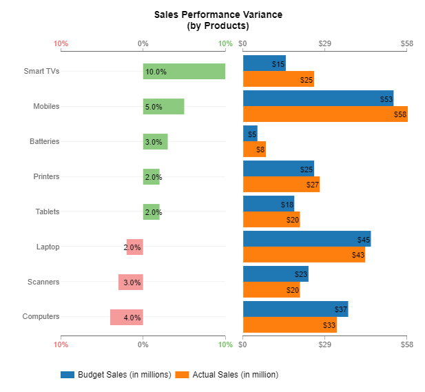
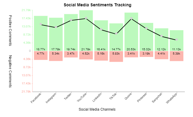
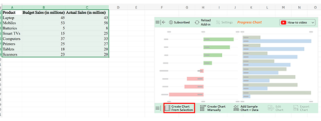
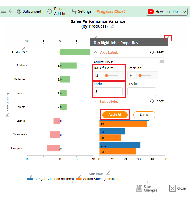
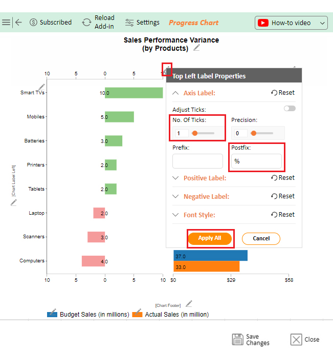
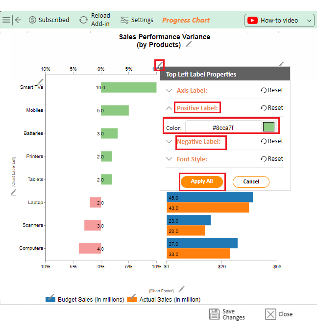
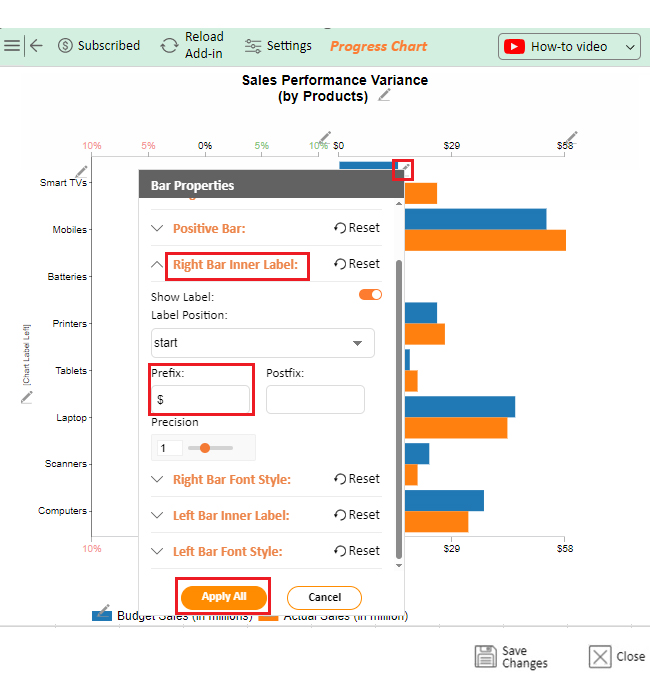
Let’s visualize the variance data below in Excel using ChartExpo and glean valuable insights.

Product Budget Sales (in millions) Actual Sales (in million)
Laptop 45 43
Mobiles 53 58
Batteries 5 8
Smart TVs 15 25
Computers 37 33
Printers 25 27
Tablets 18 20
Scanners 23 20
  • To get started with ChartExpo, install ChartExpo in Excel.
  • Now Click on My Apps from the INSERT menu.
insert chartexpo in excel
  • Choose ChartExpo from My Apps, then click Insert.
open chartexpo in excel
  • Once it loads, scroll through the charts list to locate and choose the “Progress Chart”.
Search Progress Circle Chart in Excel
  • You will see a Progress Chart on the screen.
See Progress Chart on Screen After Doing Variance in Excel
  • Click the “Create Chart From Selection” button after selecting the data from the sheet, as shown.
Click Create Chart From Selection After Doing Variance in Excel
  • ChartExpo will generate the visualization below for you.
Initial Visual After Doing Variance in Excel
  • If you want to add anything to the chart, click the Edit Chart button:
  • Click the pencil icon next to the Chart Header to change the title.
  • It will open the properties dialog. Under the Text section, you can add a heading in Line 1 and enable Show.
  • Give the appropriate title of your chart and click the Apply button.
Add Chart Header After Doing Variance in Excel
  • You can increase the height of the bars.
Increase Height of Bars After Doing Variance in Excel
  • You can change (increase or decrease) the number of ticks in the axis and also apply a prefix ($).
Change Number of Ticks in Axis After Doing Variance in Excel
  • You can change (increase or decrease) no. of ticks on the axis (left-side axis) and also apply postfix(%), showing change or variance in percentage.
Apply Postfix After Doing Variance in Excel
  • You can change the color of the axis’ ticks. Going to change color for positive numbers similarly, you can change for negative numbers.
Change Color of Bars After Doing Variance in Excel
  • We can set prefixes with the right bar labels.
Set Prefixes with Right Bar Labels After Doing Variance in Excel
  • Similarly, you can apply postfix (%) with left bar numbers.
Apply Postfix with Left Bar Number After Doing Variance in Excel
  • You can show or hide the legend.
Show or Hide Legend After Doing Variance in Excel
  • Click the “Save Changes” button to persist the changes made to the chart.
Click Save Changes After Doing Variance in Excel
  • Your final Progress Chart will look like the one below.
Final Variance in Excel

Insights

  • The chart indicates a positive variance of 10% for “Smart TVs,” while “Computers” show a negative variance of 4%.

FAQs

What is variance insight in Excel?

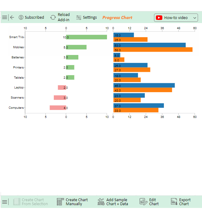
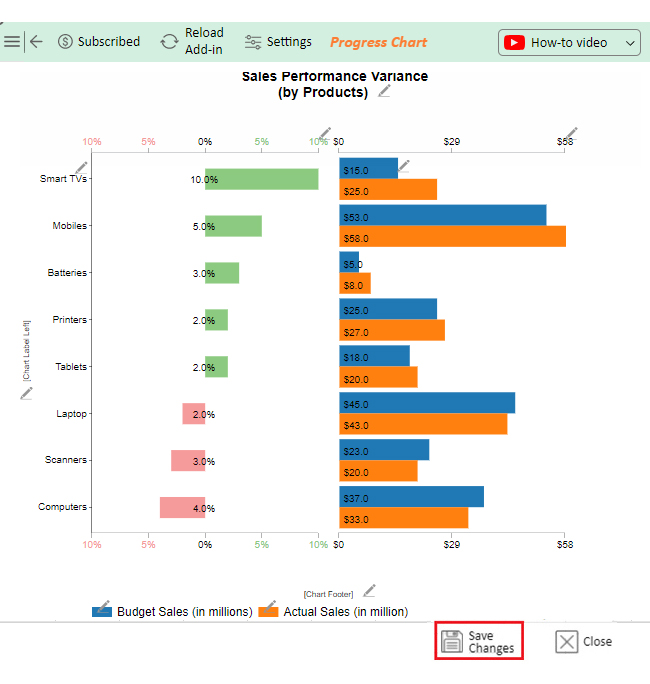
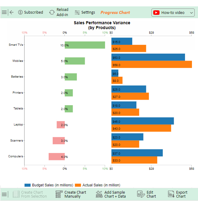
Variance insight in Excel compares actual data to projected values. It calculates the difference, or variance, between them. You can use simple formulas or create a detailed variance report to track performance, and identify discrepancies and trends.

How to make a variance chart in Excel?

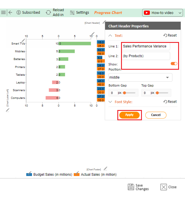
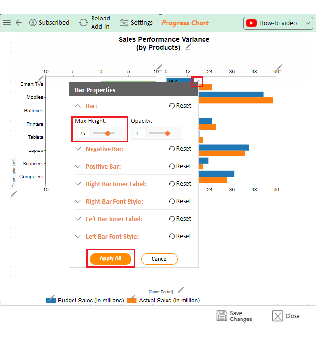
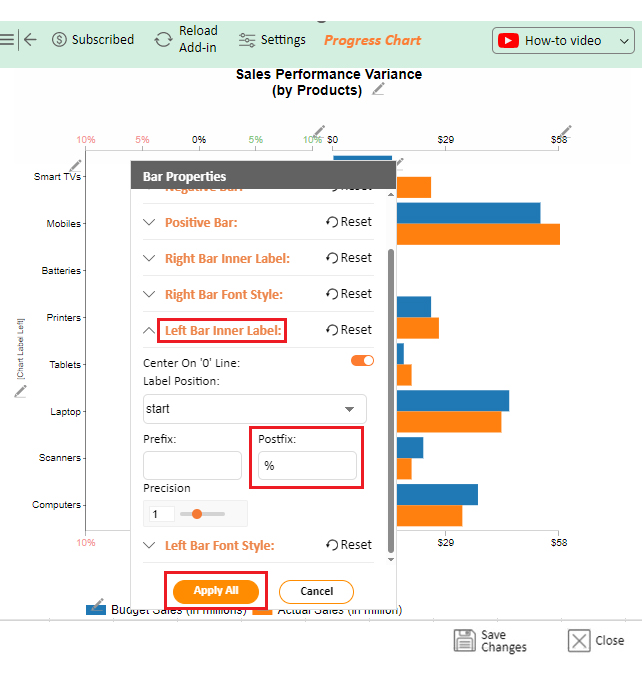
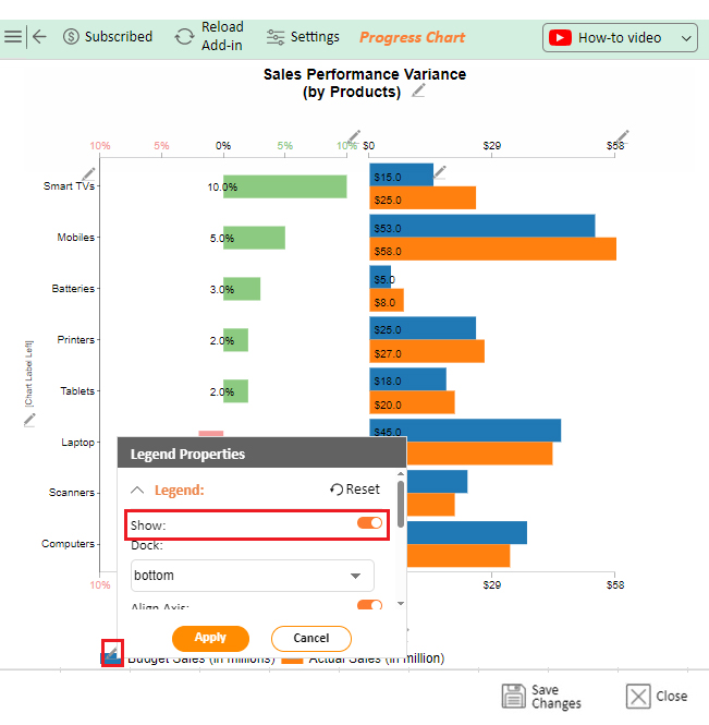
To make a variance chart in Excel:

  • Enter your actual and target data.
  • Subtract the actual from the target to get the variance.
  • Select the data, then insert a column or bar chart.
  • Format the chart to highlight positive and negative variances.
  • For more insightful data visualization and analysis, use ChartExpo.

What is variance in t-test Excel?

In a t-test in Excel, variance measures the spread of data in each sample group. It helps determine if there’s a significant difference between group means. Excel uses variance to calculate the t-value, which tests the hypothesis.

Wrap Up

Variance in Excel is a key tool for analyzing data. It shows how many values deviate from the average, which helps understand data consistency.

There are different types of variance: Population variance covers the entire dataset, whereas sample variance focuses on a subset.

Variance is useful in various fields. It’s widely used in finance, quality control, and forecasting. This makes it valuable for decision-making.

Excel offers easy functions for variance calculations. You can use VAR.P for population variance and VAR.S for sample variance. These formulas save time and effort.

However, Excel has limits in data visualization. Its charts often don’t convey complex data effectively. This is where tools ChartExpo comes in to help.

In short, variance in Excel gives you insights into data patterns. When paired with good visuals, it becomes even more powerful.

Do not hesitate.

Install ChartExpo today for an insightful variance insight in Excel.

How much did you enjoy this article?

ExcelAd1
Start Free Trial!
143660

Related articles

next previous
Microsoft Excel8 min read

Excel Task Tracker Template for Smarter Task Insights

Task tracker template in Excel organizes tasks, tracks deadlines, and boosts efficiency. Learn its benefits, and explore expert tips to simplify task management.

Microsoft Excel10 min read

Invoice Tracker Template in Excel for Better Insights

An invoice tracker Excel template helps track invoices, due dates, and payments. Learn how to use this template for better financial management.

Microsoft Excel12 min read

Key Performance Indicators in Healthcare for Better Insights

Key Performance Indicators in healthcare track patient care and efficiency. Learn about these KPIs, top examples, and how to use them to improve outcomes.

Microsoft Excel10 min read

BMI Calculation Formula in Excel for Better Fitness Insights

The BMI calculation formula in Excel helps track and analyze body mass index. Explore step-by-step instructions and tips to simplify BMI tracking in Excel.

Microsoft Excel29 min read

How to Create a Tornado Chart in Excel? A Complete Guide

Click to learn how to plot a Tornado Chart in Excel using easy-to-follow steps. Also, we’ll address the following question: what is a Tornado Diagram?

ChartExpo logo

Turn Data into Visual
Stories

CHARTEXPO

  • Home
  • Gallery
  • Videos
  • Services
  • Pricing
  • Contact us
  • FAQs
  • Privacy policy
  • Terms of Service
  • Sitemap

TOOLS

  • ChartExpo for Google Sheets
  • ChartExpo for Microsoft Excel
  • Power BI Custom Visuals by ChartExpo
  • Word Cloud

CATEGORIES

  • Bar Charts
  • Circle Graphs
  • Column Charts
  • Combo Charts
  • Comparison Charts
  • Line Graphs
  • PPC Charts
  • Sentiment Analysis Charts
  • Survey Charts

TOP CHARTS

  • Sankey Diagram
  • Likert Scale Chart
  • Comparison Bar Chart
  • Pareto Chart
  • Funnel Chart
  • Gauge Chart
  • Radar Chart
  • Radial Bar Chart
  • Sunburst Chart
  • see more
  • Scatter Plot Chart
  • CSAT Survey Bar Chart
  • CSAT Survey Chart
  • Dot Plot Chart
  • Double Bar Graph
  • Matrix Chart
  • Multi Axis Line Chart
  • Overlapping Bar Chart
  • Control Chart
  • Slope Chart
  • Clustered Bar Chart
  • Clustered Column Chart
  • Box and Whisker Plot
  • Tornado Chart
  • Waterfall Chart
  • Word Cloud
  • see less

RESOURCES

  • Blog
  • Resources
  • YouTube
SIGN UP FOR UPDATES

We wouldn't dream of spamming you or selling your info.

© 2025 ChartExpo, all rights reserved.