• Home
  • Tools dropdown img
    • Spreadsheet Charts

      • ChartExpo for Google Sheets
      • ChartExpo for Microsoft Excel
    • Power BI Charts

      • Power BI Custom Visuals by ChartExpo
    • Word Cloud

  • Charts dropdown img
    • Chart Category

      • Bar Charts
      • Circle Graphs
      • Column Charts
      • Combo Charts
      • Comparison Charts
      • Line Graphs
      • PPC Charts
      • Sentiment Analysis Charts
      • Survey Charts
    • Chart Type

      • Box and Whisker Plot
      • Clustered Bar Chart
      • Clustered Column Chart
      • Comparison Bar Chart
      • Control Chart
      • CSAT Survey Bar Chart
      • CSAT Survey Chart
      • Dot Plot Chart
      • Double Bar Graph
      • Funnel Chart
      • Gauge Chart
      • Likert Scale Chart
      • Matrix Chart
      • Multi Axis Line Chart
      • Overlapping Bar Chart
      • Pareto Chart
      • Radar Chart
      • Radial Bar Chart
      • Sankey Diagram
      • Scatter Plot Chart
      • Slope Chart
      • Sunburst Chart
      • Tornado Chart
      • Waterfall Chart
      • Word Cloud
    • Google Sheets
      Microsoft Excel
  • Services
  • Pricing
  • Contact us
  • Blog
  • Support dropdown img
      • Gallery
      • Videos
      • Contact us
      • FAQs
      • Resources
    • Please feel free to contact us

      atsupport@chartexpo.com

Categories
All Data Visualizations Data Analytics Surveys
Add-ons/
  • Google Sheets
  • Microsoft Excel
  • Power BI
All Data Visualizations Data Analytics Surveys
Add-ons
  • Google Sheets
  • Microsoft Excel
  • Power BI

We use cookies

This website uses cookies to provide better user experience and user's session management.
By continuing visiting this website you consent the use of these cookies.

Ok

ChartExpo Survey


Home > Blog > Microsoft Excel

Frequency Tables in Excel: Visualize Patterns with Ease

What are frequency tables in Excel? And why do they matter? Organizing data is essential for managing business, research, or personal projects. Frequency tables in Excel summarize large datasets by showing how often values occur. They’re a go-to tool for anyone handling repetitive data patterns.

Data generation is skyrocketing, and information is becoming overwhelming without tools to handle it. However, frequency tables simplify the process, condensing scattered numbers into actionable insights. They also assist with data consolidation in Excel, making organizing data from multiple sources easier.

Frequency Tables in Excel

Imagine tracking customer preferences or survey results. Frequency tables instantly reveal trends, such as the most common responses or value ranges. This clarity supports better decision-making and improved outcomes. Moreover, Excel’s built-in tools, like pivot tables and functions, make creating them easy—even for beginners.

Frequency tables aren’t just about numbers but uncovering patterns. They help identify trends in sales, inventory, or statistical distributions. Paired with various types of charts and graphs, they bring data to life, making insights more accessible.

Data analysis doesn’t need to be intimidating. Why? Because tools like Excel bridge the gap between raw data and meaningful understanding. Adding chart elements in Excel, like titles and labels, enhances clarity.

Let’s see how frequency tables are simple yet powerful, helping you transform data into decisions.

Table of Contents:

  1. What is the Frequency Distribution Table in Excel?
  2. What is the Importance of Frequency Tables in Excel?
  3. How to Create a Frequency Table in Excel?
  4. How to Analyze Excel Frequency Table?
  5. What Are the Uses for a Frequency Distribution Table in Excel?
  6. What Are the Benefits of Using Excel Frequency Distribution Table?
  7. FAQs
  8. Wrap Up

What is the Frequency Distribution Table in Excel?

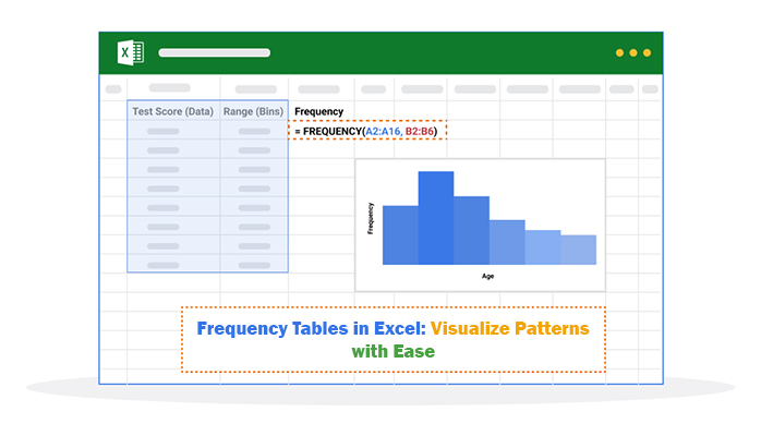
Definition: A frequency distribution table in Excel organizes data to show how often values occur. It groups data into categories or intervals, making patterns easy to spot. Thus, it helps you analyze trends, identify outliers, and understand data distribution. Excel tools, like pivot tables or the FREQUENCY function, simplify the creation of these tables.

Data merging in Excel can further enhance your analysis by combining multiple datasets into one. Whether tracking survey results or sales data, a frequency distribution table provides clear insights. It’s a powerful way to turn raw data into meaningful information.

What is the Importance of Frequency Tables in Excel?

Why are frequency tables in Excel so important? Think about the mountains of data we deal with every day. Frequency tables bring order to the mess, turning scattered information into something you can use. They do more than count numbers—they uncover stories hidden in your data.

Let’s break it down:

  • Data organization: Frequency tables organize raw data into manageable categories, making finding meaning and spotting trends easier.
  • Identifying patterns: By showing how often values occur, these tables reveal patterns that might go unnoticed.
  • Summarizing large datasets: Large datasets can feel overwhelming. However, frequency tables simplify them into clear, digestible summaries.
  • Data visualization: Pairing frequency tables with charts makes your data come alive. Table vs. chart? Visuals amplify understanding and impact.
  • Analyzing distribution: Frequency tables let you explore how data spreads across categories, helping you spot outliers and clusters.
  • Better decision-making: Clearer data insights make decisions more informed and confident. Frequency tables are a fundamental tool in data analysis, making it easier to spot patterns and trends.

How to Create a Frequency Table in Excel?

Creating a frequency table in Excel is easier than you think. This tool simplifies the process of analyzing survey results or sales data. Let’s walk through it step by step.

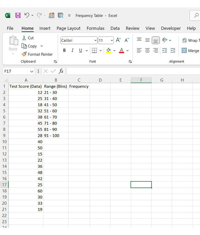
1. Add your data: Enter your data into an Excel sheet. Ensure your data is clean and ready for analysis.

Creating Frequency Tables in Excel

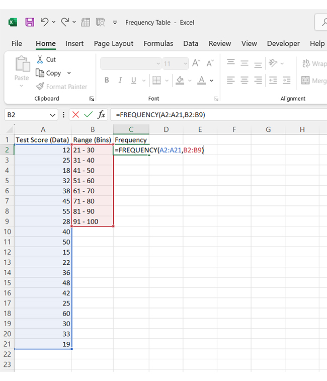
2. Apply the “FREQUENCY” formula: Next, use the FREQUENCY formula to calculate how often values occur. Select the range for your data and the bins (categories) you want to group them into. This formula automatically counts the frequency for each group.

Creating Frequency Tables in Excel

3. View your frequency table: Excel displays your frequency data. It shows how often each value or group of values appears in your dataset.

Creating Frequency Tables in Excel

How to Analyze Excel Frequency Table?

Data analysis is all about understanding the story behind the numbers. But let’s face it—Excel, while powerful, often falls short with data visualization. It can handle data, but creating meaningful charts can feel like a puzzle.

That’s where frequency tables in Excel come in, offering a clearer picture of your data’s distribution. But you need more advanced Excel charts to unlock the power of data visualizations.
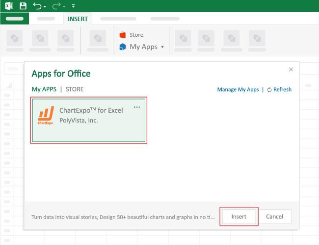
Enter ChartExpo: The perfect solution to bridge Excel’s gaps and turn your data into stunning, easy-to-understand visuals.

How to Install ChartExpo in Excel?

  1. Open your Excel application.
  2. Open the worksheet and click the “Insert” menu.
  3. You’ll see the “My Apps” option.
  4. In the Office Add-ins window, click “Store” and search for ChartExpo on my Apps Store.
  5. Click the “Add” button to install ChartExpo in your Excel.

ChartExpo charts are available both in Google Sheets and Microsoft Excel. Please use the following CTAs to install the tool of your choice and create beautiful visualizations with a few clicks in your favorite tool.

Example

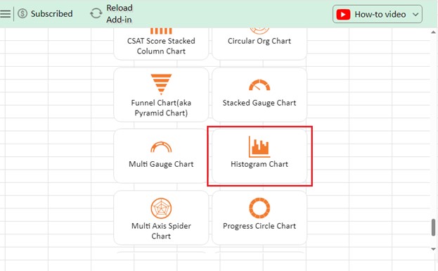
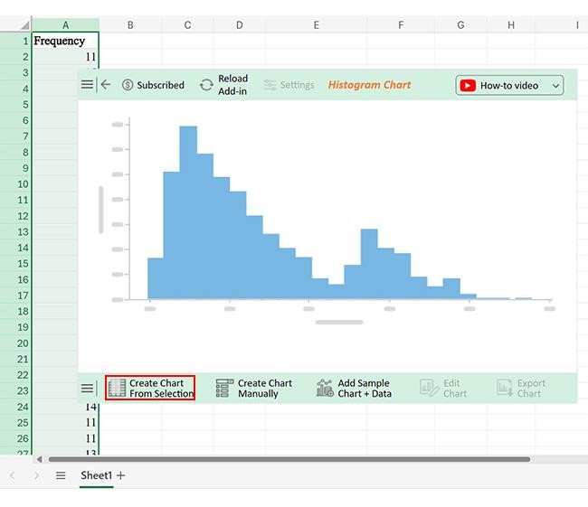
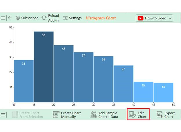
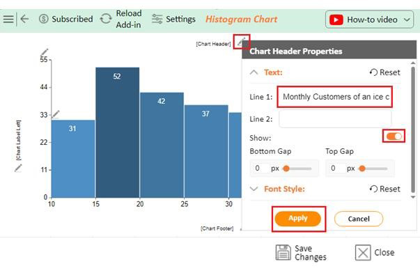
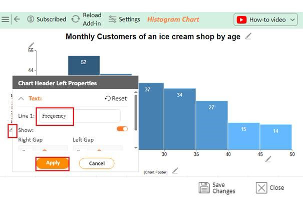
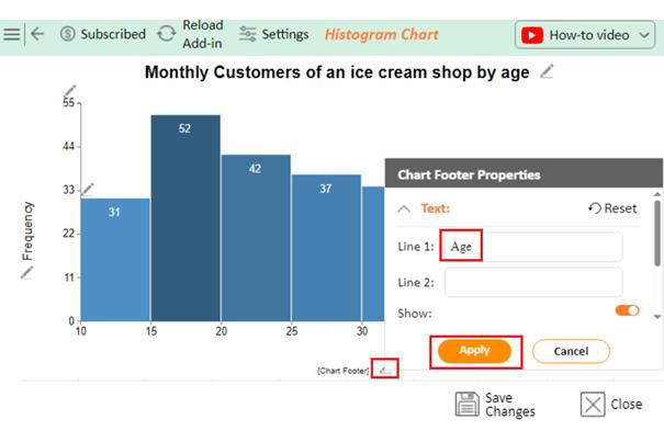
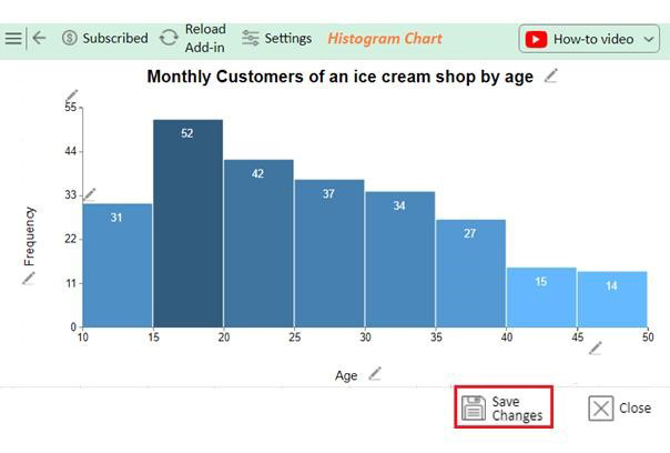
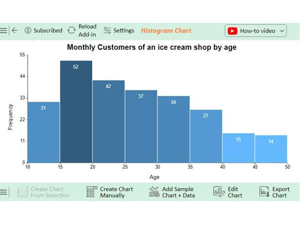
Let’s create a frequency chart of the data below using ChartExpo and glean valuable insights. And that’s not all: You will also learn how to update a chart in Excel.

Frequency

11, 15, 12, 12, 12, 14, 14, 10, 14, 11, 13, 13, 15, 13, 12, 11, 11, 15, 11, 10, 14, 12, 14, 11, 11, 13, 14, 10, 10, 13, 12, 15, 14, 15, 12, 11, 15, 16, 18, 16, 20, 17, 18, 15, 19, 15, 17, 15, 17, 19, 18, 16, 15, 15, 20, 19, 20, 20, 19, 19, 20, 16, 15, 16, 18, 15, 15, 17, 20, 16, 16, 15, 17, 15, 20, 18, 20, 19, 19, 20, 17, 18, 17, 17, 20, 16, 15, 19, 15, 18, 18, 17, 15, 20, 25, 22, 22, 25, 25, 25, 24, 21, 21, 25, 24, 25, 21, 22, 21, 22, 24, 23, 24, 25, 25, 21, 24, 22, 24, 25, 24, 25, 21, 24, 22, 23, 25, 23, 23, 25, 22, 23, 22, 22, 23, 22, 21, 30, 27, 28, 28, 29, 27, 26, 28, 27, 27, 29, 30, 26, 26, 26, 27, 30, 28, 30, 28, 26, 28, 26, 27, 30, 27, 30, 27, 27, 30, 30, 28, 29, 34, 32, 31, 33, 32, 31, 33, 33, 34, 32, 34, 34, 33, 31, 32, 32, 31, 31, 33, 34, 34, 32, 34, 31, 33, 34, 38, 38, 38, 38, 37, 36, 37, 36, 40, 37, 38, 39, 40, 38, 38, 39, 36, 38, 37, 36, 38, 39, 36, 37, 36, 36, 39, 37, 39, 44, 44, 44, 43, 44, 44, 44, 45, 44, 44, 43, 43, 42, 42, 50, 45, 47, 46, 46, 49, 47, 46, 47, 47, 48, 47, 46 (Please arrange data in one column for analysis)

Analyzing Steps

  • To get started with ChartExpo, install ChartExpo in Excel.
  • Now Click on My Apps from the INSERT menu.
Example of Frequency Tables in Excel
  • Choose ChartExpo from My Apps, then click Insert.
Example of Frequency Tables in Excel
  • Once it loads, choose the “Histogram Chart” from the charts list.
Example of Frequency Tables in Excel
  • Click the “Create Chart From Selection” button after selecting the data from the sheet, as shown.
Example of Frequency Tables in Excel
  • ChartExpo will generate the visualization below for you.
Example of Frequency Tables in Excel
  • If you want to have the chart’s title, click Edit Chart, as shown in the above image.
  • Click the pencil icon next to the Chart Header to change the title.
  • It will open the properties dialog. Under the Text section, you can add a heading in Line 1 and enable Show.
  • Give the appropriate title of your chart and click the Apply button.
Example of Frequency Tables in Excel
  • Add the chart label text on the Y-axis by clicking on the small pencil icon as follows:
Example of Frequency Tables in Excel
  • Add the chart label text on the X-axis by clicking on the small pencil icon as follows:
Example of Frequency Tables in Excel
  • 13. Click the “Save Changes” button to persist the changes.
Example of Frequency Tables in Excel
  • Your final Histogram Chart will appear as below.
Example of Frequency Tables in Excel

Insights

  • The frequency data shows that age groups range from 10 to 50.
  • Data is divided into distinct age categories, showing varied customer visit patterns by age.
  • Focus marketing efforts on customers aged 35 and older for better engagement.
  • Customize products to cater to the preferences of elderly customers.
  • Introduce special promotions or discounts to attract younger customers and balance demographics.

What are the Uses for a Frequency Distribution Table in Excel?

Have you ever felt lost in a sea of numbers? A frequency distribution table in Excel helps you organize data into meaningful insights. Here are some of its many uses:

  • Data summarization: Frequency tables condense large datasets into clear, structured summaries. This makes it easier to understand the overall composition of your data.
  • Analyzing data distribution: These tables show how data is spread across categories or intervals. They help you identify the dataset’s clusters, gaps, or unusual patterns.
  • Identifying trends and patterns: Frequency tables highlight recurring patterns and trends by grouping data. This provides valuable insights that raw numbers alone might obscure.
  • Simplifying data visualization: Pairing frequency tables with charts like histograms or bar graphs speeds up data interpretation. Visual representations are also more engaging and help convey key points.
  • Supporting statistical analysis: Frequency tables form the basis for advanced statistical calculations, such as averages or standard deviations. Therefore, they provide structured data that are essential for accurate statistical insights.
  • Forecasting and decision-making: Frequency tables help predict future outcomes, leading to more informed and strategic data-driven decision-making processes.

What are the Benefits of Using Excel Frequency Distribution Table?

An Excel Frequency Distribution Table helps spot patterns, trends, and insights hiding in plain sight. Whether conducting market analysis or reviewing sales data, this tool helps uncover critical information. Let’s break down why it’s such a game-changer:

  • Data simplification: A frequency distribution table organizes raw data into manageable chunks. It groups data into categories, making it much easier to analyze.
  • Enhanced data understanding: Have you ever tried to make sense of a chaotic spreadsheet? These tables give clarity. They show how often certain values appear, helping you identify trends and patterns instantly.
  • Better decision-making: Frequency tables summarize data and provide the foundation for informed choices. They help you spot the highs, lows, and averages at a glance.
  • Facilitates visualization: Frequency tables make creating charts and histograms a breeze. Data visualizations make it easier to communicate and understand.
  • Supports statistical analysis: Do you want to calculate mean, median, mode, or variance? A frequency distribution table lays the groundwork. It’s an essential tool for diving deeper into your data.

FAQs

How do I convert raw data to a frequency table in Excel?

To convert raw data into a frequency table in Excel:

  1. Organize your data in a column.
  2. Use the COUNTIFS function to count occurrences for each category.
  3. Alternatively, you can apply PivotTables to automate grouping and frequency.

How do you construct a frequency table with the given set of data?

To construct a frequency table:

  1. List all data values or categories in one column.
  2. Use tally marks or Excel’s COUNTIF function to count how often each value occurs.
  3. Record the frequencies in the adjacent column.

Wrap Up

Frequency tables in Excel are powerful tools for data analysis. They simplify large datasets into clear summaries, showing how often values occur. They eliminate duplicates in Excel by organizing raw data, making it easier to interpret and analyze effectively.

Frequency tables highlight key insights often hidden in scattered data. They help make sense of complex information, whether analyzing sales trends, survey results, or other datasets. They also bridge the gap between raw data and meaningful understanding.

Excel makes creating frequency tables straightforward. Its built-in functions, like FREQUENCY and pivot tables, streamline the process. Moreover, you don’t need advanced skills to use them. Whether for simple summaries or more advanced tasks like data modeling in Excel – it’s straightforward.

Frequency tables also support better decision-making. Clear summaries and visualizations provide actionable insights, helping you plan more effectively and achieve improved outcomes. Depending on the audience or purpose, choosing between tables vs. charts can further enhance your data presentation.

Conclusively, frequency tables in Excel simplify raw data and turn it into actionable insights. They help you organize, analyze, and uncover patterns effortlessly.

Pro tip: Install ChartExpo to make your data visualization more effective and insightful.

How much did you enjoy this article?

ExcelAd2
Start Free Trial!
147822

Related articles

next previous
Microsoft Excel9 min read

How to Create a Stacked Waterfall Chart in Excel?

Discover how to build and customize a stacked waterfall chart in Excel. Ideal for showing positive and negative values across categories or time.

Microsoft Excel10 min read

Excel Bookkeeping for Small Business: Insights at a Glance

Excel bookkeeping for small businesses helps track income, expenses, and cash flow. Learn about templates and financial analysis to simplify bookkeeping.

Microsoft Excel10 min read

Compound Interest in Excel for Smarter Reporting

Discover compound interest in Excel and how it works. Learn its formulas, calculation tips, and common errors to avoid for more accurate financial analysis.

Microsoft Excel9 min read

KPI Dashboard in Excel: A Complete Guide

A KPI dashboard in Excel helps track key metrics and streamline data visualization. Discover how to create, analyze, and use it with clear guides and examples.

Microsoft Excel11 min read

How to Plot a Speedometer Chart in Excel?

Create a Speedometer Chart in Excel to track KPIs, goals, and performance metrics visually. Explore templates, examples, and step-by-step instructions for better dashboards.

ChartExpo logo

Turn Data into Visual
Stories

CHARTEXPO

  • Home
  • Gallery
  • Videos
  • Services
  • Pricing
  • Contact us
  • FAQs
  • Privacy policy
  • Terms of Service
  • Sitemap

TOOLS

  • ChartExpo for Google Sheets
  • ChartExpo for Microsoft Excel
  • Power BI Custom Visuals by ChartExpo
  • Word Cloud

CATEGORIES

  • Bar Charts
  • Circle Graphs
  • Column Charts
  • Combo Charts
  • Comparison Charts
  • Line Graphs
  • PPC Charts
  • Sentiment Analysis Charts
  • Survey Charts

TOP CHARTS

  • Sankey Diagram
  • Likert Scale Chart
  • Comparison Bar Chart
  • Pareto Chart
  • Funnel Chart
  • Gauge Chart
  • Radar Chart
  • Radial Bar Chart
  • Sunburst Chart
  • see more
  • Scatter Plot Chart
  • CSAT Survey Bar Chart
  • CSAT Survey Chart
  • Dot Plot Chart
  • Double Bar Graph
  • Matrix Chart
  • Multi Axis Line Chart
  • Overlapping Bar Chart
  • Control Chart
  • Slope Chart
  • Clustered Bar Chart
  • Clustered Column Chart
  • Box and Whisker Plot
  • Tornado Chart
  • Waterfall Chart
  • Word Cloud
  • see less

RESOURCES

  • Blog
  • Resources
  • YouTube
SIGN UP FOR UPDATES

We wouldn't dream of spamming you or selling your info.

© 2025 ChartExpo, all rights reserved.