• Home
  • Tools dropdown img
    • Spreadsheet Charts

      • ChartExpo for Google Sheets
      • ChartExpo for Microsoft Excel
    • Power BI Charts

      • Power BI Custom Visuals by ChartExpo
    • Word Cloud

  • Charts dropdown img
    • Chart Category

      • Bar Charts
      • Circle Graphs
      • Column Charts
      • Combo Charts
      • Comparison Charts
      • Line Graphs
      • PPC Charts
      • Sentiment Analysis Charts
      • Survey Charts
    • Chart Type

      • Box and Whisker Plot
      • Clustered Bar Chart
      • Clustered Column Chart
      • Comparison Bar Chart
      • Control Chart
      • CSAT Survey Bar Chart
      • CSAT Survey Chart
      • Dot Plot Chart
      • Double Bar Graph
      • Funnel Chart
      • Gauge Chart
      • Likert Scale Chart
      • Matrix Chart
      • Multi Axis Line Chart
      • Overlapping Bar Chart
      • Pareto Chart
      • Radar Chart
      • Radial Bar Chart
      • Sankey Diagram
      • Scatter Plot Chart
      • Slope Chart
      • Sunburst Chart
      • Tornado Chart
      • Waterfall Chart
      • Word Cloud
    • Google Sheets
      Microsoft Excel
  • Services
  • Pricing
  • Contact us
  • Blog
  • Support dropdown img
      • Gallery
      • Videos
      • Contact us
      • FAQs
      • Resources
    • Please feel free to contact us

      atsupport@chartexpo.com

Categories
All Data Visualizations Data Analytics Surveys
Add-ons/
  • Google Sheets
  • Microsoft Excel
  • Power BI
All Data Visualizations Data Analytics Surveys
Add-ons
  • Google Sheets
  • Microsoft Excel
  • Power BI

We use cookies

This website uses cookies to provide better user experience and user's session management.
By continuing visiting this website you consent the use of these cookies.

Ok

ChartExpo Survey


Home > Blog > Microsoft Excel

Automatic Formatting in Excel for Smarter Presentation

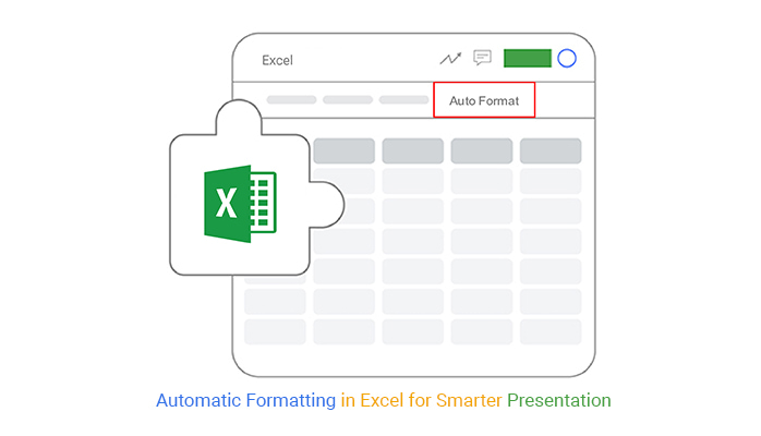
What is automatic formatting in Excel, and why does it matter?

Picture this: you’re managing a massive spreadsheet of numbers, dates, and text. Your boss needs a clear report in ten minutes. Do you highlight each row by hand? No. This is where automatic formatting in Excel becomes a game-changer.

Automatic Formatting in Excel

Automatic formatting can make patterns jump out at you. Imagine a heat map that instantly shows sales dips or profit spikes. Or a calendar that color-codes deadlines without manual effort. These tools save time and reduce errors. A study by Forbes found that businesses spend nearly 13 hours a week on spreadsheet tasks. Automatic formatting slashes this time dramatically.

Mistakes happen when formatting is manual. A misplaced highlight or incorrect color could lead to costly errors; Excel’s built-in tools ensure consistency. For example, conditional formatting can automatically highlight overdue tasks and spot duplicates before they cause problems.

The beauty of this feature lies in its simplicity. You don’t need advanced skills to use it. Excel can transform dull data into visually striking insights with a few clicks. The result? Better decisions. Studies suggest visuals improve data comprehension by up to 80%.

Automatic formatting in Excel isn’t just for large corporations. It’s helpful for anyone dealing with data. Students tracking assignments, freelancers managing invoices, or parents planning budgets can all benefit. It’s a tool that works as hard as you do.

Table of Contents:

  1. What is Automatic Formatting in Excel?
  2. Where is Autoformat in Excel?
  3. Why Use Automatic Formatting in Excel?
  4. How to Use the Excel Automatic Formatting Option with Examples?
  5. How to Remove Automatic Formatting in Excel?
  6. How to Automatically Format Cells in Excel?
  7. How to Create Charts with Conditional Formatting in Excel?
  8. What are the Limitations of AutoFormat in Excel?
  9. Wrap Up

First…

What is Automatic Formatting in Excel?

Definition: Automatic formatting in Excel is a powerful feature that applies styles or rules to data automatically, making it invaluable for trend analysis in Excel. It highlights patterns, trends, and key information in your spreadsheet, such as color-coding high and low values or flagging overdue dates. This not only reduces manual work but also ensures accuracy, enabling quicker and more reliable insights.

Conditional formatting is a common type triggered by specific criteria. Automatic formatting saves time, simplifies data analysis, and makes information easier to understand. It’s a powerful tool for organizing and visualizing data.

Where is Autoformat in Excel?

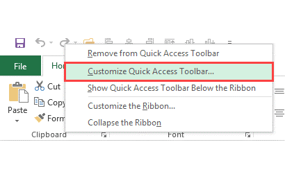
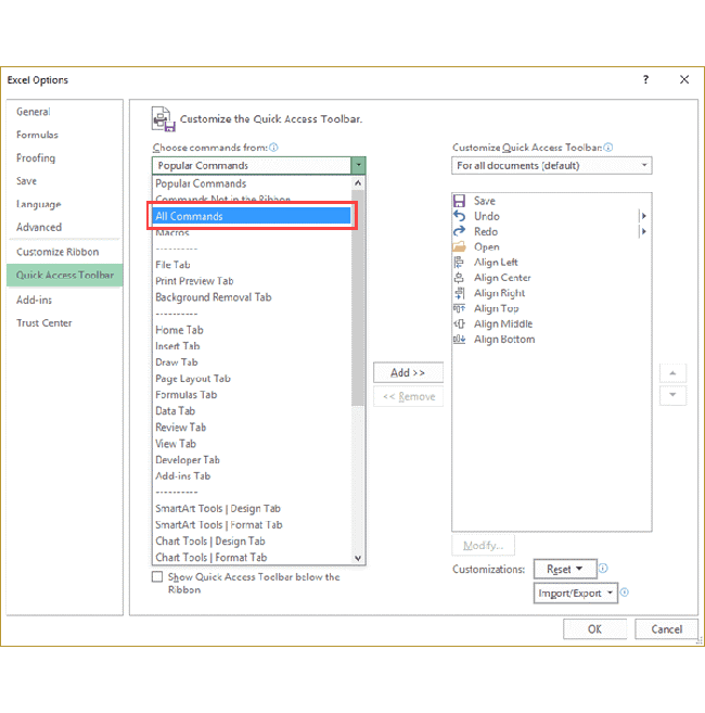
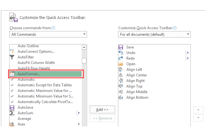
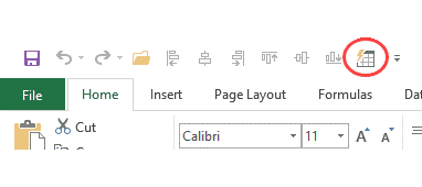
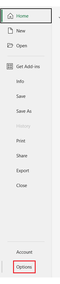
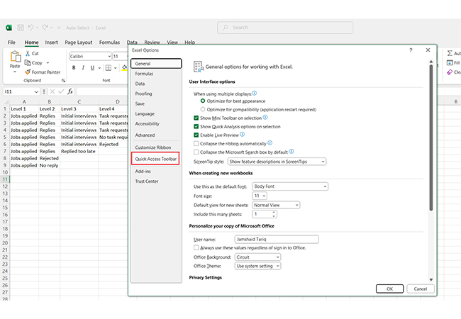
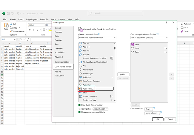
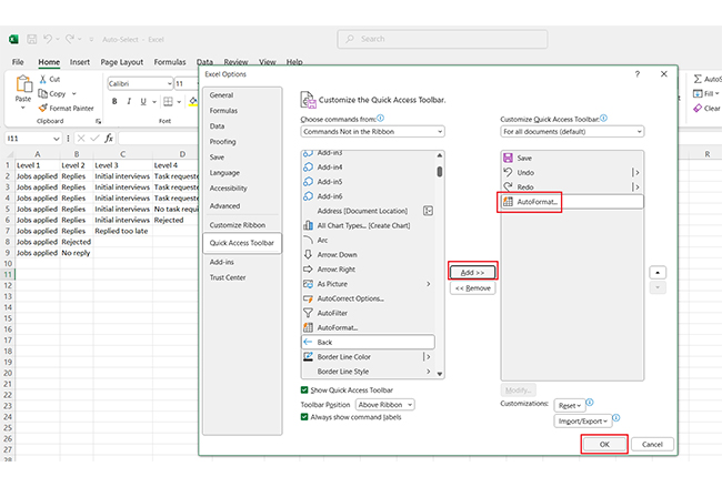
Are you struggling to locate the AutoFormat option in Excel? You’re not alone. By default, this feature isn’t visible on the ribbon or the Quick Access Toolbar (QAT). But don’t worry—it’s easy to bring it back with a few simple steps.

Here’s how:

  1. Right-click on any existing icon in the QAT.
  2. Choose ‘Customize the Quick Access Toolbar’.
Choose Customize Quick Access Toolbar for Learning Automatic Formatting in Excel
  1. In the Excel Options window, find the drop-down labeled ‘Choose commands from’. Set it to All Commands.
Find Drop-Down Labeled Choose Commands From for Learning Automatic Formatting in Excel
  1. Scroll through the list, locate AutoFormat, and select it.
Locate AutoFormat and Select It for Learning Automatic Formatting in Excel
  1. Click the Add button to move AutoFormat to the QAT icons.
  2. Hit OK to save your changes.
  3. And that’s it! You’ll now see the AutoFormat icon in your Quick Access Toolbar, ready to simplify your formatting tasks.
Hit Ok to Save Your Changes for Learning Automatic Formatting in Excel

Why Use Automatic Formatting in Excel?

Excel automatic formatting isn’t just convenient—it’s transformative. Whether you’re managing complex data or preparing polished reports, this tool streamlines the process. Here are the key reasons to use it:

  • Saves time and reduces effort: Automatic formatting handles repetitive tasks instantly, letting you focus on analysis instead of manual edits.
  • Ensures accuracy and consistency: Applied rules prevent formatting mistakes, ensuring every cell follows the same logic.
  • Highlights key patterns: Conditional formatting helps you identify trends, outliers, and important data points at a glance.
  • Improves clarity: Clean, organized visuals make spreadsheets easier to read and interpret.
  • Enhances workflow: Customizable options adapt to your needs, simplifying large datasets and speeding up data-driven decision-making.

How to Use the Excel Automatic Formatting Option with Examples?

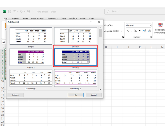
Adding and using the AutoFormat feature is a great way to give your data a professional, polished look with minimal effort. Follow these steps to enable and use AutoFormat in Excel:

  1. Enter your data into an Excel sheet and click “File”.
Click File for Learning Automatic Formatting in Excel
  1. Navigate to “Options” in the menu.
Navigate to Options for Learning Automatic Formatting in Excel
  1. In the Excel Options window, select “Quick Access Toolbar”.
Select Quick Access Toolbar for Learning Automatic Formatting in Excel
  1. Locate “AutoFormat…” from the list of commands and click on it.
Locate AutoFormat from the list of Commands for Learning Automatic Formatting in Excel
  1. Press the “Add” button, then click “OK”. The AutoFormat icon will now appear in your Quick Access Toolbar.
Press Add Button and Click Ok for Learning Automatic Formatting in Excel
  1. Now, here’s how to apply AutoFormat to your data:
Apply AutoFormat for Learning Automatic Formatting in Excel
    • Highlight the range of data you want to format.
    • Click the newly added AutoFormat icon in your toolbar.
Click Newly Added AutoFormat for Learning Automatic Formatting in Excel
    • A list of formatting styles will appear. Choose your preferred style.
Choose Preferred Style for Learning Automatic Formatting in Excel
    • Click OK to apply the selected format. Your sheet instantly transforms into a neat, visually appealing table.
Click Ok to Apply Selected Format for Learning Automatic Formatting in Excel

How to Remove Automatic Formatting in Excel?

Are you tired of unwanted automatic formatting in Excel? Here’s how you can take back control of your spreadsheet:

  1. Clear conditional formatting: Navigate to Home > Conditional Formatting > Clear Rules. Choose to clear rules from selected cells or the entire sheet.
  2. Remove table formatting: Convert the table back to a range. Right-click anywhere in the table, select Table > Convert to Range, and confirm.
  3. Clear all formats: To start fresh, select your data, go to Home > Clear > Clear Formats, and strip away all applied styles.
  4. Manually adjust formatting: Edit individual cells by changing fonts, colors, or borders as needed. It’s great for making specific adjustments.
  5. Copy as plain text: Copy your data and paste it into a new sheet or file using Paste Special > Values. Then, remove all formatting in one go.

How to Automatically Format Cells in Excel?

Want your Excel spreadsheets to look sharp and be easy to read without spending hours formatting? Automatic cell formatting is your go-to solution. Here are five effective ways to streamline your Excel workflow:

  1. Using conditional formatting: Highlight important trends or outliers by setting rules. For example, make sales figures above a target turn green automatically. Go to Home > Conditional Formatting to get started.
  2. Applying table styles: Convert your data into a table to instantly apply professional formatting. Select your range, click Insert > Table, and choose from various pre-designed styles.
  3. Using the autoformat tool: Add the AutoFormat tool to your Quick Access Toolbar for quick style options. Select your data, click the tool, and pick a format that suits your needs.
  4. Setting data validation: Keep your spreadsheet clean and consistent. Use Data > Data Validation to restrict input formats like dates, numbers, or drop-down lists that match your formatting rules.
  5. Format as you type: Excel can format cells on the fly based on how you input data. For example, entering “1/1” auto-formats to date or typing “$100” applies currency formatting.

How to Create Charts with Conditional Formatting in Excel?

Data visualization is the heart of effective data analysis. It transforms raw numbers into insights that anyone can understand. But Excel often falls short here, especially for creating advanced, interactive charts.

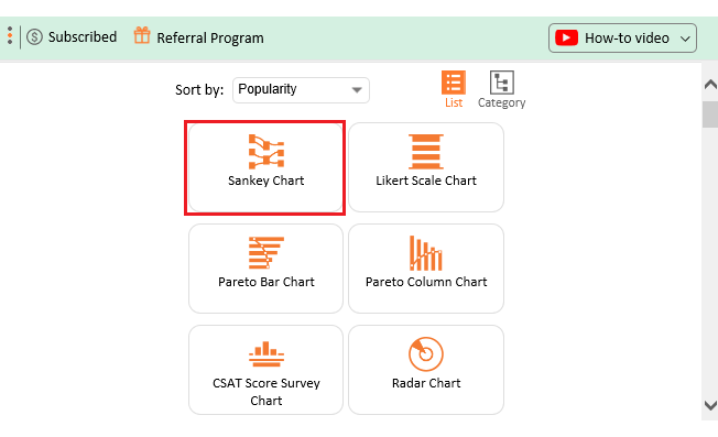
Conditional formatting helps a bit, but it’s not enough. This is where ChartExpo steps in. It’s a game-changer for building stunning Excel charts.

Install ChartExpo and say goodbye to limitations and hello to visuals that truly communicate your data’s story.

Let’s learn how to install ChartExpo in Excel.

  1. Open your Excel application.
  2. Open the worksheet and click the “Insert” menu.
  3. You’ll see the “My Apps” option.
  4. In the Office Add-ins window, click “Store” and search for ChartExpo on my Apps Store.
  5. Click the “Add” button to install ChartExpo in your Excel.

ChartExpo charts are available both in Google Sheets and Microsoft Excel. Please use the following CTAs to install the tool of your choice and create beautiful visualizations with a few clicks in your favorite tool.

Example

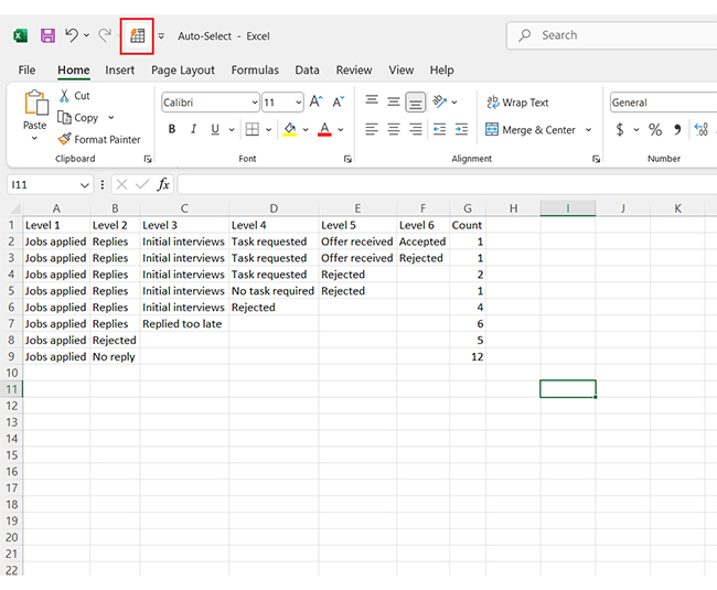
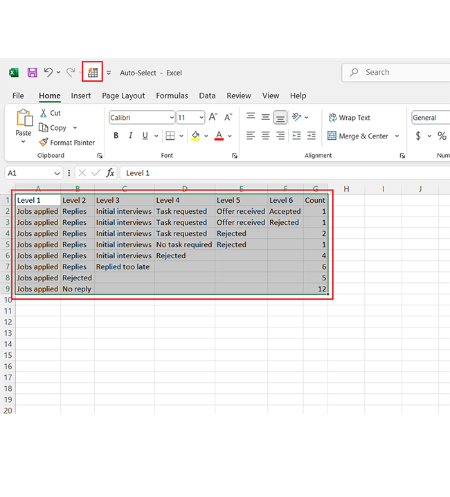
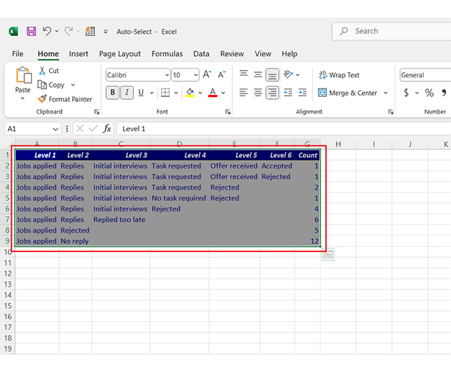
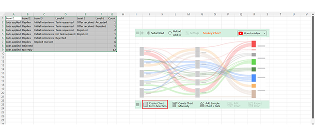
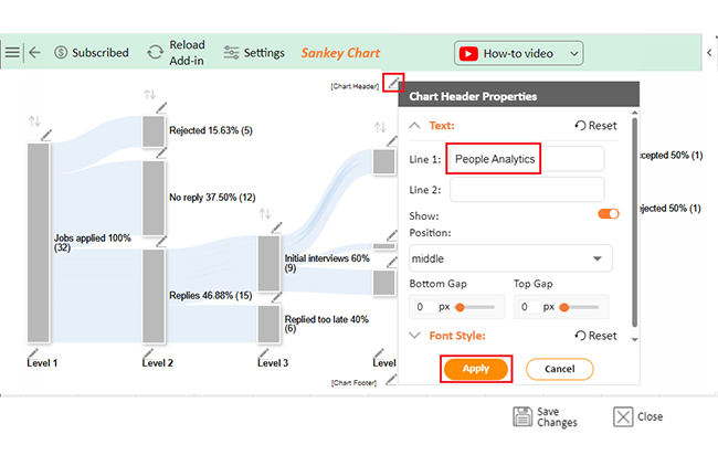
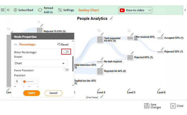
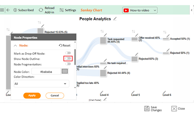
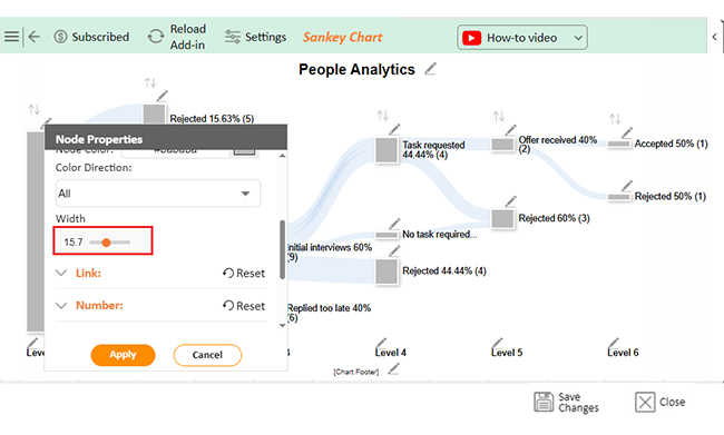
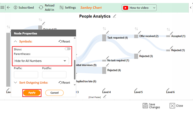
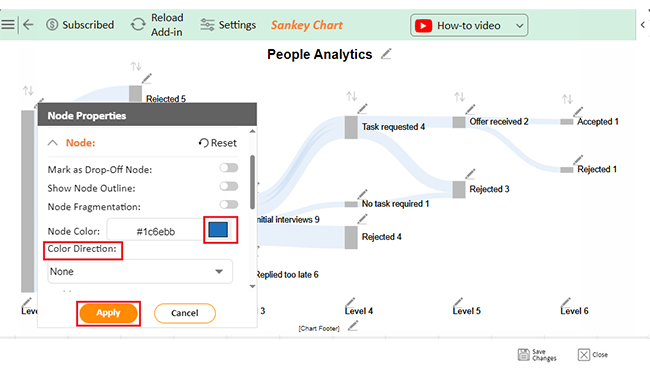
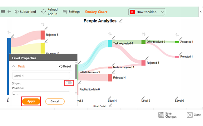
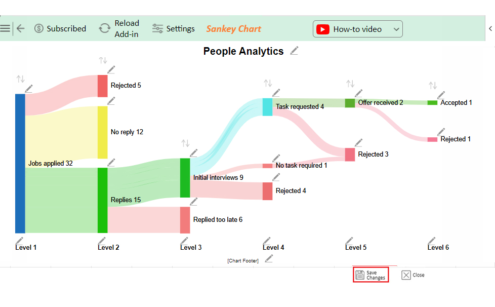
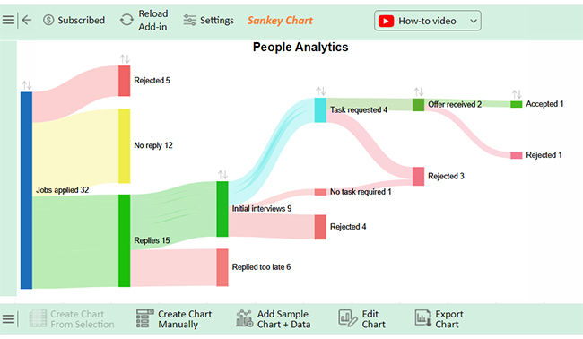
Let’s add a chart in Excel using ChartExpo to visualize the data below and glean valuable insights effortlessly.

Level 1 Level 2 Level 3 Level 4 Level 5 Level 6 Count
Jobs applied Replies Initial interviews Task requested Offer received Accepted 1
Jobs applied Replies Initial interviews Task requested Offer received Rejected 1
Jobs applied Replies Initial interviews Task requested Rejected 2
Jobs applied Replies Initial interviews No task required Rejected 1
Jobs applied Replies Initial interviews Rejected 4
Jobs applied Replies Replied too late 6
Jobs applied Rejected 5
Jobs applied No reply 12
  • To get started with ChartExpo, install ChartExpo in Excel.
  • Now Click on My Apps from the INSERT menu.
insert chartexpo in excel
  • Choose ChartExpo from My Apps, then click Insert.
open chartexpo in excel
  • Once it loads, choose the “Sankey Chart” from the charts list.
search sankey chart in excel
  • Click the “Create Chart From Selection” button after selecting the data from the sheet, as shown.
Click Create Chart From Selection for Learning Automatic Formatting in Excel
  • ChartExpo will generate the visualization below for you.
Initial Visual for Learning Automatic Formatting in Excel
  • If you want to have the chart’s title, click Edit Chart, as shown in the above image.
  • Click the pencil icon next to the Chart Header to change the title.
  • It will open the properties dialog. Under the Text section, you can add a heading in Line 1 and enable Show.
  • Give the appropriate title of your chart and click the Apply button.
Add Chart Header for Learning Automatic Formatting in Excel
  • You can disable the percentage value as follows:
Disable Postfix Value for Learning Automatic Formatting in Excel
  • You can disable the Node Outline as follows:
Disable Node Outline for Learning Automatic Formatting in Excel
  • You can change the width size of Nodes as follows:
Change Width Size of Nodes for Learning Automatic Formatting in Excel
  • You can disable the parentheses and change the status from the drop-down as follows:
Disable Parentheses and Change Status for Learning Automatic Formatting in Excel
  • You can add the colors of all Nodes and change the direction as follows:
Add Color of All Nodes for Learning Automatic Formatting in Excel
  • You can disable the Footer label as follows:
Disable Footer Label for Learning Automatic Formatting in Excel
  • Click the “Save Changes” button to persist the changes.
Click Save Changes for Learning Automatic Formatting in Excel
  • Your final chart will appear below.
Final Automatic Formatting in Excel

Insights

  • No response: 12 job applications and no replies were received.
  • Immediate rejections: 5 applications were rejected outright.
  • Post-interview eliminations: Most candidates were disqualified after interviews.
  • Successful outcome: Only 1 offer was ultimately accepted.
  • Other notable trends: Late responses and rejections before task requests also stood out.

Visualize Relationships in Excel with Automatic Formatting and Chart Techniques:

  1. Open your Excel Application.
  2. Install ChartExpo Add-in for Excel from Microsoft AppSource to create interactive visualizations.
  3. Select Sankey Chart from the list of charts.
  4. Select your data.
  5. Click on the “Create Chart from Selection” button.
  6. Customize your chart properties to add header, axis, legends, and other required information.

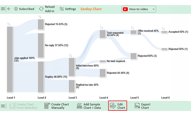
The following video will help you create a Sankey Chart in Microsoft Excel.

What are the Limitations of AutoFormat in Excel?

AutoFormat in Excel is a handy tool, but it has flaws. Understanding its limitations helps you decide when and how to use it effectively. Here are the key drawbacks:

  • Lack of customization: AutoFormat offers preset styles but doesn’t let you create personalized formats.
  • Applies to the entire range: It formats the whole selected range, even if you only want changes in specific areas.
  • Does not update dynamically: Unlike conditional formatting, AutoFormat doesn’t adjust when data changes.
  • Hidden in modern versions: The tool isn’t on the ribbon by default, making it less accessible.
  • Limited to static styles: The style options are basic and may not meet modern design needs.
  • Overwrites existing formats: Applying AutoFormat replaces any previous cell formatting.
  • Dependent on range selection: The results may look inconsistent if you don’t select the range correctly.

FAQs

Can you automate formatting in Excel?

Yes, you can automate formatting in Excel! Use the AutoFormat option or conditional formatting tools. They apply styles, highlight data, and adapt automatically. It’s quick, easy, and ensures consistent, professional-looking spreadsheets with minimal effort.

How do you enable auto format in Excel?

To enable AutoFormat in Excel:

  • Go to File > Options and select Quick Access Toolbar.
  • Add AutoFormat from the commands list.
  • Click OK to save.
  • Highlight your data, click AutoFormat, and choose a style.

How do you auto-format rows and columns in Excel?

To auto-format rows and columns in Excel:

  • Select your data.
  • Go to Home > Format as Table or use AutoFormat from the Quick Access Toolbar.
  • Choose a style, and Excel applies formatting to rows and columns instantly.

Wrap Up

Automatic formatting in Excel is an essential feature for anyone working with data. It allows you to instantly apply rules and styles to your spreadsheet, eliminating the need for repetitive manual adjustments. This saves time and effort, especially when dealing with large datasets or tight deadlines.

One of its biggest advantages is time efficiency. Instead of formatting each cell individually, you can set rules, and Excel will do the work for you.

Another strength of automatic formatting is consistency. It ensures that all cells follow the same formatting logic, which is particularly important in collaborative projects. This consistency reduces the risk of human error and makes your data presentation more professional.

The feature also greatly enhances readability. Color-coding, bold text, or data bars make patterns and trends easy to spot. This simplifies extracting insights from complex information, leading to quicker and more informed decisions.

What’s more, automatic formatting is highly flexible. You can customize it to fit your unique needs, whether for numbers, text, or specific data ranges. This adaptability makes it a versatile tool for various scenarios.

Conclusively, automatic formatting in Excel is more than a convenience—it’s a productivity booster. It saves time, ensures accuracy, and transforms raw data into clear, visually appealing formats.

Do not hesitate.

Start using automatic formatting in Excel with ChartExpo. It’s a must-have tool for efficient data management and analysis.

How much did you enjoy this article?

ExcelAd2
Start Free Trial!
144921

Related articles

next previous
Microsoft Excel12 min read

Artificial Intelligence in Excel for Clear Insights

Discover how AI elevates Excel, from automation to advanced data analysis. This blog covers benefits, limitations, and examples to enhance your productivity.

Microsoft Excel8 min read

Excel Task Tracker Template for Smarter Task Insights

Task tracker template in Excel organizes tasks, tracks deadlines, and boosts efficiency. Learn its benefits, and explore expert tips to simplify task management.

Microsoft Excel10 min read

Invoice Tracker Template in Excel for Better Insights

An invoice tracker Excel template helps track invoices, due dates, and payments. Learn how to use this template for better financial management.

Microsoft Excel12 min read

Key Performance Indicators in Healthcare for Better Insights

Key Performance Indicators in healthcare track patient care and efficiency. Learn about these KPIs, top examples, and how to use them to improve outcomes.

Microsoft Excel10 min read

BMI Calculation Formula in Excel for Better Fitness Insights

The BMI calculation formula in Excel helps track and analyze body mass index. Explore step-by-step instructions and tips to simplify BMI tracking in Excel.

ChartExpo logo

Turn Data into Visual
Stories

CHARTEXPO

  • Home
  • Gallery
  • Videos
  • Services
  • Pricing
  • Contact us
  • FAQs
  • Privacy policy
  • Terms of Service
  • Sitemap

TOOLS

  • ChartExpo for Google Sheets
  • ChartExpo for Microsoft Excel
  • Power BI Custom Visuals by ChartExpo
  • Word Cloud

CATEGORIES

  • Bar Charts
  • Circle Graphs
  • Column Charts
  • Combo Charts
  • Comparison Charts
  • Line Graphs
  • PPC Charts
  • Sentiment Analysis Charts
  • Survey Charts

TOP CHARTS

  • Sankey Diagram
  • Likert Scale Chart
  • Comparison Bar Chart
  • Pareto Chart
  • Funnel Chart
  • Gauge Chart
  • Radar Chart
  • Radial Bar Chart
  • Sunburst Chart
  • see more
  • Scatter Plot Chart
  • CSAT Survey Bar Chart
  • CSAT Survey Chart
  • Dot Plot Chart
  • Double Bar Graph
  • Matrix Chart
  • Multi Axis Line Chart
  • Overlapping Bar Chart
  • Control Chart
  • Slope Chart
  • Clustered Bar Chart
  • Clustered Column Chart
  • Box and Whisker Plot
  • Tornado Chart
  • Waterfall Chart
  • Word Cloud
  • see less

RESOURCES

  • Blog
  • Resources
  • YouTube
SIGN UP FOR UPDATES

We wouldn't dream of spamming you or selling your info.

© 2025 ChartExpo, all rights reserved.