

Enter ChartExpo. This tool brings life to your data, filling the gap Excel charts often leave behind. You can build smarter matrices and make them shine with better visuals.
Categories
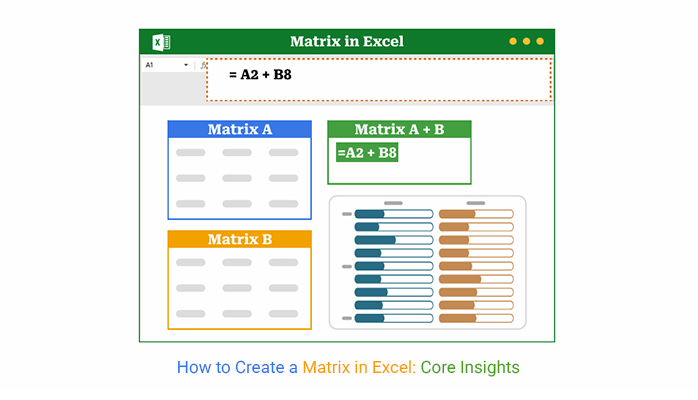
“How to create a matrix in Excel?”—Have you ever asked yourself this while buried in data? You’re not alone. Whether you’re building reports, comparing options, or mapping relationships, creating a matrix can simplify the process.


Think about decision-making. Businesses often rely on tools like the decision matrix to compare options with clarity and precision. Without the proper structure, you risk basing big moves on guesswork. Excel makes it easier—but only if you know how to use it.
And it’s not just about choices. In project planning or resource allocation, a well-built matrix can spotlight what’s urgent or impactful. That’s where tools like the impact vs. effort matrix help, especially when time and resources are limited.
So why do people avoid building matrices? Often, it’s because they don’t know how to create a matrix in Excel without getting lost in formulas or formatting. However, once you learn the steps, they become second nature. You’re not looking for a fancy template—you need something that works and saves time.
Whether you’re organizing team skills, comparing performance, or analyzing data relationships, Excel is more than capable. And how to create a matrix in Excel doesn’t have to be a question anymore. Why? I will take you through the practical steps you need.
Let’s get started.
Definition: A matrix in Excel is a table that shows data in rows and columns. It helps you organize, compare, or analyze information quickly. You can use it to build a prioritization matrix or even track progress with skills matrix templates.
Whether it’s numbers, tasks, or people, matrices help make sense of it all. In Excel, they’re easy to build – once you know the basics. Think of it as a smart way to bring clarity to data.
Have you ever stared at a messy spreadsheet and felt overwhelmed? That’s where a matrix steps in. It turns clutter into clarity, helping you focus and organize your thoughts. Here’s why so many professionals rely on Excel for this:
You’ve got data. Now you want structure. A matrix helps, but how do you build one in Excel? Good news: you’ve got options. Whether you prefer simplicity or want complete control, there’s a method that suits you.
Have you ever felt stuck looking at numbers, unsure of how to make them meaningful? A matrix in Excel can change that. It helps you see patterns, compare options, and make more intelligent choices—fast. This step-by-step guide shows you how to create a matrix in Excel—the easy way:
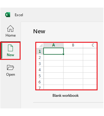
Step 1: Open Excel. Start fresh with a blank workbook or open one you’re already working on.
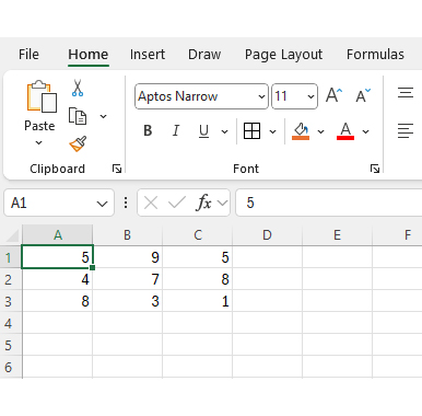
Step 2: Type your values into rows and columns. For a 3×3 matrix, fill cells A1 to C3 with nine data points.
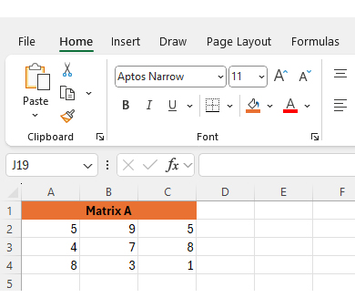
Step 3: Select the cells that hold your matrix. Right-click and choose “Format Cells.” Add borders, select a font, and adjust the text size to ensure readability. That’s your fundamental matrix.
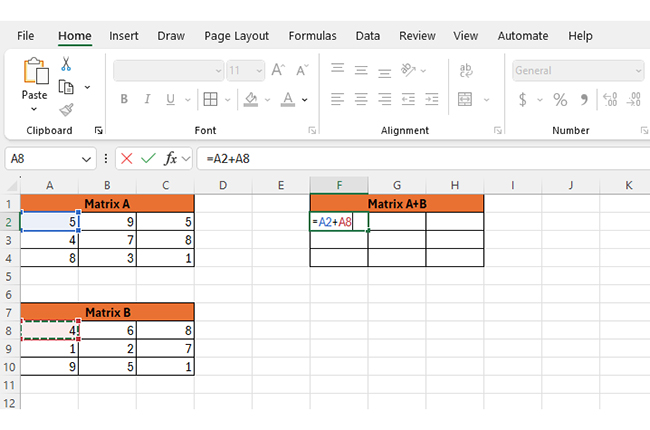
Step 4: Let’s add some math. Create a second matrix—call it Matrix B. To add the two, enter a formula in a third matrix (e.g., =A2 + A8). Do this for each cell to build Matrix A + B. It’s fast and effective.
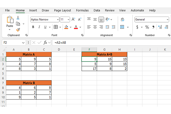
After adding both matrices, the matrix A+B should look like this:
Step 1: Set up your data like this:
| Product | Region |
Sales |
| A | North | 1200 |
| B | South | 950 |
| C | East | 1250 |
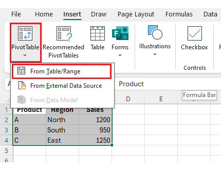
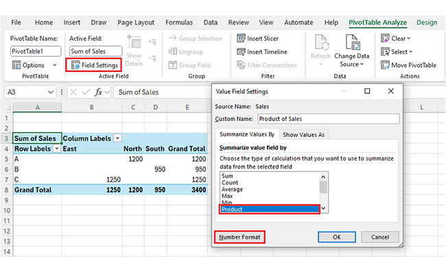
Step 2: Highlight your data range. Go to Insert > PivotTable, and choose to place it in a new sheet.
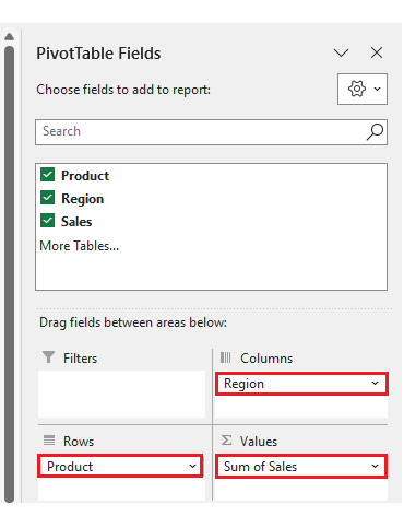
Step 3: Now customize: Drag product to rows. Drag the region to the columns. Drag sales to values.
Step 4: Click “Field Settings” under the Sales field. Pick Product from “Summarize value field by”, then go to Number Format.
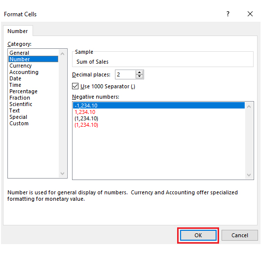
Select the number and click OK.
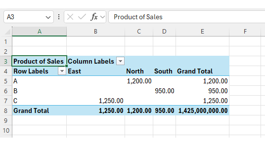
After the number format, our matrix looks as follows:
Step 5: Final polish: Use tabular form in the PivotTable Design tab. Add conditional formatting for color-based highlights.
Are you drowning in spreadsheets? You’re not alone. Data analysis begins with numbers, but it ends with clarity—and that’s where many get stuck. Sure, Excel handles rows and columns like a pro. But when it comes to data visualization, things can fall flat. Clunky charts. Limited styles. No spark.
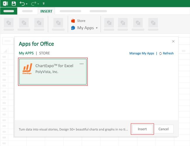
How to Install ChartExpo in Excel?
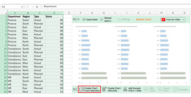
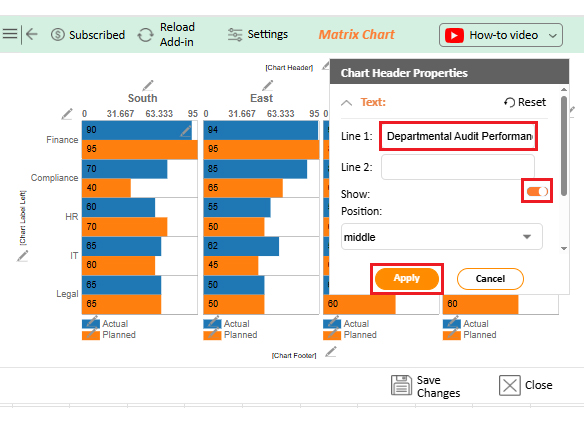
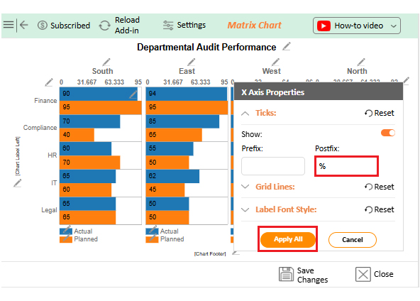
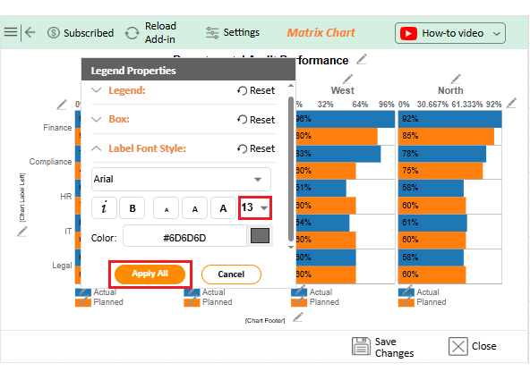
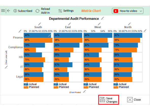
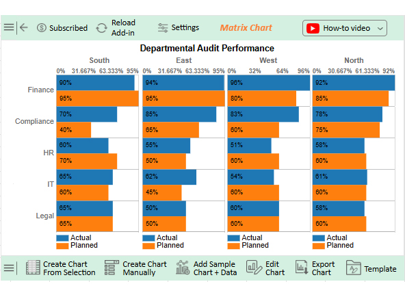
Let’s analyze this sample data in Excel using ChartExpo.
| Department | Region | Type | Score |
| Finance | South | Actual | 90 |
| Finance | South | Planned | 95 |
| Finance | East | Actual | 94 |
| Finance | East | Planned | 95 |
| Finance | West | Actual | 96 |
| Finance | West | Planned | 80 |
| Finance | North | Actual | 92 |
| Finance | North | Planned | 85 |
| Compliance | South | Actual | 70 |
| Compliance | South | Planned | 40 |
| Compliance | East | Actual | 85 |
| Compliance | East | Planned | 65 |
| Compliance | West | Actual | 83 |
| Compliance | West | Planned | 60 |
| Compliance | North | Actual | 78 |
| Compliance | North | Planned | 75 |
| HR | South | Actual | 60 |
| HR | South | Planned | 70 |
| HR | East | Actual | 55 |
| HR | East | Planned | 50 |
| HR | West | Actual | 51 |
| HR | West | Planned | 60 |
| HR | North | Actual | 58 |
| HR | North | Planned | 60 |
| IT | South | Actual | 65 |
| IT | South | Planned | 60 |
| IT | East | Actual | 62 |
| IT | East | Planned | 45 |
| IT | West | Actual | 54 |
| IT | West | Planned | 60 |
| IT | North | Actual | 61 |
| IT | North | Planned | 60 |
| Legal | South | Actual | 65 |
| Legal | South | Planned | 65 |
| Legal | East | Actual | 50 |
| Legal | East | Planned | 50 |
| Legal | West | Actual | 60 |
| Legal | West | Planned | 60 |
| Legal | North | Actual | 58 |
| Legal | North | Planned | 60 |


Have you ever felt like your data is talking, but you can’t quite hear what it’s saying? A matrix in Excel helps clear the noise by bringing structure to chaos. It turns rows of numbers into something you can use. Here’s why building one is worth it:
Let’s be honest—Excel can either make you feel brilliant or completely lost. And when you’re building a matrix? One wrong move, and things spiral fast. But don’t worry. A few smart habits can keep your matrix clean, clear, and helpful. These tips will save you time (and your sanity):
Have you ever built a matrix in Excel, hit Enter, and then nothing makes sense? We’ve all been there. The data is in the cells, but it’s not working. The truth is, building a matrix takes more than dragging and typing. It’s part logic, part layout, and part “don’t mess this up” awareness. These tips will help you build smarter, not harder:
Creating a matrix in Excel doesn’t have to be hard. With the right approach, you can turn raw data into clear insights. Whether it’s for analysis or planning, a matrix helps simplify complex information. It’s about seeing patterns, not just numbers.
You can build one manually, with formulas, or through PivotTables. Each method serves a purpose, so choose the one that matches your goal. A clean structure always helps.
Need to explore how things relate? A co-occurrence matrix does that. It shows how often two items appear together. It is ideal for research, customer feedback, or behavioral data analysis.
Trying to collect structured responses? Use matrix survey questions. They’re perfect for tracking multiple answers at once. Excel helps lay them out in a readable format.
Have you ever wondered what a confusion matrix is? It’s a tool in machine learning to evaluate model accuracy. You can also build it in Excel, using formulas and smart formatting.
So yes, Excel may seem basic. But it’s powerful when used right. With the steps in this guide, your following matrix won’t be a challenge—it’ll be a solution. Start small, stay organized, and let the data speak for itself.
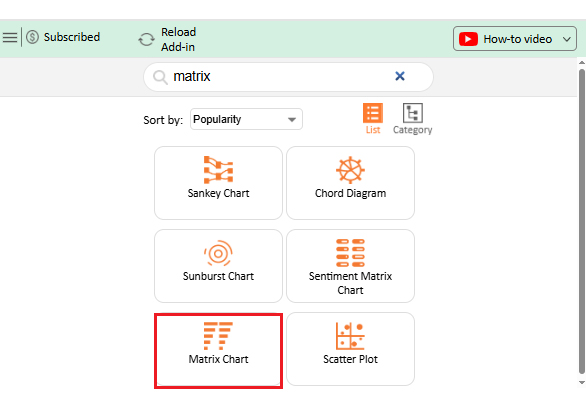
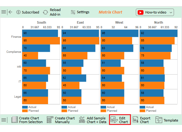
Pro tip: To take your visuals further, install ChartExpo. It will transform your matrix into an interactive chart in minutes.
How much did you enjoy this article?


Learn how to use sparklines in Excel to quickly visualize trends inside cells. Discover types, creation steps, customization, use cases, benefits, and best practices.

Learn what a confidence interval graph is, how to create it in Excel, and how to interpret results to make more reliable, data-driven decisions.

A correlation matrix in Excel helps identify relationships between variables. Learn how to create, read, and use it for effective data analysis.


