• Home
  • Tools dropdown img
    • Spreadsheet Charts

      • ChartExpo for Google Sheets
      • ChartExpo for Microsoft Excel
    • Power BI Charts

      • Power BI Custom Visuals by ChartExpo
    • Word Cloud

  • Charts dropdown img
    • Chart Category

      • Bar Charts
      • Circle Graphs
      • Column Charts
      • Combo Charts
      • Comparison Charts
      • Line Graphs
      • PPC Charts
      • Sentiment Analysis Charts
      • Survey Charts
    • Chart Type

      • Box and Whisker Plot
      • Clustered Bar Chart
      • Clustered Column Chart
      • Comparison Bar Chart
      • Control Chart
      • CSAT Survey Bar Chart
      • CSAT Survey Chart
      • Dot Plot Chart
      • Double Bar Graph
      • Funnel Chart
      • Gauge Chart
      • Likert Scale Chart
      • Matrix Chart
      • Multi Axis Line Chart
      • Overlapping Bar Chart
      • Pareto Chart
      • Radar Chart
      • Radial Bar Chart
      • Sankey Diagram
      • Scatter Plot Chart
      • Slope Chart
      • Sunburst Chart
      • Tornado Chart
      • Waterfall Chart
      • Word Cloud
    • Google Sheets
      Microsoft Excel
  • Services
  • Pricing
  • Contact us
  • Blog
  • Support dropdown img
      • Gallery
      • Videos
      • Contact us
      • FAQs
      • Resources
    • Please feel free to contact us

      atsupport@chartexpo.com

Categories
All Data Visualizations Data Analytics Surveys
Add-ons/
  • Google Sheets
  • Microsoft Excel
  • Power BI
All Data Visualizations Data Analytics Surveys
Add-ons
  • Google Sheets
  • Microsoft Excel
  • Power BI

We use cookies

This website uses cookies to provide better user experience and user's session management.
By continuing visiting this website you consent the use of these cookies.

Ok

ChartExpo Survey


Home > Blog > Data Analytics

Impact vs. Effort Matrix for Effective Planning and Strategy

What is an impact vs. effort matrix? Picture yourself as a product manager in a busy technology company. Your team has come up with ideas for 20 new features to add to your application. Excitement permeates the atmosphere, yet a nagging question lingers: Which features should you prioritize?

Impact vs Effort Matrix

Enter the impact vs. effort matrix, your new best friend in decision-making. This tool, a 2×2 grid, helps you visualize and prioritize tasks based on the following:

  • Their potential impact.
  • The effort required to implement them.

Picture this: You plot your 20 features on the matrix. Suddenly, clarity emerges. That AI-powered chatbot? High impact, but also high effort. The one-click sharing feature? Low effort, high impact. Bingo! You’ve found your quick win.

The impact vs. effort matrix isn’t just for tech. Marketing teams use it to prioritize campaigns. HR departments leverage it for employee initiatives. Even non-profits apply it to maximize their limited resources. The Harvard Business Review found that organizations using prioritization tools increased their project success rates by 37%.

So, are you ready to supercharge your decision-making? Let’s explore the impact vs. effort matrix and discover how it can revolutionize your approach to project management.

Table of Contents:

  1. What is Impact vs. Effort Matrix?
  2. How Does an Impact vs. Effort Matrix Work?
  3. Why Should I Use the Impact vs. Effort Matrix?
  4. What are the Key Differences between Matrix Effort vs. Impact?
  5. How to Create an Impact and Effort Matrix?
  6. How to Visualize Impact vs. Effort Matrix?
  7. What are the Pros and Cons of the Impact and Effort Matrix?
  8. Wrap Up

First…

What is Impact vs. Effort Matrix?

Definition: The Impact vs. Effort Matrix is a decision-making tool. It helps prioritize tasks based on their potential impact and the effort required. The matrix is divided into four quadrants:

  • Quick Wins: High impact, low effort. Prioritize these.
  • Major Projects: High impact, high effort. Plan carefully.
  • Fill-Ins: Low impact, low effort. Do these when time permits.
  • Thankless Tasks: Low impact, high effort. Avoid or minimize these.

By categorizing tasks, teams can focus on actions that provide the most value with the least effort.

How Does an Impact vs. Effort Matrix Work?

The impact vs. effort matrix is a simple yet powerful tool for data-driven decision-making and effective time management. Here’s how it works:

  1. Define criteria: Identify the tasks or projects you want to evaluate. Then, determine what “impact” and “effort” mean in your context. For example, impact could mean potential benefits, and effort could mean time or resources required.
  2. Plot on the matrix: Place each task on the matrix based on its estimated impact and effort. This creates a visual representation, helping you see where each task stands.
  3. Prioritize tasks: With the matrix in front of you, it’s easier to prioritize. Focus first on “Quick Wins” (high impact, low effort) and then move on to more complex tasks.
  4. Implement and review: Take action based on your prioritization. Regularly review the matrix to adjust and ensure you’re always working on the most valuable tasks.

Why Should I Use the Impact vs. Effort Matrix?

The impact vs. effort matrix is a powerful tool that helps you make smarter decisions. Here’s why it’s essential:

  • Prioritization and resource allocation: It helps you focus on tasks that matter most while effectively distributing your resources.
  • Strategic decision-making: It guides you in making informed choices, ensuring your efforts align with your long-term goals.
  • Quick wins and efficient planning: The matrix highlights quick wins, enabling efficient planning and swift progress.
  • Risk management and focus: It helps you manage risks by focusing on high-impact, low-effort tasks, ensuring you stay on track.

What are the Key Differences between Matrix Effort vs. Impact?

The Effort vs. Impact Matrix and the Impact vs. Effort Matrix may sound similar. However, they offer different perspectives on how to prioritize tasks. Let’s break down their key differences so you can choose the right approach for your needs:

Aspect Effort vs. Impact Matrix Impact vs. Effort Matrix
Primary focus Emphasizes how much effort a task requires before considering its impact. Prioritizes the potential impact of a task before assessing the effort needed.
Ideal for Projects where resources (time, money, energy) are limited and need careful management. Strategic planning where maximizing outcomes with minimal effort is crucial.
Decision-making approach Helps in identifying tasks that might be resource-intensive but necessary. Aims to identify tasks with high impact and low effort for quick wins.
Task categorization Tasks are first filtered by effort, potentially leading to higher effort but high-impact tasks being overlooked. Tasks are first filtered by impact, focusing on results that can be achieved quickly.
Quadrants: High Effort, High Impact: Major Projects

High Effort, Low Impact: Time Wasters

Low Effort, High Impact: Quick Wins

Low Effort, Low Impact: Easy Wins

High Impact, Low Effort: Quick Wins

High Impact, High Effort: Major Projects

Low Impact, Low Effort: Easy Wins

Low Impact, High Effort: Time Wasters

How to Create an Impact and Effort Matrix?

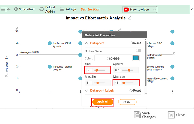
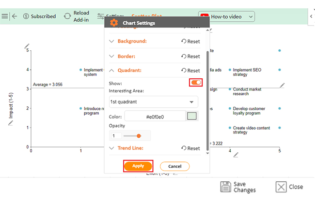
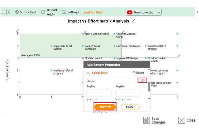
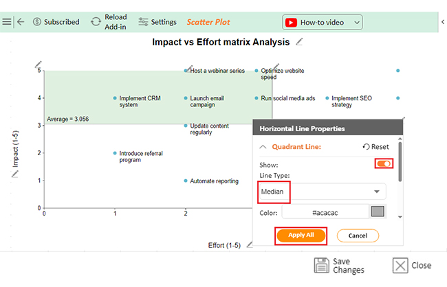
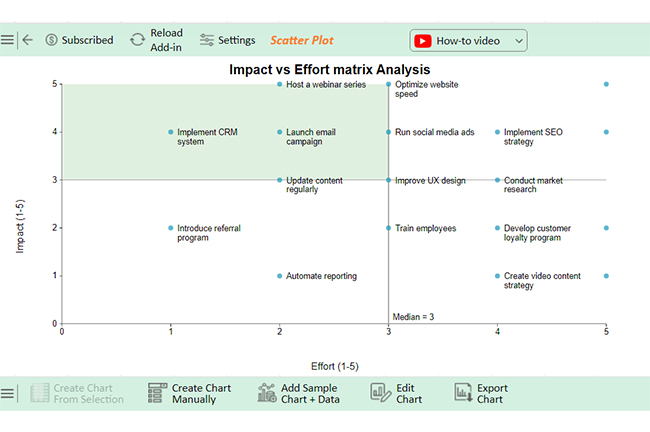
Creating an impact and effort matrix is a straightforward way to prioritize tasks and make smarter decisions. Here’s how to do it:

  1. Define your criteria: Clarify what “impact” and “effort” mean for your situation. Tailor these to your goals.
  2. List tasks or projects: Write down all the tasks or projects you need to evaluate.
  3. Rate each task: Assign a score to each task for both impact and effort, typically on a scale of 1 to 5.
  4. Create the matrix: Draw a simple 2×2 grid, with impact on the Y-axis and effort on the X-axis.
  5. Plot the tasks: Place each task in the appropriate quadrant based on your ratings.
  6. Analyze and prioritize: Focus first on tasks in the “Quick Wins” quadrant. Then, plan for the “Major Projects”.
  7. Update regularly: As tasks progress or new ones arise, revisit and adjust the matrix to stay on track.

How to Visualize Impact vs. Effort Matrix?

The impact vs. effort matrix is a game-changer, trust me! But how do you make sense of your project priorities?

We all know data visualization is crucial in data analysis. It helps us spot trends and make decisions faster. But here’s the thing: Excel falls short in this department. It’s like trying to paint a masterpiece with crayons.

But don’t worry! We have ChartExpo, the superhero of data viz. It’s here to save the day and overcome Excel’s limitations.

Ready to level up your visualization game? Install ChartExpo now!

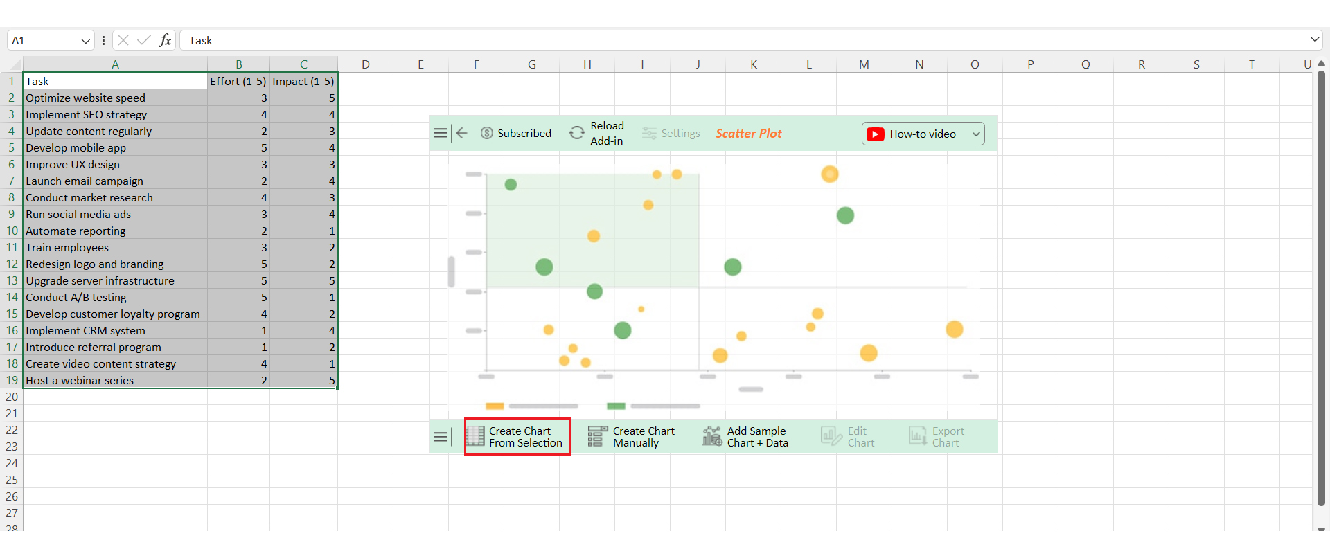
Let’s learn how to install ChartExpo in Excel.

  1. Open your Excel application.
  2. Open the worksheet and click the “Insert” menu.
  3. You’ll see the “My Apps” option.
  4. In the Office Add-ins window, click “Store” and search for ChartExpo on my Apps Store.
  5. Click the “Add” button to install ChartExpo in your Excel.

ChartExpo charts are available both in Google Sheets and Microsoft Excel. Please use the following CTAs to install the tool of your choice and create beautiful visualizations with a few clicks in your favorite tool.

Example

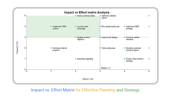
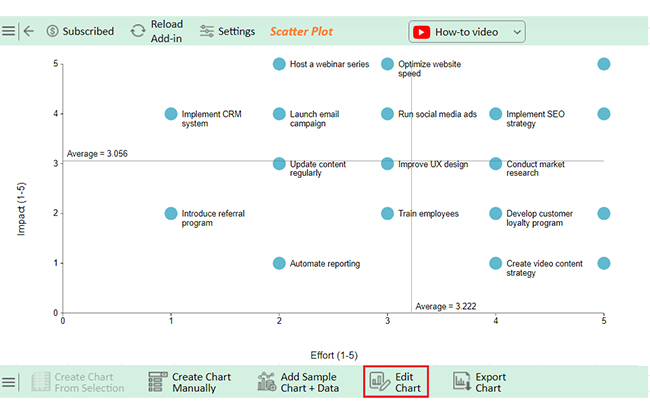
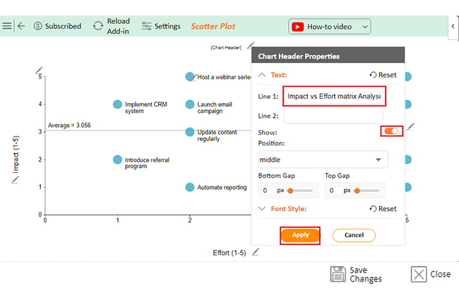
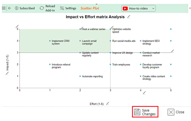
Let’s visualize the impact vs. effort matrix data below using ChartExpo and glean valuable insights.

Task Effort (1-5) Impact (1-5)
Optimize website speed 3 5
Implement SEO strategy 4 4
Update content regularly 2 3
Develop mobile app 5 4
Improve UX design 3 3
Launch email campaign 2 4
Conduct market research 4 3
Run social media ads 3 4
Automate reporting 2 1
Train employees 3 2
Redesign logo and branding 5 2
Upgrade server infrastructure 5 5
Conduct A/B testing 5 1
Develop a customer loyalty program 4 2
Implement CRM system 1 4
Introduce referral program 1 2
Create a video content strategy 4 1
Host a webinar series 2 5
  • To get started with ChartExpo, install ChartExpo in Excel.
  • Now Click on My Apps from the INSERT menu.
insert chartexpo in excel
  • Choose ChartExpo from My Apps, then click Insert.
open chartexpo in excel
  • Once it loads, scroll through the charts list to locate and choose the “Scatter Plot”.
search scatter plot chart in excel
  • Click the “Create Chart from Selection” button after selecting the data from the sheet, as shown.
Click Create Chart From Selection After Learning Impact vs Effort Matrix
  • Select the fields of the X-axis and Y-axis to the given data.
  • ChartExpo will generate the visualization below for you.
Select Fields with Rexpect to Given Data After Learning Impact vs Effort Matrix
  • If you want to add anything to the chart, click the Edit Chart button:
  • Click the pencil icon next to the Chart Header to change the title.
  • It will open the properties dialog. Under the Text section, you can add a heading in Line 1 and enable Show.
  • Give the appropriate title of your chart and click the Apply button.
Click Edit Chart After Learning Impact vs Effort Matrix
  • You can decrease the size of data points as follows:
Decrease Size Data Points After Learning Impact vs Effort Matrix
  • You can enable the Quadrant as follows:
Enable Quadrant After Learning Impact vs Effort Matrix
  • You can disable the label text as follows:
Disable Label Text After Learning Impact vs Effort Matrix
  • You can show the Quadrant Line and change the type into Median as follows:
Change Type into Median After Learning Impact vs Effort Matrix
  • Click the “Save Changes” button to persist the changes made to the chart.
Click Save Changes After Learning Impact vs Effort Matrix
  • Your final Scatter Plot will look like the one below.
Final Impact vs Effort Matrix

Insights

  • Prioritize high-impact tasks like optimizing website speed, SEO, and server upgrades for maximum business benefit.
  • High-effort tasks like app development and rebranding may require extra resources and careful planning.
  • Avoid low-impact, high-effort tasks like automating reporting and CRM implementation unless they offer significant benefits.
  • Focus on high-impact, low-effort tasks like email campaigns and social media ads for strong results with minimal effort.
  • The Scatter Plot helps to prioritize tasks and allocate resources effectively.

What are the Pros and Cons of the Impact and Effort Matrix?

As we have discussed, the impact vs. effort matrix is a popular tool for decision-making. However, like any tool, it has its strengths and weaknesses. Let’s break it down:

Pros of the Impact vs. Effort Matrix:

  • Prioritization: Helps you focus on what matters most.
  • Visualization: Provides clear, visual analytics to assess tasks.
  • Focus on quick wins: Highlights easy, high-impact tasks that can be tackled first.
  • Strategic alignment: Ensures your efforts align with your goals.
  • Resource allocation: Assists in allocating resources efficiently.
  • Simplified decision-making: Makes complex decisions easier.

Cons of the Impact vs. Effort Matrix:

  • Subjectivity: Ratings can be biased or subjective.
  • Oversimplification: May overlook the complexities of certain tasks.
  • Neglect of long-term impact: Short-term wins might overshadow long-term benefits.
  • Static analysis: Doesn’t account for changing circumstances over time.
  • Limited scope: Best for simple tasks; may not suit complex projects.
  • False sense of priority: Incorrect ratings can lead to misaligned priorities.

FAQs

How can an Impact vs. Effort Matrix help in project management?

An impact vs. effort matrix helps prioritize tasks in project management. It focuses on high-impact, low-effort activities, ensuring efficient use of resources. This leads to quick wins, better decision-making, and streamlined project execution.

Can the Impact vs. Effort Matrix be used for personal productivity?

Yes, the impact vs. effort matrix can boost personal productivity. It helps you focus on tasks that offer the most benefit with minimal effort. This approach streamlines your to-do list, enhances time management, and maximizes daily achievements.

Can the Impact vs. Effort Matrix be adapted for different industries?

The impact vs. effort matrix is versatile and can be tailored to any industry. It aids in prioritizing tasks across sectors, whether in tech, healthcare, or manufacturing, ensuring resources are focused on high-impact, low-effort activities.

Wrap Up

The impact vs. effort matrix is a practical tool for prioritizing tasks. It helps teams and individuals focus on what truly matters. Plotting tasks based on their impact and effort helps you visualize where to direct your energy.

This matrix divides tasks into four quadrants. “Quick Wins” are tasks with high impact and low effort. These should be tackled first. “Major Projects” have a high impact but require significant effort. They need careful planning.

“Fill-ins” are low-impact, low-effort tasks that can be done when time permits. Lastly, “Thankless Tasks” are low-impact and high-effort tasks. It’s often best to avoid them or minimize their effort.

Using this tool leads to smarter decision-making. It ensures resources are used efficiently. The matrix simplifies complex choices, making it easier to focus on valuable tasks.

However, it’s important to recognize its limitations. The matrix can be subjective and may oversimplify some situations. It is crucial to review and adjust it regularly.

In summary, the impact vs. effort matrix is a valuable tool. It helps prioritize tasks, align efforts with goals, and ensure efficient resource use.

Do not hesitate.

Start using the impact vs. effort matrix with ChartExpo today to revolutionize your decision-making.

How much did you enjoy this article?

PBIAd1
Start Free Trial!
140726

Related articles

next previous
Data Analytics31 min read

Data Analysis Without Nonsense: Fix the Right Problem, Fast

Data analysis can mislead when metrics look right but outcomes fail. Learn how to spot red flags, fix failures, and make better decisions. Read on!

Data Analytics29 min read

Variance Analysis Isn’t a Math Problem, It’s a Trust Problem

Variance analysis helps identify what went wrong, who owns it, and what to do next. Use it to drive decisions, not just reports. Learn more!

Data Analytics10 min read

Supplier Comparison Template: Download It Now

A supplier comparison template streamlines vendor evaluation by comparing cost and quality. Click here to learn its benefits and how to analyze them.

Data Analytics32 min read

Ecommerce Analytics: How to Fix What It Often Gets Wrong

Ecommerce analytics often lead to mixed signals and costly misreads. Fix attribution gaps, align teams, and act on the right data. Get started now!

Data Analytics30 min read

When Sales Funnel Breaks: Failures, Fixes, & Funnel Debt

Is your sales funnel hiding costly gaps? Learn how pipeline stalls, false metrics, and handoff chaos could be draining revenue. Get started now!

ChartExpo logo

Turn Data into Visual
Stories

CHARTEXPO

  • Home
  • Gallery
  • Videos
  • Services
  • Pricing
  • Contact us
  • FAQs
  • Privacy policy
  • Terms of Service
  • Sitemap

TOOLS

  • ChartExpo for Google Sheets
  • ChartExpo for Microsoft Excel
  • Power BI Custom Visuals by ChartExpo
  • Word Cloud

CATEGORIES

  • Bar Charts
  • Circle Graphs
  • Column Charts
  • Combo Charts
  • Comparison Charts
  • Line Graphs
  • PPC Charts
  • Sentiment Analysis Charts
  • Survey Charts

TOP CHARTS

  • Sankey Diagram
  • Likert Scale Chart
  • Comparison Bar Chart
  • Pareto Chart
  • Funnel Chart
  • Gauge Chart
  • Radar Chart
  • Radial Bar Chart
  • Sunburst Chart
  • see more
  • Scatter Plot Chart
  • CSAT Survey Bar Chart
  • CSAT Survey Chart
  • Dot Plot Chart
  • Double Bar Graph
  • Matrix Chart
  • Multi Axis Line Chart
  • Overlapping Bar Chart
  • Control Chart
  • Slope Chart
  • Clustered Bar Chart
  • Clustered Column Chart
  • Box and Whisker Plot
  • Tornado Chart
  • Waterfall Chart
  • Word Cloud
  • see less

RESOURCES

  • Blog
  • Resources
  • YouTube
SIGN UP FOR UPDATES

We wouldn't dream of spamming you or selling your info.

© 2025 ChartExpo, all rights reserved.