• Home
  • Tools dropdown img
    • Spreadsheet Charts

      • ChartExpo for Google Sheets
      • ChartExpo for Microsoft Excel
    • Power BI Charts

      • Power BI Custom Visuals by ChartExpo
    • Word Cloud

  • Charts dropdown img
    • Chart Category

      • Bar Charts
      • Circle Graphs
      • Column Charts
      • Combo Charts
      • Comparison Charts
      • Line Graphs
      • PPC Charts
      • Sentiment Analysis Charts
      • Survey Charts
    • Chart Type

      • Box and Whisker Plot
      • Clustered Bar Chart
      • Clustered Column Chart
      • Comparison Bar Chart
      • Control Chart
      • CSAT Survey Bar Chart
      • CSAT Survey Chart
      • Dot Plot Chart
      • Double Bar Graph
      • Funnel Chart
      • Gauge Chart
      • Likert Scale Chart
      • Matrix Chart
      • Multi Axis Line Chart
      • Overlapping Bar Chart
      • Pareto Chart
      • Radar Chart
      • Radial Bar Chart
      • Sankey Diagram
      • Scatter Plot Chart
      • Slope Chart
      • Sunburst Chart
      • Tornado Chart
      • Waterfall Chart
      • Word Cloud
    • Google Sheets
      Microsoft Excel
  • Services
  • Pricing
  • Contact us
  • Blog
  • Support dropdown img
      • Gallery
      • Videos
      • Contact us
      • FAQs
      • Resources
    • Please feel free to contact us

      atsupport@chartexpo.com

Categories
All Data Visualizations Data Analytics Surveys
Add-ons/
  • Google Sheets
  • Microsoft Excel
  • Power BI
All Data Visualizations Data Analytics Surveys
Add-ons
  • Google Sheets
  • Microsoft Excel
  • Power BI

We use cookies

This website uses cookies to provide better user experience and user's session management.
By continuing visiting this website you consent the use of these cookies.

Ok

ChartExpo Survey


Home > Blog > Data Analytics

Moving Annual Total for Insightful Reports

Moving Annual Total (MAT) —what does it mean for businesses?

This simple yet powerful metric tracks performance over a rolling 12-month period. Rather than confining analysis to a calendar year, it offers an ongoing trends perspective. This helps companies avoid misleading conclusions based on seasonal spikes or dips.

Moving Annual Total

Sales teams rely on this approach to improve forecasts. Without it, a company might wrongly attribute sales growth to a strong holiday season. But if sales from other months are declining, the total tells a different story. By calculating a moving annual total, companies can identify growth patterns and adjust strategies.

The metric is also key for cash flow management. Businesses can better analyze trends in revenue collection. This helps to accurately calculate days sales outstanding, ensuring steady cash flow and preventing financial surprises.

In today’s data-driven business environment, precision matters. Tracking sales allows businesses to make data-driven decisions. Whether analyzing revenue, managing cash flow, or refining forecasts, this simple calculation provides clarity.

Companies that embrace business analytics grow 30% faster than those that don’t. Making sense of sales performance starts with the right tools, and this metric is one of the best ways to do so.

Let’s explore further.

Table of Contents:

  1. What is Moving Annual Total?
  2. Why is Moving Annual Total (MAT) important in Business?
  3. What is the Moving Annual Total Formula?
  4. How to Calculate Moving Annual Total (MAT)?
  5. How to Analyze Moving Annual Total in Excel?
  6. Benefits of Calculating Moving Annual Total in Sales
  7. Best Practices of Moving Annual Total
  8. FAQs
  9. Wrap Up

What is Moving Annual Total?

Definition: A Moving Annual Total (MAT) is a metric that tracks a company’s performance over the past 12 months. It updates continuously to provide an ongoing view of performance trends.

Unlike annual data, MAT offers a rolling perspective, smoothing out seasonal fluctuations. This enables businesses to identify long-term trends and make more informed decisions.

The MAT is commonly used in sales analytics and helps forecast future performance. Companies can monitor sales growth, making it a vital tool in data analysis.

Why is Moving Annual Total (MAT) important in Business?

The Moving Annual Total (MAT) is more than just a metric—it’s a tool for insight. It helps businesses look beyond short-term fluctuations, offering a clearer view of long-term trends. Here’s how MAT can make a difference:

  • Identifies long-term trends: It smooths short-term fluctuations, revealing consistent growth or decline in gross annual sales and highlighting actual performance trends.
  • Improves decision-making: MAT provides accurate data, reducing impulse decisions based on temporary changes. It supports informed strategic choices.
  • Enhances performance evaluation: The Moving Annual Total provides consistent data over 12 months, ensuring fair and accurate performance reviews. It balances seasonal impacts.
  • Aids in sales and demand forecasting: MAT helps predict future sales accurately by focusing on long-term trends. It also guides the creation of a sales forecast.
  • Supports benchmarking and goal setting: MAT helps businesses set realistic, data-driven benchmarks and goals. It also improves the evaluation of the sales dashboard.

What is the Moving Annual Total Formula?

The Moving Annual Total (MAT) formula adds up the value of a specific metric. This provides a continuous view of performance over time. To calculate MAT, add the values for the last 12 months and update the sum each month.

MAT = ∑ (Last 12 Months’ Values)

Remove the oldest month’s data and add the latest month’s data. This gives a continuous, rolling total that reflects long-term trends.

In Excel Formula:

Assume your figures (such as monthly sales) are located in Column B, beginning at Row 2. The formula to calculate the Moving Annual Total (MAT) in Row 13 would be:

=SUM(B2:B13)

To create a flexible MAT formula that refreshes automatically each month, apply:

=SUM(OFFSET(B13, -11, 0, 12, 1))

MAT is often used in sales and business analytics to smooth out short-term fluctuations and spot actual patterns.

How to Calculate Moving Annual Total (MAT)?

Calculating MAT in Excel is simple and incredibly useful for tracking long-term trends in your analytics. This method allows real-time insights into your sales forecasts. Let’s walk through the steps:

  1. Prepare your data: Organize sales data in Excel with at least 12 months in a column. This is the foundation for tracking gross annual sales over time.
  2. Use the SUM formula for the first MAT calculation: Use the SUM function to add the sales figures from the first 12 months. It helps you track the start of your sales pipeline report.
  3. Create a rolling MAT using a dynamic formula: Use the dynamic formula =SUM(A3:A14) for the following months. This formula updates monthly, keeping your monthly sales report templates accurate.
  4. Drag the formula down: Once the first formula is in place, drag it down the column to apply it to the other months. This creates an automatic sales dashboard that updates monthly with the latest MAT data.

How to Analyze Moving Annual Total in Excel?

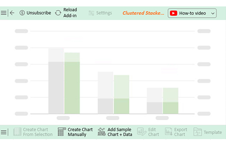
Excel is excellent, but it sometimes feels like trying to fit a square peg in a round hole regarding data analysis. You can create graphs, but the real value is in bringing data to life. That’s where insightful data visualization comes in; it turns raw numbers into insights.

But if you’ve ever tried to visualize a Moving Annual Total (MAT) in Excel, you know it’s not always straightforward. That’s where ChartExpo steps in. This tool elevates your Excel data, providing powerful, easy-to-understand visuals. It’s perfect for analyzing long-term trends like MAT and making your data stand out.

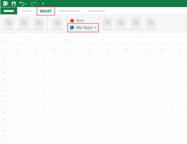
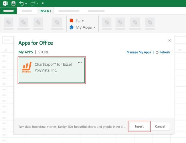
How to Install ChartExpo in Excel?

  1. Open your Excel application.
  2. Open the worksheet and click the “Insert” menu.
  3. You’ll see the “My Apps” option.
  4. In the Office Add-ins window, click “Store” and search for ChartExpo on the My Apps Store.
  5. Click the “Add” button to install ChartExpo in your Excel.

ChartExpo charts are available both in Google Sheets and Microsoft Excel. Please use the following CTAs to install the tool of your choice and create beautiful visualizations with a few clicks in your favorite tool.

Example

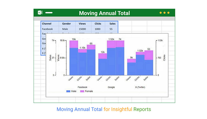
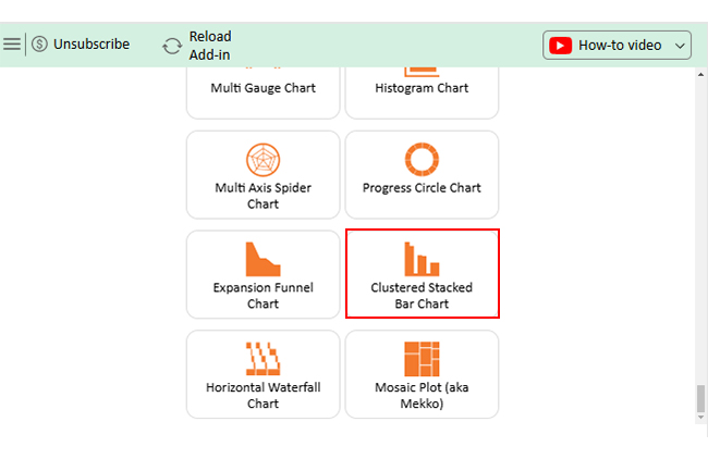
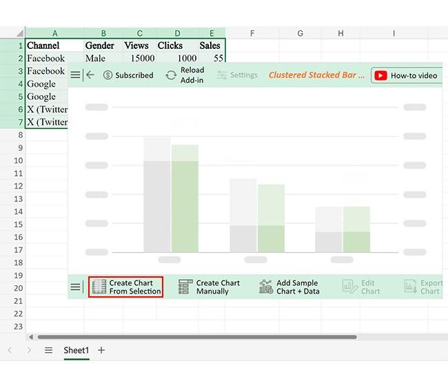
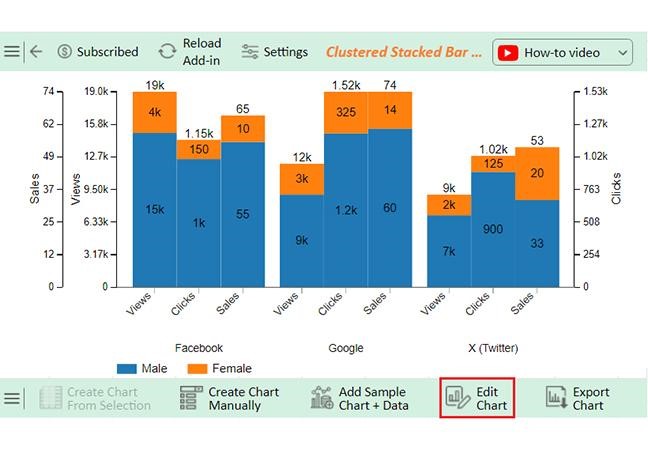
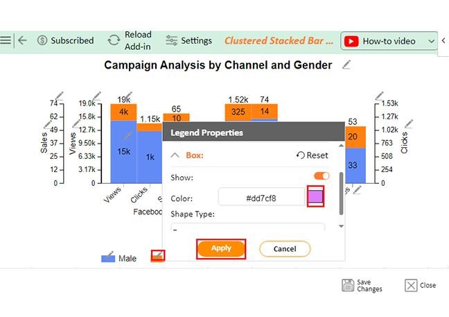
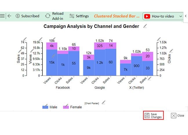
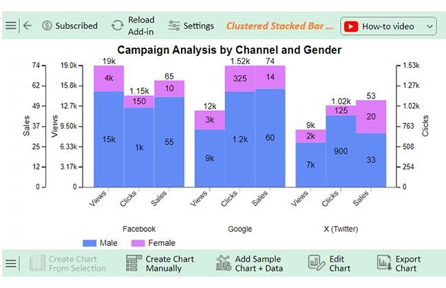
Let’s analyze this sample data in Excel using ChartExpo

Channel Gender Views Clicks Sales
Facebook Male 15000 1000 55
Facebook Female 4000 150 10
Google Male 9000 1200 60
Google Female 3000 325 14
X (Twitter) Male 7000 900 33
X (Twitter) Female 2000 125 20
  • To get started with ChartExpo, install ChartExpo in Excel.
  • Now, click on My Apps from the INSERT menu.
Moving Annual Total
  • Choose ChartExpo from My Apps, then click Insert.
Moving Annual Total
  • Once it loads, scroll through the charts list to locate and choose the “Clustered Stacked Bar Chart”. This chart is best suited to this scenario.
Moving Annual Total
  • You will see a Clustered Stacked Bar Chart on the screen.
Moving Annual Total
  • Click the “Create Chart From Selection” button after selecting the data from the sheet, as shown.
Moving Annual Total
  • ChartExpo will generate the visualization below for you.
Moving Annual Total
  • If you want to have the chart’s title, click Edit Chart, as shown in the above image.
  • Click the pencil icon next to the Chart Header to change the title.
  • It will open the properties dialog. Under the Text section, you can add a heading in Line 1 and enable Show.
  • Give the appropriate title of your chart and click the Apply button.
Moving Annual Total
  • You can change the bars’ colors by clicking on Legend as follows:
Moving Annual Total
  • Click the “Save Changes” button to persist the changes.
Moving Annual Total
  • Your Clustered Stacked Bar Chart will appear as below.
Moving Annual Total

Insights

Males:

  • Higher engagement across all channels
  • Facebook leads in views
  • Google shows higher sales conversion

Females:

  • Highest clicks on Google
  • Twitter has balanced engagement with lower sales compared to other channels

Benefits of Calculating Moving Annual Total in Sales

Calculating the Moving Annual Total (MAT) offers many advantages for businesses, especially when analyzing sales data. It helps to provide a more accurate and consistent view of performance.

Here’s how MAT can enhance your sales strategy:

  • Identifies long-term sales trends: MAT helps you spot consistent sales patterns over time. Smoothing out short-term fluctuations reveals actual growth and performance in your sales pipeline.
  • Improves sales forecasting: MAT provides a clearer view of sales trends, leading to more accurate predictions. It helps refine your sales forecast, making future predictions more reliable and actionable.
  • Enhances performance evaluation: MAT provides a clear and consistent benchmark for evaluating sales performance. It prevents seasonal highs and lows from skewing evaluations, providing a clearer picture of your gross annual sales.
  • Reduces the impact of seasonal variations: MAT helps eliminate the noise caused by seasonal changes in sales. Businesses can avoid overreacting to seasonal fluctuations, leading to better decision-making.
  • Aids in benchmarking and goal setting: MAT effectively sets realistic sales goals by providing a rolling sales total. It helps businesses assess past performance and establish achievable targets, supporting long-term sales analytics strategies.

Best Practices of Moving Annual Total

Following best practices is key to harnessing the power of Moving Annual Total (MAT). MAT helps track long-term sales trends, but only when used correctly. Here are the top tips to make the most of it:

  • Ensure data accuracy: For MAT to be helpful, you need clean, accurate data. Sales analysis relies on correct inputs, so double-check your numbers to avoid errors.
  • Use rolling 12-month data: MAT works best when you consistently use 12 months of data. Use the moving average in Excel to calculate the rolling total for a better sales trend.
  • Automate with Excel formulas: Automation is key in simplifying your MAT calculations. Use Excel formulas to update your sales dashboard and monthly sales report templates automatically.
  • Analyze trends, not just numbers: Don’t just focus on the numbers—look for patterns in the data. MAT helps highlight trends in sales forecast examples and lets you track performance more effectively.
  • Account for seasonality: While MAT smooths out seasonal effects, it’s still important to understand them. Seasonality can impact gross annual sales; factoring this in ensures you’re not misinterpreting your long-term performance.
  • Visualize with charts & compare year-over-year: Comparing your MAT year-over-year provides valuable insights into sales growth. It helps you see how trends align with your analytics strategy.

FAQs

What is the difference between moving annual total and year-to-date?

The Moving Annual Total tracks data over the last 12 months, updating monthly. Year-to-date measures data from the start of the current year to the present date. MAT provides a rolling view, while YTD is static.

What is the 12-month moving total?

A 12-month moving total sums data from the past 12 months, updating each month. It provides a rolling total that smooths out fluctuations, offering a more accurate performance trend in sales or other metrics.

Wrap Up

The Moving Annual Total (MAT) is a valuable metric for tracking long-term trends in business performance. By averaging data over 12 months, MAT smooths out fluctuations and provides a clearer view of consistent growth. This is essential for making informed decisions and staying ahead of the competition.

Excel is an excellent tool for calculating MAT. It makes it easy to apply formulas that help you calculate rolling totals and track your performance monthly. However, Excel’s essential charting tools can be limiting when visualizing the data.

Analytics tools for business fill that role. Data visualization tools like ChartExpo can be integrated with Excel for enhanced visuals. This allows you to identify trends and analyze results more effectively. In data science, the goal is to convert raw information into practical insights using the right tools.

With MAT in your monthly sales reports, you can analyze past performance and predict the future. It enables you to spot long-term trends and resist overreacting to short-term spikes.

Do not hesitate.

Incorporate MAT into your analytics process to improve decision-making and forecasting accuracy. Also, install ChartExpo to enhance data visualization, help your business grow, and adapt based on actual performance data.

How much did you enjoy this article?

PBIAd1
Start Free Trial!
151138

Related articles

next previous
Data Analytics9 min read

Marketing Spend Template for Smarter Insights

Learn everything about the marketing spend template. You'll also learn how to create a marketing budget plan and tips for using one, and many more.

Data Analytics12 min read

Business Intelligence in Healthcare Industry: A Visual Approach

Business Intelligence in the healthcare industry improves patient care and streamlines operations. Learn how BI works and benefits healthcare providers.

Data Analytics10 min read

Analytics in Telecom Industry for Better Insights

Analytics in the telecom industry optimizes networks, enhances customer experience, and detect fraud. Learn its key benefits, challenges, and use cases.

Data Analytics7 min read

Financial Forecasting for Startups: A Complete Guide

This guide dives deep into financial forecasting for startups. You'll also discover elements of a financial projection for a startup, and tips for creating one.

Data Analytics32 min read

Data Reporting: Making Your Reports Irresistible

Data reporting turns numbers into insights that guide decisions. Learn how to simplify complex data and make confident choices. Read on for key strategies!

ChartExpo logo

Turn Data into Visual
Stories

CHARTEXPO

  • Home
  • Gallery
  • Videos
  • Services
  • Pricing
  • Contact us
  • FAQs
  • Privacy policy
  • Terms of Service
  • Sitemap

TOOLS

  • ChartExpo for Google Sheets
  • ChartExpo for Microsoft Excel
  • Power BI Custom Visuals by ChartExpo
  • Word Cloud

CATEGORIES

  • Bar Charts
  • Circle Graphs
  • Column Charts
  • Combo Charts
  • Comparison Charts
  • Line Graphs
  • PPC Charts
  • Sentiment Analysis Charts
  • Survey Charts

TOP CHARTS

  • Sankey Diagram
  • Likert Scale Chart
  • Comparison Bar Chart
  • Pareto Chart
  • Funnel Chart
  • Gauge Chart
  • Radar Chart
  • Radial Bar Chart
  • Sunburst Chart
  • see more
  • Scatter Plot Chart
  • CSAT Survey Bar Chart
  • CSAT Survey Chart
  • Dot Plot Chart
  • Double Bar Graph
  • Matrix Chart
  • Multi Axis Line Chart
  • Overlapping Bar Chart
  • Control Chart
  • Slope Chart
  • Clustered Bar Chart
  • Clustered Column Chart
  • Box and Whisker Plot
  • Tornado Chart
  • Waterfall Chart
  • Word Cloud
  • see less

RESOURCES

  • Blog
  • Resources
  • YouTube
SIGN UP FOR UPDATES

We wouldn't dream of spamming you or selling your info.

© 2025 ChartExpo, all rights reserved.