• Home
  • Tools dropdown img
    • Spreadsheet Charts

      • ChartExpo for Google Sheets
      • ChartExpo for Microsoft Excel
    • Power BI Charts

      • Power BI Custom Visuals by ChartExpo
    • Word Cloud

  • Charts dropdown img
    • Chart Category

      • Bar Charts
      • Circle Graphs
      • Column Charts
      • Combo Charts
      • Comparison Charts
      • Line Graphs
      • PPC Charts
      • Sentiment Analysis Charts
      • Survey Charts
    • Chart Type

      • Box and Whisker Plot
      • Clustered Bar Chart
      • Clustered Column Chart
      • Comparison Bar Chart
      • Control Chart
      • CSAT Survey Bar Chart
      • CSAT Survey Chart
      • Dot Plot Chart
      • Double Bar Graph
      • Funnel Chart
      • Gauge Chart
      • Likert Scale Chart
      • Matrix Chart
      • Multi Axis Line Chart
      • Overlapping Bar Chart
      • Pareto Chart
      • Radar Chart
      • Radial Bar Chart
      • Sankey Diagram
      • Scatter Plot Chart
      • Slope Chart
      • Sunburst Chart
      • Tornado Chart
      • Waterfall Chart
      • Word Cloud
    • Google Sheets
      Microsoft Excel
  • Services
  • Pricing
  • Contact us
  • Blog
  • Support dropdown img
      • Gallery
      • Videos
      • Contact us
      • FAQs
      • Resources
    • Please feel free to contact us

      atsupport@chartexpo.com

Categories
All Data Visualizations Data Analytics Surveys
Add-ons/
  • Google Sheets
  • Microsoft Excel
  • Power BI
All Data Visualizations Data Analytics Surveys
Add-ons
  • Google Sheets
  • Microsoft Excel
  • Power BI

We use cookies

This website uses cookies to provide better user experience and user's session management.
By continuing visiting this website you consent the use of these cookies.

Ok

ChartExpo Survey


Home > Blog > Data Analytics

Supplier Comparison Template: Download It Now

Supplier comparison template—what is it, and why does it matter? Businesses rely on suppliers for everything from raw materials to essential services. Wrong choices lead to delays, financial losses, or even damaged reputations. A supplier comparison template helps prevent loss. This simple tool organizes key details so you can compare options.

Supplier Comparison Template

With MS Excel used in business, creating a structured template becomes easier and more efficient. Price, quality, and reliability are not the only factors. Payment terms, lead times, and customer service also matter. Without structure, essential details slip through the cracks. Analysis paralysis can delay decisions, but a well-organized template simplifies the process.

Supply chains are unpredictable. Vendors change policies, and costs fluctuate. An intense comparison process helps businesses adapt quickly. And the best part? With self-service analytics, you can update and analyze supplier data without relying on IT support.

A clear, organized template is a small step that leads to significant results. Let’s see how a well-structured supplier comparison template streamlines vendor selection and review for better efficiency.

Table of Content:

  1. What is a Supplier Comparison Template?
  2. Why Use a Vendor Comparison Template?
  3. How to Use the Vendor Comparison Template?
  4. Pros and Cons of Supplier Comparison Templates
  5. Tips for Using Vendor Comparison Templates
  6. How to Create an Excel Vendor Comparison Template?
  7. How to Analyze the Supplier Comparison Template in Excel?
  8. Supplier Comparison Template – FAQs
  9. Wrap Up

What is a Supplier Comparison Template?

Definition: A supplier comparison template is a tool for evaluating suppliers side by side. It helps businesses compare costs, quality, reliability, and service.

Supply chain disruptions cost companies thousands each year. A straightforward comparison process reduces risks and improves decision-making. Tracking supplier performance over time is also essential. A month-to-month comparison Excel chart helps visualize trends and identify inconsistencies.

A Supplier comparison template organizes critical data in one place. It makes choosing the best supplier faster, easier, and more effective. Businesses that use structured comparisons gain better control over costs and supplier relationships.

Why Use a Vendor Comparison Template?

Poor suppliers cause delays and hidden costs, while good ones offer reliability and growth. This template streamlines decision-making by organizing key details. Combining it with market analysis helps to compare trends and make wise choices.

Here are reasons why a vendor comparison template is useful:

  • Structured and organized evaluation: Messy notes and scattered data lead to confusion. A structured template puts key details in one place, making tracking performance, pricing, and service quality easy.
  • Saves time and effort: Sorting through vendor proposals is exhausting. A comparison table speeds up decisions, eliminating the need to flip through endless documents.
  • Ensures data-driven decision-making: Gut feelings aren’t enough in business. Instead, a vendor comparison template provides facts and figures, ensuring choices are based on actual performance data.
  • Helps in cost analysis: A structured approach helps uncover hidden fees, bulk discounts, and long-term costs.
  • Enhances negotiation power: Knowing the numbers gives businesses leverage in discussions. A side-by-side comparison makes it easier to push for better deals and terms.
  • Improves supplier relationship management: Strong relationships provide better service and long-term benefits. Tracking vendor performance helps businesses choose partners who consistently deliver quality.

How to Use the Vendor Comparison Template?

Reviewing supplier scorecard examples improves evaluations by highlighting performance metrics. This ensures businesses choose reliable suppliers and maintain strong, long-term partnerships. Here’s how to use the vendor comparison template to ensure informed choices:

  1. Define your evaluation criteria: Not all vendors offer the same value. List the factors that matter most, such as price, quality, reliability, and customer service.
  2. Enter vendor details: Gather key information from each supplier. Add pricing, contract terms, delivery timelines, and any extra fees.
  3. Assign scores or weights: Some factors matter more than others. Give each criterion a weight and score vendors based on performance.
  4. Compare and analyze: Look at the data side by side and identify strengths, weaknesses, and potential red flags.
  5. Make an informed decision: Choose the vendor that best meets your needs. A straightforward comparison ensures confidence in your final choice.

What are the Pros and Cons of Supplier Comparison Templates?

Selecting the right supplier impacts business success. The wrong choice causes delays, extra costs, and quality issues. A supplier comparison template organizes details and simplifies vendor evaluation. However, while helpful, this tool has some limitations.

Here’s a closer look at its pros and cons.

Pros:

  • Structured and organized evaluation: The template systematically reviews key factors like pricing, quality, and reliability. This prevents overlooking essential details and helps maintain consistency in supplier assessments.
  • Time-saving & efficient: Comparing vendors manually takes time and effort. A structured template consolidates all relevant information, making evaluation quicker and easier.
  • Data-driven decision-making: Relying on instincts can lead to costly mistakes. This template ensures choices are based on measurable facts.
  • Cost optimization: Evaluating multiple suppliers helps identify cost-effective options, uncover hidden fees, and prevent unnecessary expenses.
  • Better negotiation power: Vendors are more likely to offer competitive pricing when they see buyers making informed decisions. A well-prepared comparison strengthens the buyer’s ability to negotiate favorable terms.
  • Customizable & scalable: The template can be adjusted to fit different industries and business needs. It remains valid as a company grows and its supplier requirements evolve.

Cons:

  • It may not capture subjective factors: Some elements, like customer service and long-term reliability, are challenging to measure. These qualitative aspects may require additional evaluation outside the template.
  • Requires regular updates: Supplier performance, pricing, and terms change over time. Frequent updates keep the template relevant and valuable.
  • Complexity with too many criteria: Adding too many factors can confuse comparisons. A balance between detail and simplicity ensures effective decision-making.

What are the Tips for Using Vendor Comparison Templates?

Choosing the right vendor isn’t easy. Prices, quality, and service vary. A vendor comparison template helps only when used correctly. Moreover, understanding the types of comparison charts makes the process more transparent. The right chart highlights key differences for better decisions.

Here’s how to get the most out of it.

  • Set clear selection criteria: Identify the most critical factors, such as price, reliability, and service quality. Defining priorities upfront ensures a focused and consistent evaluation process.
  • Ensure data is accurate and updated: Decisions based on outdated or incorrect information can lead to costly mistakes. Regularly verifying supplier details keeps comparisons relevant and reliable.
  • Use a scoring system for fair evaluation: Assigning numerical scores to different criteria eliminates bias and subjectivity. A structured scoring approach ensures a more balanced and objective assessment.
  • Make analysis simple with formatting and filters: Conditional formatting helps highlight key insights at a glance. Filters allow quick sorting, making it easier to focus on top-performing vendors.
  • Look beyond cost for long-term value: The lowest price doesn’t always mean the best deal. Evaluating long-term reliability, customer support, and overall value ensures a wiser investment.

How to Create an Excel Vendor Comparison Template?

Picking the right vendor shouldn’t be a guessing game. An Excel vendor comparison template makes the process clear and structured. It helps break down options, compare key factors, and choose the best fit. Here’s how to create one step-by-step:

  1. Define your evaluation criteria: List the most important factors, such as cost, quality, reliability, and support. Clear criteria ensure a focused and fair comparison.
  2. Set up your Excel sheet: Create columns for vendor names, criteria, and scores. A well-organized layout makes data entry and analysis easier.
  3. Assign weights to criteria: Some factors matter more than others. Give each a weight based on its importance.
  4. Scoring system: Rate each vendor on a set scale for every criterion. This structured approach eliminates bias and makes comparisons objective.
  5. Use formulas for automated calculation: Excel formulas help calculate weighted scores instantly. It reduces errors and speeds up decision-making.
  6. Apply conditional formatting: Highlight top scores with colors to make patterns easy to spot. A visual approach simplifies analysis.
  7. Visualize data with charts: Use bar or radar charts to compare vendors at a glance. Charts make trends clearer and decisions easier.
  8. Make an informed decision: Review the results and choose the vendor that best meets your needs. A data-driven choice leads to better long-term outcomes.

How to Analyze the Supplier Comparison Template in Excel?

Choosing the right supplier shouldn’t feel complicated. A supplier comparison template helps you analyze vendors side by side, ensuring you make the best choice. But raw numbers alone don’t tell the whole story. Data visualization is key to spotting trends, risks, and opportunities.

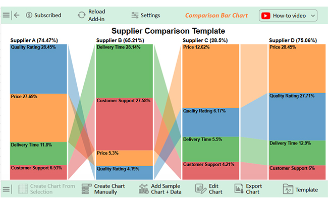
Unfortunately, Excel’s built-in charts can be clunky and limited. But don’t worry, we have a solution in ChartExpo. This tool transforms dull spreadsheets into clear, insightful visuals, making supplier comparisons faster and wiser.

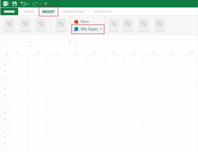
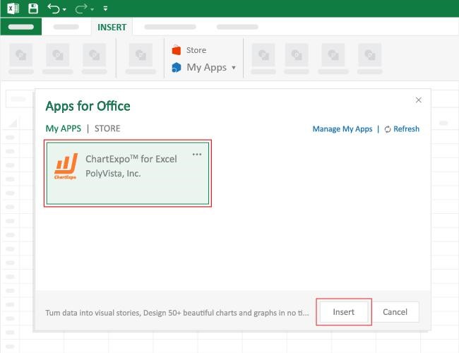
How to Install ChartExpo in Excel?

  1. Open your Excel application.
  2. Open the worksheet and click the “Insert” menu.
  3. You’ll see the “My Apps” option.
  4. In the Office Add-ins window, click “Store” and search for ChartExpo on the My Apps Store.
  5. Click the “Add” button to install ChartExpo in your Excel.

ChartExpo charts are available both in Google Sheets and Microsoft Excel. Please use the following CTAs to install the tool of your choice and create beautiful visualizations with a few clicks in your favorite tool.

Example

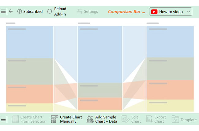
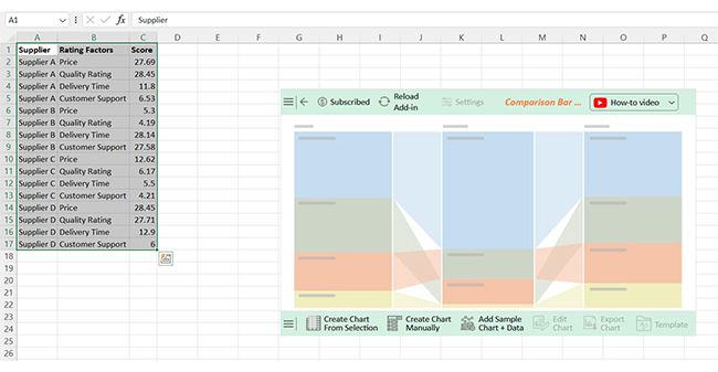
Let’s learn how to use a data table in Excel and analyze it using ChartExpo:
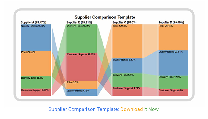
Supplier Rating Factors Score
Supplier A Price 27.69
Supplier A Quality Rating 28.45
Supplier A Delivery Time 11.8
Supplier A Customer Support 6.53
Supplier B Price 5.3
Supplier B Quality Rating 4.19
Supplier B Delivery Time 28.14
Supplier B Customer Support 27.58
Supplier C Price 12.62
Supplier C Quality Rating 6.17
Supplier C Delivery Time 5.5
Supplier C Customer Support 4.21
Supplier D Price 28.45
Supplier D Quality Rating 27.71
Supplier D Delivery Time 12.9
Supplier D Customer Support 6
  • To get started with ChartExpo, install ChartExpo in Excel.
  • Now, click on My Apps from the INSERT menu.
Training Plan Template in Excel
  • Choose ChartExpo from My Apps, then click Insert.
Training Plan Template in Excel


  • After ChartExpo loads, choose the “Comparison Bar Chart” from the chart list.
search comparison bar chart in excel
  • After clicking on the chart, you will see the Comparison Bar Chart on the screen.
Comparison Bar Chart on screen ce805
  • Select the data from the sheet, and click the “Create Chart From Selection” button.
Create Chart From Selection ce805
  • ChartExpo will create the visualization below for you.
create visualization below ce805
  • If you want to add a chart title, click the “Edit Chart” button.
  • To modify the title, click the pencil icon next to “Chart Header”. Add the appropriate heading in Line 1 under the Text section. Enable the Show option and click the “Apply” button.
Add Tittle on Chart ce805
  • Now, you can add the percentage sign to all values.
  • Also, disable the inner bar values within the bracket as follows:
Edit Chart ce805
  • Click on the “Save Changes” button:
Save Changes ce805
  • Your final chart will then resemble the image below.
Final Supplier Comparison Template ce805

Insights

  • Supplier A – Strong in price and quality but weak in delivery and support.
  • Supplier B – Best in delivery and support, but lacks in price and quality.
  • Supplier C – Underperforms in all criteria.
  • Supplier D – Strong in price and quality.

Supplier Comparison Template – FAQs

How do you compare two vendor quotes?

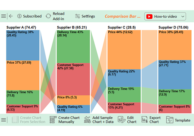
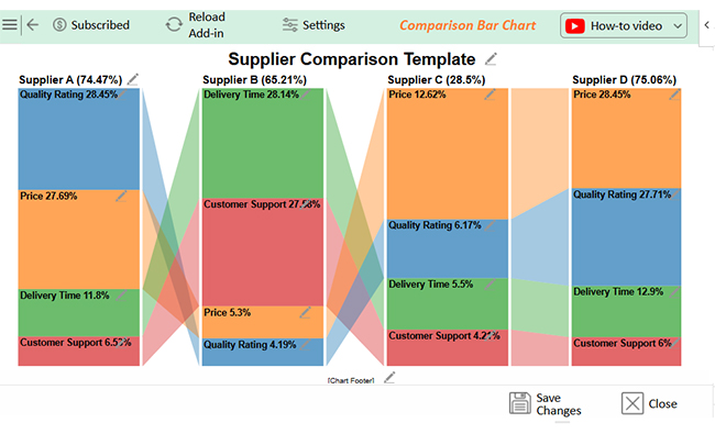
Compare vendor quotes by analyzing price, quality, delivery time, and support:

  • Check for hidden costs and payment terms.
  • Evaluate warranties and service agreements.
  • Consider the reputation and past performance.
  • Use a weighted scoring system to make an informed, data-driven decision.

What is a vendor comparison matrix?

A Vendor Comparison Matrix is a tool that evaluates suppliers side by side. It lists vendors, key criteria, and scores for each. This helps identify strengths, weaknesses, and the best overall option. It simplifies decision-making with a clear, structured comparison.

Wrap Up

A supplier comparison template is a powerful tool for making informed decisions. It helps businesses evaluate suppliers based on cost, quality, and reliability. Without a structured approach, businesses risk overlooking critical details.

Supplier selection can be overwhelming without proper organization. Comparing multiple vendors manually leads to confusion and errors. A well-structured template, such as a price comparison template in Excel, ensures a fair and consistent evaluation process.

Data-driven decisions lead to better outcomes. Relying on instincts alone can result in costly mistakes. Product comparison charts help businesses analyze multiple suppliers side by side, making the decision process more transparent.

A good supplier comparison template must be flexible and regularly updated. Market conditions, pricing, and supplier performance change over time. Visual analytics can highlight trends, helping you track supplier performance more effectively.

Using a supplier comparison template simplifies supplier evaluation and improves business efficiency. It saves time, reduces risk, and leads to more intelligent decisions. Businesses that use it gain a competitive advantage and long-term success.

Pro tip: Install ChartExpo to visualize the data and make supplier comparisons clearer.

How much did you enjoy this article?

ExcelAd1
Start Free Trial!
150051

Related articles

next previous
Data Analytics32 min read

Ecommerce Analytics: How to Fix What It Often Gets Wrong

Ecommerce analytics often lead to mixed signals and costly misreads. Fix attribution gaps, align teams, and act on the right data. Get started now!

Data Analytics30 min read

When Sales Funnel Breaks: Failures, Fixes, & Funnel Debt

Is your sales funnel hiding costly gaps? Learn how pipeline stalls, false metrics, and handoff chaos could be draining revenue. Get started now!

Data Analytics29 min read

Correlation Analysis: Don’t Worship Correlation, Question It.

Correlation analysis helps spot patterns, avoid costly mistakes, and guide decisions with data that matters. Want smarter strategy? Get started now!

Data Analytics33 min read

Product Analytics for Decisions, Not Decoration

Product analytics can mislead more than it guides. Learn how to spot false signals, wasted tools, and hidden churn before decisions go wrong. Read on!

Data Analytics32 min read

Data vs Information vs Knowledge vs Wisdom: Win Or Die

Data vs information vs knowledge vs wisdom – what’s the real difference, and why does it matter for strategy and decision-making? Get started and read on!

ChartExpo logo

Turn Data into Visual
Stories

CHARTEXPO

  • Home
  • Gallery
  • Videos
  • Services
  • Pricing
  • Contact us
  • FAQs
  • Privacy policy
  • Terms of Service
  • Sitemap

TOOLS

  • ChartExpo for Google Sheets
  • ChartExpo for Microsoft Excel
  • Power BI Custom Visuals by ChartExpo
  • Word Cloud

CATEGORIES

  • Bar Charts
  • Circle Graphs
  • Column Charts
  • Combo Charts
  • Comparison Charts
  • Line Graphs
  • PPC Charts
  • Sentiment Analysis Charts
  • Survey Charts

TOP CHARTS

  • Sankey Diagram
  • Likert Scale Chart
  • Comparison Bar Chart
  • Pareto Chart
  • Funnel Chart
  • Gauge Chart
  • Radar Chart
  • Radial Bar Chart
  • Sunburst Chart
  • see more
  • Scatter Plot Chart
  • CSAT Survey Bar Chart
  • CSAT Survey Chart
  • Dot Plot Chart
  • Double Bar Graph
  • Matrix Chart
  • Multi Axis Line Chart
  • Overlapping Bar Chart
  • Control Chart
  • Slope Chart
  • Clustered Bar Chart
  • Clustered Column Chart
  • Box and Whisker Plot
  • Tornado Chart
  • Waterfall Chart
  • Word Cloud
  • see less

RESOURCES

  • Blog
  • Resources
  • YouTube
SIGN UP FOR UPDATES

We wouldn't dream of spamming you or selling your info.

© 2025 ChartExpo, all rights reserved.