• Home
  • Tools dropdown img
    • Spreadsheet Charts

      • ChartExpo for Google Sheets
      • ChartExpo for Microsoft Excel
    • Power BI Charts

      • Power BI Custom Visuals by ChartExpo
    • Word Cloud

  • Charts dropdown img
    • Chart Category

      • Bar Charts
      • Circle Graphs
      • Column Charts
      • Combo Charts
      • Comparison Charts
      • Line Graphs
      • PPC Charts
      • Sentiment Analysis Charts
      • Survey Charts
    • Chart Type

      • Box and Whisker Plot
      • Clustered Bar Chart
      • Clustered Column Chart
      • Comparison Bar Chart
      • Control Chart
      • CSAT Survey Bar Chart
      • CSAT Survey Chart
      • Dot Plot Chart
      • Double Bar Graph
      • Funnel Chart
      • Gauge Chart
      • Likert Scale Chart
      • Matrix Chart
      • Multi Axis Line Chart
      • Overlapping Bar Chart
      • Pareto Chart
      • Radar Chart
      • Radial Bar Chart
      • Sankey Diagram
      • Scatter Plot Chart
      • Slope Chart
      • Sunburst Chart
      • Tornado Chart
      • Waterfall Chart
      • Word Cloud
    • Google Sheets
      Microsoft Excel
  • Services
  • Pricing
  • Contact us
  • Blog
  • Support dropdown img
      • Gallery
      • Videos
      • Contact us
      • FAQs
      • Resources
    • Please feel free to contact us

      atsupport@chartexpo.com

Categories
All Data Visualizations Data Analytics Surveys
Add-ons/
  • Google Sheets
  • Microsoft Excel
  • Power BI
All Data Visualizations Data Analytics Surveys
Add-ons
  • Google Sheets
  • Microsoft Excel
  • Power BI

We use cookies

This website uses cookies to provide better user experience and user's session management.
By continuing visiting this website you consent the use of these cookies.

Ok

ChartExpo Survey


Home > Blog > Microsoft Excel

How to Change X-Axis Scale in Excel to Refine Visuals

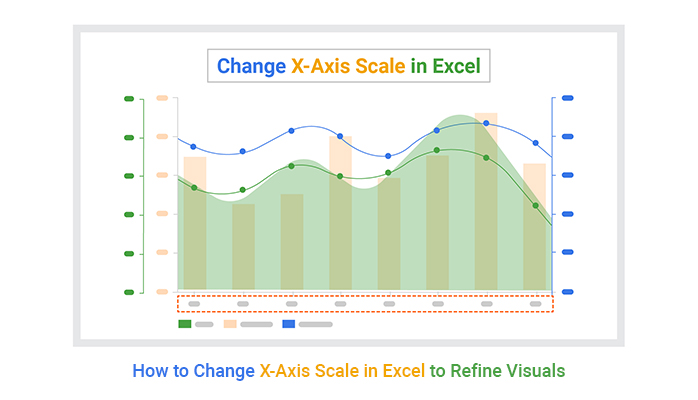
How do I change the x-axis scale in Excel? Many Excel users ask this question when working with data visualization. Charts and graphs are powerful tools, but how your data is presented can make or break its impact. If your x-axis scale doesn’t fit your data, your chart might be confused rather than clarified.

Many struggle with seemingly simple tasks, such as adjusting the x-axis scale. Getting it right can make trends stand out, making your insights more accessible and actionable.

How to Change X-Axis Scale in Excel

Imagine presenting sales data where each year appears evenly spaced, but your company only operated in alternate years. The default scale wouldn’t make sense. Knowing how to change the x-axis scale in Excel ensures that your chart tells the right story. Whether you’re adjusting for time intervals, custom labels, or specific ranges, mastering this skill saves time and improves clarity.

Excel’s flexibility means you can tailor charts to suit your needs. The x-axis scale plays a key role in showing patterns and relationships. Without proper scaling, vital trends might go unnoticed.

Let’s learn to change the x-axis scale in Excel. This isn’t just about aesthetics but precision and communication. Data deserves to be understood, and your audience deserves clarity.

Table of Contents:

  1. What are the Basics of the X-Axis in Excel Charts?
  2. Why Change the X-Axis Scale in Excel?
  3. How to Change the X Axis Scale in Excel Graph?
  4. How to Analyze Data in Excel?
  5. What are the Benefits of Changing the X-Axis Scale in Excel?
  6. What are the Common Pitfalls of Changing the X-Axis Scale in Excel?
  7. Wrap Up

First…

What are the Basics of the X-Axis in Excel Charts?

The x-axis in Excel charts represents the horizontal axis. It shows categories, time intervals, or numerical values. This axis is crucial for understanding the data’s structure. It defines the chart’s foundation in line, column, and bar charts.

The x-axis in Excel charts can display evenly spaced labels or specific data points. You can easily add data labels to Excel charts for extra clarity.

Excel offers customization options like adjusting scale, intervals, and labels. A well-designed x-axis enhances clarity and impact, playing a key role in analyzing and interpreting data. It highlights trends and patterns, making complex information easier to understand and act upon.

Why Change the X-Axis Scale in Excel?

Your chart should make your data clear, not confusing. Changing the x-axis scale in Excel helps your visuals tell the right story. Here’s why adjusting the x-axis is essential:

  • Accurate representation of data: Default axis scales may not accurately reflect your data. Customizing the scale ensures your chart aligns with your data’s real-world values or intervals.
  • Focus on relevant data: Sometimes, not all data points are equally important. Adjusting the x-axis scale allows you to zoom in on specific ranges, highlighting critical details while removing unnecessary clutter.
  • Highlight relationships in scatter plots: The x-axis scale is crucial in scatter plots for showing patterns or trends. Customizing it can make relationships between variables more obvious, ensuring viewers see the connections.
  • Improved readability: A poorly scaled x-axis can make charts confusing and hard to follow. Adjusting the chart elements in Excel makes it easier for your audience to understand the message without unnecessary guesswork.
  • Enhanced visual appeal: A properly scaled chart communicates effectively and looks professional. It creates a polished, clear data presentation that reflects attention to detail and ensures your insights are presented well.

How to Change the X-Axis Scale in Excel Graph?

Tired of confusing X-axis labels on your Excel chart? Don’t worry—it’s super easy to fix! You can update the X-axis scale to match your needs in just a few clicks. Here’s how:

  1. Add your data: Enter your numbers and labels in an Excel worksheet.
  2. Highlight your data: Select the range of data you want to display in your chart.
  3. Create a chart: Go to the Insert tab in the ribbon.
    • Choose a chart type (e.g., bar chart, line chart, or scatter plot).
    • Click to insert the chart onto your worksheet.
Click to Insert Chart for Learning How to Change X-Axis Scale in Excel
  1. Click on the X-Axis: Locate the X-axis on your chart and click it to select.
Locate X-axis on Chart for Learning How to Change X-Axis Scale in Excel
  1. Open data options: Right-click and choose Select Data from the menu.
Choose Select Data From Menu for Learning How to Change X-Axis Scale in Excel
  1. Edit the X-Axis: Find Horizontal (Category) Axis Labels in the dialogue box and click Edit.
Find Horizontal Axis Labels in Box for Learning How to Change X-Axis Scale in Excel
    • Remove the current X-axis values.
Remove Current X-axis Values for Learning How to Change X-Axis Scale in Excel
  1. Choose new values: Select your updated range of X-axis labels.
Select Updated Range of X-axis Labels for Learning How to Change X-Axis Scale in Excel
  1. Click OK to confirm.
Click Ok to Conform for Learning How to Change X-Axis Scale in Excel
  1. Finalize: Click OK once more to save your changes.
Click Ok Once More to Save Changes for Learning How to Change X-Axis Scale in Excel

How to Analyze Data in Excel?

Data tells stories, but only if you present it right. Excel is a go-to tool for crunching numbers, but let’s face it—its charts and graphs can feel clunky and limited.

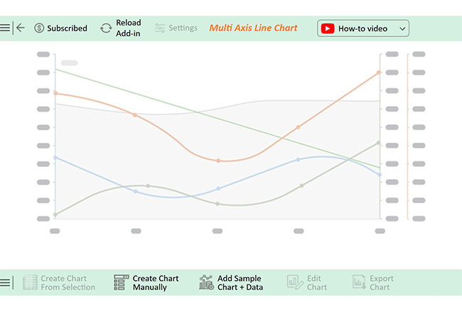
Excel often falls short in data visualization clarity and creativity. For example, adjusting an X-axis scale in a 3-axis graph in Excel can be tedious, with room for errors. Enter ChartExpo—this powerful add-on turns Excel into a data visualization powerhouse.

Say goodbye to the struggle; learn how to add a secondary axis in Excel with ChartExpo.

But first…

Let’s learn how to install ChartExpo in Excel.

  1. Open your Excel application.
  2. Open the worksheet and click the “Insert” menu.
  3. You’ll see the “My Apps” option.
  4. In the Office Add-ins window, click “Store” and search for ChartExpo on my Apps Store.
  5. Click the “Add” button to install ChartExpo in your Excel.

ChartExpo charts are available both in Google Sheets and Microsoft Excel. Please use the following CTAs to install the tool of your choice and create beautiful visualizations with a few clicks in your favorite tool.

Example

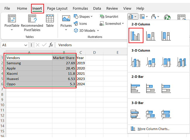
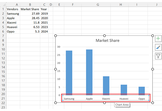
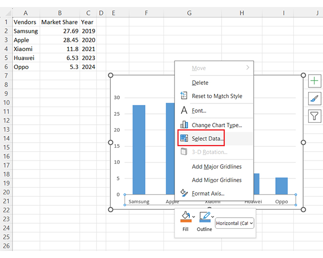
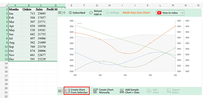
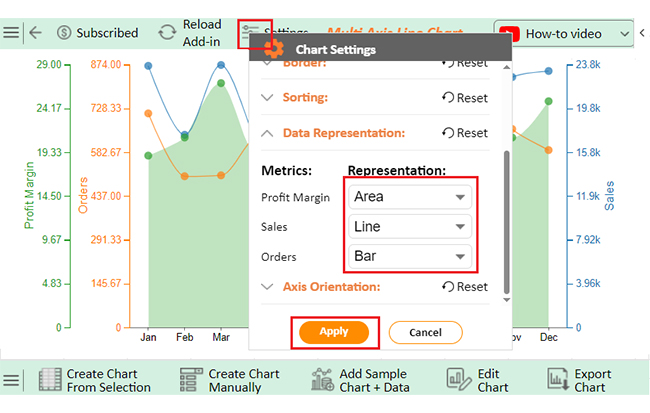
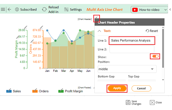
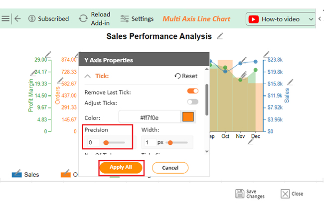
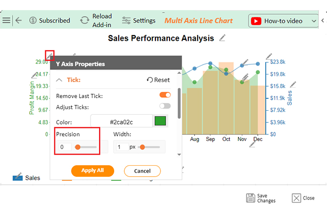
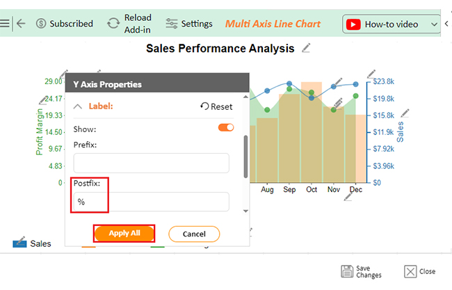
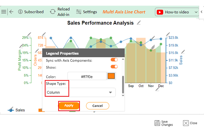
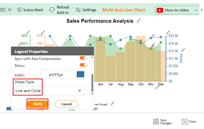
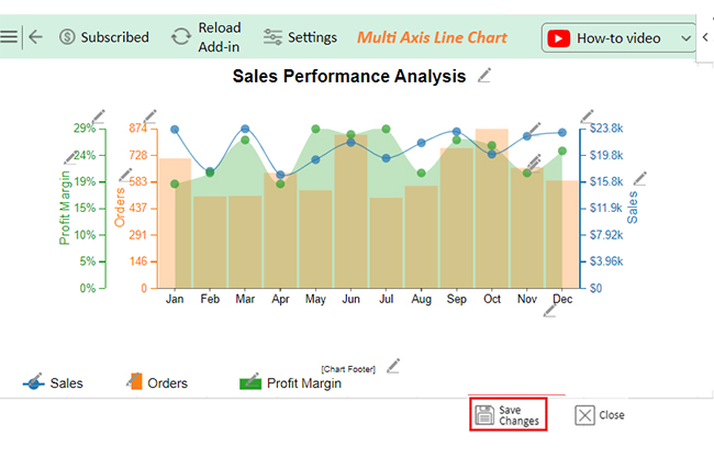
Let’s use ChartExpo to create a multi-axis chart in Excel from the sample data below and extract insights from it.

Months Orders Sales Profit Margin
Jan 713 23695 19
Feb 504 17457 21
Mar 507 23771 27
Apr 634 16936 19
May 538 19181 29
Jun 842 21755 28
Jul 497 19406 29
Aug 562 21689 21
Sep 769 23370 27
Oct 874 20006 26
Nov 661 22677 21
Dec 591 23229 25
  • To get started with ChartExpo, install ChartExpo in Excel.
  • Now Click on My Apps from the INSERT menu.
insert chartexpo in excel
  • Choose ChartExpo from My Apps, then click Insert.
open chartexpo in excel
  • Once it loads, scroll through the charts list to locate and choose the “Multi Axis Line Chart”.
search multi axis line chart in excel
  • You will see a Multi Axis Line Chart on the screen.
See Multi Axis Line Chart Page After Learning How to Change X-Axis Scale in Excel
  • Click the “Create Chart From Selection” button after selecting the data from the sheet, as shown.
Click Create Chart From Selection After Learning How to Change X-Axis Scale in Excel
  • ChartExpo will generate the visualization below for you.
Initial Visual After Learning How to Change X-Axis Scale in Excel
  • Click on Settings and change the “Data Representation” as follows.
Change Data Representation After Learning How to Change X-Axis Scale in Excel
  • If you want to add anything to the chart, click the Edit Chart button:
Click Edit Chart After Learning How to Change X-Axis Scale in Excel
  • Click the pencil icon next to the Chart Header to change the title.
  • It will open the properties dialog. Under the Text section, you can add a heading in Line 1 and enable Show.
  • Give the appropriate title of your chart and click the Apply button.
Add Chart Header After Learning How to Change X-Axis Scale in Excel
  • You can change the precision value of Orders to zero as follows:
Change Precision Value of Order to Zero After Learning How to Change X-Axis Scale in Excel
  • You can change the precision value of the Profit Margin to zero as follows:
Change Precision Value of Profit Margin to Zero After Learning How to Change X-Axis Scale in Excel
  • You can add the percentage sign with Profit Margin as follows:
Add Postfix Sign with Profit Margin After Learning How to Change X-Axis Scale in Excel
  • Change the Legend shape of “Discounted Cash Flow” to Column and click the “Apply” button.
Change Legend Shape of Discounted Cash Flow After Learning How to Change X-Axis Scale in Excel
  • Change the Legend shape of “Discount Rate” into a Line and Circle and click the “Apply” button.
Change Legend Shape of Discount Rate After Learning How to Change X-Axis Scale in Excel
  • Change the Legend shape of “Discount Factor” into a Line and Circle and click the “Apply” button.
Change Legend Shape of Discount Factor After Learning How to Change X-Axis Scale in Excel
  • Click the “Save Changes” button to persist the changes made to the chart.
Click Save Changes After Learning How to Change X-Axis Scale in Excel
  • Your final Multi Axis Line Chart will look like the one below.
Final How to Change X-Axis Scale in Excel

Insights

  • Highest sales: January ($23,695)
  • Most orders: October (874)
  • Peak profit margins: May (29%) and July (29%)
  • Strong performance: June (842 orders, $21,755 in sales)

Adjusting X-Axis Scale in Microsoft Excel to Improve Chart Accuracy:

  1. Open your Excel Application.
  2. Install ChartExpo Add-in for Excel from Microsoft AppSource to create interactive visualizations.
  3. Select the Multi-Axis Line Chart from the list of charts.
  4. Select your data
  5. Click on the “Create Chart from Selection” button.
  6. Customize your chart properties to add header, axis, legends, and other required information.

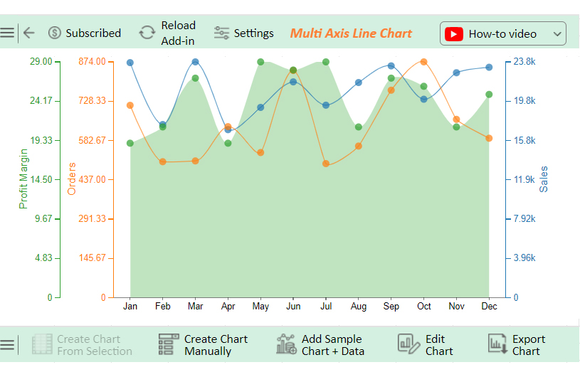
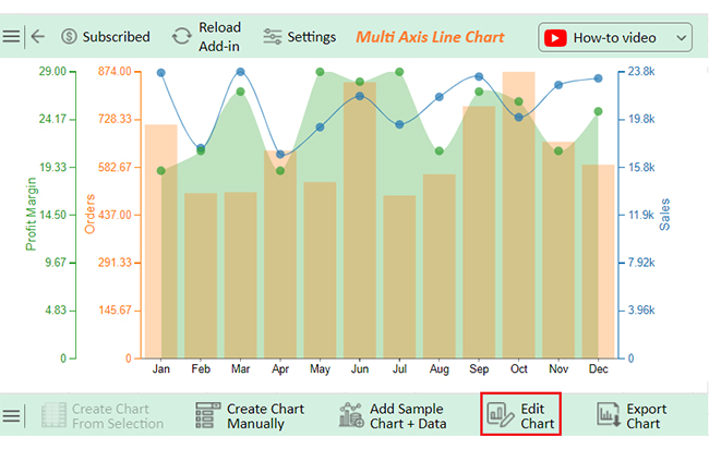
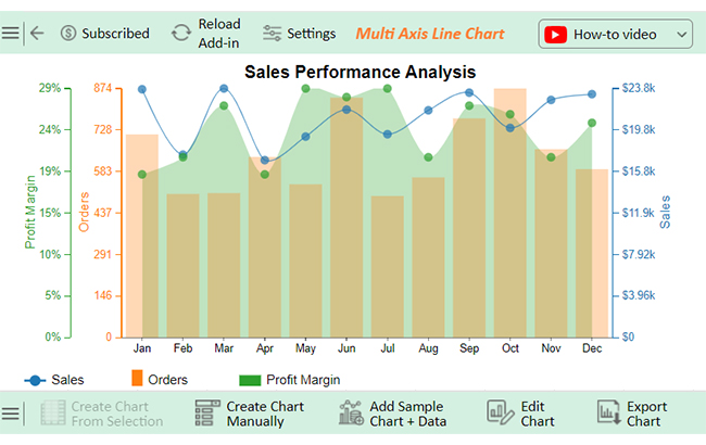
The following video will help you to create a Multi-Axis Line Chart in Microsoft Excel.

What are the Benefits of Changing the X-Axis Scale in Excel?

Did you learn how to add axis labels in Excel? Did that simple tweak to your Excel chart’s X-axis make a big difference? Changing the X-axis scale isn’t just about numbers; it’s about making your data shine. Here’s why you should consider it:

  • Improved data accuracy: Adjusting the X-axis ensures the chart aligns perfectly with the actual data, eliminating any chances of misrepresentation.
  • Enhanced data focus: It lets you emphasize specific timeframes or categories, highlighting the most important details.
  • Better visualization of trends and patterns: A refined scale makes patterns and trends more apparent, giving a clear view of fluctuations and changes.
  • Enhanced readability and clarity: Simplifying the X-axis reduces clutter, making it easier for your audience to understand your chart.
  • Aesthetic and professional presentation: Proper scaling creates a clean, polished chart that looks professional and leaves a lasting impression.

What are the Common Pitfalls of Changing the X-Axis Scale in Excel?

Changing the X-axis scale in Excel is simple, but even small mistakes can result in misleading charts. Avoiding these common pitfalls ensures your charts remain clear, accurate, and professional, preventing misinterpretation and enhancing data reliability:

  • Misaligning data: Your chart can become confusing or inaccurate if the X-axis labels don’t match the actual data points. Always ensure the labels you set correspond directly to the represented data.
  • Overcrowded axis labels: Placing too many labels on the X-axis in move columns in Excel can make it look cluttered and hard to read. Simplify by skipping some labels, using abbreviations, or rotating them for better spacing.
  • Ignoring logarithmic scales: A regular linear scale can distort visualization when working with wide data ranges. Use a logarithmic scale where appropriate to represent patterns or trends better.
  • Forgetting to update chart type: Some charts, like pie charts or stacked bar charts, don’t accommodate changes in the X-axis scale well. Always choose a chart type that complements the adjustments you make.
  • Neglecting to test readability: Even if the data is accurate, a chart that’s hard to read loses its impact. Preview your changes to ensure they make the chart clearer and not more complicated.

FAQs

How do you change the X-axis range in Excel?

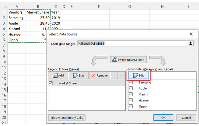
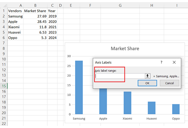
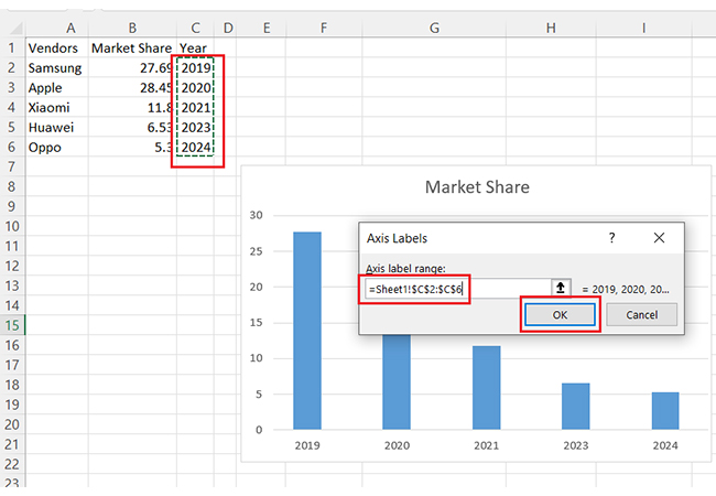
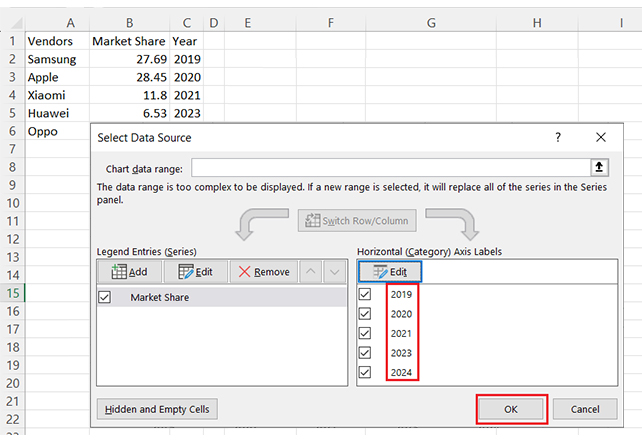
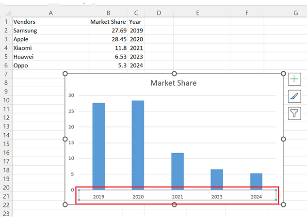
To change the X-axis range in Excel:

  • Click the X-axis and select “Format Axis”.
  • Adjust the Minimum and Maximum bounds.
  • For categorical data, use “Select Data” to edit the range of axis labels.

How do I change the x-axis to log scale in Excel?

To change the X-axis to a log scale in Excel:

  • Right-click the X-axis and select Format Axis.
  • In the Axis Options pane, check the box for the Logarithmic scale.
  • Adjust the base if needed and click Close.

How do I move the X-axis scale in Excel?

To move the X-axis scale in Excel:

  • Right-click the X-axis and select “Format Axis”.
  • Under “Axis Options,” adjust the Vertical Axis Crosses value.
  • This shifts where the X-axis appears relative to the data points.

Wrap Up

How to change the chart style in Excel can transform your data visualization. It allows you to tailor charts to fit your message. For instance, a well-scaled axis makes charts clearer and more impactful.

Changing the X-axis scale in Excel starts with understanding your data. Identify the range and intervals that best represent it. Excel’s tools make this customization simple and effective.

Adjusting the scale ensures accuracy. Default settings might not suit your dataset – customizing lets you focus on relevant trends and patterns. You also improve readability. A clear X-axis helps your audience grasp information quickly, eliminates confusion, and highlights key insights.

Customization enhances visual appeal. A polished chart reflects professionalism. It makes your data presentation stand out.

Mastering how to update a chart in Excel saves time and effort. This tool, paired with ChartExpo, ensures your charts are precise, clear, and engaging.

Do not hesitate – take control of your X-axis scale and let your data tell the right story.

How much did you enjoy this article?

ExcelAd2
Start Free Trial!
146757

Related articles

next previous
Microsoft Excel10 min read

Compound Interest in Excel for Smarter Reporting

Discover compound interest in Excel and how it works. Learn its formulas, calculation tips, and common errors to avoid for more accurate financial analysis.

Microsoft Excel9 min read

KPI Dashboard in Excel: A Complete Guide

A KPI dashboard in Excel helps track key metrics and streamline data visualization. Discover how to create, analyze, and use it with clear guides and examples.

Microsoft Excel11 min read

How to Plot a Speedometer Chart in Excel?

Create a Speedometer Chart in Excel to track KPIs, goals, and performance metrics visually. Explore templates, examples, and step-by-step instructions for better dashboards.

Microsoft Excel13 min read

Excel for Teachers for Insightful Preparation

Excel for teachers simplifies grading, tracks attendance, and organizes data. Find its key features, expert tips, and how ChartExpo enhances data visualization.

Microsoft Excel14 min read

How to Make a Cash Flow Diagram in Excel?

Learn how to make a Cash Flow Diagram in Excel. It will help you learn to visualize and analyze inflows and outflows of your business cash flow.

ChartExpo logo

Turn Data into Visual
Stories

CHARTEXPO

  • Home
  • Gallery
  • Videos
  • Services
  • Pricing
  • Contact us
  • FAQs
  • Privacy policy
  • Terms of Service
  • Sitemap

TOOLS

  • ChartExpo for Google Sheets
  • ChartExpo for Microsoft Excel
  • Power BI Custom Visuals by ChartExpo
  • Word Cloud

CATEGORIES

  • Bar Charts
  • Circle Graphs
  • Column Charts
  • Combo Charts
  • Comparison Charts
  • Line Graphs
  • PPC Charts
  • Sentiment Analysis Charts
  • Survey Charts

TOP CHARTS

  • Sankey Diagram
  • Likert Scale Chart
  • Comparison Bar Chart
  • Pareto Chart
  • Funnel Chart
  • Gauge Chart
  • Radar Chart
  • Radial Bar Chart
  • Sunburst Chart
  • see more
  • Scatter Plot Chart
  • CSAT Survey Bar Chart
  • CSAT Survey Chart
  • Dot Plot Chart
  • Double Bar Graph
  • Matrix Chart
  • Multi Axis Line Chart
  • Overlapping Bar Chart
  • Control Chart
  • Slope Chart
  • Clustered Bar Chart
  • Clustered Column Chart
  • Box and Whisker Plot
  • Tornado Chart
  • Waterfall Chart
  • Word Cloud
  • see less

RESOURCES

  • Blog
  • Resources
  • YouTube
SIGN UP FOR UPDATES

We wouldn't dream of spamming you or selling your info.

© 2025 ChartExpo, all rights reserved.